If you're reading this post, chances are you already have the SlideShare basics under your belt. You've uploaded a few presentations. You know you need a compelling story, beautiful design, enticing call-to-action, and solid promotion plan -- and you're comfortable executing on all of that in your slides.
Click here to download our templates for killer SlideShare presentations.
But you feel like there's still more you could be doing with the platform. You want better copy, and better design, and better promotions, and better CTAs, and better results (usually in the form of leads).
Unfortunately, the recommendations you've found so far have been fairly surface-level.
If this sounds like you, I'd recommend you keep on reading. We've compiled an in-depth guide to generating leads with SlideShare, showing you how to design, optimize, and promote your presentations to get more traffic and leads. Check it out below -- and if you have any other tips you'd like to add, let us know in the comments.
Note: If you want to get up to speed on the basics of SlideShare, here are instructions on how to get started, tips for making your slides even better, and several different presentation templates (download one here, and another here).
The Key Elements to Optimize in Your SlideShare Presentations
Great SlideShare presentations aren't great because of just one thing -- they often have some combination of a great story, copy, design, and promotion that's difficult to codify and replicate.
That being said, if you're trying to take your presentation from good to great, there are a few components you should be optimizing.
1) Title
Titles are arguably the most important part your SlideShare -- it’s the only part of the presentation most people will see before they decide to view it, particularly in social media and the SERPs, so you better make sure it’s a good one.
Headlines often feel subjective -- and truthfully, they are -- but there are some formats you should try out to boost your traffic:
Go Negative
Being a Debbie Downer can come in handy with your titles. According to a recent study by Outbrain, the average clickthrough rate on headlines in their distribution network with negative superlatives was 69% higher than that of their positive counterparts.
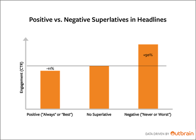
So in your next SlideShare, try opting for the "worst" angle instead of the "best" -- it could give you a boost in clicks.
Include Numbers
According to a headline analysis by Conductor, the most preferred headline format by surveyed individuals was numbered headlines:

So instead of framing your SlideShare as "How to Double Your SlideShare Traffic" (we're going to go meta here), you should trying positioning the title as "15 Little Ways to Double Your SlideShare Traffic."
Keep Your Title to ~55 Characters
You already know how important search is to getting people to find your presentation. If your title is too long, your SERP CTR could plummet.
Though there's no magic number to make your title length, Moz research indicates that you should keep your titles to 55 characters or so to avoid having your headline cut off in search.
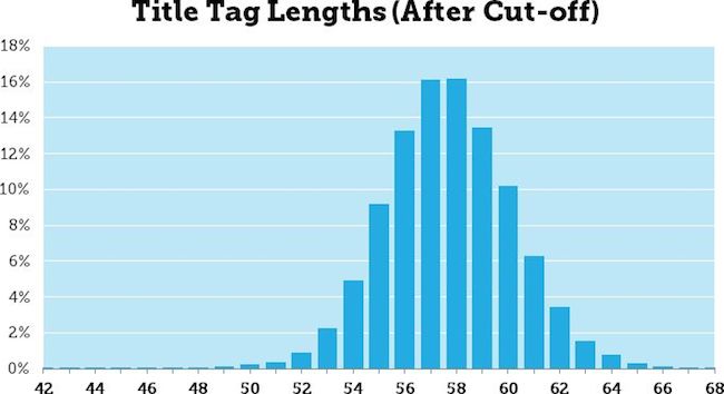
Bonus: Moz even created a preview tool to help you test out what your headline looks like in search. Before deciding on your next SlideShare title, test it out in their tool.
2) Cover
The next most important aspect of your presentation to optimize is your cover -- on certain social networks and on SlideShare itself, it's visible to users prior to clicking on your presentation. Cover optimization is less about using red instead of green or choosing Helvetica over Impact, and much more about making your presentation readable (and enticing) no matter who you are or what technology you're using to view it. Here are a few tips to keep in mind.
Create Covers With Facebook Cropping in Mind
Right now, SlideShare doesn't allow you to select a preview image for social networks. So if you haven't optimized your cover properly, Facebook may crop your cover thumbnail is a weird, unreadable way.
You can see what this looks like in this slide from Nick Demey:
To make sure your slide cover is readable, even with Facebook cropping, make sure all of your key information fits in the bounds of Facebook’s image dimensions.
Text Should Be Readable at Small Sizes
You don’t know how people will be viewing your cover. They may be clicking through the presentation in a tweet, or viewing it on their phones, or just looking at thumbnails on SlideShare’s homepage. You want your text to be readable in all of those situations, so opt for large, bold text on your cover.
Use High Contrast Colors That Work for Colorblind Audiences
Part of getting people to notice your cover in the sea of other SlideShares is to use colors that pop. Make sure that you’ve choosen at least one vivid color in your color scheme to get your cover to be noticed.
But when picking colors in your cover, you should also consider your colorblind audience’s needs. Make sure that your chosen colors have a high enough contrast (both in the brightness and in the hue) so that you’re not alienating a decent chunk of your audience. Be sure to check out this article for fabulous tips on designing for a colorblind audience.
3) Length
As far as how long SlideShares should be, there isn’t a ton of information out there on the exact length you should make it. Previous internal research we’ve done (albeit, it’s old) indicates that longer SlideShares are, the more views they’ll get.
A little more recently, Demy’s SlideShare recommends keeping your length to about 60 slides.
So I’d recommend using 60 slides as your starting point, and then testing for yourself to see what your audience likes.
Now that we know the key elements to optimize within a presentation, let’s talk about the tactics you can implement to get people to convert on your SlideShare.
How to Design Your Presentation to Convert
Before you start sending people to your SlideShare, you need to make sure you've got it optimized for conversion -- otherwise, all of that traffic will be a waste. Below are a few tips for getting your SlideShare primed to convert visitors. Keep in mind that these probably all shouldn't be used simultaneously for every presentation you do -- but they're best practices you should try out.1) Include clickable CTAs throughout your presentations.
One thing many marketers overlook on SlideShare is the ability to place clickable hyperlinks in your presentations. It's super simple to do (here are some easy instructions to follow to set them up), but there are three very important rules to follow when placing them in your presentations:
Don't place them in the first three slides.
SlideShare disables links in the first three slides of every presentation to discourage people from spamming the site with light presentations filled with links. So if you’re going to add in clickable links, know that you can only do it after slide three.
Only place links in the middle of the slide.
On every SlideShare, there are areas on slides that you can click to advance to the next slide or return to the previous one. If you put links in these areas, they won’t work. The sections are highlighted in red below:
Place important CTAs early on in the presentation.
In our own SlideShare presentations, we’ve seen way more conversion come from CTAs that are placed earlier in the presentation.
Even if you can hook someone with a great story, compelling copy, and fluid design … they may not want to stick around. By placing the CTA early in the deck, you can get more people to see it -- and maybe convert on it, too.
I’d suggest putting your first CTA right after your slides’ introduction. That way, people have enough time to understand why the presentation was created in the first place, and they can choose to convert if they’re bored.
2) Make a CTA the last step of the story.
You’ve already mastered this SlideShare storytelling thing -- why not make that story work harder for you? Set up properly, you can actually use your story to entice people to download the CTA. Usually, people will publish a story with a set number of steps or tips. At the end, they'll tack on a slide with a relatively random CTA to their website.
HubSpot’s Sidekick team ran a test to see if making the last CTA in the SlideShare as the final step in the story increased conversions. Below, you can see the last three slides of our presentation. We finished up our story, provided a metric on our users, and ended by making it clear that readers could be among those already succeeding with Sidekick by clicking the blue "Just click here" button. (Hint: That was our CTA.)
This last slide is responsible for nearly half of all clicks from this presentation's refferals to our website.

3) Disable SlideShare’s PDF download and create a specific CTA within the presentation to download a high-resolution version of the presentation.
Every SlideShare presentation has a built-in option for users to download the presentation. The only problem is that they don’t have to fill out a form to do that -- they can just click “download” at the top of a SlideShare presentation. So if you’re using SlideShare as a lead generation tool, this could be hindering your efforts.
One way to give the people what they want (free download!) while giving you what you want (leads!) is to disable your presentation’s downloads via SlideShare and add a slide to your deck with a CTA to download the slides via your site.
The Sidekick team tried this tactic, too. Previously, .4% of all visitors on our best SlideShare downloaded the PDF from SlideShare. Then, in late September, Sidekick Growth Marketer Anum Hussain added in Slide 9, which is a CTA to download the SlideShare as a PDF:

Out of the next batch of views the presentation received with this new slide, 2% of all visitors downloaded from the landing page -- a 400% increase.
The great part about this tactic is that once you get people to your landing page, you can serve them targeted smart content to make their conversion process even easier -- and your lead volume increase.
You can do this by swapping out your form with a “Pay With a Tweet” option for the people who are currently leads. That way, they don’t have to give you information you already have -- instead, they can access the content just by sharing the landing page URL with their network. And who knows, maybe other people will spot that link, click on it, and convert. More new leads for you, much less work for your leads. (If you want to learn how to set this up, click here.)
Bonus: If you're a PRO user, use the lead capture forms.
All of the other tips above can be used by any SlideShare user. This one is only available to current PRO users. Because of SlideShare’s new account structure, you can’t sign up for a PRO account at the moment -- and that’s the only way to access their lead capture forms.
If you do have the lead capture feature, you should try enabling it. You can make it pop up either after slide 10, or at the very end of the presentation. After you’ve collected leads, it’s easy to download a CSV and upload it into your contacts database.
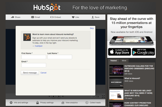
This is definitely one that should be a “bonus” for your SlideShare lead generation activities -- not something to worry too much about at the moment. SlideShare is in the process of restructuring how you pay for the lead capture feature, and should release something in 2015. When that happens, you should take a look to see if it’d be worth it for your company to purchase.
How to Get People to View Your Presentation So They Can Convert
Okay, so your presentations are in tip-top conversion optimization shape. Congrats! For your presentations to actually generate leads, you're going to need to ramp up their traffic, too. Below are a few pro tips for doing just that.
1) Optimize it for search engines.
The great thing about SlideShare is that it's a very high-ranking domain -- so the content you put there has a good chance of ranking highly if you optimize it properly.
Optimizing your SlideShares is very similar to optimizing your blog posts -- make sure you’ve keyword optimized your titles and descriptions. The only other thing you should know about is that SlideShare automatically transcribes your presentation -- so if possible, make sure your presentation has been properly optimized with keywords, too. (That is, without overstuffing.)
2) Embed your presentation on your blog and include a blog post link in the description of your SlideShare.
One of the easiest ways to promote your SlideShare is to embed it on your blog. Not only will this help you get leads via the SlideShare itself (more on that below), but the blog post itself should have a CTA on it, too -- giving you more opportunities to convert someone into a lead.
Once that blog post is published, make sure you’ve included its link in the description of your SlideShare, too -- just another opportunity to get people on SlideShare to visit your website (and hopefully convert).
3) Share the link on social networks.
Promoting content on social networks is probably one of the first things you would have done anyway, but there are a few tips and tricks for making your social posts even better for SlideShare promotion.
We’ve already talked about Facebook a bit. Outside of optimizing your cover to be shared on Facebook, there’s not much more you should do for the network.
Twitter, on the other hand, should be handled differently. Now, Twitter embeds SlideShares in tweets, so people can view your presentation without clicking through to SlideShare.net. Pretty cool, huh?
To ensure that happens, you just need to share a link to your SlideShare directly -- not the blog post hosting your SlideShare. This link can be shortened though -- the presentation will still appear within your stream.
Just like Twitter, LinkedIn also allows people to click through SlideShares without leaving their news feeds. The only difference you need to know is that it won’t embed the presentation if the URL is shortened.
Instead, grab the full URL with tracking tokens attached (so you aren’t losing out on analytics), and then paste that into your LinkedIn status update window. Voila -- SlideShare can be clicked on and you still get the data you need.
4) Add prominent “Share This Presentation” CTAs within the deck.
Let your current SlideShare viewers generate more traffic for you by prominently including “share this presentation” CTAs throughout the deck.
These types of CTAs only work when they’re prominent. (We’ve seen that just including the Twitter bird logo to signify that you can tweet something on a slide doesn’t drive a lot of results for us. And because you don’t want to be overly spammy, you’ll only want a slide or two of these prominent “share this presentation” CTAs -- preferably one close to the beginning and one close to the end.
5) Notify interested customers and leads via email.
It seems counterintuitive to send a piece of content to people in your database if you want new people in there, but it’s worked wonders for us at HubSpot. The key is to make your email about two things, and two things only: 1) Viewing the presentation, and 2) Sharing the presentation with others if they like it.
6) Targeted outreach to industry blogs.
After your SlideShare has accumulated some views (thanks to your above promotions), you’ll want to reach out to a few industry blogs to see if they’ll want to cover it.
Remember to make your pitches super targeted -- don’t blast out your SlideShare to anyone who’ll listen. If you’re sending it to a few blogs who are very relevant to your SlideShare and their audience has already shown an interest in topics and formats like your SlideShare covers, you should have a much easier time getting noticed.
Measure, Iterate, and Repeat
Now's the part where you can sit back and let the leads roll in.
But don’t sit back for too long. Take time to celebrate, but there are still things you can (and should) do to squeeze more lead generation juice out of your SlideShares.
Find the weak links in your conversion path.
When you’re analyzing your success with SlideShare, don’t forget to look beyond views, clicks, and leads. Those are obviously the most important if your goal is to generate leads, but I’d suggest looking at the entire funnel to see the effectiveness.
The results may surprise you -- you could find that while SlideShares don’t convert particularly well for you in terms of raw leads, they do convert faster, or they’re higher quality leads, or the customers bring in more revenue. And since those are all metrics your CMO and the rest of the C-Suite care about, you might still want to continue with SlideShare creations even if the raw number of leads aren’t there.
Of course, to measure all of this, you need closed-loop marketing software. (HubSpot customers, you’re covered.)
Tweak your presentation to fix your conversion path, and reupload.
After you’ve analyzed your first few lead generation SlideShare presentations, you’ll probably want to tweak the presentation to improve your conversion rates.
One of the best things about SlideShare is that to tweak your presentation, you just need to reupload an updated version -- no need to start from scratch every time you need to make a change. All of the important information stays the same (URL, title, meta description) -- the presentation itself just appears as the newest version.
Run future experiments on high-performing SlideShare presentations.
As you can tell, this SlideShare optimization process is iterative -- you make a brand new presentation, run some analyses on it, make some smaller changes to optimize it further, analyze those changes, and so on and so forth.
Once you have several presentations that get a lot of traffic, you can use them to run smaller experiments too -- no need to launch a brand new SlideShare every time you want to try some other conversion test.
And that’s basically it folks: a comprehensive guide to generating leads with SlideShare. These are all based on examples and data we’ve found, but we could be missing some ideas. For instance, LinkedIn has written the Sophisticated Marketer's Guide to LinkedIn, outlining some best practices for integrating your SlideShare presentations with your LinkedIn profiles. What other tips do you have for generating leads through SlideShare?
Lead Generation



![What is a lead magnet? 20 lead magnet ideas and examples [+ step-by-step]](https://53.fs1.hubspotusercontent-na1.net/hubfs/53/lead%20magnet%20represented%20by%20a%20magnet.webp)




![Gated Content: What Marketers Need to Know [+ Examples]](https://53.fs1.hubspotusercontent-na1.net/hubfs/53/UNGated%20Content.png)

![What Is Demand Generation? Here’s How You Can Create Buzz for Your Offering [FAQs]](https://53.fs1.hubspotusercontent-na1.net/hubfs/53/demand-generation-1-20250321-225687.webp)
