Professional services branding, whether it be law firms, consultancies or accountancies, is already incredibly risk averse. This media attention will help ensure the partnerships at these organizations wring the creative fire out of any ideas advanced from their marketing teams and agencies.
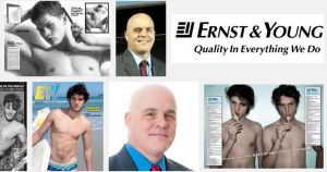
First, let’s deal with the latest issue. The comparison to the racy Spanish magazine is a bit unfair, but it does reveal that attention to detail in global rebranding is critical. If EY’s website administrators would have changed the file names of logo images on its website to include “EY" before it launched, that would have helped its prominence in Google search results. As of Monday afternoon, the main image on the EY website was simply named “logo.gif.”
 Screenshot of Google image search for EY.
So when you search “EY,” you get EY! Electric Youth magazine images that make American Apparel advertising look like Disney. This will die down rather quickly as the accountancy begins to assume ownership over “EY” in its communications, though I believe it will be one of those branding missteps that will be referenced for some time within the marketing industry.
The missing question: why did Ernst & Young make the change in the first place?
Hopefully, it was prompted by a substantive shift in its strategy. Otherwise it is an ultra expensive logo project (think of the signage costs!). The new CEO, Mark Weinberger, says it will help the company achieve its goal of being the No. 1 brand in the industry. Yet, there is no mention of how that will be achieved or measured. Quite frankly, even if he gave a revenue or growth target, it would not justify this change.
Perhaps in the coming months we will see demonstrative changes in its business. This could include investment in developing markets, expansion of consulting, aggressive acquisitions or the introduction of new service lines. Any of those would have added credibility to the image change. Instead its leaders’ quotes in press releases are vague: "We will use our expertise to team with other companies that share our purpose and commitment to building a better working world, contributing to the growth and success of our business, our clients' businesses, our people and the communities in which we work."
 In other words, there is no new positioning outside of a tagline, “Building a better working world.” This too would have been bolder and more aspirational if the company did not include “working” in the statement. But perhaps it intends to play up the notion that the new EY “makes things work.” It is hard to say because of the missing strategic rationale.
In terms of logos, subjectivity always abounds. Some will like it, but most will not. They should be credited for a bit of continuity because the “yellow beam” has been used previously. But as many critics (armchair and otherwise) have pointed out, the whole thing lacks imagination. Many have thought it looks like clipart, “a trucking company or the parent company of Budget car rental.”
The biggest shame is it misses out on a huge opportunity. If you plan to go through an effort like this and spend the money, then go for a home run and not a single. Also, professional service firms’ two main audiences are existing and prospective employees and clients. Will they be excited by this change? If not, why do it?
It is not my intent to beat up on this fine firm, but there is so much precedent for mediocrity in that industry that efforts like this are frustrating. I am dating myself, but I remember when there was the “Big Eight” accounting firms. For a chunk of the ‘90s, I worked at two of the then “Big Six.” Following that I consulted with many professional services firms including BDO, Deloitte and PwC in the areas of branding and marketing. So I think I know what happened in this case.
A new leader came in and wanted to express some sort of change. Ideas were commissioned, and there were probably some pretty cool ones that got discarded through the process. This is because firms that are built on partnerships are ultimately managed by oodles of committees. With all due respect, a hot dog vendor has more strategic bandwidth than Mr. Weinberger. I assume consensus is the culprit in this case, so the accountancy ended up with a watered-down, ho-hum result.
There are many lessons that come from this rebranding for other professional service firms, but here are the principle three:
1. Rebrand with Substance
A logo should only change to reflect a substantive change in business strategy. A new logo does not make a new brand.
2. Stand Out
EY’s new look and feel does not look or feel new. The introduction of color helps, but would you want to wear this on a t-shirt or have it embroidered on your computer bag?
3. Look Outside
This exercise must have looked at the same set of competitors that EY has looked at for decades. That immediately doomed the company to an incremental improvement at best. If it truly wanted to be the best brand in its industry, it should have raised its sights. It should have compared itself to and aspired to be the best brand in the world.
Rebranding
