
This post originally appeared on the Marketing section. To read more content like this, subscribe to Marketing.
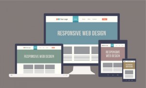
Now more than ever, businesses are focusing on creating delightful mobile website experiences. After all, 80% of Internet users are using smartphones to search online.
What's more, marketers are gearing up for a big change Google plans to make to their algorithm starting on April 21, 2015. Google wrote in their official blog that they will be "expanding our use of mobile-friendliness as a ranking signal," and their update should have a significant effect on marketers.
When Google makes this change, it will affect40% of mobile search queries. To put that in context, their Panda update impacted only about 12% of queries, and Penguin affected about 4% of mobile and desktop queries.
In other words, if you haven't been focusing on improving your mobile experience, you'd better prioritize it now, or your search ranking might suffer. According to a Search Engine Land article about the update, there will be "no degrees of mobile friendliness" -- your site will either be judged as mobile-friendly ... or not.
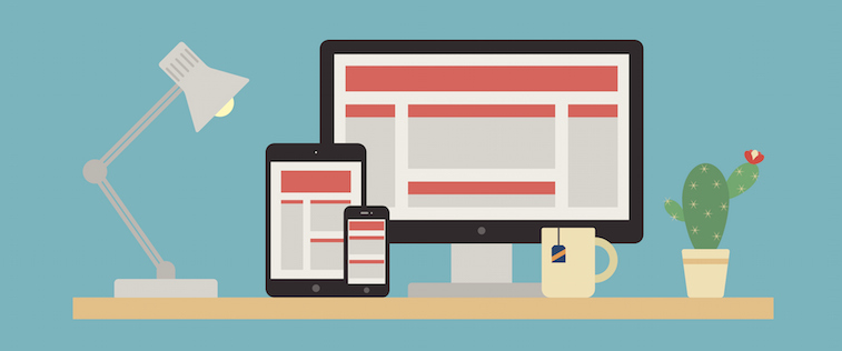
To help inspire any mobile website design changes you'll be making to prepare for the impending algorithm update, here's a list of 15 companies who really nailed their mobile web experience.
15 Examples of Great Mobile Websites
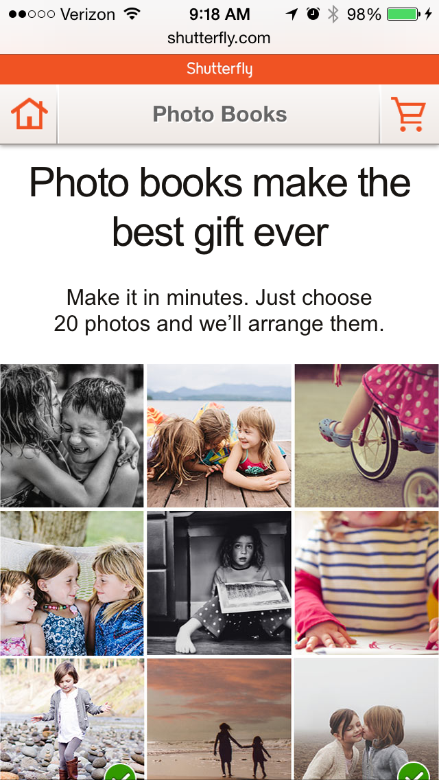
1) Shutterfly
Shutterfly is an online service that allows users to create photo books, personalized cards and stationary, and more. Because more and more people are taking photos and then accessing them using their smartphones, Shutterfly recognized the need to create a great mobile experience for their customers -- and they delivered.
Shutterfly accomplishes two key goals on their mobile website: 1) It's easy for users to find out information about their offerings; 2) They're selling that information by way of beautiful imagery.
When you arrive on their mobile site, you'll see the menu items have been enhanced into large buttons at the bottom half of the screen. This makes it easy for users to quickly select which option they're interested in learning more about.
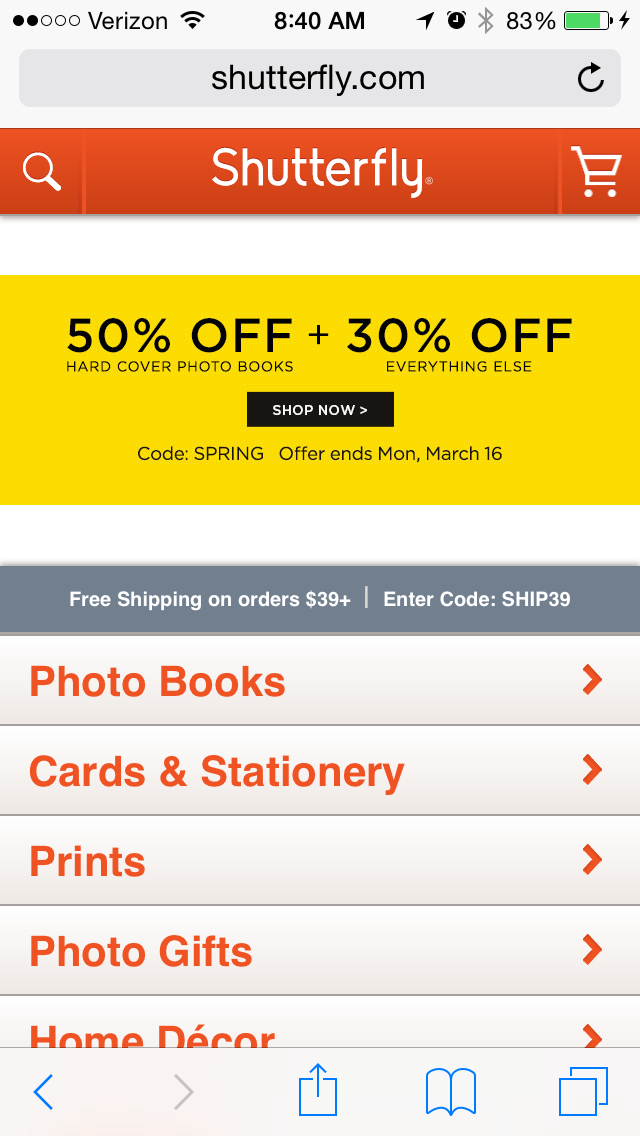
Once users click through to one of those options, they're greeted with large photos showcasing what Shutterfly is capable of for easy browsing.
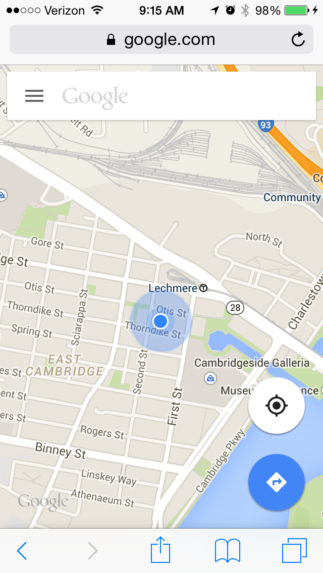
2) Google Maps
Everyone has their favorite map or directions application. Mine is Google Maps, which I use whether I'm walking, driving, biking, or taking public transportation. What's unique about their mobile website is that it's virtually indistinguishable from their downloadable mobile app.
The screenshots below are taken of their mobile website, but if you're familiar at all with the app, you'll notice they look exactly the same. Not only is the appearance identical, but the mobile website has the speed and functionality of the app.
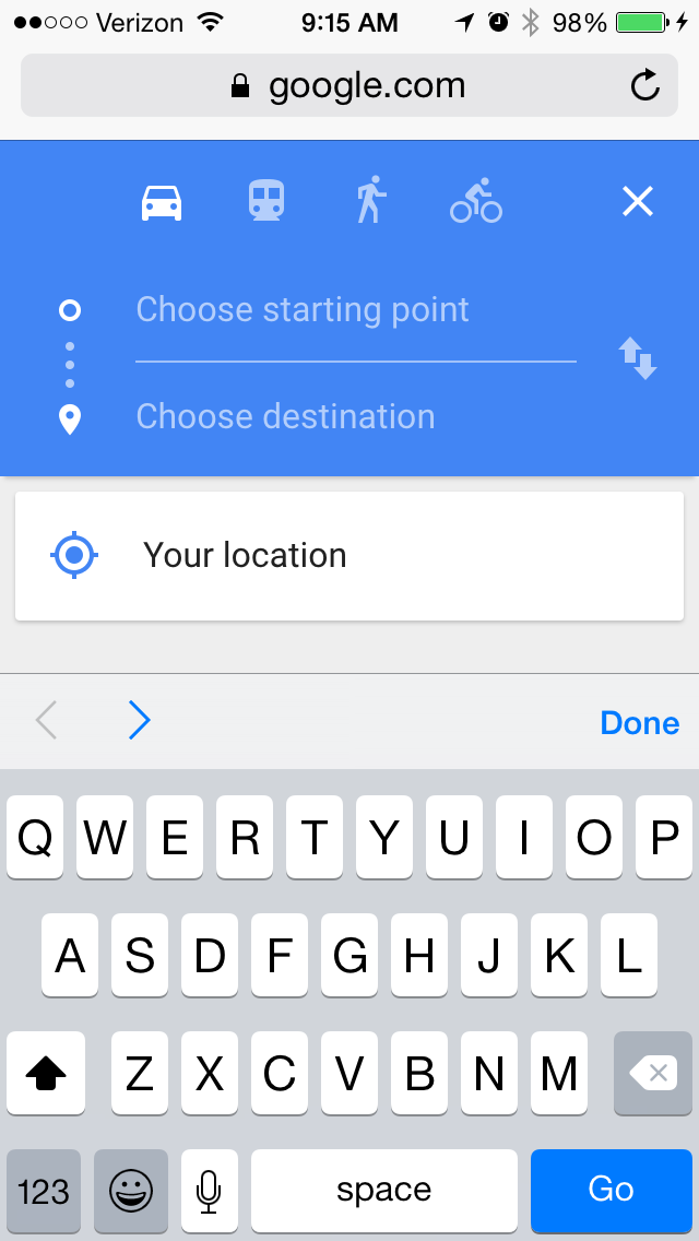
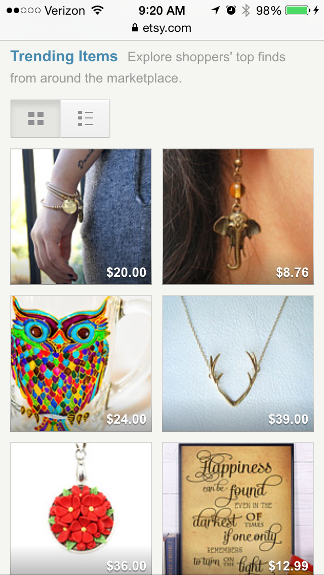
3) Etsy
Etsy is an ecommerce website where people can buy and sell vintage or handmade items. Most buyers who visit Etsy's website are there to do one of two things: Either they're searching for a specific item, or they're browsing items in categories that interest them. The mobile website caters to both types of visitors from the very beginning.
When you first go to their mobile website, you're greeted with an option to search for specific items or shops. Immediately below the search bar are thumbnail images of trending items that showcase some of the most popular things you can buy on Etsy.
Mobile users can view these trending items in list or collage format, and the images are big enough for them to easily tap with their finger.
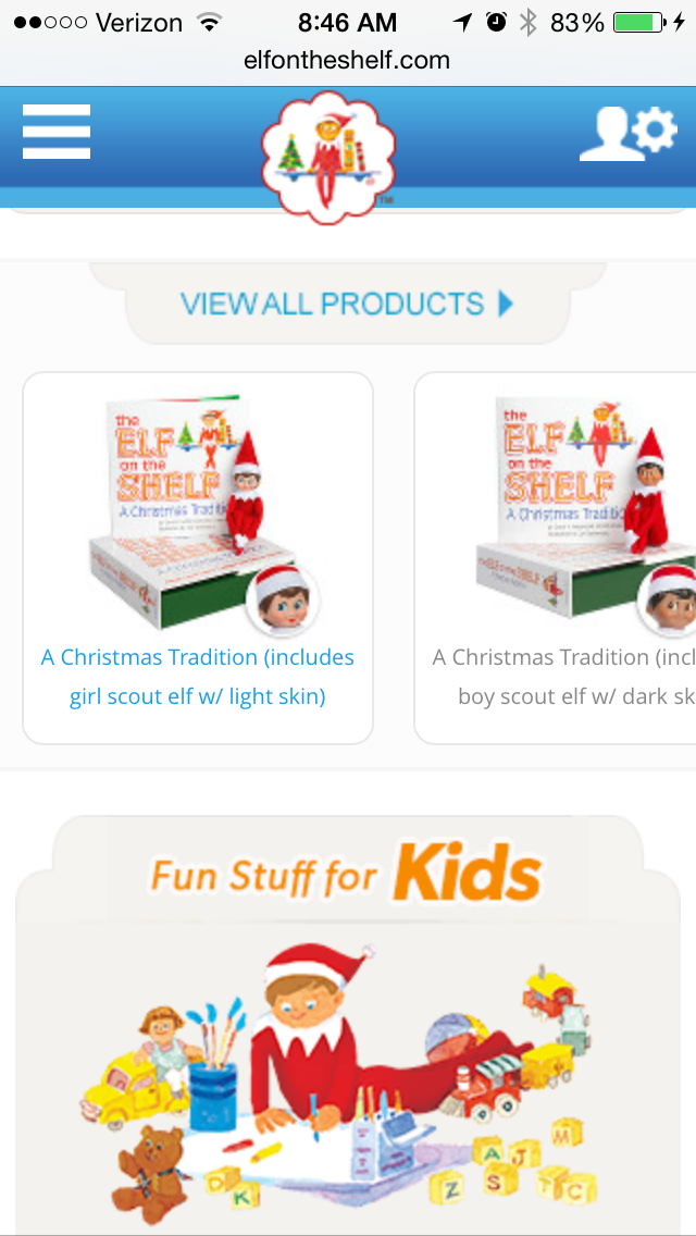
4) Elf on the Shelf
Elf on the Shelf is a fairly new Christmas tradition based on a children's book. If you're unfamiliar, the basic premise is this: The book tells the story of Santa's scout elves, who are sent by Santa to watch over children in their homes all over the world and report back to Santa. Along with the book, parents can purchase an elf figurine, which they'll subtly place somewhere in their house where their kids can see it. Every night leading up to Christmas, parents move the elf to a different location around their house to "prove" to their kids that the scout elves are real and always looking over them.
When you first arrive on Elf on the Shelf's website, you'll see that there are actually numerous types of Elf on the Shelf products you can purchase. But instead of forcing users to scroll through a long, text-based list, the web designers made it easy for users to simply swipe from left to right to look through all the different options -- ideal for visitors browsing products on the website.
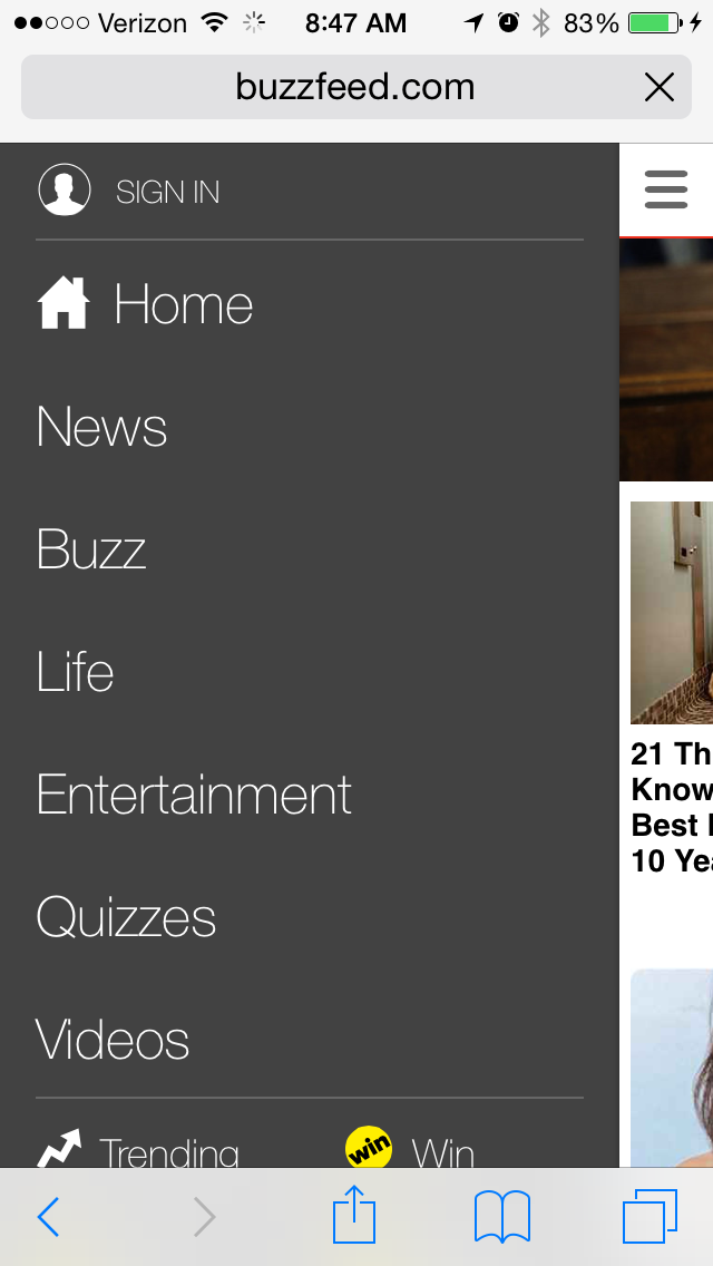
5) BuzzFeed
BuzzFeed is a news company known for it's viral content and popular quizzes. It also happens to be one of my favorite sources of entertainment during my commute to and from work. And where do you think I'm checking BuzzFeed during my commute? You guessed it: on my phone.
BuzzFeed knows that a lot of their visitors are visiting their site on mobile, so they've taken great care to create a smooth experience for their on-the-go readers.
When you arrive at BuzzFeed's mobile website, the first thing you'll see is some of their most popular pieces of content displayed in a simple, collage-like format using large images that are easy to tap with your finger.

For users interested in specific categories, there's a clickable menu in the top left-hand corner of the screen that lists out all the post categories.
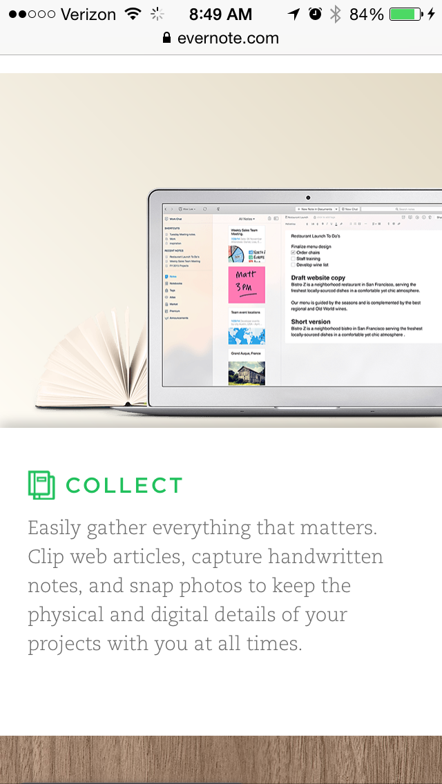
6) Evernote
Evernote is an application that allows you to store notes, images, and web articles and then access them across all your devices. Because users tend to download the app or access the website on multiple devices including desktop computer, smartphone, and tablets, it's essential that Evernote get the mobile experience right.
If you look at Evernote's homepage on your desktop computer, you'll notice how clean the design is. The value statements are short and to-the-point, and the images add to the positioning but don't clutter the page. When you look at their mobile website, they've kept this design and style entirely intact. Their mobile website is clean, simple, and doesn't detract at all from the value of the app.

7) Huffington Post
The Huffington Post is a well-known news outlet that reports from everything from politics and current events to entertainment and technology. What makes their mobile website unique is that they actually alter their headlines slightly for mobile users so their content is more easily scannable.
If you compare the desktop versus mobile websites, you'll notice that the mobile website has fewer words on the homepage. The headlines are shorter and much more digestible -- perfect for someone skimming or reading on a small screen.


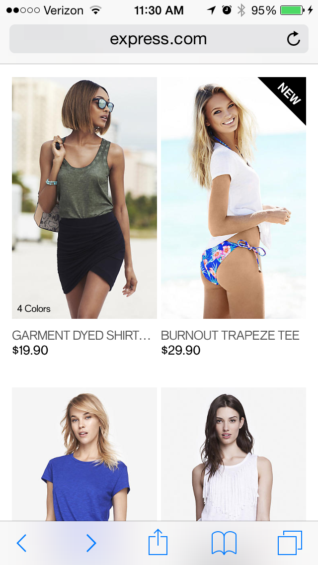
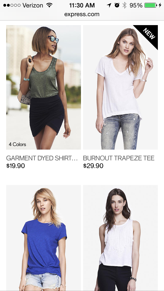
8) Express
Express is a clothing store that caters to young men and women. Because their audience often comes to their website to browse clothing, it's important for their website to include big, clear images of their clothing -- especially on mobile devices, when users will need to tap items on the screen with their fingers to click through for purchase information.
Express takes their mobile experience a step further than most online retail sites. If you slide your finger from left to right across an image showing a piece of clothing, the image will change so you can see the clothing in a different view. In other words, users don't have to load another page to see multiple pictures of the same article of clothing.
Look at the image on the top right in the following two images to see how it changes when you swipe to one side:
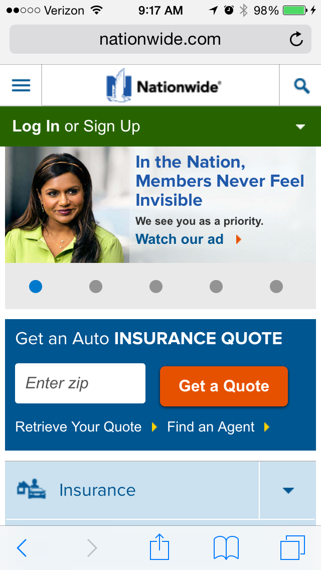
9) Nationwide Insurance
Nationwide Insurance provides insurance and financial services. You might think a financial company would have a really complicated website, but on mobile, Nationwide Insurance nailed down the simple user experience.
When you arrive on their mobile site, you have two options: either enter your zip code to get a quote, or find out more information about their services. That's it. Although this gives users limited options, it makes for a much easier experience for visitors using small screens. This is a great technique to lead potential customers in the right direction.
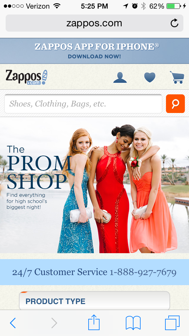
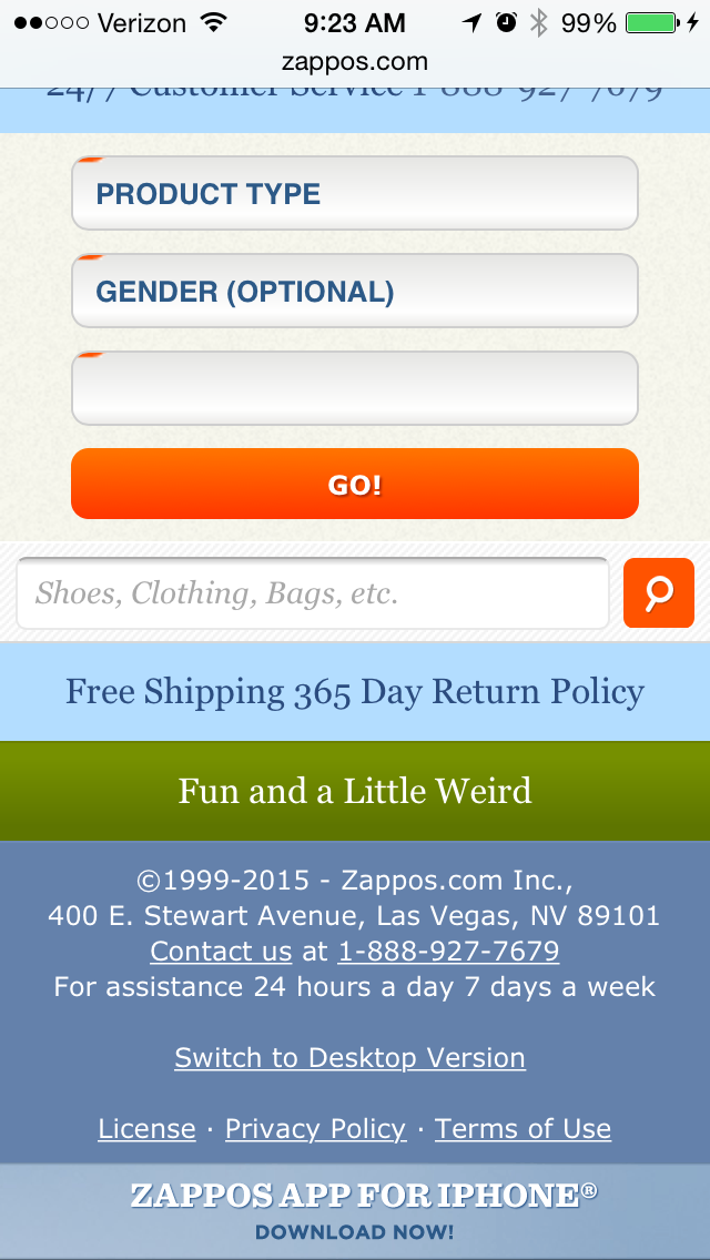
10) Zappos
Zappos is an online vendor for shoes and clothing known for their stellar customer service. Their top priority on mobile is to help users search easily for the items they're looking for on their website, so they've put a large search bar at both the top and bottom of their mobile website to make it super easy for them.
This is what the top of their mobile site looks like:
And here's the bottom:
11) ABC
ABC is a television broadcasting company known for popular shows like "Dancing with the Stars," "Modern Family," and "Scandal." Users visiting ABC's desktop website are greeted with a ton of options: view their television schedule, check out the Oscar winners, watch some of your favorite television shows, or even look at entertainment news relating to those shows.
But ABC knows that the experience on a mobile device should be simplified. When you visit the ABC website on a mobile device, you aren't offered nearly as many choices from the get-go. Instead, you're given one option: to scroll through large, clickable images representing all their television shows. Users can scan through these options and click into any show they want.

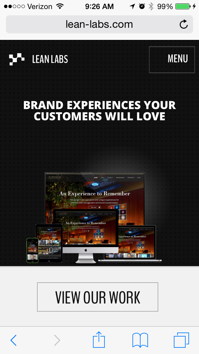
12) Lean Labs
Lean Labs is a HubSpot partner agency that creates engaging, responsive, and high conversion web solutions. They do a great job of providing a smooth experience for their mobile users, especially with regard to their design techniques and the emphasis they place on their core values, which are apparent to visitors within seconds of landing on their mobile site.
Notice how their mobile website uses scale and color to distinguish certain elements of their page:
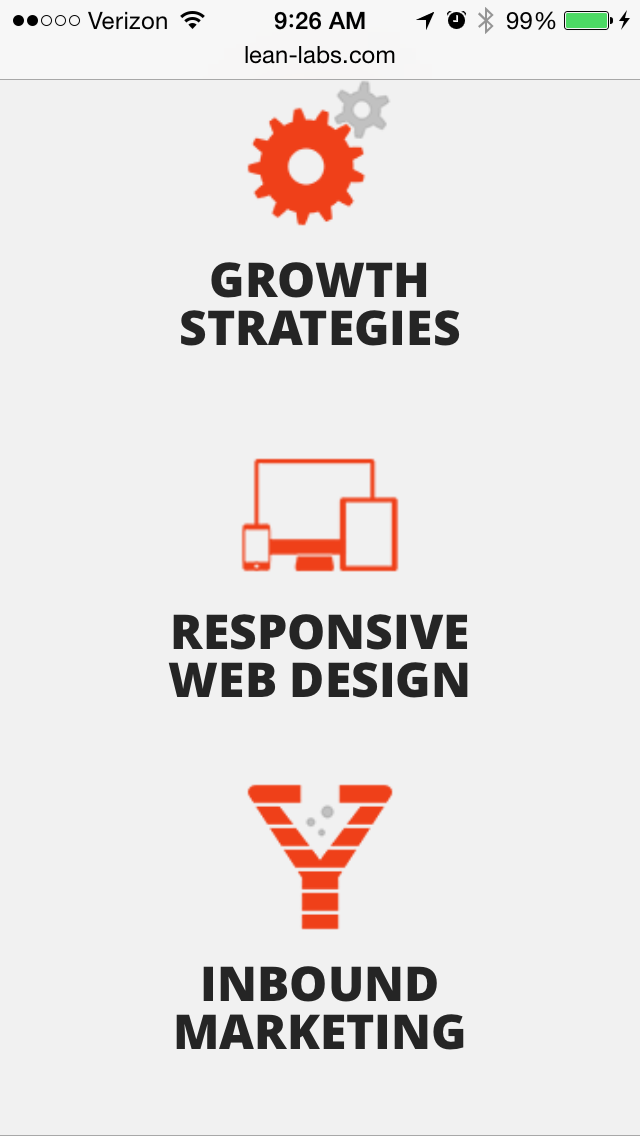
And, like I said before, their core values -- growth strategies, responsive web design, and inbound marketing -- are clearly visible to mobile users scrolling through the homepage.
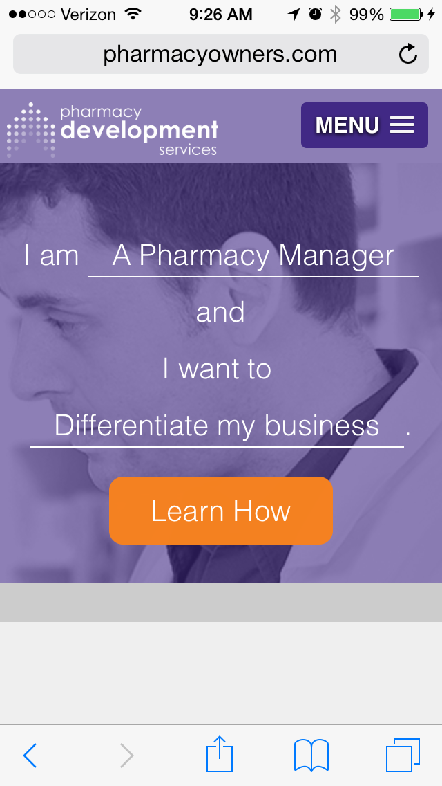
13) Pharmacy Development Services
Pharmacy Development Services is a HubSpot customer that provides coaching for independent pharmacy owners running their businesses. Both their desktop website and mobile website are super simple and user-friendly. The great part about these experiences is that they are essentially the same across devices, thanks to responsive design.
Their mobile homepage is interactive: Users are prompted to fill in the blanks based on their needs, and from there, they can click a CTA to be taken to a webpage catered to the information they might be looking for. Notice the form is really short -- this is intentional, as typing a lot of information can be frustrating on a mobile device.

14) SAP
SAP is an enterprise software company that manages business operations and customer relations. They enhance the mobile experience by condensing information by combining some of their calls-to-action into a slider, whereas their desktop website has these CTAs laid out horizontally. This helps keep things simple so mobile users aren't overwhelmed with a lot of information at once, and it also ensures none of the CTAs are too small to read.

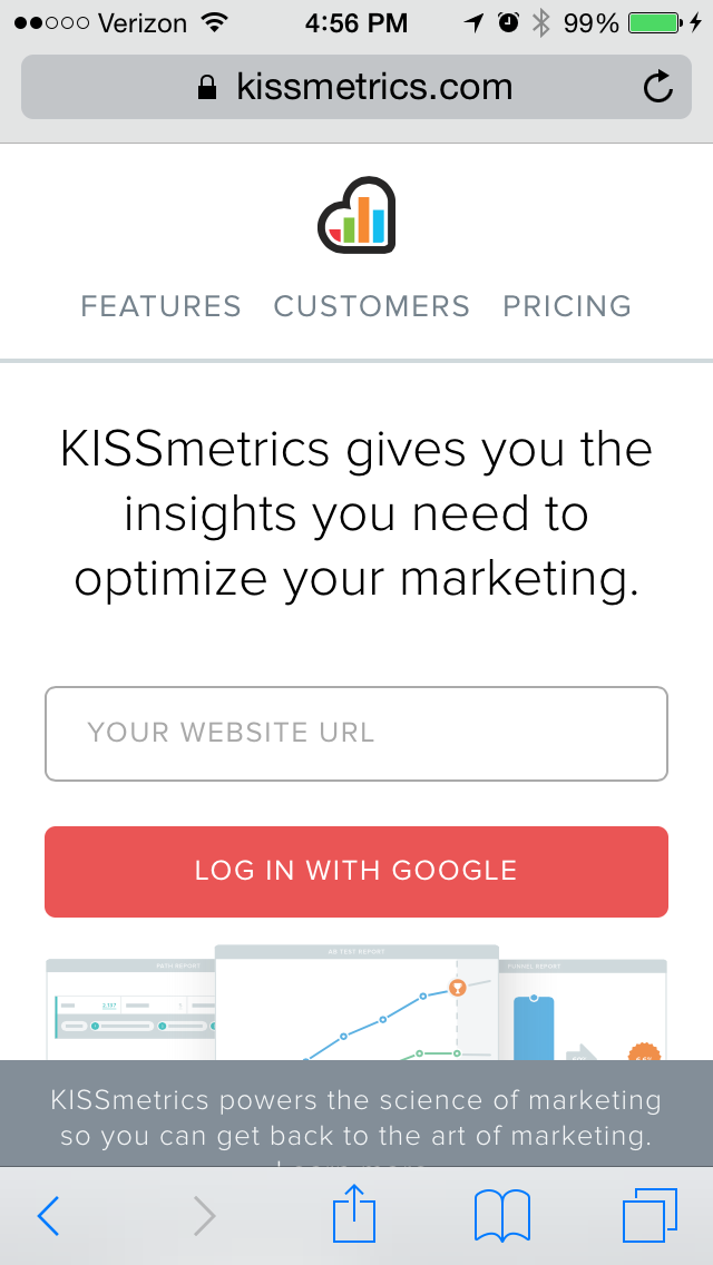
15) KISSmetrics
KISSmetrics provides analytics software for businesses. On their homepage, there's a lot of information explaining what the software along with a testimonial. But their mobile site is displayed a little differently: On a mobile device, a lot of the text and the testimonial is removed completely. Why? Because KISSmetrics knows mobile users tend to skip over lots of text on their mobile devices more than they would on a desktop computer.
These were some of our favorites. Which other mobile websites have caught your fancy? Share with us in the comments!