
But what exactly is responsive website design, how does it work, and why should you make the switch? This guide sets out to answer those questions, offer some compelling statistics, and teach you the key features of responsive design all marketers should know about. Let’s get started.
What is responsive web design?
Responsive web design refers to a website designed with mobile-friendly features, content, and media. Responsive websites change and adapt to whatever device a visitor may be using, including smartphones, tablets, and desktops.
Responsive web design is no longer a suggestion — it’s a critical investment to build your brand awareness, diversify your user experience (UX), and convert more site visitors.
It also saves your business valuable time. You can’t possibly design a separate website for each potential device your visitors may use — not to mention future technologies. Responsive web design ensures your website is compatible with all devices and screens to ensure a delightful experience … both modern-day devices and those yet to be invented.
Let’s dig more into why responsive design is so important nowadays.
HubSpot's Free Website Builder
Create and customize your own business website with an easy drag-and-drop website builder.
- Build a website without any coding skills.
- Pre-built themes and templates.
- Built-in marketing tools and features.
- And more!
Why Responsive Web Design is Important
Responsive design allows you to reach a broader, more engaged audience wherever and however they choose to browse.
More importantly, a lack of responsive web design can do the opposite — it can alienate your website from customers looking for an engaging mobile experience. In fact, research shows that you can lose up to 90% of your potential customers due to a poor mobile-friendly experience.
That’s a lot of customers — and revenue.
Let’s unpack three major benefits of responsive web design.
1. Responsive web design helps consumers discover your website.
A lot of people access Google on their mobile devices — 63%, in fact. Google also penalizes websites that don’t offer a responsive design. Its mobile-first indexing can actually impact how your website ranks and can cause it to be bumped down on search engine results pages (SERPs) in favor of websites that offer consumers a mobile-friendly design.
So, if the majority of your audience is searching on their smartphone (as the above statistic says), and your website doesn’t feature a responsive design, customers may not find your website at all.
2. Responsive web design keeps shoppers on your website longer.
Website bounce rates on smartphones are almost 40% (compared to only 27% for tablets). Also, a web page that loads in five seconds or less guarantees 70% longer viewing sessions.
Mobile users expect quick, high-quality website experiences (so does Google) — expectations that you can meet with a responsive website design.
Use our Website Grader to grade your website in seconds and learn how to improve it for free.
3. Responsive web design builds positive brand recognition and trust with consumers.
Finally, 57% of consumers say they’re not likely to recommend a business with a poorly-designed mobile website. The same report shows that more than half of online shoppers who are disappointed by a business’s online presence are likely to think negatively about the business itself.
Responsive website design delights online shoppers, encourages them to recommend your business, and brings them back to buy more.
How to Make a Responsive Web Design
It is possible to make your own responsive website using CSS and HTML. But this is like taking lengthy backroads when an expressway is available. In this case, the expressway would be a content management system (CMS) or a website builder.
A CMS is a software that allows you to build your website without knowing how to code — and that includes knowing how to code for responsive design. Site builders are similar tools, but they give up some functionality offered by a CMS in exchange for ease of use and lower pricing.
Responsive web design can be achieved using either a CMS or site builder that facilitate responsive designs. Here are a few common choices.
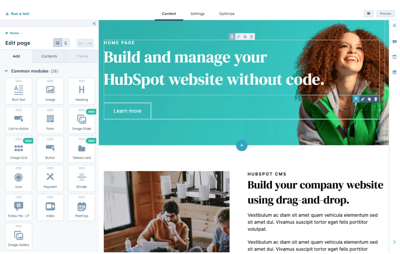
1. Content Hub
Content Hub is a content platform that includes a fully-hosted, fully-integrated CMS. It connects to your other HubSpot tools so you can present a unified marketing, sales, service, and site browsing experience for your visitors, customers, and employees.
In terms of your site building experience, Content Hub offers pre-built website themes that are also mobile-optimized to meet your visitors and customers wherever and however they’re browsing.
-1.gif?width=1500&name=ezgif.com-crop%20(1)-1.gif)
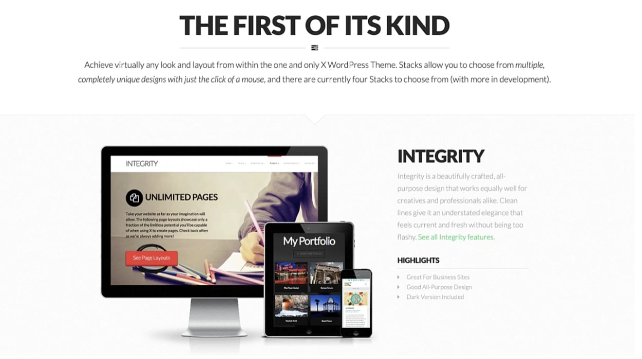
2. WordPress
WordPress is the world’s most popular CMS and maintains this superlative by offering one of the most straightforward website builders — the Gutenberg editor.
WordPress offers thousands of themes and templates to start with, including numerous templates with responsive design.
Note: Once you’ve set up a theme for your WordPress website, engage and convert your visitors with free forms, live chat, email marketing, and analytics by adding HubSpot’s WordPress plugin.
3. Squarespace
Squarespace is a popular site builder that offers gorgeous site designs and creative tools.
Squarespace offers 60 mobile-optimized templates from which you can choose to quickly build your site. Within the Squarespace editor, you can also transition from desktop to tablet to mobile view to ensure your designs seamlessly respond to different devices.

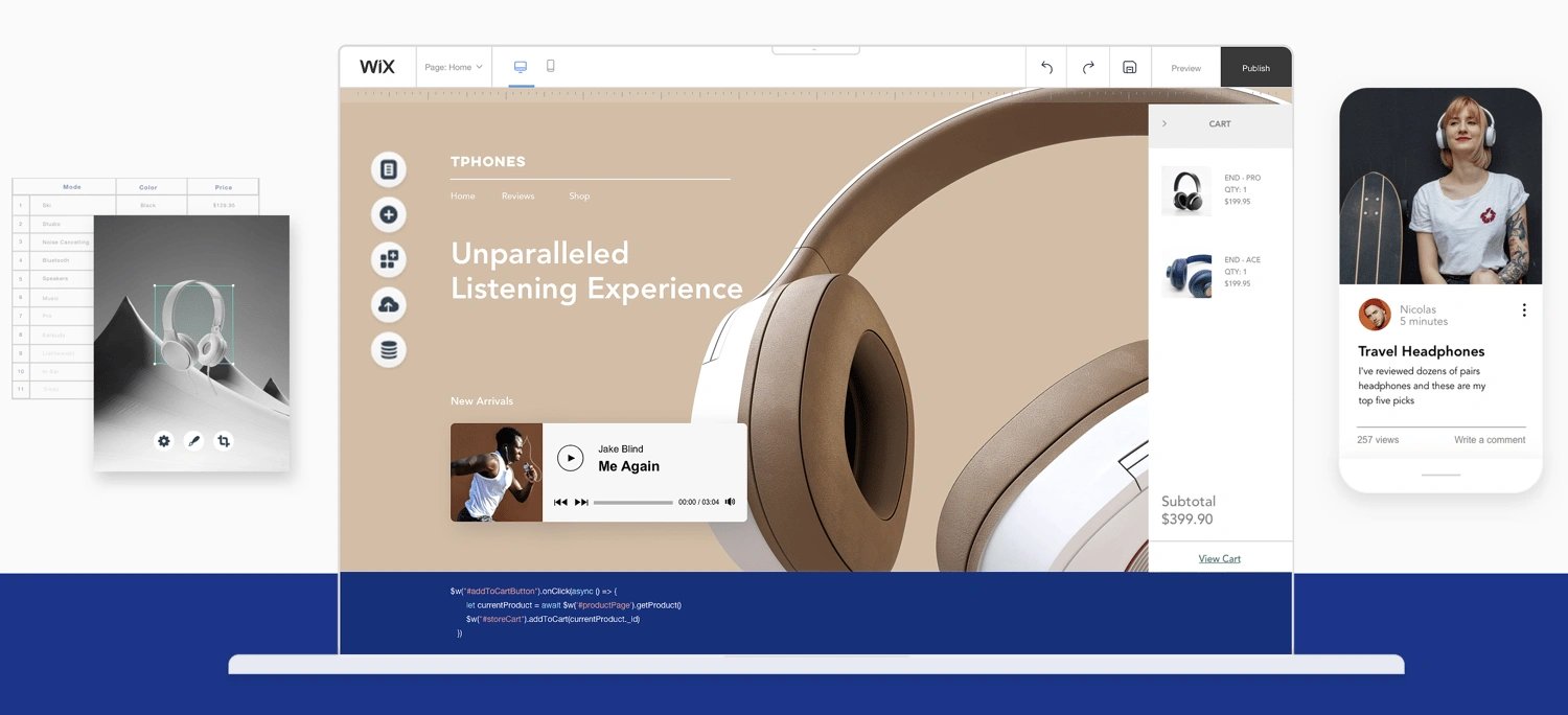
4. Wix
Wix is another site builder that offers free and paid website subscriptions. It provides an easy-to-use drag-and-drop editor, free hosting, and security features.
All Wix templates provide a mobile-optimized experience for visitors. Like Squarespace, the Wix editor allows you to see how your website looks on multiple devices.
In addition to creating a responsive web design using one of the above CMS tools or site builders, read this blog post to learn how to optimize your website for mobile use, too.
Responsive Web Design Best Practices
With an intuitive CMS or site builder, responsive design is easy. But even if you’re using the very best CMS, it can’t compensate for mobile-friendly content and media — that part is up to you. Let’s talk about some responsive web design best practices to help you create the most mobile-friendly web experience for your visitors and customers.
HubSpot's Free Website Builder
Create and customize your own business website with an easy drag-and-drop website builder.
- Build a website without any coding skills.
- Pre-built themes and templates.
- Built-in marketing tools and features.
- And more!
1. Don’t neglect your buttons.
What do you want site visitors to do when they land on your website? Take action, right? This could be by clicking a call-to-action (CTA) like Learn More, Download, or even Buy.
How do site visitors interact with these buttons when on your desktop site? If these CTAs pop up, scroll, or are located at the bottom of your web page, you may need to reevaluate how mobile visitors can access these.
For example, let’s say you offer a main CTA like Get HubSpot Free at the top of your desktop site where visitors can see if from every page.
When you view your mobile site, however, it doesn’t fit into the header. Instead of removing it altogether, consider moving the button or including it in your hamburger menu (the three lines in the top corner), where visitors can still see and click it.
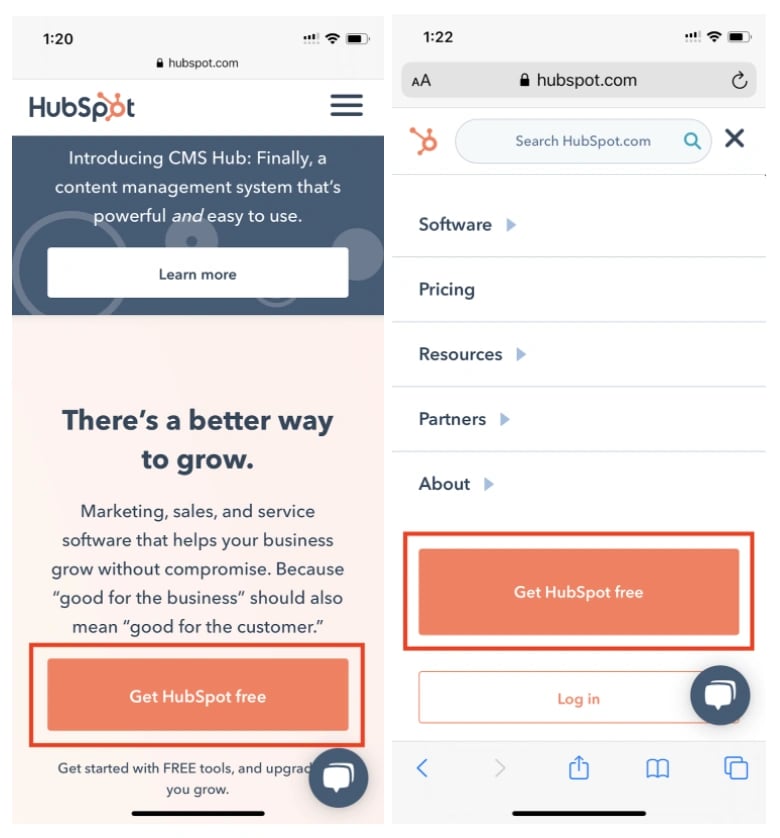
In addition, consider the size of clickable areas on your mobile site. Unlike a desktop, where visitors can use a mouse cursor to click buttons and links, they’re using fingers to navigate your website on their smartphone or tablet.
It’s recommended that clickable elements on mobile devices be at least 48 pixels in height. This includes buttons, form fields, inline links, and menu navigation.
2. Use scalable vector graphics.
If your website includes illustrations or icons, they should be formatted as scalable vector graphics (SVGs).

SVGs can be scaled infinitely, unlike other media formats like JPGs and PNGs. This ensures your website provides a high-quality browsing experience for users on any device. They also help your site load faster — which we’ve already discussed is a good thing for user experience and SERP rankings.
3. Make sure your images scale.
Illustrations and icons aren’t the only media type changing size on varying devices. Your images have to scale, too.
For example, desktop websites may require images at 1200 pixels, whereas mobile websites may need those at 400 pixels. Using the larger resolution on all devices can slow down your page speed, so that approach isn’t recommended.
Instead, consider uploading different image resolutions and designating which image you want to display on each device. This is typically achieved by assigning different “media” tags to specific “source” objects (e.g. tablet or mobile) in your website code.
Note: HubSpot enables automatic image resizing on content — yet another reason to build your responsive website on Content Hub!
4. Consider your typography.
A font that looks gorgeous on your desktop site may not read so well on a mobile device that’s a quarter of the size. If visitors can’t read your website, they certainly won’t click on or buy anything.

Alternatively, revolving your website fonts around the mobile experience can leave your desktop users with ugly words that are too big and clash with your branding.
Here’s our best advice for typography on responsive web design:
-
16pt body type is the rule of thumb for desktop and mobile web content.
-
Avoid uber thin fonts that fade away on smaller screens.
-
Make sure all headings are clearly larger than body and subheading content.
-
Use contrasting colors for your typography so it doesn’t fade into your website background colors.
5. Take advantage of device features.
While prospects and customers can’t call you over their computers, they definitely can on their smartphones. Consider changing your “Chat Now!” CTA to “Call Now!” and include your business phone number in lieu of email.
Additionally, if your business has a mobile application, prompt site visitors to open your app from your website — something they might not be able to do on their computers.
6. Test your website often.
As always, test your responsive website on different devices and browsers. Check out Google’s Mobile-Friendly Test tool to see how your site performs.
This handy tool by Matt Kersley will also provide a peek at your website on different sized devices. You can, of course, use your own mobile devices, too.
Responsive Web Design Templates
The best way to ensure your website has a responsive design is to start with a responsive web design template. Below are five gorgeous templates available on HubSpot Asset Marketplace that will give your site visitors a mobile-friendly browsing experience.
Get access to thousands of templates with HubSpot Marketing Professional.
1. DjanGo Responsive Design Template
Price: $200
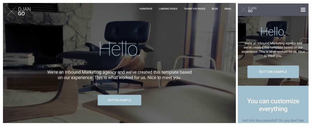
The DjanGo template is a fully-customizable and responsive site template. Its modern, minimalist design allows visitors to focus on your site content and product information.
2. Prodigy Responsive Design Template
Price: Free
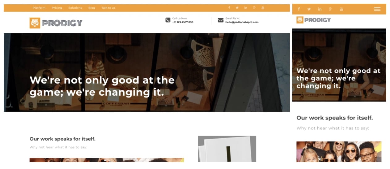
The Prodigy template is a clean website template that reaches your audience with bright media and multiple CTAs. It automatically converts its design to fit any device used by your site visitors.
3. Quantum Responsive Design Template
Price: $75

The Quantum template is a multi-purpose theme that captures your audience with bold headings and a video background. Customize your site with a variety of page layouts and custom modules.
4. Kalahari Responsive Design Template
Price: $199
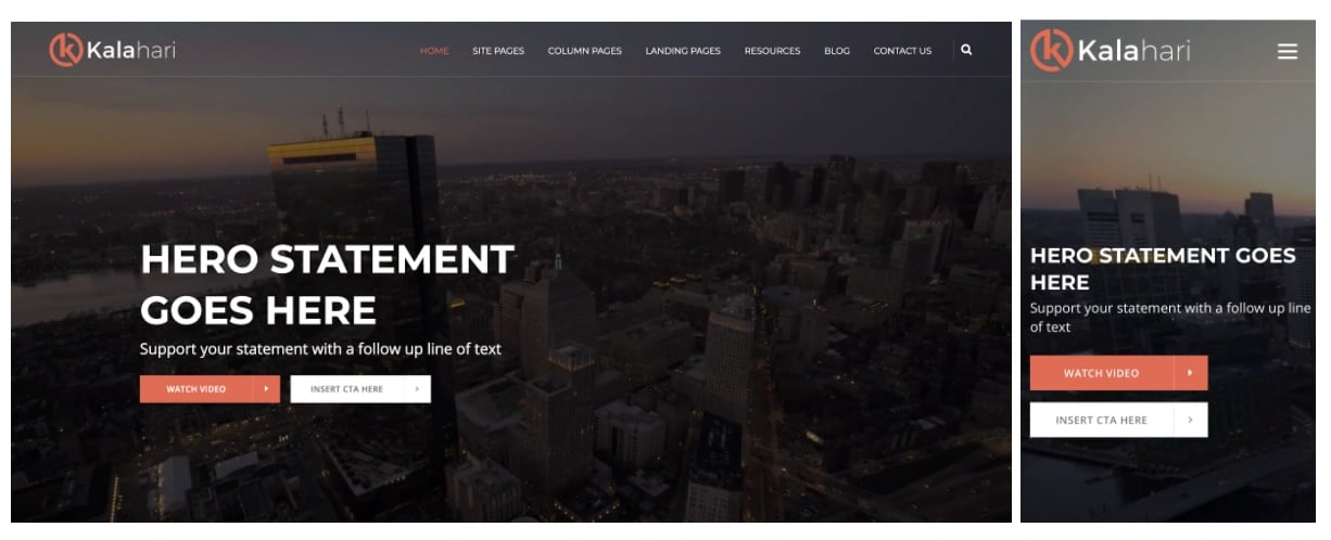
The Kalahari template is a responsive theme that offers dynamic navigation and customization at the page level. Use this template to convert your audience with bright, standout CTAs.
5. Startup Framework Responsive Design Template
Price: Free
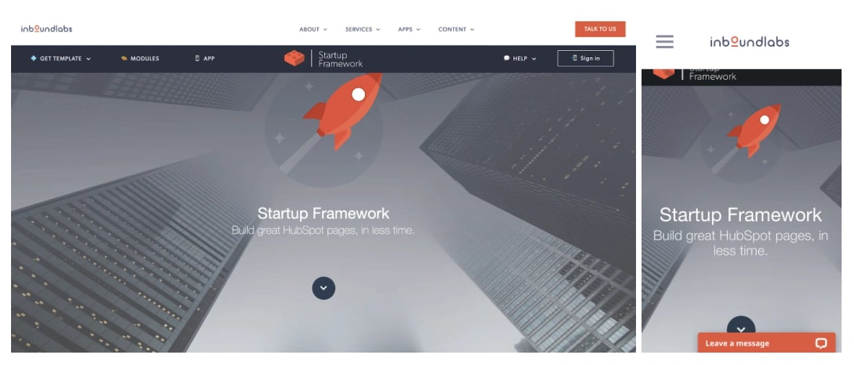
The Startup Framework template is a unique website template with bold typography and bright graphics. Build it natively within HubSpot’s content editor and choose from thousands of icons and dozens of custom modules.
Respond to Your Audience with Responsive Design
With so many consumers shopping and browsing on their mobile devices, responsive design is an absolute must-have. Without it, you could be missing out on leads, customers, and revenue.
Use these tools, templates, and best practices to get started with responsive web design today.
Editor's note: This post was originally published in September 2014 and has been updated for comprehensiveness.
![Blog - Website Redesign Workbook Guide [List-Based]](/hs-fs/hub/53/hub_generated/resized/78197628-483f-4ee0-8235-df4f95edd7ae.png)
.webp)
![How to create a landing page with high ROI [+ expert and data-backed tips]](https://53.fs1.hubspotusercontent-na1.net/hubfs/53/%5BUse-2.webp)

![Signs it's time to redesign your website [+ 15 steps to follow]](https://53.fs1.hubspotusercontent-na1.net/hubfs/53/phaseswebsiteredesign%20copy.png)


![How to start a blog (the right way) and write posts people actually want to read [+ free templates]](https://53.fs1.hubspotusercontent-na1.net/hubfs/53/how-to-start-a-blog-2.webp)
![What is a lead magnet? 20 lead magnet ideas and examples [+ step-by-step]](https://53.fs1.hubspotusercontent-na1.net/hubfs/53/lead%20magnet%20represented%20by%20a%20magnet.webp)