Have you ever been forced to duke it out with a company just to get off of their email list? What about insist that you never opted in to someone's email communications in the first place? Or maybe you did opt in once upon a time, but the messages are so poorly targeted and infrequently sent you'd have no way of remembering your relationship with that company in the first place.
These days, we'd be hard pressed to find someone who hasn't melted down into an unproductive diatribe with sloppy email marketers who fill our inboxes with unsolicited, random, and irrelevant messages. And I know none of us want to be guilty of such behavior! So to keep us all in check, we've compiled a list of the most annoying things (actually, some are just plain illegal) email marketers do. This way, we can all just stop it already.
16 Things People Hate About Your Email Marketing
1) Emailing People Who Didn't Opt In
The first rule of email marketing is only email people who have opted in. (You thought I was going to make a Fight Club reference, didn't you?) If CAN-SPAM laws aren't enough to deter you from emailing people who haven't explicitly asked to receive email from you, remember that emailing a cold list will also result in some pretty paltry metrics; since they haven't indicated interest in you, your open and click-through rates will be much poorer than with an opt-in list. It also means you'll suffer miserable unsubscribe rates, greatly impacting the deliverability of your future email marketing campaigns.
And if none of that makes you bat an eye, consider your brand's likability. You know how it feels to receive unsolicited email. Don't be that guy.
2) Making Unsubscribing Difficult
No matter how amazing your email marketing is, some people are going to want to unsubscribe. Maybe they don't work in the same industry anymore. Maybe they moved and your email marketing caters to people in a specific area. Maybe they just have too many emails. Whatever the reason, there's nothing more frustrating than scrolling to the bottom of an email and not seeing an option to unsubscribe (and again, having no unsubscribe option is actually illegal). Or worse, struggling to find the unsubscribe option that's hidden with teeny tiny font, and written in confusing language like, "Learn more about why your email address is receiving these messages."
Make the option to unsubscribe simple; if your recipient wants to do it, they will take the time to scan your email, find the link, and be removed from your mailing list. You get to decide whether they leave your unsubscribe center fuming in annoyance, or relatively level-headed.
3) Not Honoring Unsubscribes
This seems to go without saying -- if someone unsubscribes from your email communications, you should opt them out. So what's the deal with those emails you get back (despite just unsubscribing) that say, "It may take up to 2 weeks to remove you from our email list." Two weeks!? What's the hold up? Is the unsubscribe guy on vacation? AGAIN ... you're legally obligated to remove opt-outs from your list within 10 days' time, so waiting for two weeks could result in you answering to the law. This is where email marketing software that integrates seamlessly with your CRM comes in handy, as the opt-out is immediately processed and recorded in both the contact record and within the email software. But if you're removing unsubscribed addresses from your list manually, make it a top priority to process that request.
4) Writing a Vague Subject Line
After deliverability hurdles are crossed, the subject line is the gatekeeper of your email. Your content will never see the light of day if the subject line isn't interesting enough to entice a click. In fact, we've written an entire blog post about how to craft catchy subject lines that get recipients clicking!
But you know what? We don't always need catchy. What we need is relevance . Clever or not, the subject line should tell readers what they'll get when they open the email. As we stare at our bloated inboxes each morning, or click over to our email tab as we see the number of unread emails piling up, we expect to see something useful. It should be worth our time to stop what we're doing and read the latest piece of content to hit our inbox. If the subject line gives no indication of the email's relevance to our lives, it's certainly not going to get opened -- and as a result, it becomes just one more thing we've wasted time trashing.
5) Not Indicating How We Know Each Other
We're all on a lot of email lists, and there's just no way to keep it all straight. So sending emails that don't give the recipient a clue as to who you are and how you know each other is a guaranteed way to make your readers struggle. What company is this? When did I sign up for these emails? Don't make them think! Send your email from a recognizable sender name, and use the beginning of your email to establish your relationship with the recipient to prevent deletions and unsubscribes. HubSpot customer Bonafide does a good job of this, reestablishing their connection with the lead in the beginning of their email copy.

6) Speaking With Forced Sincerity
"Hello Mike! Hope things are going well!"
This is a relic from the days when dynamic content was new, the concept of personalization in email marketing was the hottest ticket in town -- and the two were tied together like peanut butter and jelly. The thing is, inserting someone's first name and getting "personal" by asking how they're doing isn't really personalization. In fact, it's incredibly generic, because it can apply to everyone on your email list. And your email recipients see right through it. Start your emails with a recipient's name, sure; but you should really spend your time segmenting email lists so you can provide targeted content instead of trying to finesse copy that could apply to anyone under the sun. Which takes us to our next email marketing pet peeve ...
7) Providing Irrelevant Content
The content of your email -- whether the copy itself or the offer you're promoting -- should be something the email recipient actually wants to receive. And you would know what they want to receive if you've spent time collecting lead intelligence, segmenting your email lists based on that intelligence, and mapping the appropriate content to each segment of your list.
What some email marketers do, however, is email blast a 10% off coupon for dog food when half of their email list only owns a cat. If the content you're sending out won't be helpful to everyone on your current list, slowly back away from the 'Send' button, and refine the list to which you're sending your email.
8) Bombarding Recipients With Email
A surefire way to see an onslaught of unsubscribes is hammering your recipients' inboxes with emails. Take a look at this instance from Dell, who sent the exact same email. Twice. In two days. You know, in case I wanted to re-evaluate my decision not to open it the first time.

Figuring out the right email sending frequency certainly takes some experimentation -- here's a scientific approach to it if you're interested -- but there's never a need to send the exact same email to a recipient twice in a row. That's just bad marketing automation.
9) Sending Emails Once in a Blue Moon
The flip side of the coin is that you get emailed so infrequently, you forgot who the company was. Or maybe you remember the company, but it's been so long since you've heard from them ... you just don't care that much anymore. Leads need to be consistently nurtured to maintain interest in your company; remember that there is such a thing as communicating too infrequently.
10) Including Broken Dynamic Content
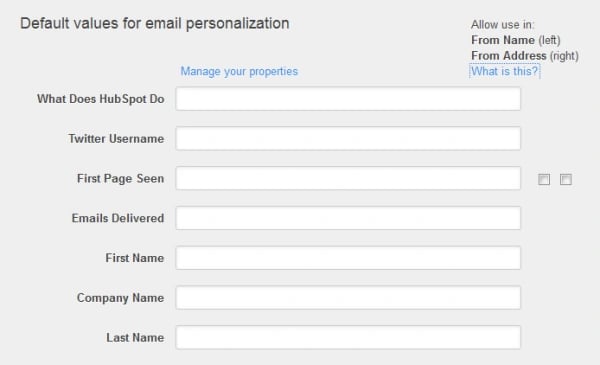
You know what's a bummer, [BLOG READER]? Getting an email that tries to implement personalization using dynamic tags, only to find filler text in its place. It's embarrassing for you, and it looks unprofessional to the reader -- not to mention it muddies the clarity of your email content. We understand that sometimes, the form field being mapped to that content is empty, but you should be working with an ESP that lets you set relevant default text that will appear in those instances (like HubSpot's email software does, pictured below).

11) Not Including a Call-to-Action
I know, not including a call-to-action (CTA) in your email content sounds like more of a sales person's pet peeve -- how else are they going to get more sales-ready leads in their funnel? But it's actually a huge annoyance for email readers, too. Like I mentioned a little earlier in this post ... you shouldn't make your email recipients think! It's not that they can't think, it's that they are likely multi-tasking as they read their email, and the more detective work required to glean "the point" of your email, the more likely they'll just give up and hit 'Delete.' And without a clear CTA in each and every email, recipients will feel like they just wasted their time after trashing your message, because no meaningful action was taken as a result of reading your email.
12) Sending Emails That Aren't Mobile Optimized
According to ComScore and Markle, 70 million US consumers are checking their email on mobile devices. And 40% are doing it 4 or more times per day. So what does it feel like when one of your emails is opened in their inbox? Are they pinching to make the screen fit, and incessantly scrolling right to left to read your copy? Can they read your email in both plain text and HTML (more on this later)? Is descriptive alt text included for those who don't want to wait for their phones to load your images? Is the experience pleasant across all mobile devices? It's hard enough to get opens and click-throughs from desktop emails; your audience is even more unforgiving on those tiny mobile screens!
13) You're Overdesigning Your Emails
We're all about beautifully designed emails, don't get me wrong. But there's such a thing as overdesigning an email, either to the point that the message barely functions, or the meaning is completely lost. When your email message has too many images, your message could suffer a slow load time -- not good for those already suffering inbox overload. But even if your images do load quickly, it's critical to consider whether the message actually makes sense without all those bells and whistles. If your recipients' email clients don't load images, will they still receive a message as powerful as the one that comes across with your highly designed email? And if they do load images, is the call-to-action lost upon them amid bright colors and flashing text? With email design, keep it simple, stup...err, sweetie ;-)
14) Not Optimized for Plain Text and HTML
Your email obviously looks stellar when HTML is enabled -- thing is, some recipients have their emails defaulted to only show plain text. And if your email is only optimized to look great as HTML, your reader will have a pretty jumbled message on their hands. Not. Good.
On the other hand, you might have an email that looks great in plain text and HTML -- when HTML is enabled, that is. Again, not every email automatically displays all of the HTML in your messages, especially rich formatting elements like images. So how do you ensure that the meaning of your emails isn't lost due to poor HTML optimization? Here's a quick checklist:
- Always assign clear alt text to images
- Make your email message comprehensive even without images
- Avoid CSS
- Use plain text style bullets
- Use light background colors so text doesn't disappear
- Don't copy and paste from other word processors
- Always include a link to the web version of the email
If you'd like to learn even more about optimizing your emails for both plain text and HTML, check out this blog post on the subject.
15) You're Not Proofing Your Email Before Sending
We're all human; spelling and grammatical errors slip into our copy from time to time. But the email inbox is a highly personal space, and not taking the time to proof your email before sending it shows disrespect for the precious space in your recipients' inboxes. Luckily, there are precautions you can take to make sure this happens extremely infrequently -- forward your emails to a grammatically inclined colleague before hitting send! Ask them to check that all of the links in your email work, too, especially the link to your primary call-to-action. What a bummer for readers and marketers alike to realize your stellar email offer can't be redeemed because of a broken link!
16) Not Providing a Real Address to Reply To
Just because it happens on a computer doesn't mean email isn't a personal form of communication -- which means it should go two ways. When you email your recipients, they should be able to reply to your message via email, too. When your return address is reply-fe5f112-91596_78057@e.biz.com, you're kind of giving a giant middle finger to your recipient. Make the 'Reply to:' field an actual, working email address, or at the very least, provide a legitimate method of contact within the email message itself.
What about email marketing grinds your gears? Share your pet peeves in the comments!


![How to Write a Marketing Email: 28 Tips for Writing Compelling Email Copy [+ HubSpotter Insights]](https://53.fs1.hubspotusercontent-na1.net/hubfs/53/Untitled%20design%20(40).jpg)


![Professional Email Address: How to Create One [+ Examples]](https://53.fs1.hubspotusercontent-na1.net/hubfs/53/professional-email-address-2.jpg)
