Raise your hand if you've ever sent out a marketing email, only to realize after clicking 'send' that your email's main call-to-action contained a broken link. What a waste, right? And talk about embarrassment ... Now how many of you did I actually get to raise your hand? ;)
Yes, silly mistakes happen -- more easily than you might think. After all, we may be savvy marketers, but we're still only human. So how can you prevent those silly mistakes from bleeding into your email campaigns? Enter the mighty test send! Most email service providers, including HubSpot's own email tool, allow you to send a test email for review before you send the real email out to your list of email contacts. So if you're not leveraging these test sends to proof your email messages before they go out, you're just asking for the scenario we highlighted above.
To avoid email marketing embarrassment -- and the poor results that accompany it -- print out this checklist, pin it to your cubicle, and consult it every time you're reviewing an email test send.
13 Things to Look Out for in Your Email Test Sends
1) Broken Links
The mishap we mentioned in our intro scenario is probably one of marketers' biggest nightmares, especially when lead generation is the goal of an email send. That's why we're emphasizing how important it is to check to make sure your links are working as the first item on this checklist. Like -- actually click on them. Every single one. Does the (right) page load? Do you get a 404 error? Unbreak any broken link you find.
2) Forgotten Links
A close second to the dreaded broken link is the forgotten one. The most common (and regrettable) instance of the forgotten link is when you're using an image to serve as a call-to-action (CTA) button. Double check to make sure everything that's supposed to be linked is indeed linked. This includes anchor text, CTAs, social media follow/sharing icons, and images.
3) Broken Social Media Sharing Buttons
While we're talking about social media buttons, let's discuss how easy it is to break those little buggers. We've published a helpful guide to make creating the buttons for social sharing on social sites like Facebook, LinkedIn, and Twitter less painful, so be sure to check it out. And luckily, if you're a HubSpot customer, our email tool makes the creation of social media sharing buttons in email messages virtually idiot-proof. Just plug in the URL of the page you want your email recipients to share (whether it's a landing page, blog post, or the HTML version of the email, which we'll discuss later in this post), and -- POOF! -- social sharing buttons. But whether you're using HubSpot's email tool or another ESP, always be sure to try out those sharing buttons in your test send as an extra sanity check.
4) Spelling/Grammatical Errors
Spelling and grammar do matter in marketing, whether you're creating an ebook, writing a blog post, or drafting your next email marketing message. Send your test email to the biggest grammar geek you have on your team to alert you to any slip-ups, and always be sure to spell-check!
5) Distorted Images
How do your images look? Are they stretched or squished? Pixelated? Overwhelmingly large? When they don't render, did you remember to associate alt text with them? Check to make sure your images are displaying the way you want them to, and if not, adjust accordingly.
6) Wonky Formatting
When you view the email in an inbox, make sure the formatting looks the way you intended it to. Is there a line bleeding onto the next because you forgot to add an extra space? If you used bullets, are they displaying properly? ( Tip: Some email clients can't handle HTML bullets, so you're best off just using asterisks (*) instead of rounded or squared HTML bullets.) If things are looking wonky, fix those formatting issues before you send the email to your true list.
7) Color Issues
Is the font color you're using clear and easy to read, or do you have to strain your eyes because it's an odd shade? Are blocks of background color making it difficult to read the text you've layered on top? Also keep in mind that, while blocks of color can add a pretty design element to your email, you should beware the following scenario: Say you decided to create your entire email -- or just a section -- with a dark gray background. To make the text readable, you selected white as your font color. Now what happens when your recipient's email client doesn't render that background color (yes, it can happen)? Invisible text! Lesson: the visibility of your email's copy should never depend on the background color of your email.
8) Subject Line/Sender Name
Does it look like your email was sent by a human, not a robot? In other words, what moniker are you using for your sender name -- your company name (robot), or the name of someone at your company (human). In fact, according to a HubSpot A/B test in which we compared a generic “HubSpot” sender name to the personal name of someone from the marketing team with our company name, we found that emails sent by a real person are more likely to be clicked on than emails sent from just a company name . Another thing to watch out for is the length of your subject line. Does it get cut off? Keep your subject lines as brief as possible -- a good rule of thumb is 50 characters or fewer . You want as much of it as possible to display in the email pane (especially on mobile devices).

9) Functioning Dynamic Tags
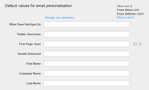
If you're using any dynamic tags (e.g. [FIRSTNAME], etc.), check to make sure they're functioning properly and pulling in the correct information. And if you're using dynamic tags, make sure the list you're using is clean, and only use tags that everyone on your list has information for. For example, if you're trying to pull in the recipient's Twitter username within your email, yet the contacts on the list you're sending to never provided you with that information, you're going to run into quite a few problems. (Note: If you're using HubSpot's email tool, you can set your default values for dynamic tags/email personalization in your email settings to accommodate any outliers on your list who haven't provided certain information you're targeting in dynamic tags. Either way, only use dynamic tags that most people on your list have provided information for.)
10) Fulfilled CAN-SPAM Requirements
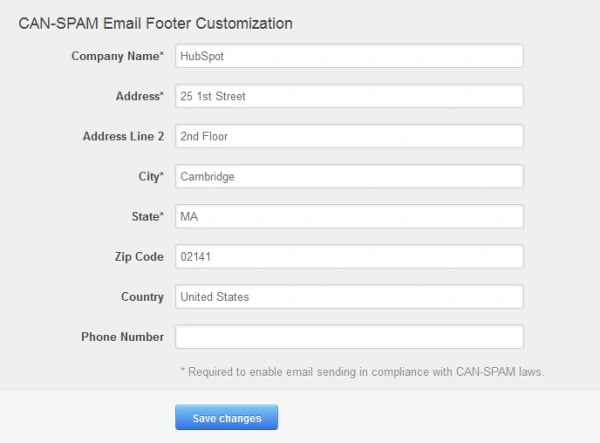
You don't want that email send to get you into legal trouble, now do you? If you're sending any commercial email, you should be aware of and know how to comply with the requirements enforced by the CAN-SPAM Act, which establishes rules for commercial messages. Specifically, each email you send must include your valid physical mailing address -- yup, we're talking snail mail here. Furthermore, check that you're not using misleading, deceptive, or falsified information in your “From,” “To,” “Reply-To,” subject line, and routing information. In other words, make sure you clearly identify who is sending the email, whether it's from a company or an individual. Make sure your email subject line clearly indicates what the content of the email is about. Lastly, in each email you send, you must also include a clear and obvious way for recipients to unsubscribe from all email communication from you. So if there is no opt-out link in your email, you could get into big trouble. And remember, failing to comply with the CAN-SPAM Act could mean penalties of up to $16,000 for each separate email violation.
11) Option to View on the Web
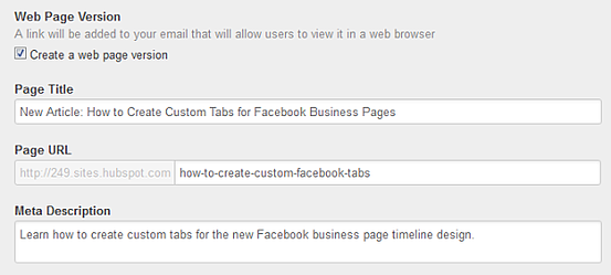
Does your email include a link to its web-based counterpart? Many ESPs (including HubSpot!) will enable you to create a web-based version of your email. Include this link in your email send. That way, if the images or anything else isn't rendering properly for your recipients, they can easily click over to the web-based version and see exactly what you intended.
12) Plain Text Formatting
 How does the plain text version of your email look? Your email client should enable you to view the test email in both HTML and plain text formats. And yes, optimizing for both HTML and plain text is absolutely important. To make sure your email is optimized for plain text, look for the following in your test send (all of which we elaborate on in this post): similar copy to the HTML version of the email, compelling email copy, shortened links (and few of them), all caps in headers, and plain text bullet points (e.g. asterisks *).
13) Accessibility Across Devices, Browsers, and Email Clients
The best way to understand how different browsers, email clients, and devices (mobile or desktop) interpret your email is to see for yourself! To save yourself the trouble of testing every single email send to every single option, test a few options once across the most popular devices, browsers, and email clients, and then create a template to use for each email you send using the winning version.
What else would you add to this email marketing pre-send test checklist?
Image Credit: Nico Paix


![The Best Time to Send an Email [2023 Research]](https://53.fs1.hubspotusercontent-na1.net/hubfs/53/best-time-to-send-an-email.png)


