Your lead generation forms can make or break your online conversion goals. Because of this, very few other page elements receive quite as much attention as the lead-capture form.
Convert anonymous visitors into leads. Try HubSpot Forms free.
In fact, 56% of marketers consider optimizing form logic to have a very significant impact on website performance, and another 46% consider optimizing their form layout to have a very significant impact as well, according to MarketingSherpa.
So why is the form so vital? Well, it’s basically the entire point of a landing page -- and the entire crux of lead generation! We marketers need our prospects to provide us with their contact information, because once we have that, we can define these people as leads and funnel them into our various marketing campaigns. And the more intelligence you have about the leads in your contacts database -- whether it be personal information, information on their website activity and behavior, or both -- the better you can segment, target, nurture, and effectively market to them. Thus, the better the likelihood that you'll be able to close them as customers!
The importance of lead-capture forms means you can sift through quite a lot of research on exactly what information to ask for on your lead generation forms. And after two years researching landing pages, I have spent a lot of time knee deep in these statistics.
What I've learned is, there's no hard and fast rule that governs what fields are mandatory for all landing page forms. Instead, marketers need to review their sales and lead generation goals and balance how much information they absolutely need from their leads vs. how much information those prospects will actually provide on a first form.
Seem like a tall order? It really all boils down to thinking strategically about your marketing goals, and making sure your online tools -- such as your lead gen forms -- match those objectives.
Follow these steps to help you determine what information you can (and should be) asking for on your forms.
Step 1: Understand Page Friction
Think fast! How much information can you get someone to agree to give you in six seconds?
That's right: You have roughly six seconds from the time a reader visits your site until they decide whether or not to click the back button. While this statistic is most commonly quoted for website optimization, you can also use this rule of thumb to gauge the attention span of people who are deciding to fill out your forms.
So if you have a limited time to grab a visitor’s attention, you want every part of your site doing its job. And to help you do just that, you also need to eliminate any friction on your landing pages. Friction is any element of your website that is confusing, distracting, or causes stress for visitors, which can make them leave your page and, thus, abandon your form. Examples of friction-causing elements include dissonant colors, too much text, distracting website navigation menus, overwhelming the landing page with additional calls-to-action, and … landing page forms with too many fields.
Reducing form length and adding other friction-reducing elements on your forms such as links to privacy policies or accreditation seals, are great ways to boost conversions. Still, the whole point of landing pages is to drive leads, and so you can't do away with forms entirely. So let's get right into how you can strike the right balance between form length and getting the information you need from your leads ...
Step 2: Begin With Form Best Practices
Because so much research has gone into how long you should make your lead gen forms, there is a ton of best practice material regarding what the optimal form length is. Again, as every business is different, your ideal form length may vary slightly from these best practices.
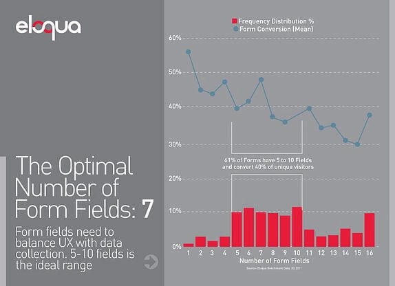
The industry baseline varies a bit, but most recommend somewhere between three and seven fields on a landing page form. As you can see in this chart from Eloqua, which cites averages up to 10 fields, there is a pretty significant drop-off in overall conversion rates after both three and seven fields.

I find this chart somewhat fascinating, if for no other reason because it indicates that some marketers actually ask 16 questions on their landing page forms and still drive conversions out of it. That just goes to show that there is a group of people out there who are so motivated to obtain certain offers and content, they are willing to provide 16 pieces of personal information to get it!
As you can see, there is no single rule -- just guidelines based on how people generally behave online. And keep in mind that, depending on your specific goals, the number of form fields you decide on might vary. For marketers who are tasked with generating more high-quality leads, they might want to make their forms longer to weed out prospects who aren't that interested in what they're offering. For a marketer solving for overall lead volume, shorter forms that cause less friction might make more sense. But more on that later ...
Step 3: Consider All the Information You Can Ask For
Online data can be magical, because every Like, visit, and click someone makes can be tracked and catalogued in a spreadsheet somewhere. The danger of this potentially abundant information, however, especially when thinking about which types of information to collect from our prospects, is that we forget why we are collecting all this data in the first place.
So what types of information can you ask on a landing page form? Anything you want. The only real limit might be the fields you can track in your CRM system. But why would you want to ask 300 questions? What does that do for you?
On landing pages, the goal is to collect information to inform your sales and marketing strategies. There is a whole range of information it might make sense to collect, which will help you personalize your content, inform future lead nurturing campaigns, and frame future sales conversations.

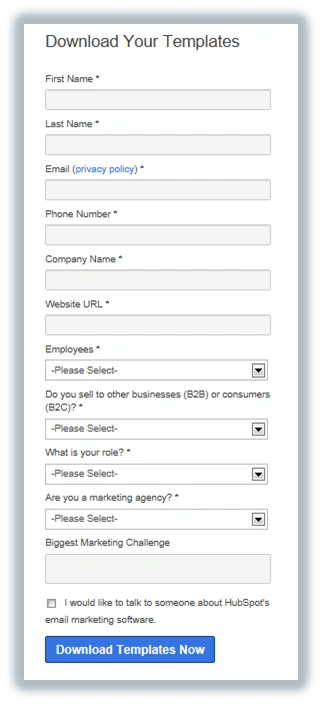
For example, on HubSpot's standard lead-capture form for new visitors (see right), we require 10 pieces of information:
- First name
- Last name
- Email address
- Phone number
- Company name
- Website URL
- Number of employees
- Whether their business primarily sells to other businesses (B2B) or consumers (B2C)
- Job role
- Whether they work at a marketing agency
Beyond endemic information, you can see that we also include a few drop-down menus, and a non-mandatory open comments field and check-box opt-in field. Giving prospects the option to mention their biggest marketing challenge is incredibly helpful in informing future sales conversations.
Step 4: Decide What's Nice-to-Have vs. What's Must-Have
By definition, there is only once piece of information that should be absolutely mandatory on every lead gen form: namely, a way to contact the person, via either email or phone. Beyond that, it becomes a game of intuition. How much information are your prospects willing to provide in order to redeem your offer? This will depend on both how valuable the content you're offering is, and how motivated your prospects are to get it. In other words, the less valuable your audience perceives the offer to be, the fewer form fields a prospect will be willing to fill out. For an offer with a much greater perceived value, prospects will be more likely to provide more information. Keep this in mind as you're deciding about form length.
Ultimately, how many form fields you require is really a math problem. The less information you ask for, the less friction, and as a result, the more conversions you'll get. Longer forms can be intimidating, leading people to avoid them and abandon your landing page. But as we mentioned earlier, the more fields you require, the better quality those leads will be (and the more information you'll have to qualify them). Deciding how many fields to include on your landing pages should be a balance between how much information you really need from your leads, and how many net new leads you need to drive into your funnel.
Carefully consider your company goals, ideal buyer personas, and lead gen and sales strategies, and then decide which fields are "musts." For most B2B companies, this should include at least three main pieces of information:
- Name
- Email Address
- Job Title
From there, you have approximately two to five fields left before best practices tell us you'll get a dramatic conversion drop off. It’s up to you what you do with the rest of your form, but in general, you should ask only for information that you will definitely use. Adding form fields because you think they'd be interesting to know -- or because you might want to use them someday if your marketing strategy evolves -- is a waste of space and attention. If you ask for a prospect’s birthday, they'll expect you to use it.
Step 5: Talk to Both Marketing & Sales
So how exactly do you decide what additional questions are essential to your lead gen forms? The best approach is to talk to the people who are nurturing and selling to your leads. Since that audience is generally your marketing and sales teams, a really helpful strategy in developing and optimizing your lead gen forms is to ask the following questions:
- Does the length of your forms align with Marketing's lead gen goals (e.g. quantity vs. quality)?
- What types of lead nurturing campaigns does Marketing want to run?
- What types of lead intelligence does your marketing team need to collect from lead-capture forms in order to segment and personalize their marketing campaigns?
- Does Sales have everything they need to properly contact a lead?
- Does Sales have enough details to qualify leads? What else would they include?
- What are Sales' primary deal breakers? Is there a way to further pre-qualify those leads?
- What routinely surprises your sales team? Is there information that would alleviate that?
Remember: You have a limited amount of space (and attention span) on your forms before you create too much friction, so your conversations with your marketing and sales teams should be in an effort to crystallize the most important data tidbits both teams need to do their jobs. As a bonus, this kind of open communication is also a great way to bridge the sales-marketing gap that exists in many companies.
Step 6: Use Smart Forms & Progressive Profiling to Fill in the Blanks
Right about now, you may be asking questions like, "But do we need to ask the same questions of our leads over and over again if they've already downloaded content from us?" Or, "What if we have an incredibly complicated sales process, and we really need to ask 13 questions in order to know whether people who download our content are a good fit?" (This can, in fact, happen for niche industries such as regulated energy markets or other specific pharmaceutical sales.)
First, I would make sure that you have sufficiently streamlined your processes. Once you’ve done that, you can also look to technologies such as Smart Forms and progressive profiling to optimize your forms.
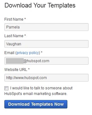
Smart Forms, for example, is functionality on your landing pages that remembers visitors who are already in your contacts database. If someone has already converted on one of your landing pages in the past, this means you already have information about that lead, and a Smart Form will autofill information into the fields they've filled out in the past, making the process of filling out your forms less painful. For example, this is what that same form we showed above might look like to a lead we already have in our database:

A lot less daunting -- and less friction-inducing -- isn't it?
Furthermore, progressive profiling technology allows you to set up dynamic, iterative forms, which allows you to choose which questions appear on a form based on what you already know about a lead. That way, each time a lead fills out a form, you are progressively collecting valuable new information about them while keeping your forms short and easy to fill out -- not squandering the opportunity by asking the same questions over and over.
(For HubSpot customers, Smart Forms and progressive profiling are both features of HubSpot's marketing software.)
Step 7: Test to Optimize Landing Page Conversions
As with most marketing strategies and tactics, the best way to determine which form fields and form lengths work best for your particular business is to test it. As I mentioned before, deciding your ideal form field mix is a balancing act. The only way to really know what your audience will react to is to try it out on your landing pages and see how it goes.
So, go ahead. Experiment with your lead gen forms. See if your audience really needs a short form, or if they will convert on a longer one.
What form length works best for your audience? Which form fields are essential to you?
Landing Pages
.png?width=112&height=112&name=shortening-property-en%20(1).png)


![Why You Need to Create More Landing Pages [Data + Tips]](https://53.fs1.hubspotusercontent-na1.net/hubfs/53/create%20more%20landing%20pages.png)
.png)


