Most inbound marketers aren't using just one social network. They're using, like, five. Presences on Facebook, Pinterest, Twitter, Google+, LinkedIn, YouTube, Quora ... probably some others I haven't even heard of yet ... are all more or less the norm for most marketers.
With all of the social media platforms available to us, however, it also becomes more and more difficult to present a cohesive message across all the channels. One thing that we’ve noticed -- and struggled with ourselves -- is that the experience from one social network to another can feel really disjointed. And I'm sure that's not the brand experience most marketers hope and dream for their fans and followers.
So, we’ve put together a list of companies that have been doing an amazing job at maintaining a consistent brand experience on all of their social networks. If you're struggling with this consistency problem on your social networks, hopefully looks at what some other companies are doing to create that consistent experience across social networks will help!
Free Download: Slogan Writing Guide and Examples
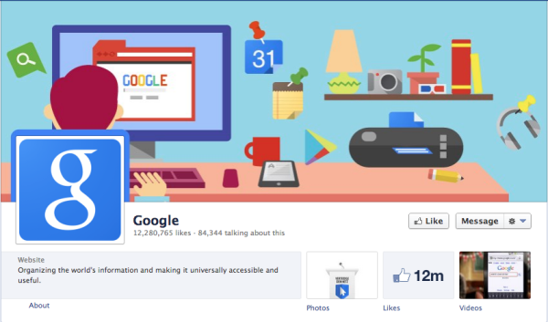
Even though they’ve got a social network of their very own, Google still makes sure that it has a properly branded presence on other social media sites. The biggest thing to take away from Google's consistent social branding is that the current style of their design and graphics are working in unison across all its platforms. They are actively pushing the use of consistent colors, fonts, icons styles, and logos. Take a look.
Here, they have the iconic Google logo coupled with a creative and entertaining cover image that playfully features all of their products and services. How many can you identify? ;-)
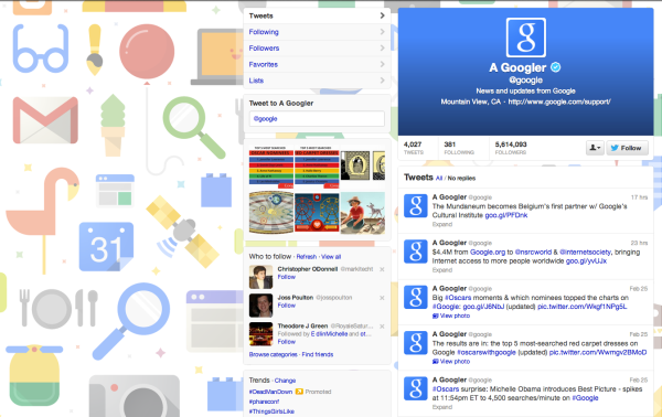
Once again, you'll notice the Google logo acting as their Twitter thumbnail, and it's comfortably sitting in a nicely styled box with a matching blue cover image. The background image follows the same look and feel of its Facebook page, but is a little more faded so the blue Google logo and the actual tweets stand out more.
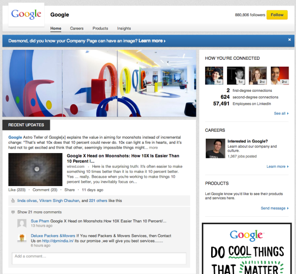
Following a more corporate style -- which makes sense if they're catering to their B2B audience on LinkedIn -- the Google LinkedIn page showcases a snapshot of their Mountain View headquarters. This gives its fans an inside look into what Google employees see every day. Even the company decor is branded!
Google+
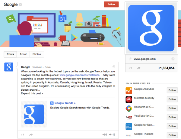
We wouldn't expect anything less than fantastic on Google's own social network. They're using the Google logo again, and the same cover image that we first saw on Facebook. Don't be afraid to use the same art across your social networks -- modified to fit the proper size, of course. This helps build consistency and makes for a more congruous experience for your audience.
Target
It's hard not to recognize the vibrant reds and cute puppies. Target has been amazing at branding its social networks across the board. We have all come to know the symbolic indicators of Target over the past several years, and they've taken this engrained symbolism and made it come through on all of its social networks.
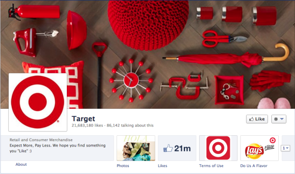
We don't want to say that Target has taken over the color red, but they've gotten pretty close. The great thing about the Target cover image is that it does not have to explicitly say "Target" for you to get an idea of who this Facebook page belongs to. The neatly arranged assortment of fiery red appliances and consumer products subtley says it for them.
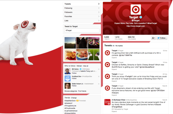
Playing on the same concept that they used on their Facebook page, the Target Twitter page uses the same subtle messaging. They don't have to spell it out for you that the cute little puppy with the red rings represents Target as a brand. A nice use of color and shapes in the cover image helps add some branding to the Target logo in the profile image.
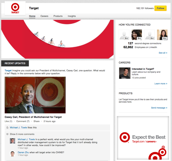
One thing you'll notice about many companies, is that they actually don't bother branding their LinkedIn pages. LinkedIn acts as an extremely powerful tool for marketers, though, because it gives them access to a very targeted crowd. No pun intended. The Target company page uses one of its nicely designed ads as a cover image that adds a nice branding element to what could have been a bland page.
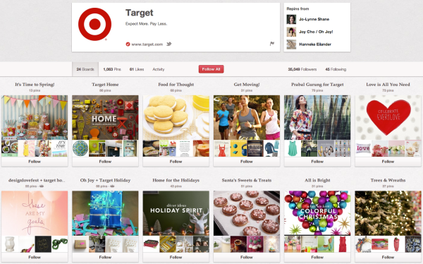
More and more companies are beginning to hop on the Pinterest bandwagon because they've finally come to realize how many active users are actually in and out of Pinterest every day. Target obviously sells consumer, and what better social network to share the things you sell than Pinterest?
Etsy
The orange speaks for itself. You know the logo and you know what they do. Etsy has been able to successfully capitalize on the power of social media to really grow its brand recognition. As one of the growing ecommerce websites and apps on the almighty interwebs, Etsy has done some serious work building its brand. Their consistent use of color, text, and content give it a very recognizable look and feel. Let's see how they translate that across their social networks.
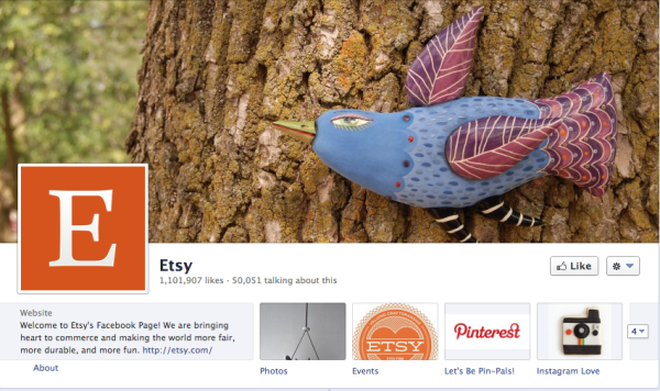
As we mentioned, Etsy has been doing a great job at circulating its simple yet recognizable icon. The cover image features a creative, yet odd looking bird thing that actually fits quite well with the overall brand of Etsy. It showcases the variety and character of the goods that Etsy users buy and sell through its platform.
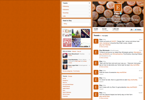
And here's one of the few companies that can pull off such a simple Twitter background image. Normally, my opinion on blank or simple background images is that the brand either doesn't care or doesn't have time to brand the largest screen real estate available to them on Twitter. This is not the case with Etsy. They have a very clean, slightly textured background that works very well with their cover image of branded bottle caps.
Google+
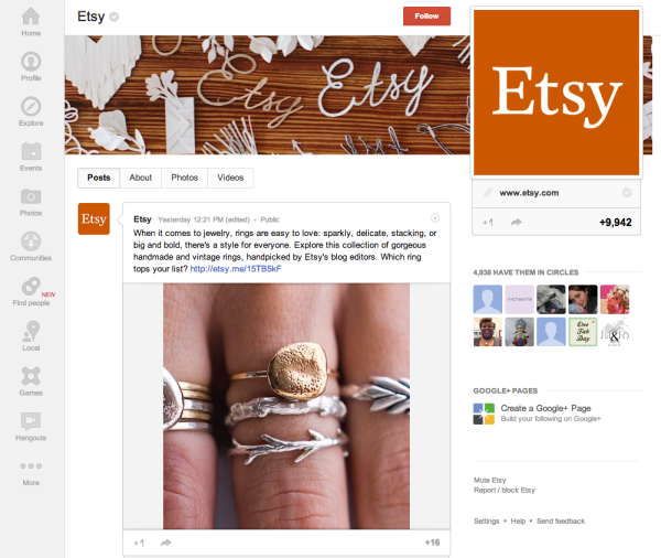
This time, we're looking at a slight variation from the logo we've been seeing on Facebook and Twitter. This isn't a bad thing, this just shows that you can utilize a variation of your logo and still maintain a very consistent brand presence. The cover image continues to play on the idea that Etsy's brand is very much tied to their ability to surface interesting and unique consumer goods.
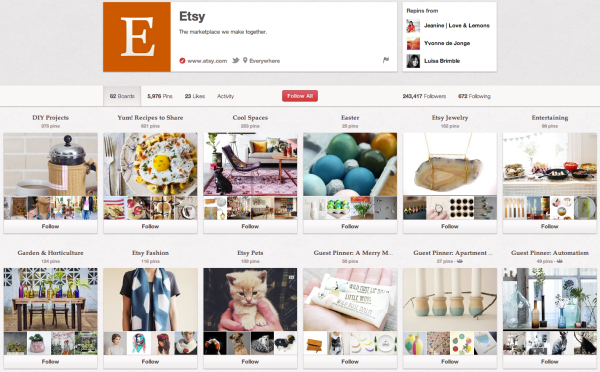
Etsy, much like many other ecommerce sites, has totally caught onto the value that Pinterest can provide through its social network. The idea of being able to publish and share all of your products in a visually stunning catalog-esque layout bodes quite well for this type of company. They provide a nice and simple branded page with a variety of well-organized pin boards for its many followers.
Coca-Cola
We're all familiar with the long standing brand and their famous product. Coke does a spectacular job of creating a consistent brand experience across its many social networks. What Coke has done with its social media branding is focus more on the idea of a lifestyle, along with an emotional connection to the product. Take a look at the images of memorable moments that they link back to their company brand across some of their social networks.
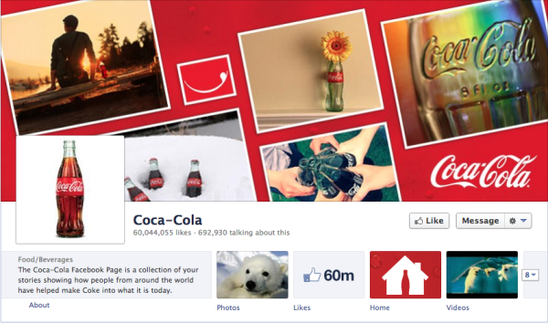
The Coca-Cola Company has been around for quite some time now. With that type of longevity and continued success, the brand is bound to fit into the memories of countless people. Coke knows this and does an amazing job at creating a brand image around that idea. Their Facebook cover image is a perfect example of how they use the bottle to bring about emotional connections to their product. Whether its sharing a Coke with your closest group of friends or having an ice cold Coke at the lake house last summer, these images were made to resonate with people.
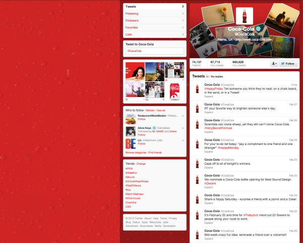
Following the same game plan, Coke uses a very simple yet symbolic background image that doesn't pull too much attention from the cover image of the Twitter account. Just like the Facebook cover image, their Twitter page is branded with a variety of images showcasing Coke bottles in different moments and settings.
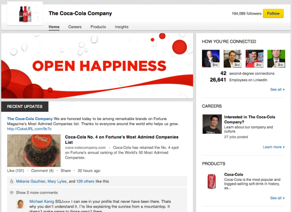
Here, they pretty much spell it out for you. Coke equals happiness. As we explained, Coke has pushed its branding toward the idea that their product creates wonderful memories and has an emotional connection with its consumers. We'll Coke is much less subtle with its LinkedIn fans, but they're still consistent with the overall brand message.
Google+
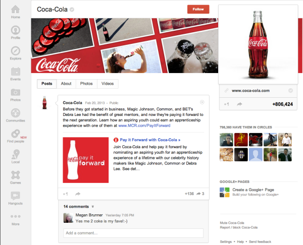
Although you don't find glass bottles of Coke filling convenience store refrigerators or dropping out of vending machines anymore, the iconic glass Coke bottle still represents the memory behind the brand, and the message that they have been using the same (secret) recipe for decades. The Google+ account follows their trend of symbolic images that foster an emotional connection to the product.
Disney
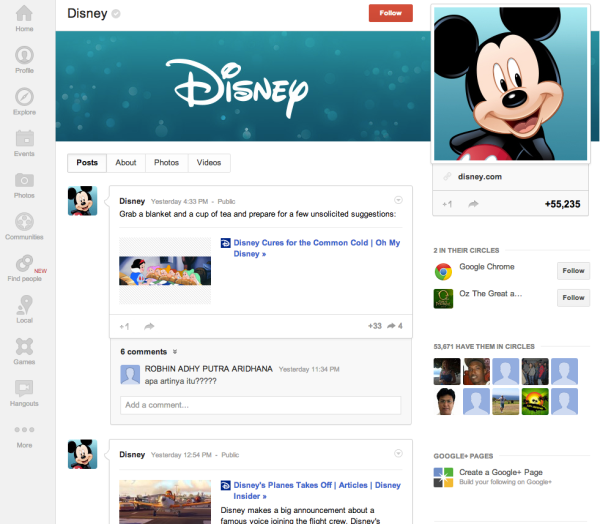
If there's one company that knows how to create an emotional bond with its fans, it's Disney. Disney's social networks all welcome you with new and familiar faces, drawn from our favorite childhood memories. This gives them the ability to generate a ton of brand loyalty through social media by using images and animated icons to trigger those warm and fuzzy memories.
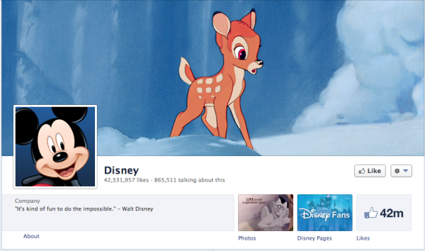
Mickey Mouse is not the kind of cartoon character you forget. When you see those big ears and shiny nose, you know that guy rolls with Disney. Aside from using the animated super star as its profile image, Disney occasionally switches up its cover image to feature a variety of scenes from old and new animated movies. This month happens to be that cute little thing we've come to know as Bambi. Do you remember Bambi? I know I do.
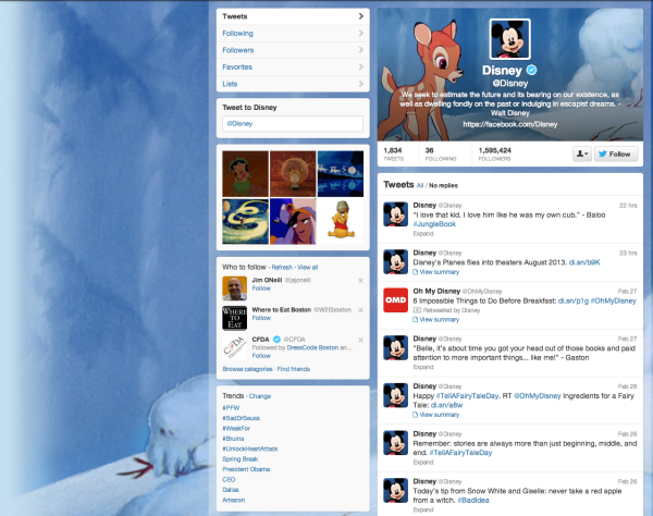
Once again, Disney stays consistent in its imagery and branding across its social networks. You'll be sure to find Mickey Mouse and Bambi kickin' it on that Twitter account in a snowy winter background.
Google+
It looks like Bambi didn't make it over to Google+, but that's alright. Mickey Mouse can still rep the brand quite well and tug on our nostalgic heartstrings. Disney also uses their iconic font and company name here as the background image. I've always wondered who else writes their "D"s like that.
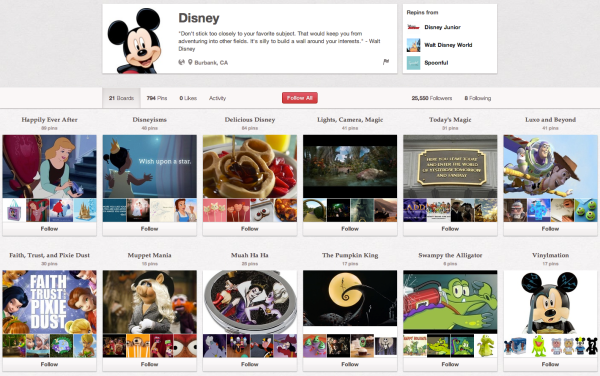
You know who has a ton of merchandise and swag to sell you? Disney does. Which makes the maintenance and branding of a Pinterest account all the more important. They have a nice showcase of good ol' Disney merch in a variety of helpful categories that you can get your hands on, and you know it's Disney ... because of all those familiar faces we know and love!
Amazon
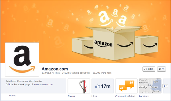
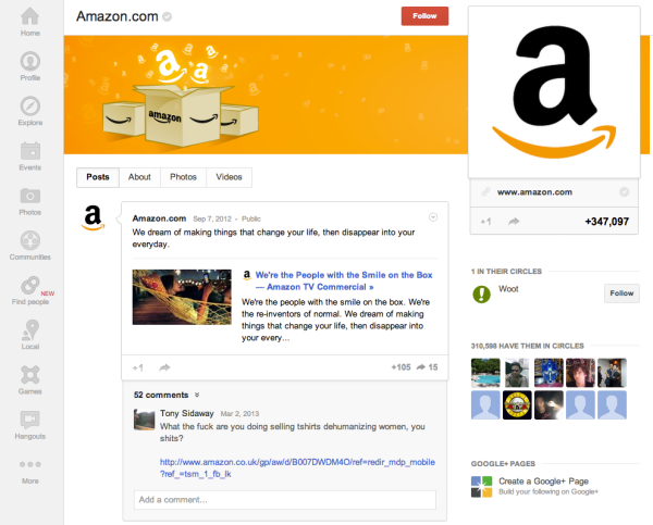
Over the years, Amazon has become a power house of ecommerce. They will sell you pretty much anything you could think of. So it makes sense that Amazon does a great job at branding its social networks with some pretty sweet graphics and recognizable colors.
Does anyone else think that the Amazon logo looks like a smiling cyclops? Anyway, it's definitely a logo that you've seen before and will recognize. The Facebook cover image features a number of nice graphics and colors that brand it quite well, and play on that feeling you get when your Amazon box arrives in the mail, and it's time to open up your goodies.
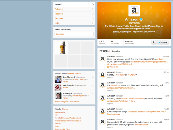
A bit more subtle than its Facebook page, the Amazon Twitter accounts uses a simple background image with a solid light blue. The cover image has a number of lightly faded Amazon logos and that nice subtle gradient that give the page a hint of branding that's aligned with the Facebook cover image, but without overwhelming its followers.
Google+
We're back to happy boxes and smiling cyclops logos! The Google+ page is very consistent with the Facebook page and works well into the overall branding of all the social networks. This is a great example of not reinventing the wheel, by the way -- Google+ and Facebook have very similar layouts, with a place for a cover photo and thumbnail-type image. If you can repurpose imagery, go for it.
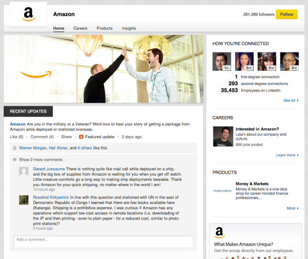
Amazon sure loves those smiles. Happy Amazon employees grace the LinkedIn cover image, accompanied by a floating arrow which I can only assume is another smile. These are some happy people and at this point, I'm sure their followers know it. This is also a sensible image adjustment, since Amazon may be using LinkedIn for not just marketing purposes, but recruiting purposes, too.
The New Yorker
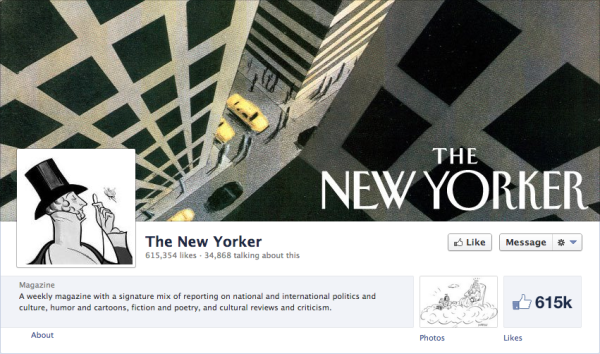
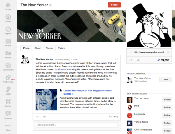
This is a brand with a serious following and a reputable brand to uphold. With so many amazing years under their belts, they have done a great job of still embracing the digital world and the growing impact of social media on publishing. The New Yorker's monocle man has become a very recognizable symbol of the classiness the publication's aiming for.
Notice how the famous monocle man quietly judges you from the comfort of his fitted profile image. (Note: I don't know if he's officially known as the "monocle man", but that's what I'll be referring to him as.) One great aspect of this Facebook page is the artwork they used for the cover image. You get a very good idea of the personality of the brand from the style of the illustration.
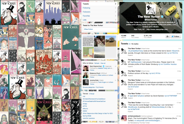
Once again, we've got the monocle man and the nicely illustrated cover image for some consistent branding. The background image is what really caught my eye on this particular Twitter account. It features a variety of illustrated covers in an assortment of colors that definitely works well with the company branding, yet still ties in the -- duh -- New York theme as they did in the Facebook cover photo.
Google+
Like we mentioned before, using the same profile images and cover images on two social networks is not a bad thing! It solidifies your brand presence and makes it much easier for fans and followers to identify your social networks simply by looking at your images.
Pinterest
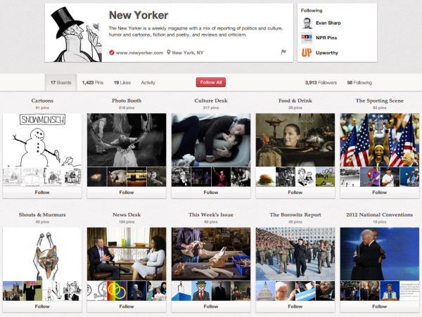
Driving transactions isn't the only reason you should be using Pinterest for your company. The New Yorker has had great success using Pinterest as a place to share interesting articles and images that are easily shareable. With over 1,400 pins, they've got quite the list of pinnable content, and the board images (and sure, that monocle man) all look aligned with what you might expect the brand to display.
SEOmoz
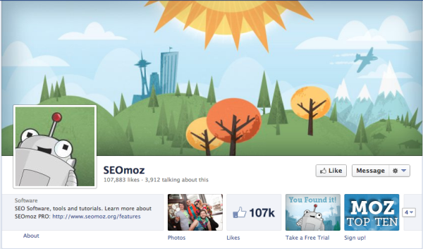
Our friends over at SEOmoz have this adorable little robot that has been synonymos with their brand for a while now. This playful robot has made its way into the hearts of its many followers and fans. SEOmoz has been very good at using this robot to provide a very consistent brand experience across their social networks. The vibrant colors and playful design show off the character of the company.
When you arrive on the SEOmoz Facebook page, you're immediately greeted by their happy-go-lucky robot mascot and an equally cheerful background image designed in the same style of animation. The design styles and colors all work together in creating a very solid brand presence.
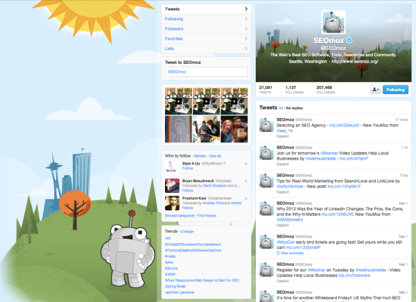
On their Twitter account, they've got the same look and feel as they did on Facebook. We have the colorful background image, happy robot, and fluffy clouds that tie everything into a well-branded presentation.
Google+
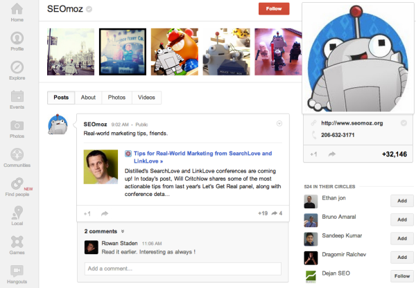
SEOmoz did things a little differently on Google+, which is awesome considering they could have repurposed imagery used on Facebook. We still have the recognizable robot friend, but the colorful backdrop has been replaced with some great real-life images of that playful robot. This is an excellent example of a riff on a well-known logo that doesn't compromise brand recognition.
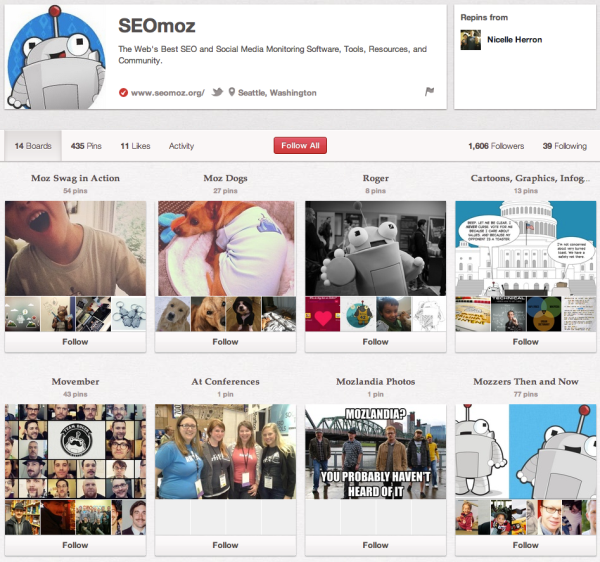
Following the same look and feel of Google+, the SEOmoz Pinterest page features a branded profile image and a variety of interesting boards that the SEOmoz team has put together for its followers. The board covers and names are still easily identifiable with the SEOmoz brand -- you'll notice boards with robots or riffs on their name that make it clear whose page this is.
Now that you've got an idea of what brands are doing to rock it on social media, start experimenting with what your company needs to do to build brand consistency across multiple social media platforms.
How consistent is your brand experience across your various social networks?
Brand Management
.png?width=112&height=112&name=Image%20Hackathon%20%E2%80%93%20Vertical%20(71).png)
