Editor's Note: The free email templates originally featured in this post in 2013 were part of a limited-time offer that is no longer available. However, our free guide to optimizing marketing emails is still available to download here.
If you’re like most marketers, email marketing is one of the most powerful channels at your disposal. Email reaches out to an already engaged audience -- people who have already said yes to your marketing by opting in to your list (right?). It’s also an incredibly cost-effective channel. In fact, Magill research estimated that marketers earned $39 for every $1 they spent on email marketing in 2012. Now that’s a pretty good stat to include in your next presentation about the value of email marketing if I've ever heard one.
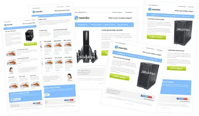
But how do you take your email to the next level -- from a white bread campaign to a five-star email experience? Well, I'm going to let you in on a little secret: You don’t have to start from scratch every time you want to craft a new email. Pre-designed templates are a great way to streamline your email development. After all, you know what they say about reinventing the wheel. That's why we decided to help you out by using what we know about email marketing best practices and creating five pre-optimized email templates, free to download for a limited time. These templates, which you even can test out using HubSpot's free software trial, give you everything you need to customize your own email messaging. So rather than fidgeting with column widths or image sizing, all you need to do is insert your email content and … presto! An optimized email in minutes. And to top it off, we've also created a helpful guide to go along with it -- The Anatomy of a Five-Star Email -- which walks you through the12 components of an effective marketing email. You can download them both here for free.
And in this post, we'll walk you through each of these downloadable email templates, highlight which aspects of their designs address specific email optimization best practices, and talk about the types of email marketing campaigns they can used for. Let's get started!
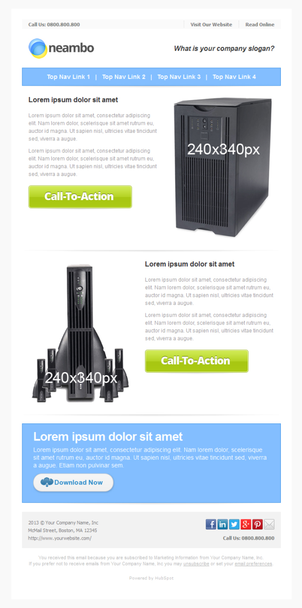
Template 1: Best for Promoting a Single Offer
This email template takes to heart Da Vinci’s principle that “simplicity is the ultimate sophistication.” In fact, this template is pretty close to the style we use in many of our own HubSpot emails. We've learned -- and optimization proponents agree -- that uncluttering your email messages usually produces the best results. Each email should have a specific goal, and that goal should be immediately evident to the reader. This specific template, for example, is best for promoting a single offer or conversion event.
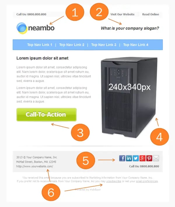
In addition to its clean design, this email template epitomizes several noteworthy email optimization best practices:
1) Consistent Company Branding
While your emails don’t need to be identical to your company website, giving all your marketing collateral a consistent look and feel helps improve prospects' overall experience with your brand. In this case, the template echoes the look and feel of the Neambo company website. Because you want the people opening your email to recognize who you are, using complementary brand cues can help your emails stand out from the crowd. In fact, all five of our free templates offer a choice of 33 different colors to enable you to customize elements of your email like its background, headline, and accent colors to mirror your company brand.
2) Clear Value Proposition
To generate clicks instead of confusion, your email should immediately address two important value propositions: 1) who your company is and why you matter, and 2) what your offer is and why it’s valuable to your audience. This template does a good job showcasing both of these.
First, the company's value proposition is clearly displayed in the top right corner of this email template -- in a marquee, “top of the fold” position. According to Neilson, only 20% of people read below the fold, so putting your competitive advantage front and center is vital to improving email conversions.
Beyond a company value prop, you should also address the value of the offer, product, or service you're promoting in the email in brief, clear, and compelling language. In this template, you'll notice the bold headline to draw in readers' attentions, and the copy below it should be used as supporting text that further emphasizes the offer's value.
3) Dominant Call-to-Action (CTA)
As we mentioned above, this email template is best for promoting a single offer or conversion event. To achieve it, the recipient must click on the green call-to-action, which is large and visually prominent.
An optimized CTA is crucial for bolstering the performance of your email marketing. Even for such a small amount of real estate, 41% of marketers report that optimizing their CTAs is extremely valuable, according to MarketingSherpa. And using this template, you can easily swap the placeholders with your own images and CTAs.
4) Relevant Image
According to research by 3M Corporation, our brains process visuals 60,000X faster than text. With that in mind, incorporating compelling images in your emails are another great way to capture readers' attention quickly, engage your audience, and differentiate your emails. At HubSpot, we've learned that matching our emails with relevant images significantly boosts our conversion rates. We've also noticed that for emails promoting a single offer, showing recipients an image of what they'll get when they convert (e.g. the cover of an ebook, a screenshot of tools in our software, etc.) also improves email conversion rates. (Same goes for landing pages, too!)
5) Social Sharing Buttons
Email marketing sounds great for generating reconversions from your existing contacts, but how does it impact new lead generation? For instance, at HubSpot, email marketing is one of our top organic lead drivers, even though we're only emailing people who have already converted into leads. So how does this all add up? It's all about the shares, people! Adding social sharing buttons will help you magnify the reach of your email messages and reach a whole new set of potential leads with very little effort on your part. You spend so much time developing valuable content, so why not make it easy for your audience to share it with their own networks?
6) Visible Unsubscribe Link (And Other Key CAN-SPAM Requirements)
You'll also notice that this email template (as well as all the others in this set) includes a visible unsubscribe link and the physical address for the company's headquarters, both of which are requirements of the CAN-SPAM Act and ensure your emails are compliant. Neglecting these additions can significantly damage your email sender reputation -- and also get you in some trouble with Johnny Law.
7) Mobile Optimized
While it's hard to tell from the image of this template, it's important to note that this template and the four others are all mobile optimized. As tablets and smartphones continue to grow in popularity, keep in mind that more and more people are bypassing their laptop and desktop computers and reading your emails on their mobile devices. In fact, according to research from Litmus, email open rates on smartphones and tablets increased 80% from the beginning to mid-2012 -- in just six months! A five-star email message, first and foremost, needs to be readable on every device, so check to make sure your email provider optimizes for mobile (Hint: HubSpot's email software does ... wink wink).
When Does This Template Come in Handy?
This first template is very multi-purpose. You can use it for just about any email with a single offer or conversion goal -- which will probably be the majority of your email marketing. In the example above, you'll notice the image is product-focused. But if you were to replace this product image with, say, an ebook or whitepaper cover, you'll probably recognize this as something similar to what HubSpot sends to promote our thought leadership content.
This template is less funnel stage-specific. For example, content in emails you might send to promote a single conversion event could range anywhere from an introductory, thought leadership-style content offer such as an ebook, to a middle-of-the-funnel offer like a product webinar, to a bottom-of-the funnel offer like a free trial, to a product upsell/thank you message.
Because this template is the most multi-purpose of the group, we had our designers craft three very similar template styles. Which leads us to ...
Templates 2-3: Variations for Promoting a Single Offer
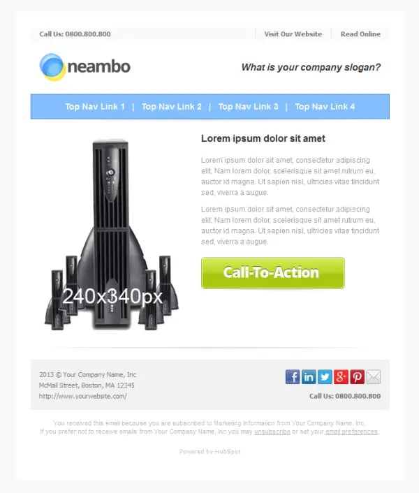
Template Two is very similar to Template 1, but it gives you the alignment option of the image/CTA on the left, and the text on the right. Try both options to see which generates the best conversion rate with your audiences. You might even consider A/B testing it!
Template Three increases the featured offers per email to two. This template arms you with the opportunity to provide an additional CTA enabling you to test whether your emails convert better with multiple offers. You never know -- perhaps your audience prefers the option of two offers to choose from. In addition to promoting specific offers or conversion events, this two-tiled email is great for thank-you/confirmation emails or cross-sell nurturing campaigns in which displaying additional offers is beneficial rather than distracting. For example, if someone just bought red boots from you, they might also be interested in seeing the complementary red backpack or red belt you also offer.
Template 4: Best for Ecommerce Emails or Email Roundups
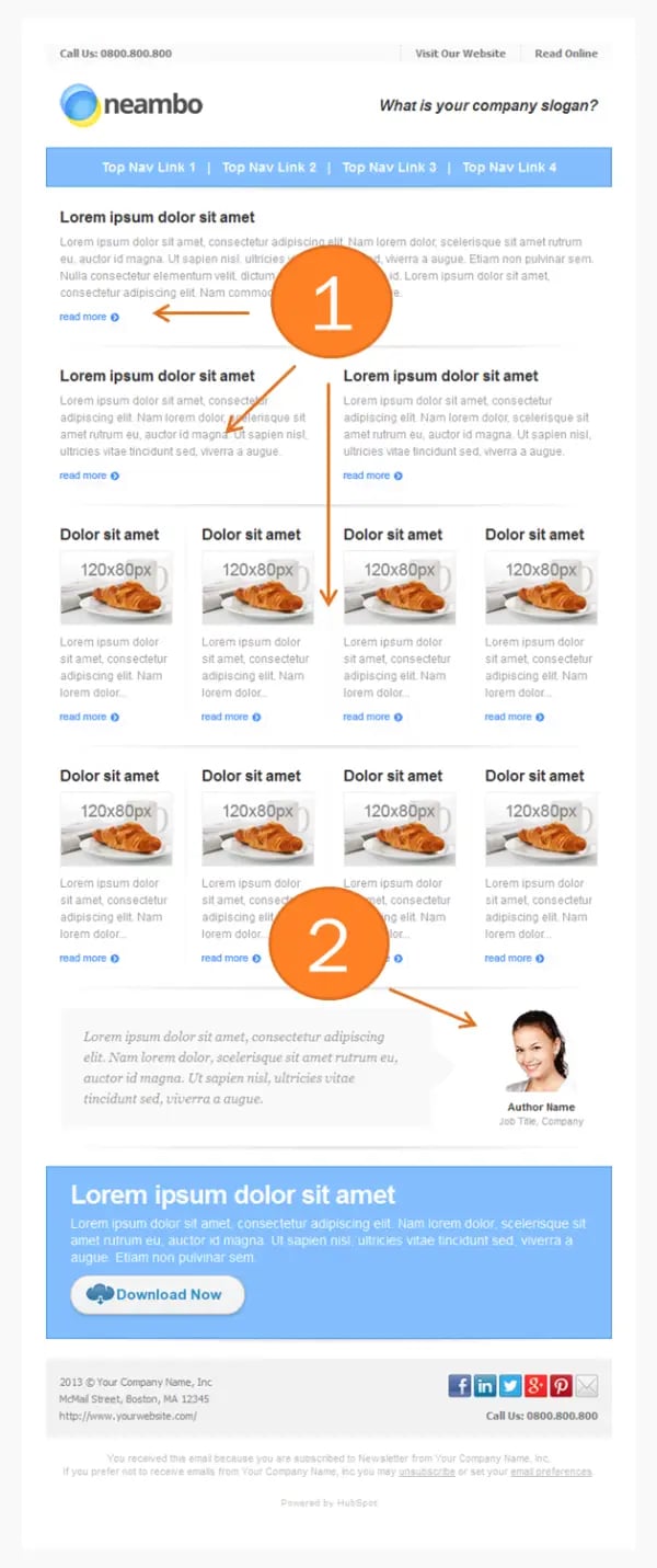
On the opposite end of the spectrum, Template 4 incorporates a variety of visual elements. This email template is, obviously, designed for email messages that contain more than one possible conversion path or conversion goal.
If you have more than one type of offer, experiment with this template to see if its tiled approach generates any additional conversions. For example, if you're an ecommerce company and your conversion goal is a sale, then any variety of sales from a single email might meet your goals, and giving recipients more choices may actually make sense.
Regardless of why this template appeals to you, it’s important to remember that every additional layer of design and content you add to an email increases the likelihood your readers will get overwhelmed. So if you're trying to get your readers to embark on a very specific conversion path, this template probably isn't for you.
In addition to the email optimization tactics we already highlighted in the first template, here's how some additional email best practices play out in this template:
1) Primary and Secondary Calls-to-Action
Check out the hierarchical structure of this particular email template. You'll notice the pyramid approach to featuring both content and CTAs. Even in a rich email like this, you should always clearly highlight a primary call-to-action; in other words, your email's main goal, which is usually your top-selling product, top-converting offer, or the most desired action you want recipients to take.
In this template, the primary CTA is featured above the fold of the email in its own column, with double (and quadruple) the real estate of the secondary offers and CTAs. From there, the template uses design cues to present the secondary and third-tier offers, with subsequently less real estate as the reader moves down. These visual cues tell the reader which parts of your email message you're emphasizing as most -- and least -- important. Furthermore, the space at the bottom of the email can be used to emphasize the primary CTA.
2) Real Sender Name
This email template also does a good job of improving the personalization of your emails with its placeholder for the email author's personal signature and headshot. At HubSpot, we've found that emails sent from an actual person generate better open and clickthrough rates than emails sent from just the company name. This template makes it easy to upload your headshot and send out more personalized emails with the click of a button.
When Does This Template Come in Handy?
The most obvious use case for this email template is for ecommerce marketers with multiple products, such as a catalogue store or a photographer’s site. However, this is certainly not the only scenario in which a marketer might want to use this template. For example, a B2B company could use this template to send a year-end roundup of its top thought leadership content like blog articles or ebooks -- or to announce widespread pricing changes across multiple products.
Template 5: The Best of Both Worlds
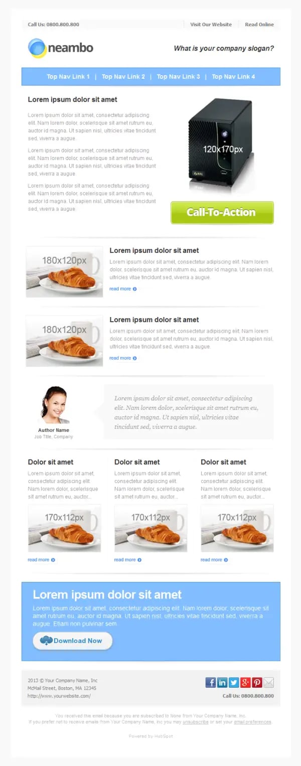
This email template is a great blend of a single offer email and a more multi-purpose grid layout, and it plays to the strengths of both -- clearly highlighting a primary CTA while offering additional content or offers.
When Does This Template Come in Handy?
This template would make a terrific email newsletter, with one monthly featured article and a few pieces of supporting evergreen content. You could also use this as a thank-you email, with the primary CTA thanking the user for filling out the form and providing the download or purchase confirmation, and the remainder of the email used to promote related content or products.
Editor's Note: The free email templates originally promoted in this post in 2013 were part of a limited-time offer that is no longer available. However, our free guide to optimizing marketing emails is still available to download here.

![12 great examples of welcome emails for new customers [templates]](https://53.fs1.hubspotusercontent-na1.net/hubfs/53/welcome-email-examples-1-20251024-7984960.webp)
.webp)
![4 types of emails that get the most engagement [+ 4 emails that fail]](https://53.fs1.hubspotusercontent-na1.net/hubfs/53/Untitled%20design%20(56).jpg)
