As a Math major in college and former high school Mathlete, I'd consider myself a numbers geek. In the world of marketing, that can be a blessing and a curse. With so many numbers in so many places, where do we begin? What questions should we be asking and where in HubSpot can we go to answer them? No need to worry, HubSpot customers! We're here to help.

In HubSpot, when trying to assess the impact of the content you're producing on your marketing funnel and your company's bottom line, there are two primary places you should be looking for data:
- Content Dashboards: The screens you land on when navigating into Site Pages, Landing Pages, Blog, or Email under "Content."
- Custom Reports: Contacts, Companies, and Attribution reports built under the "Reports" tab in the HubSpot navigation.
In this post, we'll walk through the basic functionality of content dashboards and custom reports, and lay out the most important questions you should be asking of each.
What to Ask HubSpot's Content Tool Dashboards
Each of the Content Tool dashboards --- site pages, landing pages, blog, and email --- shows a unique set of data points specific to the individual content type. That said, there's a single high-level question that all dashboards effectively answer when it comes to measuring your content's impact on the business: how did a single content asset perform? In the paragraphs below, we'll explore the ways to answer this question in the context of each dashboard.
How did my Landing Pages perform?
Suppose you published your first offer, complete with a landing page, a thank-you page, and a catchy call-to-action (CTA) button. Congratulations! Now, a week later, you want to prove to your boss how worthwhile the project was -- and prove to yourself that slaving into the late hours, missing the first quarter of your daughter's basketball game, and being forced to DVR the latest Scandal episode was totally worth it. In HubSpot, how might we do that?
First, navigate to the Landing Page dashboard via Content > Landing Pages. On that page, you'll get an overview of how each of your pages has performed according to several key statistics: views, submissions, new contacts generated, and even paying customers.
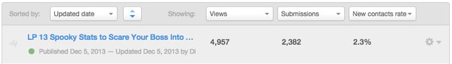
We can choose which columns to include based on the data we find most important, and can easily export the data to manipulate it further or send it to other members of the team. Great! Our content has been viewed, and we've gotten new leads from our efforts. But how can we look deeper into the data to understand, for this single piece of content, what's worked and what hasn't?
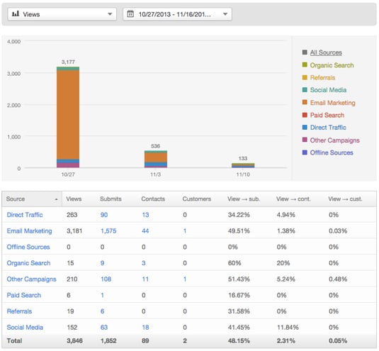
Click on the blue link into the individual landing page from the dashboard (shown above), then into the "Performance" section on the left. There, we get a zoomed-in view of which channels were most fruitful in the offer launch. In the example below, you can deduce that the email campaign we sent to promote the offer brought the highest number of visitors and contacts. Based on this data, you may decide to focus your efforts on certain channels for future launches.
To note, the Site Pages dashboard behaves in the same way as the Landing Pages dashboard. The Landing Page dashboard is available to all HubSpot customers, as are the Blog, and Email Dashboards. The Site Page dashboard is available for customers hosting a full site on the COS.
Did my emails live up to my boss's expectations?
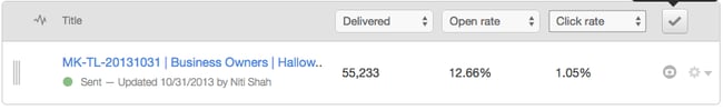
Similar to the Landing Pages dashboard, the Email dashboard helps us answer the simple question of "how did a piece of content perform?" Let's take the above campaign as an example. We saw from the landing page data that a majority of it's visits came from Email traffic. But how effective was the email, really? And were our best leads the ones that engaged with it? Pulling into the Email Dashboard (Content > Email), we search for our associated Email send, and we're presented with the following high-level view right off the bat:
From this data, several actionable questions arise. Is our open rate higher than usual, when sending to the same list? If so, what was it about our subject line and preview text that drove an improved open rate --- perhaps action verbs and persona-aligned language? If not, where did we miss the mark? With our click rate as well, where did we fall in relation to our historical benchmarks? If higher than usual, we rocked it! Our CTA was clear and relevant. If not, perhaps adding that meme of Justin Bieber was too much....
Pro tip from HubSpot Email insider Jess Webb: the Email Dashboard allows you to compare email performance between any two emails you choose. From the Dashboard, simply navigate to "All" on the left-hand side, then select the checkboxes next to the emails you'd like to juxtapose, and click "Compare" on the right side.

Clicking into the email, we're taken to a list of recipients that we can manipulate using the "Filter by Status" dropdown at the top of the screen. Once we've filtered, we can utilize the "Use List" feature in the upper-right to export, create a new list, or add to an existing one. Use this feature to laser-target future email sends: send a VIP invite to the contacts who open your emails, or a feedback request to those who click.

Did my audience totally dig my last blog post?
So far, we've gleaned key takeaways and action items from our Landing Page and Email dashboards. But there's a final content type that we haven't yet seen: blog posts. Navigate to Content > Blog. You'll be brought to a dashboard that gives you an overview of your blog's performance month-over-month, and gives you access to your posts, authors, comments, and more. Click "Published" in the left-hand navigation menu to find your live posts, and search for the blog of your choosing. In our case, continuing with our spooky example from above, we'll find our 2013 Halloween blog post. When you find our post, you will be presented with the most basic statistics for measuring its success: total views and CTA click percentage.

As in the other two dashboards, you can customize your columns to display the most relevant data to your blogging goals. Diving into the post, click on the "Performance" link on the left. Here, you'll get an in-depth breakdown of the sources that brought the best traffic to the post.
Key takeaway: The Content Dashboards should be your home base for reporting on content. if you only have two minutes to review data, you should spend it in your Dashboards. That said, they don't always tell the whole story.
What to Ask HubSpot's Custom Reports
When asked about the extent of HubSpot's reporting capabilities, fellow mathlete Lindsay Lohan commented, "THE LIMIT DOES NOT EXIST!" Okay, maybe that wasn't what she meant. But her point is still valid. While the Content dashboards give you the basic 101 on how your content performs, custom reports allow you to answer more specific questions about its impact on your business.
Before diving too deep, let's get some definitions out of the way. When we describe custom reports, we're talking about three advanced features included in the Reporting suite within HubSpot's Enterprise Subscription:
- Contacts Reports, which allow you to flexibly analyze data about your contacts to fully comprehend the nuances of the people you're bringing to the site.
- Companies Reports, which provide B2B marketers the ability to report on the number of companies in their database, not just the number of individual contacts.
- Attribution Reports, which paint a detailed picture of the path visitors took on your site on the way to converting at each stage of the funnel.
HubSpot Professional and Basic customers: You can try HubSpot Enterprise for free for 30 days. Click here.
These reports fill in the gaps in reporting left by the Content Dashboards by answering several key questions. Here are some of the questions I hear the most on the Premier Services Team that custom reports help to solve.
How did specific segments interact with my content?
First, they allow you to break down your data by the specific segments of your audience that you prioritize. For example, let's suppose that you wanted to show your boss how many US-based leads at big companies downloaded our recent offer, broken down by the Job Title of those contacts. A question this specific goes beyond the breadth of the Landing Pages dashboard. So how would we run this report in HubSpot?
- To get started, you'll need to create a list. I won't go into full detail on how to create a list --- you can find that here. For the above example, we'll want to include criteria that use the "Company," "Number of Employees," and "Recent Conversion" fields.
- Once you've created your list, head over to your Reports Home, and click on Create a New Report > Contacts Report > Start from Scratch.
- At the top of the editing screen, choose the list you created.
- Then, choose "Recent Conversion Date" and specify the date range of contacts you'd like to break down.
- Next you need to choose how you want your data displayed. Depending on the time frame you select, you will see options for daily, weekly, or monthly.
- Finally, choose the Property we'd like to break the report down by. In our case, we'll choose job title.
Here's the configuration we ended up with:

Below, take a look at the final report. At the top, you'll see a graph of the number of contacts whose most recent conversion came within each segment of our selected time range. Below, you'll see a table breaking down the contacts in our list by their Title.

From this data, we'd likely conclude that the format and topic of the Spooky offer was most effective in attracting Marketers to the site, and was poor at converting the Mathletes in our target audience. Given how we prioritize our personas, we could make decisions on future marketing offers based on the types of individuals who converted on this one.
How did my content tangibly impact the bottom line?
While the Landing Pages dashboard gave us a high-level sense of our offer's impact on each stage of the funnel, it didn't shed any light on the most important metric of all --- the company's bottom line. Custom reports allow you to bring revenue into the picture. To illustrate, let's dive into an example. Suppose, to make a final reference to our Spooky campaign from above, that we wanted to understand how many of our contacts that downloaded our Halloween offer ended up becoming customers, and how valuable they were to the business. In order to do so, we'll run a revenue report using the Companies Report within HubSpot. To note, if you primarily work in the B2C space, you'll use a Contacts Report instead.
To get started, find your way back to Reports Home, click "Create a New Report," choose "Companies Report," and start from scratch. This time, to more deeply analyze the contacts who downloaded a single offer, we'll create a smart list of contacts first converted on the offer in question. In the Companies Report edit screen, choose this list. Then, choose "Recent Deal Close Date" as your conversion type. Next, select your time period of choice and your desired date range display option. Finally, in the "Calculate the total value..." property at the bottom, choose "Recent Deal Amount." Save your report.
If you've done everything correctly so far, your data should look something like this:
 The graph at the top shows the total revenue generated by companies that were a part of our specified list, plotted over the course of our selected time range. The table underneath gives us a sum and an average of the recent deals. In this report, the "Sum" is the key data point, as it answers the all-important question of how our Spooky offer ultimately impacted the business.
How many leads have my blog posts driven?
The Blog dashboard tells the high-level tale of our blog's success, but it doesn't give us the full picture of the blog's contribution to conversions. To dive deeper into this important question, you can use the Attribution Report. Navigate to Reports > Reports Home, and click "Create a New Report," then "Attribution Report." In this case, we'll choose one of the pre-built reports (Recipes) that comes baked into your HubSpot portal: "Website Content & Blog Posts That Generate Leads." For more information on how to build similar reports from scratch, take a look at this recent post on Attribution Reports.
 In the first column, you'll see the URL's of your blog posts. In the second, you'll see the total number of leads created in the last two months who viewed each URL immediately before converting. The third column represents this number of contacts as a percentage of all contacts created during the time range. Finally, the score represents the value of a touchpoint leading to Contact conversions. Touchpoints with higher scores are considered more valuable because they are attributed to the most Contacts. The score for a touchpoint is calculated based on the points received from Contacts’ interactions. Learn more about how this score is calculated.
From this data, we get important insight into which of our posts has been most influential in lead generation. How can we turn these takeaways into action items in our marketing plan? For starters, identify which formats and topics are most represented in the posts that are highest on the list. Given that these types of posts have been most successful in driving conversions, incorporate them into your content calendar moving forward. Next, identify the strengths of the CTA's on the most influential posts. What made them work so well? Take these CTA's and strategically place them on the posts at the bottom of the lists, which to date haven't driven too many leads.
Other questions that we just don't have room for...
Custom reports aren't just limited to the questions above. Below, we've listed a few other questions that can be answered. In the comments at the bottom, let us know what we've missed!
- Where are my leads in the lifecycle? (Contacts Reports)
- How many companies do I have in my database? (Companies Reports)
- How often is a certain list visiting my site? (Contacts Reports)
- Which marketing channel is bringing in the most revenue? (Companies Report)
- What's the most common last-touch source for my MQL's? (Attribution Report)
So... when should I use a report versus a dashboard?
To sum up, content dashboards and custom reports serve distinct purposes in measuring your marketing funnel. Content dashboards should be the first stop in your search for meaningful marketing data. They should be used to understand how your content performs at the most basic level. For emails, how many people received and engaged? For landing pages, what percent of visitors converted? For blog posts, how many new sets of eyes did they bring to the site, and how effective were they in driving CTA clicks? Custom reports are for the questions that go beyond the basic. How do certain lists interact with our content? How was revenue affected by our campaigns? How did certain pages impact your contacts on the way to conversions throughout the funnel? To gain a holistic understanding of your marketing, it is imperative that you use both content tool dashboards and custom reports.
That said, the key to making the most of your marketing data is not just to pull the right reports, but rather, to ensure that every report you run provides tangible action steps for your marketing team moving forward. For example, simply running an Attribution Report which identifies which posts contribute to conversions is not sufficient --- you must use the data to optimize your blog conversion paths in the future.
Said Mean Girls Mathlete Kevin on the value of being data-driven: "I'm a mathlete, so nerd is inferred, but forget what you heard I'm like James Bond the third, sh-sh-sh-shaken not stirred." Okay, so maybe he took it a bit farther than we would have, but we appreciate his point nonetheless. As a marketer in today's world, with so many analytics at your fingertips, you must be able to identify the most critical questions to ask and the best places to find their solutions.
What's the most impactful report you've run in HubSpot? Let us know in the comments below!