The goal of a banner ad is to drive traffic to a website. This happens when a browser clicks on the ad.
Also, if your banner ad is a potential customer's first introduction to your brand, it could make-or-break their perception of your company. Plus, sizing can impact whether or not someone sees the ad at all.
Ad effectiveness can be impacted if a banner ad is too small or too large, but the correct size adds to the positive impression an ad could leave on a web browser.
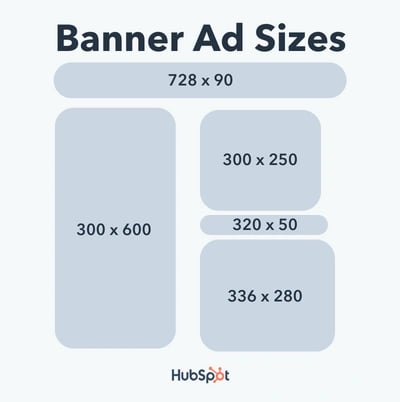
So, we've got the basics. Now, let's go over the proper sizes for banner ads:

The first two sizes, 300 x 250 and 336 x 280, are for medium-sized and large rectangles, much like the smaller ads on the sides of blogs. The leaderboard sizing (728 x 90) will look like The New Yorker ad from above, and the last two sizes are aimed to act as headlines or billboards on the top or bottom of a page.
Sometimes, finding the proper size for a particular ad requires experimentation. Remember that this isn't one-size-fits-all.
Play around with sizes before committing to one — for instance, a medium rectangle might be switched in favor for a half-page ad.
Ultimately, ad size is critical. If well-sized, your ad will look natural, professional, and eye-catching — however, if it isn't well-sized, it could look clunky or awkward on the page.
Can't decide on an ad size? To combat that issue, when the ad is ready to go live, think about testing potential ad performance to see which size performs better with audiences. This is a great case for an A/B test, a process that puts different versions on a trial run to see which one customers interact with better.
Software, such as content management systems, help track metrics. HubSpot's ad management software, for instance, can show you the ROI on different ads, which helps brands make informed decisions about which ad type to use.
Lastly, when creating ads, keep in mind that sizes aren't the only key to incredible ads. It's also good to focus on ad design, copy, call-to-action, and branding. These design details can take an ad from looking okay to outstanding.
Banner ads work online as they do in real life: they're meant to catch a consumer's eye and spark interest in a product or service. They're intended to increase traffic and sell a product early in the buyer's journey.
The right sizing can accomplish all of this. If an ad is visual and interruptive, there's a great chance of having an effective ad — sizing shouldn't disrupt that process. When planning out targeted sites for customers, think about the kind of ads that work best with the platform and go from there.
Advertising


![How Marketers Can Use Retail Media Networks to Get In Front of Customers [Expert Tips]](https://53.fs1.hubspotusercontent-na1.net/hubfs/53/retail%20media%20networks-hero%20(598%20x%20398%20px).webp)
![14 Media Planning Tools I Tried & What Worked Best [+ Free Template]](https://53.fs1.hubspotusercontent-na1.net/hubfs/53/media-planning-tools-1-20250304-7834338.webp)

![How Much Does a Super Bowl Ad Cost [& Does It Get ROI]? A Data-Backed Deep Dive](https://53.fs1.hubspotusercontent-na1.net/hubfs/53/how-much-does-a-super-bowl-ad-cost-1-20250120-9019772.webp)
![Media Buying 101: What It Is and How It Works [+ 14 Platforms to Use]](https://53.fs1.hubspotusercontent-na1.net/hubfs/53/media-buying-1-20250115-5695026.webp)
