I've examined 96 companies from Shark Tank, Season 8 (check the full list here) and selected the best Shark Tank logos, explaining in-depth why each logo works and which design elements make it great.
The process of designing a logo requires an enormous amount of patience and an obsession with getting it right. So whether you're a designer looking for some inspiration or an entrepreneur looking for logo design ideas for your business -- you're in the right place! Check out my analysis of the logos below to inspire your own design.
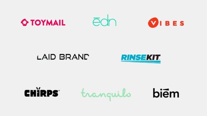
8 Best Shark Tank Logos
- Toymail
- Edn
- Vibes
- LaidBrand
- RinseKit
- Chirps
- Tranquilo
- Biem
How do you judge a logo?
A good logo is distinctive, appropriate, practical, graphic, simple in form, and conveys an intended message. The most successful companies continue to say:
Simpler is better.
And these companies definitely made the right hiring decision, whether they hired an independent design or a design agency, their logos came out well executed.
I'm going to judge these Shark Tank logos only in terms of their pure visual aesthetics without discussing the whole identity system, and how these logos work on the applications like websites, stationery design etc.
Simple ≠ Easy
Remember that the simplest ideas often require many hours of tweaking design concepts. Simplicity is something that is achieved by eliminating unnecessary elements -- going from a visual clutter to a visual essence.
Principles of a Good Logo
.webp?width=700&height=447&name=Screen%20Shot%202017-11-02%20at%203%20(1).webp)
I have judged all the Shark Tank logos by the following five criteria:
- Simplicity: Is the design simple and clean enough to be flexible and easily recognizable? Is it not too busy, distracting, or confusing?
- Memorability: Is it quickly recognizable? Is it clever? Will people only have to spend a second or two thinking about it to get it?
- Timelessness: Will it still be a great logo in 10, 20, or even 50 years?
- Versatility: Does it scale to different sizes without losing quality or clarity? Will it work across various media and within different contexts?
- Appropriateness: Does it resonate with the desired audience and industry of the business?
The 8 Best Startup Logos from Shark Tank Season 8
1) Toymail
.webp?width=700&height=348&name=Screen%20Shot%202017-11-02%20at%203%20(2).webp)
The pitch: Toymail is a toy with hidden components inside that allow you to send a message to your kids. With just a push of a button, kids can connect to Mom, Dad, grandparents, or friends at any time, from anywhere. Parents use the Toymail app to send messages. Approve your child’s trusted circle through the Toymail app.
The logo is attractive for its unique toy-contour and a modern geometric typeface. The icon and the wordmark use a one-weight line which sets a unified style. The bright pink color is appropriate for a toy-company.
2) Edn
.webp?width=700&height=348&name=Screen%20Shot%202017-11-02%20at%203%20(3).webp)
The pitch: Edn is a seed pod to grow your tiny garden indoor. Now anyone can master growing herbs, vegetables and flowers within the comfort of their home. The Small Garden's soil-free technology takes care of your plants, so you don’t need to. The seed pods are dirt-free, so there's no mess to clean up.
The wordmark feels very light and clean. The line over the “e” adds some character to it and marks the accent. The turquoise color adds a sense of nature and an organic feel to this slim and elegant typography.
3) Vibes
.webp?width=700&height=346&name=Screen%20Shot%202017-11-02%20at%203%20(4).webp)
The pitch:Vibes are designed to enhance your live music experience. They lower decibel levels of your environment without sacrificing sound clarity. You hear true natural sound the way it was intended: clear, clean, controlled.
The minimalist execution is perfectly calibrated with a sturdy sans serif, just the right amount of airy letter-spacing. The icon adopts the silhouette of the earplugs and highlights the first letter in a distinctive & unique way.
4) LaidBrand
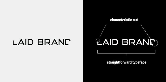
The pitch:LaidBrand is a pheromone-enriched hair care. Pheromones are naturally occurring chemicals in humans, and to put it simply without getting too technical, pheromones trigger responses. Whether you are trying to attract a mate or just exude that extra boost of confidence, pheromones play a huge part in achieving those desires.
The new wordmark is quite elegant and striking and the characteristic cuts on both sides add some sexy touch to it. There's a great harmony between the cuts and the middle “A” letters. Overall, a great logo that sets a strong tone and makes it feel like something completely different.
5) RinseKit
.webp?width=700&height=349&name=Screen%20Shot%202017-11-03%20at%2010%20(1).webp)
The pitch: RinseKit is the only portable shower to have the pressure of a garden hose without pumping or batteries. With up to 4 minutes of spray time, RinseKit’s 2 gallon system holds pressure for over a month.
Overall, this is a very bold and dynamic logo. I like the underline that symbolizes a stream of water. Very confident, flat design with a special treatment that makes it look unique. It's a complete conceptual and graphic solution.
6) Chirps
.webp?width=700&height=348&name=Screen%20Shot%202017-11-03%20at%2010%20(2).webp)
The pitch:Chirps are chips made of bugs -- crickets. When we first started Chirps, many people told us to hide the fact that our foods have bugs and just talk about the nutritional benefits. That’s not us. We started Chirps because we want people to know that bugs are delicious, nutritious, and sustainable.
It is a crisp and bold icon that has a great presence. Very impressive logo. The subtle modifications to the “i” letter turn it into a bug which perfectly embodies the main ingredient: bugs.
7) Tranquilo
.webp?width=700&height=348&name=Screen%20Shot%202017-11-03%20at%2010%20(3).webp)
The pitch:The Tranquilo Mat is a portable vibrating mat that soothes baby in the crib, stroller, or on the go! The mat helps baby transition from a mother’s womb to the world during the “fourth trimester” after birth.
The logotype is an expressive and playful script that embodies the feel-good of the soothing mat. The friendly curves of the hand-scripted font and the light green color create an approachable and optimistic vibe.
8) Biem
.webp?width=700&height=349&name=Screen%20Shot%202017-11-03%20at%2010%20(4).webp)
The pitch:Biem is the handheld device that transforms a stick of real butter to a spray in seconds, making cooking, home entertaining, and baking infinitely easier.
I like the concept of the “i” being a spray bottle with the spray beam coming out of it, which captures perfectly what it is about in a simple way. The beam is neither too big nor too small to serve as a graphic trigger for something memorable.
Feature image credit: ABC


Branding
![How Internal Marketing Helps You Build a Strong Brand From the Inside Out [Experts Weigh In]](https://53.fs1.hubspotusercontent-na1.net/hubfs/53/internal-marketing-1-20241126-7031360.webp)