.png?width=112&height=112&name=Image%20Hackathon%20%E2%80%93%20Vertical%20(50).png)
What you might not realize is the bottom-line impact your homepage design can have, good and bad. The homepage is usually where leads and customers get their first look and impression of your business. It's a digital representative, acting on behalf of your business to introduce your brand, products, and services.
In this guide, I’ll share best practices for homepage design along with brilliant homepage design examples that have implemented them.
Table of Contents
Homepage Design Best Practices
Through trial and error (and a whole lot of website analytics ), I’ve developed a set of homepage design best practices that consistently deliver results. The goal is to capture attention at the first page load, while also leaving a lasting impression that encourages visitors to return and take action.
1. First impressions and next steps happen in the hero section.
The most important part of your homepage lies above the fold (also known as the “hero” section). That means everything that a visitor sees when they first load the page, and before they start to scroll.
I spend a lot of time carefully crafting this section, from the layout and background to the copy. Here are some things I always make sure to have in place in the homepage hero:
- Consistent brand identity, from colors to tone of voice
- Sharp, clear visuals without cluttering the space
- A punchy headline that encapsulates the key message of the business
- Very brief paragraph text underneath the headline to provide more detail
- A strong call-to-action
These are the basics, but there are other important elements to think about.
For example, I always try to test the headline in the hero section over time. I use different variations and see which impacts website metrics like Time On Page, Scroll Depth, or Bounce Rate.
For the call-to-action, I might use a button that takes the visitor to a contact or demo page. Sometimes, I’ll embed a form right within the hero to remove the extra step.
The most important factor is stating what your business provides so the user knows where they’ve landed. I always try to combine the product or service of the business with a user benefit to encourage visitors to learn more.
For example, an online clothing store might write “Comfortable Clothing for Parents on the Go” with a “Shop Now” call-to-action button. The user then knows:
- This is an online store for day wear
- It’s designed with them in mind (busy parents)
- The unique selling point is comfort
.png)
Free Website Design Inspiration Guide
77 Brilliant Examples of Homepages, Blogs & Landing Pages to Inspire You
- Agency Pages
- Ecommerce Pages
- Tech Company Pages
- And More!
Download Free
All fields are required.
2. Write for your target audience.
I have two main focus points when it comes to writing your homepage copy:
- Write for your target audience
- Write like your target audience
Many companies I work with believe they should focus solely on their brand and products on their homepage, with little to no content beyond that. But if you’re not writing with the target audience in mind, the messaging won’t resonate, and visitors will disengage.
Taylor Shanklin , CEO and founder of Barlele, a branding strategy and web design agency, says when designing a homepage, you should start by creating a clear list of problems your target audience has and the solutions you offer for those problems.
“ Once you have that really well defined, it is easier to design the website interaction journey in a way that quickly and clearly communicates how you are the best company to provide a solution to their problem.”
Tone matters, too. I research my target audience's behaviors, preferences, needs, and challenges. Those findings guide the language and tone I use in my homepage elements. My goal is to speak in terms they use daily and avoid confusing them with technical jargon.
Pro tip: Head to forums and online communities for advice and feedback.
If you’re unsure what problems your target audience has or how they speak about the solutions your business provides, head to places like relevant subreddits or other online spaces. Check out discussion threads for insight into their needs and write your homepage copy accordingly.
3. Use design to showcase your unique selling proposition.
Your homepage must clearly explain your unique selling proposition (USP). That includes:
- What makes the products, services, and brand unique
- Why they’re superior or different from the competition
I already spoke about your hero design and copy above. But don’t forget visual elements, too. Use consistent brand design across your colors, fonts, and graphics. Consider adding an explainer video or customer testimonials that hone in on your USP.
For example, HubSpot’s USP is perfectly captured in the homepage subheading: “Unite marketing, sales, and customer service on one AI-powered customer platform that delivers results fast.”
As you move through your homepage design, outline this in a logical way to guide visitors through your offerings. The order or layout might look something like this:
- Hero section
- Brief brand story speaking to the customer about why you’re the best choice for them
- Section on your products or services with links to other pages for more detail
- Customer testimonials
- Final call-to-action banner
Leave plenty of whitespace between elements and sections to let the information stand out.
Pro tip: Use color or animation to enhance your homepage design.
Consider contrasting colors in your palette or simple animations to focus attention on your USP.
4. Optimize your webpage for multiple devices.
In 2024, mobile devices accounted for 67.3% of website traffic. When I’m in a website builder or Content Management System (CMS), the default view is usually desktop. So, I know it’s easy for the tablet or mobile view to feel like a secondary priority.
But that’s where most of your visitors are going to see the website, especially if you’re running a direct-to-consumer business.
How do I optimize a homepage for multiple devices? It depends on the platform a customer uses to manage the website, but here are some fundamentals:
- I use a responsive design that automatically adjusts the layout to fit the screen of any device.
- I prioritize mobile usability, so I use clear and concise navigation bars and menus, large tap-friendly buttons, and larger font-size text.
- I hide some elements on the mobile version of a site if they’re going to clutter the layout or cannot re-size responsively.
- I avoid elements like flash banners, bulky animations, and pop-ups that can overload mobile screens, slow page loading times, and cause higher bounce rates.
Avoiding slowing your page is especially important. Paige Arnof-Fenn, founder and CEO of marketing network Mavens & Moguls, says that if your website doesn’t load in 3 seconds or less, “your users will go somewhere else, and the opportunity will be lost.”
Pro tip: I always fully test a website’s responsiveness on multiple devices. It might look good on mobile, but grab a tablet and use a large desktop monitor to double-check the site is usable everywhere.
5. Include multiple calls-to-action (CTAs).
I know a potential customer getting in touch or making a purchase via your website is a top priority. However, when reviewing your homepage design, I recommend considering what a customer might want to do now, rather than what you would like them to do.
Not everyone buys in the same way, and website visitors often like options.
Let’s say I’m working on the homepage layout and design for a construction company. I’ll include a call to action to get in touch or book a consultation, of course. But I might also include a form to access a cost calculator for home renovations. Multiple CTAs keep visitors engaged and provide other ways for you to capture their contact details to nurture them further through other channels like email marketing
Other CTA options include things like:
- Signing up for a free trial
- Exploring a specific product category
- Downloading a valuable resource
- Contacting your sales team
Homepages with multiple CTAs act as a bridge between interest and conversion.
Here are some quick tips I keep in mind to maximize the effectiveness of my CTAs.
- I position them prominently on the homepage, with the first one easily visible in the hero without scrolling.
- I use design elements like contrasting colors or images to make them stand out.
- I use strong verbs and action-oriented language to compel action. Verbs like get, start, join, and discover are powerful because they convey both action and outcome.
Pro tip: Don’t go overboard. too many CTAs can create visual clutter on your homepage.
Don’t overload your homepage with too many CTAs. Consider one or two per section of your homepage. The goal is for them to be easy to find, not overpowering.
6. Stay on brand.
One of my pet peeves is seeing inconsistent design elements on a homepage. It shouldn’t feel like the visitor is seeing a completely different website from one section to the next. You’d be surprised how much that comes down to the little things.
Staying on brand is all about cohesion throughout your website, but also on individual pages like the homepage. Consistency builds a strong visual identity that visitors can recognize and remember.
For me, that covers:
- Making sure I place the logo in the main navigation so it’s visible on the homepage at all times
- Using the brand’s color palette for text, backgrounds, icons, graphics, and buttons.
- Using the same font for all headers and all paragraph text.
- Maintaining a consistent tone, which means avoiding a casual tone in one area and a formal tone in another.
Pro tip: It’s totally acceptable (and even typical) to use a different font for headings and subheadings than your paragraph text. I might use a bold, fun font for headings. But for paragraph text, I always lean on something very clean and readable.
7. Localize your homepage content.
This tip applies whether you’re a local business, serve multiple regions, or operate internationally.
For local businesses like restaurants or home improvement services, I always recommend highlighting the location prominently. People like to know that providers live and operate in the same community they do, and it helps improve your visibility in places like Google Search. I might add the town or county’s name to the hero heading, for example, or embed a map on the homepage to help people find a brick-and-mortar location.
Regional or international businesses have other things to consider, like:
- Do your products or services vary from one location to another?
- Do your customers speak different languages depending on where they’re visiting the site?
- Are there multiple office or store locations to consider?
Let’s say I’m working on the site for a franchise business, for example. It may be a national chain, but the customers want to know what’s available in their area. So, I might include a “Locate Store” CTA in the homepage hero to take users directly to the most relevant sub-website or location page.
Similarly, I’ve worked on international websites that need to serve the content in multiple languages. One site even needed completely different content for homepages in different countries because they offer different services in each.
Like all homepage design considerations, it’s all about the user and making their journey as frictionless as possible.
Pro tip: If I need to serve a website in different languages but I’m tight on time and budget for translating pages, I often use paid tools that automatically translate content and create language-specific variations of the homepage.
8. Pay close attention to your website analytics.
I’ve spent a lot of time on homepage designs previously, only to be disappointed by the results, such as low conversion rates. But I’ve learned over time that analytics are crucial to avoiding and correcting homepages that aren’t driving results.
Many website building platforms like HubSpot come with built-in analytics to help you see things like:
- How many visitors the homepage is getting
- How long visitors are spending on the page
- Whether they’re taking action like clicking buttons or visiting other pages
- How many conversions the homepage and overall site is driving
I also usually create and connect a Google Analytics account to provide more detailed information or the ability to drill down into important metrics a bit further.
Keeping an eye on analytics monthly or quarterly means I can begin pinpointing areas for improvement. For example, I might decide to change the hero CTA on the homepage and see if that leads to more conversions.
Pro tip: Other tools allow you to see how users interact with your homepage by recording their visits into video clips that you can watch, or by showing heatmaps to determine where users scroll and click the most. I often use Microsoft Clarity for this purpose as it’s free, but there are more advanced paid tools available, too.
Free Website Design Inspiration Guide
77 Brilliant Examples of Homepages, Blogs & Landing Pages to Inspire You
- Agency Pages
- Ecommerce Pages
- Tech Company Pages
- And More!
Download Free
All fields are required.
Brilliant Homepage Examples To Inspire You
I’ve shared my personal best practices for website homepage design. Now, let’s take a look at some of the best real-world homepage examples that put these best practices into action.
1. HubSpot
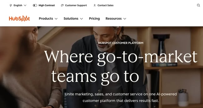
There might be a bit of bias here since it's our website, but HubSpot is one of the best examples of good homepage design.
The background visuals are strong, it provides multiple CTAs, and the layout stays super clean while still fitting in feature explanations and plenty of social proof.
As Garry West, director at Imagefix, a design and digital marketing agency, says, social proof tells potential customers and visitors that a company “isn't just making promises — it delivers for others like them.”
HubSpot’s homepage also uses lots of small animations and microinteractions to keep users scrolling and learning more without overwhelming the design.
What I love: I love the subtle animation in the hero header. The final word in the sentence scrolls through terms like “grow,” “scale,” and “retain” to communicate the all-in-one power of the platform.
2. Barkbox
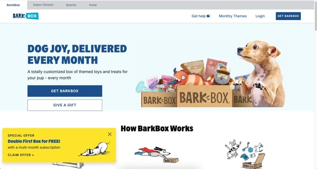
Barkbox is a subscription service for monthly toy and treat packages for dogs. On their homepage, they combine real visuals of dogs with cute graphics and cartoons to explain the service.
Alongside cohesive design, they use a strong brand voice in the copy, complete with dog-related puns, while maintaining clear messaging.
What I love: Social proof can be tricky to come by when your end user communicates in tail wags rather than in writing. But Barkbox still embeds customer stories on their homepage, showing some of their canine customers enjoying the treats and toys from their packages.
3. A24 Films

A24 Films takes a unique approach to its homepage engagement, which works quite beautifully.
I think this is a great example of how to lean on visuals to communicate, rather than a text-heavy homepage. A24 uses a simple layout, with each section containing a striking image and a simple subheading to direct users to podcasts, interviews, merchandise, or membership.
What I love: There are no fancy bells and whistles on the A24 website. Everything is focused on clear calls-to-action and giving each one plenty of space to stand out.
4. Pixelgrade
![]()
Pixelgrade provides WordPress themes for people building WordPress websites.
They use visuals right within the hero to showcase examples of their themes, before highlighting the benefits of their themes, interspersed with customer testimonials further down the page.
Color is used liberally but consistently to add style without overwhelming the user, with lots of white backgrounds and contrasting element backgrounds
What I love: The simple design and the color combination that makes the above-the-fold CTA stand out is beautifully done.
5. Chipotle
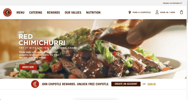
The Chipotle homepage uses tons of background video. That includes close-up food shots in the hero, and video background where you’d usually expect to see images in modular sections further down the page.
It gives the whole page movement and life to reflect the fun atmosphere customers can expect in their many locations.
What I love: Some brands think homepages have to be static or only update them once in a while. Chipotle features upcoming events and current offers right on their homepage to drive interest among both new and loyal customers.
6. Spotify
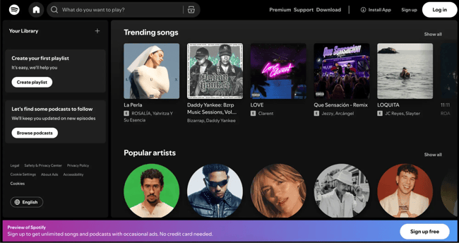
Spotify is an interesting one. They used to have a fairly standard, static homepage with a CTA to sign up to the platform. Now, when you open the site, the homepage looks like you’re already signed in, even if you’re not yet a user. Every element on the page opens up a path to conversion, leading to a sign-up opportunity.
It gives new visitors a snapshot of what the app looks like and they use the space to show key features like playlists, podcasts, and trending items.
What I love: Instead of generic text, Spotify uses a “What do you want to play?” placeholder in the search bar. It’s the perfect opening for new users to find something that will instantly engage them.
7. Future Current
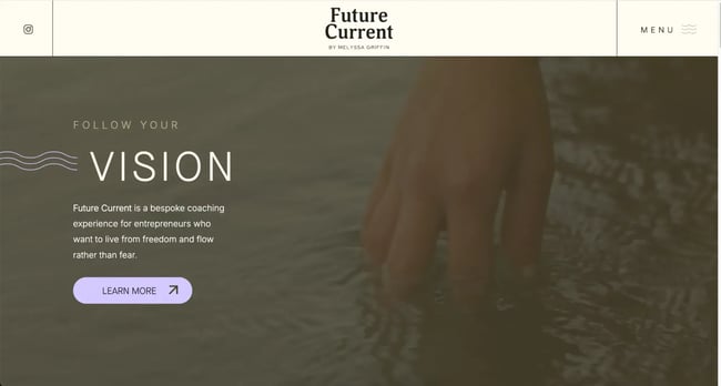
I’ve worked with a few coaches and individual consultants, and it can be tricky to nail down a personal brand. Future Current does this beautifully while still finding space to place founder Melyssa’s story front and center on the homepage.
The homepage uses a simple but cohesive combination of colors and visuals to instill the sense of calm and “inner knowing” that Melyssa’s services are based on.
What I love: Future Current focuses on the target audience all throughout the homepage, highlighting what they can gain from working with the company and providing CTAs for their free community space.
8. Digiday
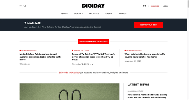
Digiday is an online trade publication geared towards digital marketing and media professionals. Since the site is almost exclusively focused on publishing and promoting content, it uses a typical news media layout for the homepage.
From “Latest News” to topic-based rows as users scroll, Digiday ensures anyone in the industry can find something interesting and useful to engage with on the homepage.
What I love: At the very top of the homepage is a banner promoting content for “Digiday+ Member Exclusives.” If you’re running a content-based site and finding it challenging to monetize, small CTAs like this can help nurture free users into paid subscribers.
9. Evernote
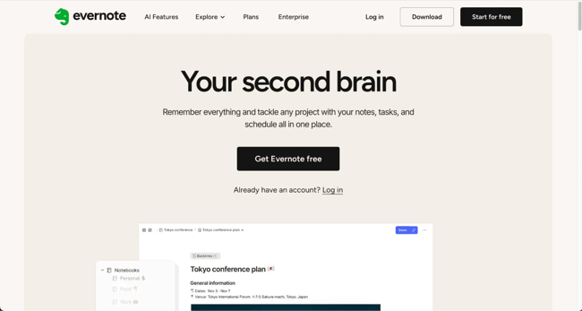
Evernote's homepage will feel like a beacon of hope if your desk is a warzone of sticky notes like mine. The headline “Your second brain” is enough to make me want to try it immediately.
The design stays true to the promise of organization with a simple layout and graphics. The CTA, with its sleek black color against the white space, is impossible to miss as well.
What I love: The primary visual is an image of Evernote in action. I can almost see my own to-do lists and notes neatly organized within the app. It's a powerful image that fuels a desire to get started and experience that organization firsthand.
10. charity: water
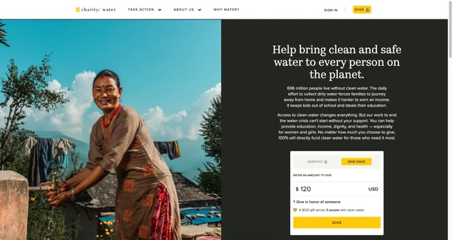
Charities and non-profits need to be more heavily CTA-focused than many other organizations. Donations are the primary goal of the website, and charity: water does an excellent job of this by placing a donation payment form right within the homepage hero.
Users can enter an amount and donate with as little friction as possible. Meanwhile, the rest of the homepage focuses on driving home the mission behind the organization with beautiful visuals and several other methods through which visitors can donate.
What I love: charity: water uses an extensive navigation menu for users to discover more, so they don’t clutter the homepage with too many sections. It keeps the focus purely on donations towards their important cause.
11. Medium
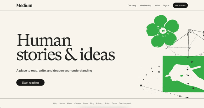
Medium’s homepage is another brilliant example of less is more. It uses simple messaging on a minimalist background that communicates what the brand is all about and the key value proposition.
This is followed by a prominent and action-oriented CTA that invites me to take the next step. By minimizing messaging, they lean into their “Human stories & ideas” headline and create curiosity to drive clickthroughs.
What I love: Unique CTA button text is one of my favorite things to try on websites. I love the “Start reading” CTA text on Medium’s homepage.
12. Kind Snacks
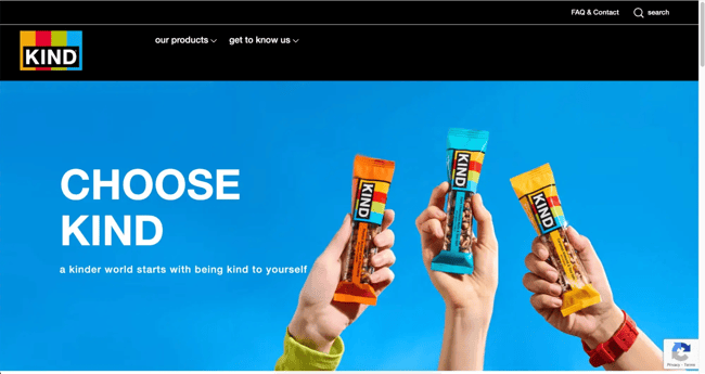
Kind is a snack brand that centers itself around kindness in every aspect of its vision and products, from being kind to the environment to your own individual health.
The homepage seamlessly weaves this mission and brand values into a narrative, always featuring high-quality product visuals in the mix.
What I love: Getting the right balance of color can be difficult. Kind achieves this by using the bright, primary colors of their brand as simple backgrounds in each section on the homepage. It gives life to the page without being overwhelming.
13. Happy Money
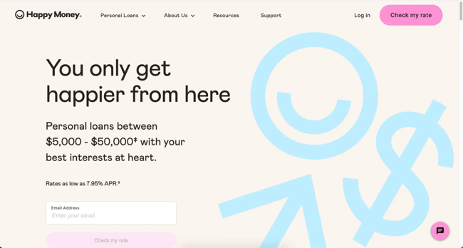
Happy Money’s homepage grabs my attention with a positive and emotionally charged message that promises you won’t be just another number with the company.
The color scheme and graphics play into this humanized feel to drive home the idea of trust and approachability. Below the fold, the content is well-organized to keep visitors scrolling by answering questions and providing more encouragement with social proof.
What I love: Many financial services brands opt for dark colors and simple designs. But Happy Money leans into their unique brand values with playful colors and visuals.
Free Website Design Inspiration Guide
77 Brilliant Examples of Homepages, Blogs & Landing Pages to Inspire You
- Agency Pages
- Ecommerce Pages
- Tech Company Pages
- And More!
Download Free
All fields are required.
14. Tesla
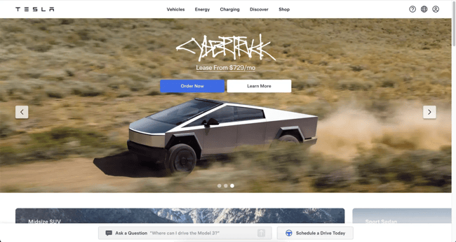
Tesla is a brand known for its innovation and futuristic products. Rather than using excessive copy on the homepage, they let the vehicles speak for themselves with a wealth of visuals.
The hero utilizes a scrolling carousel to showcase various models in diverse environments. Hero CTAs, which give users options to “Order Now” or “Learn More,” demonstrate how you can cater to different stages of the buying journey above the fold.
What I love: Further down the homepage, Tesla embeds an interactive global map of all Tesla Superchargers and Destination Chargers around the world. It’s a clever way to get ahead of any potential objections in relation to electric vehicles.
15. Thrive Market
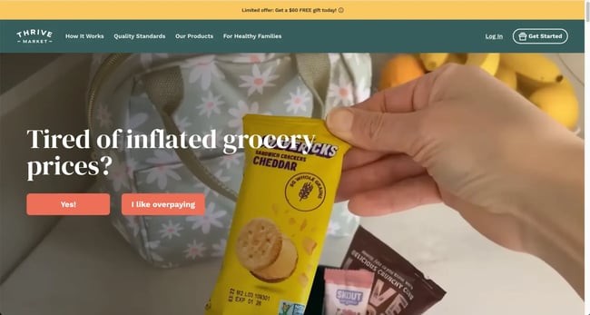
The Thrive Market is another example of a website that gets straight to the point. The homepage immediately asks me a question, encouraging immediate engagement and moving me one step closer to conversion.
The page features vibrant images of wholesome foods and natural products with clear, straightforward text promising you don’t have to break the bank to eat well.
What I love: I love the video background on the hero. While video backgrounds aren’t unique these days, Thrive Market uses them to show different products in different scenarios. From snacks in lunchboxes to home-cooked pizzas, it allows users to visualize the day-to-day scenarios where the product would be convenient.
16. Security.org
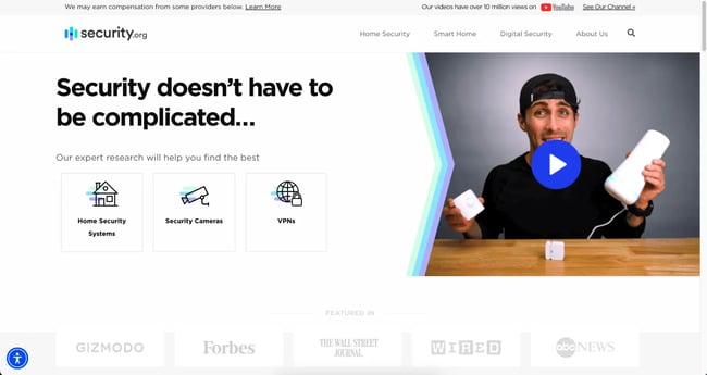
Security.org positions itself as the ultimate resource for all things DIY digital security. The homepage encourages visitors to do it themselves with Security.org’s help.
Additionally, the page features a clear, uncluttered layout with ample white space surrounding the text and between elements. This ensures everything is easy to read and find.
What I love: Security.org is a super niche website, focusing purely on customer education around home security. They make this clear right from the hero header copy to avoid confusing users about the purpose of the site.
17. Carmax
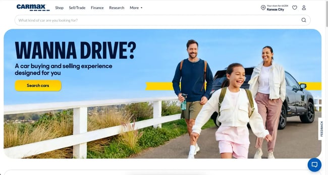
Carmax is an online marketplace for used cars, and it keeps it very simple in terms of design. After the bright, fun background image in the hero, it relies on lots of whitespace and minimalism throughout the rest of the page.
Alongside CTAs to explore used cars, the homepage takes visitors on a journey through customer testimonials, resources, and multiple search options.
What I love: Right below the fold is a simple calculator for visitors to see what price point they should aim for while browsing the site.
18. Coursera
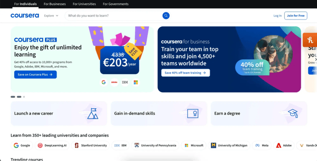
Coursera is another example of a content-heavy website that caters to a diverse range of target audiences. As an online training marketplace, it uses multiple sections throughout the homepage to ensure anyone who lands on the site can find their way to a suitable course or category.
By grouping courses into specific job functions, learning paths, and career stages, the homepage directs the user to the most relevant journey.
What I love: Rather than focusing on a single CTA, the homepage hero scrolls through different offers with beautiful but distinct graphics and color combinations.
19. The Exploratorium
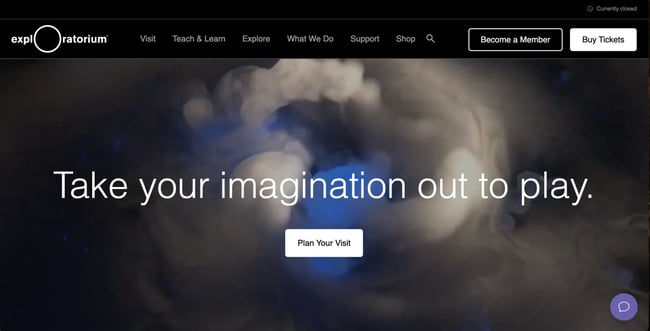
When you’re marketing an in-person experience, your website homepage can become a first touchpoint for what users can expect during their visit.
The Exploratorium in San Francisco uses real footage for a background video in the hero, so users can picture themselves at the attraction as soon as they land on the site.
Throughout the rest of the page, they use sections to promote upcoming special events and reservations for school field trips to guide the user to the right place.
What I love: The Exploratium has a chatbot embedded on the homepage and throughout the site to help visitors easily take action around memberships and reservations.
20. Italic
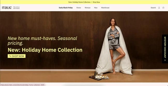
Italic is a luxury homeware and clothing brand. The homepage uses a subtle blend of monochrome colors, which allows the product highlights in different sections of the page to stand out even more.
All the images on the page use the same treatment and style to keep a cohesive feel to the products as users scroll.
What I love: When I open the Italic website, a full-screen pop-up appears to promote their latest sale. Pop-ups are a great way to increase conversions, especially if you switch them out frequently with new deals and promotions.
21. One Fine Stay
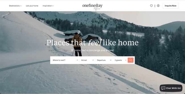
One Fine Stay is another great example of how to use video in your hero background to help visitors visualize themselves using your product or service.
But One Fine Stay also ties this into the messaging really well with the main heading and sub-heading text.
As the user scrolls, the homepage further explains how the stays work, but always with that “home away from home” angle in the copy to keep the message consistent.
What I love: I counted over four CTAs on the homepage, from searching a destination to calling the reservations team on the phone. Giving users the option to convert how they want to is a surefire way to increase your homepage conversion rates.
22. Roto-Rooter
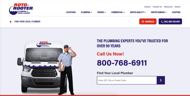
Roto-Rooter is a plumbing service but with national reach. Their homepage needs to combine the feeling of a local service while ensuring they can make the site usable for people in many different locations.
They do this by giving people multiple options to find the service closest to them, primarily with a ZIP code-based search in the hero. But users can also use the “Locations” item in the main navigation and even find the option to switch to the Canadian version of the site further down the page.
What I like: From images of the team to embedded customer reviews, Roto-Rooter uses a ton of social proof on the homepage to reinforce its brand values around quality and expertise.
23. Anytime Fitness
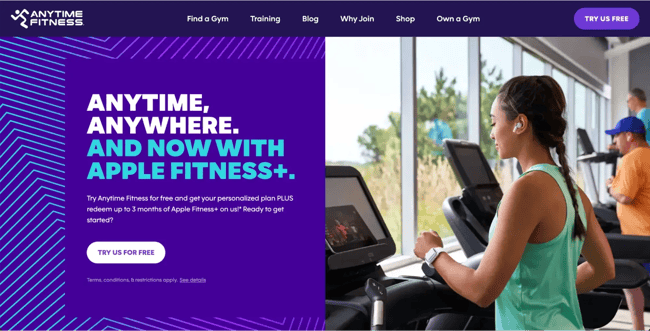
Anytime Fitness is an example of a really strong brand applied the right way on the site homepage. The strong purple base with blue highlights gives the hero a striking appearance. The rest of the homepage still incorporates these design elements really well, but with lots of whitespace and lower contrast backgrounds, so information about locations and classes can stand out.
What I love: Anytime Fitness homepage uses a simple checklist section to highlight the benefits of their gyms, like 24-hour opening times and the number of locations available.
24. Pearl Dental NYC
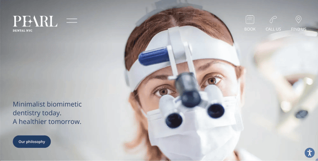
NYC-based dental clinic, Pearl Dental, uses very simple branding and colors. The dark navy invokes a sense of professionalism and trust, while the clinic images and team profiles help potential customers feel at ease.
They also include sections on specific dental services they provide and an embedded map to help patients find the clinic more easily.
What I love: Pearl Dental includes an accessibility widget in the bottom right corner, so users with different needs can adapt the look of the site to better find information.
25. Index Ventures
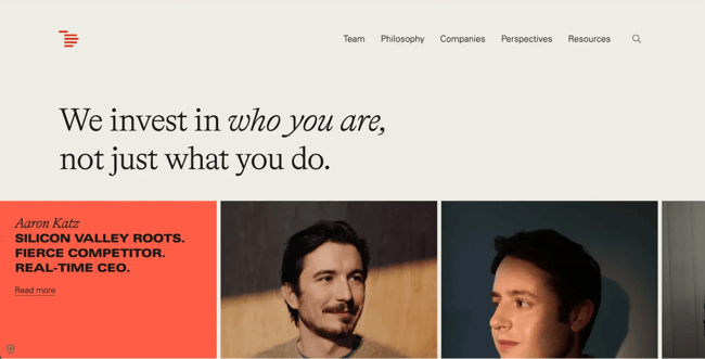
Index Ventures is a venture capital firm that uses its website homepage to inform potential founders about who they are and what they do.
The branding is clean and simple, but clever animations like background color changes on scroll keep the user engaged as they scroll through different sections.
What I love: The scrolling list of existing portfolio companies, such as Figma and Revolut, reinforces the industry expertise and previous successes of Index Ventures.
26. Huda Beauty
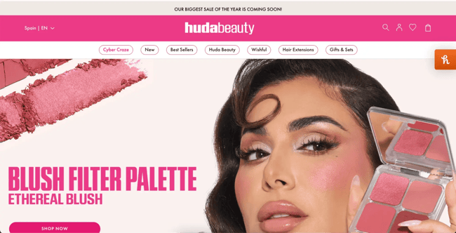
Huda Beauty has become a global brand, but it started as an influencer channel. Huda remains front and center in the branding and website design; however, to keep the brand’s grassroots origins at the forefront of user trust.
The bright pink branding colors and sections are the perfect framing for product shots. The brand also utilizes sections to promote items such as gifts and kits, aiming to increase conversions.
What I love: Another callback to Huda Beauty’s influencer roots is the helpful beauty guides embedded on the homepage.
27. Burrow
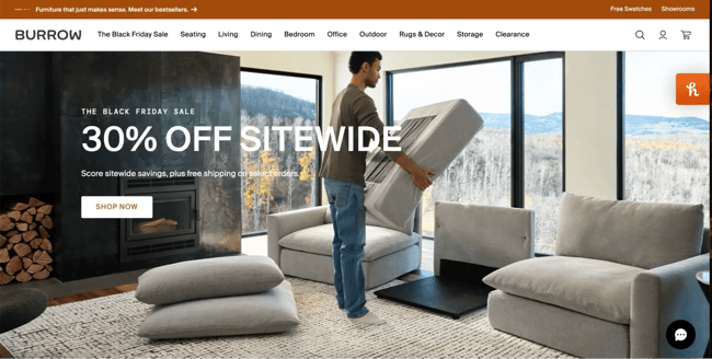
Burrow makes and sells different kinds of modular furniture. I’ve highlighted a few examples of hero background videos on this list, but this one might be my favorite.
Burrow uses a form of stop-motion animation in their video, which is reflective of how their modular furniture products work; each piece fits into the other with simplicity.
What I love: Further down the homepage, Burrow includes a longer, standard video showing people unboxing and putting the furniture together so users can see for themselves how easy it is.
28. Citrin Cooperman
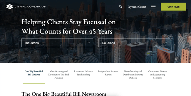
Citrin Cooperman is a finance and tax consulting firm that operates across several industries. Their site’s homepage is an example of B2B marketing done well.
It keeps helpful resources on things that matter to the target audience front and center, which builds trust and conveys a sense of expertise.
What I love: The branding is sleek and professional, but not dull, and I particularly like the background images overlaid with their navy brand color.
29. St. Elmo Steak House
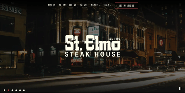
St. Elmo’s Steak House in Indianapolis uses lots of dark colors and fades in their branding on the homepage, reflective of the classic and comforting interior of the restaurant itself.
They lean heavily on their heritage, highlighting their tenure of over 100 years and the dishes they are most known for.
What I love: The scrolling effect on a collage of images showing off the food, cocktails, and dining experience gives visitors a sense of what to expect when they visit the location itself.
30. Pastels Salon
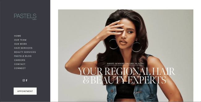
The Pastels Salon site subverts expectations a bit. Rather than having the website menu horizontal along the top, it sits to the left and remains static as the user scrolls the homepage.
This keeps the “next step” for the user in their eyeline at all times, whether it’s exploring a specific service or clicking the “Appointment” button.
What I love: Pastels includes images of their real team on the homepage to build trust with their website visitors and give the brand a welcoming feel.
31. Avis
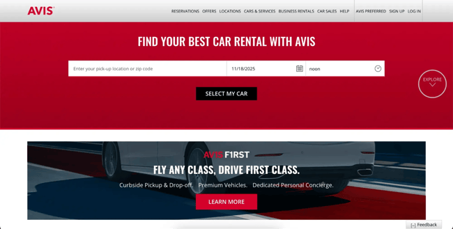
Renting a car can be a stressful experience. There are so many options, and it’s difficult to know what to choose. Avis aims to reduce this friction for website visitors all throughout the homepage, including the easy “Select My Car” form right in the hero.
What I love: Further down the page is a big list of cities users can click to jumpstart their booking process even further with the correct pick-up details.
32. Rabbit Hole Distillery
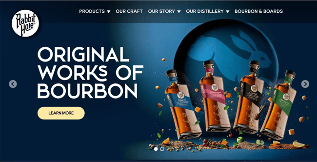
When your website needs to serve more than one purpose, it can be difficult to know what to prioritize. Rabbit Hole does this beautifully, using their homepage to promote both bourbon sales and in-person visits and tours of the distillery itself.
The strong branding and 3D effect on product images ensure every section on the homepage pops, making scrolling an experience in itself.
What I love: One section of the homepage is dedicated to a brief history of the brand’s founder, highlighting the values and journey that underpin their products.
Build a great homepage for your brand.
If you’ve taken the time to review a few examples from my list of favorites, you’ll notice a few key themes that stand out for building a great homepage: build a cohesive brand, focus on CTAs, and minimize friction for users wherever possible.
Follow these golden rules and, no matter your industry or target audience, you can build a homepage built to intrigue and convert website visitors into loyal customers.
Editor's note: This post was originally published in March 2013 and has been updated for comprehensiveness.
Free Website Design Inspiration Guide
77 Brilliant Examples of Homepages, Blogs & Landing Pages to Inspire You
- Agency Pages
- Ecommerce Pages
- Tech Company Pages
- And More!
Download Free
All fields are required.
.webp)
![How to create a landing page with high ROI [+ expert and data-backed tips]](https://53.fs1.hubspotusercontent-na1.net/hubfs/53/%5BUse-2.webp)
![Signs it's time to redesign your website [+ 15 steps to follow]](https://53.fs1.hubspotusercontent-na1.net/hubfs/53/phaseswebsiteredesign%20copy.png)


![How to start a blog (the right way) and write posts people actually want to read [+ free templates]](https://53.fs1.hubspotusercontent-na1.net/hubfs/53/how-to-start-a-blog-2.webp)
![What is a lead magnet? 20 lead magnet ideas and examples [+ step-by-step]](https://53.fs1.hubspotusercontent-na1.net/hubfs/53/lead%20magnet%20represented%20by%20a%20magnet.webp)

![15 best AI SEO tools & how I use them [new data]](https://53.fs1.hubspotusercontent-na1.net/hubfs/53/ai-seo-tools-1-20260313-9008245.webp)