

Download Now: Email Marketing Planning Template
You see, HubSpot research found that despite competition and spite, email remains the third most popular marketing channel in 2026. Fortunately, my experience sending email marketing materials, such as newsletters, has given me a wealth of knowledge I'm happy to pass on to other marketers and business owners to see success with it.
Let's explore 13 crucial email metrics and KPIs, performance benchmarks to look out for, and also how to choose the right metrics for your efforts.
Table of Contents
- 13 Essential Email Marketing Metrics
- How to Choose the Right Email Marketing Metrics to Track
- Frequently Asked Questions About Email Marketing Metrics:
- Navigating Email Marketing Metrics
Email Marketing Planning Template
Organize your email marketing strategy and metrics with this free template.
- Gather data
- Summarize results
- Manage A/B tests
- And More!
Download Free
All fields are required.
13 Essential Email Marketing Metrics
- Open Rate
- Mobile Open Rate
- Click-through Rate
- Conversion Rate
- Engagement Rate
- Revenue per Email
- Overall ROI
- Deliverability Rate
- Bounce Rate
- List Growth Rate
- Email Sharing/Forwarding Rate
- Complaint Rate
- Unsubscribe Rate
Note: Are you using AI to generate and send your emails? You may also want to consider tracking these unique analytics.
1. Open Rate
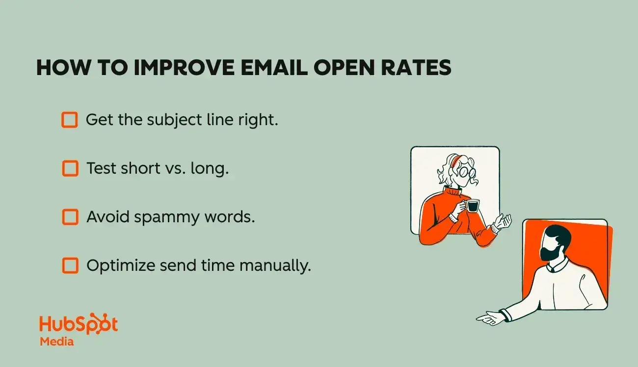
This is the percentage of email recipients who open a given email. Many modern marketers shrug this off as a vanity metric compared to things like click-through rate (CTR) and ROI, but let’s not forget — none of these are possible if your email doesn’t even get opened.
That said, the open rate can nevertheless be a very misleading metric for several reasons. For instance, some email clients only count a message as “opened” if the recipient also receives the images embedded in that message. And many email users today have image blocking enabled.
It's also important to note that HubSpot research found 22% of marketing professionals say Apple's latest Email Privacy Protection feature impacts the reporting accuracy of open rates, particularly on mobile.
How valuable is your email open rate?
Because of its potential inaccuracy, open rate can be a hit-or-miss metric. However, you can derive value from tracking as a comparative metric. For example, comparing the open rates of this week‘s email sent to last week’s (both to the same lists) might give you some insight since the variables are somewhat controlled.
How to calculate open rate:
Open rate = Number of opened emails/Number of total emails sent x 100
= 3,500 emails opened / 20,000 emails sent x 100 = open rate of 17.5%.
Benchmark: While this varies by industry, the overall average email open rate in 2025 was 42.35%, which is a great open rate. In my experience, at the absolute minimum, you should see at least 20% if your email list is in decent health.
2. Mobile Open Rate
As the name suggests, mobile open rate is the percentage of recipients who opened your email on a mobile device.
How valuable is your mobile email open rate?
This distinction is important because it can help you understand buyer behavior and how to optimize your email design, while also providing more insight into your overall open rate and how it may be skewed.
How to calculate mobile open rate:
Open rate = Number of emails opened on mobile/Number of total emails sent x 100
= 3,500 emails opened on mobile / 20,000 emails sent x 100 = open rate of 17.5%.
This is also something your email tool, like HubSpot, will show you.
Benchmark: N/A
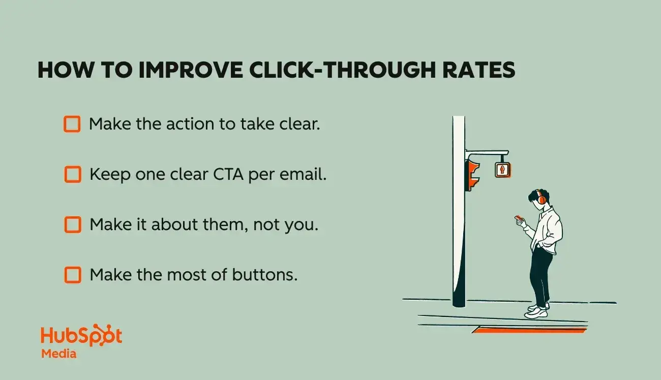
3. Click-through Rate
Click-through rate (CTR) is likely the first metric you'll hear when you ask an email marketer what they track, and with good reason, as it reflects actual action. Your click-through rate is the percentage of email recipients who clicked on one or more links, out of all of the emails sent.
How valuable is a click-through rate?
In my experience, CTR is a crucial metric for all email marketers to track, as it gives direct insight into how many people on an email list are engaging with the content and interested in learning more about a brand or offer.
How to calculate click-through rate:
CTR = (Total clicks OR unique clicks/Number of delivered emails) x 100\
= 500 total clicks/10,000 delivered emails x 100 = 5%
The formula other marketers and I use to calculate this metric is dividing total or unique clicks by the number of delivered emails. I then multiply that answer by 100.
For example, let's say I sent out 10,000 delivered emails that amassed a total of 500 clicks. I would divide the 500 total clicks by the 10,000 delivered emails and multiply the answer by 100, yielding a 5% click-through rate.
The math would look like this:
= 500 total clicks/10,000 delivered emails x 100
= 5% click-through rate
Benchmark: The average CTR across industries is 2.5% (HubSpot)
Read this blog post to know what a “good” click-through rate is, according to industry benchmarks, and how to improve yours. HubSpot customers can click here to learn how to set up click tracking in your emails using HubSpot quickly.
Pro Tip: If you’d like to get even more granular, look at the Click-to-open rate — This is the percentage of people who clicked out of those who actually opened the email, not just received it. This is a good indicator of how engaging the content of your email actually was after someone opened it.
Not seeing a great CTOR? Consulting an AI email writer may help you with drafting and brainstorming copy that can make your email more compelling.
4. Conversion Rate
Conversion rate is the percentage of email recipients who click on a link within an email and complete a desired action, such as filling out a lead generation form or purchasing a product.
After an email recipient has clicked through on your email, the next goal is typically to get them to convert on your offer, in other words, to take the action your email has asked them to take. So, if you‘re sending an email to offer your audience the chance to download a free ebook, you’d consider anyone who actually downloads that ebook to be a conversion.
How valuable is your conversion rate?
If your goal is to generate leads, conversion rates are significant as they show you how successful your newsletters are at actually generating prospects and leads.
Targeting the right email recipients by segmenting your list based on demographics, past interactions, and preferences is crucial for boosting conversion rates. This approach ensures your message resonates with the audience, leading to higher engagement and a more successful email marketing strategy.
How to calculate conversion rate:
Conversion rate = (Number of people who completed the desired action/Number of total emails delivered) x 100
= (400/10,000) x 100 = 4%.
To calculate the conversion rate, I divide the number of people who completed the desired action by the number of emails delivered and multiply the answer by 100.
Let‘s say I have 10,0000 total emails delivered, and 400 of the recipients completed the desired action. To get the conversion rate, I'd divide 400 by 10,000, which equals 0.04. Multiply that by 100, and the conversion rate is 4%.
I've found that conversion rate is one of the most important metrics for determining how my emails achieve my goals.
This is because the definition of a conversion is directly tied to the call-to-action in an email, and my call-to-action should be directly connected to the overall goal of my email marketing.
Pro Tip: To measure the conversion rate of your emails, you'll need to integrate your email platform and web analytics. If you use HubSpot, this is done automatically, whether you use text links or call-to-action buttons.
However, you can also do this by creating unique tracking URLs for your email links that identify the source of the click as coming from a specific email campaign.
Email Marketing Planning Template
Organize your email marketing strategy and metrics with this free template.
- Gather data
- Summarize results
- Manage A/B tests
- And More!
Download Free
All fields are required.
5. Engagement Rate
The email engagement rate is a measure of the interaction subscribers have with your emails, including opens, clicks, replies, and forwards.
Unlike individual metrics that only show one type of interaction, the engagement rate provides a holistic view.
How valuable is engagement rate?
This metric is valuable because it helps marketers get a deeper look at the interactions their emails receive.
A high engagement rate means your content resonates with subscribers and motivates them to take action, while a low rate suggests that your messaging, timing, or targeting may need work. Email engagement rate is particularly useful for evaluating content quality and subscriber interest over time.
How to calculate engagement rate:
The formula varies depending on which actions you want to measure, but:
Email Engagement Rate = [(Unique Opens + Unique Clicks + Other Actions) / Delivered Emails] × 100
= [(2,500 + 800 + 200) / 10,000] × 100 = 35% engagement rate
Example: If you sent an email to 10,000 subscribers, and 2,500 opened it, 800 clicked a link, and 200 forwarded it, your calculation would be 35%.
If you are a HubSpot user, these numbers can be found in your individual email performance dashboards:
Benchmark: According to GetResponse, engagement rates vary significantly by email type and industry. Standard marketing emails typically see engagement rates of 15-25%, while triggered emails (based on customer actions) achieve higher engagement with click-through rates around 5% compared to 3.25% for standard campaigns.
Emails with graphics show particularly strong engagement, with open rates of 43.12% and click-through rates of 4.84%.
6. Revenue per Email
Revenue per email (RPE) measures the average amount of revenue generated by each email you send. This metric directly ties your email marketing efforts to business outcomes, making it one of the most important indicators of email program success from a financial perspective.
How valuable is revenue per email?
This metric is invaluable for marketers because it quantifies the actual business value of email campaigns, making it easier to justify email marketing budgets and demonstrate ROI to stakeholders.
Revenue per email helps you identify which campaigns, segments, and strategies generate the most value, allowing you to allocate resources more effectively. It's especially useful for e-commerce businesses and companies with clear revenue attribution models.
How to calculate revenue per email:
Revenue Per Email = Total Revenue Attributed to Email Campaign / Total Emails Delivered
= $75,000 / 50,000 = $1.50 revenue per email
Example: If you sent 50,000 emails for a promotional campaign and generated $75,000 in attributed revenue, your calculation would be:
This means each email you sent generated an average of $1.50 in revenue.
Benchmark: According to Litmus's research on email marketing ROI, email marketing delivers an average return of $36 for every $1 spent.
While specific revenue per email varies by industry and campaign type, email marketing statistics data show that standard campaigns in e-commerce generate approximately $0.10-$0.50 per email sent, while automated campaigns can achieve significantly higher returns of $1.00 or more per email.
The automotive industry leads in revenue per recipient, with standard campaigns generating $0.16 per email and automated campaigns returning $5.47 on average.
7. Overall ROI
This metric is the overall return on investment for your email campaigns. In other words, total revenue is divided by real spend.
How valuable is ROI?
How many of these types of leads did you generate via email marketing? How does this translate to potential revenue? Actual revenue? These metrics will help you show your boss and sales team how valuable email marketing is as a channel that drives accurate, tangible results.
How to calculate ROI:
There are several ways to calculate the ROI of your email campaigns, but this is the most basic:
Campaign ROI = [($ in additional sales made minus $ invested in the campaign)/ $ invested in the campaign] x 100
= ($1,000 in additional sales - $100 invested in the campaign / $100 supported in the campaign) x 100 = a 900% return on investment for the campaign
Pro Tip: As with every marketing channel, you should be able to determine the overall ROI of your email marketing. If necessary, set up an SLA system that assigns different values to various types of leads based on their likelihood of generating revenue for your company.
Benchmark: This is business-dependent, but generally, 7-10% is considered a reasonable return on investment. Ideally, businesses aim for at least 20%.
8. Deliverability Rate
Deliverability rate is the percentage of your emails that successfully reach the inboxes of your subscribers (not filtered into spam folders or rejected entirely). While the delivery rate tells you if emails reached the mail server, the deliverability rate indicates whether they actually made it in front of your recipient, where they can be seen and opened.
How valuable is deliverability rate?
Even the most compelling email content is worthless if it is never seen.
Poor deliverability hurts your sender reputation and reduces campaign effectiveness, in turn, wasting your team's time and effort. Monitoring deliverability helps you identify technical issues, content problems, or list quality concerns before they severely impact your email program.
How to calculate deliverability rate:
Deliverability Rate = (Emails Reaching Inbox / Total Emails Sent) × 100
= (18,400 / 20,000) × 100 = 92% deliverability rate
If you sent 20,000 emails, and inbox placement tools show that 18,400 reached the inbox (while 1,200 went to spam and 400 bounced), your calculation would be 92%.
Note: Calculating true deliverability requires specialized tools that can detect inbox placement versus spam folder placement, as standard email platforms are typically only able to track delivery (reaching the server), not inbox placement. Thankfully, tools like Litmus, MailChimp, and HubSpot offer insights into this.
Benchmark: According to Validity, the global average inbox placement rate is approximately 84-85%, meaning roughly one in six legitimate marketing emails fails to reach the inbox.
Research from Brevo shows that top-performing senders with excellent sender reputation and proper authentication achieve deliverability rates of 90% or higher. Anything below 80% indicates serious deliverability issues that need immediate attention.
9. Bounce Rate
Bounce rate is the percentage of total emails sent that could not be successfully delivered to the recipient's inbox. And there are two kinds of bounces to track: “hard” and “soft.”
I've found soft bounces result from a temporary problem with a valid email address, such as a full inbox or a problem with the recipient’s server.
The recipient’s server may hold these emails for delivery once the problem clears up, or you may try re-sending your email message to soft bounces.
Hard bounces, however, result from an invalid, closed, or non-existent email address, and these emails will never be successfully delivered.
How valuable is bounce rate?
Bounce rate is important to know because, similar to deliverability, they help you see just how many of your emails are actually getting seen. Internet service providers (ISPs) use bounce rates to determine an email sender’s reputation, which can impact whether or not you show up in spam folders or get delivered at all.
That said, you want to keep this number low by removing complex bounce addresses from your email list.
How to calculate bounce rate:
To calculate it, divide the number of bounced emails by the number of emails sent, and multiply the answer by 100.
Bounce rate = (Number of bounced emails/Total number of emails sent) x 100
= 75 bounced emails/10,000 total emails sent x 100 = 0.75% bounce rate
Benchmark: Average bounce rate across industries 2.48% (Webfx via HubSpot)
10. List Growth Rate
Aside from the call-to-action metrics (CTR, conversion rates), I also suggest keeping tabs on list growth and loss. Believe it or not, there's a natural decay of your email marketing list, and it expires by about 28% every year — which means that it's more important than ever to pay attention to growing your subscriber list and keeping it at a healthy size.
Your list growth rate refers to the rate at which your email list expands.
How valuable is your list growth rate?
The size of your list determines your email reach and audience size. Therefore, growing this list with quality contacts can only help you grow as a thought leader and business. Your list growth rate helps you understand how effective you are at doing this.
How to calculate list growth rate:
List growth rate = ([(Number of new subscribers) minus (Number of unsubscribes + email/spam complaints)]/Total number of email addresses on your list]) x 100
= (500 new subscribers - 100 unsubscribes and email/spam complaints)/ 10,000 email addresses on the list x 100 = 4% list growth rate
Email Marketing Planning Template
Organize your email marketing strategy and metrics with this free template.
- Gather data
- Summarize results
- Manage A/B tests
- And More!
Download Free
All fields are required.
11. Email Sharing/Forwarding Rate
This metric is the percentage of email recipients who clicked on a “share this” button to post email content to a social network and/or clicked on a “forward to a friend” button.
Now, I used to think the rate at which my email recipients forward or share my emails with others was insignificant, but I‘ve since learned it’s arguably one of the most important metrics marketers should track.
Why? Because this is one of the most effective, but low-effort ways to generate new contacts. The folks on your email list are already in your database. They’re advocates, so when they share or forward the email to a friend, it serves as a form of social proof.
How valuable is your sharing/forwarding rate?
Keep a close eye on your sharing rates to identify which types of articles and offers tend to be shared the most, and use that insight when planning future email campaigns.
How to calculate your sharing/forward rate:
Email sharing/forwarding rate = (Number of clicks on a share and/or forward button/Number of total delivered emails) x 100
= 100 clicks on a share/forward button/10,000 total delivered emails x 100 = 1% email sharing/forwarding rate
Encourage your readers to forward your email to a friend or colleague if they find the content helpful, and start tracking how many new people you can add to your database this way. Read this blog post for tips on getting people to forward your emails.
Benchmark: N/A
12. Complaint Rate
Complaint rate (also called spam complaint rate) measures the percentage of recipients who mark your email as spam or junk, rather than using your unsubscribe link.
How valuable is the complaint rate?
This metric is important because it directly impacts your sender reputation with email service providers (ESPs) and ISPs. High complaint rates signal to inbox providers that your emails are unwanted, which can result in future emails being filtered to spam folders or blocked entirely — not just for those who complained, but your entire subscriber list.
Even a small increase in complaint rate can damage deliverability across the board. Monitoring this metric helps you identify content, frequency, or list quality issues before they cause lasting harm to your sender reputation.
How to calculate the complaint rate:
Complaint Rate = (Number of Spam Complaints / Emails Delivered) × 100
= (12 / 24,500) × 100 = 0.049% complaint rate
Example: If you sent an email campaign to 25,000 subscribers with 24,500 successfully delivered, and 12 recipients marked it as spam, your calculation would be:
Benchmark: The industry standard for complaint rate is below 0.1% (one complaint per 1,000 emails sent), with many experts recommending rates of 0.02% or lower. According to recent email deliverability research, the average spam complaint rate reached 0.07% in 2024, with 44% of marketers maintaining rates at or below 0.1%.
As of February 2024, Gmail and Yahoo enforce a maximum threshold of 0.3% for bulk senders, though exceeding this can result in emails being blocked or filtered. The best-performing email programs maintain complaint rates well below 0.05% to protect sender reputation and ensure consistent inbox placement.
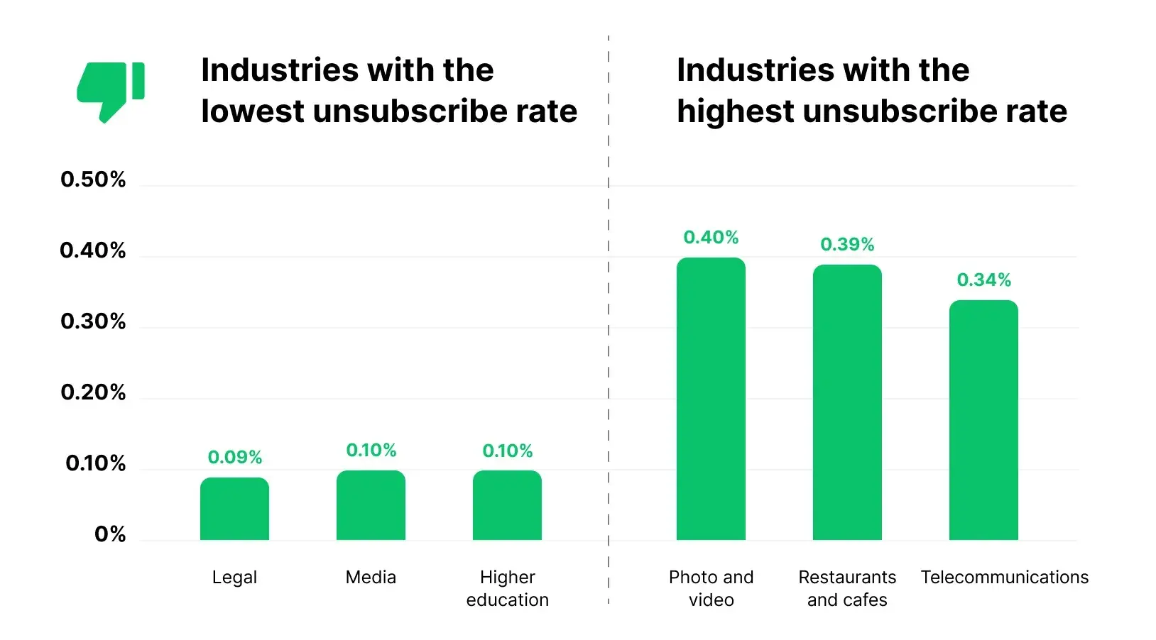
13. Unsubscribe Rate
The unsubscribe rate is the percentage of email recipients who unsubscribe from your send list after opening a given email.
How valuable is the unsubscribe rate?
As with the open rate, the unsubscribe rate isn’t always a reliable indicator of the health of your email list, as many subscribers who are tired of receiving emails won’t bother to go through the formal unsubscribe process. They’ll just stop opening, reading, and clicking on your email messages.
That‘s why I’ve found measuring subscriber engagement by click-through and conversion rates is much more effective. From there, you can keep an eye out for unengaged subscribers so you can consider removing them at some point, as we went over earlier.
Although your unsubscribe rate doesn't directly relate to your goals, checking it monthly helps calculate your overall list growth rate. So, do keep an eye on it every once in a while.
How to calculate the unsubscribe rate:
This is something you must get from your email marketing client, but the median unsubscribe rate according to Mailerlite is .22%.
How to Choose the Right Email Marketing Metrics to Track
With dozens of email marketing metrics, it's easy to feel overwhelmed or fall into the trap of tracking everything. However, not every metric is relevant for every campaign or business.
The key is aligning your metrics with your business goals, so don’t spend valuable time analyzing data that doesn't actually move the needle.
Follow these three simple steps:
- Conduct an audit of your current business state and identify what you need to accomplish.
- Identify what you need to accomplish with your email marketing strategy to aid these goals.
- Find your goal in the section below to find your suggested metrics.
Growing Your Email List
If your primary goal is to expand your subscriber base and reach more potential customers, you're focused on top-of-funnel growth. This means your emails likely include calls-to-action, such as “Subscribe to Our Newsletter,” “Join Our Community,” or “Get Weekly Tips.”
Key metrics to track:
- List Growth Rate — This metric indicates how quickly your email list is growing. Calculate it by subtracting unsubscribes and complaints from new subscribers, dividing by your total list size, and multiplying by 100.
- Email Sharing/Forwarding Rate — When recipients share your content, you're reaching new audiences organically. Track how often people click “share” or “forward” buttons.
- New Subscriber Source — Identify which channels (website forms, social media, events) drive the most subscriptions so you can double down on what works.
Remember that your email list naturally decays by about 28% each year as people change jobs, abandon email addresses, or lose interest. This makes consistent list growth even more critical.
Email Marketing Planning Template
Organize your email marketing strategy and metrics with this free template.
- Gather data
- Summarize results
- Manage A/B tests
- And More!
Download Free
All fields are required.
Generating New Leads
If you're focused on converting subscribers into qualified leads, your emails should offer valuable gated content that requires form completion — things like ebooks, webinars, templates, or exclusive research.
Key metrics to track:
- Conversion Rate — The percentage of email recipients who complete your desired action (filling out a form, downloading a resource, registering for an event).
- Click-through Rate (CTR) — This shows how many people are interested enough to click through to your landing page.
- Lead Quality Score — Not all leads are equal. Track which email campaigns generate leads that actually progress through your funnel.
Pro tip: To accurately measure conversion rate, you'll need to integrate your email platform with your web analytics using unique tracking URLs (UTM parameters) for each campaign.
Driving Engagement and Brand Awareness
Sometimes your goal isn‘t an immediate conversion — you’re simply trying to keep your brand top-of-mind, share valuable content, or build stronger relationships with your audience.
Key metrics to track:
- Click-through Rate (CTR) — High CTR indicates your content resonates and motivates action.
- Click-to-Open Rate (CTOR) — This tells you what percentage of people who opened your email actually clicked something. It's arguably a better engagement indicator than CTR alone because it isolates content performance from subject line performance.
- Time on Page (for linked content) — If your analytics allow, track how long people spend on the pages you link to. High bounce rates or short visit times suggest a disconnect between your email and landing page content.
For engagement-focused campaigns, don't obsess over immediate conversions. Instead, look for signs that recipients are consuming and valuing your content.
Nurturing Leads into Customers
When your email marketing goal is to move leads further down the funnel and ultimately drive sales, your emails will likely include product information, demos, case studies, free trials, or special offers.
Key metrics to track:
- Lead-to-Customer Conversion Rate — Specifically, track how many leads convert to paying customers after engaging with your email.
- Revenue Per Email — Calculate the average revenue generated by each email sent to understand true campaign value.
- Overall ROI — This is the ultimate metric for sales-focused campaigns: total revenue generated minus campaign costs, divided by campaign costs.
With this goal, integrating your email platform with your CRM is essential. You need visibility into which emails influenced closed deals, not just which generated clicks.
Need help planning better emails? Try our free email planning templates here.
Maintaining List Health and Deliverability
Even if list health isn‘t your primary goal, it should always be a secondary consideration. After all, none of your other goals matter if your emails aren’t reaching inboxes.
Key metrics to track:
- Bounce Rate — Keep this below 2%. High bounce rates damage your sender reputation.
- Complaint Rate — Industry standard is below 0.1%. Anything higher signals serious problems.
- Engagement Rate — Track what percentage of your list has opened or clicked. Anyone who hasn’t in 6+ months should be removed.
- Deliverability Rate — If you have access to inbox placement data, aim for 90% or higher.
I‘ve learned the hard way that ignoring list health metrics can tank even the best-performing campaigns. ISPs notice when recipients consistently ignore your emails, and they’ll start filtering you to spam automatically.
Measuring Long-Term Program Success
Some email marketers need to demonstrate the big-picture value of their entire email program to leadership, not just individual campaigns.
Key metrics to track:
- Overall Email Marketing ROI — Compare total revenue attributed to email against total email marketing costs (tools, staff time, creative resources).
- Customer Lifetime Value (CLV) by Acquisition Source — Track whether email-acquired customers are more valuable over time than those from other channels.
- Email's Contribution to Multi-Touch Conversions — Most customers interact with multiple touchpoints before buying. Attribution modeling shows how email fits into the larger journey.
For this level of analysis, you'll need robust analytics and potentially marketing attribution software that connects email engagement to revenue outcomes.
The bottom line: There's no one-size-fits-all approach to choosing email metrics. Start by defining your specific goal, then select 3-5 metrics that directly indicate progress toward that goal. Track these consistently, benchmark your performance, and adjust your strategy based on what the data tells you.
As long as you can measure individual email performance, the health of your email list, and progress toward your overarching goals, you're on the right track for more effective email marketing.
Frequently Asked Questions About Email Marketing Metrics:
What are email marketing metrics?
Email marketing metrics are quantifiable measurements that help you evaluate the performance and effectiveness of your email campaigns. These data points track how recipients interact with your emails—from whether they open them to what actions they take after clicking through.
Email metrics fall into three categories:
- delivery metrics (bounce rate, deliverability rate),
- engagement metrics (open rate, CTR, click-to-open rate), and
- conversion metrics (conversion rate, revenue per email, ROI).
The key is to choose metrics that align with your specific campaign goals, rather than tracking everything indiscriminately.
What is the 60/40 rule in email?
The 60/40 rule in email marketing suggests that your emails should contain approximately 60% text and 40% images for optimal performance and deliverability. This balance helps ensure your emails display properly across different email clients, avoid spam filters, and remain accessible to all recipients.
The 60/40 rule also improves accessibility since screen readers can‘t interpret images without alt text. While this is a guideline rather than a strict requirement, maintaining a healthy text-to-image ratio helps your core message communicate effectively even when images don’t load.
What are some KPIs for email marketing?
Email marketing KPIs (Key Performance Indicators) are specific metrics that directly measure progress toward your strategic business objectives. Metrics, on the other hand, measure activities (clicks, opens).
Core email marketing KPIs include: Email ROI (revenue divided by costs), Revenue Per Email (average revenue per email sent), Lead-to-Customer Conversion Rate, Customer Lifetime Value from Email Subscribers, and Email Attributed Revenue. According to Litmus research, email marketing delivers an average ROI of $36 for every $1 spent.
What are good email metrics?
Good email metrics vary by industry and audience, but 2024-2025 benchmarks provide helpful reference points. Key benchmarks include:
- Open Rate of 20-40% (with 42% cross-industry average)
- Click-through Rate of 2-3% (above 3.5% is excellent)
- Click-to-Open Rate of 10-15%
- Bounce Rate below 2%
- Unsubscribe Rate below 0.5%
- Complaint Rate below 0.1%
Remember that “good” metrics are relative to your own baseline performance. Focus on benchmarking against your historical data and consistently improving month over month rather than fixating on industry averages. Test different strategies and let your metrics guide optimization decisions.
Navigating Email Marketing Metrics
The bottom line? Be smart about which metrics you're tracking, and ensure you can effectively measure your individual email performance, the health of your email list, and your progress toward your overarching goals.
As long as you can determine each of those, you're on the right track for more effective email marketing.
Editor's note: This post was originally published in March 2014 and has been updated for comprehensiveness.
Email Marketing Planning Template
Organize your email marketing strategy and metrics with this free template.
- Gather data
- Summarize results
- Manage A/B tests
- And More!
Download Free
All fields are required.


![The Best Time to Send an Email [2023 Research]](https://53.fs1.hubspotusercontent-na1.net/hubfs/53/best-time-to-send-an-email.png)


![How to Embed Video in Email [Quick Tip]](https://53.fs1.hubspotusercontent-na1.net/hubfs/53/embed-video-in-email.jpg)
![23 Email Marketing Tips to Improve Open & Clickthrough Rates [+HubSpot Blog Data]](https://53.fs1.hubspotusercontent-na1.net/hubfs/53/email-writing-tips-1-20260225-400042.webp)

![What is Comparative Advertising? [+ Examples]](https://53.fs1.hubspotusercontent-na1.net/hubfs/53/Untitled%20design-Aug-17-2022-02-39-51-39-PM.png)