.png?width=112&height=112&name=shortening-property-en%20(1).png)

When it comes to growing and scaling your blog, there are three critical things you need to think about: how you're going to get new visitors to discover your blog, how you're going to convert those visitors into quality subscribers, and how you're going to leverage your most dedicated subscribers to share your content and attract new audiences.
Subscribers are a very, very important part of this whole process -- especially if you're in the early stages of blogging.
You're already pouring time and resources into creating awesome blog content, but you'll never get significant business results from that content without readers.
And each time you publish a new blog post, it's your subscribers who'll provide you with that initial surge of traffic -- which, in turn, will propel those posts' long-term success. The key to getting more blog traffic (and, eventually, leads and customers) all starts with growing subscribers.![]()
So, how do you get the folks who are reading your blog to stick around and keep coming back? Here are seven creative ways to increase your blog subscriptions.
Note: In order for the ideas below (and any other ideas) to work, you'll need to make sure you're frequently and consistently publishing new blog posts. You can't expect visitors to subscribe to your content if you don't publish anything new for them to read, do you? If you really want to scale your blog, start with making a commitment to boosting your blogging frequency.
How to Get Subscribers for Your Blog: 7 Fresh Ideas
1) Optimize your top blog posts for subscriptions.
If your main goal is increasing email subscribers, then one of the first things you might consider doing is optimizing your top blog posts for subscriptions. This isn't super time-consuming and can give you a large boost of subscriptions that'll compound over time.
Why? Because your top blog posts might be garnering a lot more traffic (from organic search and other sources) than your average blog post, and you can reap the benefits of that traffic by adding subscription CTAs -- if that's your main goal.
For example, here at HubSpot, we recently found that 76% of our monthly blog views came from "old" posts (meaning posts published prior to that month).

Why not take advantage of this by getting recurring, lasting value from old content? That, after all, is one of the main benefits of blogging.
First, identify your top blog posts for traffic. If you're a HubSpot customer, you can do this on your Blog Dashboard by sorting your blog posts by number of visits. Non-HubSpot customers can use a free tool like BuzzSumo to identify your top posts.
Once you've figured out which blog posts get the most traffic, start optimizing those posts one by one for subscribers. You can do this in a number of ways: by adding a smart subscription CTA to the post, adding a slide-in CTA, and so on. Read on for more ideas, and experiment to see what works best with your audience.
2) Add opt-in checkboxes your landing pages.
Back in 2012, we were able to boost our newsletter subscribers by 128% in just three months' time. How? We simply added a new checkbox field to all our landing page forms so people could subscribe to our blog with just one click.
In other words, when people filled out a form on a HubSpot landing page to get one of our gated offers (like an ebook), they could also opt in to receive emails about new content on the HubSpot Blog. Years later, and we still have that check box on our landing pages:

Adding opt-in check boxes on your landing pages is an easy way to capture more subscribers because all the person has to do to subscribe is check a box. This could be especially lucrative if you have a lot of landing pages to add this to.
(HubSpot customers: If you are a Professional- or Enterprise-level customer, you can easily set this up right in HubSpot and start boosting your email subscribers. Click here to learn how to create a subscribe checkbox field on your HubSpot landing pages.)
Why not make the checkbox selected by default? Because you want it to be an opt in, not an opt out. The latter definitely isn't as lovable. Plus, if you auto-check that box, you can look forward to a whole lot of low-quality subscribers. And low-quality subscribers are bad for email deliverability because it can lead to really low engagement rates on your emails and land you a pot in recipients' "junk" folders.
(Read this blog post to learn more about why low-quality subscribers are bad for business and why HubSpot unsubscribed 250,000 people from our Marketing Blog and started sending less email.)
3) Offer something extra to brand new subscribers.
One way to encourage subscription is to provide something extra for people who sign up for your emails -- something that's usually reserved for people who complete a much longer form.
For example, the folks over at HubSpot Partner IMPACT place a "smart" subscribe call-to-action (CTA) right under the header image and headline of their blog posts. When a CTA is "smart," it means that if you're already a blog subscriber, you won't see that CTA at all -- the header image will transition right into the blog post. (HubSpot Customers:Click here to learn how to create Smart CTAs like this for your own website.)

Here's another example from General Assembly, which offers a 25% discount from a class or workshop for new subscribers:

If you choose to go this route, keep an eye on the engagement rates of your emails to make sure your offers are bringing in quality subscribers. If people are just giving over their emails to get coupons and discounts, it's possible they're doing so for a one-off purchase -- and will end up getting emails from you that don't interest them.
4) Add smart subscribe CTAs to your blog, homepage, and "About" page.
Speaking of smart CTAs, there are a number of strategic places to place smart CTAs on your website. These CTAs will only show up to website visitors who aren't already subscribed to your blog. (Learn more about smart CTAs here.)
When you create these CTAs, be sure to make them as clear and easy to fill out as possible. Don't make people fill out a long form -- if all you need is an email address, only ask for the email address. When you make this process as painless as possible for your blog visitors, you'll increase the chance they'll actually fill out the form.
You'll want to test out where on your website they work best for you depending on your business and your goals, but three great places to consider adding smart CTAs are your blog, your homepage, and your "About" page.
Your Blog
People who are already reading your blog might already be interested in your content -- so why not see if they want to subscribe to your blog posts by email while they're already in the thick of it?
Create subscription CTAs and place them directly within each of your blog posts.They don't have to replace your posts' lead-gen CTAs if blog subscribers isn't your #1 goal. Instead, you can simply insert them into your posts as a secondary CTA directly below the one you're using for lead generation.
Here's an example of a CTA at the bottom of a blog post from Help Scout's blog:

Why place these secondary CTAs on the bottom of blog posts instead of the sidebar? We'll cover that in the next section.
Your Homepage
If increasing your blog subscribers is a major goal of yours, consider adding a subscription CTA to your homepage for a period of time. If you make it a smart CTA, it could show up as a short banner that runs the width of the webpage in between two other modules, for example.
If it's not a smart CTA, you could add it to a number of different places depending on your goals. Is increasing your subscribers a top goal of yours? Then place the CTA somewhere prominent on your homepage, like Noah Kagan does on his blog, Okdork:

If it's not a top goal, you might consider sticking a subscription CTA in the footer of your website, like the folks from Lynton Web did on their homepage:

Your "About" Page
For many sites, the “About” page is one of the most-visited pages. It also happens to be one of the most commonly overlooked pages, especially for lead gen opportunities. Adding opt-in forms on this page could convert a good chunk of that high traffic into subscribers.
For example, Backlinko reported that their "About” page converts visitors into subscribers at 5.81%:
5) Remove distractions, and put subscription CTAs where people are paying attention.
When you look at your website think about what might be distracting people from filling out your calls-to-action. Remember: The more distractions you give them, the less action they're going to take.
If you have a sidebar on your blog, for example, how is that affecting your conversion rate? What about user experience? Marketers at a number of different companies -- including here at HubSpot -- have reported that sidebars on their blogs are actually a big distraction for their readers.
For example, the folks at IMPACT removed the sidebar on their blog experienced a 71% increase in conversion over the performance of their standard calls-to-action on the old blog that included a sidebar.
Here's what their blog looked like before the switch. Notice the subscription CTA on the right-hand side, indicated by the red arrow:

Image Credit: IMPACT
Instead, they removed the sidebar, and moved their subscription CTA under the featured image (as shown in #3).
Here are HubSpot, we recently removed our blog's sidebar as well, mainly because we found that no one was really using it. Heat maps showed very little engagement with the sidebar, and the user testing we did revealed that people didn't interact with it. Some even said that it actually interfered with their reading experience.
When we removed the sidebar, we instead kept the smart subscription CTAs at the bottom of our blog posts, which look like this:

... As well as the subscription CTA in our blog's header, which moves along as users scroll through our posts:

Who else has removed their sidebar? How about Google? Google removed sidebar ads in February 2016 to mainly improve user experience.
If you currently have a sidebar on your blog, you'll want to test conversion rates and user experience for yourself. But what we found is that it reduces friction, makes for a cleaner user experience, and helps mobile experience both in design and by lowering page load time. (Given that Google reacts favorably to pages that load quickly, removing sidebars and other distractions could have a noticeable impact on the rankings of your blog content or overall organic search traffic to your blog.)
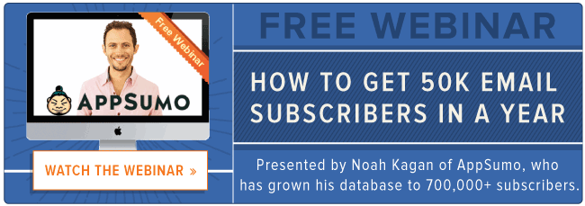
6) Launch a course via email.
While ebooks, whitepapers, and other lead gen content can be really effective parts of your inbound marketing playbook, the truth is, certain types of lead gen content are perceived as more valuable than others. Think about it: In terms of value, is an ebook really on par with something like a certification course?
Probably not. The perceived value of courses is significantly higher than that of an ebook -- a point Kagan made in his presentation with HubSpot on how to increase your email subscribers. Plus, by educating your customers, you'll be building relationships with them that'll help build trust and get them excited to engage with you -- and even buy from you.
After hearing from a friend who created a course via email and got 30,000 new subscribers, Kagan decided to do the same by creating and launching his own 12-week course called Email1K. Here's what his CTA looks like:

(Very meta, we know.)
Of course, creating an email course from scratch will require time and resources. To deliver on your promises for a valuable use of your visitors' time, you'll want the course to be really high quality. That means beautiful design, flawless user experience, and making every email actionable and important. You might need to hire a freelancer for some of these things.
The good news is that, in terms of content, you don't have to start from scratch: You can recycle content you've already written by reorganizing it, cleaning it up, and making it even more actionable than it was when you originally wrote it.
The result? You can bring in high quality subscribers from nothing. Plus, adding that "limited time" aspect is a great way to encourage people to sign up before it's too late.
Just make sure you have your promotion all lined up in advance, Kagan warns. Have experts confirmed to promote the course when it goes live, get partners in on it, perhaps arrange advertisements on social media, and write a few emails to let your current subscribers know what you're delivering.
7) Ask nicely.
How aggressively should you be asking people for their emails? Sure, you want to grab people's attention with compelling and specific copy. But at the same time, you run the risk of rubbing people the wrong way if your copy comes off as overly aggressive or pushy.
Ever seen one of those subscription CTAs where the "No" option makes you feel bad about yourself? I've seen quite a few of them, and let me tell you: They don't make me want to convert. In fact, in most cases, they make me scowl and want to leave the website immediately.
Don't know what I'm talking about? Here are a few examples:
- "Yes! I want to save money." // "No, I have enough money."
- "Yes! I'd like to receive updates." // "No, I love being out of the loop."
- "Yes! I need help losing weight!" // "No thanks, I already have a bikini body."
Ultimately, you'll need to figure out where that balance is for your business, depending on your brand voice. For example, Tipsy Elves' brand voice is funny and a little sassy, making the "No" option in their CTA below ("Sorry, I have to check with my mom first") funny instead of insulting for those familiar with their brand. But it could come at a cost when it comes to newcomers who could take it the wrong way.

Get creative with your copy, and experiment with different wording to see how it affects conversions by running an A/B test.
Our recommendation, though? Ask nicely, like the folks at Search Engine Watch did in their subscription CTA below. Newcomers to your website may not be familiar with your brand voice, and brands that don't guilt-trip users who don't want to take action are more lovable overall.

So, there you have it. While there's no one-size-fits-all plan to get more subscribers for your blog, we hope this post gives you some ideas for what to try with your audience. Hopefully, some of them will stick.
What other creative ways to increase blog subscribers can you add to this list? Share with us in the comments.
Conversion Rate Optimization