How do you convince visitors your website is worth their time? There are so many elements that a top-notch landing page design needs, and making those elements the “best” they can be often depends on what your landing page goals are.


If you're looking to up your landing page game, knowing what goes into a great one is helpful.
In this piece, I’ll explain how to make a landing page work in your favor and provide you with a list of landing pages I love so you can see these impressive designs in action and implement their tactics on your own landing pages.
Pro tip:HubSpot's free content tools enable you to create your own website from scratch, with plenty of customization options available so you can tailor your website to your branding.
Free Landing Page Builder
Create and test beautiful landing pages that generate leads and look great on any device.
- Build landing pages.
- Turn visitors into leads.
- Optimize for SEO.
- And more!
Landing Page Examples
- Shopify
- Great Jones
- Muzzle
- DoorDash
- Wise
- Airbnb
- Wag!
- Wistia
- Webflow
- Talkspace
- Nauto
- Industrial Strength Marketing
- Inbound Emotion
- IMPACT Branding & Design
- Unbounce
- Bills.com
- Zillow
- Landbot
- Webprofits
- Native Poppy
- Conversion Lab
- Taboola
- Casper
- Merrill Edge
- Munchery
- Zoom
- Domo
- Netflix
- Constant Contact
- WordStream
- Lyft
- OptinMonster
- Codecademy
- Semrush
- Eiger Extreme by Mammut
- Hint
- Linkfluencer
- Chanel
- Lamborghini
- Apple
- Hubstaff
What makes a landing page effective?
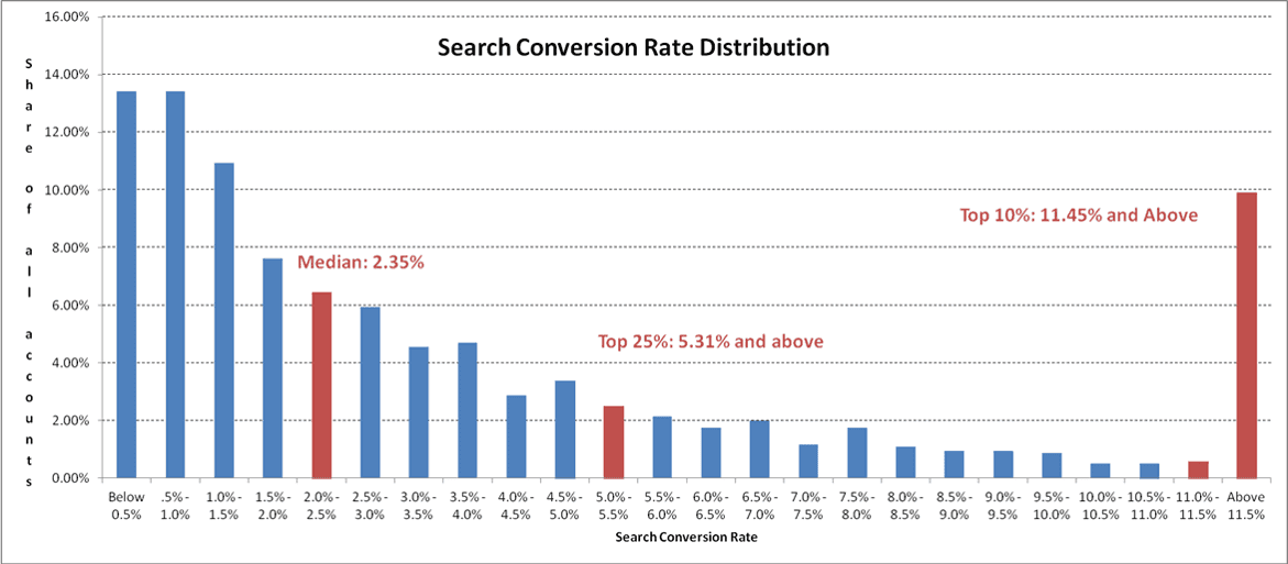
Different industries have different conversion rates, but it's 2.35% on average.
However, with awesome landing pages, you can raise that number to 5.31% or even more, according to WordStream’s study.
The best part? Over 30 landing pages can get you seven times more leads compared to sites with less than 10—no need to say more about the impact of a good landing page.
But what makes a landing page suitable?
Let’s go through six key factors.
Content Management Software
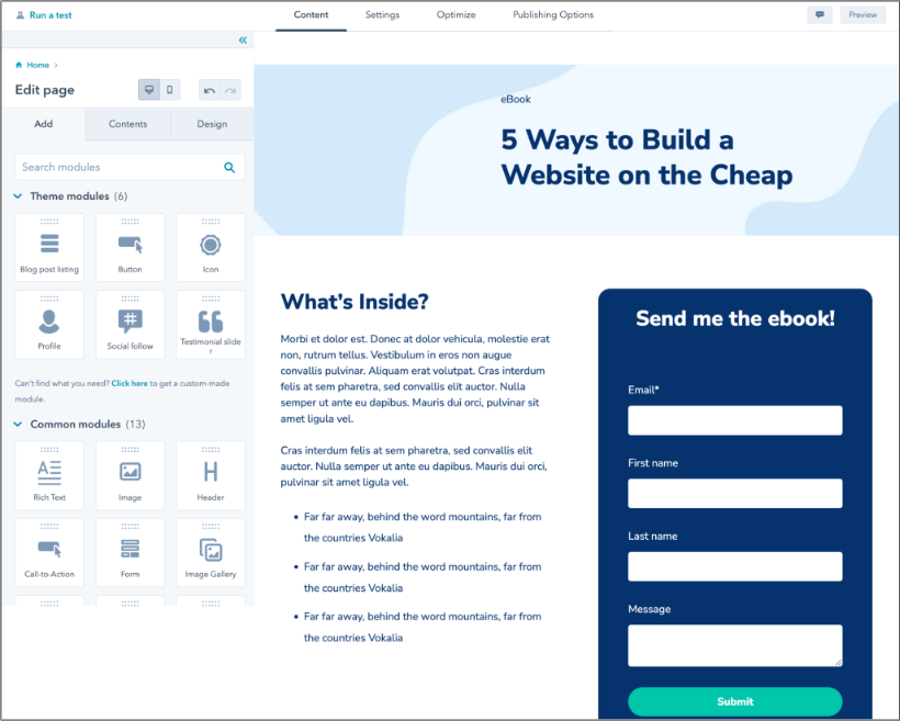
Landing pages can be built from scratch, but it's often quicker and more effective to use content management software with free landing page builder tools.

Design landing pages for free with HubSpot's free landing page builder
For example, with HubSpot's Landing Page Builder, you'll access a drag-and-drop website builder with free landing page themes and templates. These features let you hit the ground running with your landing pages and start ranking on SERPs and converting visitors into contacts. Get a demo or get started for free today.
Catchy Headlines
Make a headline that grabs attention. It should be around ten words short and tell visitors what they'll get from your page.
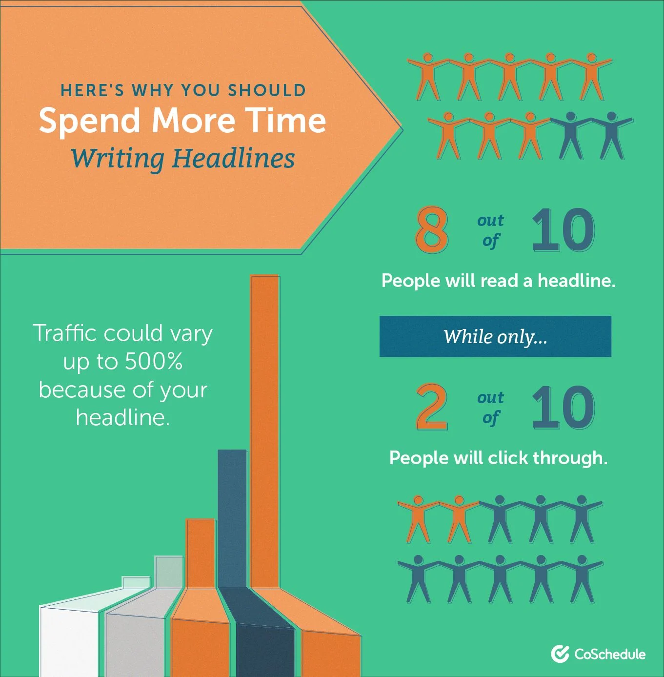
Use numbers, be specific, and choose strong words.
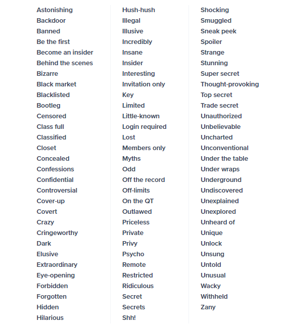
If you need some inspiration for word choice, I found a fantastic OptinMonster blog post with 700+ converting and attractive words.
From the long list, I chose this one because catchy terms keep me engaged every time:
Pro tip: Emotional headlines grab attention. For example, “Master Time Management” is transparent, but “Best Tool for More Time with Your Kids” hits differently, straight to the heart.
Eyeflow Design
Make sure your page looks neat and is easy to use.
First, categorize everything you can.
Then, put up excellent videos or pictures that fit your brand. Don‘t use too many colors and elements — it can make things messy and make it hard to notice what’s important.
Play with neutral colors, contrast, white space, and directional cues to make your CTA pop.
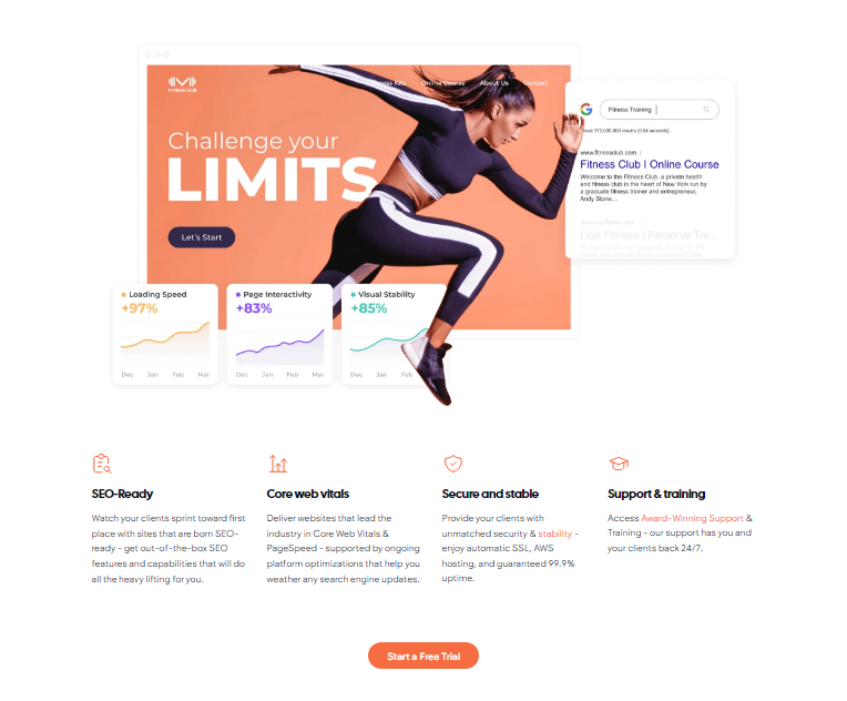
Here’s a bit of inspo from Duda:
Scroll down to see pictures with the same colors and fonts, keeping the brand's style consistent.
Pro tip: Consider spicing things up with new elements like VR, AR, or 3D images. Shopify's research showed a 94% increase in conversions with these visuals.
Short and Sweet Writing
Just like with headlines, keep your landing page text brief. In this case, we’re talking around 250-300 words — unless you're selling something super complex.
The shorter text makes it 11.8% easier to read and understand.
Keep it simple and direct.
Explain why your offer matters to them.
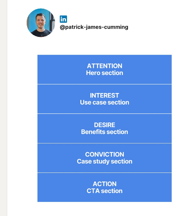
When writing landing page content, start with an outline.
I love Patrick Cumming’ s LinkedIn carousel, where he shared the AIDCA outline for crafting effective landing page content.
Also, don‘t be boring or too pushy with your CTA. Instead of “Sign up for a Trip,” go for “Join the Trip of Your Life.” It’s more fun and promises something amazing ahead.
Pro tip: Don't sound like a robot. If your copy is too ChatGPT-ish, most people will probably leave the site (including me :)). Show you care by writing in a way that connects with your audience.
.png)
Free Website Design Inspiration Guide
77 Brilliant Examples of Homepages, Blogs & Landing Pages to Inspire You
- Agency Pages
- Ecommerce Pages
- Tech Company Pages
- And More!
Download Free
All fields are required.
Testimonials and Reviews
Include quotes from happy customers or stories about good experiences. It helps people trust that your thing is great.
You can use different types of testimonials — short quotes, video stories, case studies, ratings, before-and-after pictures, social media posts, influencer endorsements, employee feedback, expert recommendations, or interactive content.
And who says you need to choose one type only?
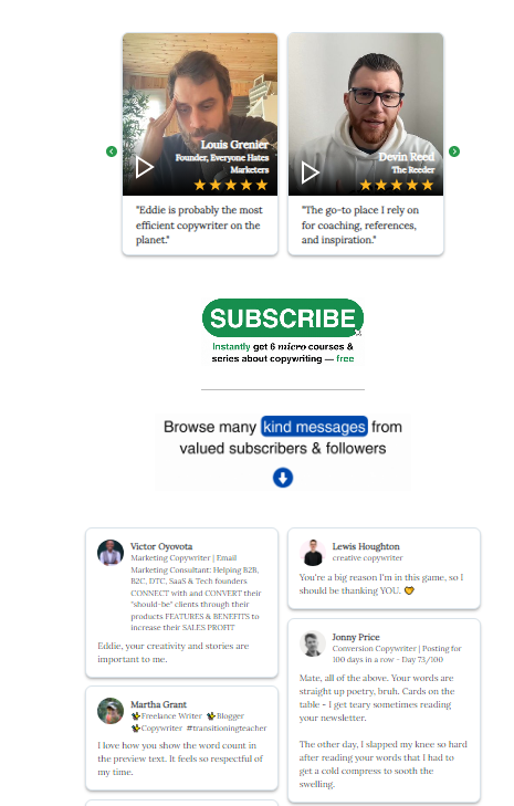
Very Good Copy mixes both video and written testimonials, and it works great:
According to the Reputation X study, business needs more than just showing up in search results:
- 49% of people want at least a four-star rating.
- People read about 7 reviews before trusting a business.
Trust leads to purchases, and online reviews can make or break that trust.
Pro tip: Try to use video testimonials whenever possible. 93% of marketers think videos work as well or even better than other content types.
I like it when there's a real person talking on a site — way cooler than reading quotes and names, especially on some new site where you end up Googling if that person is even real.
A/B Testing
You need to regularly do checkups to see what's working on your landing page.
A/B testing helps you compare two web page styles with the same web address. Some visitors see one style, and the rest see another. By looking at how well each version does, you can pick the one that works better.
Keep changing little things on your page to make sure it's always a crowd-pleaser. Whatever the problem is, A/B testing can help you figure it out and find the best solution.
Use quality tools for this purpose to find out where users are having trouble. For instance, with our Marketing Hub and Content Hub, you can A/B test your landing pages.
You can put things into context with marketing analytics. It helps identify more info about your audience and how your landing page contributes to your overall marketing efforts — details useful to create relevant A/B tests or to further refine your page.
Pro tip: If your page is in multiple languages, you can run a test for each language version with our software.
Now, check out the best 41 landing pages to inspire yourself.
41 Examples of Great Landing Pages
1. Shopify
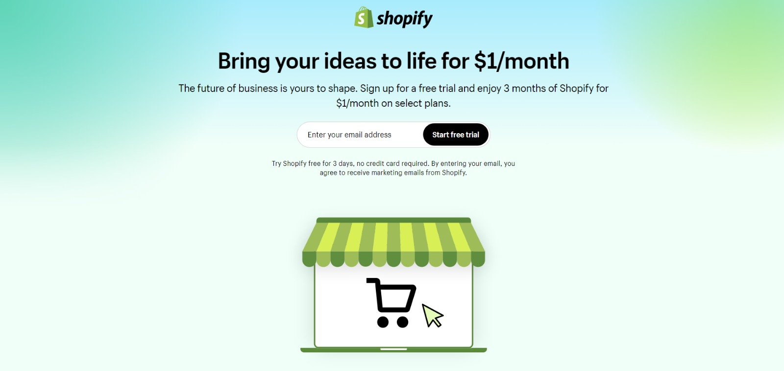
Like many of the other landing pages in this post, Shopify's trial landing page for sellers keeps it simple. It’s not too text-heavy but still manages to persuade users by noting a few key points about its top-notch product.
Visitors come away knowing that Shopify is an all-in-one platform that is easy to use and trusted by many.
Why This Landing Page Works
- Clean interface: The user-oriented headline is just a few words, for example, and the page relies on simple graphics and short paragraphs to communicate the trial's details and benefits.
- Concise CTA: There are only a few fields you need to fill out before you get started. All of this makes it easier for you to quickly get started selling online with their tool.
What Could Be Improved
- Emphasizing security: The last column states that the platform is safe, but doesn’t explain why. Instead, it mentions that over a million businesses use it. A few words that speak to site security would improve this section since the number of vendors is already stated at the top of the page. Additionally, it would eliminate friction for visitors with security concerns.
2. Great Jones
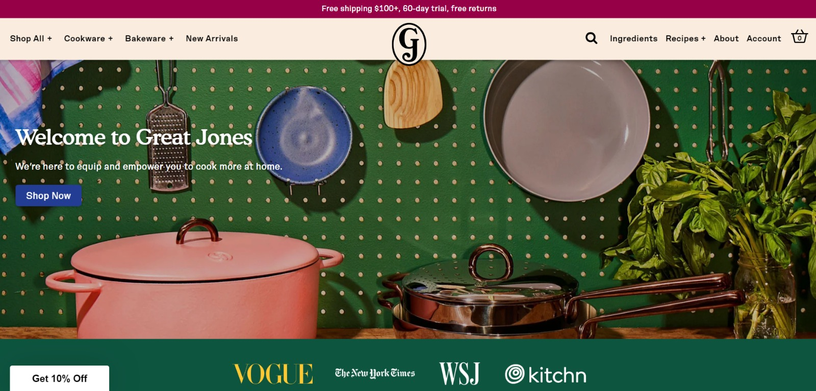
Great Jones offers up a landing page that’s as beautiful as its Dutch Ovens. It’s very aspirational and taps into all of our ideal kitchen dreams.
Why This Landing Page Works
- Use of color: Great Jones’ site is colorful, just like its cookware. The use of bold colors quickly draws visitors in and makes the cookware stand out.
- Prominent CTA: You can’t miss the $10 Off coupon. Who wouldn’t want a discount on these gorgeous pots?
What Could Be Improved
- Rollover descriptions: With so many pans and utensils pictured at once, it would be great if users had the ability to view the name of the item. That way, they could find it easier on the site when they’re ready to buy.
3. Muzzle
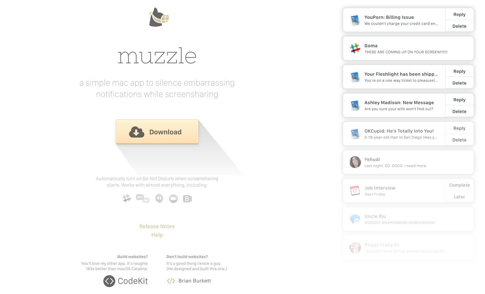
Muzzle, a Mac app that silences on-screen notifications, fully embraces this show-and-tell mentality on their otherwise minimal landing page.
Landing pages help users decide whether or not your product or service is actually worth their precious time and energy.
What better way to clearly and straightforwardly communicate your value proposition than by confronting visitors with the very problem your app solves?
Why This Landing Page Works
- Show rather than tell: Visitors to the page are greeted with a rapid-fire onslaught of embarrassing notifications in the upper left of the screen. Not only is the animation hilarious, but it also manages to compellingly convey the app's usefulness without lengthy descriptions.
- Cohesive visual experience: Even the text on the page is a muted gray color, mirroring the function of the product.
What Could Be Improved
- Could be difficult to read: While the light gray text on the white background is great at mimicking the product’s function, it may be harder to read for some.
4. DoorDash
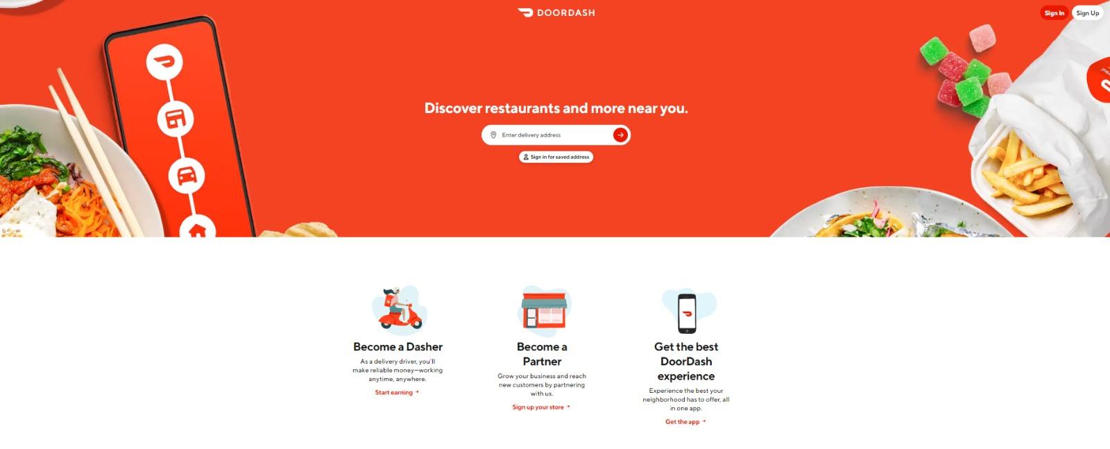
Takeout enthusiasts are no doubt familiar with DoorDash, the app that lets you order food from a variety of restaurants from your phone.
Well, instead of customers, this landing page is geared towards recruiting partners and Dashers who make the deliveries.
Why This Landing Page Works
- Emphasizes dasher autonomy: This landing page really plays up that Dashers are independent and free to work when they want.
- User-friendly: Just enter your address in the search bar, and voila! Instantly find the best local restaurants near you.
What Could Be Improved
- Advantage over competitors: DoorDash is not the only delivery game in town. They could highlight what sets them apart from a competitor like UberEats.
5. Wise

Wise allows you to send or receive money in different currencies and countries. Its landing page separates customers into two categories — either Business or Personal. You‘re not distracted by options that don’t apply to you.
There’s even a short video to show visitors how the service works before they try it. Since they’re dealing with money, it’s important to get the customer experience right the first time.
Why This Landing Page Works
- Highlights safety: The security information is out front and center on this page, helping to ease any hesitancy a potential customer might have and assuring them that Wise is a safe service to use to send and receive money.
- Emphasizes value: In several places on the page, in both text and video, Wise reiterates that it's less expensive than transferring money through a traditional bank.
What Could Be Improved
- Adding an FAQ: Putting an FAQ section at the bottom would be great, especially for such finance-related stuff where people often have many questions.
6. Airbnb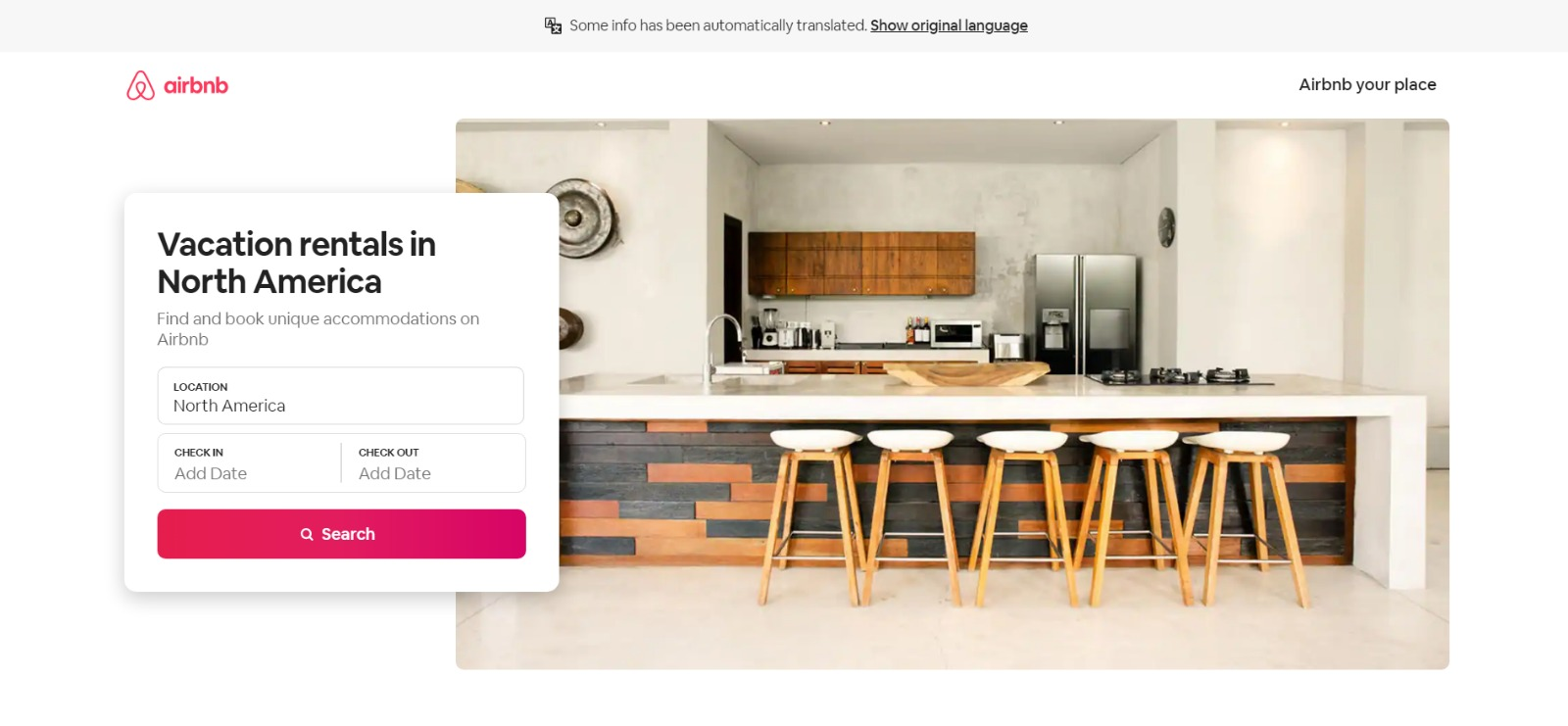
To help convert visitors into hosts, Airbnb offers a search bar pop-up. You can enter additional information about your potential accommodations into the fields to get an even more customized estimation.
If you visit the page already convinced, the clear call-to-action at the top of the page makes it easy to convert on the spot.
Why This Landing Page Works
- Personalization: Airbnb shows you right at the start what you could potentially earn based on your area and the size of your home. This is useful for potential new hosts who may still be figuring out how much they should charge and what they can expect to earn.
- Straight to the point: Minimal information against a clean white backdrop keeps the focus sharp.
What Could Be Improved
- Nothing: The page is clear and concise, reassures potential hosts Airbnb is safe to use, and offers a personalized experience.
7. Wag!
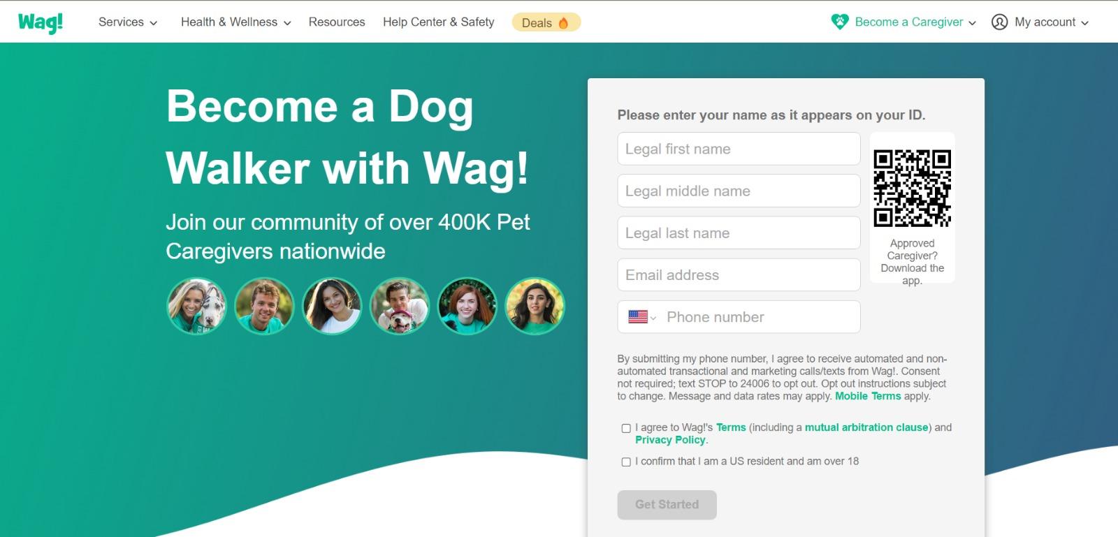
Wag! is a service that connects dog owners with dog walkers and sitters. This page gets right to the point with a large font encouraging prospects to join and puts the sign-up form prominently on the right half of the page.
The green background color makes the white font and other elements on the page pop. The addition of a QR code on the form is also a nice touch, enabling visitors to scan it, quickly download the app, and sign up.
Why This Landing Page Works
- Efficient form: Leaving the form field open on the page means visitors don’t even have to click on a CTA to access it. The QR code further expedites the process.
- Emphasizes credibility: Including caretaker photos and the fact that more than 400,000 caretakers currently use the service nationwide makes Wag! more trustworthy.
What Could Be Improved
- It’s not compelling: Unlike DoorDash mentioned earlier, Wag! makes no mention of why people should join. What are the perks? Are the hours flexible?
8. Wistia
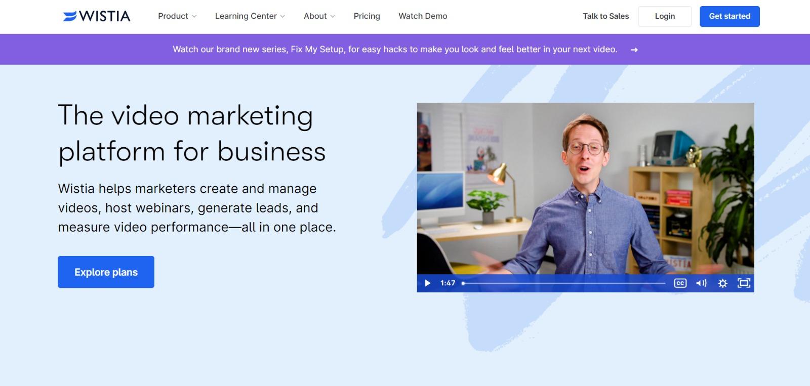
Right off the bat, you notice the baby blue background with the pop of darker blue in the form of an “Explore Plans” button. The page gets right into the action with a video describing the services.
Why This Landing Page Works
- Ease of use: The form itself allows users to quickly fill it out by linking to their Google account. Doing so enables the autofill feature, which cuts down on friction for the user.
- Capitalizes on visuals: As a video host, Wista does a great job of showcasing its capabilities using a variety of mediums. There are colorful graphics, videos, and even a link to marketing-focused cartoons.
What Could Be Improved
- Including an FAQ: Testimonials are great, but sometimes customers have a few concerns that could be answered quickly with an FAQ section. That way, they can decide whether or not to sign up without having to leave the page to search for answers.
9. Webflow
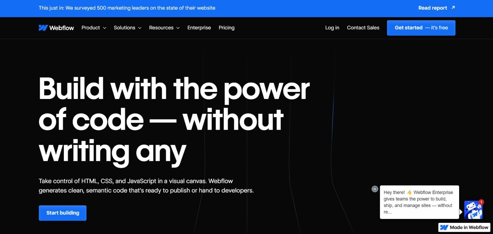
Webflow, a design tool for web developers, packs a lot of information into just one GIF. As with Muzzle, Webflow also gets right to the point and demonstrates what its tool can do, rather than just talking about it.
The animated GIF is visible in the same frame on the website, so users can see how the product works and sign up without scrolling.
Why This Landing Page Works
- Show rather than tell: Being able to view Webflow’s tool in action gives potential customers a clear idea of not only what it does but how their user experience will be.
- Removes risk: In several places on the landing page, visitors are reminded that the service is free. There’s no trial to sign up for. They can build their site for free and decide whether or not to sign up for a plan when they’re ready to launch.
What Could Be Improved
- Nothing: This landing page is the perfect balance of information, usability, and visuals.
10. Talkspace
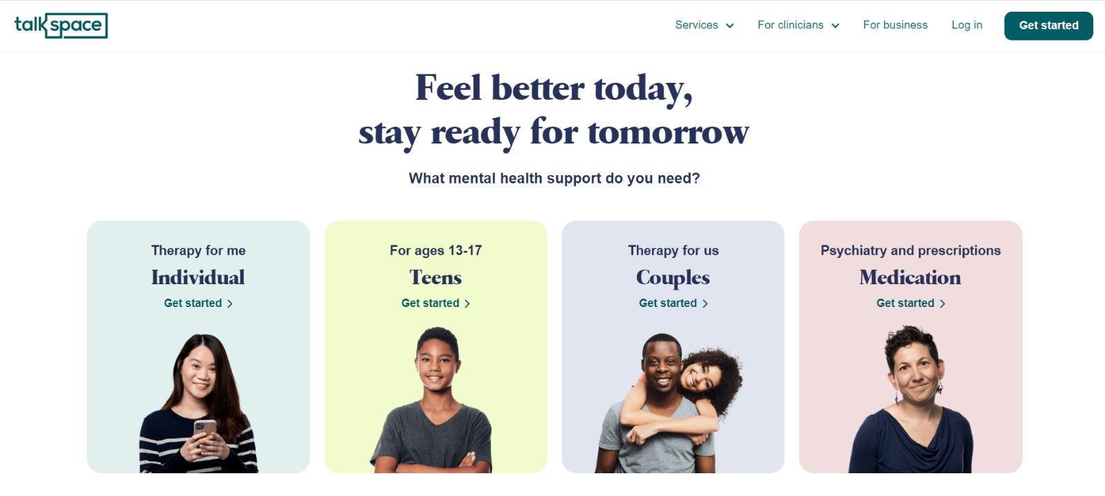
Talkspace, an online therapy service, really focuses on trustworthiness with this landing page. All of the information on this page emphasizes that customers will have access to licensed therapists.
It drives home that the service is secure and confidential. This is a great way to reassure those who may be hesitant to participate.
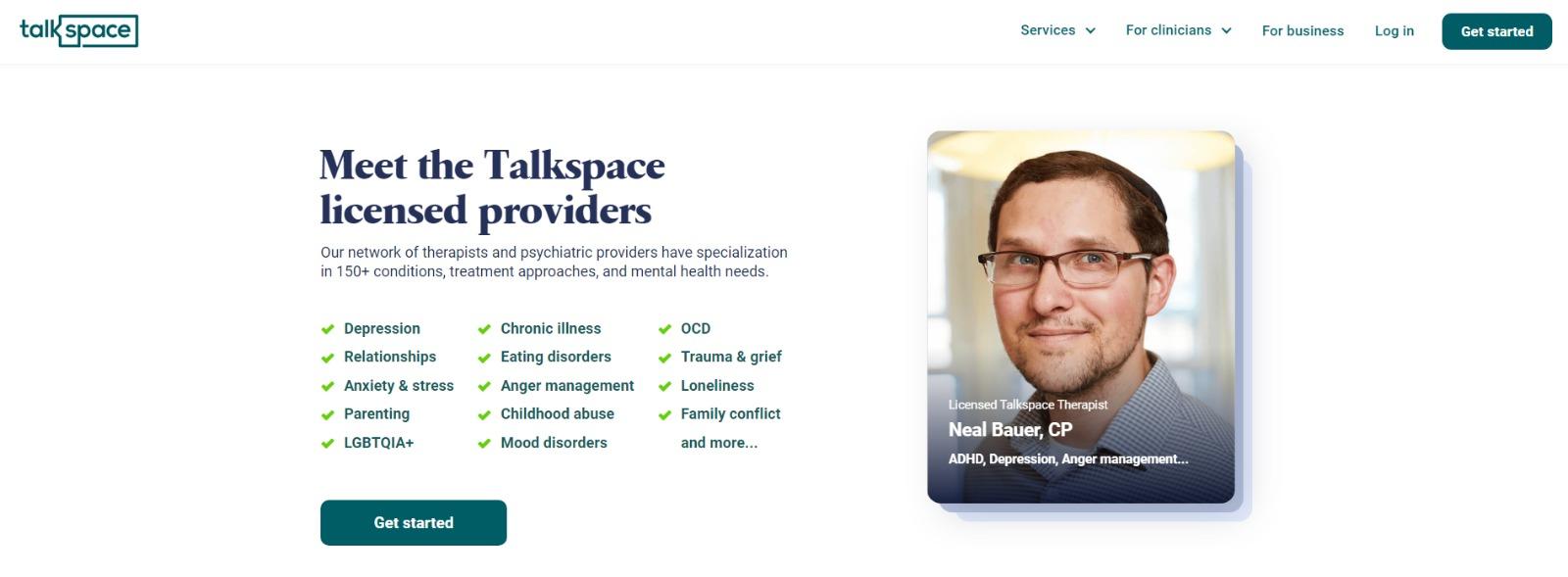
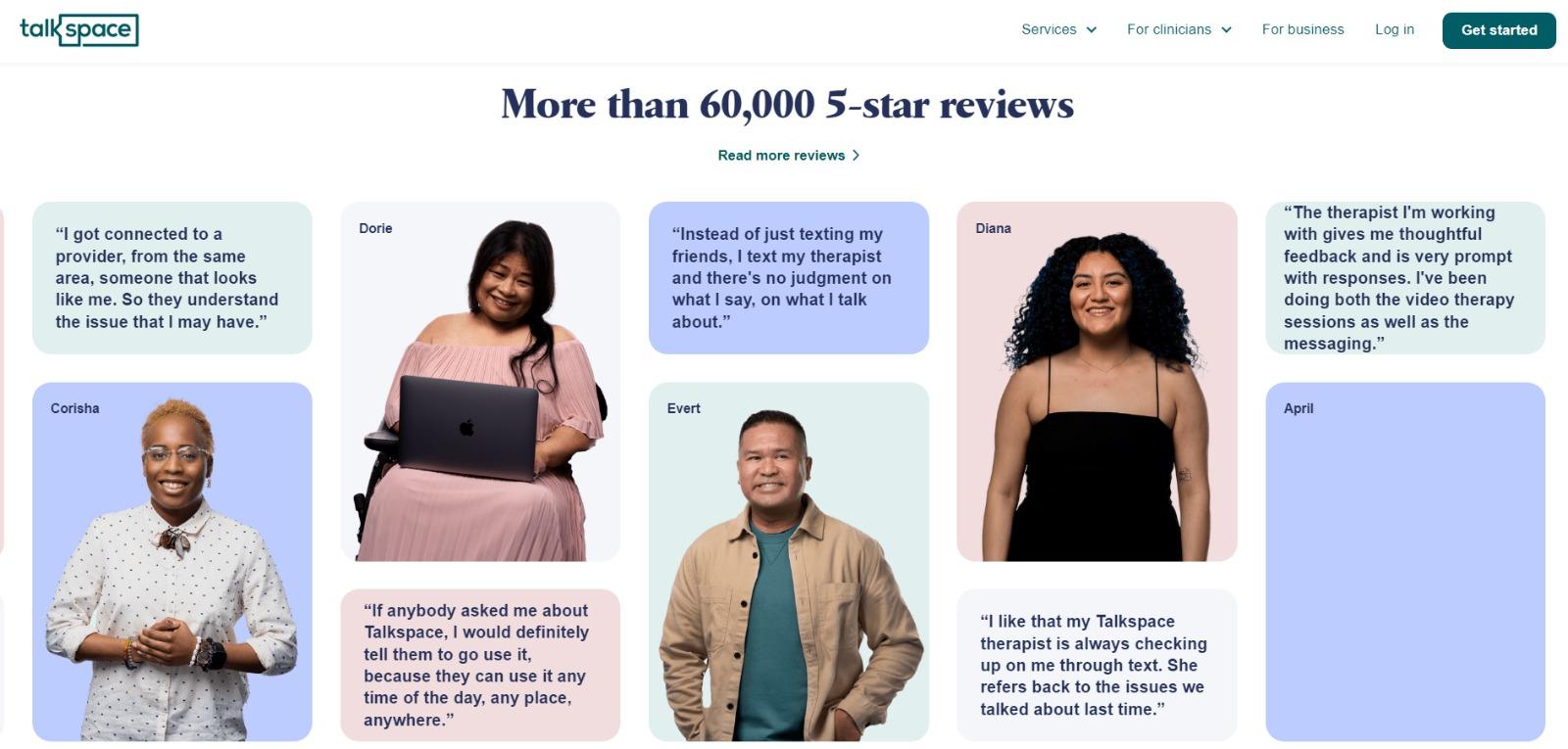
The use of shapes is also a clever idea. Overall, the layout is clean, inviting, and informative.
Why This Landing Page Works
- Color palette: Calming pastel colors perfectly match the brand’s message.
- Provides value: In addition to providing details about how Talkspace works, this page also provides several mental health resources and articles.
What Could Be Improved
- Nothing: This page has a great user interface and serves as a great starting point for mental health resources.
11. Nauto

Nauto, a data platform for self-driving cars, helps make autonomous driving safer for companies that manage fleets of self-driving vehicles.
Naturally, its customers would need all kinds of information to sell them on this platform. Nauto has it packaged into a super-simple ebook.
Its landing page gives you both a brief contact form and some preview statistics to prove why this resource is so important.
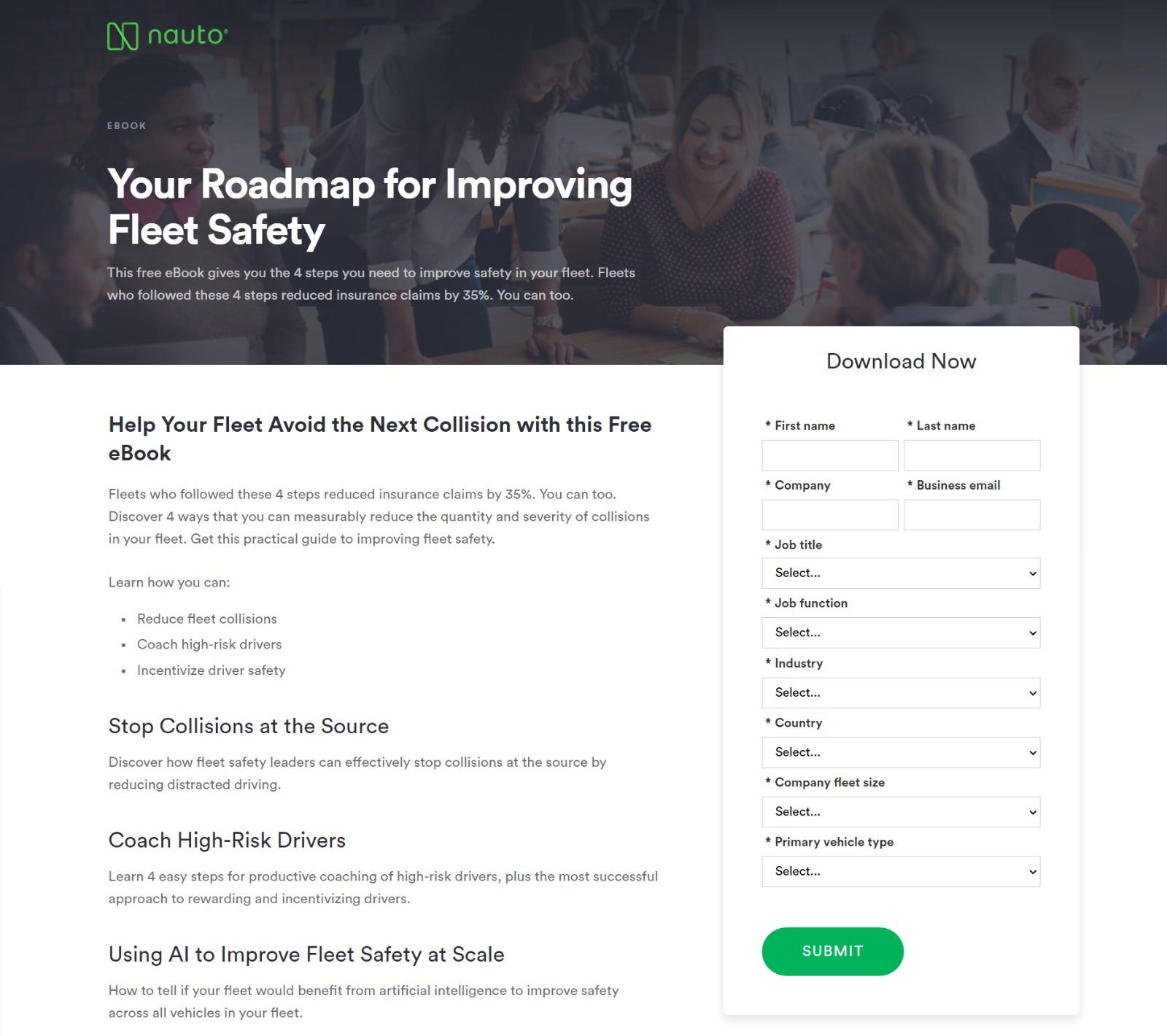
The green "Submit” button might've even been on purpose (on the road, green means go, after all).
Why This Landing Page Works
- Simplicity: No distractions on this landing page, which is perfect given the company’s focus on safe, self-driving vehicles.
- Smart white space usage: Nauto effectively uses a white background, showcasing a clean and purposeful design.
What Could Be Improved
- The form: 10 fields is too overwhelming.
12. Industrial Strength Marketing
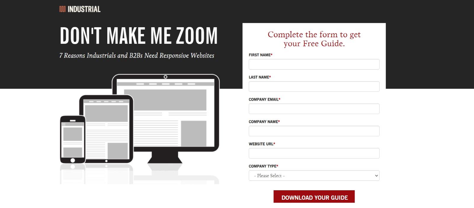
Right off the bat, this landing page pulls me in with a compelling, punchy header: “Don't Make Me Zoom.” It directly speaks to a common experience most of us have had when we‘re browsing on our phones or tablets — and it’s a little sassy, too.
But that‘s not the only thing keeping me interested in this landing page. Notice how the color red is strategically placed: It’s right at the top and bottom of the form, drawing you even closer to the conversion event.
Why This Landing Page Works
- Voice: The language is punchy and relatable, quickly drawing the reader in.
- Minimalist: The black and white color scheme with just a few pops of red really makes the sign-up sheet stand out. Additionally, the minimalist design works beautifully on mobile and desktop, with no pinching required.
What Could Be Improved
- Nothing: Both the mobile and desktop versions illustrate the perfect execution of a minimalist layout, which helps the reader navigate the site with ease.
13. Inbound Emotion
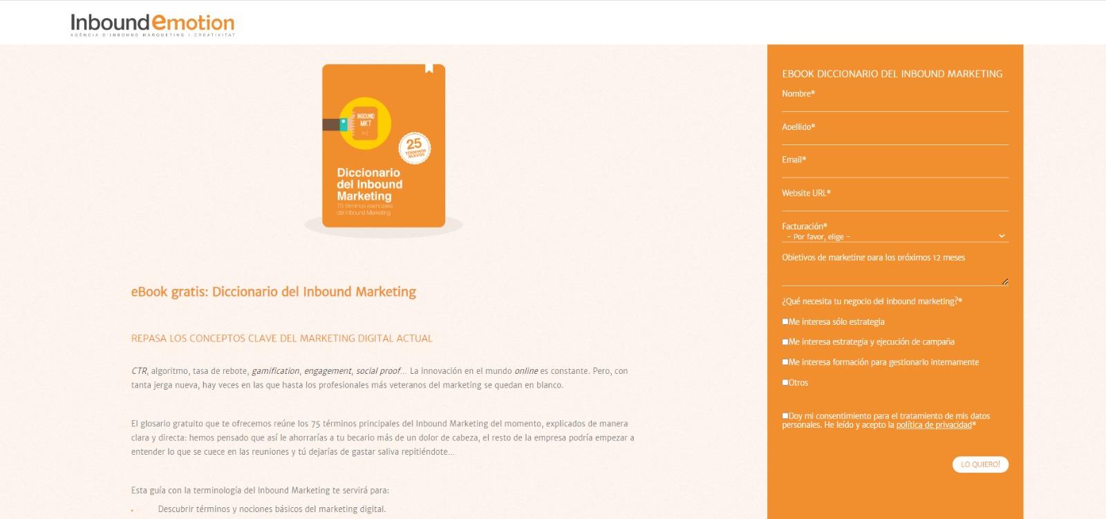
Even if you don't speak Spanish, you can still appreciate the conversion capabilities of this HubSpot partner site. My favorite feature of the page? The form stays in a fixed, prominent position as you scroll through the site.
I also love the simple layout and warm colors.
Why This Landing Page Works
- Fixed form: Having access to the form while scrolling provides a better user experience. No need to scroll back up to the top of the page to find it.
- Simple interface: The layout is simple but effective. The use of only two shades of orange gives a monochrome feel and keeps the focus on the benefits of the ebook.
What Could Be Improved
- Make the form brief: There were six items to fill out, not including the checkboxes option at the end. Longer forms could be a turnoff for some visitors.
14. IMPACTBranding & Design
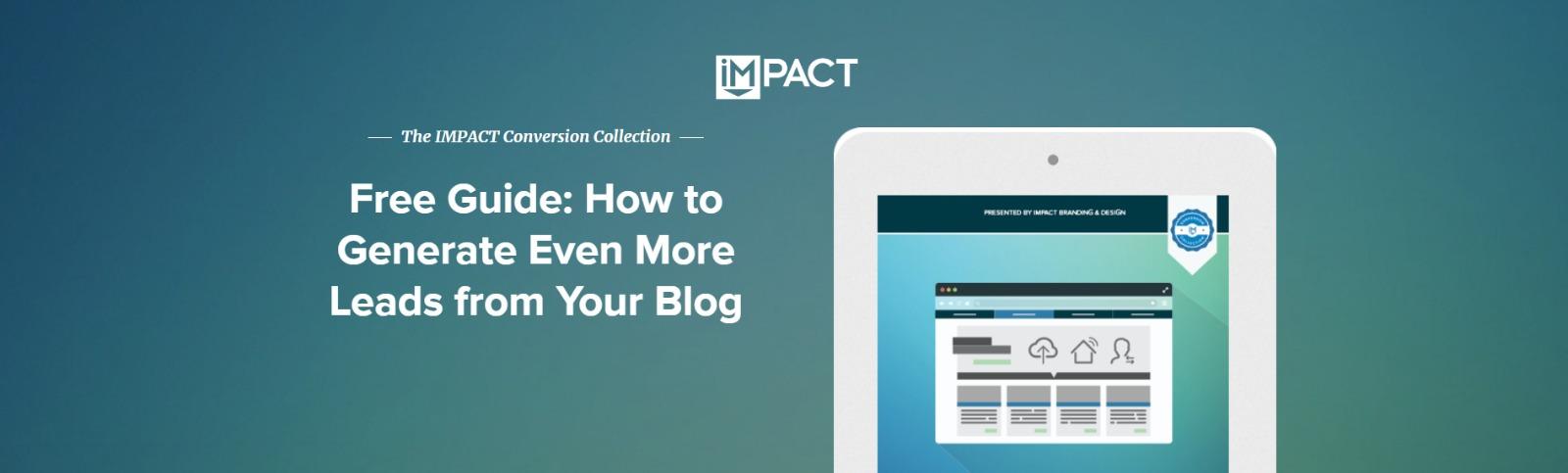
Full disclosure: IMPACT is a HubSpot partner — but that‘s not why they’re included here.
IMPACT's landing pages have long been a source of design inspiration.
I love the simple layout of the page, from the large headline copy and detailed featured image, to the outline that surrounds the form, to the colors and fonts that are very pleasing to the eye.
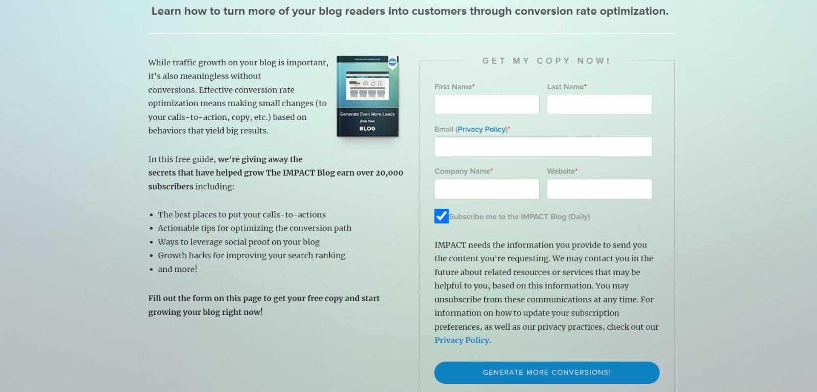
The free guide IMPACT is offering for download here also doesn't emphasize the download itself in the blue button that allows you to submit your filled-out form.
Rather, IMPACT is inviting you to “generate more conversions” — putting the focus on what you stand to gain as a result of reading the guide.
Why This Landing Page Works
- Clever messaging: You’re not downloading an ebook. You're learning how to “generate more conversations.” This rephrasing is far more enticing than simply putting a regular download button.
- Simple use of color and fonts: The blue tones work really well on this landing page, giving it variety while keeping the look cohesive. Since there’s lots of text on the page, a simple font is perfect.
What Could Be Improved
- Nothing: This page encourages downloads in a clever way using a simple layout and colors.
15. Unbounce
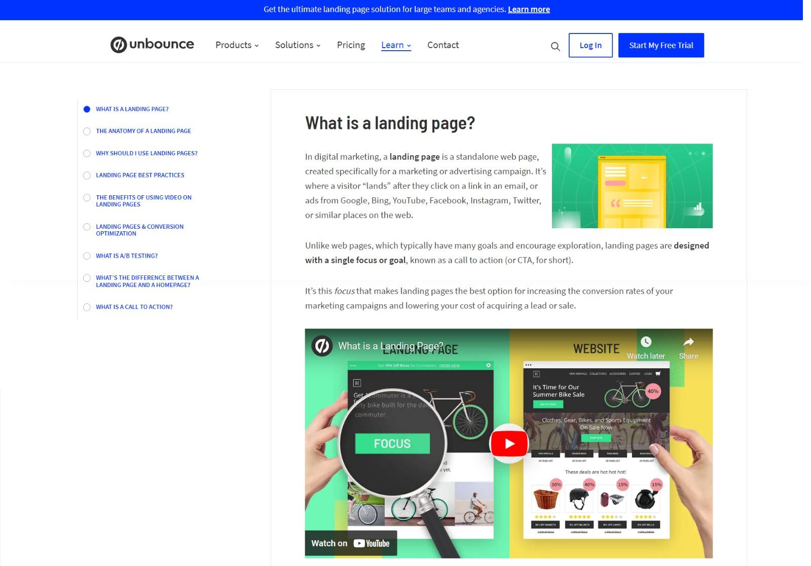
It‘s no surprise Unbounce made this list — they’ve actually written the book on creating high-converting landing pages.
Although there are many amazing things about this landing page, I absolutely love the sidebar menu and lots of visuals.
Unbounce is really skilled at providing visitors with the information they need, but also what they didn’t know they needed until they landed on the site.
Why This Landing Page Works
- Gives visitors options: When it comes to accessing the course, users can either click the main button above the upper half of the page or, if they’ve been scrolling, click on the course from the sidebar on the left. Eliminating the need to scroll back up to the top of the page.
- Sometimes more is more: In addition to the course, Unbounce provides visitors with industry-specific reports and answers to other landing page-related topics. Providing even more useful information sets Unbounce up as a trusted authority in their field.
What Could Be Improved
- The descriptions: The course offers several modules, and it would be helpful if some offered a brief description. The sidebar menu offers a course list, but a short sentence summarizing what visitors can expect to learn would be helpful.
16. Bills.com
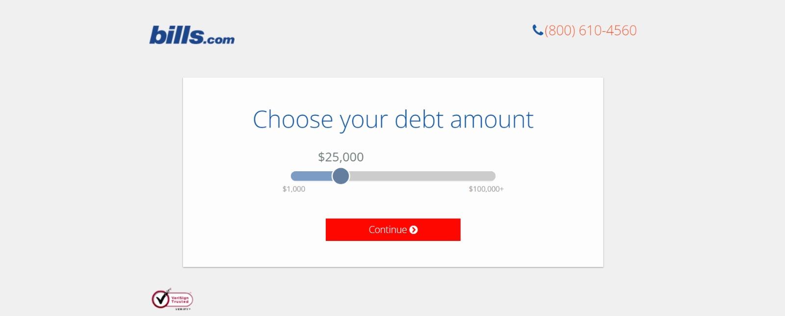
Often, people think landing pages are static pages on your website. But with the right tools, you can make them interactive and personalized.
Take the example above from Bills.com. To see if you'd benefit from their consultation, you answer three questions before you are shown a form.
Then, you answer two more questions, like the one below:
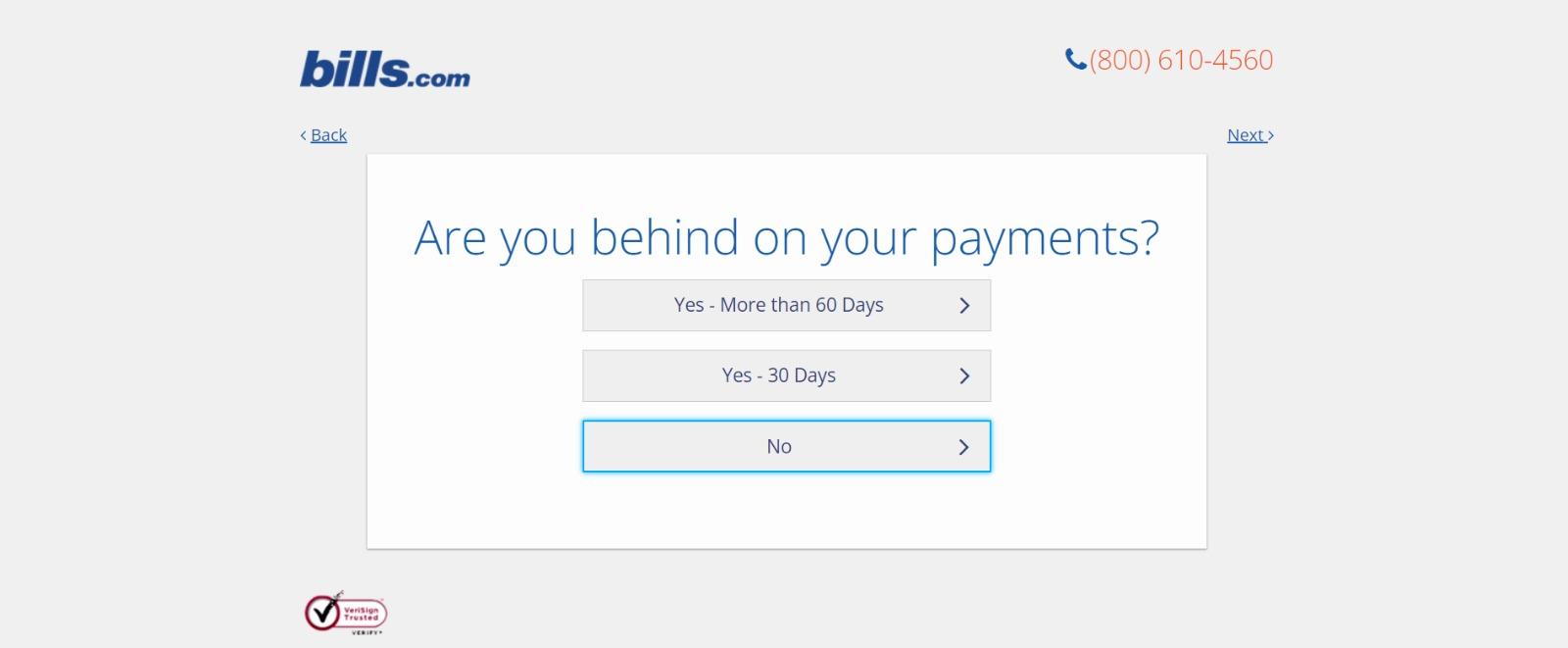

And here's the final landing page form where you fill out your information:
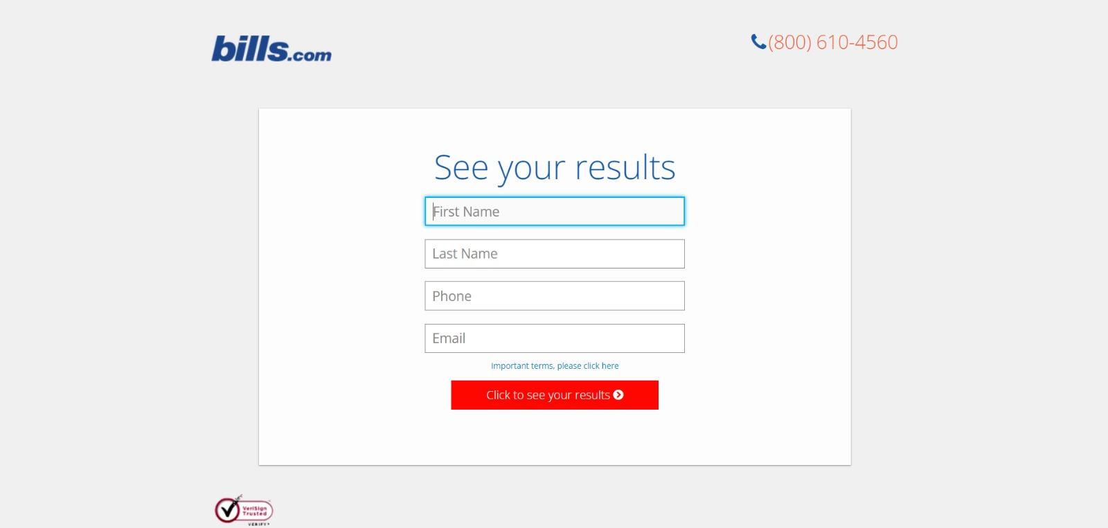
I‘m not sure how the algorithm works (or if there’s one at all), but while I was filling it out, I had some anxiety about not qualifying.
Once I found out I did, I was excited to fill out the form, which I'm sure most people who are in debt and using this tool are.
By making this offer seem more exclusive before the form appeared on the landing page, I'd bet that Bills.com increased conversions pretty significantly.
Why This Landing Page Works
- Exclusivity: Everyone likes to feel special, which is why exclusivity works so well. The page gives the impression that the offer isn’t given to just anyone. You have to qualify first.
- Interactivity: Anytime you can get users to interact with the page, even if it’s something as simple as using a form with a sliding bar question.
What Could Be Improved
- More color: While the site is geared toward not-so-fun topics like bills and debt, it doesn’t mean it has to be boring. The gray leaves much to be desired.
17. Zillow
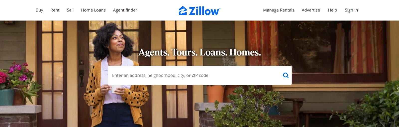
Zillow did something very similar to Bills.com with their landing page. It starts with a simple search bar asking for a neighborhood, city, ZIP code, or address. Sounds creepy, but don’t worry.
This form field is set on top of a hero image featuring a woman stepping out from home.
Of course, the address itself won‘t be enough to get a true appraisal value of a home. It just denotes the home’s neighborhood. It’s a bit like playing The Price is Right.
You can guess how many homes in the area are worth and then type in an address to see how close you are. If you want to learn more info about a property, Zillow then prompts users to sign up to continue.
Why This Landing Page Works
- Simple access: Users can get all the information without signing up.
- Establishes authority on the topic: Zillow has access to so much housing and neighborhood data. It’s no wonder they are one of the top home search sites in the nation.
What Could Be Improved
- Nothing: The Zestimate page is simple but effective. Those with concerns about what a Zestimate is and how it’s calculated have easy access to the homebuying FAQ on the second half of the page.
18. Landbot
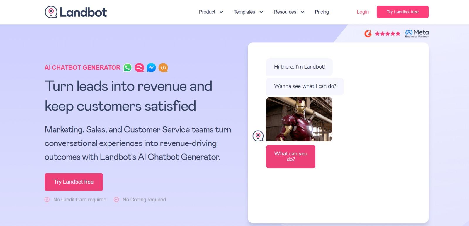
Landbot, a service that creates chatbot-based landing pages, puts its own product front and center on its chat-fueled landing page.
Visitors are greeted by a friendly bot —complete with emojis and GIFs —that encourages them to provide information in a conversational format instead of via a traditional form.
Why This Landing Page Works
- It’s fun: From the bright colors to the GIFs, this page keeps visitors engaged and entertained.
- Show, not tell: By having the chatbot right on the page, doing its thing, potential customers can see exactly what they’re getting. The whole experience simulates what it’s like to use Landbot’s product.
What Could Be Improved
- Nothing: Landbot’s use of a live demo, testimonials, highlighted integration features, and detailed breakdown of how the product works leaves new customers ready to sign up at first glance.
19. Webprofits
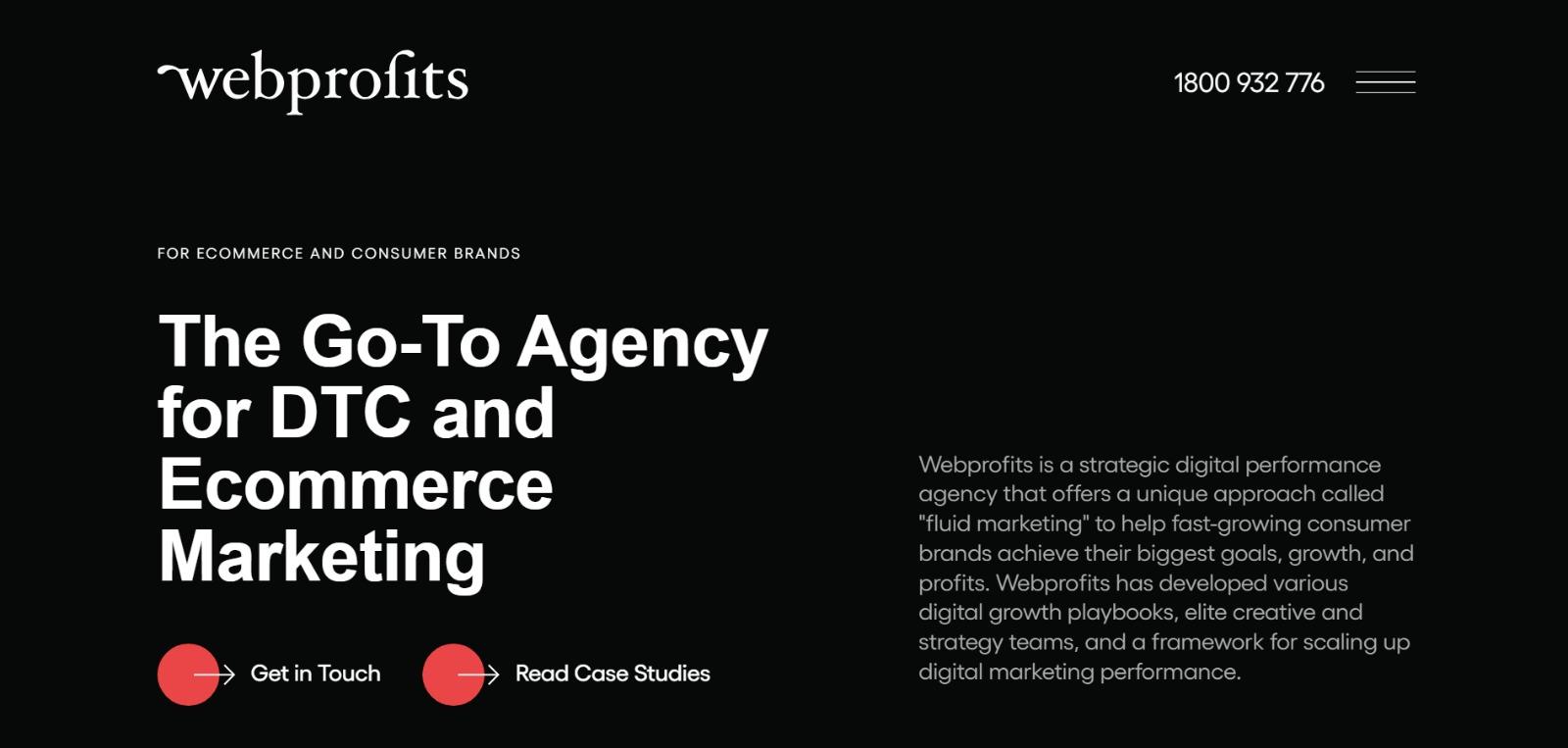
Like Industrial Strength Marketing mentioned earlier, Webprofits also makes great use of a predominantly black, white, and red color scheme. The result is a clean layout that makes great use of the pops of color on the page.
It’s a testament to the organization's expertise in digital marketing and UX design.
They also make it easy for you to figure out what Webprofits actually does. The rest of the page offers detailed case studies.
Why This Landing Page Works
- Informative, but not overwhelming: There’s a lot of information and text on this page, but the use of well-placed graphics and videos helps break things up.
- Multiple CTAs: Placing the same CTA throughout the page makes it so visitors don’t have to scroll all the way to the top to “Talk with Webprofits” or “Get in Touch.”
What Could Be Improved
- Nothing: Webprofit makes great use of the long landing page format, packing in all the pertinent information visitors would need in one place with a visually appealing experience.
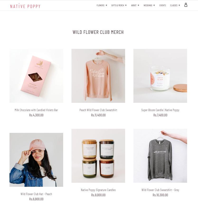
20. Native Poppy
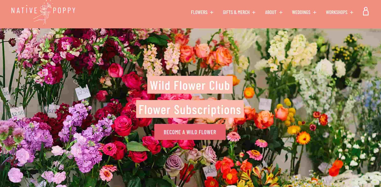
Sometimes, you‘ve just got to stop and admire a landing page for being beautiful. Using high-resolution photography and lots of white space, Native Poppy’s landing page is a pleasure to look at.
Aside from its beauty, the page has some great elements: a clear and delightfully pink CTA, an informative “How It Works” section, testimonials, and an FAQ at the bottom.
Best of all, it plays with language, ditching the phrase “become a subscriber” for “become a wild flower.” I don’t know about you, but I’d much rather be a “wild flower” over a subscriber any day.
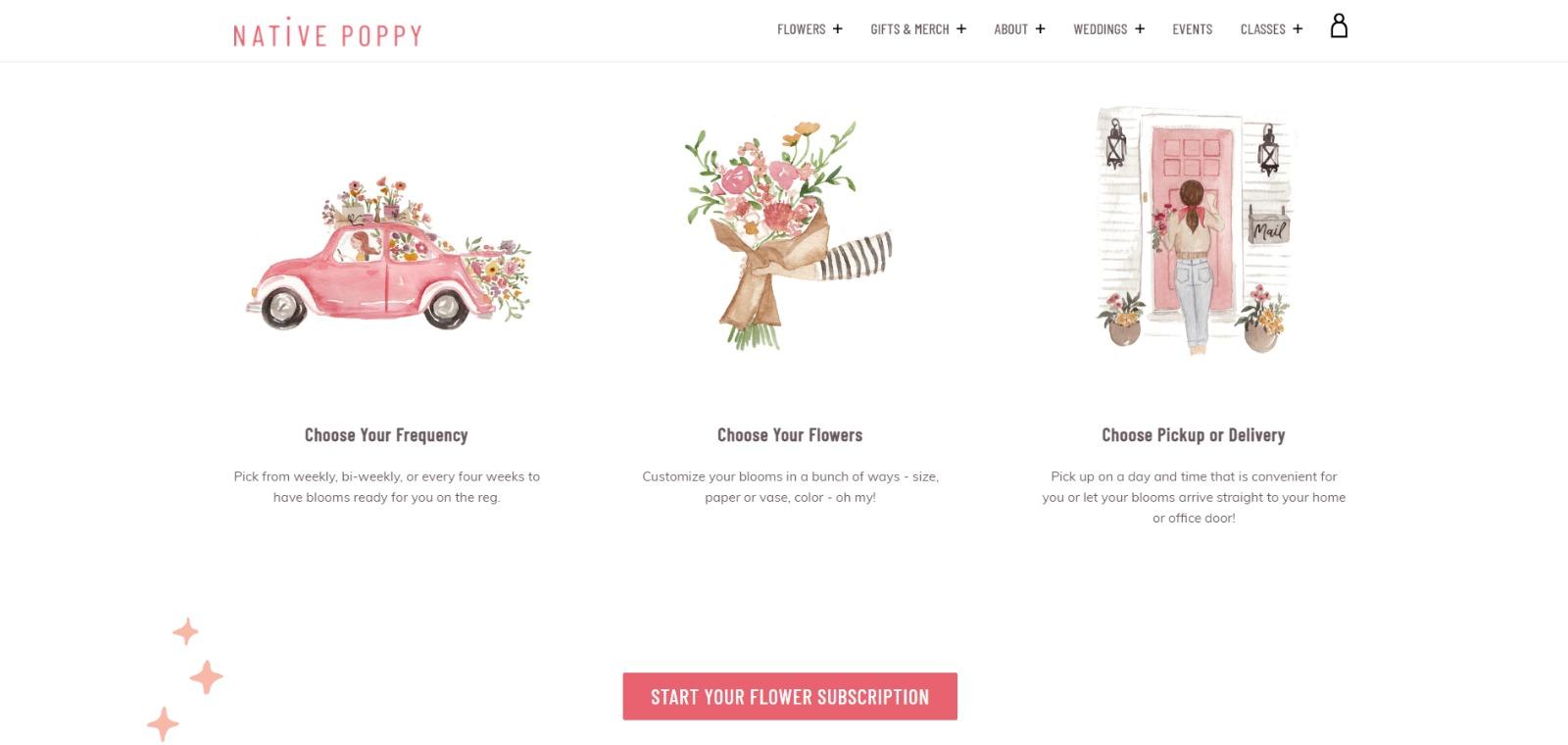
Why This Landing Page Works
- Captures brand voice: The layout of Wild Poppy mirrors the whimsical vibe of the brand. From the photos, font choice, and “wild flower” subscription, all the messaging works in harmony.
- Persuasive: By highlighting all the perks and discounts of being part of the subscription program, it entices customers to join.
What Could Be Improved
- Form visibility: While there are multiple CTAs, it would have been nice to have the form fields on the page for faster sign-up or as a pop-up after clicking.
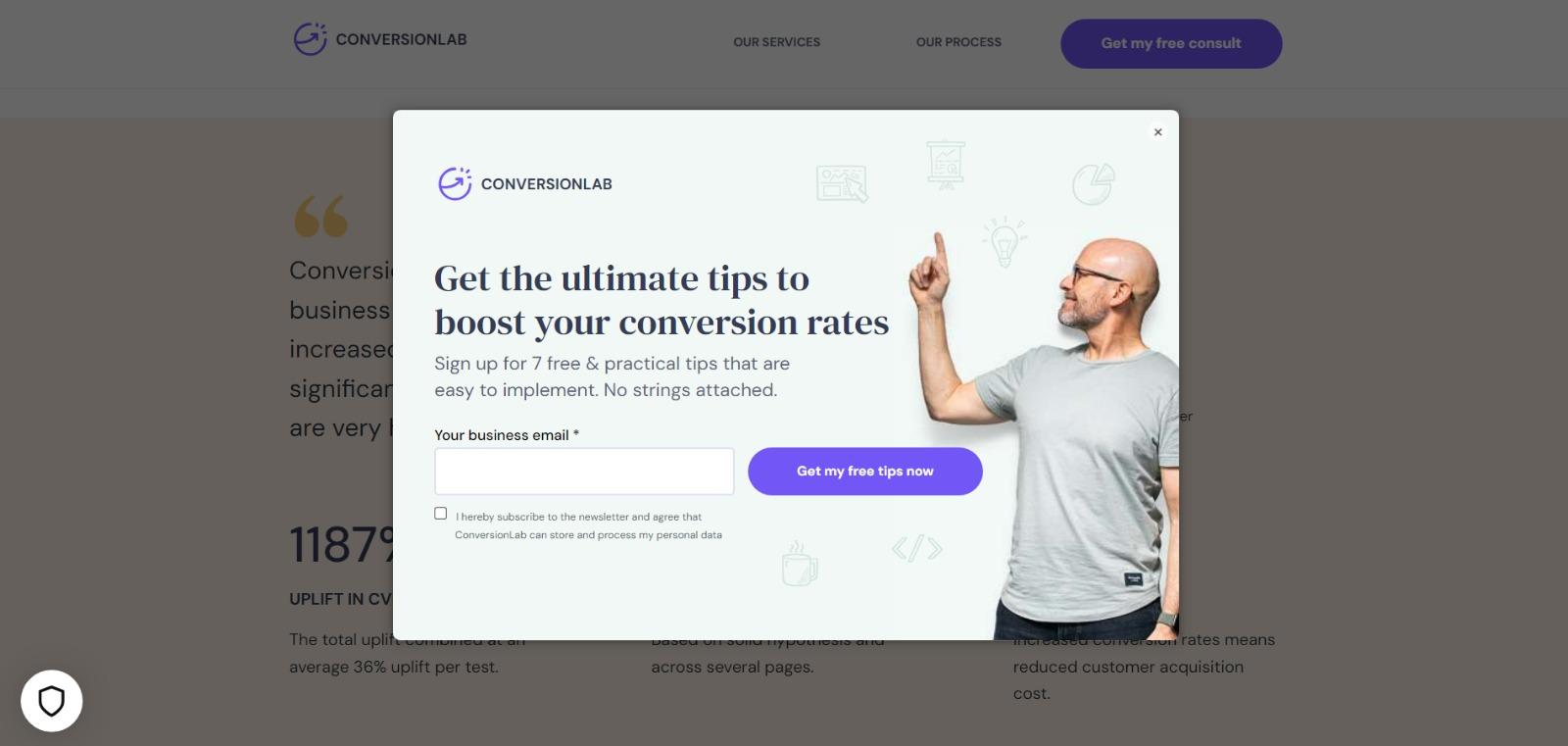
21. Conversion Lab

While I wouldn't typically include an example of a homepage with a form on it in a post about landing pages, this website is special. The homepage is the entire website — the navigation links just take you to the information below.
When you click “Get My Free Consult,” the entire page darkens to highlight the form. See what it looks like before you click on the photo above.
And, when you click that CTA, check out how the form appears:
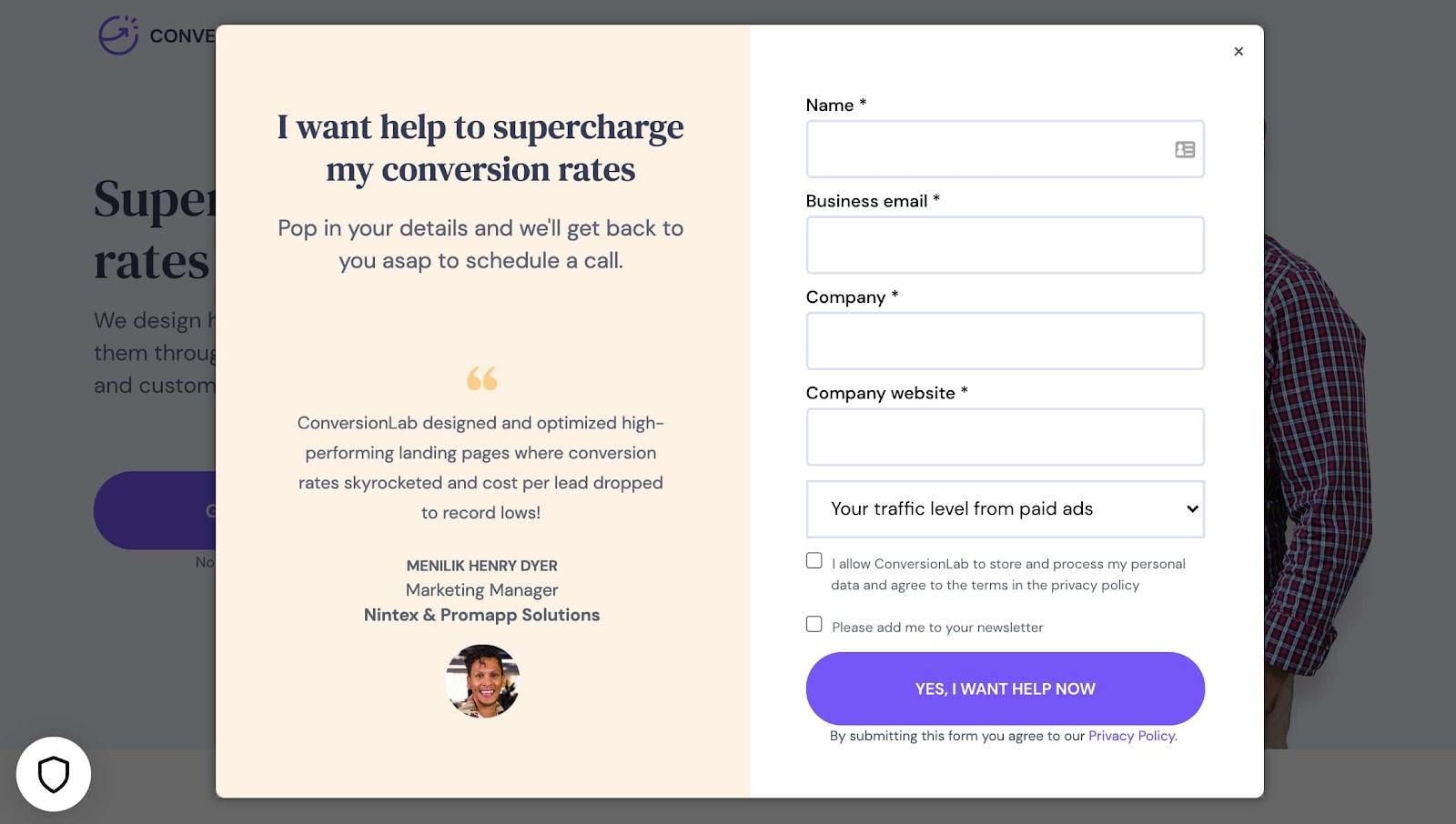
It’s a similar function when clicking on any of the headings on the page. Instead of taking you to a different page, it simply jumps to the corresponding section on the homepage.
I love how you don't have to leave the page to fill out the form or view any of the features, creating a seamless user experience.
Why This Landing Page Works
- Creative: Having a homepage that also functions as various landing pages makes Conversion Lab unique. Best of all, it still provides a pleasant user experience.
- Organized layout: Despite having the homepage and landing pages as one, the page doesn’t feel cluttered or busy at all.
What Could Be Improved
- Form placement: It would be nice if the form maybe opened up on one side so visitors could still read the content on the rest of the page.
22. Taboola
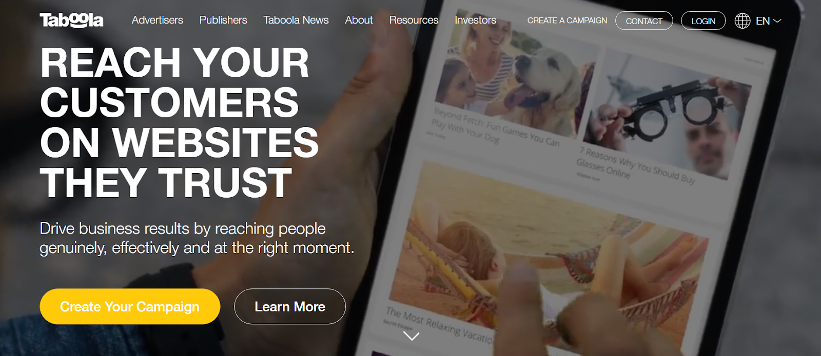
The first thing that grabs attention on the Taboola page is the big headline in capitalized letters. The message really stands out against the dark background, and I love the pop of the yellow bubble around the CTA button.
Plus, there‘s a super easy-to-spot “Learn More” button, so you don’t have to scroll through the whole page for more info.
Why This Landing Page Works
- Bold message: The big headline immediately convinces visitors.
- Simplicity: Clear and simple design makes it easy to understand and navigate.
- Color combination: The black, yellow, and white combo is effective for improving readability and conveying a modern and energetic vibe.
What Could Be Improved
- Nothing: The page is already great with its clear message and eye-catching colors.
23. Casper
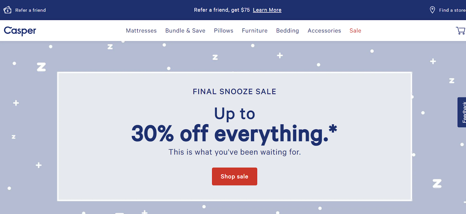
Casper usually has big discounts right on the main page that change depending on the season and collection.
For instance, in this example, we can see the final snooze sale offering a 30 percent discount on everything, perfect for those in need of a new mattress or bedroom upgrade.
The design is minimalistic and kinda relaxing, matching their vibe of selling good, quality sleep.
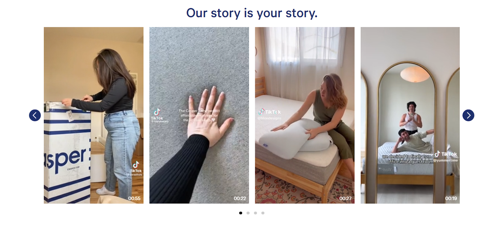
Keep scrolling, and you'll find a cool section I love on the site — UGC. Those TikTok videos make the site feel real and leave you wanting to try products.
Why This Landing Page Works
- Quick access: Product categories are right at the page’s center, making it easy to find things quickly.
- Highlighted CTA: The “Shop Now” button catches the eye with its vibrant red color against the light tones.
- User-generated content and reviews: Real TikTok videos and customer feedback make the site authentic and trustworthy.
What Could Be Improved
- No pop-up chat: The chat button only pops-up on the mobile version. It would be great if it was also on the desktop for easy access to customer support.
24. Merrill Edge
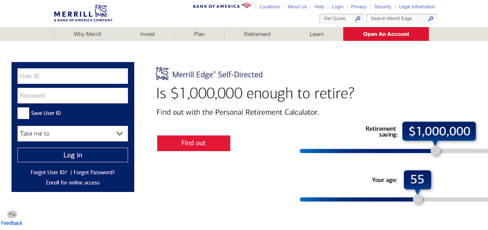
If you need inspiration for your finance site, check Merrill Edge.
The first thing you notice here is a personal retirement calculator that prompts you to click and make some calculations. Although it seems like a calculator at first, it's actually an image that you need to click, leading you to the real calculator.
In my opinion, that's a minor drawback.
The combination of colors is effective, showcasing the colors of the US.
Why This Landing Page Works
- Matching colors: The page has nice colors that match the US flag, making it visually appealing.
- Sign-up form: The sign-up form is right there, easy to see, making it simple to get started.
- Dual search bars: With two search bars — one for quotes and another for site navigation — finding information is simple and efficient.
What Could Be Improved
- Visual appeal: The website would be more attractive if it had more images. Even though finance and stocks involve a lot of written information, adding pictures can make the content more engaging and easier to understand.
25. Munchery
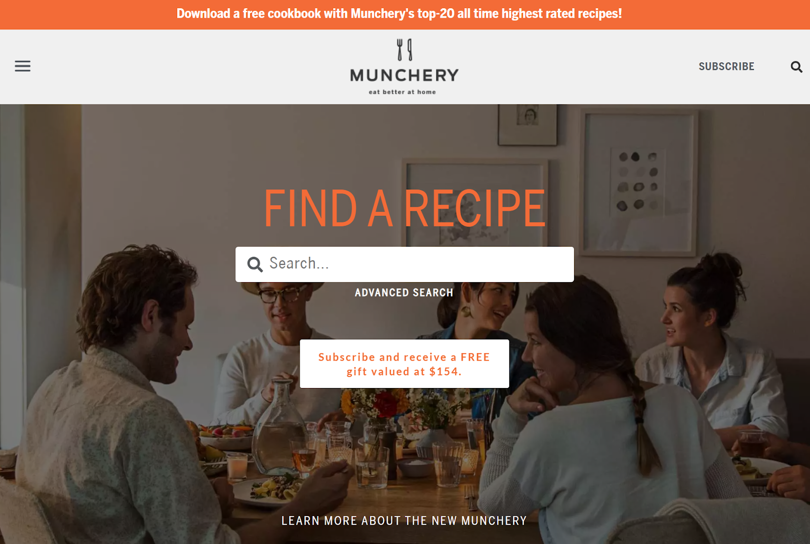
For discovering awesome recipes, check out Munchery. When you land on the website, there's a handy search bar where you can find the recipe you want with just one keyword.
I love the cool, dark background with real people enjoying their food at a table.
Right below the search bar, there's a subscribe button and a chance to win a free gift worth $154 — super enticing!
When you scroll down, you'll find neatly organized recipes, from burgers and grilling to vegetarian dishes.
Why This Landing Page Works
- Easy recipe search: Find recipes quickly with a simple keyword search.
- Attractive colors: The vibrant orange colors break the monotony of black and white.
- Clear categories: Well-organized recipes and simple navigation.
What Could Be Improved
- Nothing: Munchery has a great page setup, making it easy to find what you need while looking pretty cool.
26. Zoom
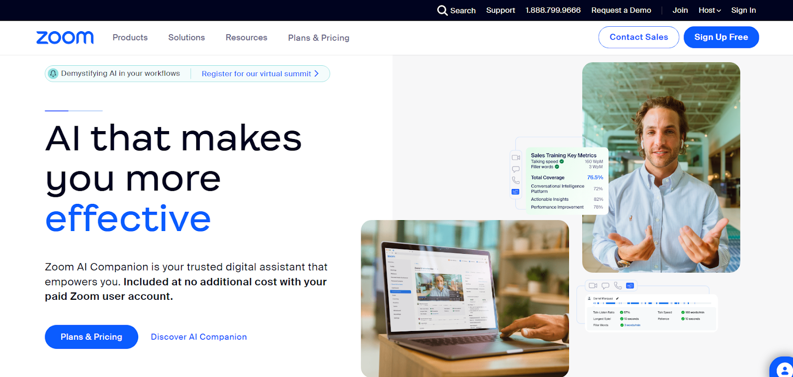
When you go to Zoom's page, the first thing you see is the Zoom AI Companion. The page is simple, showing how this AI makes you better at your job.
The buttons like “Sign Up” and “Contact Sales” are easy to find, so you don‘t have to search around. On the right side, there are cool sliding pictures, showing real people, numbers, and features. It’s a friendly start, inviting you to explore more.
Why This Landing Page Works
- Nice colors: The white and blue combo looks fresh and clear.
- Credibility: Partners and trust site reviews give the site credibility and trust.
- Good copy: The short and snappy writing is on point—easy to understand and grabs attention.
What Could Be Improved
- Information overload: The abundance of information and resources on a single page might be a bit overwhelming for users.
27. Domo
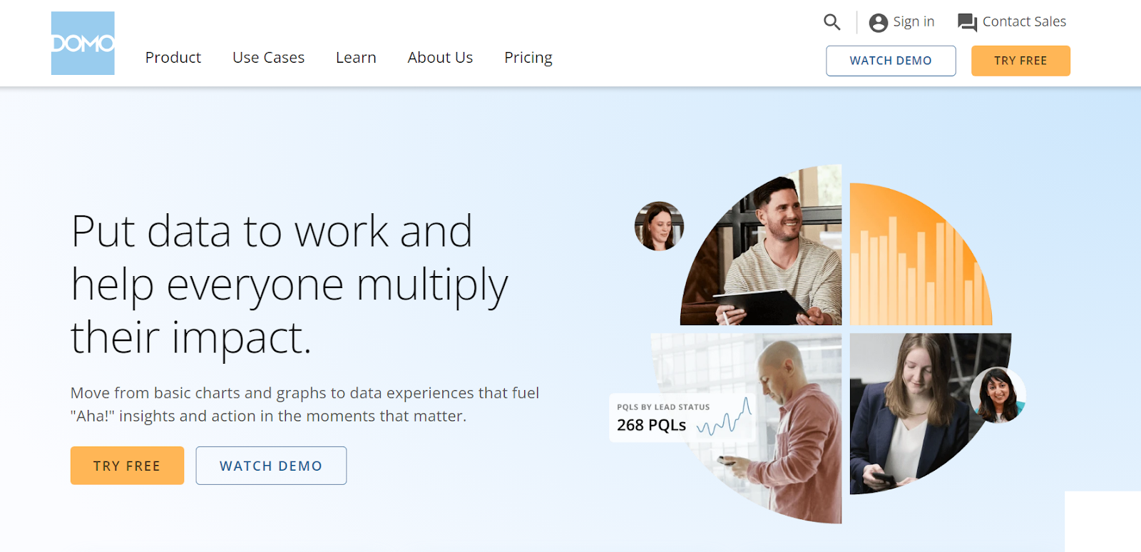
Domo turns data into super-smart decisions. The landing page is user-friendly and packed with helpful information.
And the colors? Soothing baby blue and vibrant orange — so easy on the eyes.
Cool visuals, quotes from happy customers, and buttons like “Watch Demo” and “Try Free” are right where you need them.
Domo also highlights industry recognition and real ROI stats, emphasizing the platform's credibility.
Why This Landing Page Works
- Clear menu: Easy navigation with categorized sections.
- Engaging visuals: Images, quotes, and logos improve visual appeal and credibility.
- Simple actions: Prominent buttons encourage immediate engagement.
What Could Be Improved
- Nothing: This page is clear and uncomplicated. It’s easy to absorb information and visuals.
28. Netflix
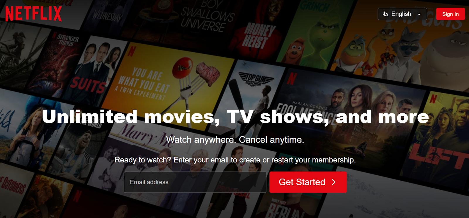
Netflix's landing page cannot be simpler and better at the same time.
It strategically places the email sign-up feature right in the center. After you enter your email, it takes you to the account setup or login page (if you already have an account).
Crystal-clear CTA and slick, streamlined steps ensure hassle-free navigation for users of all ages.
Why This Landing Page Works
- Easy talk: Netflix talks in simple words. No need for a dictionary — just straightforward info.
- No puzzle: Everything in the offer is laid out neatly and cleanly.
- Attractive design: Cool movie and series pics in the background, and that irresistible red and black combo makes the page look fantastic.
What Could Be Improved
- Pricing plan: It would be a good idea to put the prices where people can easily see them, instead of FAQs.
29. Constant Contact
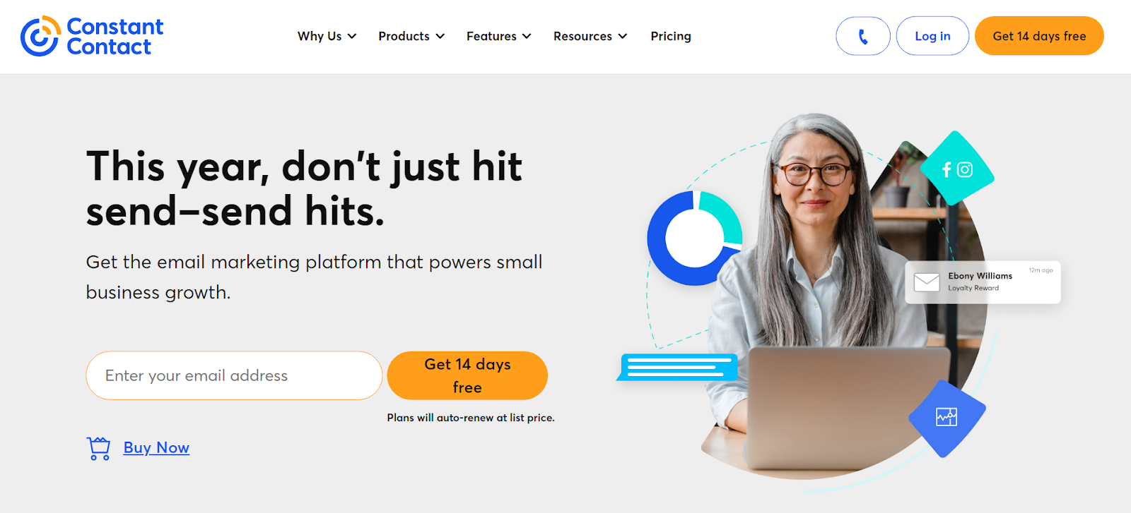
Upon opening Constant Contact, I fell in love with the clear and organized layout.
The tagline, "This year, don't just hit send–send hits," also caught my eye immediately.
Simple. Effective. Amazing.
Explore what you need by entering your email and testing out a 14-day free trial.
Also, you can't miss the badge proudly declaring Constant Contact as the top email marketing agency in summer 2023, so you know they mean business.
Although there are many colors on the site, Constant Contact strikes that sweet balance for an awesome user experience.
Why This Landing Page Works
- Cool words: The writing is catchy and makes you want to learn more about the offer.
- Easy to get around: Finding stuff is easy because of flawless organization and categorization.
What Could Be Improved
- Communication choices: You can call or email for help, but adding a chat option would offer a better way to communicate.
30. WordStream
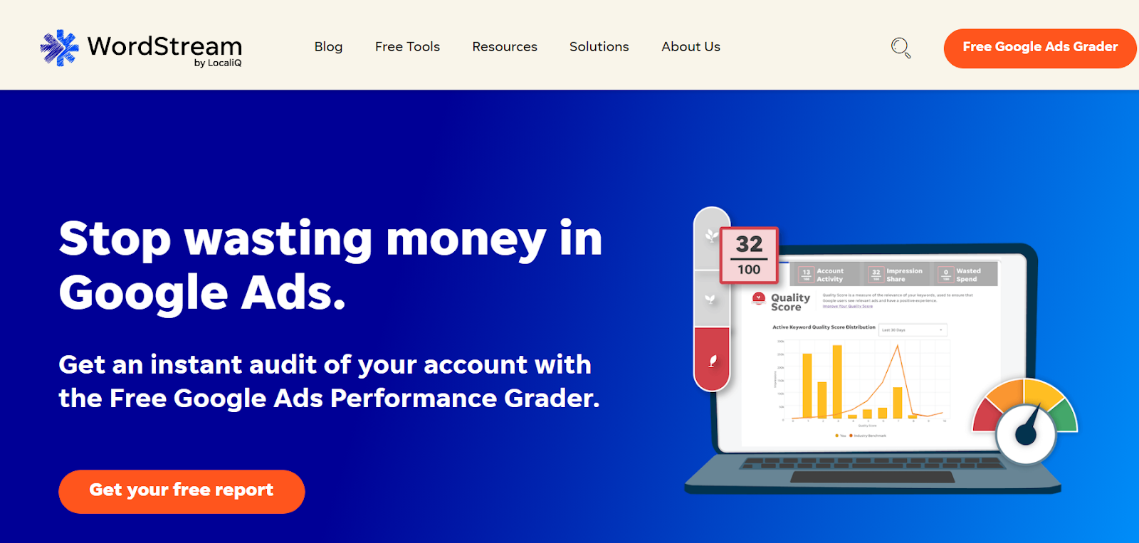
Talking about good copies, WordStream also knows how to capture attention with a single catchy sentence.
Right on the landing page, there’s a freebie with the Google Ads Performance Grader. The laptop flaunts a bold image, drawing attention to quick audit reports and tempting you to hit the “Grade My Account” button.
If you keep scrolling through the page, you'll see the Free Keyword Tool and many helpful blog posts.
Trust builds up with impressive stats on LocaliQ's success, while features like demo scheduling and newsletter sign-ups improve the overall experience.
Why This Landing Page Works
- Effective messaging: Clear and compelling copy on the landing page to communicate the value proposition.
- Visual appeal with data: Engaging graphs and numbers for credibility and persuasive impact.
- Bullet points: Quick and easy scanning of key information.
What Could Be Improved
- Contact section: It'd be good to add an email option in the contact section, as many users prefer email communication over phone calls.
31. Lyft
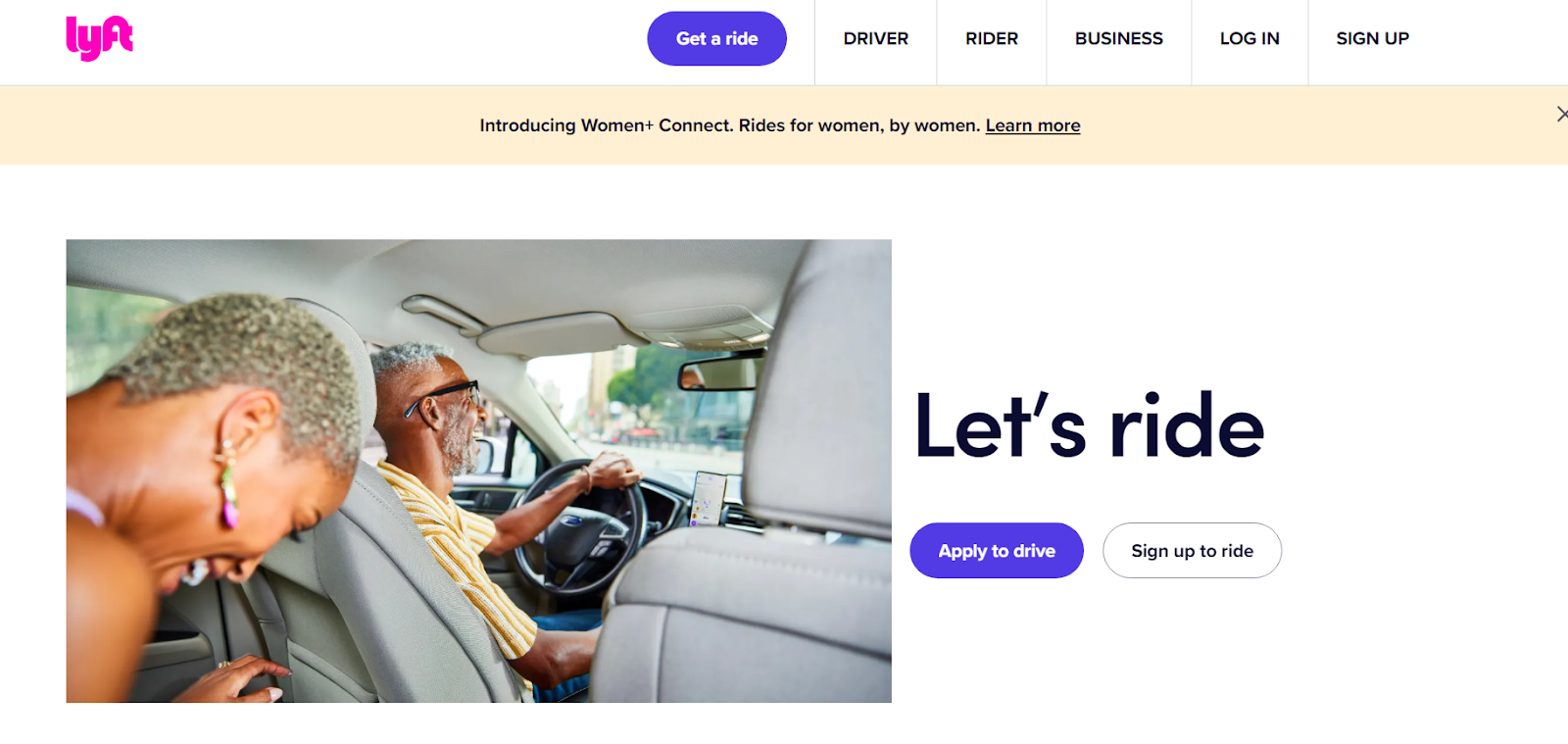
The Women+ Connect by Lyft page looks cool and has a girly vibe — nice pics, minimalistic design, catchy messages, and a clear layout.
It talks about rides for women and how they can make money with Lyft. The words are short and simple, saying women can drive on their own terms.
Lyft’s landing site also talks about fun things like different ways to travel and special benefits for members.
Why This Landing Page Works
- Clean design: A simple, clutter-free design for easy navigation.
- Real-life pictures: Images with real people add an authentic feel.
- Easy option exploration: Find and understand all choices with a user-friendly layout.
What Could Be Improved
- Nothing: I don't want to play favorites, but the girly vibe on this landing page is just awesome. Everything is clear, easy to find, and super cool.
32. OptinMonster
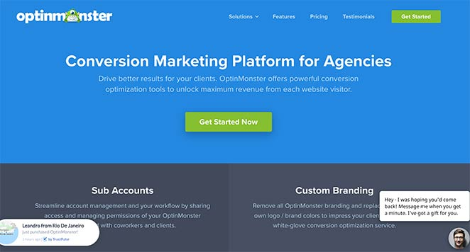
OptinMonster is one of those sites that might not sweep you off your feet in terms of design, but its functionality is top-notch. I like the tidy layout — everything is well-categorized and structured.
There are pictures and videos next to the explanations to help you understand the features better.
When you scroll down a bit, you can see the results and figures constantly cycling and updating.
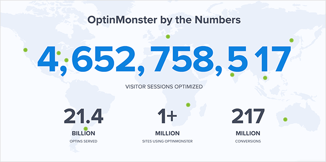
Why This Landing Page Works
- Page sections: Well-organized page sections and categories.
- Live chat: If you have further questions, you can get answers immediately.
- Testimonial slider: Real customer opinions in a cool sliding format, making it look attractive and reliable.
What Could Be Improved
- The copy: The copy would be better with a stronger emphasis on “you” instead of relying heavily on “our” or “we.”
33. Codecademy
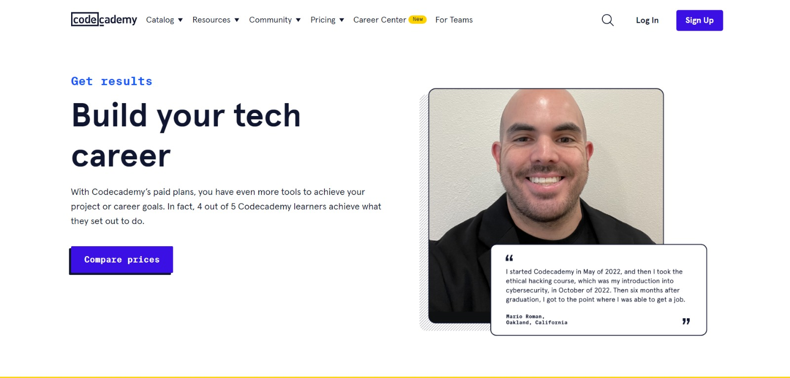
Codecademy‘s landing page is a mix of authenticity and functionality. They kick things off with a real person’s testimonial, adding immediate credibility.
“Build your tech career” copy screams ambition right from the headline.
But what really rocks here are the videos featuring real learners sharing success stories. That’s the most relatable inspiration and motivation to get intrigued.
I also love the color scheme on the site. White, blue, and yellow always make me happy for some reason. They have a good vibe and can influence people to choose your service.
Why This Landing Page Works
- Testimonials: Video testimonials of previous successful learners give you a real feel of what's possible.
- Content: The landing page clearly shows what Codecademy has without making you read a lot.
- Nice colors: The mix of white, blue, and yellow looks good and makes you want to stick around.
What Could Be Improved
- CTA: The first button you notice on this page says “Compare prices.” However, it’d be good to replace it with a more engaging option like “Become the best tech expert in the country.”
34. Semrush
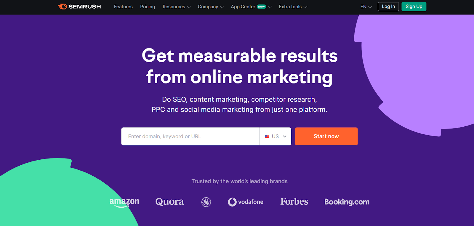
I can’t get enough of Semrush’s landing page for a few key reasons.
Firstly, they promise measurable results from online marketing, setting the tone and message right away.
The central search bar makes it super easy to jump into action by entering keywords or URLs. Right below, we can see partnership muscles with global giants like Amazon, Tesla, and Samsung.
The breakdown of services into categories with visuals and bullet points is informative and easy to catch. The testimonials and numbers add weight to their claims, showcasing the platform's popularity and awards.
Something that’s too cool to ignore is the CEO's presentation with a cartoonish hat.
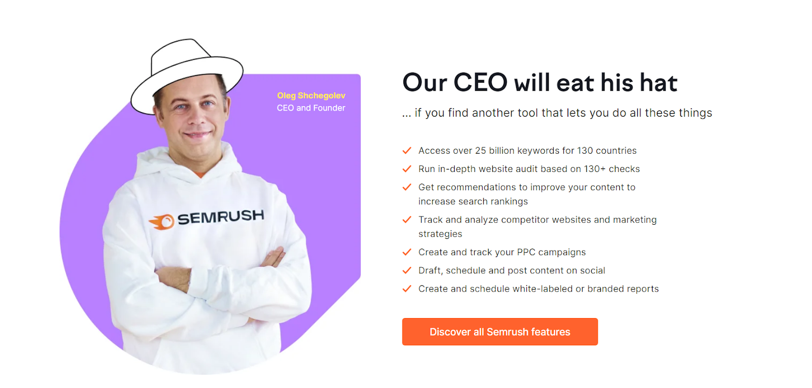
Semrush simply knows how to make it playful and professional at the same time.
Why This Landing Page Works
- Visual and Informative: Clear categories, images, and bullet points for an effortless understanding of the content.
- Credibility: Impressive testimonials and numbers highlight the platform's popularity and accolades.
- Coolness: The CEO's presentation adds a fun and cool vibe that sticks in your memory.
What Could Be Improved
- Nothing: No complaints at all.
35. Eiger Extreme by Mammut
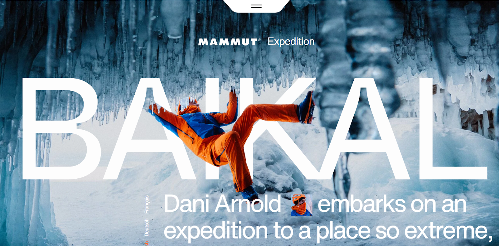
The most interesting site I explored is definitely the Mammut website for Eiger Extreme. The way they use moving pictures and that science lab font is absolutely fantastic.
I like how the top menu stays in place while you scroll down.
The small animations, like the temperature dropping, are also amazing and engaging.
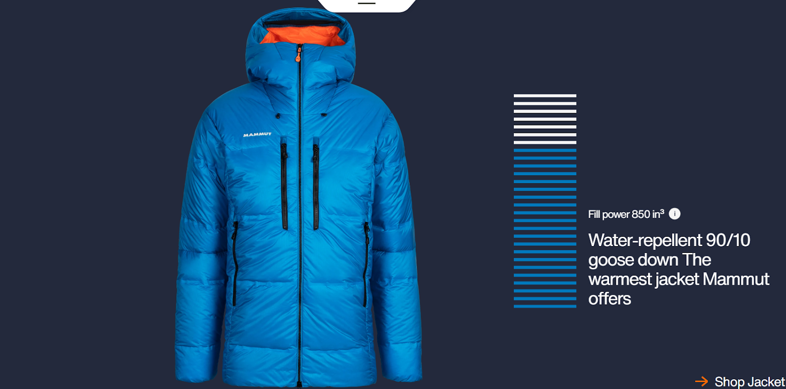
As you keep scrolling, different parts of the page show up, and it's easy to add things to the cart. The page has good pictures and sounds, telling a story about adventures.
So, once you open the site, you won’t feel like you’re in a typical online store; it will make you want to go outside and explore. And that’s the best part of it.
Why This Landing Page Works
- Visually appealing: Moving pictures and special fonts look amazing.
- Fun animations: The little things, like the temperature dropping, make the site fun to check out.
- Tells a story: The pictures and sounds tell a neat story about adventures.
- Unique: Something you haven't seen before.
What Could Be Improved
- Loading and scrolling issues: The page takes a while to load — it's a bit frustrating. It also stutters a bit when scrolling.
36. Hint
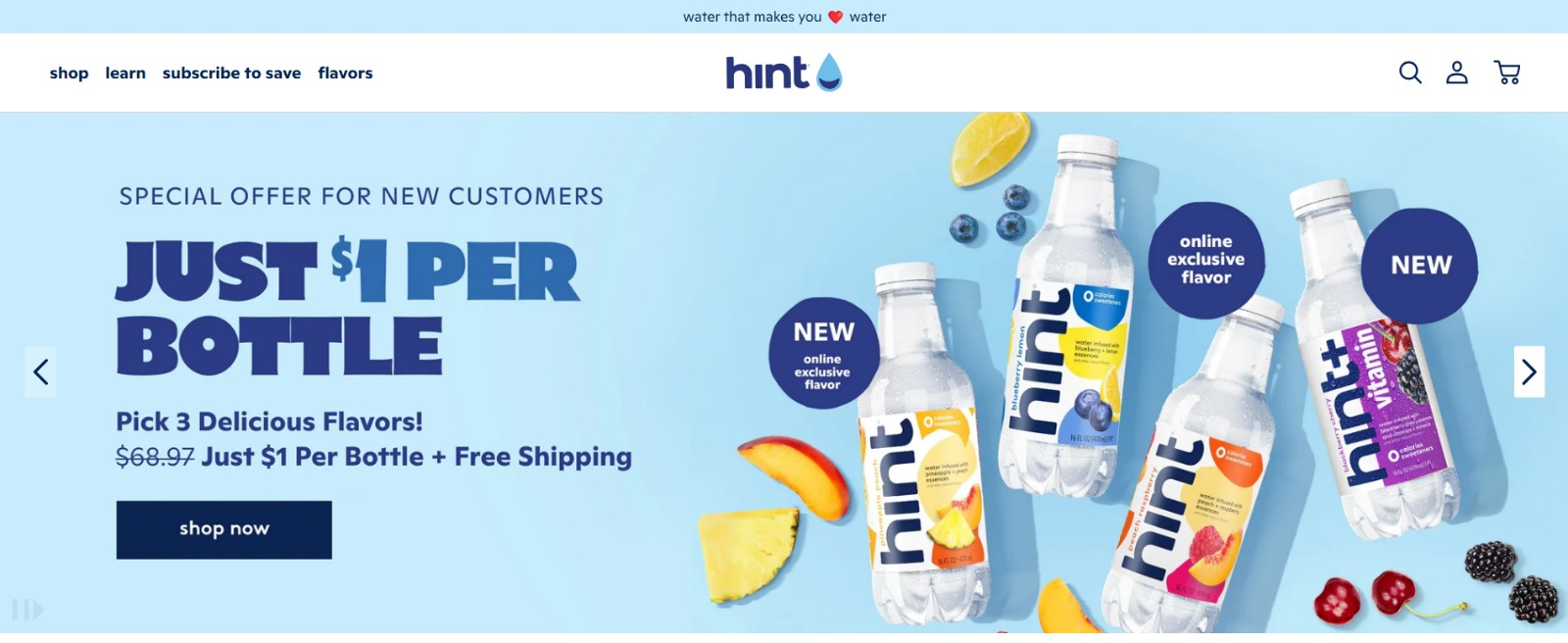
Hint’s landing page is a showstopper with its lively aesthetic. The imagery of ingredients and bottles pops against the serene baby blue background.
Placing the one-dollar-per-bottle offer in the focus is a brilliant move, instantly grabbing attention and interest.
There’s also an ability to put bottles into your cart directly from the landing page—not a common but definitely a convenient feature.
Why This Landing Page Works
- Smart offer placement: The one-dollar-per-bottle deal grabs attention right away.
- Easy shopping: Adding items from the landing page is super handy.
- Consistent brand look: The colors stay true to the brand's product.
- Organized sections and categories: Each part of the site is neatly laid out for a user-friendly experience.
What Could Be Improved
- Shift focus: Instead of so many discounts and offers, I’d like to see the product's qualities and benefits to provide people with a reason to buy.
- Real-life images: It would be good to include images of influencers and UGC showcasing how people enjoy the product. It makes it more relatable and appealing to potential customers.
37. Linkfluencer
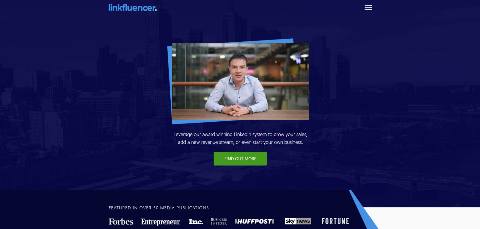
Linkfluencer helps you succeed on LinkedIn.
I like the friendly video from the founder explaining how things work. The whole site feels real with actual people, testimonials, and success stories.
The site is well-designed, using dark blue as the primary color to align with LinkedIn's aesthetics.
B2B sites should always have some valuable resources for free, so they put a free guide button at the end of the page.
Why This Landing Page Works
- Real and genuine: The friendly video with the founder and testimonials makes the site feel real.
- Credibility boost: Conference images show Linkfluencer is involved and knows their stuff.
- Effective copies: The content is clear and gets the message across.
What Could Be Improved
- Autoplay video: The video starts right away, and I don't like that. It would be better if you could choose whether you want to watch it or not.
- No chatbot: It’d be good to have a chatbot for instant replies and help.
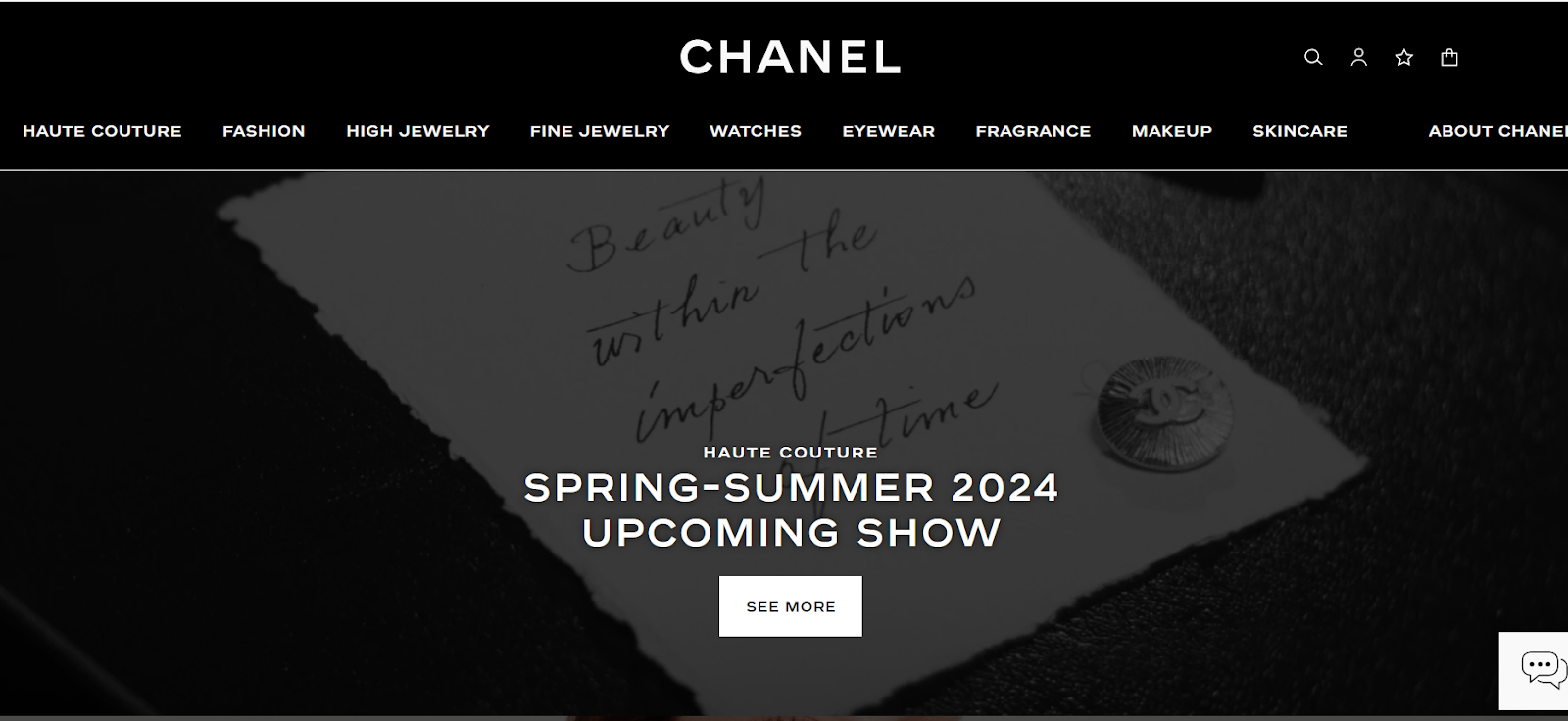
38. Chanel
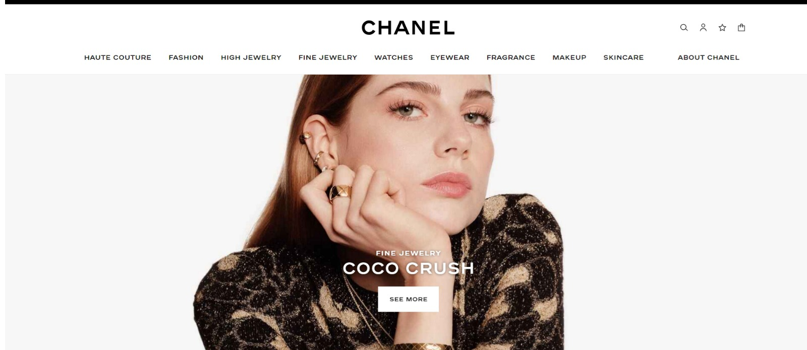
The Chanel landing page screams luxury. But not luxury like kitsch and tastelessness, but luxury like elegance and timeless sophistication. The landing page showcases various collections, one below the other.
Each collection features background images of fragrances, jewelry, eyewear, watches, and fashion shows.
If you want to learn more about each, there's a “See more” button that takes you to more details.
What I particularly like is the option to enable high contrast, turning the entire site into a dark mode. It is a thoughtful and eye-friendly feature.
Why This Landing Page Works
- Luxurious style: The page looks classy and fancy, perfectly in line with the brand's image.
- Good overview: The page provides a clear and systematic display of collections.
- Chat: Live chat option for quick assistance.
- Dark mode: You can switch to a dark mode for a more comfortable viewing experience.
What Could Be Improved
- Layered navigation: One button leads to another button until you finally reach the information/product you want.
39. Lamborghini
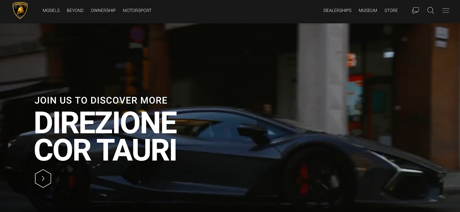
Lamborghini’s landing page features a dynamic background with scenes of cars, car parts, and the whole production process.
The site looks great, with a simple layout and clear categories. You can also see the latest Lamborghini news right on the main page, keeping enthusiasts informed and engaged.
The website focuses more on pictures than words, which makes it enjoyable to explore.
Why This Landing Page Works
- Background videos: Big moving videos show cool car stuff, making the page interesting.
- Easy layout: The site is simple and easy to use, with clear categories.
- Lots of pictures: The website has many images, making it attractive.
- Nice colors: The landing page is mostly black, with bright-colored cars breaking the monotony.
What Could Be Improved
- Nothing: No issues at all. Lamborghini's site scrolls smoothly despite the motion background, with no glitches.
40. Apple
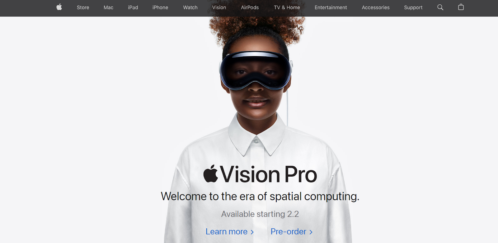
The Apple landing page boasts the best design among all companies selling similar products.
Typically, pages for brands selling devices aren‘t stunning. I mean, don’t get me wrong — they're all high-quality — but Apple has the most beautiful look.
The landing page is well-organized, with easy-to-spot sections. They always showcase the newest product first, taking up most of the landing page.
Why This Landing Page Works
- User-friendly navigation: It's easy to explore, making it hassle-free for visitors.
- Visual focus: More pictures, less text, giving a visually appealing experience.
- Spotlight on new products: The latest items in the main focus for quick attention.
- Concise and impactful writing: Short, effective sentences to keep you interested.
What Could Be Improved
- Nothing: This page serves as an amazing starting point for anyone looking for a new device.
41. Hubstaff
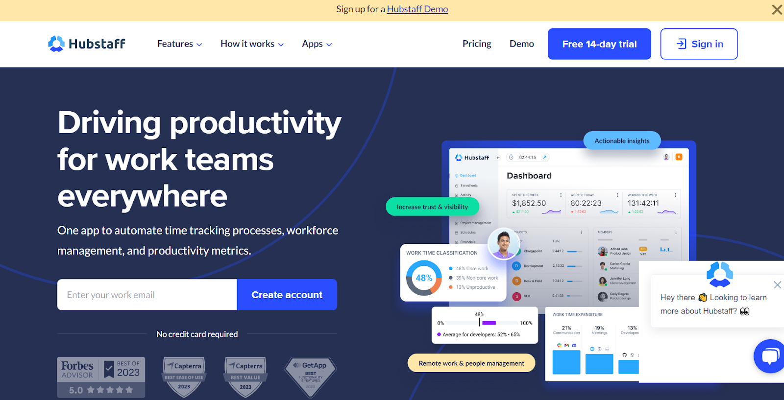
Hubstaff’s landing page brings value, has a clear CTA, and includes trust-building elements like partnerships and testimonials.
The page uses cool visuals, important stats, and key features to highlight how great Hubstaff is. What I especially love is focusing on the benefits, not only the features.
The “Free 14-day trial” stands out in the blue button on the white top bar, making it easy for users to notice.
Why This Landing Page Works
- Sharp look: Sleek design with different shades of blue and easy-to-read fonts.
- Good pictures: Awesome choice of images with real people, keeping it genuine and relatable.
- Smart layout: Well-placed CTA and account creation fields.
What Could Be Improved
- FAQ: It’d be good to add an FAQ section on the landing page to address common user queries.
Landing Page Ideas
A well-optimized landing page can transform prospects into leads by gathering information that can help you better understand, market to, and delight visitors.
Since landing pages are crucial for conversions, it‘s important to make sure they’re well-planned, designed, and executed.
Here are a few things to keep in mind when creating landing pages:
- Appealing aesthetics. Giving your landing page color and a clean UI can only help. Visitors will want to learn more about your products and see evidence of the value you're offering. Take a look at #18 on our list, Landbot, for a great example of a stunning web page.
- Less is more. Let the offer or images do most of the talking, but be sure to include any and all descriptive headlines and supporting text to make your landing page clear and compelling. HubSpot's Campaign Assistant does the heavy lifting for you and generates landing page copy in a few clicks. This goes for just about all the components on the page: try white space, simple copy, and shorter forms.
- Keep visitors on the page. By removing the main navigation or any distracting backlinks, it's less likely there will be any lead generation friction that could cause visitors to abandon your page.
- Offer social sharing options. A simple way of getting visitors to engage with your landing page is to include social media sharing buttons so that they can spread your content to their social followers. After all, customers are the center of your marketing flywheel.
- A/B testing. Landing pages are important to get right, and since consumer psychology can sometimes be surprising, it's always better to experiment with different versions of your pages to see which has the highest conversion rate (CVR). Test the positioning of the offer, kinds of CTAs, or even the color scheme.
- Call-to-action. The CTA is where the meat of the landing page is, or the tipping point where prospects become contacts. CTAs could ask visitors to subscribe, download, fill out a form, share on social media, and more — but, overall, CTAs are necessary for getting your audiences more engaged with your offering. To generate leads, CTAs should be bold and eye-catching, but most importantly, they need to effectively communicate value.
Creating Landing Pages That Shine
Landing pages aid in growing your customer base and increasing conversions. Create a page that delights customers with a user interface so great they continue to come back for more.
This article was originally published on April 2, 2020, and has been updated for comprehensiveness.


![How the HubSpot Blog Generates Leads [+ How Yours Can, Too]](https://www.hubspot.com/hubfs/17_Lead%20Generation.png)

![28 CTA Templates to Design Clickable CTAs in PowerPoint [Download]](https://www.hubspot.com/hubfs/cta-template.jpg)

![What is a CRO Test? [+ the 5 Steps to Perform Them Yourself]](https://www.hubspot.com/hubfs/conversion-rate-optimization-tests_4.webp)