As you design your ecommerce site, you might wonder, "What do I need on this page to seal the deal?"
The truth is, you just need to keep it simple. Think of order reviews like landing pages. Instead of using the page to convert a customer to a lead, you just want them to click the purchase button.
To get them to click quickly, allow the customer to review their exact product selection, a photo of the product(s), delivery information, and accurate costs associated with the order. When this page focuses on the product information that's important to the customer, they'll trust that they're purchasing the correct item and won't get deterred from pressing the purchase button.
As you create a review page, make sure it includes these helpful elements:
- A headline, banner, or progress bar saying "Order Review," "Review Order," or something similar.
- The customer's name, contact information, and shipping address.
- An image and basic product description for each product.
- A list of any extra specifications or customizations that the customer has designated.
- Accurate pricing information showing each product's cost, a sub-total, total, tax, and delivery fee.
- Payment information or a payment form.
- A brightly colored button with a "Place Order" call to action.
To help you build an efficient order review page, here are nine examples of review pages from real companies.
Order Review Page Examples
Neiman Marcus
Neiman Marcus' order review page allows the customer to make last-minute selections and changes to their shipping information. Then, they can use it to add payment details before making the purchase. On the right of the page, they show transparent pricing information, any gift wrapping designations made by the customer and product information.
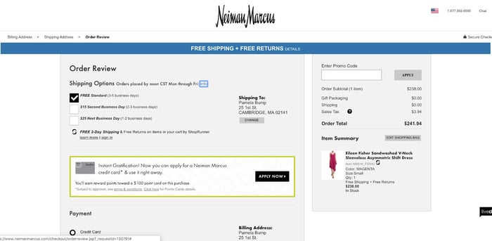
In the "Item Summary" area, a clear image of the product is shown alongside text that describes color, size, and quantity designations made by the customer. After reviewing this information, the customer will know they're ordering the correct product and will be confident that the right information is on file when they click "Pay Now.
Neiman Marcus is also using a smart strategy of hiding the navigation bar. When you log into Neiman's homepage, the bar is much more detailed and highlights different categories of products. On this page, the element is replaced by a progress bar that shows the customer where they are in the checkout process.
Without a navigation bar, there's less risk that the customer could click off of this page to look at other products. It also focuses the customer on making the purchase at hand. Although Neiman wants customers to look at their products, they've removed the bar on this specific page because it could cause customers to get distracted, abandon their cart, or make slower purchases.
Nordstrom
Like Neiman Marcus' page, this design is simple and shows off images and details related to each product so the customer trusts that they're making the right purchase. On the top of the page, you see basic shipping information. Then, the bottom of the page goes into detailed specifics. There's a bright blue "Place Order" button on both the top and bottom of the page.
This page's organization allows shoppers with limited time to do a quick review and purchase. At the same time, the details and button at the bottom also cater to customers who want to review the more intricate details.
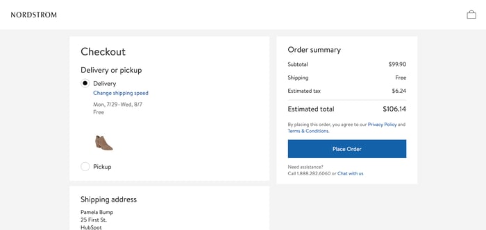
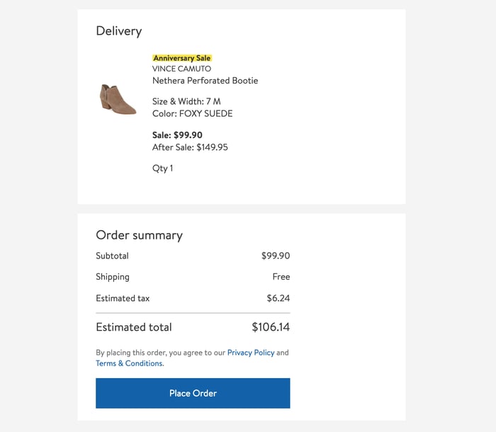
Like Neiman, this page also eliminates a navigation bar to ensure that customers are focused on making the purchase as quickly and smoothly as possible.
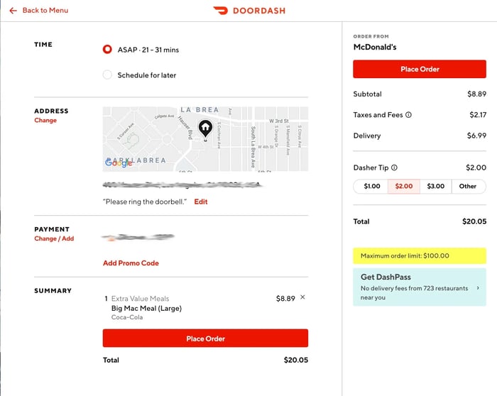
DoorDash
DoorDash, a HubSpot customer, uses its order review area to give consumers one last chance to edit to their meal delivery. It clearly designates the restaurant they're ordering from as well as specific meal details.
It also shows the customer's delivery instructions and allows them to make slight tweaks, such as adding delivery notes. Although there is a DoorDash logo and a "Back to Menu" button on the top of the page, the design also limits distraction that could lead to an abandoned order.
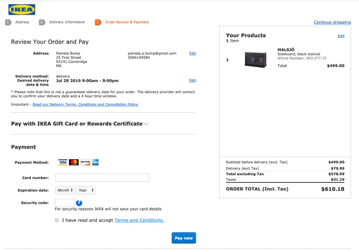
IKEA's review page takes an extremely simple, but efficient approach. While the other pages on this list have a more branded design, this page looks more like a receipt. It displays a small photo of the product and a small IKEA logo. Then it includes very specific shipping, product, and pricing details in a basic font. Although some might call it bland, this makes the page incredibly understandable and straightforward.
Similarly to Nordstrom, IKEA also replaces its usual navigation bar with an order progress bar so the user can focus purely on the order.
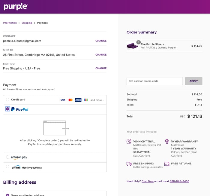
Purple
Purple, another HubSpot customer, similarly eliminates navigation and includes a progress bar on their order review page. With a sleek, clean design, a customer can easily see a photo of their product, item specifications, and shipping details. Like other pages on this list, there is also a box where you can enter your billing information before making the final purchase.
Chanel
The Chanel Review page is simple and straightforward. While they do still include the navigation bar, the pictures of the products and text about complimentary items might keep the customer focused on finishing the purchase.
This page allows customers to review delivery and product information while also filling out their billing information. It includes a "Complete the Purchase" button that allows them to pay directly after filling out the billing information.
.webp?width=700&height=670&name=9%20Highly%20Effective%20Order%20Review%20Pages%20to%20Inspire%20Your%20Own-2%20(1).webp)
Sock Club
Sock Club, which sells customs socks and offers "Sock of the Month" promotions, has a simple and easy-to-understand layout, despite the fact that they include custom sock details and specifications. The product information is on the right and includes an image of the basic sock and bulleted text that lists all customizations -- such as size and sock design -- made by the customer.
.webp?width=700&height=576&name=9%20Highly%20Effective%20Order%20Review%20Pages%20to%20Inspire%20Your%20Own-1%20(1).webp)
Similarly to the other examples, the page is a different design than its actual website as it removes navigation and replaces it with a progress bar.
Etsy
Etsy uses a more playful and colorful order review design. The page includes a fun headline that says "Double check your order details" to emphasize that this page is for a purchase review.
The page also encourages customers to place their order with a simple, but eye-catching tan box that says, "Almost done! Please click 'Place your order' to complete your purchase." The place your order button is black which contrasts well with Etsy's white design.
.webp?width=700&height=559&name=9%20Highly%20Effective%20Order%20Review%20Pages%20to%20Inspire%20Your%20Own%20(1).webp)
Customers can see detailed product information, a photo, seller information, and a transparent price. They can also add a note to the seller.
Like the other pages, Etsy ditches navigation and replaces it with a visual progress bar. This bar style might be fun and motivating for a customer who likes to visually see their progress. Each circle fills up when they complete a task within the checkout process, which might be satisfying to some shoppers.
Etsy also includes a "Secure Checkout" sign at the top of the page. Because Etsy allows users to buy products from third-party sellers, this might add a sense of trust that a customer's billing and contact information is safe.
Airbnb
Although Airbnb sells vacation rentals and not goods, this "Confirm and Pay" page is pretty similar to the other pages on this list. It similarly includes a box to fill out payment information, no navigation bar, a photo of the vacation home, and text-based details about the reservation so the user is sure about their purchase and all of its related costs.
Prior to this page, the customer has already clicked through a page that requires them to agree with the house rules and acknowledge that they understand which amenities are and aren't provided. Because they have already seen ample details, the product description is a little light on this page.
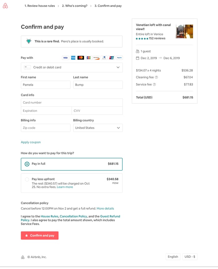
Along with the standard review page elements, there's also a note saying that this vacation spot is a "rare find" because it is regularly booked out. This might give the customer added motivation to fill out their information and pay as quickly as possible incase they're worried another vacationer might take those dates.
Remember. Keep it simple.
Your customer already knows they want to buy your product by the time they reach the order review page. So, you don't need to put large amounts of detail and design time into it.
To create an efficient page, aim to balance simplicity with need-to-know information so the customer trusts your company and is confident that they're making the right purchase.
Putting too much unnecessary information on an order review page can distract or slow the customer from making a final purchase. However, not enough information can have the customer worried that they might be ordering the wrong thing. So, focus on telling the customer exactly what they need to know, then encourage them to click "Purchase."
Want to learn more about the ins and outs of selling ecommerce products? Check out our Ultimate Guide to Ecommerce Marketing. If you'd rather focus on generating leads than one-time online purchases, we've also put together a list of great landing page designs.

Ecommerce Marketing
![How to Write an Ecommerce Business Plan [Examples & Template]](https://53.fs1.hubspotusercontent-na1.net/hubfs/53/ecommerce%20business%20plan.png)


.jpg)
![How to Start an Ecommerce Business [Steps + Must-Follow Tips]](https://53.fs1.hubspotusercontent-na1.net/hubfs/53/how%20to%20start%20an%20ecommerce%20business.jpg)