

10 Ways to Design Your Ecommerce Website for More Conversions
When designing your ecommerce website, consider the following tips to enhance its user experience for your visitors and customers.
1. Add clear CTAs.
Having a clear call-to-action (CTA) is essential to convert website traffic into sales.
Ecommerce website CTAs are often "Buy Now" or "Add to Basket" buttons that stand out on a web page to grab the attention of visitors and encourage them to click. This is typically done by using contrasting colors and unique design elements, among other tactics. And like the examples mentioned above, the wording in the CTA should be kept short and sweet.
In addition, make sure your CTA is aligned with the intent of the web page it's located on. For example, the CTA on your product page may read "Buy Now" whereas the CTA on a content page may be"Read More."
2. Create a sense of urgency.
Consider creating a sense of urgency on your ecommerce site. One CXL study found that, by creating a sense of urgency on an ecommerce site, conversation rates were increased by over 330%.
This can be done simply by changing the way you word your CTAs — for example, changing the CTA from "Shop Here" to "Shop Now" may give your visitor the nudge they need to convert.
3. Offer simple, one-click checkout for all customers.
By adopting a one-click checkout process, customers can skip the "add to cart" step and check out quickly and efficiently while still on the product page. In fact, by doing this, one-click checkout can shorten the checkout process by 90%.
This is important because by eliminating extra steps required in a traditional checkout process, cart abandonment is less likely due to the streamlined and simple process.
Even if you choose not to implement a one-click checkout, streamline your site's checkout process as much as possible to boost conversions and lower cart abandonment. You may do this by requiring the very minimum data input from your customers to make the process efficient for them.
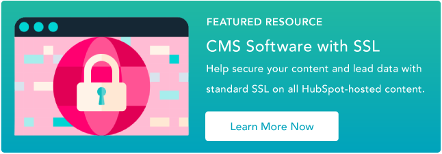
4. Add green-bar SSL.
It has been found that shopping cart abandonment may decrease if you display the green-bar SSL on your website. Here is what this looks like on different search engines:
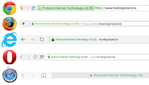
The greenbar SSL helps convey a trustworthy and reputable website — it's not only a visual cue to customers but it also plays an important role in the security of your site as well.
Having a greenbar SSL encrypts the visitor’s payment information, which makes it harder for hackers and scam artists to steal their information. Simply put, users do not want to purchase from an unsecure website.
In a test, two forms were created for customers to complete — one without a Verisign seal and the another with it.
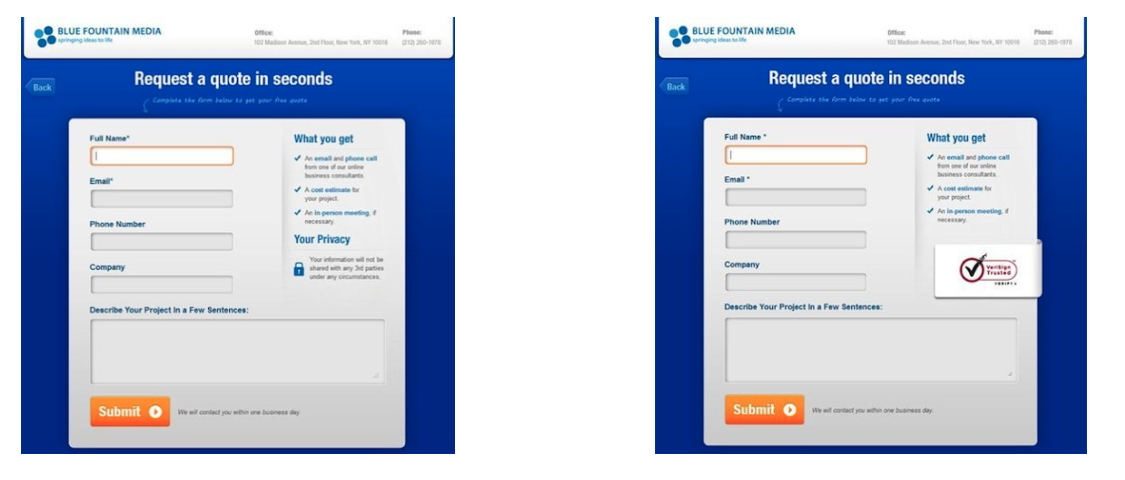
There was a 42% increase in conversions on the form containing the Verisign seal, demonstrating that visitors are more inclined to share personal data and convert when they are confident that it is secure.
5. Offer different payment methods.
There are hundreds of different ways to pay online that aren't reliant on a card, including direct debit, bank transfers, digital wallets, e-invoices, digital currencies (like Bitcoin), and many more.
Although it is impossible to offer 100+ payment methods on your website, it is important that you understand your target market and are able to offer payment methods best suited for them.
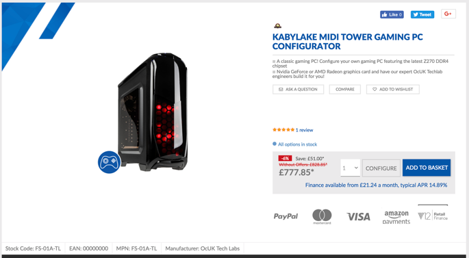
For example, a website where the average spend is $50 may benefit from offering mainly credit and debit card-style payments, whereas a website such as overclockers.co.uk may want to push a financing option as the value of the products being sold is significantly higher.
Try to provide the top three payment methods in your sector — doing so has resulted in an increase in conversion rates of 30% for businesses.
Overclockers does a great job of this by showing all their available options to buy in the product description, and near the CTA.
6. Incorporate product or company reviews.
Reviews are one of the most powerful tools to convert any interest in your product to a sale — potential customers want to hear from other buyers like them.
Add customer reviews directly next to or below your products to demonstrate your trustworthiness. Customer recommendations drive purchasing decisions as customers tend to believe the reviews from customers they relate to. To do this, give customers opportunities to provide instant feedback on the quality of your product or service.
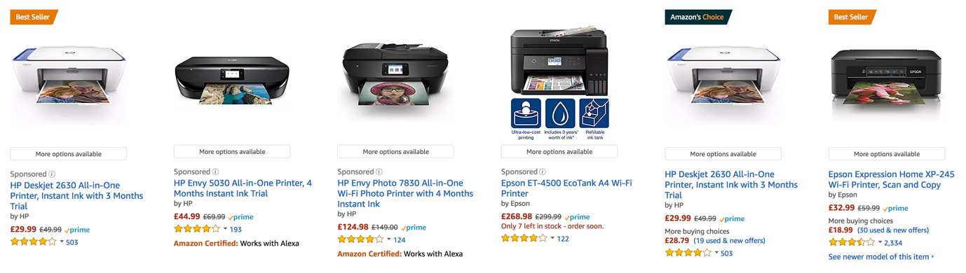
Amazon manages their customer reviews well — in fact, one of the first things you see when searching for any product is a list of customer reviews.
7. Add well-selected imagery.
Excellent imagery of the product or service you are selling is pivotal when trying to boost conversions online — as the old saying goes, "a picture is worth a 1000 words."
Ensure you have high-quality photos of your product, covering all angles and details. This gives the buyer confidence in what the product is, its quality, and what they are to expect when they receive it.
On the other hand, if you have low-quality pictures without a zoom function and a lack of detail, you'll leave your potential customers feeling anxious and wondering what you have to hide.
Truthfully, only a fraction of your site visitors actually go through the entire page and read it word for word — meaning your images can make an impact on a customer's understanding of your brand and product.
8. Optimize your website for mobile.
Mobile accounts for approximately half of web traffic worldwide. With this in mind, it's essential that your ecommerce site is mobile-friendly.
Having a simple checkout process is even more important on mobile than it is on desktop. Users are working with a significantly smaller screen, so the less distractions the better. Keep it simple.
It's also important to remember the unreliable nature of phone data. With phone signal dropping in a split second, reducing a user's download speed (to a snail’s pace!), it's imperative that your site is mobile-optimized. This will allow for fast load times, even when on a slow internet connection. Simple steps like this can make the difference between a customer converting on mobile or visiting a competitor's site.
9. Write concise and effective product descriptions.
Product descriptions are a key tool in your ecommerce selling arsenal. Without effective product descriptions, you're bound to miss out on clicks and purchases.
Focus on your ideal buyer and target them with words and descriptions of your products that relate to them, their goals, and their challenges. This will give customers the feeling that you understand who they are and what they need from you — which, ultimately, makes them feel more confident in choosing to do business with you.
Above all, the most important factor to consider when writing your product descriptions is to keep them concise. As we mentioned earlier, users will skim anything longer than a few lines. If you do have a large amount of information that you need to convey to your customer, you might consider hiding it behind a "read more" button or cutting it down in easy-to-digest bullet points or even incorporating an infographic.
10. Design a simplistic layout.
Creating an easy-to-follow and cohesive journey from homepage to checkout is one of the most important factors when lowering your bounce rate and boosting conversion rate.
A study shows that websites that have a clean look (meaning, more white space, bigger images, and less text) see significantly higher user engagement rates than websites that do not.
While it might seem daunting to think about redesigning your ecommerce site to be more minimalistic, it is actually relatively straightforward if you follow a few simple rules:
- Focus on product imagery with fewer design elements and distractions on product pages.
- Direct your customers to your CTA buttons and make sure they stand out.
- Test your website on different devices to ensure the shopping and checkout processes are streamlined no matter how customers are visiting your site.
- Stay away from creating any distractions on your site — less is more. Typically, if the page works without something, then you can lose it.


![50 Ecommerce Statistics To Know in 2024 [New Data]](https://53.fs1.hubspotusercontent-na1.net/hubfs/53/ecommerce-statistics.png)