However, the unsubscribe button in your emails doesn't have to be feared. In fact, when leveraged wisely, the unsubscribe button can be a powerful tool that helps you curate an engaged email list of your ideal customers who are ready and willing to hear your message.
Let’s break down the ins and outs of the email unsubscribe button, and how to set it up in a way that helps your business.
What is an unsubscribe button?
An unsubscribe button is a link or button module typically found at the bottom of a marketing email that gives email subscribers the chance to opt-out of future messages with one simple click.
Why Have An Unsubscribe Button
I know, the idea of subscribers leaving your list may prompt a bit of panic, especially if you have aggressive list-building goals. However, having an unsubscribe button or link can be to your benefit. One of the most important email marketing metrics you should measure is your open rate or the percentage of people on your list who actually open (and likely read) your emails.
If you have a large number of subscribers who are on your list but don’t want to be, that can significantly drive down your open rates (and negatively impact your click-through rate). Having a large email list isn’t valuable if your audience doesn’t actually want to engage with your emails, because that could indicate they are even less likely to buy your products.
Having an unsubscribe button makes it easy for those who are uninterested to opt-out of communication, freeing up space for potential subscribers who are genuinely interested in your message and product.
Do you have to have an unsubscribe button in your emails?
You may be wondering, "Do I have to have an unsubscribe button in all of my emails?"
The short answer is yes, yes you do.
In the US, the CAN-SPAM Act requires all businesses using email to include clear instructions on how to opt-out on all email communications and these opt-out requests must be honored by law. Businesses that violate the CAN-SPAM Act can face hefty fines for each email violation, so it’s in your best interest to make sure you give your subscribers a chance to opt out in every email communication you send.
Beyond the CAN-SPAM Act, there are global email marketing regulations that are designed to protect consumers and ensure they’re able to opt out of communications they no longer want to receive. People unsubscribe from emails for a number of reasons, and it’s important for businesses to honor that decision.
Unsubscribe Button Best Practices and Ethics
Now let’s cover unsubscribe do’s and don’ts.
1. Make sure your unsubscribe button uses clear language.
Avoid using confusing language or making your unsubscribe button or link difficult to understand. Doing so can be a CAN-SPAM violation. Your unsubscribe option should be clear and easy to understand for the average person.
2. Don’t hide your unsubscribe options or make them difficult to see.
Your unsubscribe button or link should be visually accessible for readers. Companies that purposefully hide or make the unsubscribe feature difficult to see can also be subject to fines and legal repercussions so avoid using fonts or colors that make your unsubscribe options hard to find or visually inaccessible.
3. Offer the option to update email preferences.
If your email service provider gives you the option, allow subscribers to update their email preferences. Perhaps they don’t want to opt out of all communications but would prefer to receive messages about specific topics or want to hear from your company less often. Doing so can help spare unsubscribes while fostering trust with your readers.
4. Avoid using negative language.
Though it may not violate any laws, having rude or whiny language in your materials when people unsubscribe can come across as needy and unprofessional, and can be a big turn-off. Honor your contact’s decision to unsubscribe, and focus on those who want to engage with your content and products.
5. Don’t require a login to unsubscribe.
Ideally, the ability to unsubscribe should be one to two simple clicks away for most users. Requiring contacts to retrieve login information or gating the unsubscribe process creates friction and can lead to frustration.
6. Include links to your company’s social media profiles.
While having a user on your email list gives you more control over when and how your company is able to communicate with them, having contacts unsubscribe doesn’t mean that’s the end-all-be-all of them interacting with your company. Make sure your emails include links to your company’s social media profiles so users who would rather keep in touch on those platforms can easily follow along.
Unsubscribe Button Examples
Looking for unsubscribe button inspiration? Check out these options.
Marketing Brew

Marketing Brew is an email newsletter by The Morning Brew that focuses on marketing-related news and content. In this email footer, subscribers can easily edit their email preferences to specify how often they’d like to receive emails or unsubscribe altogether.
The Hustle
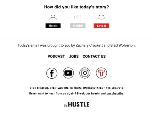
The Hustle, a HubSpot media company, has a daily tech and business newsletter where readers can offer real-time feedback about that day’s issue. The footer of each daily email has a cheeky unsubscribe button that’s easy to understand and may make the reader think twice before unsubscribing.
The Skimm
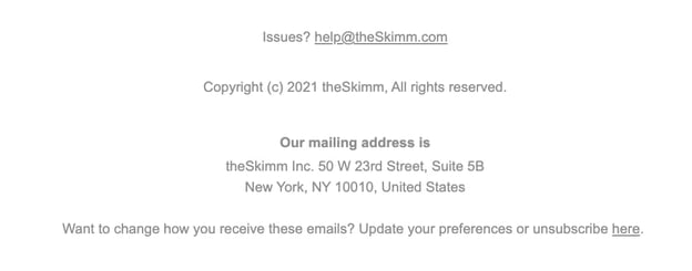
The Skimm has several variations of its popular newsletter. The Skimm Money newsletter has easy-to-understand language in the footer to empower readers to take control of their email preferences. Again, the reader could see they have subscription options that could better suit their needs which could prevent them from unsubscribing.
Lavendaire

Self-care content and stationery company Lavendaire has a gentle message for those looking to unsubscribe, emphasizing the importance of having an engaged list.
HeyDay

HeyDay, a company that offers skincare services has an unsubscribe message that is incredibly on-brand, comparing clogged pores to full inboxes. This brand also provides a great example of giving readers the option to modify their subscription or unsubscribe completely.
When it comes to email marketing, having users unsubscribe is a natural occurrence. By making the process as straightforward and simple as possible, you can create a better experience for your contacts and brand.
Conversion Rate Optimization

.jpg)

