When I think of excellent website design, I usually think about the homepage, blog, or product page, but never really a 'Contact Us' page.

If you have a website, it might not seem like the page you need to prioritize, but that’s a huge mistake, especially considering that it’s one of the most valuable pages on your website and, typically, one of the most visited site pages.

In this post, I’ll review the elements of effective Contact Us pages and show you some of the best real-life examples of Contact Us pages on the web to inspire your own.
Table of Contents
- Contact Us Page Best Practices
- Contact Us Header Examples
- Best Contact Us Pages
- Contact Us Page Templates
.png)
Contact Us Page Examples Guide
42 inspiring industry examples to help you reimagine your existing contact page.
- Retail Examples
- Finance Examples
- Agency Examples
- And more!
Contact Us Page Examples Guide
Fill out this form to see more Contact Us Pages.
Contact Us Page Best Practices
Like I mentioned above, a Contact Us page is one of the most valuable pages you can have on your site.
But, unfortunately, many website designers might place it near the bottom of their priority list in terms of copywriting and design. (Which is probably why many contact pages look like they were built in the 1990s…)
Lets review the elements that effective Contact Us pages have in common to learn about the features and best practices you should remember to include in your web form.
Great contact forms typically provide:
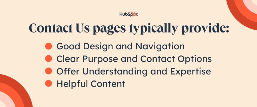
Good Design and Navigation
- Easy Accessibility: Ensure the contact form is easily accessible for visitors.
- Optimal Design: Utilize user-friendly layouts, themes, and clear formatting for a seamless experience.
Clear Purpose and Contact Options
- Clarification: Clearly explain the reasons why visitors should contact your business.
- Showcasing Work: Display your brand's services or products to offer insights upfront.
- Contact Information: Provide email and phone number for immediate communication.
- Call-to-Action: Include alternative actions for visitors who prefer not to fill out the form.
Offer Understanding and Expertise
- Problem-Solving Info: Describe how your business can address visitors' needs.
- Thought Leadership: Showcase expertise through recent blog posts or press mentions.
- Social Media Links: Connect visitors to active social media accounts for further engagement.
Helpful Content and Interactivity
- Resource Promotion: Provide links to helpful content and resources for visitors.
- Creativity: Infuse creativity to create a memorable and positive experience for visitors.
- Redirection: Direct visitors to a thank you page detailing future communication.
- Simplicity: Keep the form straightforward and avoid unnecessary fields and words, so your page remains as straightforward as possible — no fluff. Tools like our free AI Paragraph Rewriter can help you effortlessly fine-tune your content.
Now that we've gone over best practices let's review examples of some of the most effective Contact Us pages on the Internet.
Time to get inspired.
Download the Guide: 42 Contact Us Page Examples
Contact Us Header Examples
An effective Contact Us page typically starts with a catchy header. This draws the visitor in and encourages them to utilize your support offers.
Read on for a few examples of companies that have awesome headers on their contact page.
1. Brandaffair
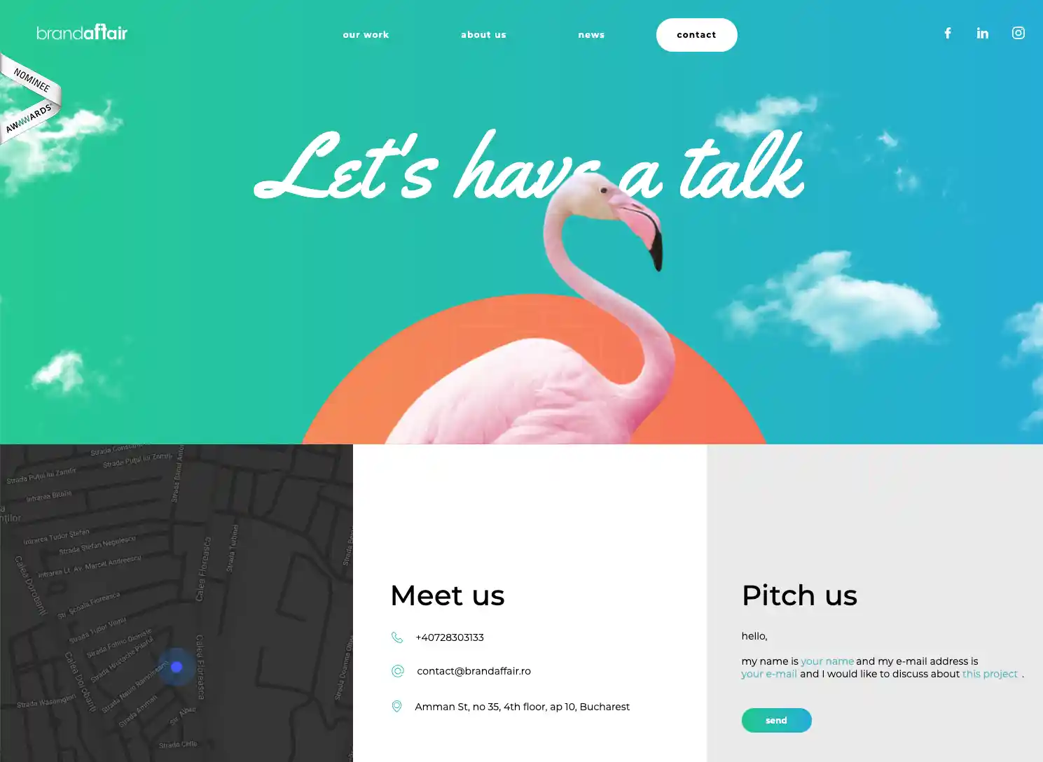
This Contact Us page is for a marketing agency that works directly with businesses. Since it knows its audience, Brandaffair encourages visitors to "have a talk" one-on-one rather than providing a one-way communication channel via support resources.
Why I think this "Contact Us" page stands out:
Aside from the obvious pink flamingo, I think Brandaffair captures visitor attention in three main ways:
- The map provides the exact location of the office
- The "Meet Us" section includes a phone number and email for general inquiries
- The "Pitch Us" section includes a template that helps businesses submit their ideas directly to the company for consideration.
2. Yummygum

Yummygum is an Amsterdam-based design studio that specializes in digital products made by startups. It's no surprise that this brand's Contact Us page balances both form and function flawlessly.
Why I think this "Contact Us" page stands out:
As an avid coffee drinker, I deeply relate to this particular header. Aside from that, this is a friendly and inviting message that gets right to the point for the visitor. It shows where the company is located on one side of the page, as well as how you can contact them on the other side of the page.
3. JetBlue
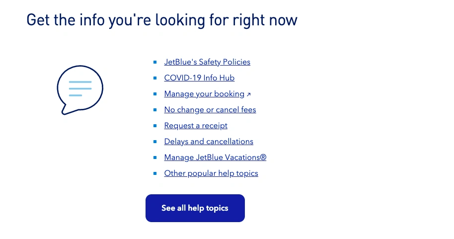
On this simple, but helpful Contact Us page, JetBlue provides a short-list of hyperlinks to help the user navigate the page. The number of options isn't overwhelming, but there are enough of them to pinpoint exactly what the visitor might be looking for.
Why I think this "Contact Us" page stands out:
JetBlue's header creates a sense of urgency for the visitor, which I would expect, since people visiting the page are likely looking for answers quickly — especially if they’re troubleshooting an issue right before a flight.
4. IMPACT
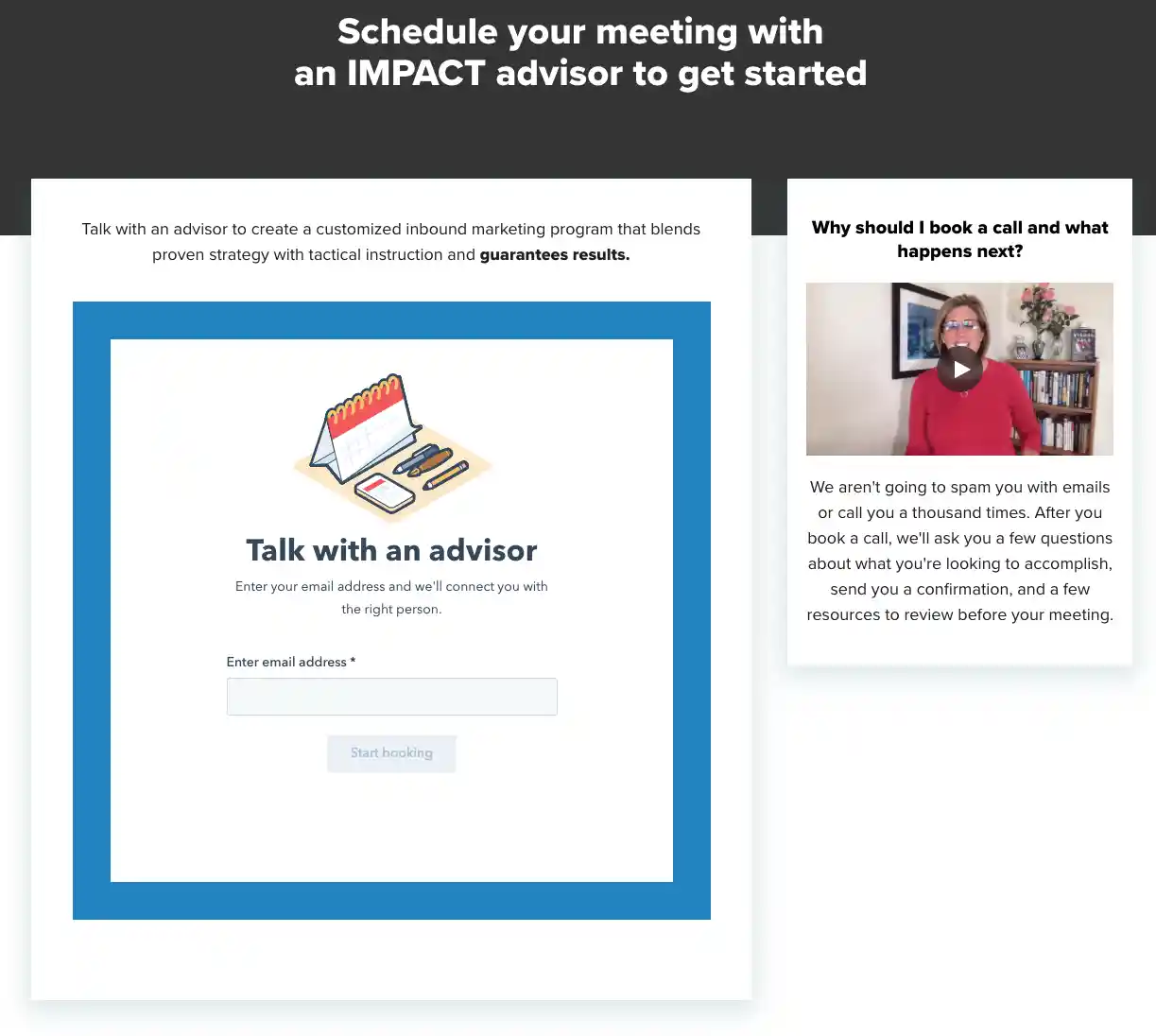
If you're looking for a sales-oriented approach, I recommend using this one from IMPACT's Contact Us page as inspiration. It gets the sales process moving right away by encouraging users to enter their email address to learn more about the company and its offers.
Why I think this "Contact Us" page stands out:
This Contact Us page does two things well: it asks for only the information that is necessary (email address) and it displays a video that explains exactly how contacting the IMPACT team works. This is a helpful experience for the user especially if they are expecting a quick response.
5. Unbounce
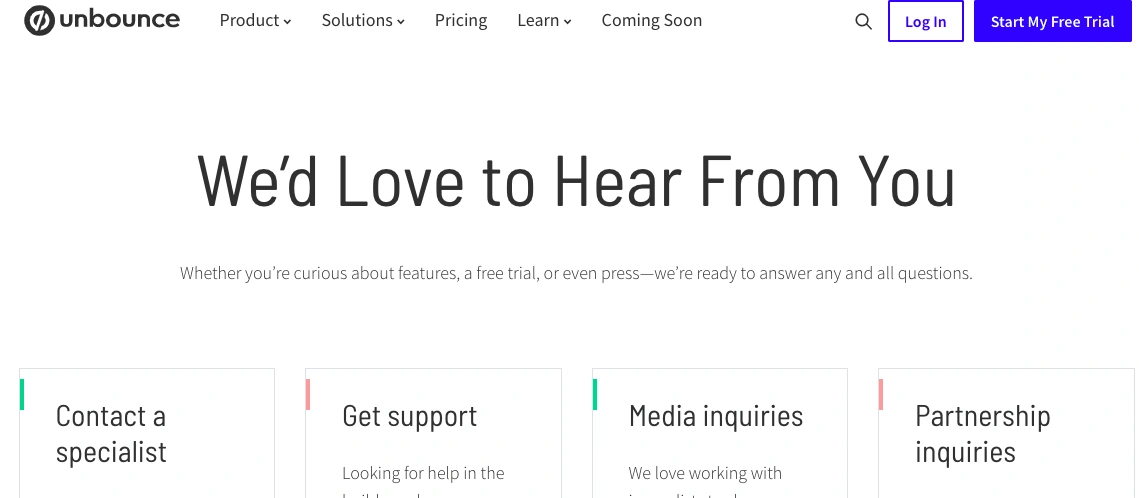
Unbounce’s Contact Us page places the header front and center for the user. It’s welcoming and accounts for all types of support inquiries including both customer support and marketing partnerships.
Why I think this "Contact Us" page stands out:
Visitors who land on Unbounce's Contact Us page don't have to sift through loads of information to find what they need. By choosing from just four options, they're likely to find the team they need to get in touch with quickly.
Now that you have ideas for a catchy header, use these examples to design the rest of your Contact Us page.
Best Contact Us Pages
- HubSpot
- Tune
- Atlas 1031 Exchange
- Choice Screening
- Pixpa
- Morroni
- Sleeknote
- PeopleMetrics
- Survicate
- Weifield Group Contracting
- Glossier
- Yeti
- Zendesk
- Moz
- Happy Cork
- Accenture
- Scribd
- The VIA Agency
- Foundation
- Atlassian
- Burger King
- ban.do
- Achieve3000
- Medium
- Dollar Shave Club
- Marvel
- Molamil
- Let's Travel Somewhere
- Hulu
- Grammarly
- Gymwrap
- The Crabby Shack
- Fear of God
- Uncle Bobbies Coffee & Books
- Zashadu
- Shekudo
- Ulta Beauty
- Mateo
- CUUP
- United Sodas of America
- Omsum
- Tower 28
- Honest
- Pattern Beauty
- Black Girl Sunscreen
A well-crafted Contact Us page will enhance user experience and cultivate a strong relationship with your leads. Although no two businesses are the same, and every buyer persona requires different things, there are multiple elements in the following examples you can pull from and include (or not include) in your contact page.
1. HubSpot
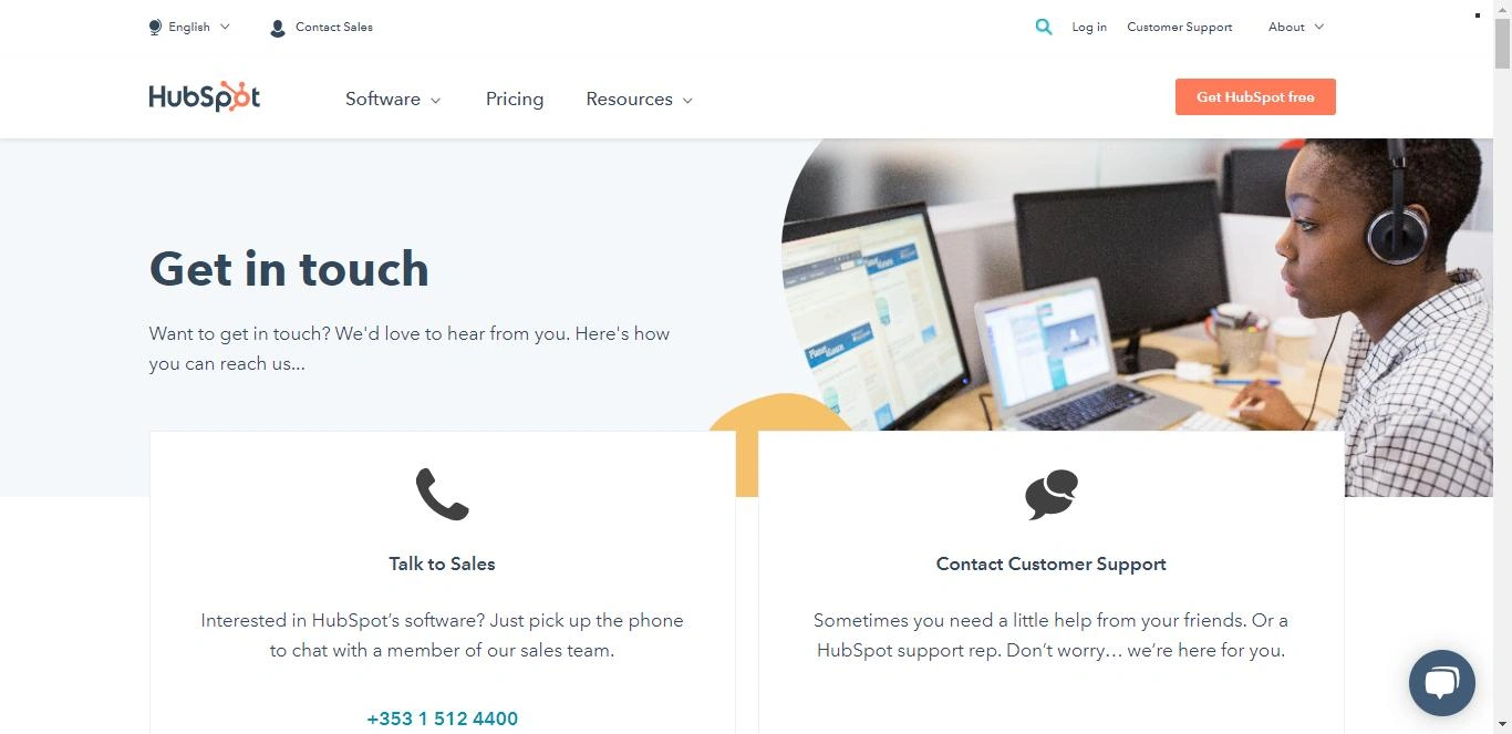
HubSpot's Contact Us page demonstrates how a contact page can be used as a customer service tool. At the top, there are two prominent CTAs connecting visitors with the HubSpot Sales and Support teams. HubSpot understands people visiting this page are likely interested in purchasing a product or need help troubleshooting one. By placing those buttons at the top of the page, HubSpot provides proactive customer service to its visitors.
Why I think this "Contact Us" page stands out:
A notable feature is how the Contact Us page is embedded into the HubSpot portal. This makes the page more accessible to the user and saves them time. If you're working in a HubSpot portal and need to look up the support phone number, you don't have to navigate away from your account — creating a more user-friendly and omnichannel experience for the customer.
2. Tune
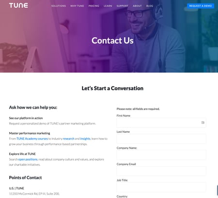
A lot is going well for Tune's Contact Us page: the beautiful design, the calls-to-action, the clearly displayed contact information, and the form below the fold for visitors who want to get in touch with specific inquiries.
Why I think this "Contact Us" page stands out:
Tune's Contact Us page feels welcoming. With copy like "Let’s Start a Conversation" and "Ask how we can help you," it makes us visitors feel like we're being taken care of.
Many business' contact pages are rather cold — but the more friendly you make your page's copy, the better you'll make your visitors feel. After all, you should want them to contact you so you can help them and start building a relationship.
3. Atlas 1031 Exchange
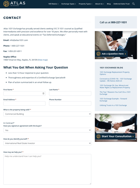
At first glance, Atlas 1031 Exchange's Contact Us page doesn't have the most flashy of designs. But when you look closely, you'll realize that it has every single aspect of a great Contact Us page — and that starts with its functionality.
Why I think this "Contact Us" page stands out:
The page actually lists out what people will get when they ask a question, including a promise for a short response time of 12 hours or fewer. The page also includes easy-to-read contact information, social media buttons, links to offers, and even a list of recently published blog posts. Well done.
4. Choice Screening
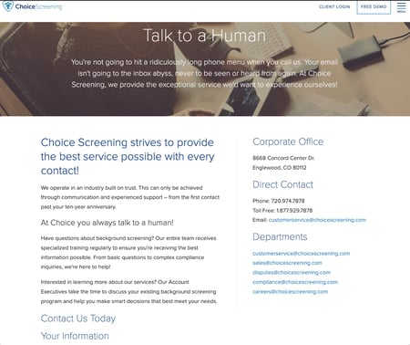
Hands down, the best thing about Choice Screening's Contact Us page is the copy. It doesn't get much better than this, all starting with that concise, delightful "Talk to a Human" header — what we all want when reaching out to customer support.
Why I think this "Contact Us" page stands out:
Following all that excellent copy is a well-organized page with contact information containing emails for every different department, followed by a form. The form's a little lengthy for most businesses, but for a company that runs background checks of all kinds, the form fields are likely necessary to help them organize all their inquiries.
When considering how long your own forms should be, I recommend considering whether you want to get more inquiries, or more qualified and higher-quality inquiries. If you have other, accessible avenues for people to contact you, a longer form can be okay for your business.
5. Pixpa
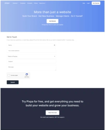
You'd be surprised how many Contact Us pages don't include a call-to-action. Although the primary purpose of a contact page is to help people get in touch with the company, there'll always be folks who land on the page and don't want to fill out the form. That's where a little secondary CTA can fit in nicely.
It can be as simple as a button leading to your blog. Or, it can lead people to demo your product, download a how-to guide, or watch a video.
Why I think this "Contact Us" page stands out:
The folks over at Pixpa chose to add a CTA at the bottom of their Contact Us page for a free trial. That way, they're providing value to the folks who land on the page and really just want to talk to a sales rep directly.
.png)
Contact Us Page Examples Guide
42 inspiring industry examples to help you reimagine your existing contact page.
- Retail Examples
- Finance Examples
- Agency Examples
- And more!
6. Morroni
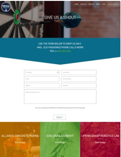
These days, most people would much rather fill out a form than get on the phone and talk to someone. When choosing what to ask people in your contact forms, I recommend focusing on questions that'll help your specific business understand the person contacting you — and even help you qualify them as a potential lead.
Why I think this "Contact Us" page stands out:
It uses humor tactfully. Of course, some people do like picking up the phone, hence the delightful quip before the phone number. I also like Morroni's colorful design that shows the page was not an after-thought.
7. Sleeknote
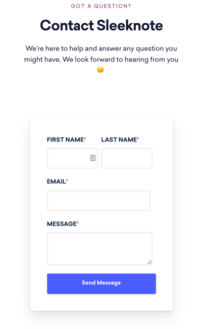
Here's another Contact Us page with a clean, functional design. All the information you need to know, including a short form, is consolidated into a smaller space that doesn't feel crowded.
Why I think this "Contact Us" page stands out:
Sleeknote takes into consideration businesses that have international customers. Check out how the company includes the prefix for its country's code when listing its contact phone number.
I find that many people overlook this if they aren’t used to dialing international prefixes themselves, but, if you serve international clients, you’re making their service seeking process even easier by having all necessary info front and center.
Here's a list of country codes if you don't know yours.
8. PeopleMetrics
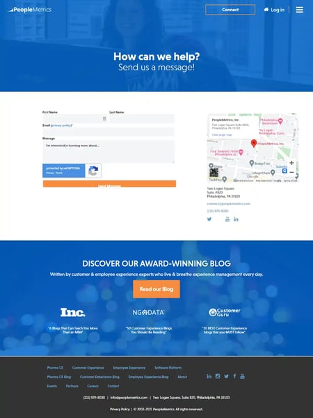
Sometimes, the simplest approach is the best approach. PeopleMetrics' Contact Us page is clean, well written, and does exactly what it's supposed to do. It knows that most people who land on the contact page are scanning for the easiest and best way to get in touch, so it didn't let any heavy design get in the way.
Why I think this "Contact Us" page stands out:
To make people's lives even easier, PeopleMetrics lets you use your Facebook or Google Apps login, shortening the conversion path even further. Plus, I think it's clever to include an option for visitors to subscribe to their blog simultaneously as they submit a request.
9. Survicate
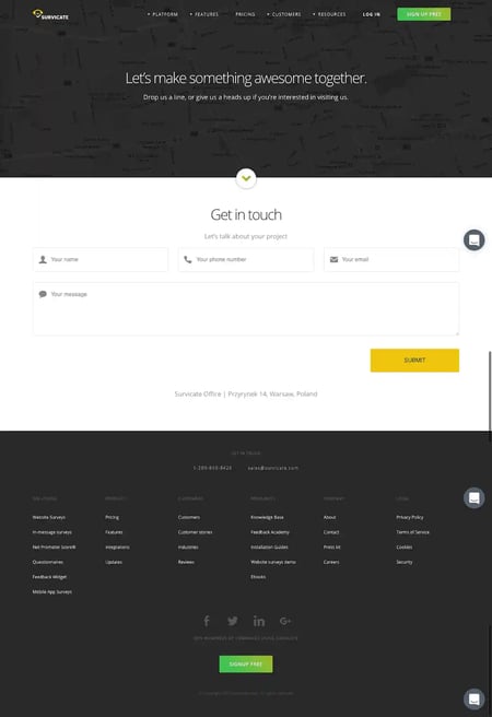
Survicate's Contact Us page is another example of a beautifully simple layout combined with welcoming copy. I love the subheader below the fold and just above the form, which reads: "Let's talk about your project." That kind of conversational, colloquial language is precisely the kind of copy that makes visitors feel closer to a brand.
Why I think this "Contact Us" page stands out:
The form itself is simple, with large form fields and CTA buttons — making it very mobile-friendly. Below that, they've laid out all the typical contact information — office address, phone number, email, hours of operation, etc. — in a way that's easy to read and scan.
Another notable plus is that the icons and primary CTA reflect the same color yellow as the brand's logo. All of these simple touches make for a clean, visually appealing design.
10. Weifield Group Contracting
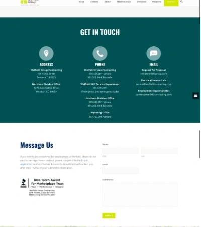
With the continuing rise of mobile web browsing and Google heavily favoring mobile-friendly websites on its search engine results pages, all pages on your website — including your Contact Us page — must be mobile-friendly.
Being mobile-friendly involves simplifying your navigation, keeping forms short, including clickable CTA buttons and large form fields that make it easy for folks to fill it out on their mobile devices instead of having to pinch and zoom.
Why I think this "Contact Us" page stands out:
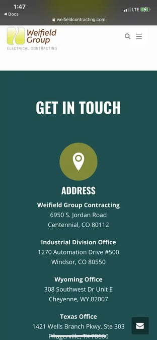
The Weifield Group's Contact Us page is an excellent example of one that is mobile-friendly and responsive. Check out the desktop version of its contact page first, followed by its contact page on mobile — and note how it has optimized every part of the page for mobile. The text is large, the form fields are easy to fill out, and their CTA button is large and easily clickable, making for a much more seamless mobile experience.
The desktop version is pictured above, and here's the mobile version:
11. Glossier
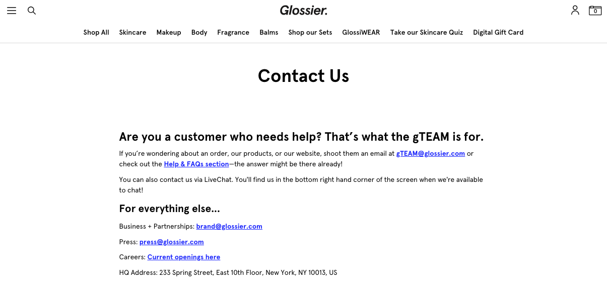
Skincare and makeup brand Glossier sells aesthetically pleasing cosmetics in various containers of pink and white — which is reflected on the website, too. The Contact Us page is clean, simple, and easy-to-read, but its simplicity belies Glossier's secret weapon: the gTEAM — its customer service arm responds to every single message and comment the team receives via email or social media.
Why I think this "Contact Us" page stands out:
Glossier's Contact Us page offers visitors various options for contacting the correct team, including its Help and FAQs section. The web page makes it clear and straightforward to get the information you need.
12. Yeti
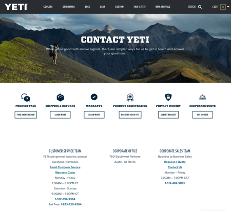
Yeti sells coolers and drinkware built for the great outdoors, and its Contact Us page maintains the cool, outdoorsy brand. I especially like the clever tagline encouraging visitors to reach out ("While we're good with smoke signals, there are simpler ways for us to get in touch and answer your questions.") and the multiple different ways to connect across platforms.
Why I think this "Contact Us" page stands out:
The beautiful image of a hiker in the mountains with a Yeti cooler is juxtaposed with a clean white background to make the contact information and CTAs clear for site visitors. And the link to Yeti's knowledge base helps them quickly and easily find answers if they don't want to wait around.
13. Zendesk
Zendesk is a cloud-based customer service software that focuses on engagement. Over 300 million people worldwide use Zendesk's customer service departments and help desks as its chosen form of support.
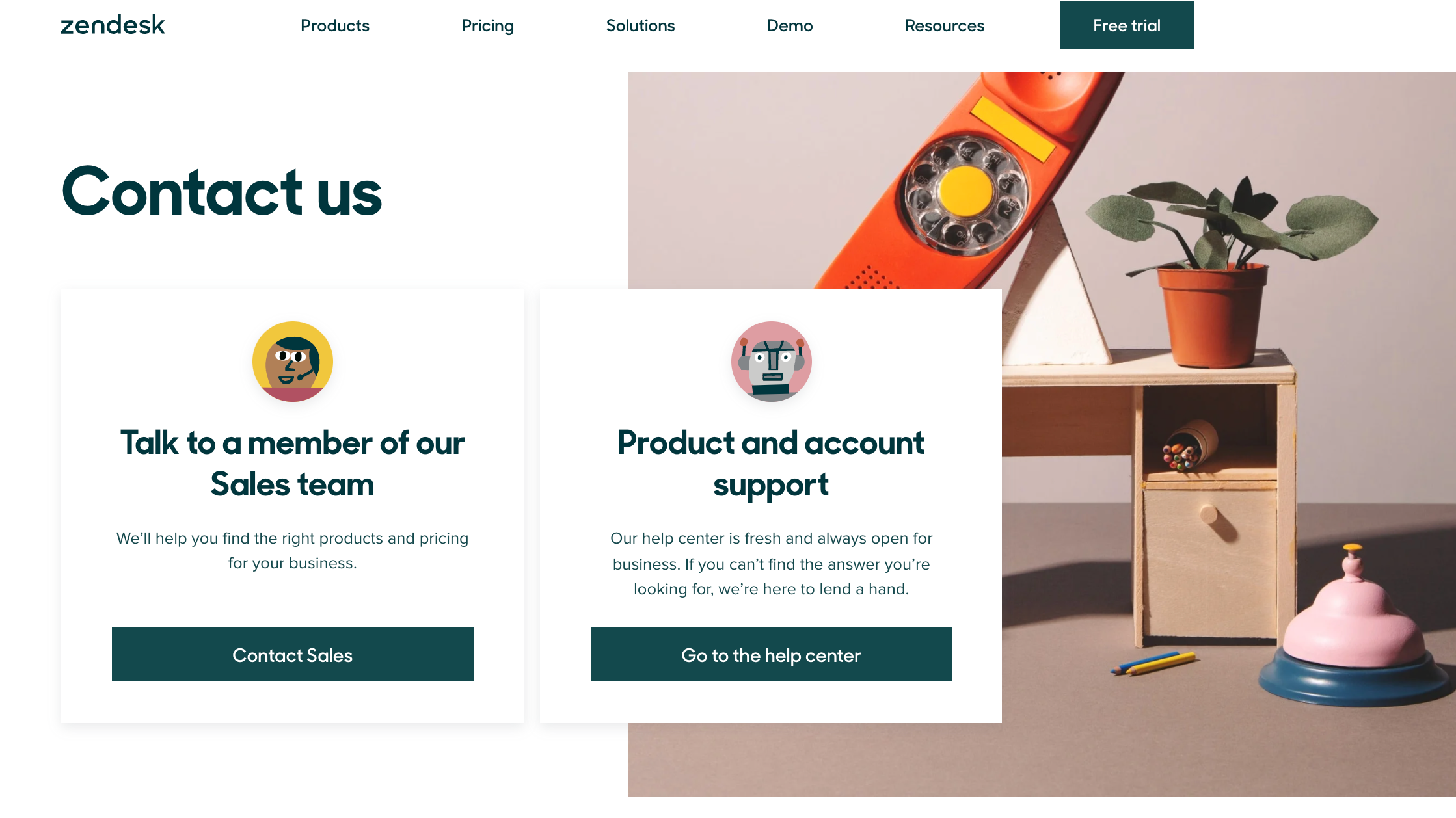
Everything on the Zendesk website is minimalist, clean, and color-coordinated. The aesthetic carries over to its simplistic and effective contact page. When it comes to web forms, businesses that keep them as straightforward as possible experience higher conversions, and that is the reason Zendesk is on our list.
Why I think this "Contact Us" page stands out:
There are two main CTAs on the Contact Us page:
The first one, "Contact Sales," leads you to a simple, easy-to-fill form.
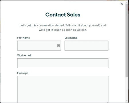
The other CTA, "Go to the help center" leads customers to a knowledge base and community of other customers who can answer questions they have.
At the bottom of the Contact Us page, there is an area where visitors can browse through Zendesk product support options and review Zendesk office locations. It's clear that the company took the time to build this page with its buyer personas in mind. It considered what users might be looking for on the contact page and added those items as additional resources.
.png)
Contact Us Page Examples Guide
42 inspiring industry examples to help you reimagine your existing contact page.
- Retail Examples
- Finance Examples
- Agency Examples
- And more!
14. Moz
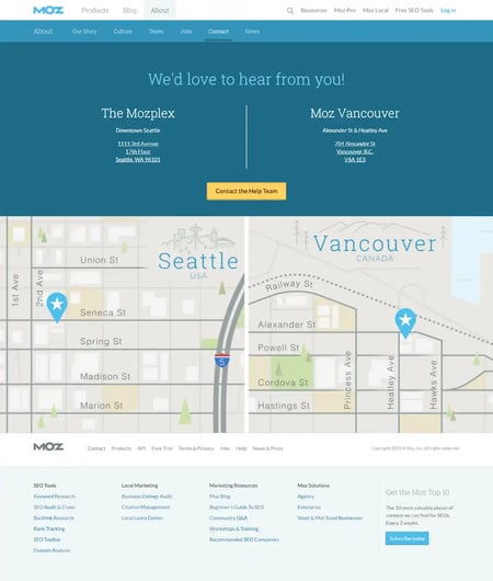
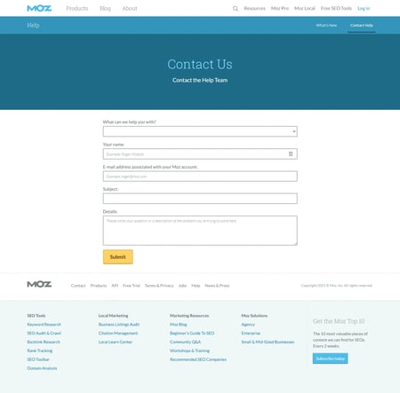
Moz, a Seattle-based SEO software company, features a bold and clear CTA on its Contact Us page. This leads visitors to a more detailed 'Help Hub,' where they can find the help they need for specific software or services Moz offers.
Why I think this "Contact Us" page stands out:
With offerings as vast and multi-faceted as those of Moz, it's a brilliant idea not to overwhelm someone who needs help right off the bat.
Instead, Moz provides the need-to-know contact information on its main Contact Us page, with additional, more detailed resources available once they click 'Contact the Help Team.' Plus, it features a neat map of Seattle showing exactly where Moz is for people who want to visit in person.
15. Happy Cork
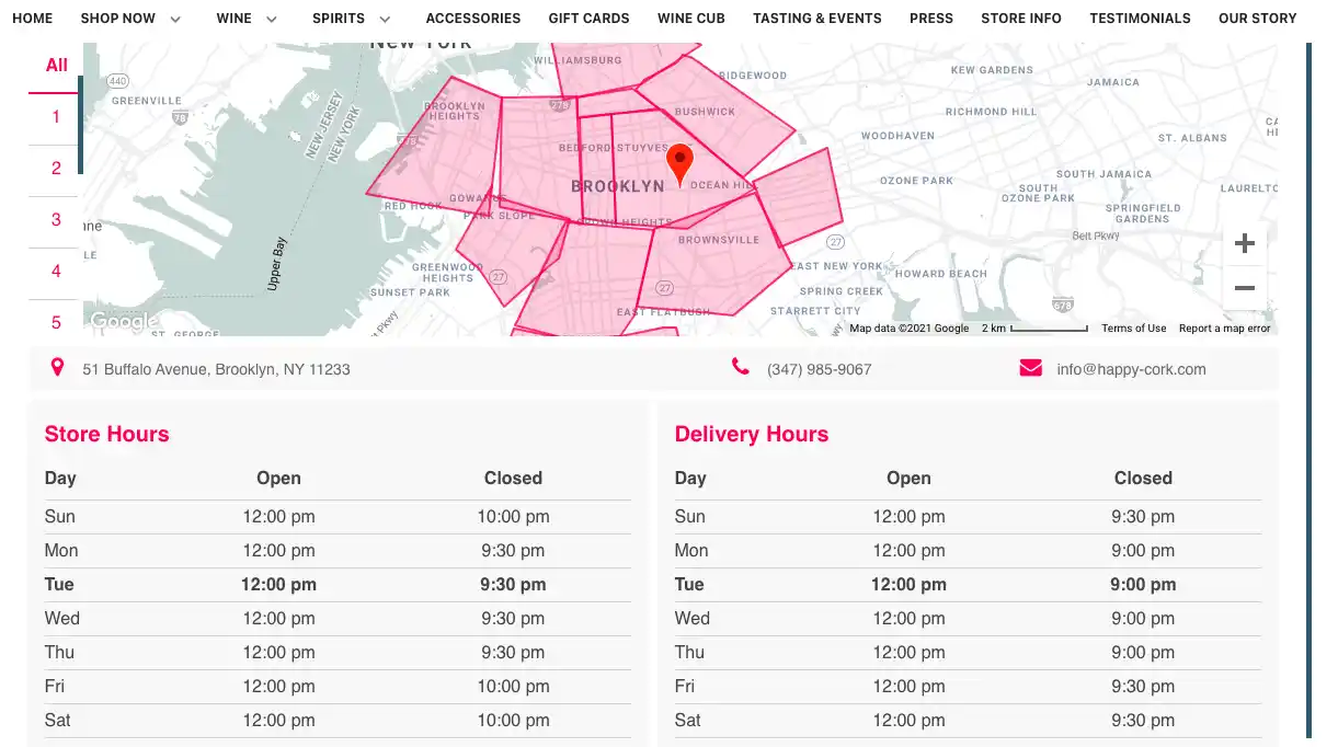
Happy Cork is a New York-based company that delivers beer, wine, and spirits to local neighborhoods in the city.
While New York may never sleep, Happy Cork certainly does as it lists its hours of operation clearly on its Contact Us page. Its schedule is split into two tables, Store Hours and Delivery Hours, which inform customers when and how they can purchase from Happy Cork.
Why I think this "Contact Us" page stands out:
At the top of the page, there's an interactive map that shows visitors where Happy Cork delivers to. You can filter by each neighborhood and easily decipher whether or not your location is within the company's delivery range.
I find that anything you can do to save customers time is especially important and, in this case, Happy Cork saves customers the annoyance of placing an order online only to have to cancel because it doesn’t deliver to them.
16. Accenture
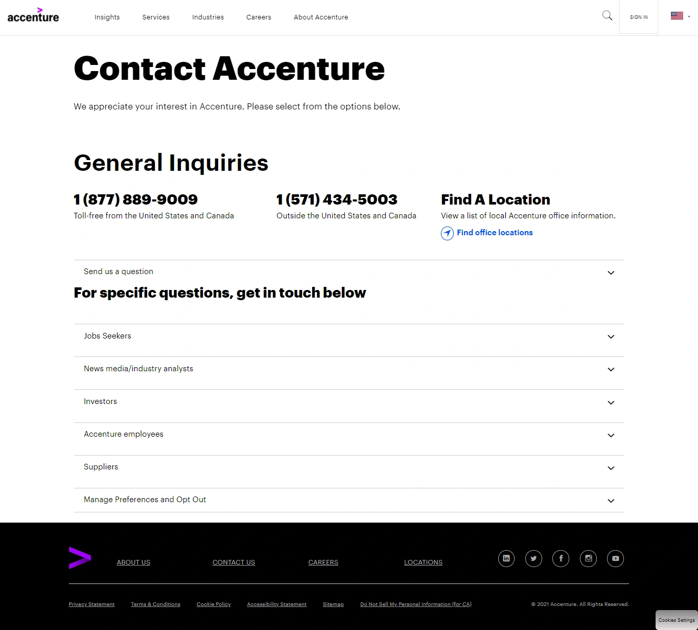
Accenture offers professional services all around the globe (in 120 countries, to be exact), so suffice it to say, there are probably hundreds of different phone numbers and emails people could reach out to for help.
Why I think this "Contact Us" page stands out:
I think this multinational corporation has figured out how to present a lot of information compactly on its Contact Us page — with expandable sections visitors can click into to get the information they need.
The Contact Us page is actually chock-full of helpful contact information for any request under the sun, but by organizing it compactly, Accenture prevents too much confusion while still giving the information needed.
17. Scribd
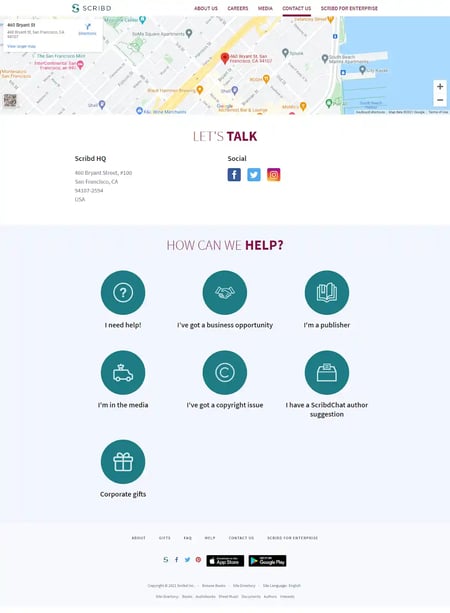 Scribd is a fully-fledged digital library that allows readers to enjoy a plethora of books, audiobooks, news articles, magazines, and more right from their browser.
Similar to the rest of Scribd's website, I find its Contact Us page to be engaging and unique. The top of the page includes the location of its company headquarters on Google Maps. It also clearly states its address and provides website visitors with links to its social media profiles.
Below this is an interactive and engaging map of organized buttons where users can select the resource they need, chat with customer service, or send an email address to customer service based on their issue.
Why I think this "Contact Us" page stands out:
Scribd ensures that its website visitors can get the help they need right on the contact page, saving time for both visitors and Scribd. Not only that, but the contact form design is fun and unique.
18. The VIA Agency
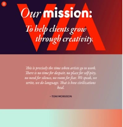
The VIA Agency, based in Portland, Maine, uses its website to showcase its slick interactive web work for various big-name clients. So, it didn't surprise me that its Contact Us page features similarly high-tech web features, including parallax scrolling and generally appealing imagery.
Why I think this "Contact Us" page stands out:
The Contact Us page shows visitors what to expect when they work with VIA. It's gorgeous, clear, and provides visitors with the names and contact information of people they can reach out to directly as a bonus.
19. Foundation
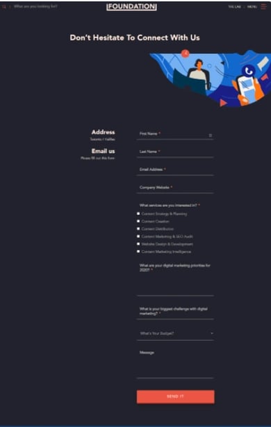
Foundation Inc Co. is a content marketing agency that doubles its Contact Us page as a sales page.
The page design is simple and on par with the rest of the website. On the contact page is a form that helps to qualify anyone who’s reaching out to them.
Why I think this "Contact Us" page stands out:
Most companies ask visitors only for their names, email, and message. But Foundation Inc Co. took the initiative to ask questions about the visitor’s budget, biggest marketing challenge, and the services they’re interested in.
19. Atlassian
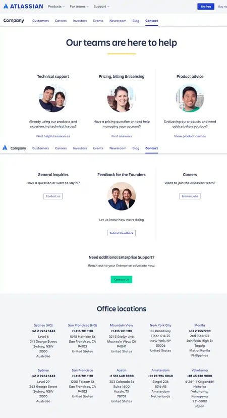
Enterprise software company Atlassian offers a ton of different products for large companies to use to stay organized. But despite that, its Contact Us page is exceptionally well-organized and clear, so visitors can quickly sort through its website to find the help they need.
Why I think this "Contact Us" page stands out:
It's clear that the headshots aren't stock photos. They're the real, friendly faces behind the emails and phone calls who are available to help.There's also the opportunity to submit feedback to Atlassian's founders front-and-center on the page.
I appreciate when brands do this because it shows a commitment to transparency and an openness to criticism that's refreshing — in addition to sharing a wide variety of help documents, FAQs, and ways to contact the company.
.png)
Contact Us Page Examples Guide
42 inspiring industry examples to help you reimagine your existing contact page.
- Retail Examples
- Finance Examples
- Agency Examples
- And more!
21. Burger King
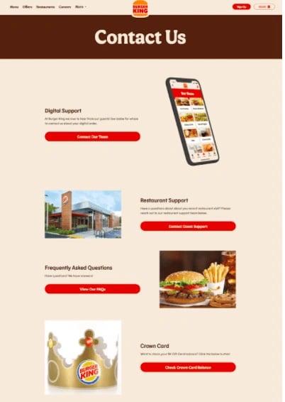
Burger King understands its customers might want to contact them for different reasons. And that is why its Contact Us page seeks to address various complaints.
Why I think this "Contact Us" page stands out:
Whether a customer is looking for digital or restaurant support, they’ll find answers on Burger King’s contact page. Plus, the store locator helps customers find the nearest Burger King restaurants.
22. ban.do
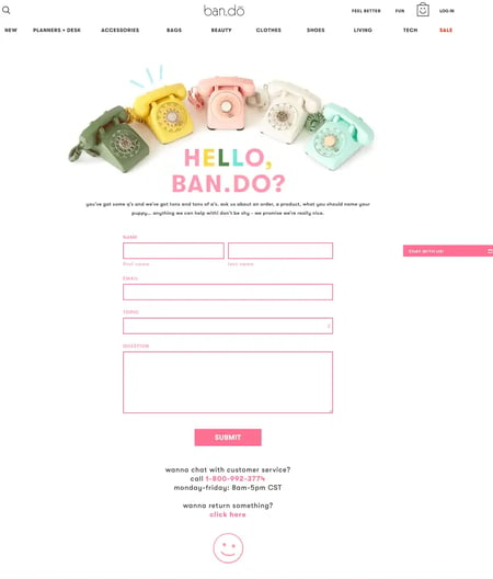
ban.do sells whimsical and creative planners, notebooks, and other accessories, and its entire website reflects its brand style with fun fonts, bright colors, and interesting animations to keep things fun.
Why I think this "Contact Us" page stands out:
Its Contact Us page features an animation of old-fashioned, colorful phones "ringing," lots of bright pinks, clever, and casual web copy, and all of the information a visitor on this page might need. From one page, you can get in touch with ban.do, contact customer service, and get information about returning a product.
It's important for every page of your website — including the Contact Us page — to reflect your brand, and this page does a great job of keeping things fun while helping ban.do's customers.
23. Achieve3000
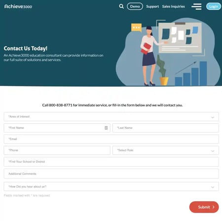
Like many businesses out there, Achieve3000 has several different types of people visiting its website, and what these people want to contact them about can vary widely. That's why Achieve3000 decided to go deeper than the one-size-fits-all approach. Instead of collecting the typical email address, name, and phone number, this company adds a few additional fields that ensures the form gets into the right hands on the backend.
Why I think this "Contact Us" page stands out:
Below the fold is a single form that serves a few different purposes. By selecting from several options in the first drop down box, users can tailor their contact request. Not only does this help them feel heard, but it helps the Achieve3000 team respond to the contact forms more quickly.
24. Medium
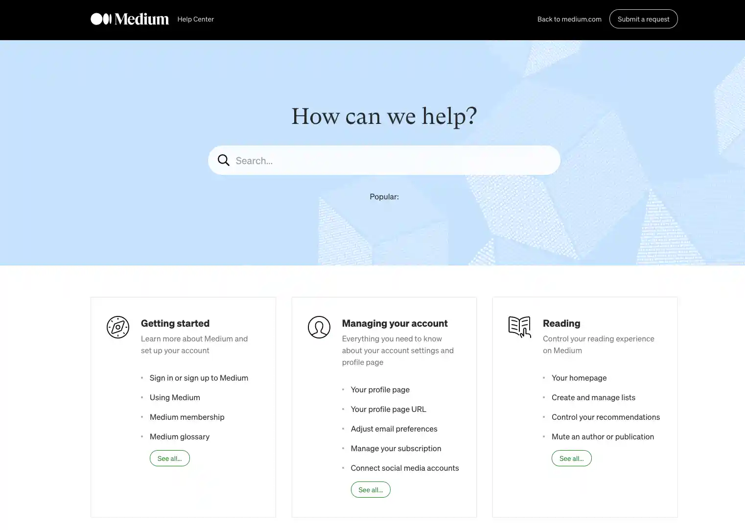
When you first navigate Medium's Contact Us page, you find multiple blocks for different types of questions service seekers might have, as well as a search box for someone who might not know where exactly to find their question, or someone who wants to find an answer without manually searching.
Why I think this "Contact Us" page stands out:
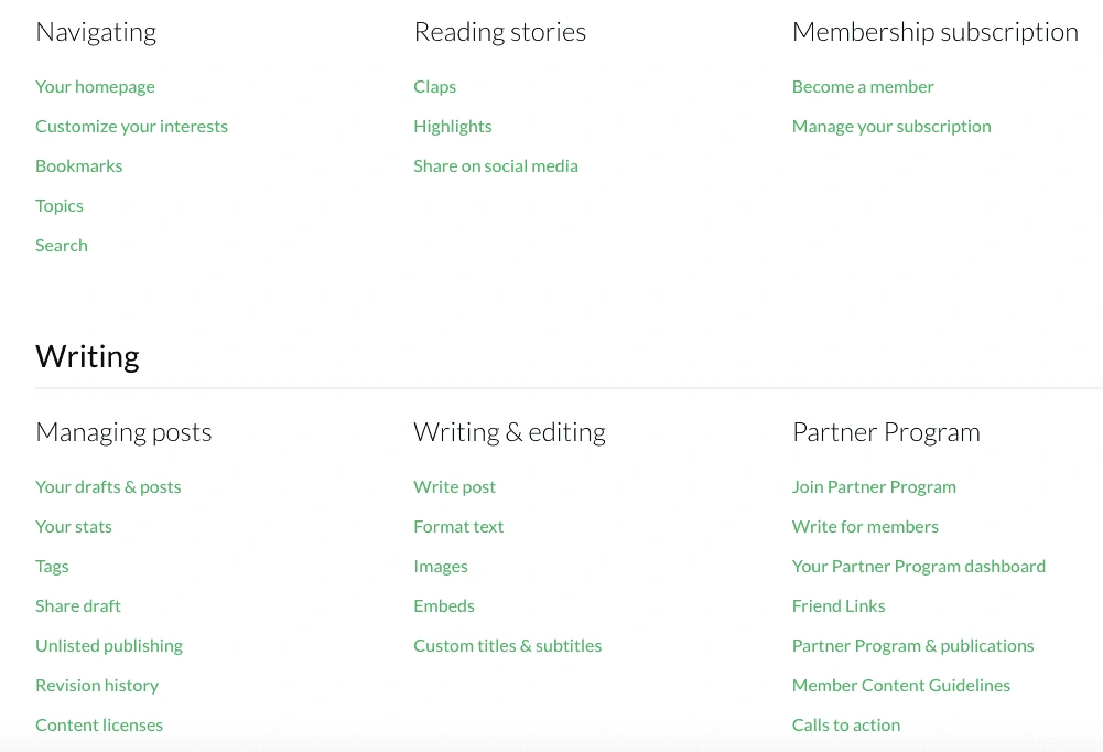
Visitors have the option to type in a topic or submit a request — or, if they keep scrolling, they'll find Medium's helpfully curated list of knowledge base articles and forums to peruse.
25. Dollar Shave Club
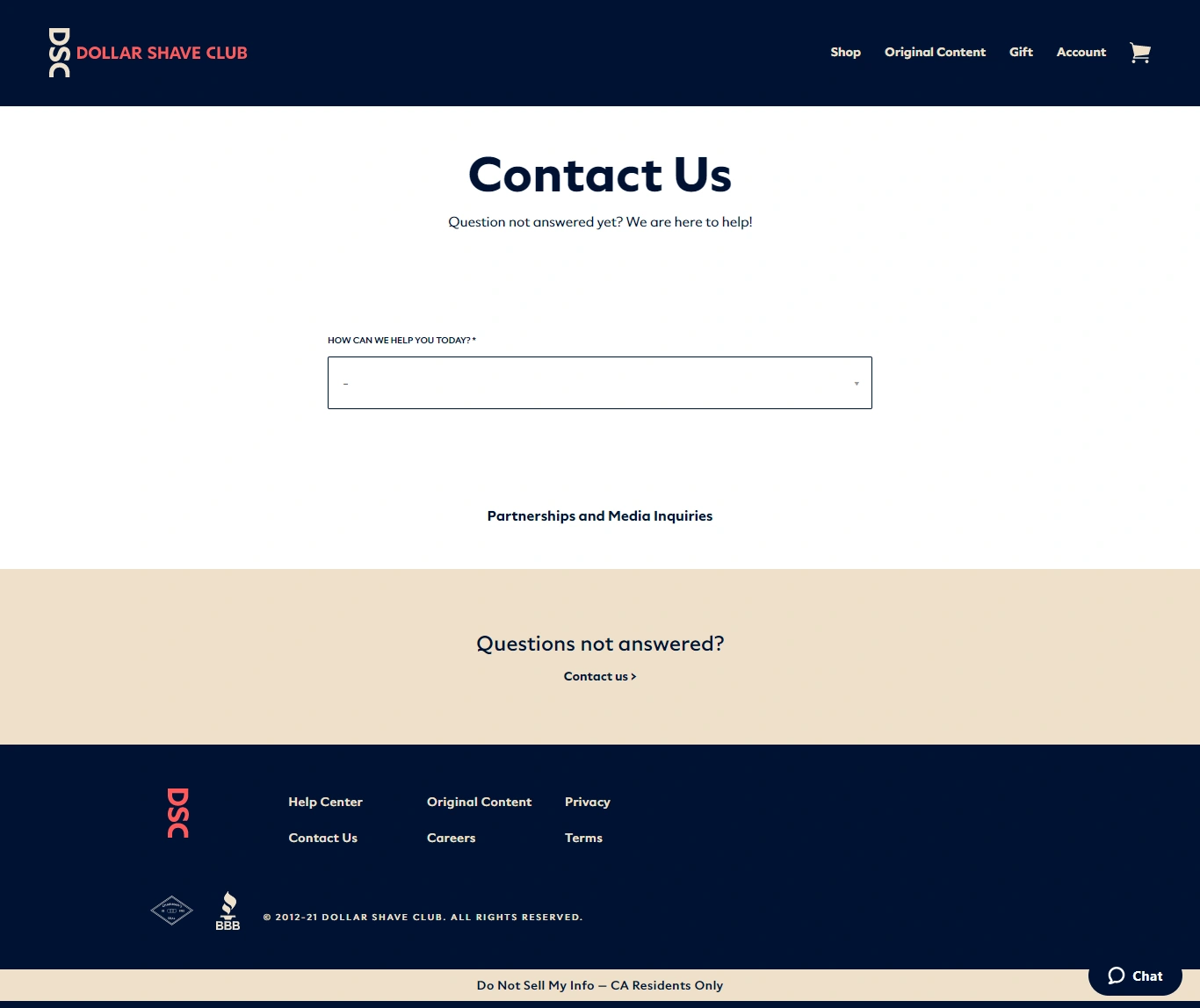
If you're not familiar with Dollar Shave Club, it's a razor subscription service that delivers quality razors at competitive prices. This brand disrupts the market by positioning itself as a cheaper and more convenient shaving solution. To do that, it needs to educate its target audience on its service, why it's different, and how customers can sign up. The Contact Us page accomplishes this by providing a comprehensive guide to the company's products and services.
Why I think this "Contact Us" page stands out:
In the middle of the page sits a drop-down menu listing options including how it works, shipping and delivery, account management, products, and gifting. This type of customer self-service creates more engagement with the visitor and can improve your site's click-through rates.
26. Marvel
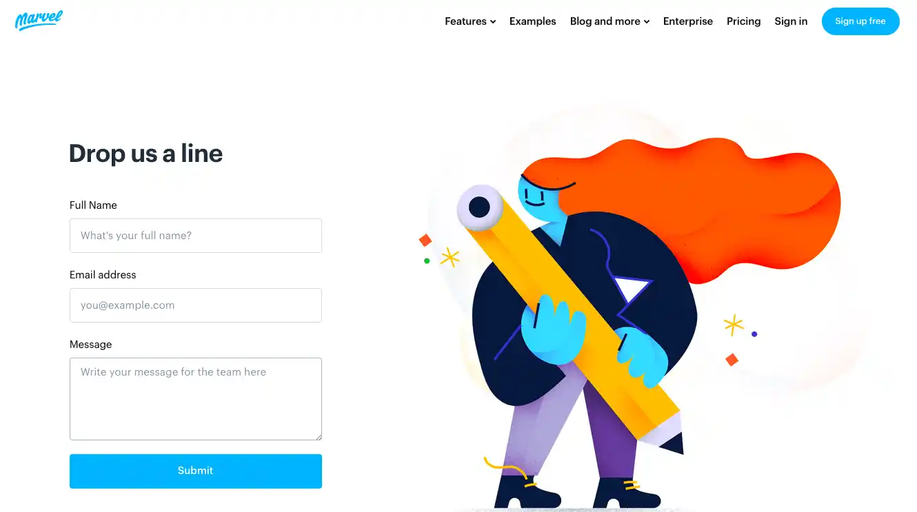
Marvel is a design software company helping users build and produce digital products. The company embraces creativity and encourages customers to "design anything, anywhere." So, it's no surprise its contact page is colorful and packed with playful images and designs. Marvel has taken a traditionally formal page and redesigned it to match its brand image.
Why I think this "Contact Us" page stands out:
I find its approach to be fun and eye-catching, but also a helpful tool to redirect visitors to the information they're looking for.
In the middle of the page, there are three CTAs users can choose. The first is for Sales. Here, visitors can review Marvel's plans and even make a purchase. Support is next — where users can find answers to their questions and get help in real time. Finally, visitors can use the Press Kit option to download images of the product or company logo to share on their personal and professional channels.
27. Molamil
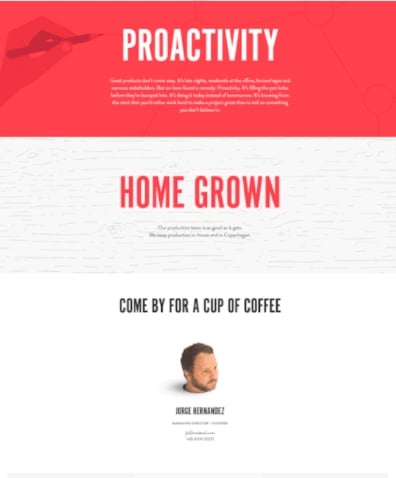
Molamil made our list for two reasons: First, it's hard to forget a page filled with floating heads. Second, the copy is so genuine you'll want to trust this company with crafting your product vision. The page’s top tells a compelling brand story and invites the visitor to "come by for a cup of coffee or a beer." This makes the visitor feel welcomed instead of pressured into making any immediate decisions.
Why I think this "Contact Us" page stands out:
Aside from the quirky images and playful text, Molamil highlights its brand values as well. The Contact Us page lists collaboration, exploration, and proactivity as Molamil's core company values. This lets the visitor know the business may have some fun, but it's still dedicated to fulfilling customer needs.
28. Let's Travel Somewhere
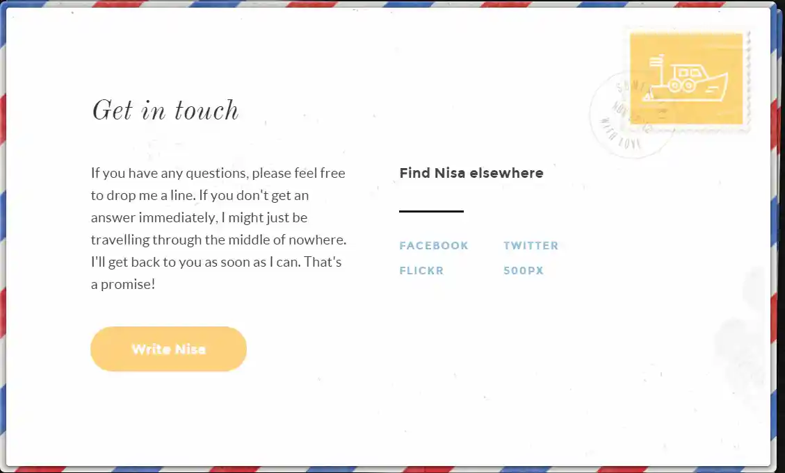
Let's Travel Somewhere is a travel blog written by a group of contributors who travel around the world. The goal of the blog is to "capture the essence of every country on the planet." That makes the Contact Us page an essential component of the website. Visitors need to easily access the page and submit their pieces to the editor.
Why I think this "Contact Us" page stands out:
Since the editor travels, the blog's writers need multiple ways to contact her. So, she provides a pop-up form and several social media links, giving the writer multiple communication options.
She even notes that because of her frequent travel, she may be slow to respond at times. This outlines expectations for her writers, so they aren't confused if their pieces aren't published immediately.
29. Hulu
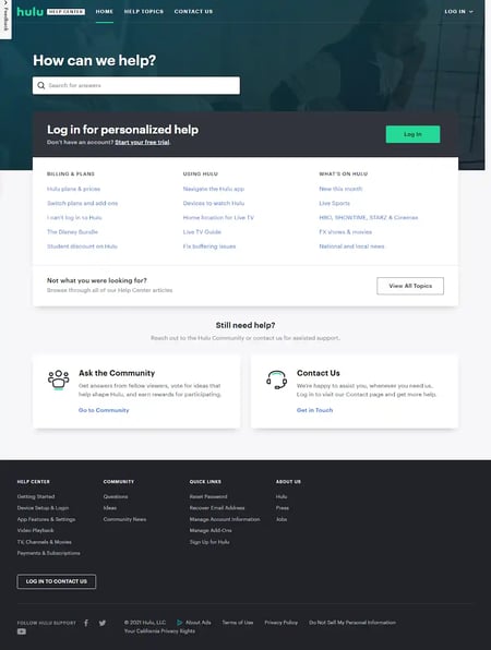
Hulu's Contact Us page is combined with its knowledge base. Users search for their solutions and then use the links at the bottom of the page to contact support. This improves customer experience and reduces case volume for its support team.
Why I think this "Contact Us" page stands out:
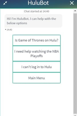
Hulu also offers a handy chatbot to guide visitors through troubleshooting steps. It starts the chat by suggesting possible questions you might have and provides links to articles that can answer them. And, most of these options are based on popular television events occurring at the time, like in the example below:
30. Grammarly
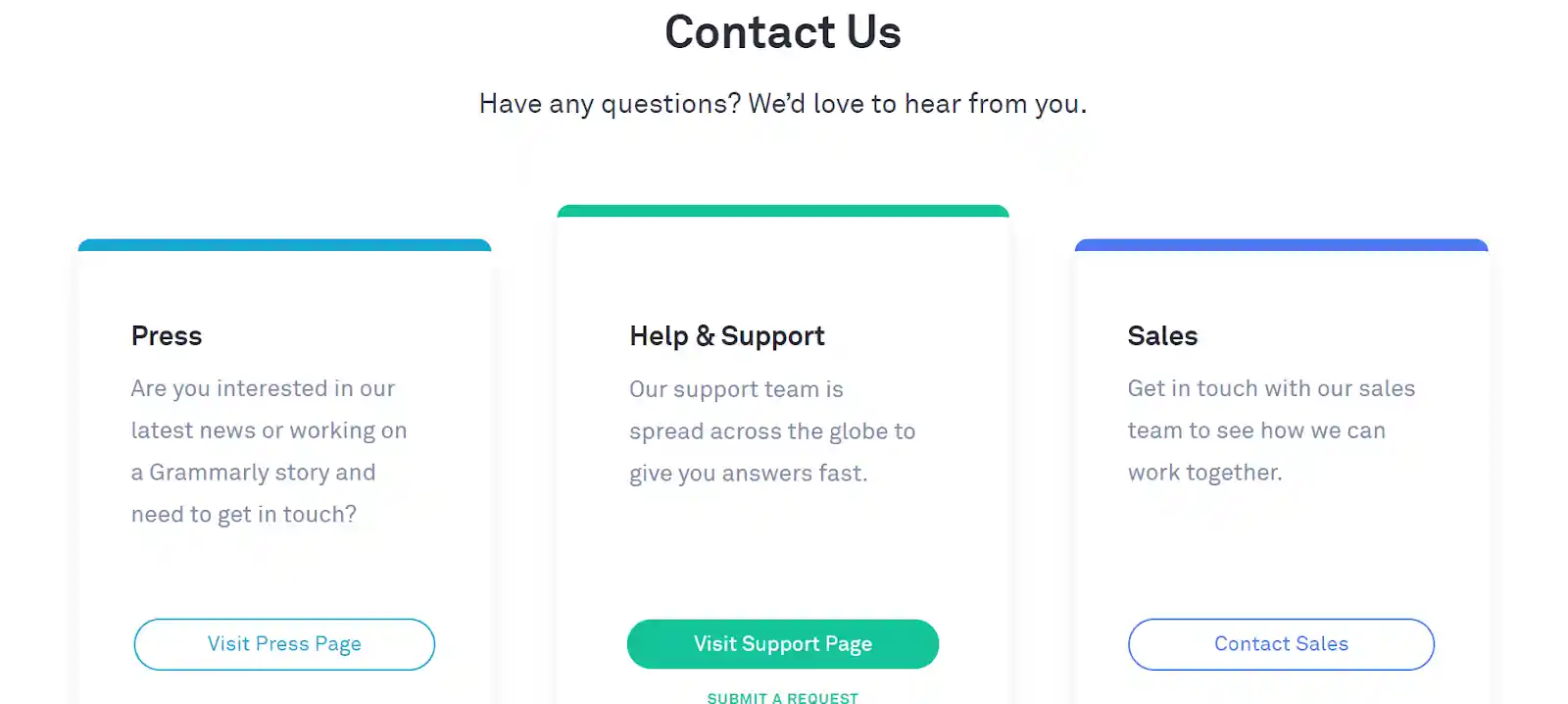
Grammarly is software for reviewing written documents for grammar and spelling errors. Its Contact Us page is easy to navigate and makes it simple for visitors to accomplish their goals. Grammarly knows visitors coming to this page likely have a support request. So, it placed the support link directly in the middle of the page in a bright green color.
Why I think this "Contact Us" page stands out:
Existing Grammarly users don't have to spend time filling out required fields and can skip right to describing their problem. If the visitor has the Grammarly extension installed, it will insert their user information into the support forms and complete these sections automatically. The result is a frictionless Contact Us page experience for the customer so they can spend more time using the tool.
31. Gymwrap
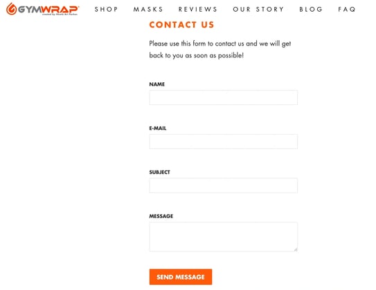
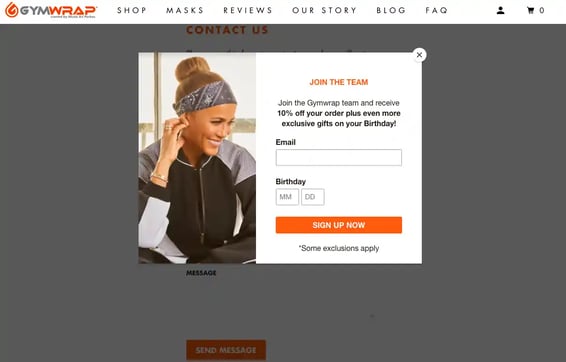
Gymwrap's clever marketing strategy leverages its Contact Us page to attract new leads and customers. If you look at the image below, you can see that Gymwrap triggers a pop-up form as soon as new visitors land on its contact page.
Why I think this "Contact Us" page stands out:
Gymwrap isn't just disrupting the user experience. It's offering visitors a discount for signing up for its newsletter. I found that this exchange makes the transaction worthwhile and more appealing to visitors who are navigating to the site just to find support information.
With this approach, what starts as a frustrated customer ends with a happy and loyal user who not only got the answer to their problem but also a nifty discount on their next purchase as well.
32. The Crabby Shack
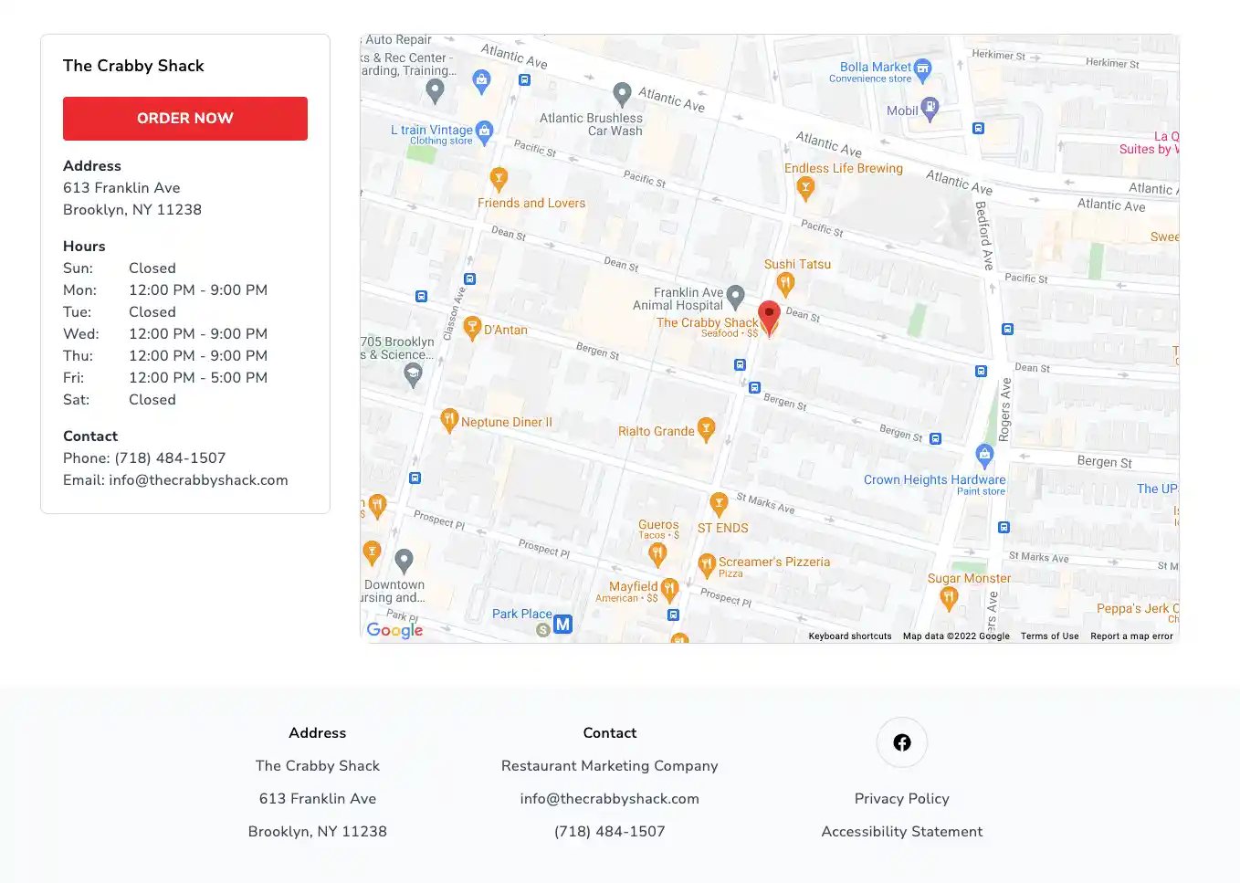
The Crabby Shack makes my list because its website knows its customers. What does it know about them? Well for starters, it knows they're hungry.
Aside from the information provided on the Contact Us page, The Crabby Shack also provides countless images of mouthwatering seafood. (This is probably all the motivation you'll need to reach out to the restaurant and learn more about its hours.)
Why I think this "Contact Us" page stands out:
Additionally, The Crabby Shack provides an email address, phone number, as well as an interactive map, so hungry customers know exactly where to go to get their seafood fix.
33. Fear of God
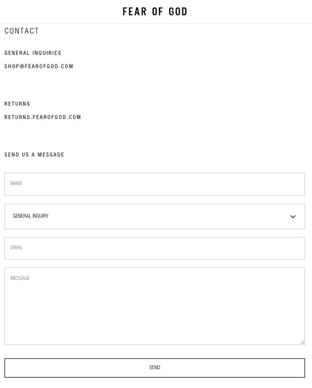
When taken out of context, Fear of God's Contact Us page might not look like much. However, it's extremely on-brand if you compare it to the rest of the company's website.
Why I think this "Contact Us" page stands out:
This simple, modern design matches its surroundings perfectly and creates a seamless transition from marketing offers to service resources. This page looks and feels like any other on Fear of God's website while still providing all of the necessary elements that visitors need to find important information.
34. Uncle Bobbies Coffee & Books
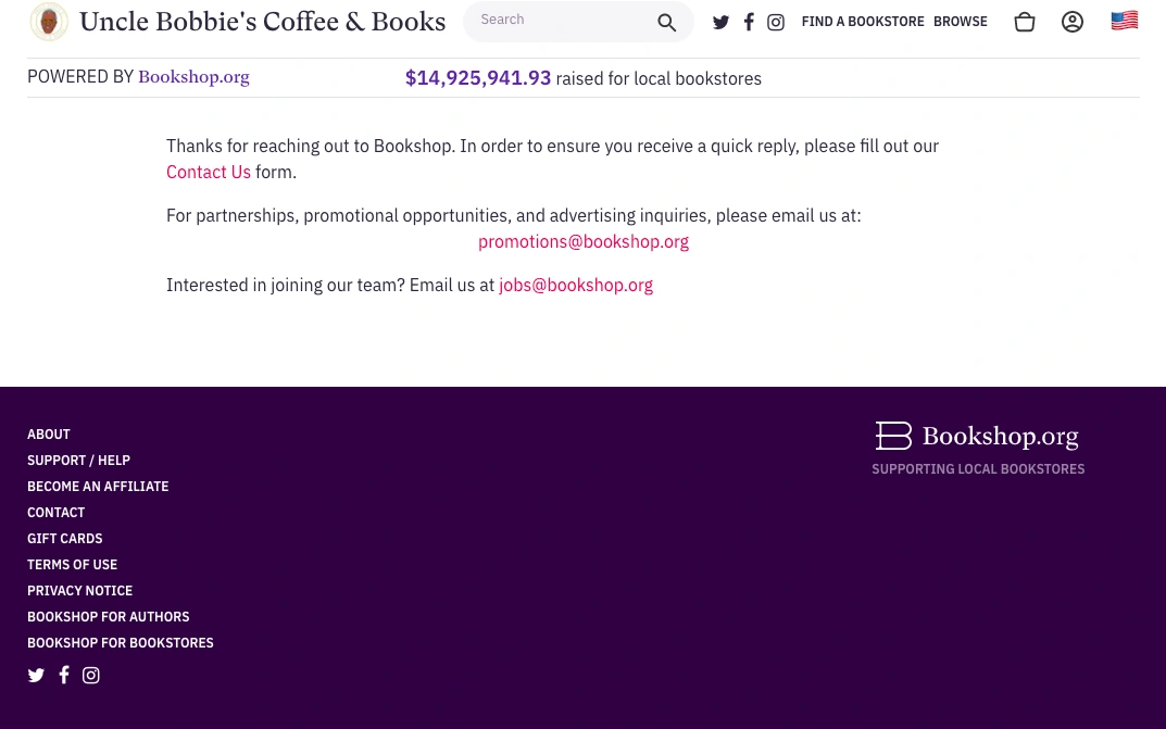
Clean and simple is the name of the game for Uncle Bobbies Coffee & Books. Its Contact Us page addresses three unique needs that visitors may have.
First, it provides a contact form for visitors and customers who have general questions about the brand or the website. Next, if you're interested in partnering with the company, you can read on to find the email address that you'll need to reach out to. Lastly, if you're looking for a job, you can learn more about the company's open positions by messaging the address listed at the bottom of the page.
This minimalist approach makes it easy for users to find information and to connect with specific employees at this organization.
Why I think this "Contact Us" page stands out:
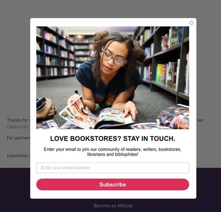
A popup appears on the Contact Us page inviting the visitor to subscribe to Bookshop's newsletter. I find this is a great way to keep them engaged while growing readership and leads.
35. Zashadu
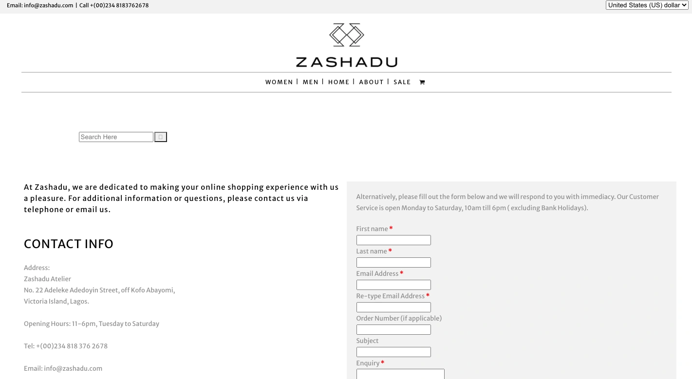
Zashadu sells handbags, shoes, and accessories like wallets and belts.
Why I think this "Contact Us" page stands out:
Zashadu makes my list because of how readily available its contact information is. You can reach out to the company via its Contact Us page shown above, or use one of the various options provided in the footer of all the pages by default. This makes life easier for visitors who may have some trouble finding the company's Contact Us page.

36. Shekudo
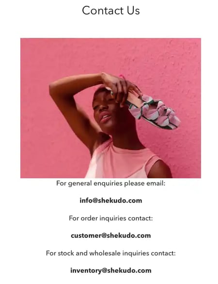
Shekudo is a women's clothing brand that's located in Sydney, Australia. Its founder, Akudo Iheakanwa, created the brand to "shed more light on the local artisan and craftsmanship scene whilst integrating some of the age-old techniques and overlooked local resources into its own contemporary aesthetic.
On its Contact Us page, Shekudo offers three email addresses to contact the company. The first is for general inquiries, the second is for order inquiries, and the last one is for stock and wholesales inquiries. This gives visitors a specific resource to reach out to depending on the question they may have for the company.
Why I think this "Contact Us" page stands out:
Shekudo stands out to me from other organizations on this list because of its imagery. It makes great use of high-quality images that not only compliment the other elements on the page but also showcase the company's products. It makes me want to buy another pair of shoes even though I'm currently in the process of contacting them about another order.
37. Ulta Beauty
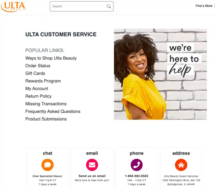
There are plenty of questions you can ask when buying makeup. What ingredients are in this eyeliner? How will this foundation affect my skin? Is there a cheaper alternative to this primer that I love?
With all of these questions, it makes sense for Ulta Beauty to offer a state-of-the-art Contact Us page.
Why I think this "Contact Us" page stands out:
On its Contact Us page, Ulta provides visitors with four ways to contact its support team. There are also FAQ links featured at the top of the page that can help users find information without having to reach out to customer service. This creates an ideal balance where visitors have plenty of self-service resources as well direct options for contacting Ulta customer support.
38. Mateo
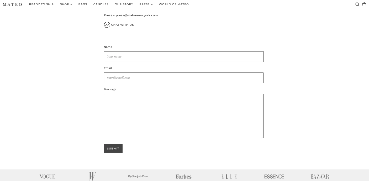
Mateo is a fashion and jewelry brand operating out of New York City.
What's great about its contact page is that it includes all of the notable partners that have featured the company's products. This adds credibility to the brand and may be enough to sway potential customers who are on the fence about buying one of its prod
39. CUUP
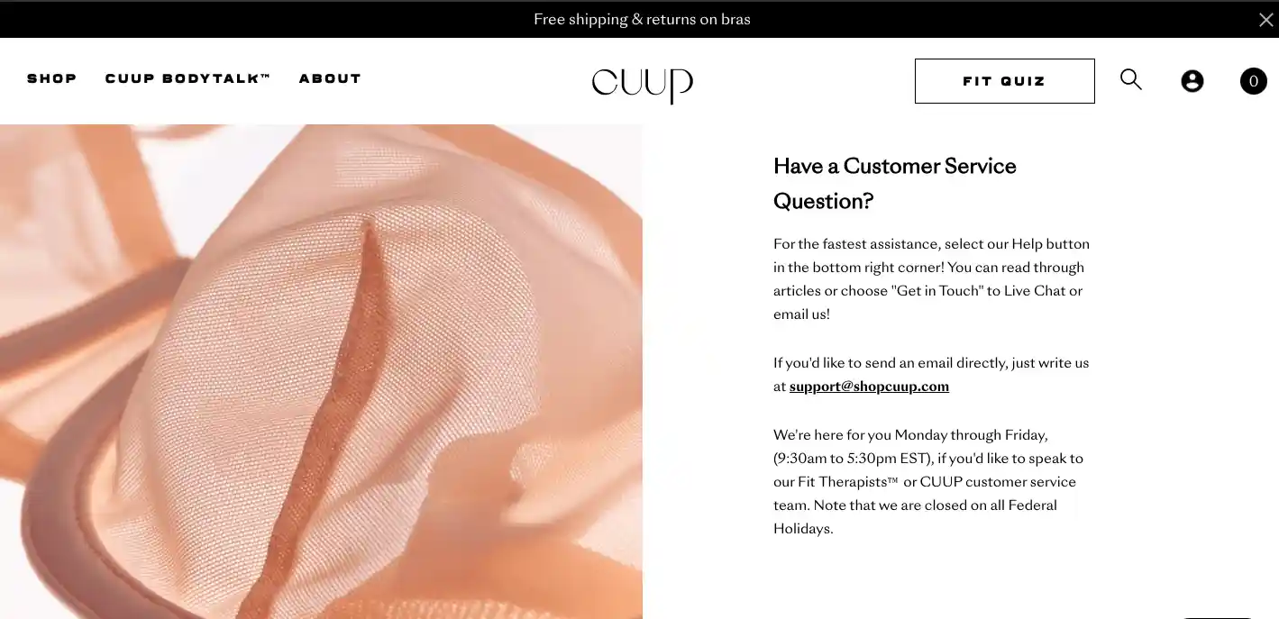
CUUP provides detailed instructions for how users can get in contact with the company. It tells visitors which forms of support are the fastest as well as the hours of operations for each one.
If you get stuck, you can launch CUUP's live chat support option featured in the bottom right-hand corner of the page. That resource connects you with a "Fit Therapist" who can help you find the bra that fits you best.
Why I think this "Contact Us" page stands out:
For marketing inquiries, CUUP also provides two email addresses and a partnership page that visitors can access directly from the Contact Us page. This opens the door for new partnerships that the company may not have initially considered.
40. United Sodas of America
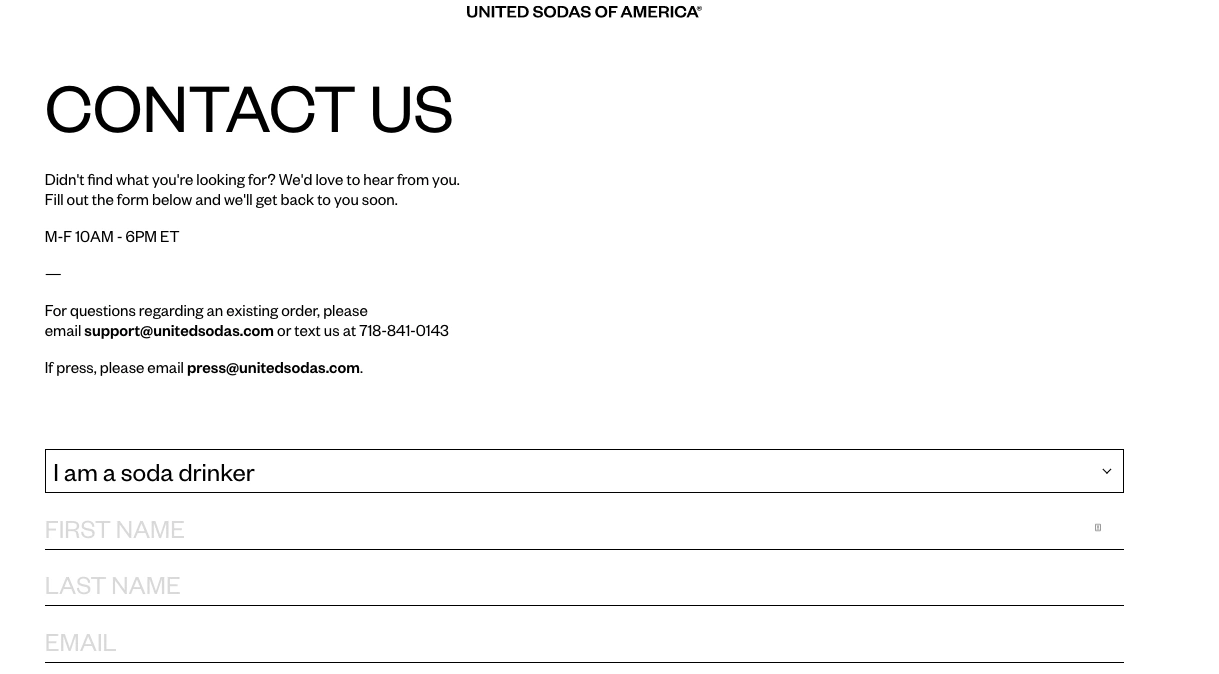
United Sodas of America offers healthier alternatives to popular soft drinks that are packed with sugar and extra calories. The bare-bones appeal of this soda extends into the brand's website, too. The simple black and white layout keeps the contact form front and center for the visitor.
Why I think this "Contact Us" page stands out:
United Sodas of America is on my list because it features its Contact Us page at the bottom of its FAQ page. Users have to first scroll through the most common questions asked before reaching out to customer support. This is great because it cuts down the number of routine inquiries that reach the support team — meaning customers are getting faster answers and support reps are dealing with fewer cases. It's a win-win.
41. Omsum
Omsom is a food brand that offers starter sauces and noodles to simplify cooking with Asian flavors. The brand gets its name from a Vietnamese phrase that means "noisy, rambunctious, riotous." This spirit is further demonstrated with the brand’s personality and visual identity, which employs bold copy, bright colors, and unique graphics — even on its Contact page.
Why I think this "Contact Us" page stands out:
Omsom’s Contact Us page stays on brand by greeting visitors with "Holler!" The page immediately directs customers with questions about Omsom’s products, process, and return policy to the FAQ page. It also provides email addresses for inquiries regarding order issues, wholesale requests, press, careers, and partnerships.
42. Tower 28
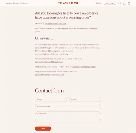
Tower 28 is a cosmetics company that specializes in creating high-performance makeup and skincare products for sensitive and allergy-prone skin. As a "clean" cosmetics brand, it’s understandable that customers may have a lot of questions about the company’s products and sustainability efforts. That’s why it’s super helpful that the Contact Us page includes a link to the FAQ.
Why I think this "Contact Us" page stands out:
Tower 28 provides a simple contact form on its Contact Us page, as well as specific email addresses that visitors can reach out to with specific inquiries regarding order status, influencing, press, and partnership.
I especially appreciate how proactive Tower 28 is about navigating potential phishing scams. Not only does the Contact Us page explain how you can get in contact with the brand, but it also lists the methods and accounts they would use if they ever reach out to you.
43. Honest
From personal care and makeup to baby care and gifts, Honest makes products that are sustainable and well-designed. The brand’s website has a convenient chatbot that can answer FAQs, check your order status, start or view a return, cancel your subscription, or direct you to a live agent.
Why I think this "Contact Us" page stands out:
If Honest’s chatbot can’t resolve your issue, its Contact Us page provides all the information you need to get in touch with someone who can. It provides an email form, a phone number, and a timeframe in which live agents will be available to chat with you. It also provides emails for press inquiries, influencer inquiries, social brand partnerships, and giving back.
44. Pattern Beauty
Founded by Tracee Ellis Ross, Pattern Beauty is a hair care brand that provides affordable, high-quality curly-hair products and empowers its customers to embrace their natural hair texture. The brand’s Contact Us page maintains the simple, yet chic design you see on the rest of the website.
Why I think this "Contact Us" page stands out:
I love Pattern Beauty’s Contact Us page because it doesn’t make things more complicated than they need to be. The contact form allows you to submit a specific reason for contact so your inquiry is directed to the right person. The page also provides a phone number and time frame, in case you prefer to speak with a rep directly.
45. Black Girl Sunscreen
Black Girl Sunscreen is a brand that makes products with Black skin and darker complexions in mind. Unlike other sun care products, Black Girl Sunscreen doesn’t leave behind a white residue on your skin and dries down completely clear.
One thing I really like about Black Girl Sunscreen’s website is that it has an accessibility menu that can be expanded by clicking on the icon in the bottom right hand corner of the screen. This allows you to enable a screen reader function, change the contrast of the page, adjust text sizes, and more, making the Contact Us page easier to navigate.
Why I think this "Contact Us" page stands out:
What’s great about this Contact Us page is that it maintains the friendly and informative brand voice you see throughout the rest of the website. It lets customers know that the Black Girl Sunscreen team genuinely cares about their experience with the brand and encourages customers to use the contact method that best works for them.
Contact Us Page Templates
Creating a Contact Us page can be a daunting task. Deciding whether to go simple or personalized is easier said than done. Luckily, there are free and affordable templates available to get you started. Check out some of our favorite Contact Us page templates and forms below.
1. JotForm
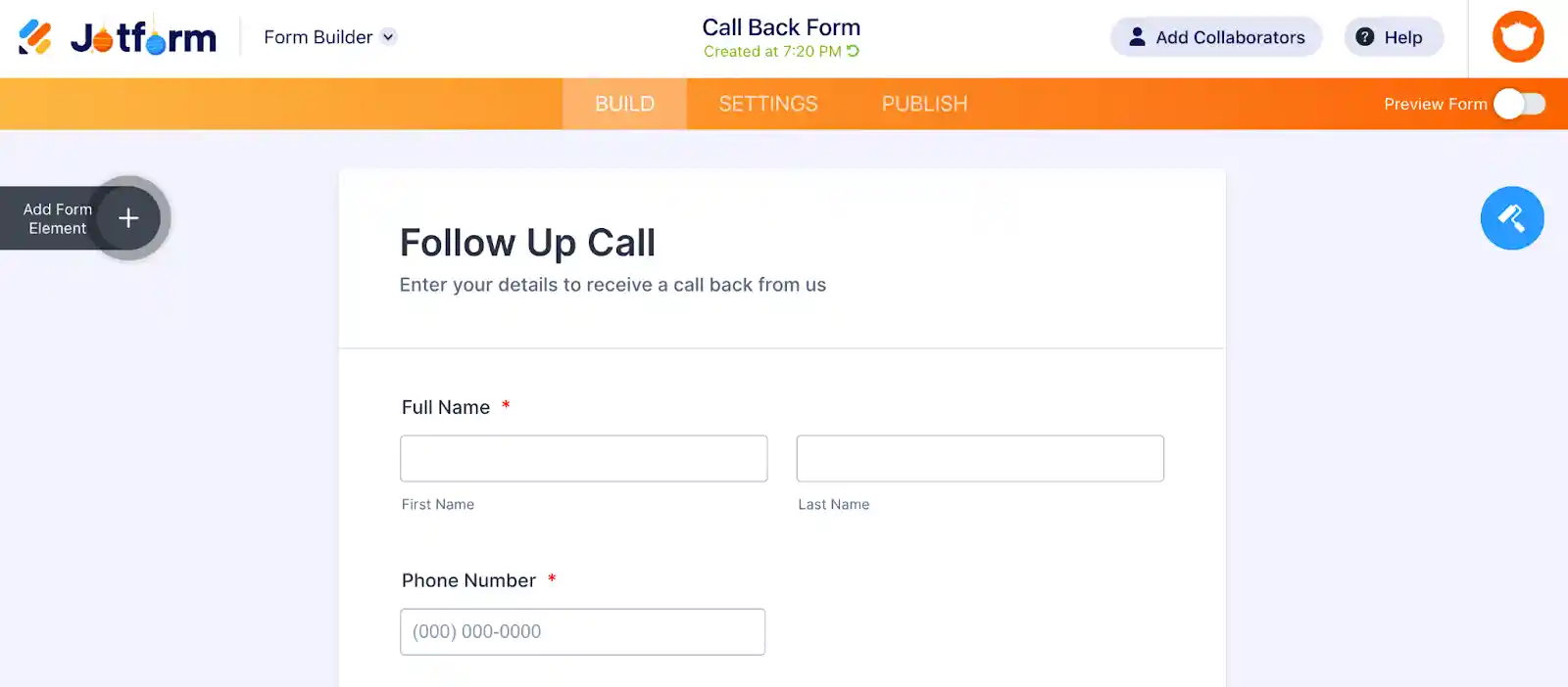
If your business is primarily focused on generating leads, it's a great idea to add a follow-up call form to your Contact Us page. This form is a gentle, pressure-free way to get more information about the visitors who land on your website in an effort to contact your team directly.
I like JotForm because it makes a flexible follow-up call form that you can customize to fit your business's needs. The template includes the typical fields like name and phone number, but it also allows you to add an appointment scheduler, address, sticker, and even a product list. Your website visitors will be able to communicate exactly what they're looking for and your team will have all the information they need to respond to them and close the deal.
2. FormPlus
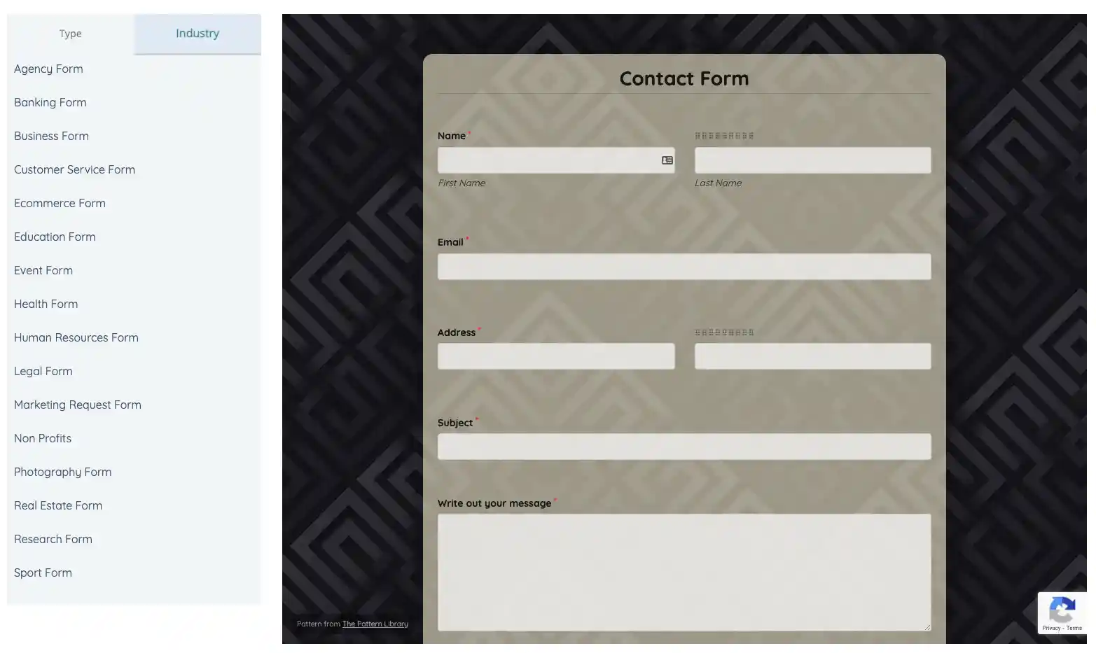
I think FormPlus is a great option because, no matter what industry your business is in, Form Plus has a Contact Us form template for you. You won't need to spend much time customizing a form to fit your specific needs as there are several templates readily available that can be embedded on your site.
This contact form template includes common fields like name, email address, and a paragraph box for a brief message. However, it also includes a file submission option. A customer or site visitor can upload a visual of a problem they're having so your team can spring into action quickly and find a resolution.
3. Typeform
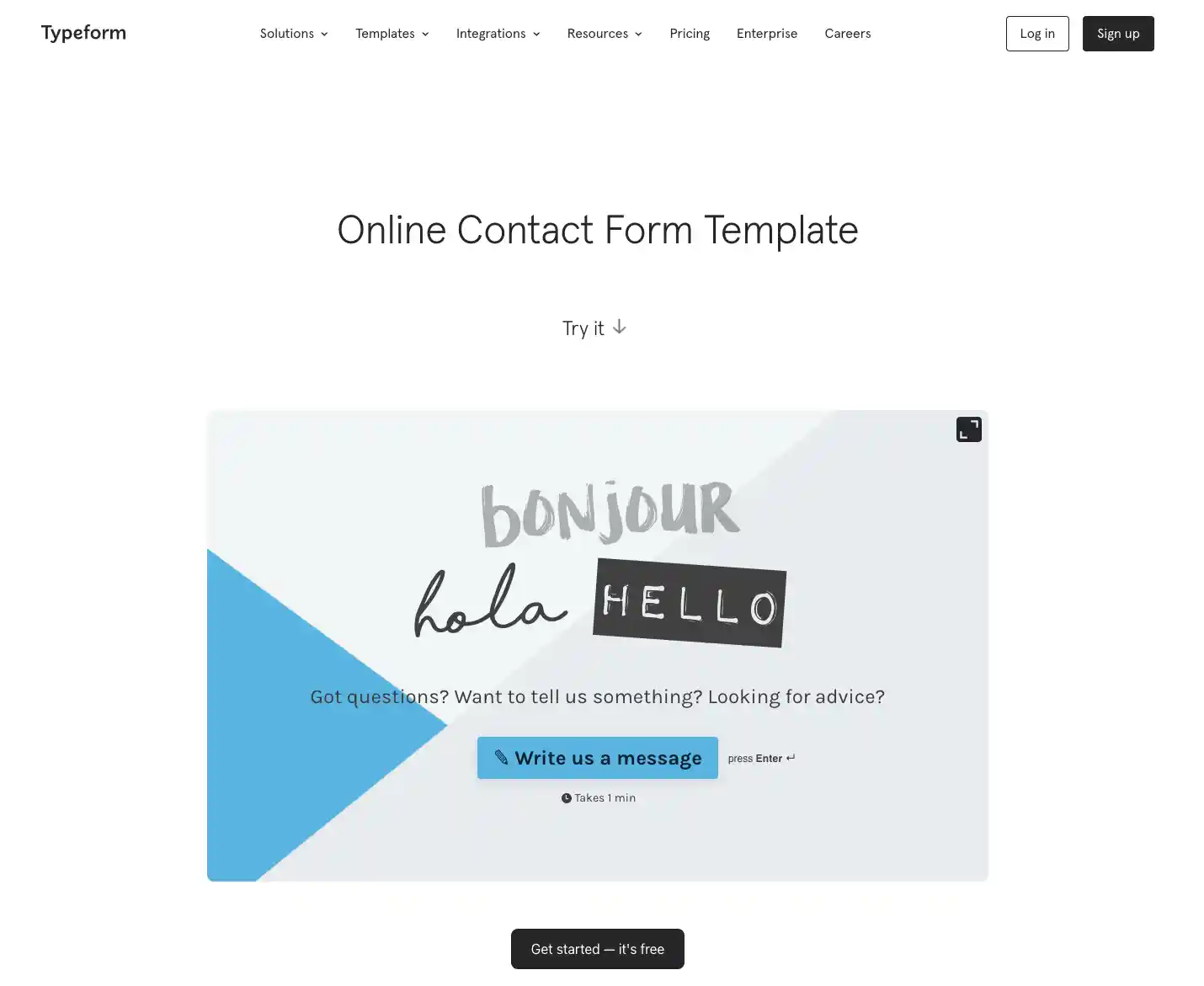
Typeform provides a fun, whimsical take on the Contact Us page template. This free, customizable Contact Us page can be edited to include your own copy, images, and even videos.
The best part of this template is the multi-page option. Rather than having each form question as a separate field, they'll appear on different screens so the user can focus only on the information in front of them. Your customers won't feel overwhelmed, and your team will still get all the information they need to offer the best support possible.
4. Formidable Forms
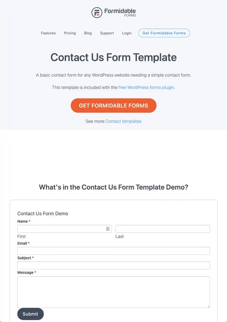
For a simple contact form template that's easy to install, Formidable Forms is an affordable solution. Choose from eight Contact Us form templates for your website visitors. Each one serves a specific purpose from lead generation to SMS messaging to quote requests. If you're using the WordPress CMS, the contact page template pictured above is included for free with the WordPress forms plugin.
In addition to Contact Us page templates and forms, Formidable Forms allows you to conduct polls and surveys on your site so you can gather data about what your users find helpful or hindering in their experience on your website.
Build a Stellar Contact Us Page
No matter your industry or what your buyer personas are like, every business should strive for a great Contact Us page. A well-thought contact page helps you maintain a professional feel and make it easy to engage with your audience to build a positive, long-lasting relationship.
Editor's note: This post was originally published in April 2020 and has been updated for comprehensiveness.
