1. Chirpley
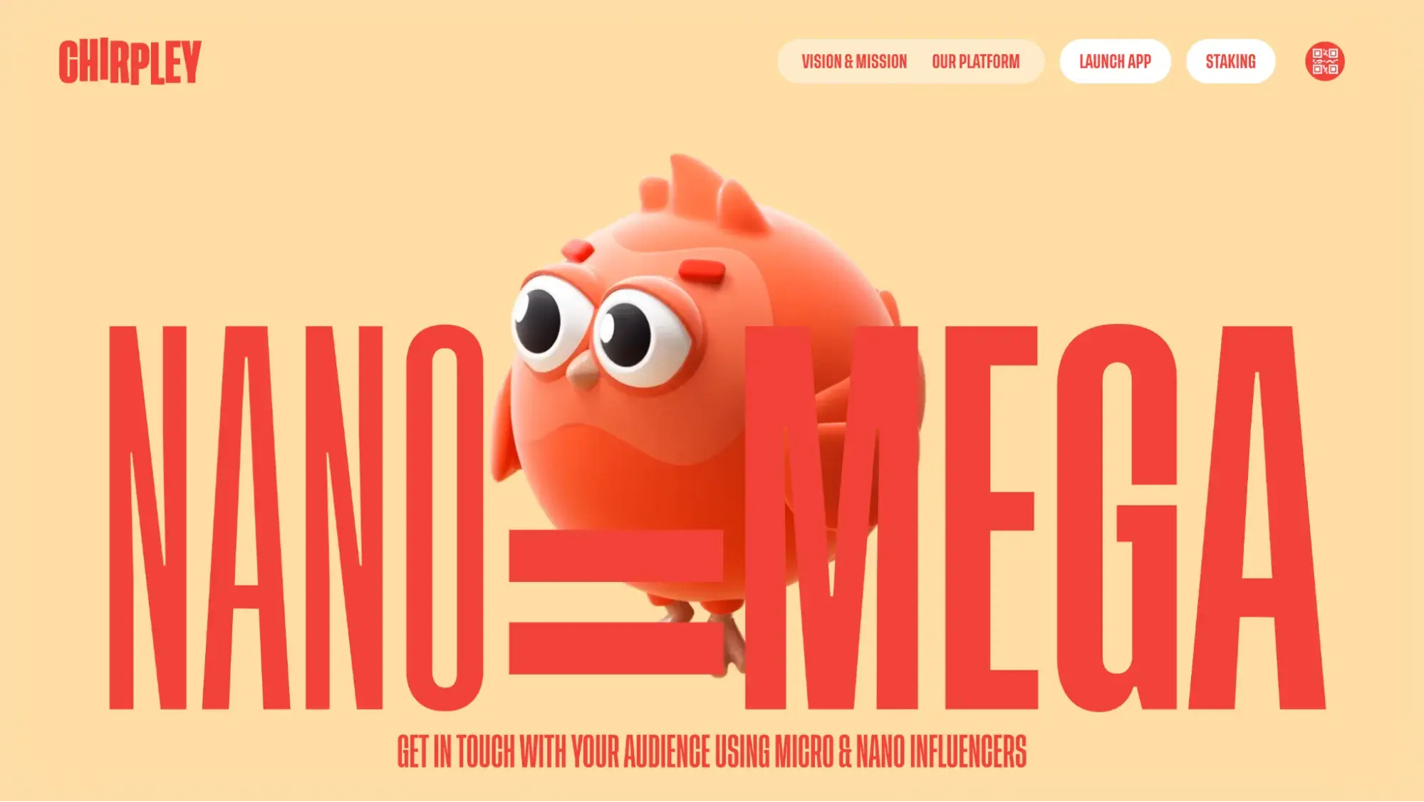
Chirpley, an AI-powered marketplace, offers an unconventional approach to marketing by connecting brands with micro-influencers. Its website design stands out from the crowd with an abundance of three-dimensional cartoon visuals, showcasing their brand identity. The website features a quirky red bird mascot that appears throughout, adding a touch of playfulness to the technical information about their product.
What I like: I love the colorful and creative design that effectively communicates the complexity of their services in a fun and engaging way. For those seeking inspiration in 3D website design that prioritizes branding, Chirpley's website is a must-visit.
2. Design In DC
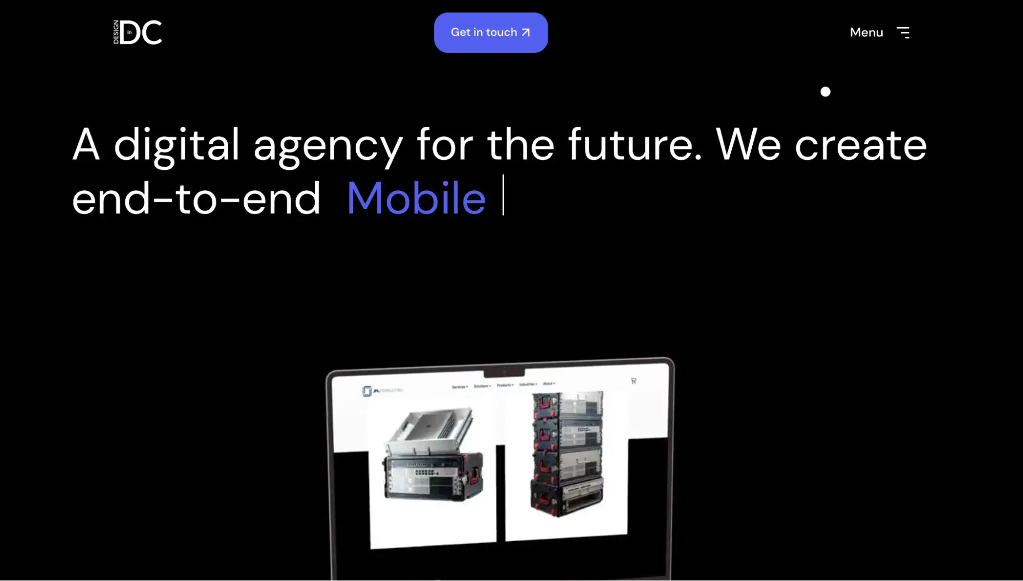
Design In DC is a digital design studio that really knows how to market its work — by using its own homepage as a testament to their animation skills! The website is fully animated, and each element of the website, from the cursor to the background, is attention-grabbing.
I spoke with Mason Carter, Business Development Director of Design In DC, about 3D website designs and asked his opinion on the length of time visitors stick around.
Carter told me, “I would say that both 2D and 3D animations keep people on the site longer. Animations can be used in subtle ways to keep the site from looking so static and guide people towards scrolling down the page.”
What I like: I appreciate Design In DC’s creative use of design elements. It’s clear they pay close attention to the small details in their website. The more I scrolled the page, the more I noticed interactive design features that held my attention — details I likely would have ignored on a 2D website.
3. Apple
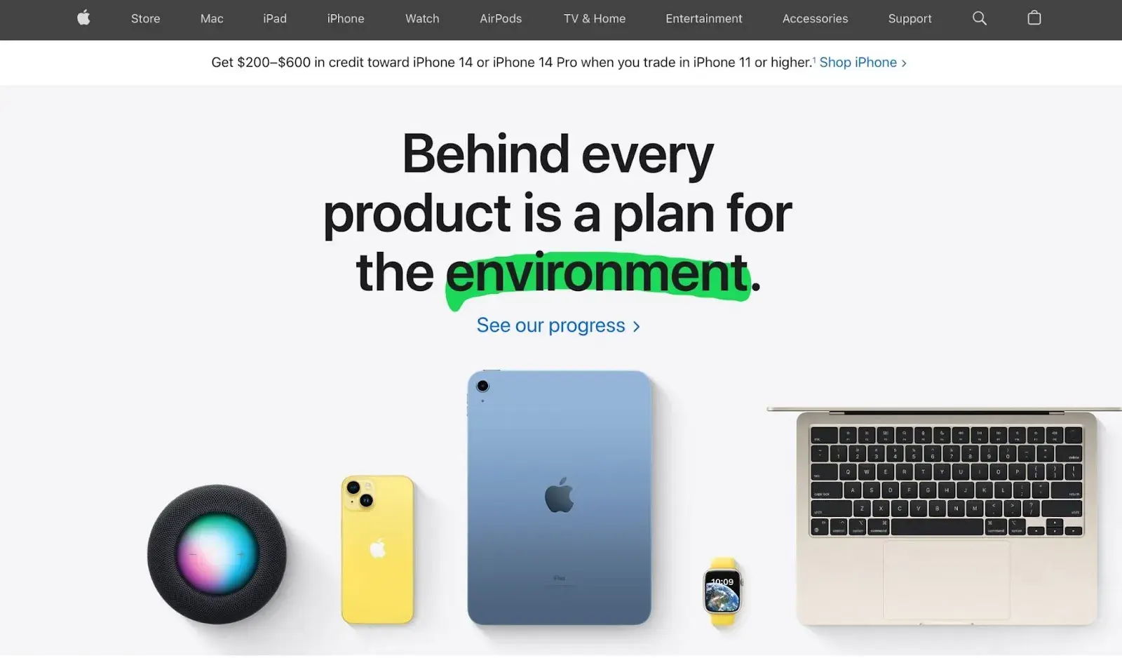
In my opinion, Apple‘s 3D website design is a true testament to the company’s commitment to innovation and user experience. And as an Apple user, I expect their website to match their brand.
With its clean and sleek design, the website showcases the latest Apple products and services in stunning 3D detail, making it easy for users to get a full view of the products from every angle. Apple's use of 3D design allows for a more interactive experience, with the ability to rotate and zoom in on products to get a closer look.
What I like: I like that design approach enhances the storytelling aspect of the website, with seamless transitions between products and features. By incorporating 3D design into their website, Apple has created an immersive and engaging online experience that truly sets them apart from their competitors.
4. UPQODE
Have you ever been so engrossed in a website’s animation that you just stopped and stared for a few seconds to watch it all the way through?
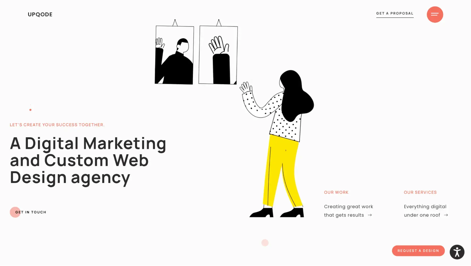
That’s what happened to me when visiting UPQODE’s website. As a digital marketing agency, they’ve pulled out all the stops to ensure their website visitors stay on their page. Their mesmerizing animated art is sure to impress and encourage visitors scrolling through the page. Plus, the animated cursor is a fun design element to help spark even more interest in their work.
What I like: I appreciate that each element of UPQODE’s website is interactive. As I scrolled the page, I noticed new design blocks appear. The movement of these blocks helped draw my attention to the featured text that I might otherwise have skipped. If you’re looking to highlight important information on your website, consider incorporating these same elements.
5. Qualle
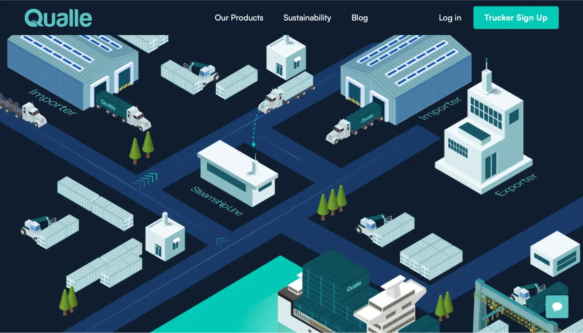
Qualle’s animations perfectly depict the company’s mission — to keep containers moving. And just like it’s their goal to keep containers moving, their animated website elements help keep visitors engaged and moving through their pages.
Branding plays a factor in website design, too, and Qualle’s branding nails it. The cool and contrasting tones in the design help lend a hand to depicting their commitment to sustainability, without being distracting.
What I like: I really like the animation elements on Qualle’s website. Instead of visitors reading about their work, they effectively show what they do by including an animation of it. For visual learners like me, this is helpful in understanding their business. And, it's a good concept to steal, if you’re looking to redesign your website.
6. Clou
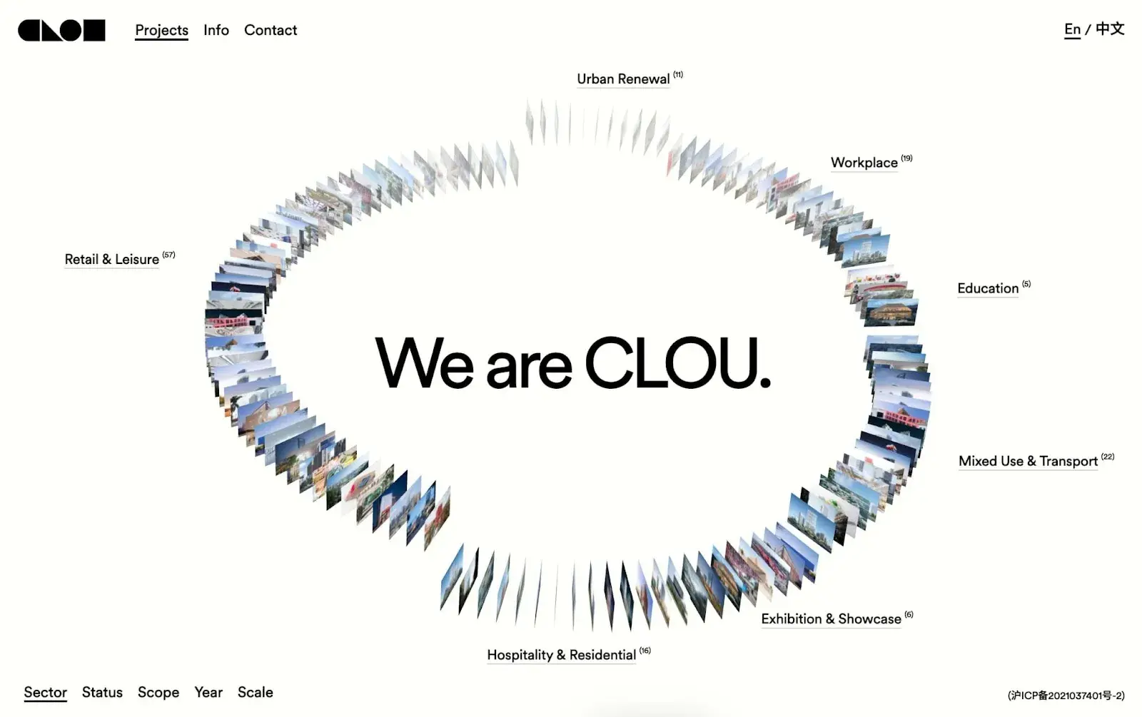
At the intersection of physical forms and space lies architecture, a discipline that has captivated creatives for centuries. With the advent of 3D web design, architects can now explore the digital realm while continuing to work with form and space.
Clou Architects, a China-based architectural firm, has leveraged this technology to create a stunning revolving carousel of projects on their website. The website boasts captivating micro-interactions, inviting users to hover over each slide to reveal a larger photo at the center.
What I like: While this design may not be as fully immersive as other 3D website examples, it still manages to showcase Clou Architects‘ innovative work in a way that is both inventive and attention-grabbing. As a lover of both architecture and technology, I can’t help but be impressed by the seamless fusion of these two worlds.
7. Kamboko Portfolio
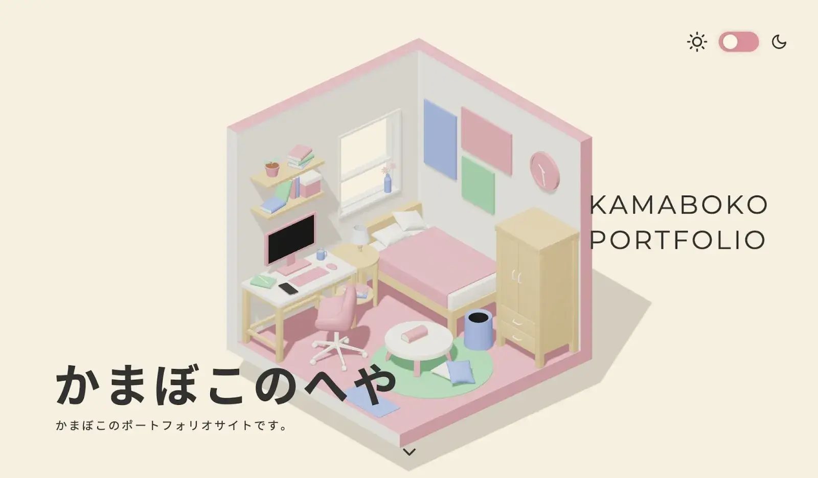
I think this design portfolio by Kamaboko is a true masterpiece that showcases the power of 3D website design. With a lightweight color palette, smooth edges, and fluid animations, the portfolio immerses you in a three-dimensional representation of a student living space.
Kamaboko’s expertise in apps like WebGL, GSAP animation, and Blender is evident in every aspect of the design, making it a great example for those looking to explore the possibilities of 3D web design.
What I like: I absolutely love the way this portfolio takes you on a journey through space, with scrolling bringing you closer and closer to the intricate details. Kamaboko’s attention to perspective and use of animation is truly impressive, demonstrating their skills as both a designer and a storyteller. For visual designers looking to create their own personal website, this portfolio is a testament to what is possible with 3D web design.
8. Cat Genius
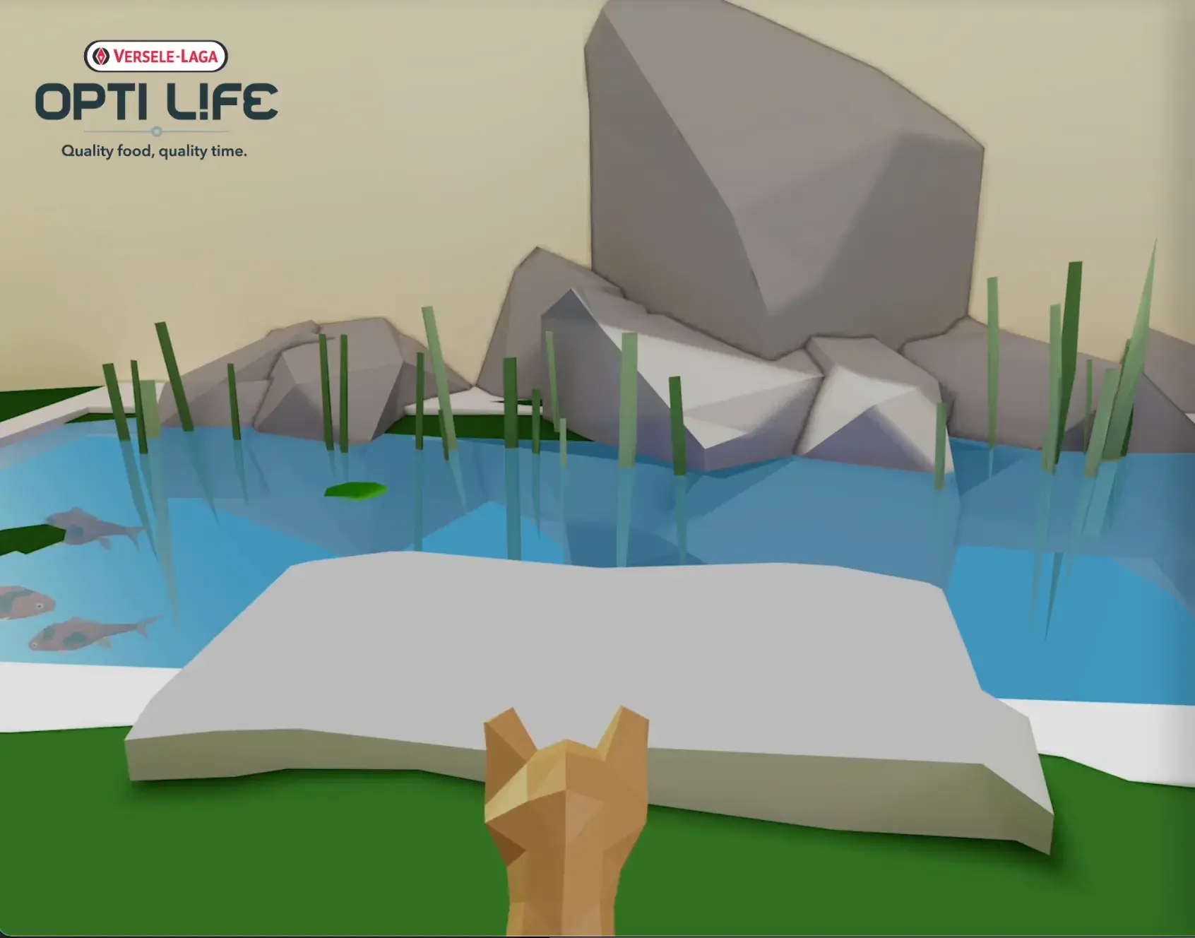
At the intersection of fun and imaginative, I stumbled upon Cat Genius, an AR-inspired game created by Opti Life, a pet food company. The game puts you in charge of Simba, the cat, on a mission to find a bowl of food while being quizzed on feline trivia. Each correct answer takes you one step closer to lunch, and if you succeed, you’ll receive a discount code as a reward.
What I like: As a lover of all things innovative, I appreciate brands like Opti Life, who use creativity to offer unique experiences and perks to their customers. This game is not only fun but also educational, making the journey to the discount code all the more satisfying.
9. Modality Solutions

When you think about “biopharma,” what is the first thing that comes to mind? For me, it's definitely bio-molecules.
Modality Solutions, a biopharma engineering solution, specializes in helping biopharmaceutical companies obtain regulatory approvals. And while you might expect them to deal with biomatter on the molecular level, if you pay close enough attention to their animated website, you’ll soon learn they also help with cold chain refrigeration.
Animating the background of their website is a perfect solution to helping the visitor understand the complexities of their business.
Carter says this is by design. He said, “There are a lot of opportunities to guide people towards designs and getting excited about a brand with animation. It’s not necessarily that animated websites are better, because static ones still have their place, too. But, the opportunities for storytelling and interactivity are much greater with animated websites.”
What I like: I like that this website makes great use of its background to further explain the company’s purpose and mission. The animated background aids in storytelling and adds an interesting element to the overall design.
10. Richard Sancho
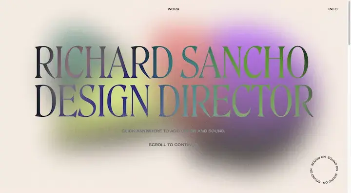
Richard Sancho‘s website design is a standout example of the power of minimalism in web design. The site’s clean, uncluttered aesthetic immediately draws the eye to the impressive portfolio of this talented designer. Sancho’s design work takes center stage, with simple animations and transitions that serve to enhance the user experience without detracting from the content.
What I like: The site's understated color palette and typography lend an air of sophistication and elegance, further emphasizing Sancho’s commitment to simplicity and attention to detail. Overall, I appreciate that this 3D website design serves as a prime example of how a minimalist approach can elevate both content and user experience to create a truly exceptional website. I think the music is a nice touch, too.
11. Robert Bürgel
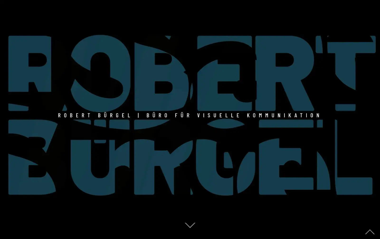
Robert Bürgel‘s website design is a true masterpiece of modern web design. With a focus on minimalism and simplicity, Bürgel’s site showcases his stunning portfolio of graphic design work in a way that is both elegant and effortless.
The site‘s clean and uncluttered design allows his work to take center stage, while intuitive navigation and subtle animations provide a seamless user experience. It’s no wonder that Bürgel's website has garnered widespread acclaim and serves as a shining example of what can be achieved with exceptional web design.
What I like: What sets Bürgel's design apart is its exceptional attention to detail, from the thoughtful use of negative space to the perfectly chosen typography. I appreciate that each element of the design has been carefully considered and masterfully executed, resulting in a website that is not only visually stunning but also a joy to use.
12. Flux Academy
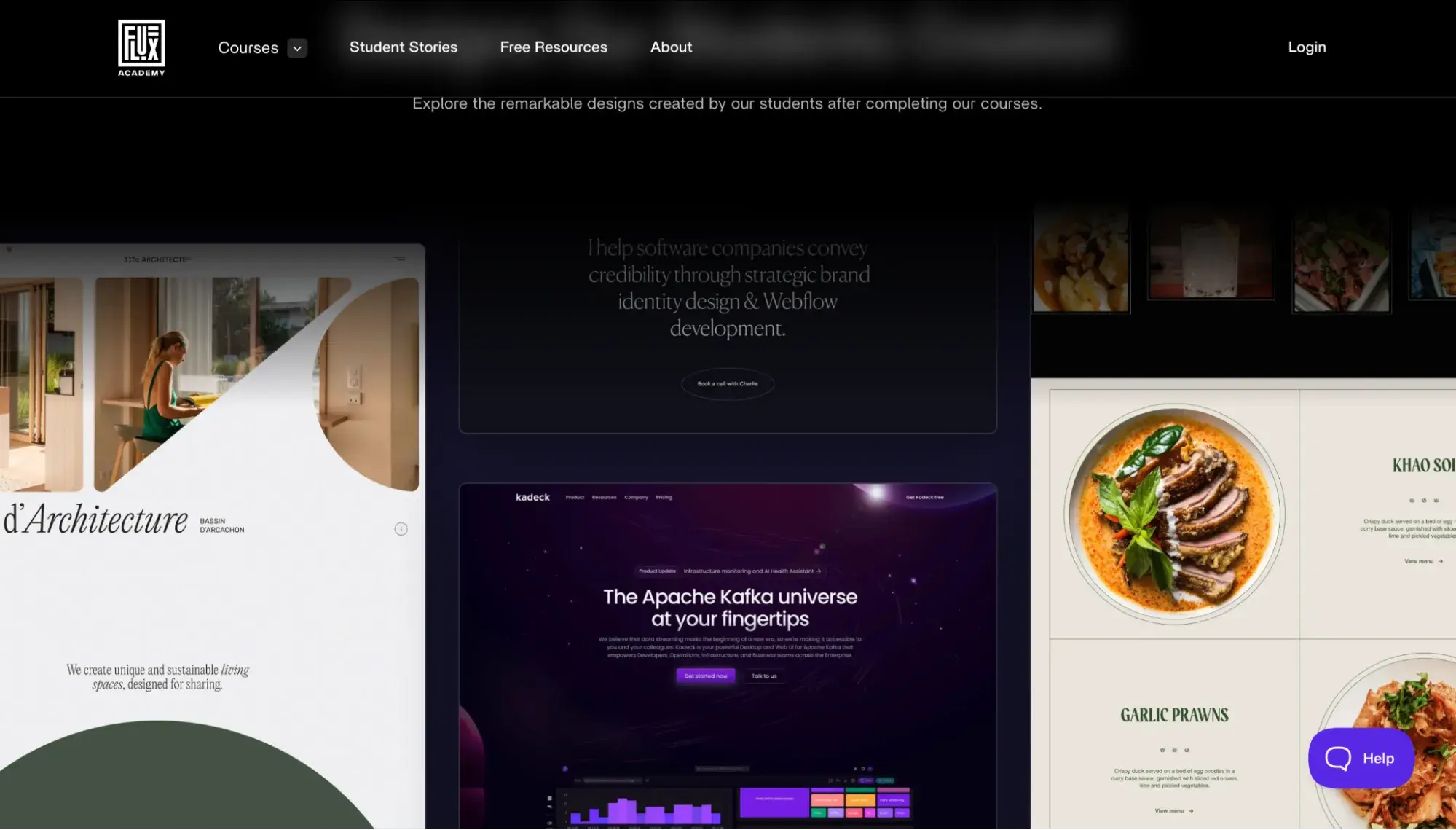
At Flux Academy, web designers can elevate their skills and knowledge through coursework that focuses on designing and perfecting web design. The homepage of the site features an array of 3D graphics that are a testament to their design skills. As the visitor scrolls down, the moving elements catch their eye and invite them to pause and take in the entirety of the web page.
What I like: Flux Academy demonstrates how motion effects can be used to create an engaging 3D experience. I appreciate the reminder that sometimes, the most effective designs are the ones that are the most straightforward. At Flux Academy, even the most basic elements can be transformed into something captivating.
13. Dasher & Crank
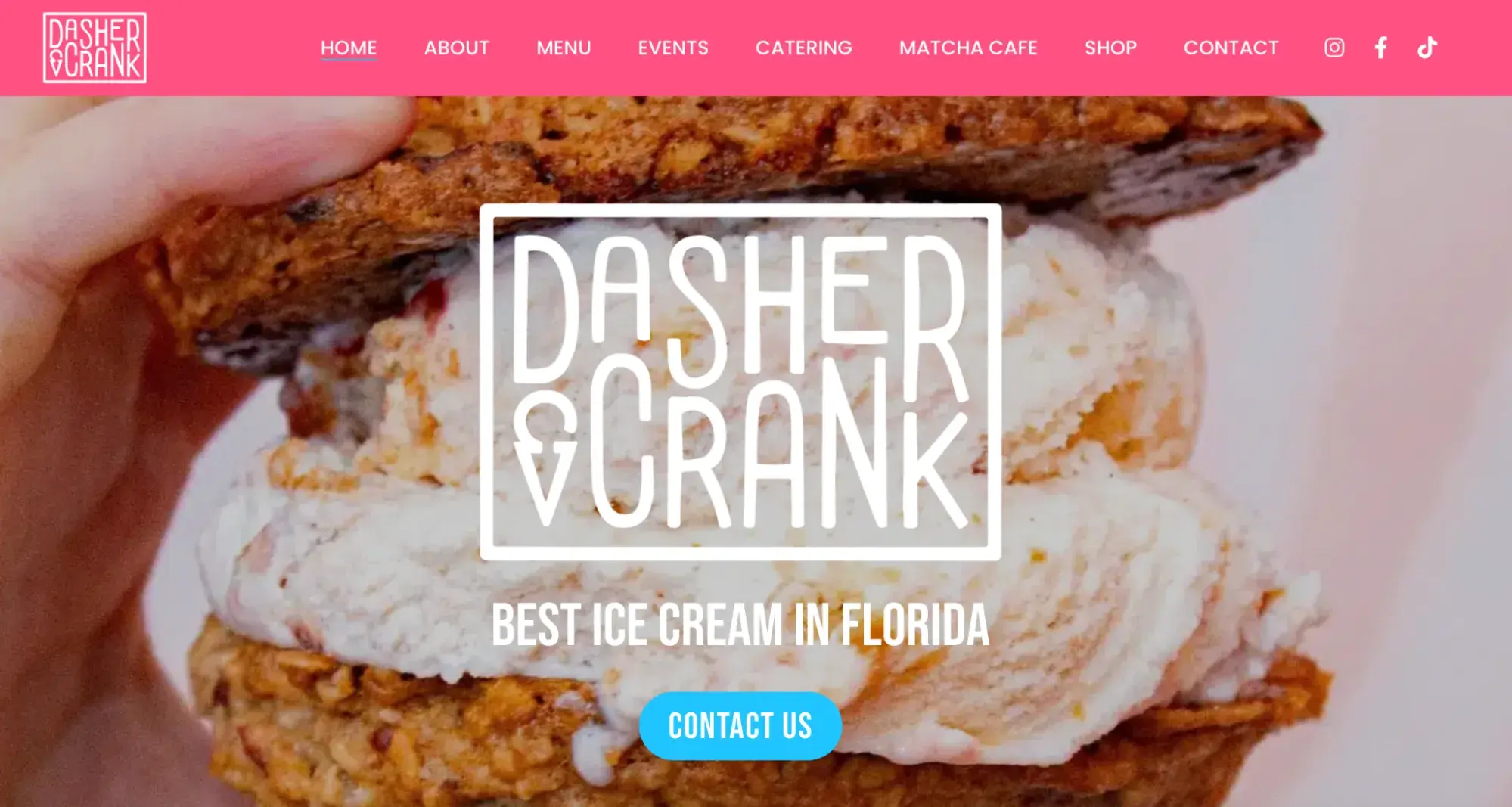
3D design isn't just for creative agencies anymore. In fact, more and more businesses are discovering the benefits of incorporating 3D elements into their website design. A great example of this is the Dasher & Crank website, where the hero image features a mouth-watering ice cream cookie sandwich that looks good enough to eat.
What I like: Unlike many restaurant websites that showcase their dishes in a flat, uninspiring manner, the solid pink background and expertly crafted 3D rendering of the dessert make it truly stand out. With this level of realism, it makes me want to reach out and take a bite!
14. The Freelance Industry Report (Contra)
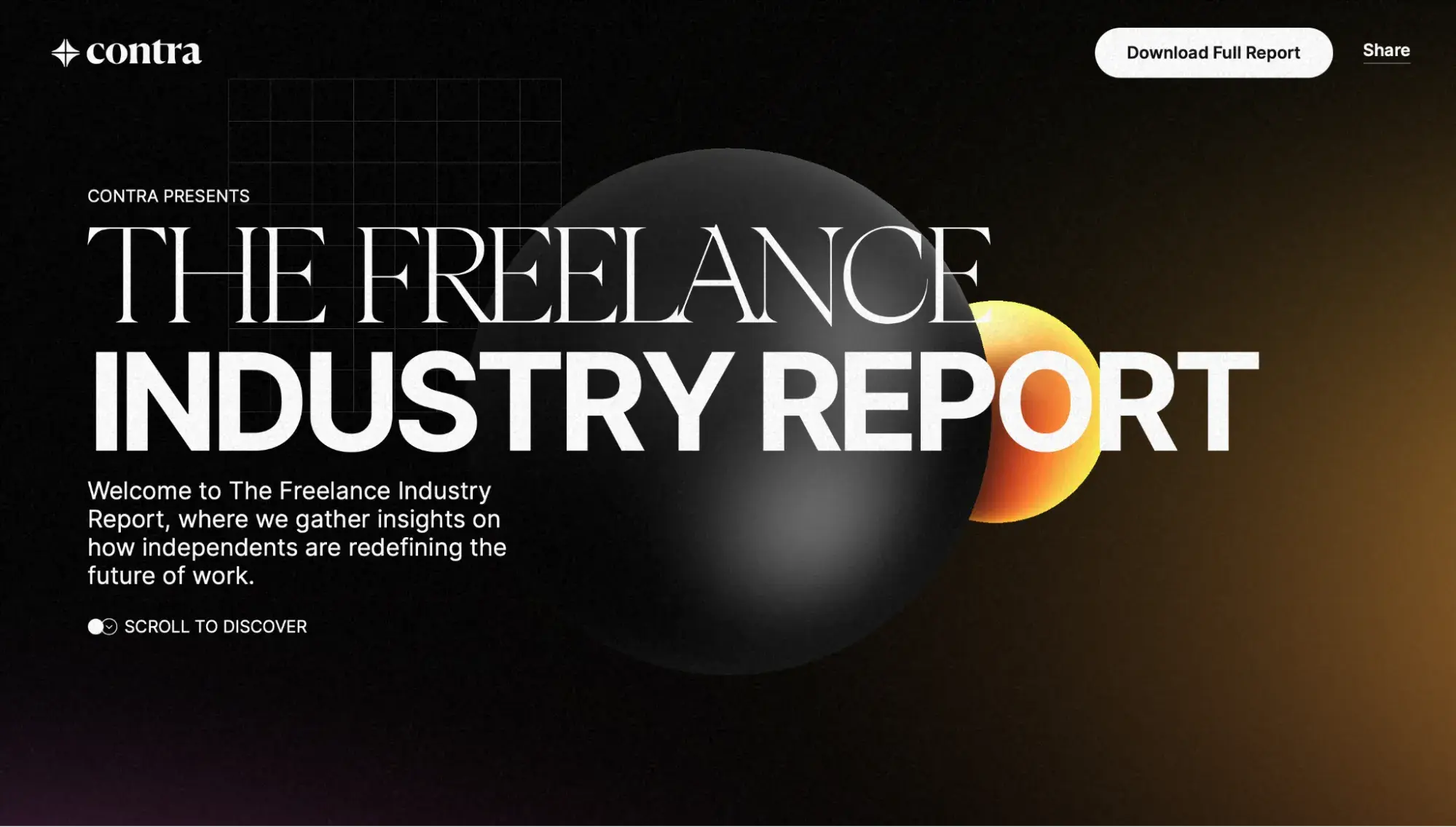
Do you ever find yourself scrolling through an online report or ebook, struggling to find the information you need? It's a common frustration, especially when documents are saved in PDF format.
But what if there was a way to make reading and learning online more engaging and interactive? Enter Contra's The Freelance Industry Report, a stunning example of how 3D design can revolutionize the educational experience.
What I like: Instead of slogging through endless paragraphs, this report incorporates small but impactful doses of 3D elements, like blobs and coins, to add a touch of visual interest. Most notably, the report uses 3D renderings to bring data visualizations and freelancer quotes to life, making the content more dynamic and engaging. I love the idea of using 3D design to enhance my reading and learning experiences.
15. Summit Ridge Energy
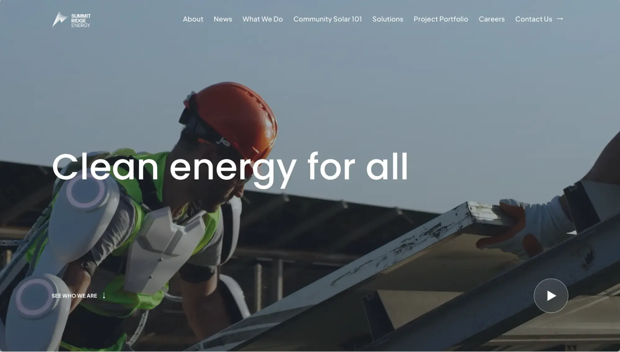
Summit Ridge Energy, a commercial solar company, knows the best way to explain their work is to just show you. Using an animated background, visitors get an up close and personal view of the ins and outs of solar energy — from a flyover view of a solar farm to tagging along on a panel installation.
The website also features animated blocks that pop up on the screen as you scroll. This feature is a great way to capture visitors' attention and direct them to important information on the website.
What I like: I really appreciate the responsiveness of Summit Ridge Energy’s website. The animated background does not slow down the website’s loading speed, which can be an issue for impatient people like me.
For web designers, website speed is a big deal. In fact, it’s one of the biggest challenges of designing websites with animation. Carter said, “When you are adding animations, there is going to be more data to be loaded at a time, and you need to account for people who have slower connections. You also don’t want to sacrifice SEO just to make a website more flashy. So to overcome this, you need to be smart with compression techniques and make sure that you are using animation as necessary, but not going too far with it if it's not justified.”
16. Moffett AI
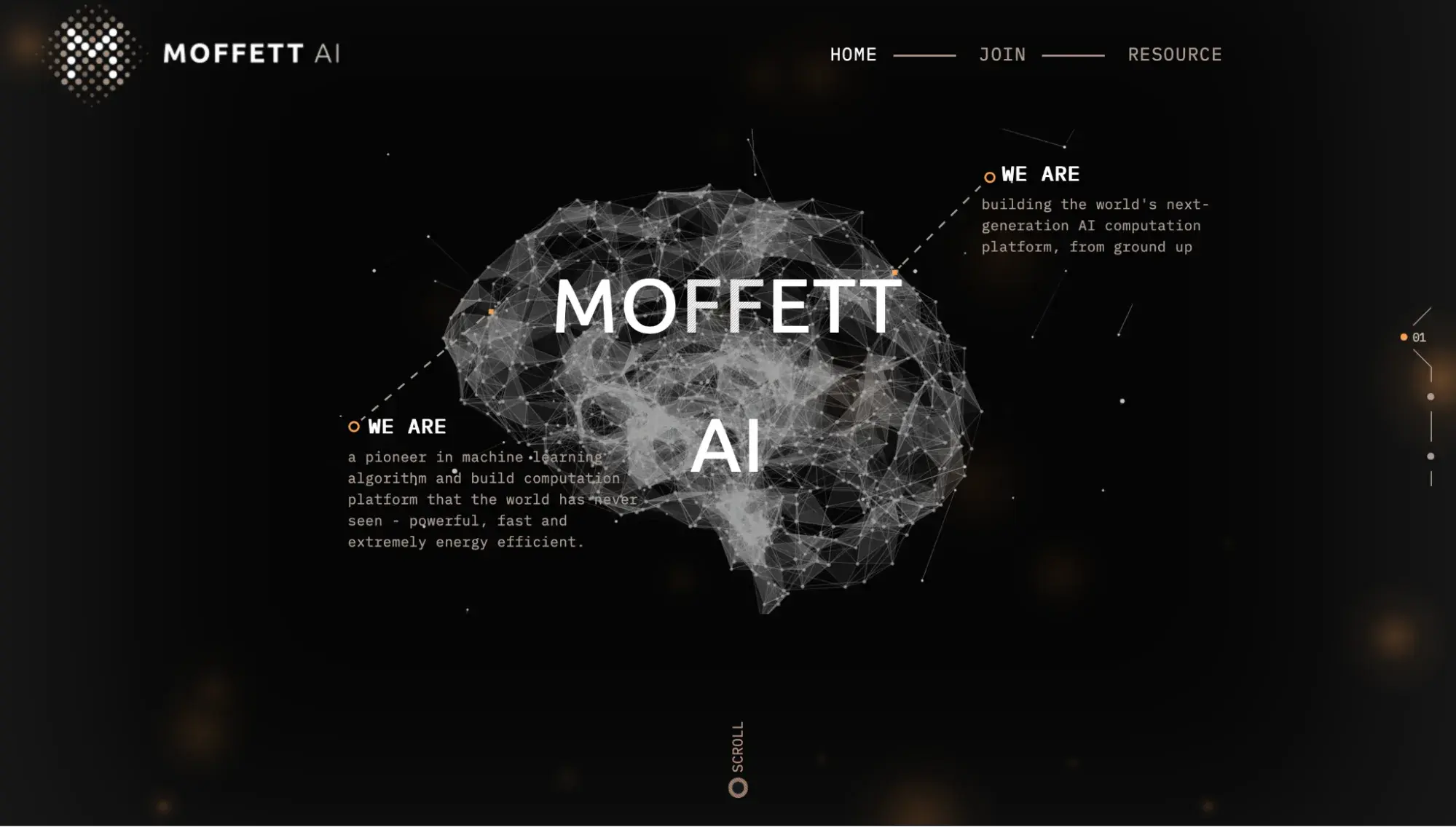
I can’t help but think of the neural network in our brains every time I think about artificial intelligence. Just like the neural pathways that help us to complete tasks, artificial intelligence also relies on algorithmic pathways to compute functions. Moffett AI’s 3D website design plays into this structure and uses design elements to make important connections between the texts.
What I like: Instead of using a simple slider on the side of the screen to scroll, I like that Moffett AI’s website incorporates the neural pathway design to indicate where you are within the web page. This design element is just a nice added touch to continue with the overall theme.
17. Capsul’in Zero Impact
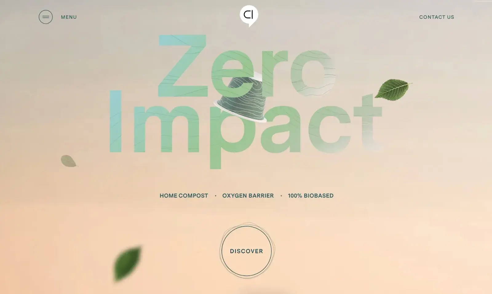
From the moment you land on the Capsul‘in Zero Impact website, you can’t help but be drawn in by the captivating 3D illustration of a falling coffee capsule. The masterful depiction, created by the talented designers at Index, is both playful and informative.
At first, the capsule is depicted as a charming hand-drawn sketch, but as you delve deeper into the page, the designer expertly dissects and reveals each unique component of the capsule.
What I like: I like that the hand-drawn sketch isn’t just a design gimmick. This 3D depiction serves to tell the product‘s story and showcase its impressive specifications in a dynamic and engaging way. It’s no wonder that this innovative approach to web design is something we all love.
18. TAG Heuer
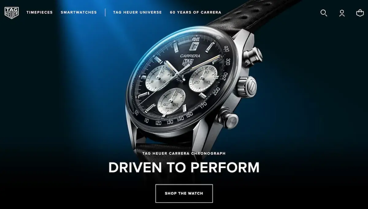
At TAG Heuer, they know that nothing showcases their stylish timepieces better than 3D visuals. While there are many ways to make a website feel sophisticated and elegant, there's nothing quite like giving customers a closer look at the products they love.
3D visuals aren‘t just for luxury brands like TAG Heuer, in my opinion. Even smaller brands can benefit from using 3D product visuals to help sell their products more effectively online. Whether you’re showcasing a high-end timepiece or a more affordable accessory, 3D visuals can help elevate your brand and bring your products to life in a way that customers will love.
What I like: I appreciate the stunning imagery on TAG Heuer’s website. From simple static shots to clever parallax effects, the brand's timepieces are shown in all their splendor. Some shots even capture the watches in motion, with the clasp opening and closing to reveal the intricate details within.
19. David Drew Longevity
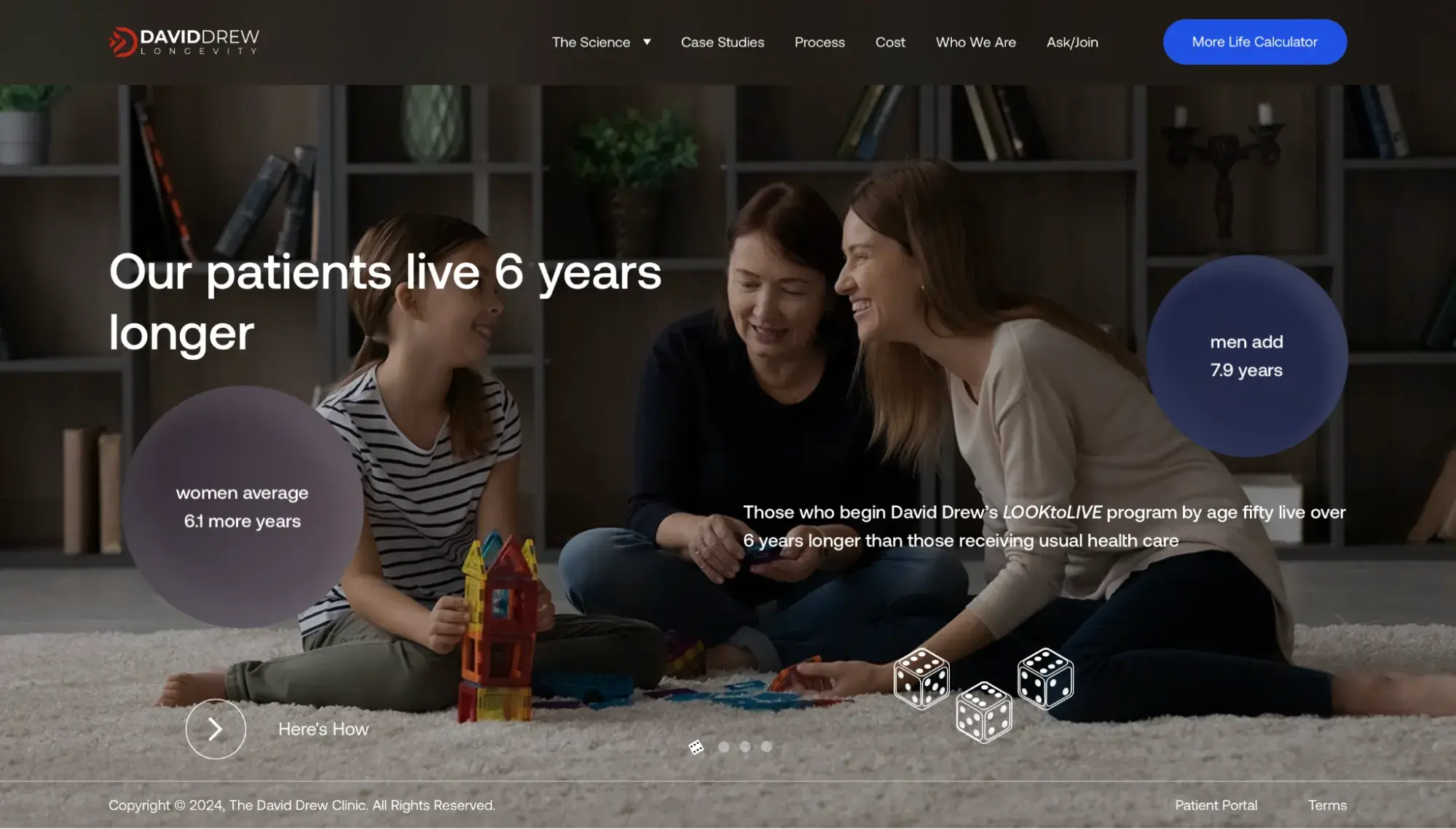
David Drew Longevity, a website designed by Designs In DC, features subtle animation on the homepage. The two bubbles on the screen move around the homepage, catching the eyes of visitors.
Carter says this is by design, too. He said, “Animations can be used to guide people to reading more information.” In this case, visitors come to understand that with David Drew’s program, participants can add years to their life.
What I like: I appreciate that the animation is subtle on this web page. In some of the other examples, the animation is flashy. And while that is eye catching, a subtle animation keeps the visitor focused on the information being presented.
How to Design a 3D Website
I know designing a 3D website can be a complex process, but following these steps can help you create an immersive online experience that truly stands out.
1. Plan your design.
Before you start creating your 3D website, it’s essential to plan out your design. This includes determining the purpose of your site, identifying your target audience, and establishing a consistent style and branding.
I suggest you make a note of any pertinent information that you want visitors to see. Depending on the design you choose for your website, this information can be displayed front and center like information in the David Drew Longevity example. Or, it can be used in a background video.
The choice is entirely up to you. It just helps to have a design idea first!
2. Choose the right software.
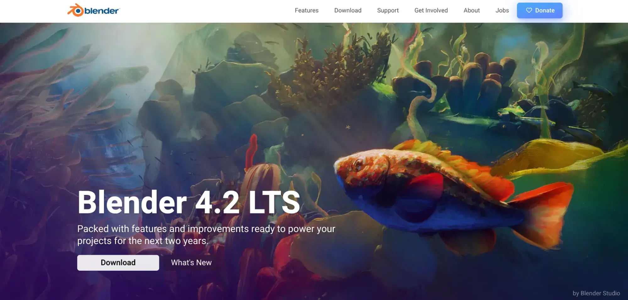
To create a 3D website, you’ll need software that can handle the task. Blender is a popular option that allows users to render, sculpt, model, animate, and more. You can download Blender to your device for free (and if you like the software, consider making a donation!).
Other popular design tools are SketchUp and 3DS Max. Consider your level of experience with 3D modeling and your budget when selecting software.
Pro tip: If designing websites is not a skill you have (it’s okay; I don’t have those skills either!), you can reach out to experienced web designers for help. Just know that 3D animation is a specialized skill, and not every designer will be able to do it. Make sure you take the time to talk with your designer about your website idea and your budget before signing a contract to begin work.
3. Create your 3D models.
With your software selected, it’s time to create your 3D models. This can involve everything from creating objects and environments to designing characters and animations. If you’re new to 3D design, search YouTube for some tutorials on how to use your selected software.
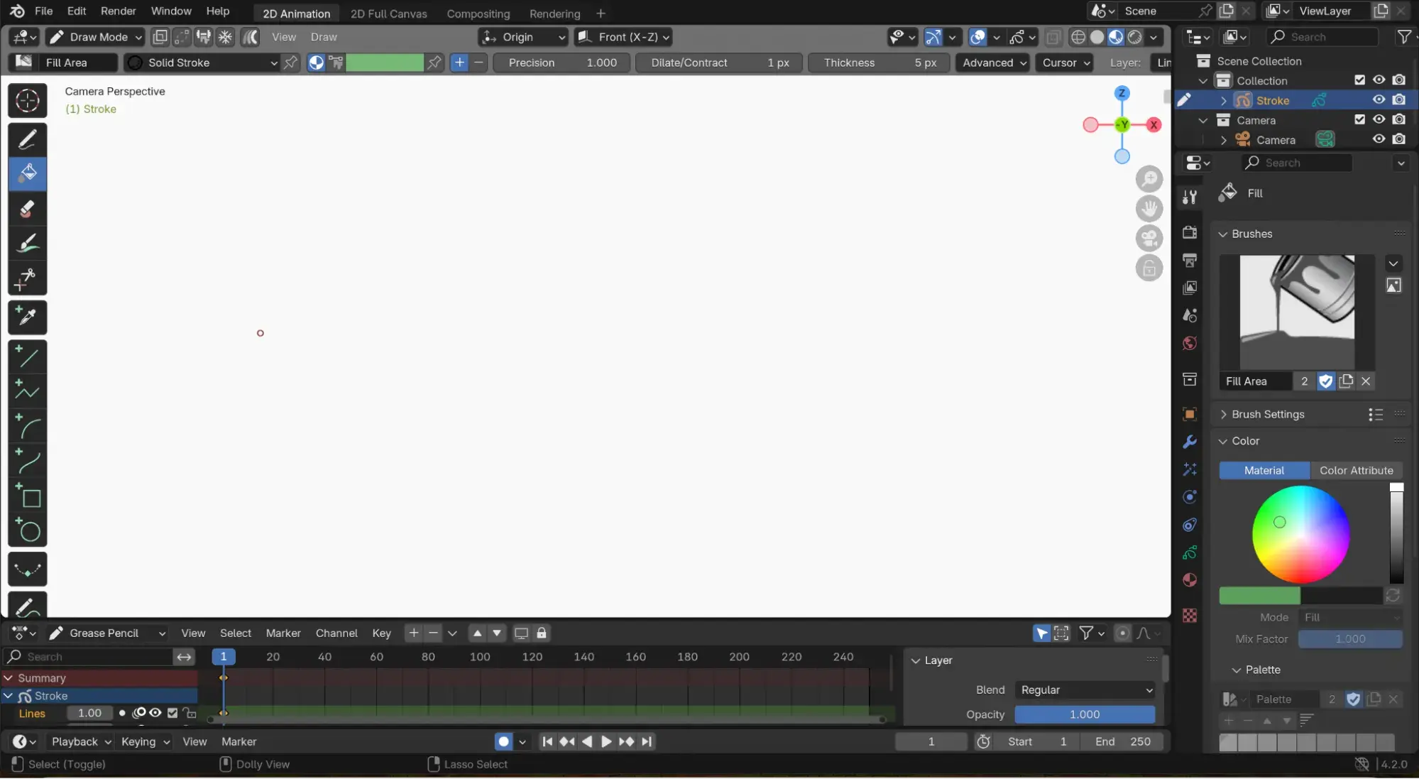
After you’ve created 3D animation, be sure to save and download your work as a usable file. You’ll need to upload the file to your website later. Also, keep in mind that your models should be optimized for web performance.
4. Build your website.
Once you have your 3D models, it’s time to build your website. This involves integrating your models into the site’s layout, creating interactive elements, and optimizing the site for performance.
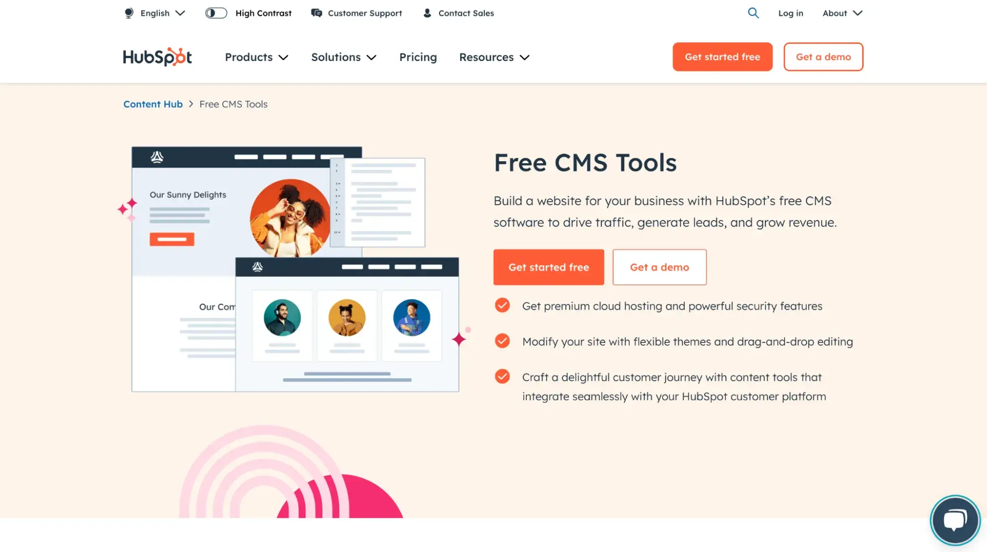
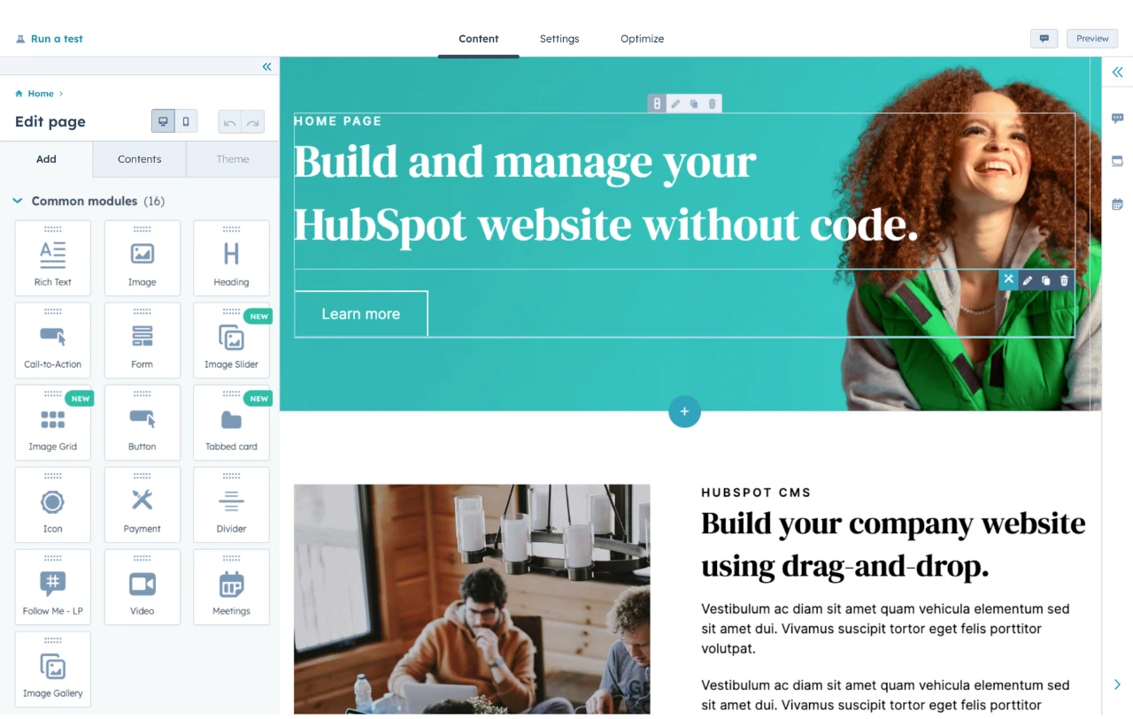
Creating a website from scratch can be challenging, especially if you’re not a skilled coder. Instead, you can use no-code website builders to create your website. I think HubSpot’s Content Hub are a great option to use.
5. Test and refine.
After your site is built, it’s important to test it and refine it. When you launch your website, check its speed, display, and performance on your computer and a mobile device. If necessary, have a friend check it from a different internet connection, as various internet connections can play a factor in performance, too.
As you and your friends check your website from multiple devices, make sure the site loads quickly. A slow-loading site can quickly deter visitors from your website — and that’s the last thing you want!
6. Consider adding interactivity.
To make your 3D website truly engaging, consider adding interactive content elements such as animations, hover effects, and clickable objects.
Remember the interactive game from Cat Genius? This kind of interactivity is fun and can help enhance the user experience, keeping visitors on your site longer. Plus, if you offer discounts like Cat Genius, visitors are sure to tell their friends about your cool website, too. Word of mouth is a great marketing tactic!
7. Publish and promote.
Once your 3D website is complete, it’s time to publish it and start promoting it to your target audience. Consider using social media, email marketing, and other promotional channels to reach your audience and drive traffic to your site.
I recommend you keep an eye on your website analytics, too. Your analytics will reveal details like how long visitors stay on your website, loading speeds, and other important metrics. You can use these metrics later to refine your site and enhance performance.
Designing a 3D website That Attracts Visitors and Builds Engagement
As a business owner, I know that creating a strong online presence is essential for any business looking to attract new visitors and build a thriving brand. And, a website is an important part of an online presence.
Whether you choose to work with a professional web designer or tackle the project yourself, it's important to prioritize user experience and accessibility. Keep in mind that visitors have a lot of options when it comes to websites, so your 3D website design needs to be clear, informative, and easy to navigate.
By incorporating high-quality 3D models, animations, and interactive elements, you can create a website that stands out from the competition and engages visitors. With a strong online presence, you can build trust and establish your brand as a leader in the industry, providing users with a memorable and immersive online experience.
Editor's note: This post was originally published in April 2023 and has been updated for comprehensiveness.
Website Design Examples
.png?width=112&height=112&name=Image%20Hackathon%20%E2%80%93%20Vertical%20(50).png)
.png)

![15 black and white website designs to inspire your own [+ pro tips]](https://53.fs1.hubspotusercontent-na1.net/hubfs/53/black-and-white-website-design-1-20250520-1336267.webp)

![15 Brochure Website Examples to Inspire You [+ How to Make One]](https://53.fs1.hubspotusercontent-na1.net/hubfs/53/brochure-website-examples-1-20250319-362228.webp)
![28 Types of Websites to Inspire You [+ Real-Life Examples]](https://53.fs1.hubspotusercontent-na1.net/hubfs/53/types-of-websites.png)

