When I test my own projects, I use both Chrome DevTools’ Lighthouse and HubSpot’s accessibility checklist to evaluate accessibility scores and pinpoint areas for improvement. Hitting that 80% benchmark always feels like a win; it means I’m moving in the right direction. Of course, 100% is the goal, but accessibility is a continual journey of refining, testing, and learning.
Thanks to organizations like W3C, we’ve made tremendous progress in making the web more inclusive. Yet, after studying dozens of sites for this piece, I’ve realized how many still fall short of accessibility best practices. That’s why I’ve handpicked 14 accessible website examples that prove inclusivity and great design can (and should) coexist. Whether you’re designing for a global brand or a small business, these sites show what’s possible when accessibility is prioritized from the start.
Table of Contents
.png)
The Ultimate Google Ads PPC Kit
A free guide and template to help run Google Ads campaigns.
- Set your budget.
- Research your keywords.
- Plan your ROI.
- Grow your business.
Download Free
All fields are required.
What makes a successful accessible website?
When I design or audit a website, I always think about how I can ensure that I consider a range of impairments, including visual, auditory, motor, cognitive, and speech. When designing websites with accessibility in mind, it’s not just about following rules — it’s about designing digital spaces that everyone can use and enjoy. That means thinking beyond color contrast or alt text and considering a full spectrum of accessibility needs.
Successful accessible websites don’t happen by accident. They’re built intentionally with standard best practices that guide how visual interfaces should look and behave, and how HTML should be structured for screen readers and assistive technologies. If you’re not sure where to start, check out our web accessibility checklist, which outlines the must-haves for creating an inclusive online experience.
I’ve also noticed more tools being introduced to the market to help businesses with accessibility compliance such as iubenda, UserWay, AccessiBe, and EqualWeb. With solutions like these, there’s really no excuse not to design for everyone. These tools help identify compliance gaps, enhance user experience, and even streamline legal readiness for global standards (iubenda, for instance, helps with privacy compliance [GDPR] and offers accessibility tools that support working toward compliance with the European Accessibility Act and WCAG guidelines).
As mentioned, accessibility isn’t just best practice, it’s increasingly becoming a legal requirement. In the United States, Section 508 of the Rehabilitation Act requires federal agencies and federally-funded organizations to make their digital content accessible, while the Americans with Disabilities Act (ADA) is increasingly applied to require accessibility for public-facing websites and digital services.
Similarly, the European Accessibility Act (EAA), which took effect in June 2025, will require specific consumer-facing products and services to meet accessibility standards, while the EU’s Web Accessibility Directive already mandates accessibility for public sector websites and apps. Simply put, accessibility is not just good design — it's the law.
While researching this article, I had the chance to speak with a product owner whose website is featured later in this list. She shared how building for accessibility improved customer trust, engagement, and retention. Her story reinforces a message that I live by: When you prioritize accessibility, you’re not only designing for inclusion, you’re designing for better business outcomes.
Keyboard Navigation
Here’s something I didn’t fully appreciate until I studied web accessibility: Not everyone navigates websites the way I do, using a mouse in hand and clicking away without a second thought.
For many users, especially those with limited mobility or fine motor control challenges, the keyboard is their primary (or only) way to get around online. That means every button, link, and form field needs to be accessible using just a few keystrokes, typically the tab key to move between elements and the enter key to “click.” It’s one of those things that sounds simple but makes a massive difference in how people with disabilities experience your site.
Another smart move? Breadcrumbs. You know, those little navigational trails that show where you are on a site (like Home > Blog > Article). They’re not just helpful for orientation, they also let users jump back to previous pages in the site hierarchy without attacking the back button.
The biggest lesson I want to leave you with is just because a website makes sense to me doesn’t mean it works for everyone. My experience is just one data point. Following accessibility best practices, like keyboard navigation and breadcrumbs, makes sure your site is truly usable for the widest range of people possible. And honestly? That’s just good design.
Alt Text
Alt text (short for alternative text) offers a text equivalent for visual and auditory page elements. Though I talk about the value of alt text for SEO often, it’s also a crucial component of improving accessibility. Accessible websites include alt text for images and other media content as it allows screen reader users to understand the page content. Alt text is added with the HTML alt tag.
Good alt text is short, concise, and appropriately descriptive of its associated content — the goal is to offer a text equivalent in case a user can’t perceive the content visually or audibly. For example, effective alt text for the image below could read “seven full coffee mugs on a wooden table.”

Not every image should have alt text — only images essential to understanding the page’s content should include it. Decorative images, such as image backgrounds, do not need alt text but should still include an empty alt tag to alert assistive devices that these images are not part of the page content.
When I’m writing alt text, I like to think about what someone would need to know about this image if they couldn’t see it.
Color Contrast
I’ve seen this more times than I can count: Text that’s just a little too light against its background. Maybe it’s a trendy gray-on-gray design or a pastel color scheme that looks sleek in a mockup. It might look fine to me at first glance, but for users with low vision, color blindness, or other visual impairments, poor contrast isn’t just annoying — it can make your content completely inaccessible.
The technical benchmark? Text should have a color contrast ratio of at least 4.5:1 against its background (or 3:1 for larger text). I know that sounds abstract, but you don’t need to calculate ratios yourself. Free tools like WebAIM’s Contrast Checker or built-in browser dev tools will flag problem areas for you in seconds. Some sites like ours even let users adjust the contrast themselves.
This is another example of how something so small can make a huge difference for people who navigate multiple sites throughout the day.
Contrast issues are surprisingly easy to overlook when you’re deep in the design process. What looks polished and modern in your design file might be creating real barriers for your audience. Now when I review websites, color contrast is one of the first things I check. Because if people can’t read your content comfortably, nothing else really matters.
Meaningful Links
One thing screen readers allow users to do is compile all hyperlinks on a page into a list, to navigate a website more quickly. Because of this function, accessible websites use meaningful text in their hyperlinks. Consider the following two sentences:
- Click here to read HubSpot’s web accessibility checklist.
- Click here to read HubSpot’s web accessibility checklist.
While both examples link to the same page, the second is more accessible because the link’s destination is clear from its constituent text. If you saw only the words “Click here” in a hyperlink, that wouldn’t tell you anything about where that link leads.
Pro tip: Always opt for descriptive, meaningful link text as it assists people who are using screen readers.

HubSpot's Free Website Builder
Create and customize your own business website with an easy drag-and-drop website builder.
- Build a website without any coding skills.
- Pre-built themes and templates.
- Built-in marketing tools and features.
- And more!
Semantic HTML
HTML is the language of the web — it’s what sets the content and structure of every page you visit. But not all HTML is created equal. Accessible web pages use something called semantic HTML, which is basically code that clearly tells browsers, screen readers, and other tools what each element actually does. Here are some common semantic HTML tags:
- Heading tags like <h1>, <h2>, <h3>, etc.
- <p> for paragraphs
- <strong> and <em> to identify important text
- <ol> for ordered (numbered) lists and <ul> for unordered lists
- <a> (anchor) for links
- <nav> for the section of the page that contains navigational links
- <button> for, well, buttons
With semantic HTML, assistive technologies can actually understand the structure of a web page, which helps users navigate between sections and interact with different elements way more easily. The clearest example? Headings. When heading tags are used properly, screen reader users can jump between different headings in an article to land exactly where they want to be, instead of listening to everything from top to bottom.
But you can’t just use these elements for the sake of it. You have to make sure you are using them in the right place. You shouldn’t slap a <p> tag on a heading (or vice versa), because that confuses screen readers and makes it harder for users to distinguish headings from regular paragraph content. Context matters.
Scalable Text
Accessible web pages should allow users to increase the text size up to 200% without disrupting the page layout or viewing experience. Also, designers should avoid putting important text inside images since the browser can’t scale up this text.
Minimal Animations and Visual Effects
Visual effects can improve a page to an extent. At a certain point, though, they detract from the experience and make the website less accessible. Accessible sites don’t overuse animations on their pages, instead opting for subtle touches while keeping the focus on the page content. Remember that flashing colors are a no-go, and anything that could overwhelm, distract, or disorient a user.
Pro tip: If your website features scrolling text or even image galleries, it’s wise to allow users to stop these animations. If your site doesn’t provide users control over how the page elements move, that makes your site less accessible.
Full transparency — I’m a sucker for animations. I love when web pages have moving parts and those little interactive touches that bring a design to life. But I’ve had to check myself on this because what I find delightful might be overwhelming, distracting, or even disorienting for someone else. You should absolutely stay true to your visual branding, but giving users the ability to “opt-out” of any moving elements? That’s how you make accessibility and good design work together.
ARIA
Accessible Rich Internet Applications, or ARIA, is a group of HTML roles, states, and properties that describe the purpose of specific user interface elements that don’t have semantic HTML tags. ARIA provides more context for assistive technologies where plain HTML cannot.
For example, a progress bar represented by a <div> element (which itself is not semantic) can be given the ARIA role progress bar to signal that this element is a progress bar element.
ARIA is a large topic, and there are many standards and syntaxes to learn when implementing it on a website. However, it’s important to note: The first rule of ARIA is to use native semantic HTML whenever possible — ARIA should only fill in the gaps where HTML falls short.
Closed Captions and Transcripts for Media
Closed captions and transcripts are key for people with hearing impairments to access your audio content.
According to 3Play Media’s 2024 State of Captioning report, 90% of organizations caption at least some of their content, with 39% captioning everything they produce. I recently found out that 80% of people aged 18–25 watch video content with subtitles at least some of the time — and most of them don’t have hearing impairments. The funny thing is, while I am not in that age range, I also love to scroll TikTok on mute. I depend on the video captions for context. My husband thinks it’s so weird.

Closed captions aren’t just for people who are deaf or hard of hearing. They benefit anyone watching videos in noisy environments, in quiet spaces where sound isn’t an option, or anyone who simply prefers to read along. Videos with captions see increased watch time, with 80% of viewers more likely to finish a video when captions are available.
From a developer’s perspective, implementing captions has never been easier. Most video platforms support WebVTT (Web Video Text Tracks) format, which you can add with a simple <track> element in your HTML5 video player. Several platforms also have auto-generated captions, but please make sure you put a human eye to them for review.
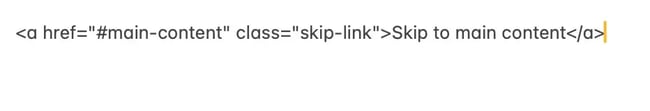
Skip Option
Skip links are one of the simplest yet most impactful accessibility features you can add. Think about it, if you’re navigating a website using only your keyboard, you have to tab through every single navigation link on every single page just to reach the main content.
But a skip link lets users bypass all that repetitive navigation and jump straight to what they came for. The good news? Many modern content management systems (like WordPress) include skip links automatically. But it’s worth checking yours manually — tab through your site with just your keyboard and see if that “Skip to main content” link appears when you hit tab for the first time. If not, adding one is straightforward. It’s typically just a single anchor link at the top of your HTML that points to your main content area.
Pro tip: Put the most important information at the beginning of each paragraph. Use descriptive headings that tell users what each section is about. And don’t be afraid of white space — it makes content less overwhelming and easier to digest.
Responsive Design
Developing with responsive design in mind involves ensuring that touch targets are large enough (at least 44x44 pixels), text is readable without requiring zoom, and interactive elements function smoothly with touch, mouse, and keyboard inputs. Small buttons and links are difficult for users with motor impairments to activate. Implementing this in your applications involves using fluid grids, flexible images, and CSS media queries to adapt your layout to different screen sizes.
Pro tip: Start with a mobile-first approach. Design for the smallest screen first, then progressively enhance for larger displays. This ensures your core content and functionality are accessible to everyone, regardless of device.
Now that you’re in the know with the most common accessibility best practices, I’ll share some accessible website examples so you can see them in action.
Accessible Website Examples
- 1% for the Planet
- Moon-Seed
- Apple
- Eventbrite
- ACLU
- Frontera Mexican
- Food Lion
- Girls Who Code
- Rustic Inn
- Patreon
- World Wildlife Fund
- NPR
- Rose Forever
- Raising Cane’s
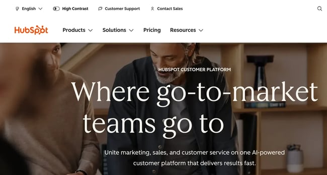
1. 1% for the Planet
1% for the Planet is a network of businesses and organizations that have agreed to donate 1% of their profits to environmental causes. With over 5,000+ members and hundreds of millions of dollars given so far, 1% for the Planet allows businesses to counteract their environmental impact by donating to charities and nonprofits.
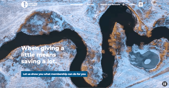
What I like: True to its motto of “Putting people and the planet over profit,” the organization’s website demonstrates its commitment to accessibility, too. High-contrasting text, ARIA tags, and thorough HTML page structuring all make this an excellent accessible website example. Pages are also simple in their content presentation and fully mobile responsive.
.png)
Website Accessibility Checklist
This checklist will help you make the following more accessible on your website:
- Web Pages
- Navigation
- Video & Media
- And More!
Download Free
All fields are required.
2. Moon-Seed
Acrylic earring and jewelry brand Moon-Seed demonstrates that ecommerce sites can be both visually appealing and highly accessible. The site scored an impressive 9.2 out of 10 on WAVE’s accessibility evaluation with zero detected errors — a rare achievement in online retail.
I asked the owner, Cathy Charles, what inspired her to make sure her website was so accessible. She shared, “Accessibility is part of thoughtful design. It ensures that everyone can connect with Moon-Seed’s story and experience the jewelry without barriers. For me, it’s just as essential to good design as color, form, or craftsmanship.”
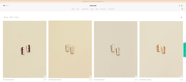
What I like: That philosophy shows in the details. Moon-Seed implements skip links that let keyboard users bypass navigation and jump straight to products. The site uses extensive ARIA attributes to provide additional context for screen readers, along with proper semantic HTML structure. Form labels are clearly implemented throughout the shopping experience, making it easier for all users — especially those using assistive technologies — to browse and purchase. It’s proof that accessible design doesn’t mean sacrificing style.
3. Apple
Tech giant Apple shows that even the world’s most recognizable brands prioritize accessibility.
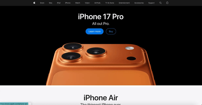
What I like: Apple implements proper semantic HTML structure with clear heading hierarchies (H1, H2, and H3 tags) that help screen reader users navigate through product information efficiently. The site uses extensive ARIA labels (145 instances) to provide additional context for interactive elements, and properly marks up lists and navigation landmarks. Apple’s use of the <figure> element for images shows attention to semantic HTML, making visual content more accessible to assistive technologies.
Room for improvement: The site has some contrast issues, like 10 instances of very low contrast text that could be difficult for users with low vision or color blindness to read. A quick contrast adjustment would make the site even more accessible without compromising Apple’s signature minimalist aesthetic.
4. Eventbrite
Event management platform Eventbrite presents users with a highly accessible site. Website visitors are invited to “Skip to the content” of each page, its layouts are clean, and easy to understand by sighted users and users with low vision alike.
The company also details their commitment to accessibility and shares that they “continue to design, develop, and test our digital properties for conformance with applicable accessibility standards.”
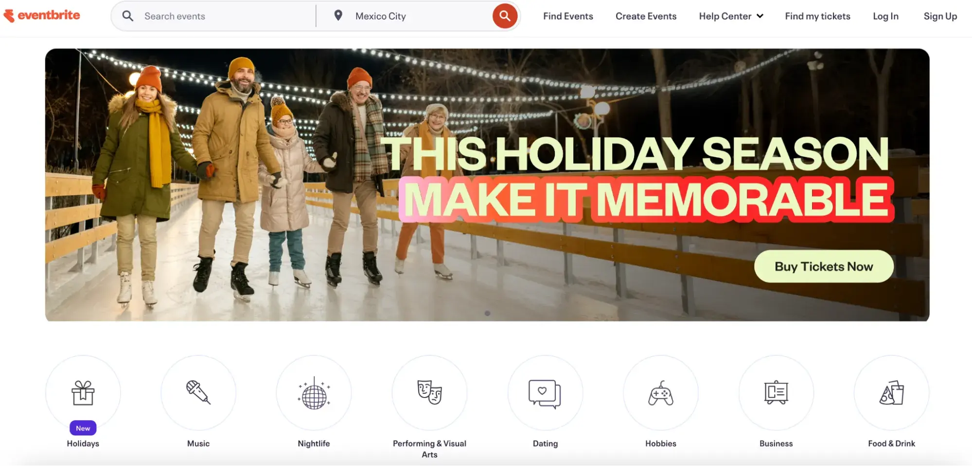
What I like: The platform makes an assistive CX technology application available to customers who have trouble typing, gesturing, moving a mouse, or reading.
5. ACLU
The American Civil Liberties Union (ACLU) is a nonprofit organization that works to “ensure the promise of the Bill of Rights and to expand its reach to people historically denied its protections.” It works to change policy and file civil cases against discrimination of oppressed groups.
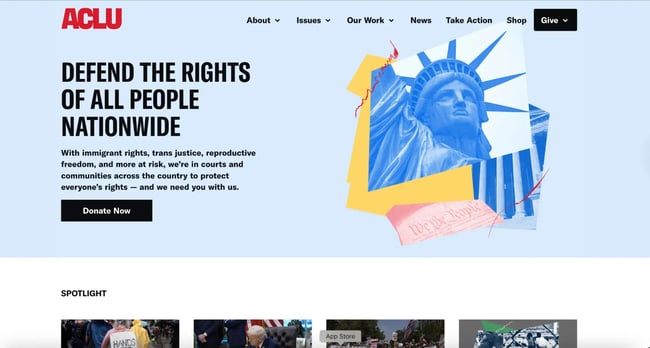
What I like: The ACLU website consciously uses structural elements such as heading tags, list elements, navigational elements, and header and footer elements. ARIA tags are present as well to provide enhanced meaning to the HTML, providing more context for accessibility software.
6. Frontera Mexican
Frontera Mexican is a locally owned Georgia-based chain serving authentic Southwestern Mexican cuisine in a family-friendly atmosphere since 1987. The restaurant offers classic dishes like tacos and fajitas alongside unique items such as Tacos Vampiros and fresh-made guacamole, all in a vibrant setting that sometimes features live music. In addition to its good food and family friendly vibe, it’s also scoring pretty high on the accessibility radar.
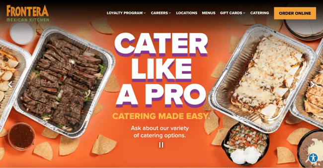
What I like: The clean structure with header, navigation, main content, and footer elements makes the site straightforward to navigate for everyone, whether using a mouse, keyboard, or assistive technology.
7. Food Lion
Food Lion is an American regional supermarket chain headquartered in Salisbury, North Carolina, that operates over 1,100 stores in 10 states throughout the Southeastern and Mid-Atlantic regions. Food Lion is committed to providing an easy, fresh, and affordable shopping experience with a focus on hunger relief. It also scores pretty high on its accessibility score, which I didn’t really see while testing quite a few grocery store web pages.

What I like: The source code is rich with ARIA tags, well-coded forms, high-contrasting text, and images with adequate alternative text.
8. Girls Who Code
Girls Who Code is a nonprofit that provides programming and educational resources for women and girls pursuing careers in technology. The organization is committed to inclusivity, and its highly accessible website proves its dedication.
The Girls Who Code website presents only the most relevant information on its pages without cluttering, which makes the content usable for anyone. Since most page content is created from simple HTML elements without other visual effects or interactive modes, the site is more easily navigable.
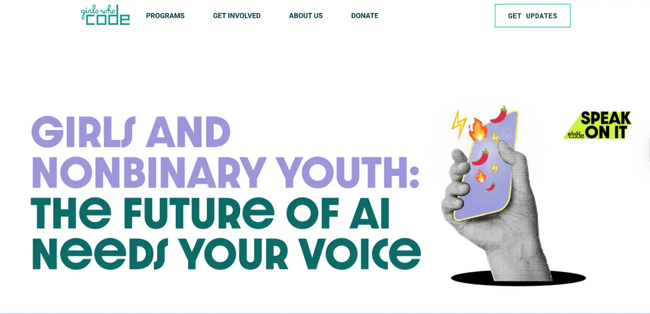
What I like: When I ran this site through the WAVE checker, it had several green flags — including linked images with alt text, form labels, and more.
9. Rustic Inn
Rustic Inn Crabhouse is a Fort Lauderdale landmark that began as a roadhouse saloon famous for its world-renowned garlic crabs and fresh seafood, served in a casual, no-frills waterfront atmosphere.
Just as their seafood is fresh and accessible to all diners, their website is equally welcoming to all users. The site scored an impressive 9.9 out of 10 on WAVE’s accessibility evaluation with zero detected errors — one of the highest scores possible.
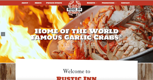
What I like: Rustic Inn implements comprehensive accessibility features including skip links, proper semantic HTML with clear heading hierarchies, and alternative text for all images. The site uses 23 ARIA labels to provide context for interactive elements, includes form labels for user inputs, and has dual search and navigation landmarks to help users find what they need quickly.
With proper header, navigation, and main content structure, the site ensures that everyone — whether using a screen reader, keyboard navigation, or standard mouse — can easily browse the menu, make reservations, and learn about this legendary crabhouse.
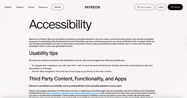
10. Patreon
Membership website Patreon allows audiences to crowdfund their favorite creators regularly, allowing artists, musicians, educators, and other creatives to pursue projects independently. In exchange, subscribers receive access to exclusive content and other benefits.
Patreon takes a straightforward approach with its design, emphasizing the text and image content to make the platform’s value clear to first-time visitors, while adhering to HTML accessibility standards.
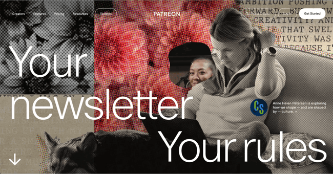
What I like: There’s a clear “accessibility” section linked on the footer which explains how to get the most use out of the website’s accessible features. The page offers helpful tips for how users can navigate the website. They also offer a clear channel to reach if you have accessibility-related concerns or questions, which I really appreciate.
11. World Wildlife Fund
The website for the nonprofit World Wildlife Fund (WWF) conveys its mission, initiatives, partnerships, and educational content in a way that is accessible. Like other examples we’ve listed, the fact that WWF doesn’t overload its pages with content helps with accessibility and navigability.
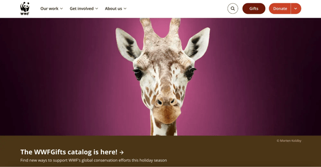
What I like: The organization takes the initiative to include the appropriate accessibility HTML tags and choose semantic elements to structure its pages. WWF’s current site isn’t made with a traditional CMS that could add some of these features automatically, further showing their commitment to accessible design. I also like how high-contrast this site’s text is.
12. NPR
National Public Radio (NPR) provides free programming to public radio stations across the U.S. In line with its purpose, NPR hosts a website built to serve users of all backgrounds and abilities.
The website takes a simple approach with article navigation easily tabbable and understandable. It also offers alternative text when necessary, and includes keyboard controls for its audio player to allow accessible listening.
Often news websites can be too busy with different media elements, so I also like that there’s a “text only” feature available at the bottom of the website where you can check out the articles listed on the homepage without any of the images.
What I like: The simple design keeps you focused on the key information that the news articles are sharing. Given that NPR is audio-first, the site offers a great mix of multimedia elements to suit visitors with different audio and visual needs.
13. Rose Forever
Rose Forever is a New York-based luxury gifting brand specializing in preserved rose arrangements that last for a year or more.
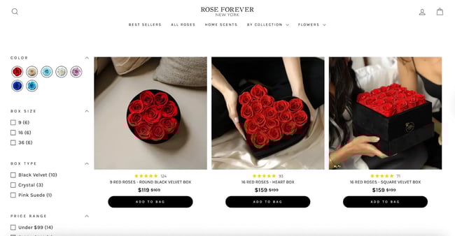
What I like: Rose Forever New York’s site is a good example of clean, structured design with accessibility in mind by showing strong use of ARIA and semantic structure. The high-contrast product photos — like red roses against soft beige backgrounds — help users with low vision clearly distinguish content. While there are some contrast and alt-text issues, most elements are easy to scan and navigate.
14. Raising Cane’s
I used to love Chick-fil-A, but I’m afraid Raising Cane’s has now stolen my foodie heart. Raising Cane’s is a fast-food restaurant that specializes in chicken finger meals only. I had to test their site to see if I would love their accessibility as much as I love their food — and I do.
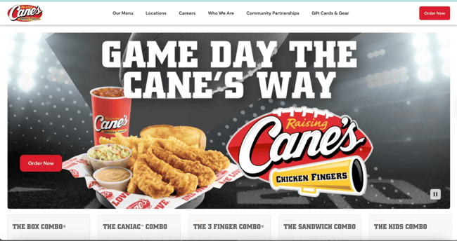
What I like: They use proper button elements for interactive controls, such as “Search,” “Clear,” and “Settings,” ensuring that keyboard users can easily activate these functions. The site includes list item elements for organized content, such as “AI Mode,” “All,” “Images,” “Maps,” “News,” “Videos,” and “Shopping,” making browsing options clear for screen reader users.
What I like the most is that the site includes dedicated “Accessibility help” and “Accessibility feedback” links right at the top, showing their commitment to continuous improvement and user input on accessibility features.
Ready to learn more? Once you’re ready to learn more, check out our guide to WCAG and our accessibility website audit checklist.
Websites Designed for Every User
Designing a website can be one of the most exciting aspects of starting a new business. After all, you’re crafting an experience to spread brand awareness, drive conversions, and build loyalty — all great things!
And, in my opinion, factoring in accessible design only adds to this excitement. By incorporating accessibility best practices and taking inspiration from other accessible websites, you’re empowering users with disabilities, impairments, and limitations to engage with your content.
If you’re looking for the gold standard in accessible websites, be sure to look closely at the examples from companies like Raising Cane’s and Rustic Inn Crabhouse. My favorite feature across all of these websites, too, is a separate page that links to the accessibility features on the site and how you can use them. This would be a great addition to add if you’re looking to improve your website.
Editor’s note: This post was originally published in October 2021 and has been updated for comprehensiveness.
Website Accessibility Checklist
This checklist will help you make the following more accessible on your website:
- Web Pages
- Navigation
- Video & Media
- And More!
Download Free
All fields are required.