.png?width=112&height=112&name=Image%20Hackathon%20%E2%80%93%20Vertical%20(50).png)

Best Architecture Websites
- William Rawn Associates
- B² Architecture
- Moody Nolan Architecture
- Conran & Partners
- Olson Kundig
- United Network Studio
- Robert Gurney Architect
- Makhno Studio
- MLA Architecture
- gnb Architects
- Bobak Studio
- Yellow House Architects
- Vertically built
- Perkins & Will
- AAmp Studio
- CO Architects
- DesignHAND Architects
- Christopher Stoll
- FivD
- AVAA Architects
- Kenny Payero Architecture
- Wade Design Architects
- SignalWorks Architecture
- Gogo Studio

HubSpot's Free Website Builder
Create and customize your own business website with an easy drag-and-drop website builder.
- Build a website without any coding skills.
- Pre-built themes and templates.
- Built-in marketing tools and features.
- And more!
1. William Rawn Associates

What we like: The William Rawn Associates website makes a great first impression. Once you land on the website’s homepage, the first thing that grabs your attention is a slideshow that shows their team, including eight of their stunning projects.
Whether it's the mesmerizing design of the Duke University or the gorgeous Boston Public Library, there’s enough evidence for prospective clients to know that this architecture firm is an expert in designing magnificent structures.
2. B² Architecture
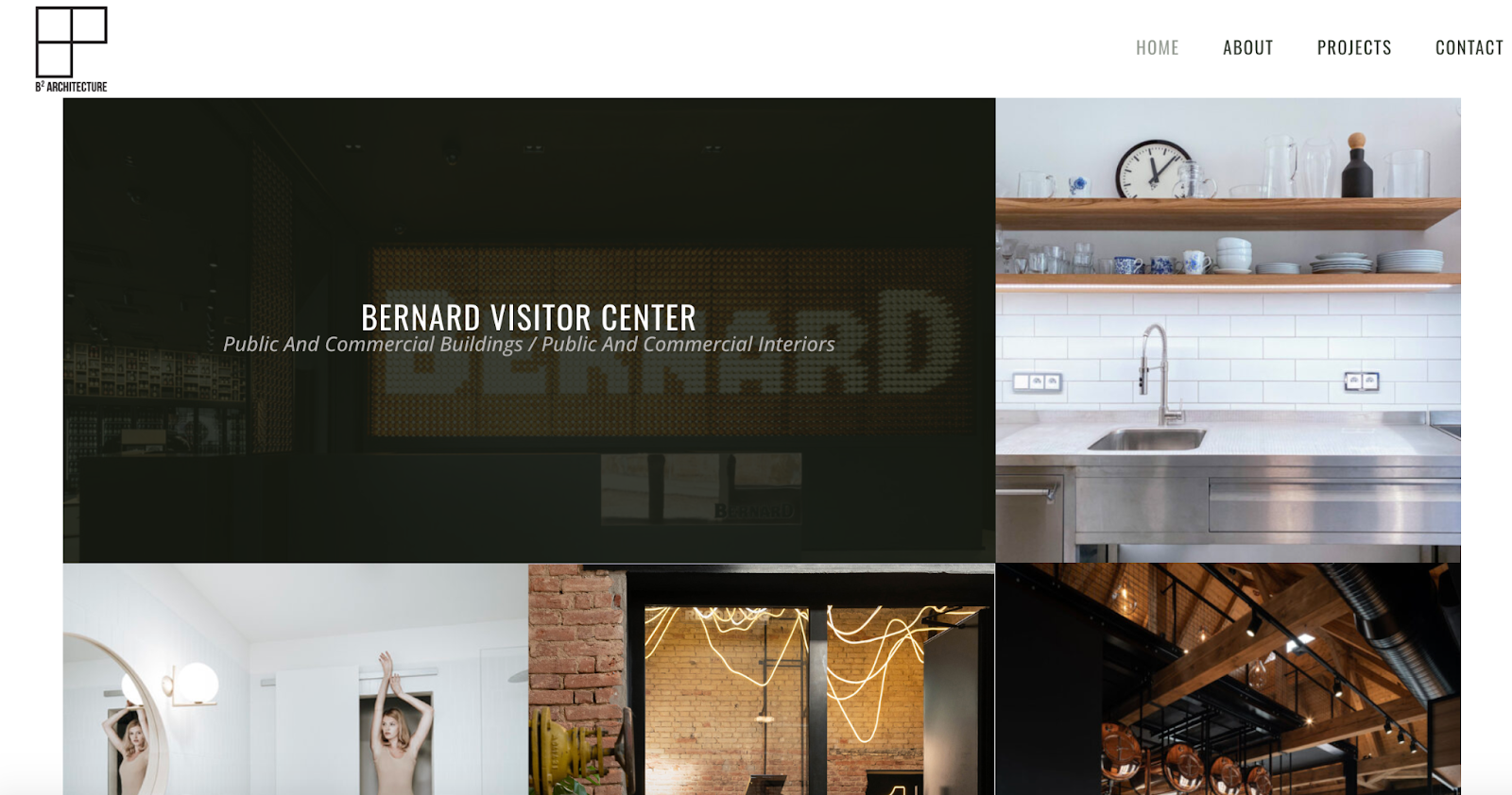
What we like: B² Architecture is a woman-owned architecture firm founded by Barbara Bencova in 2012. The company has an impressive track record of delivering successful projects as displayed on the website in a grid layout.
Each project on the grid is clickable, allowing viewers to read more and know how B² brought the project to life. Besides the brief about page, minimalist look, and use of whitespace, we also love the inclusion of eight awards in the about page. These awards provide more social proof for B² Architecture.
3. Moody Nolan Architecture

What we like: What started as the brainchild of a passionate architect 40 years ago has become the largest African-American-owned architecture firm in the US. Moody Nolan's website homepage rocks full-width images of the company’s eye-catching projects.
Scrolling down the page, you can read more about the firm’s mission and vision, design philosophy, and practice areas. At the bottom of the homepage, Moody Nolan included its awards and they are great for social proof. Showcasing your awards and recognition helps to build credibility with potential clients. We also like the use of dark brown text on a white background, giving the website a clean, distraction-free look.
4. Conran & Partners

What we like: Conran & Partners makes what they do instantly clear on their website: architecture and interior design. Clicking on either service leads you to their project pages, where you can find several of their successful work. More than these, we especially like the Conran and Partners Studio and People, which are on the navigation menu.
The ‘Studio’ gives you a sense of the company’s office and the ‘People’ shows the faces of the architects and designers who are behind their breathtaking projects. Both of these help Conran and Partners to humanize their brand.
5. Olson Kundig

What we like: The Olson Kundig website truly shows an image is worth a thousand words. Their entire homepage has amazing images of completed architectural projects, each with its name and location. Every project in the grid is clickable or has a CTA, which allows users to learn more about a project.
6. United Network Studio

Title: United-Network-Studio-homepage
What we like: UNStudio had the future in mind when designing this website as the homepage features a large, bold typography on full-screen images. We love that the navigation menu generously uses white space and takes the full page when clicked on.
One spectacular element of this website is the team page, which features over 300 team members. A page with this many people convinces prospects that the UNS has the expertise to deliver on multiple kinds of architectural projects.
7. Robert Gurney Architect

What we like: Simple, yet visually attractive — that’s the best way to describe Robert Gurney’s website. The Washington-based architect renowned for designing modern residential and commercial buildings takes a page off Instagram’s playbook to showcase his work.
The homepage hooks you with an aesthetically pleasing grid of the company’s project images. Its clean and minimal use of whitespace makes it appealing to the eye. This website is a great example of how a simple and minimalist individual portfolio website should look.
8. Amanda Martocchio

What we like: In an industry largely dominated by men, Amanda Martocchio has built one of the biggest women-owned architecture firms in the US. Her awesome portfolio has several projects displayed on her homepage. We love the moderate use of whitespace and the small red arrows that direct users to navigate left or right to see different angles of each project.
9. Makhno Studio

What we like: Founded 20 years ago by Serheii Makhno, this Ukraine-based architecture firm took its website design to a whole new level. The homepage starts with a sketch that turns into a 3D image in an animated forest. This sets the tone for a captivating user experience. The building has three doors that illuminate when you hover your cursor on any of them. Clicking any of the doors takes you to the Makhno studio, its store, or its foundation.
On the studio page, you can find useful information about the company, view its architecture portfolio, and see contact information. Thanks to the interactive effects, Makhno Studio creates a memorable user experience for visitors.
10. MLA Architecture

What we like: Based in the UK, this architecture firm’s website welcomes visitors by displaying some successful projects that highlight their expertise. But what we love most is the masterful blend of white and gray background, making it easy to browse through the page. If you want a website with minimal design, then MLA Architecture is a great source of inspiration.
11. gnbArchitects

What we like: This Athens-based architecture firm uses stunning carousels to show its impressive portfolio. From the projects, prospects can tell they are good at what they do.
One unique feature of the gnb architecture website is the hamburger menu centered on the homepage left side. This immediately grabs visitors' attention and says, “Hey, we do things differently here.”
12. Bobak Studio

What we like: If your service is mainly about visuals, what’s the best way to communicate this? By using visuals! Bobak Studio provides 3D-rendering services for architects, real estate developers, and marketing agencies and their website communicates these services perfectly.
The Bobak Studio service pages contain still images of futuristic architectural designs, an immersive animation movie, and an amazing virtual 3D location. Why tell when you can show?
13. Yellow House Architects

What we like: Immediately after you land on this black and woman-owned architecture website, you’ll be greeted by the beautiful smiles of the company’s staff which creates a welcoming and friendly atmosphere.
The New York-based company, which was founded by Elizabeth Graziolo, uses a pretty straightforward approach to its homepage. A background image of the team, a strong message that reinforces their mission statement, and a simple navigation menu.
14. Vertically built

What we like: At a glance, you can tell what Vertically Built does as it's boldly written in black text on the homepage. Down the page, Vertically built reveals more services they offer, high-quality images of some projects, and their contact information. The specificity in stating they’ve completed projects over $1 Billion is also a brilliant way to use social proof.
15. Perkins & Will

What we like: Perkins & Will doesn’t make use of any fancy animations or effects. Just a simple design. The homepage features a full-width image of a magnificent structure. Scrolling down the page, we see what Perkins & Will stands for, a few of their best projects, and a spotlight of some of their designers.
16. AAmp Studio

What we like: Landing on this website, you might be taken aback by AAmp’s massive white logo set on the background of a lovely house interior. But here’s where it gets interesting. As you scroll down the page, the logo shrinks to a smaller size, making it almost invisible. This exciting experience will interest potential customers in what this female-owned architecture firm offers.
As you place your cursor over any of the featured project images, it quickly switches to a sketched version. Awesome, right? AAmp’s use of big, black, bold text on a cream background ensures the focus is on the copy and gives it a modern, elegant look.
17. CO Architects

What we like: What better way to convince website visitors about your expertise and credibility than showing off your awards? That’s what CO Architect does by greeting prospects with their award — 2023 AIA National award winners. This text is written boldly with a white font on a background that showcases two of the brand’s impressive projects.
CO Architect’s homepage displays more project images as you scroll down, flipping from a solid dark blue background to an actual image along with the project title and location. Further down the page, you’ll find links to join the team, the latest news, and a fantastic CTA button that could make prospects take action: “Time to stop scrolling. Let’s start making!”
18. DesignHAND Architects

What we like: This Black-owned architecture firm doesn’t use any fancy effects or animations. It’s a functional website with a simple navigation menu. We’re awestruck by their brilliant use of whitespace on the homepage, which also has a contact form down the page.
The masterful blend of black text on a white background makes this Baltimore-based website visually attractive. If you’re looking to build a website on a budget, DesignHAND Architects should serve as a nice example.
19. Christopher Stoll

What we like: Christopher is an award-winning architect & interior designer with an amazing portfolio of designed and detailed buildings in both the US and the UK. This is noticeable from the carousel you instantly see when you land on his website. Nothing extravagant, just simplicity at its finest.
20. FivD

What we like: When a website starts off with a sketch that turns into a real-life building, you’ll know you’re in for a treat. That’s what this Fivd’s website achieves with its sleek design. It showcases a unique blend of creativity and functionality that you’ll hardly find anywhere else.
The homepage features engaging interactive elements, their vision statement, and the services they render. What’s most striking is the animated “Fivd in numbers” which mimics our solar system. It’s an absolute joy to watch. The perfect blend of white and gray colors with captivating visuals makes the overall user experience more exciting.
21. AVAAArchitects

What we like: AVAA Architects, located on the Bassin d’Arcachon in France, specializes in ecological architecture projects. Their website gives visitors a glimpse of their unique, innovative mastery.
AVAA Architects' homepage incorporates a dynamic animation slider that shows projects in a spin-the-wheel style. Clicking any project reveals more information about the project such as title, description, location, and delivery date.
22. Kenny Payero Architecture

What we like: Kenny Payero, an architect with over 15 years of experience uses a simple, one-page website. It starts off with a full-width image on the homepage slightly below the navigation menu.
Scrolling down the homepage reveals his impressive portfolio arranged in a grid layout. The vibrant image colors that blend with the white background make the website pleasing to the eye. The next section reveals details about him, followed by press and contact pages. If you need a minimal one-page portfolio website, look no further than Kenny Payero.
23. Wade Design Architects

What we like: “Come Home.” This tagline truly melts my heart. The inviting imagery and clear navigation contribute to creating a cozy and welcoming atmosphere. But it's not just the aesthetics that stand out.
Wade Design Architects also impresses with a slideshow of stunning private residential and commercial projects. The little slider icon that moves from left to right as the slideshow progresses adds a nice human touch to the overall experience.
24. SignalWorks Architecture

What we like: The tagline is great. The large fonts and white/red color combination make the site aesthetically pleasing to view. As you scroll downwards, the background color and copy alternates between white and red along with awesome images of completed projects making the website more engaging.
We like how SignalWorks includes a blog on its menu - a great avenue to share their expertise in the industry and build credibility.
25. Gogo Studio

What we like: Last on our list is Gogo Studio. It’s a black-owned architecture firm based in London. The website embraces a simple approach as the homepage displays full-width background images that change every second. As the image changes, so does the copy written in bold white font.
Scrolling down the page reveals information about Gogo Studio, followed by testimonials and awards to help build credibility. There are also sections with links to view more projects, read the latest news, and fill out a simple contact form.
How to Design an Architecture Website
1. Use existing website examples as inspiration.
Our list of architecture websites contains simple sites that cost a few hundred bucks and complex sites that cost thousands of dollars. So you shouldn’t be short on ideas when looking for inspiration. However, don’t limit yourself to just architecture website examples. Check out other similar industry websites such as interior design or construction to get more design ideas.
2. Choose a website builder.
Selecting the right website builder is crucial for creating your architecture website. Consider platforms like HubSpot, Wix, Squarespace, or WordPress that offer user-friendly interfaces and a wide range of templates specifically tailored for architecture brands.
Whichever builder you decide to use, ensure it has features such as project galleries, testimonial carousels, and contact forms to enhance the functionality of your architecture website.
3. Select a template.
After choosing a website builder, check the templates and select one that aligns with your architectural style and brand identity. Look for clean and modern designs that will showcase your portfolio and expertise effectively. Also, consider factors like color schemes, typography, and layout options to create a visually appealing website.
4. Add relevant pages.
Your architecture website should include essential pages such as an about page, portfolio page, services page, and contact page. You can also add a blog page to share your expertise and insights with your audience. Each page should provide compelling information about your firm, projects, and services.
5. Optimise your website for mobile.
Mobile devices account for 63% of organic search engine visits. As such, you need to optimize your website for mobile users, make it responsive and ensure it adjusts seamlessly to different screen sizes. This will enhance the experience of your users and make it convenient for potential clients to navigate your site on mobile.
Architecture Website Designs to Inspire Yours
A professional, visually appealing architecture website is essential for acquiring potential clients. Now, you have more than enough websites to draw inspiration from whenever you’re ready to build your website. Go build something stunning!

Website Design Examples


![15 black and white website designs to inspire your own [+ pro tips]](https://53.fs1.hubspotusercontent-na1.net/hubfs/53/black-and-white-website-design-1-20250520-1336267.webp)

![Gradient Website Design Examples That Prove This Trend Is Far From Over [+Tutorials]](https://lh7-us.googleusercontent.com/htOWIbyCIoCMxSjC4gJunkGnhCzXpccjTrL8NwoGdRdCsSiEmEAxe_qBFkMrzy2Y8d3cwEr_DMzSGHq9Xi-hQFnMJCo8HDQJ1yQGigcSfFxI2QKXo0s7xXSB2sY-eALG1iUqnHXgomcDsnp7AHRSH1s)
![15 Brochure Website Examples to Inspire You [+ How to Make One]](https://53.fs1.hubspotusercontent-na1.net/hubfs/53/brochure-website-examples-1-20250319-362228.webp)
![28 Types of Websites to Inspire You [+ Real-Life Examples]](https://53.fs1.hubspotusercontent-na1.net/hubfs/53/types-of-websites.png)

