

Researching bakery website design was unreasonably enjoyable for me. Bakeries hold a special place in my heart (and stomach). Web design does, too, so it’s a treat to write about both.
For this post, I’ve curated the best bakery website examples from actual places I’ve visited, plus various point-of-sale (POS) systems, so you can better understand which POS to integrate or build your website with.
So read on for some irresistible inspiration — plus tips on how to build your own bakery website.
Table of Contents
- What to Look for in a Bakery Website Design
- Best Bakery Websites to Inspire Yours
- Where Else to Find Bakery Website Inspiration
What to Look for in a Bakery Website Design
If you’re building or redesigning a website for your bakery business, you have some unique needs that other businesses don’t. Here’s what to look for:
1. Does it integrate with a POS or CRM?
Sure, you can have a website that doesn’t integrate with a point-of-sale or customer relationship management software — but that’s like operating two separate businesses. Your brick-and-mortar storefront won’t be able to communicate with your online storefront. So now, you’ll have two separate entities to manage. And who has time for that?
Ensuring your bakery website design can integrate with a POS (like BentoBox, Square, Popmenu or Toast) will ensure your website has real-time updates of inventory. And using a CRM (such as HubSpot) ensures you can collect important customer information, keep in touch with patrons, and boost your bottom line.
2. Does it have a menu feature?
Website builders and themes often have industry-specific features. For a bakery, a menu is a must-have. It’ll make it easy to add an image and description of your product and adjust pricing.
3. Does it prominently display your location(s) and hours?
Unlike an ecommerce site, a bakery website needs to quickly show visitors where they can go to get their hands on your delicious goods.
Your address and hours should be prominently displayed either above the fold or on your homepage in the footer (or both). You can also have a separate “locations” webpage that goes into more detail, especially if you have multiple locations.

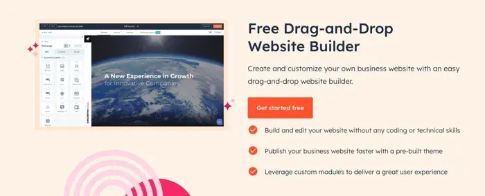
HubSpot's Free Website Builder
Create and customize your own business website with an easy drag-and-drop website builder.
- Build a website without any coding skills.
- Pre-built themes and templates.
- Built-in marketing tools and features.
- And more!
4. Does it have lots of opportunities for high-res photos?
If you want to lure your website visitors into your brick-and-mortar store, give them something to feast their eyes upon.
A lot of the bakery website themes I’ll list below have large photos, which means the images that you upload need to be high resolution so they don’t end up looking blurry on your site.
5. Is it easy to set up and maintain?
My guess is you’re a baker, not a developer. If you’re more into whipping up pastries than writing code, you’ll want a website that’s easy to set up and maintain. To achieve this, opt for a no-code, drag-and-drop website builder.
Check out HubSpot's Free Website Builder to craft your bakery site with free premade templates that you can customize by dragging and dropping modules. No coding required.
I’ll also show you other website builder options in the list below. So, let’s dive in!
Best Bakery Websites to Inspire Yours
1. King Arthur Baking Company
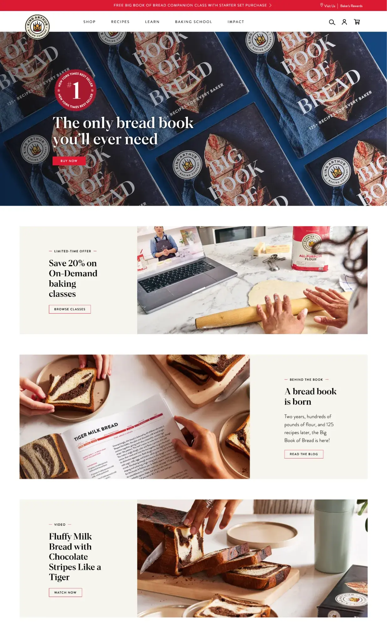
I’m not just featuring King Arthur Baking Company first because they make my all-time favorite gluten-free brownies (dense, gooey, and delicious!). No, this employee-owned bakery dedicated to responsibly sourced ingredients, environmental causes, and philanthropy has a fantastic website too.
What I love
What caught my eye was the large, bold photos and the broken grid layout. The colors are bright but not overwhelming, and its featured photos are detailed and crisp. Plus, the site is easily navigable whether you’re looking to shop, read the blog, or learn more about the company’s mission.
2. Apelsyn Cafe Theme
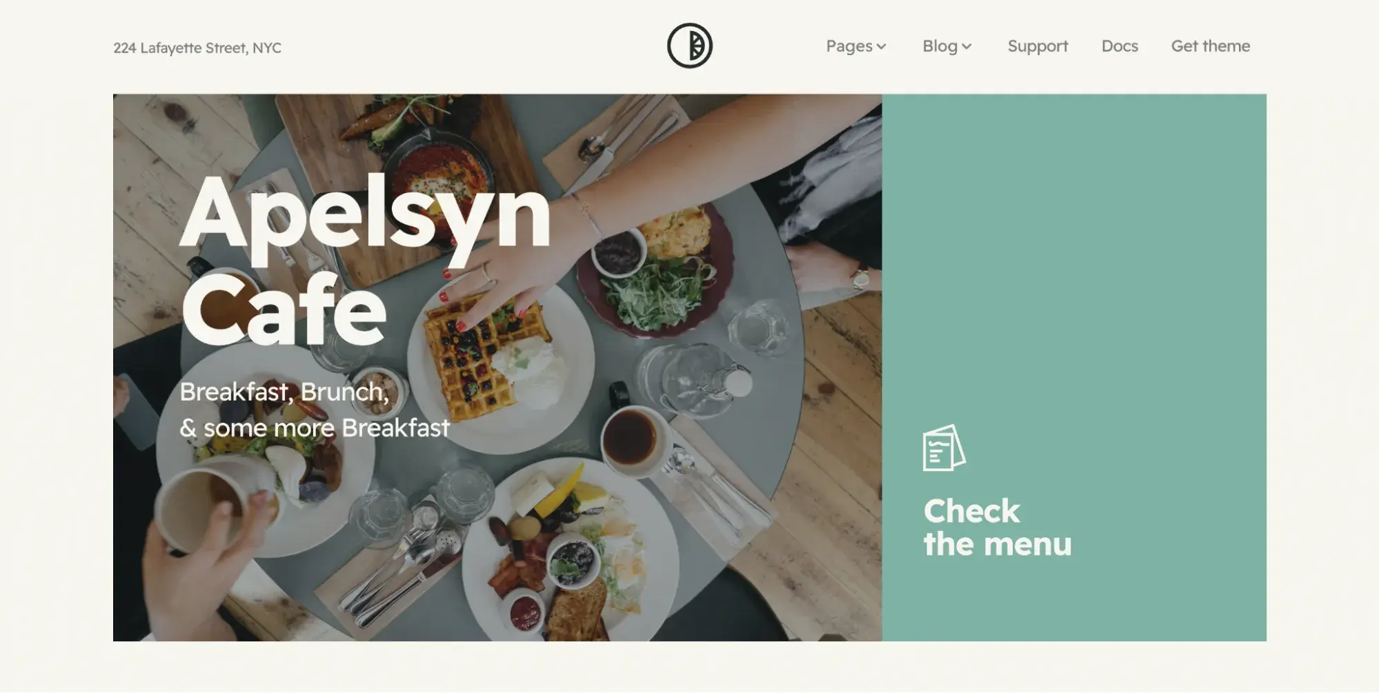
This clean, fresh website template is free and has everything your bakery website needs: a captivating hero image, a menu section, built-in SEO features, and a drag-and-drop editor. It also integrates with leading CRM HubSpot so you can manage relationships with your patrons.
What I love
I’m a big fan of the ample use of white space, large fonts, and prominent imagery. My favorite page layout is probably the menu, as it’s clean and clearly made for restaurants and bakeries.
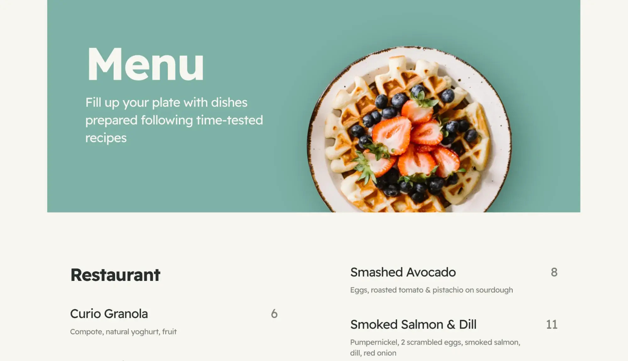
You can easily modify this theme using the HubSpot website builder. Try it out for free!
3. OWL Bakery
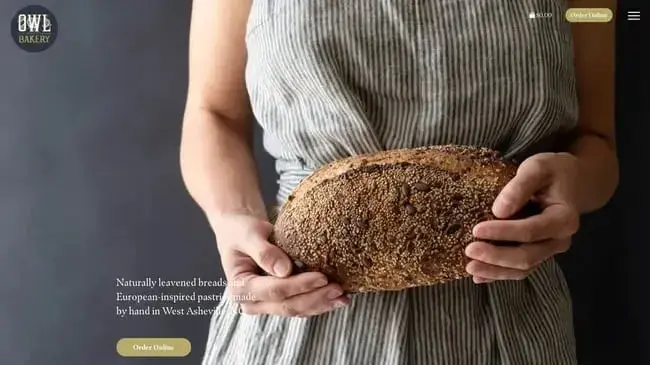
OWL Bakery’s website is a great example of an elegant, achievable bakery website that manages to feature both its creations and its story in harmony. The North Carolina-based bakery specializes in naturally leavened bread and European-inspired treats (hence the name Old World Levain).
What I love
I appreciated the excellent use of parallax scrolling on its homepage — text content sections are interspersed with large, detailed food images that scroll by smoothly. The online store component is also easy and intuitive, allowing visitors to easily fill their cards and place orders.
4. Chambelland
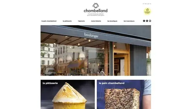
When in Paris, stopping by a bakery or a pastry shop (or both!) is an absolute must. As such, I’ve featured several Parisian bakery sites on this list, the first being Chambelland in the neighborhood of Folie-Méricourt.
This incredibly clean site captures the modern appeal of the shop while keeping your eyes and taste buds engaged.
What I love
Clicking a homepage grid image will bring you to a product listing page where you can quickly order items online. Scroll a bit more and you can learn about the company’s history, recipes, and process illustrated in a one-of-a-kind comic. As a final helpful feature, the website lets visitors switch their site language to English, Japanese, or Dutch.
I particularly like that Chambelland shares videos of its recipes so you can make its goods at home!
5. Wildwood Bakery
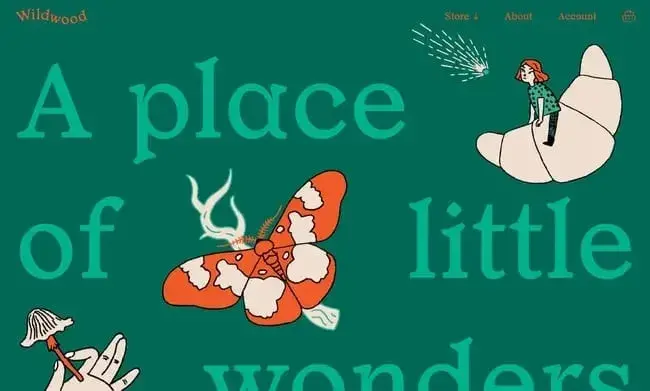
Wildwood Bakery was an Australian bakeshop known for delicious treats down under, and the same can certainly be said for its website. What made this site stand out was its subtle but effective animations and earthy colors, which created a unique energy that you don’t get on competing sites.
What I love
The designers recognized the beauty in simplicity, opting to limit visitors’ options to a store, deliveries, and subscriptions. Other aspects of the business — like sustainability — were pushed to the footer. This way, the website limited information overload and channeled my attention where it wanted.
6. Claudine
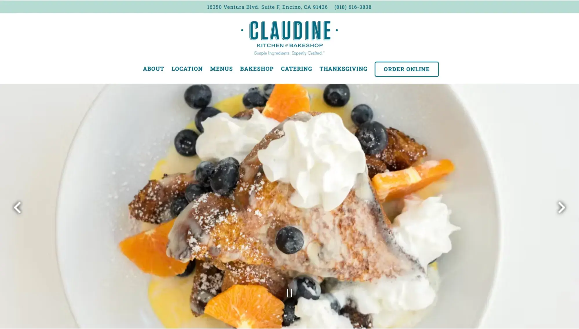
California-based Claudine wows with its bright, fresh colors and airy feel. The scrolling slider in the hero section does a great job conveying the food’s quality through high-res imagery. Claudine’s website was built with BentoBox.
What I love
Claudine’s website is a testament to how powerful branding (including your logo, colors, and image) can be. The same website layout with inconsistent colors, a poor logo, and blurry images would not pack the same punch.
7. Cafe Delight Theme
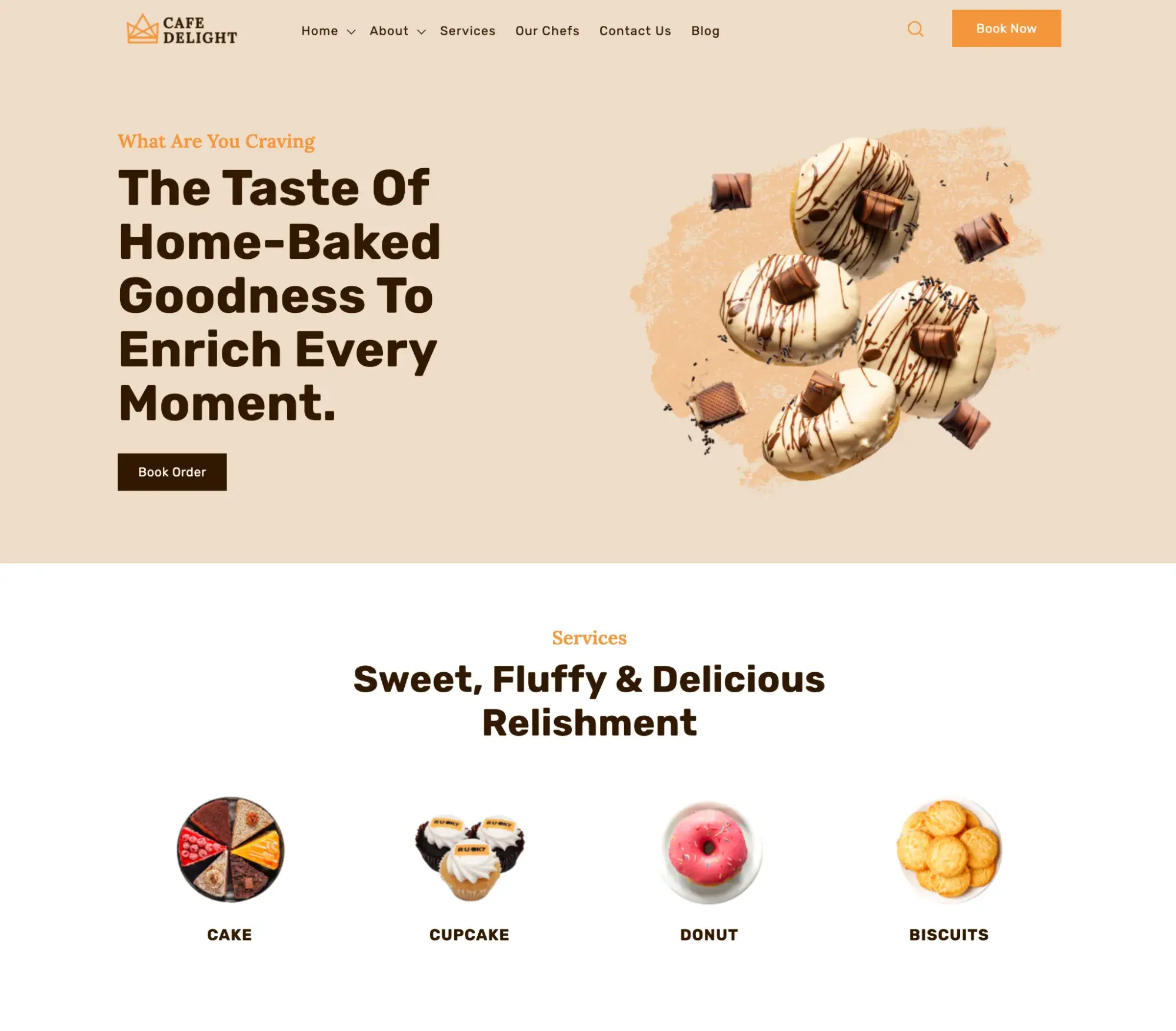
Cafe Delight is a premade HubSpot template built specifically for bakeries. It comes with a hero image with a CTA button, menu modules — and a 15-minute consultation with developers to customize the theme.
Bakeries that use this theme can easily track customer interactions and send personalized marketing thanks to it being powered by the HubSpot customer platform.
What I love
This Cafe Delight theme stands out because its hero image is a cutout image over a solid background, which is different from most websites on this list that opt for a full-screen image.
I also like that it caters to bakeries with customizable menus, galleries, and a design preview with bakery-related images and text to give you a better idea of what your site might look like.
8. La Cannelle de Martini
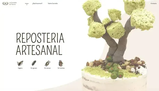
The Barcelona-based bakery La Cannelle de Martini is deeply committed to natural, earth-friendly ingredients with its vegan, sugar-free, gluten-free, and dairy-free cakes. This is clear when you first land on the homepage — the site showcases one of its cakes topped with a spongy tree.
What I love
La Cannelle de Martini’s one-page website has a unique scrolling experience. As I moved down the page, images “painted” themselves on the screen with fun animations. It packs what all visitors are looking for in one place, putting few obstacles between a first visit and an order.
9. Sweet Mae’s Cookies
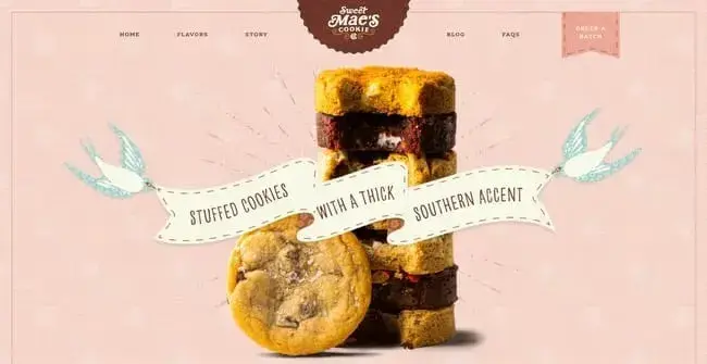
A departure from the more stripped-back designs we’ve seen so far, Sweet Mae’s Cookies goes all-out with its website’s visuals.
Built with WordPress and WooCommerce, the website entices visitors to order as many of its creations as possible. By calling its creations “flavors,” the brand taps into our primal need for sugary snacks while inviting us in with Southern charm.
What I love
The maximalist approach makes it one of my personal favorites here — the use of textures, the hover animations, and appetizing closeups all align for a perfectly cohesive design.
10. Jane The Bakery
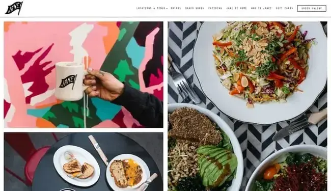
This website goes beyond simply featuring images of food — it’s a full-on collage of culinary delights. The prominent images draw San Francisco residents and visitors alike to one of its multiple locations — without a doubt, flooding our eyes with photos of sweet and savory treats is bound to work for some of us.
What I love
Another testament to the power of branding: When I saw Jane’s flag logo, I was like, “Wow, that looks so familiar.” It felt like I’d been there before. And then, as I scrolled the website, I realized I had: When I lived in San Francisco, I visited the trendy Jane on Fillmore many times.
That was over eight years ago — yet the branding left an impact on me, making the brand feel familiar all these years later.
HubSpot's Free Website Builder
Create and customize your own business website with an easy drag-and-drop website builder.
- Build a website without any coding skills.
- Pre-built themes and templates.
- Built-in marketing tools and features.
- And more!
11. Gruberbrot
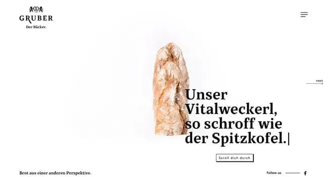
The creators of Gruberbrot’s website understand the value of whitespace in creating visual impact. This site’s layout is sparse, but what visuals it does include are impactful, prominent, and a little off-kilter.
What I love
I’m a big fan of the subtle effects, including animations triggered by scrolling and a navigation menu with an interesting hover effect.
12. Partake
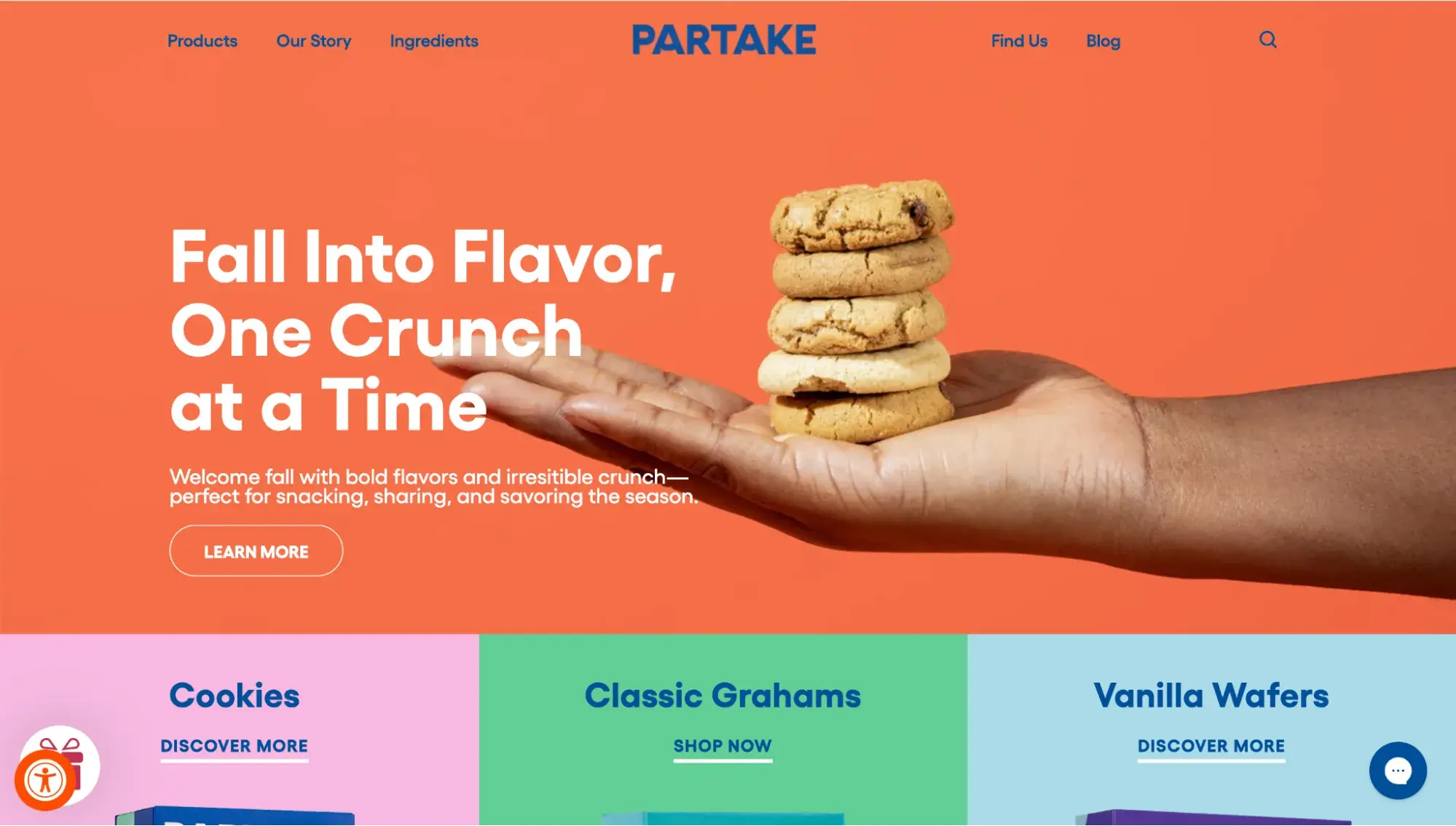
Built with Shopify, the Partake Foods website draws users in with a warm, bright color palette and friendly copy. Its products are vegan, gluten-free, and free from common allergens (my personal fave is the chocolate chip cookies!). An inclusive snack merits an inclusive website, and this one delivers.
What I love
The product pages on this website are also a delight to browse. I appreciated the full ingredients lists and customer reviews.
13. Dominique Ansel Bakery
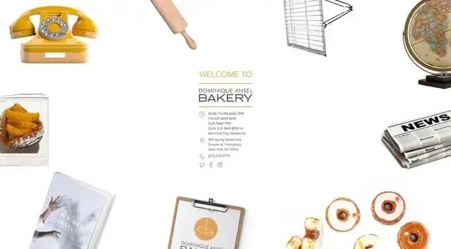
Just like its famous Cronut (croissant-donut hybrid), Dominique Ansel Bakery’s website is unconventional. Instead of a text-based navigation menu, the homepage has images for each link.
What I love:
When I hovered over each image, it had an animation effect that indicated where the link leads. While unusual in its design, I think this website succeeds in its attempt to try something unique.
14. Balthazar Bakery
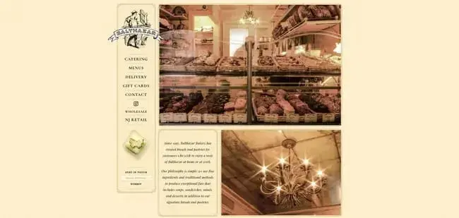
Here’s another NYC bakery that takes the opposite approach: The famous Balthazar Bakery has a website that mimics the look of a traditional restaurant menu and keeps things consistent with a sepia color palette.
What I love
My initial reaction to opening the Balthazar website was, “Whoa!” Sure, it’s ornate, but this example demonstrates how, in order to capture the essence of your bakery, a throwback design might be more effective than a minimalist, modern design.
15. Justice of the Pies
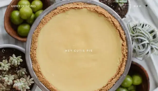
Justice of the Pies is another delightful bakery website that uses prominent images, parallax effects, and a touch of humorous copy to sell new visitors on its creations. It manages to balance a modern look and feel with a homey atmosphere.
What I love
Looking past the visuals, Justice of the Pies also emphasizes its story and its social mission. I enjoyed learning more about the bakery’s backstory and seeing how the L3C company gives back to its Chicago community.
16. Hovey & Harrison
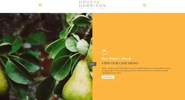
Hovey & Harrison does away with traditional scroll navigation altogether, instead opting for a one-of-a-kind homepage slider that combines images and informative copy.
What I love
I usually love long, scrolling one-pagers and gigantic footers. But this site offered me a welcome break from the norm while retaining a familiarity that I appreciated. By clicking “Next,” I could view the bakery’s philosophy, produce sourcing, events, and menu.
17. Zak The Baker

Zak The Baker is an artisan kosher bakery in Miami that serves breads, pastries, and savory dishes. It’s clear why Zak The Baker’s website is special from the moment you land on the page — there’s a fullscreen animated video to welcome users aboard.
What I love
The animated video warmed my heart. It adopts a watercolor aesthetic, depicting owner Zak departing his boat in the Miami harbor and heading to work. It’s a charming touch that adds a ton of character.
18. Yann Couvreur Pâtisserie
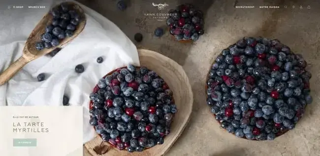
Yann Couvreur Pâtisserie is another Paris bakery that gets enough buzz to sustain itself without a dedicated website, but went and made a beautiful one anyway.
What I love
This site might feature my favorite food images so far (a major achievement), with its close-ups of bread, cakes, and tarts that drift into view as I scroll down the page.
With a click, visitors can visit the bakery’s e-shop and place online orders. On the product pages and in the checkout process, it becomes clear that this site keeps to its branding and colors throughout — clearly, every detail was considered while crafting this bakery’s online home.
19. La Newyorkina
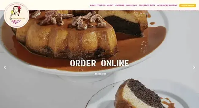
This list could use some more splashes of color — enter La Newyorkina, a New York City destination for sweet baked goods and frozen foods.
What I love
My experience browsing this site can be summed up with one word: fun. From the hero slideshow to the order pages, everything is steeped in vibrant colors and enchanting imagery.
20. Gilles Marchal
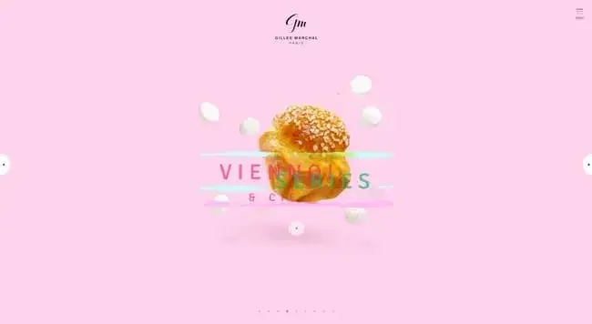
Gilles Marchal’s website has changed since we first published this post, but you can view its archive in Wayback Machine. The old version was one of the most contemporary takes on a bakery website, combining a slider effect, animated text boxes, colored brush strokes, and high-quality confectionery photography.
What I love
Marchal’s old website kept its focus on the baked goods it sells. Without distracting background images or too many other graphics, my eyes were drawn to the delicious madeleines and viennoiseries it’s known for.
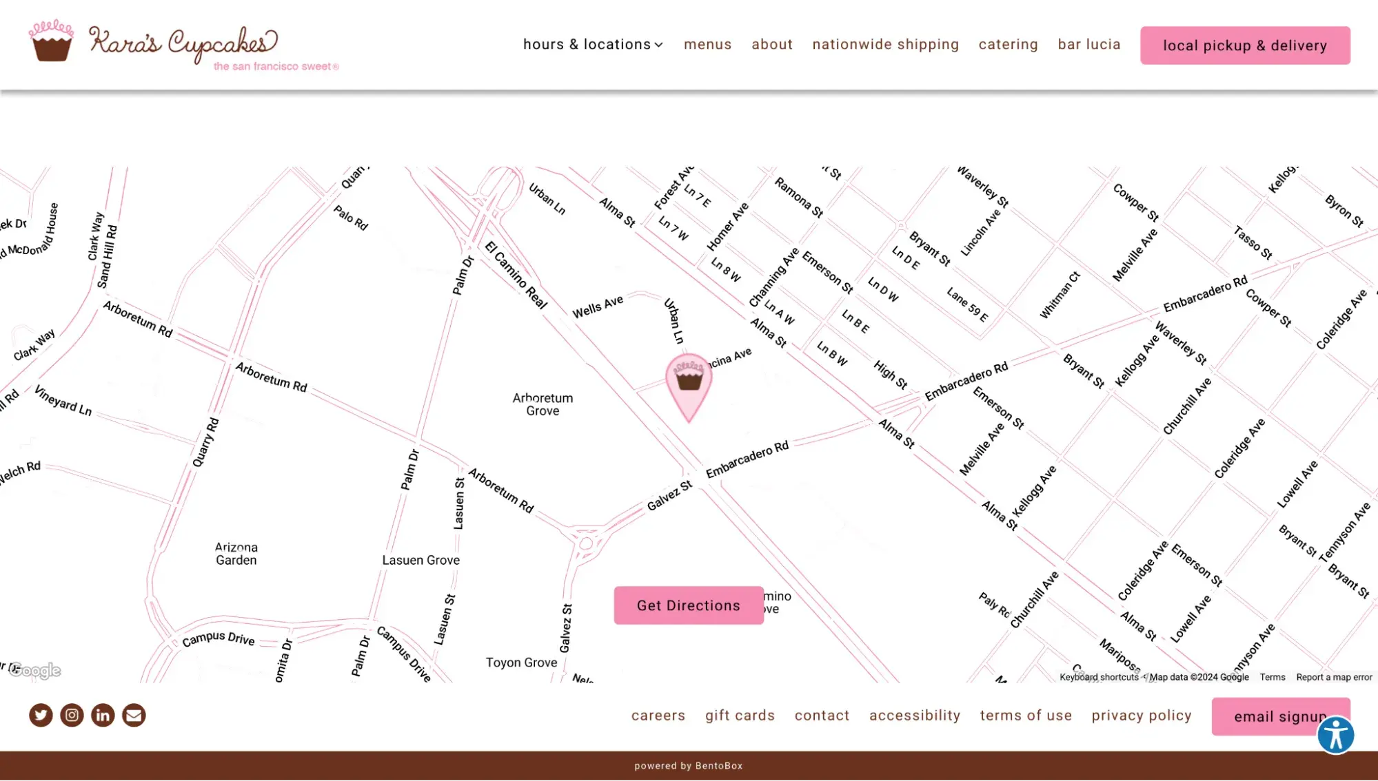
21. Kara’s Cupcakes
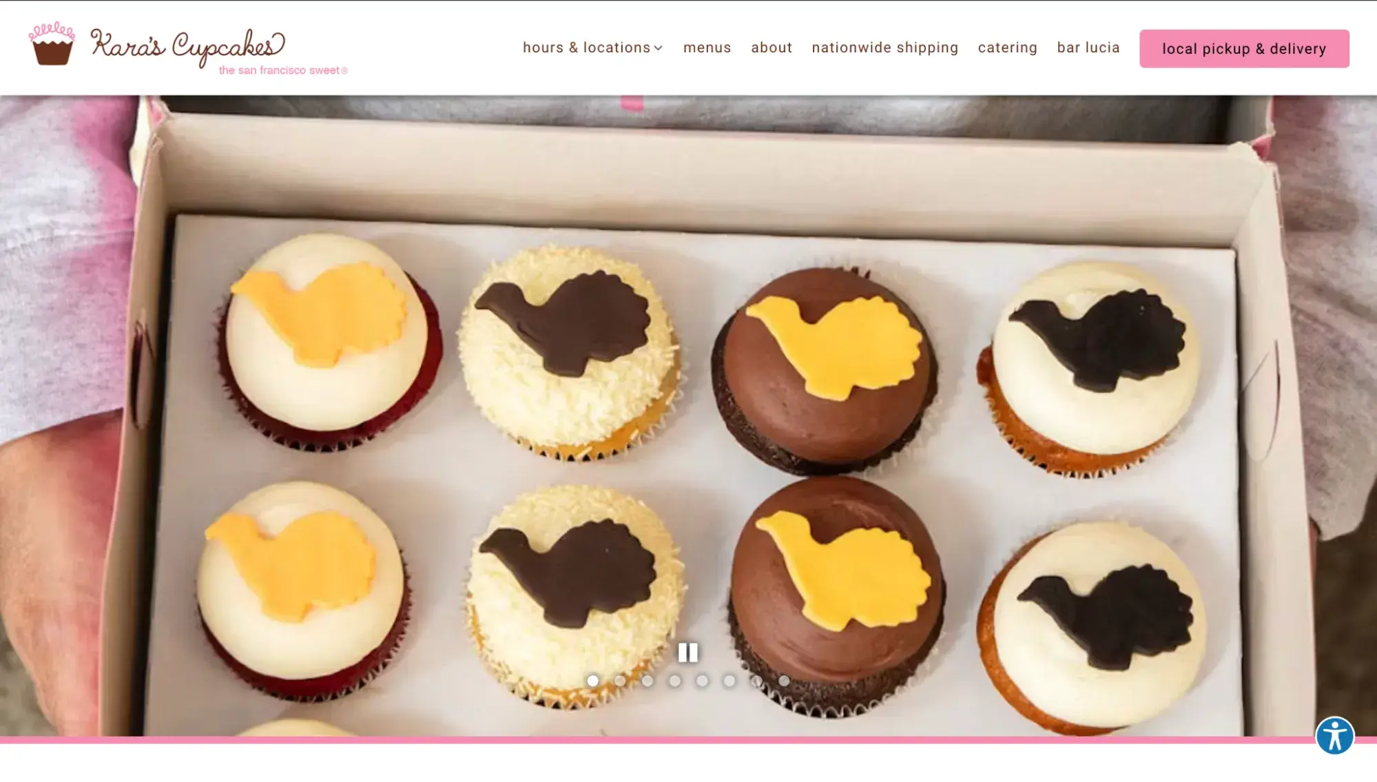
Another example powered by BentoBox, Kara’s Cupcakes website is bright, fun, and designed to get you to order.
What I love
Anyone can build a website thanks to site builders, but what makes a bakery website truly great is the attention to detail. Kara’s Cupcakes personalizes something as run-of-the-mill as a Google Map to make it branded. Notice the custom pin image of a cupcake on the embedded map.
22. Back Door Donuts
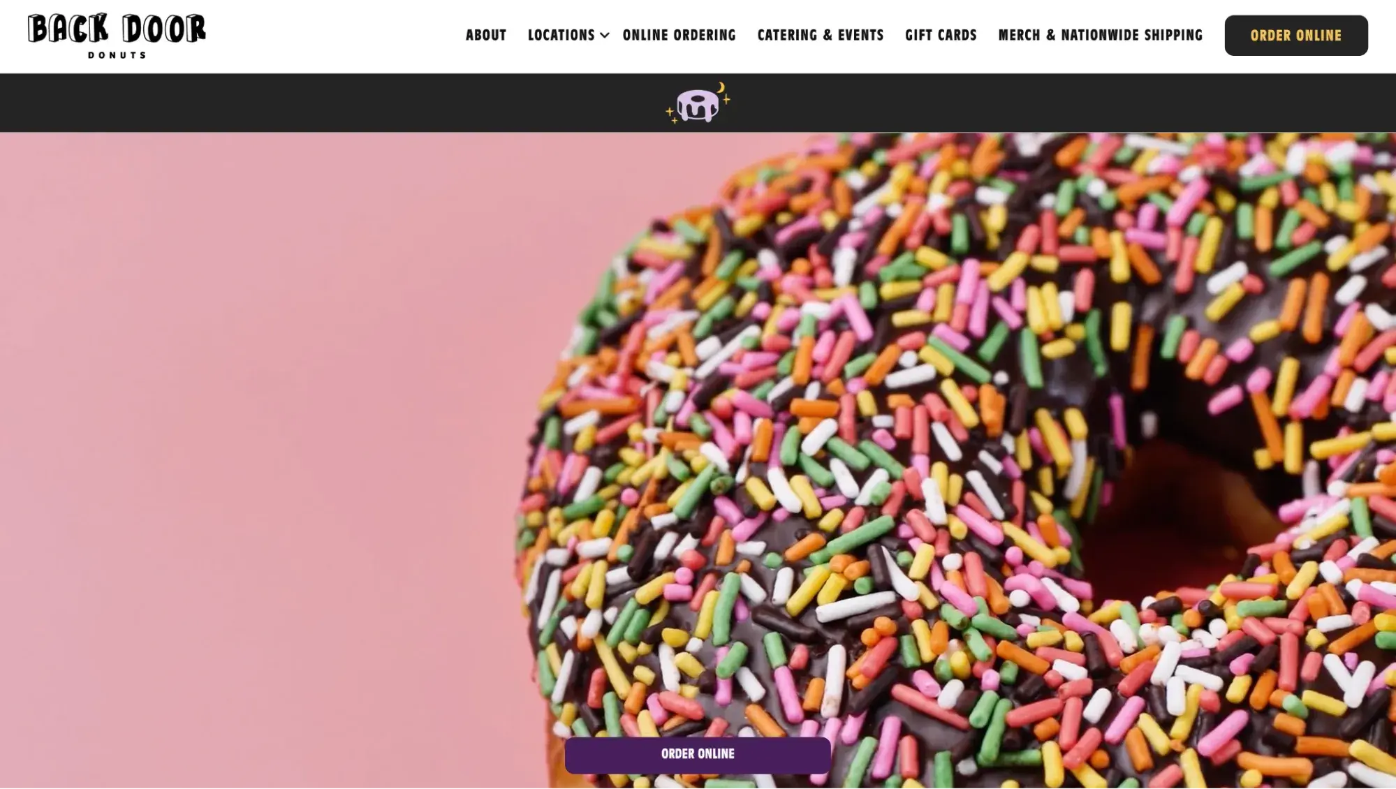
Based out of the serene island of Martha’s Vineyard, Back Door Donuts has a website that might just make you want to book a ferry ticket. The homepage features a full-screen video background, a pleasing color palette, and fun graphics that reinforce its branding.
What I love
Right when I landed on the site, I saw two prominent buttons that said, “Order online.” These buttons followed me as I scrolled, so I never lost sight of how to obtain donuts.
It’s an impressive testament to what the BentoBox website platform can do, though these design strategies can be carried over to any CMS or site builder with a bit of tweaking.
HubSpot's Free Website Builder
Create and customize your own business website with an easy drag-and-drop website builder.
- Build a website without any coding skills.
- Pre-built themes and templates.
- Built-in marketing tools and features.
- And more!
23. Tartine Bakery
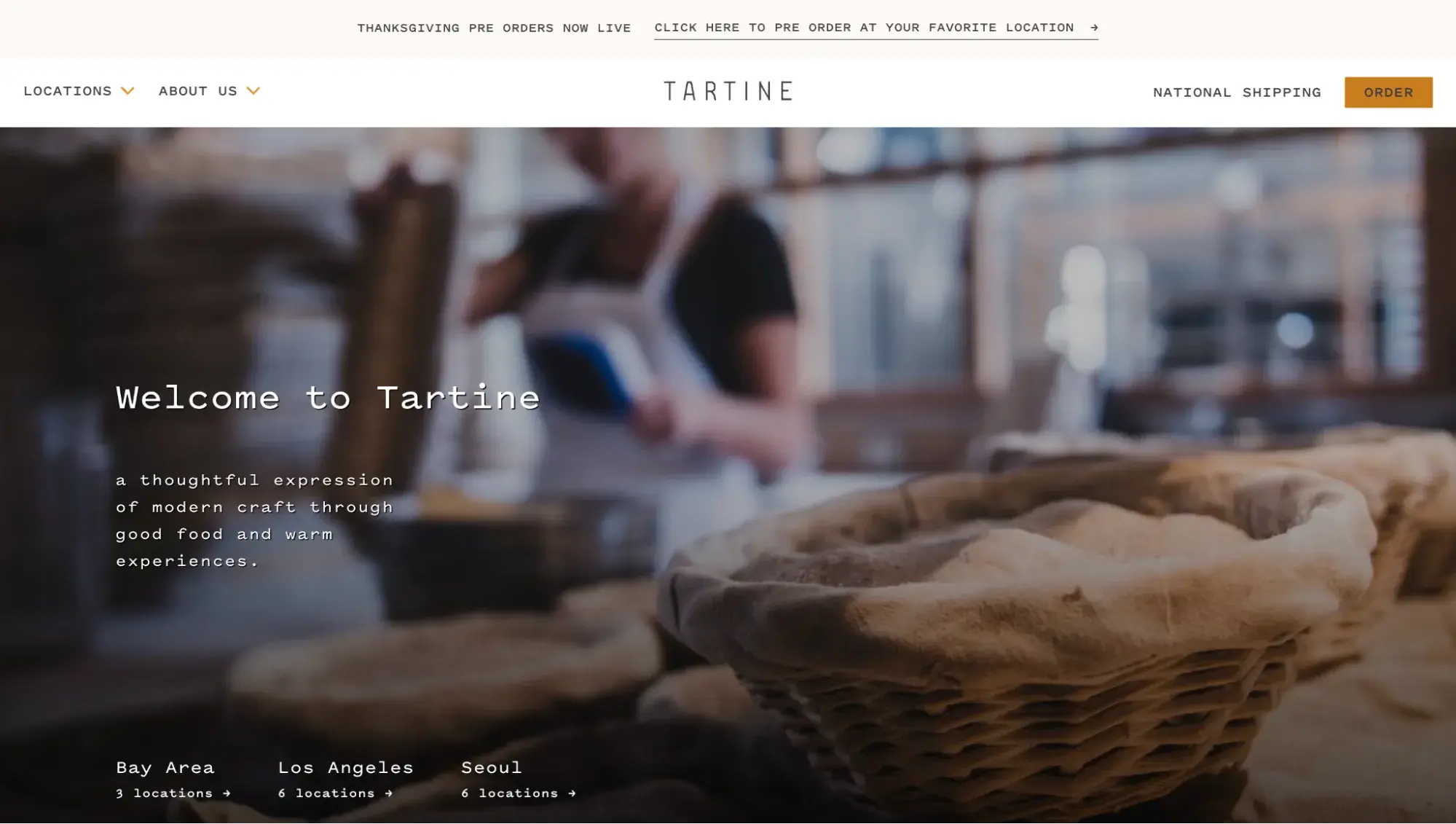
Look at how well this website communicates with the visitor in just one glance. Without even using the word “bakery” anywhere above the fold, the website conveys:
- Tartine is a bakery (made clear thanks to its hero image).
- There are locations around the world.
- You can place an order online and get national shipping.
And yet, it does all of this without looking cluttered. A+ job.
What I love
Besides its buttery, flaky morning bun, what I love about Tartine is that it built a lovely interactive map on its locations page. You can click on any region name, and the map will zoom in to show the different bakeries there.

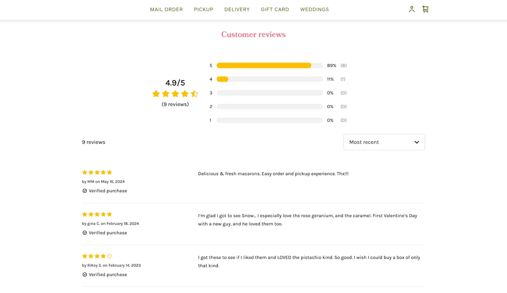
24. Miette Patisserie & Confiserie
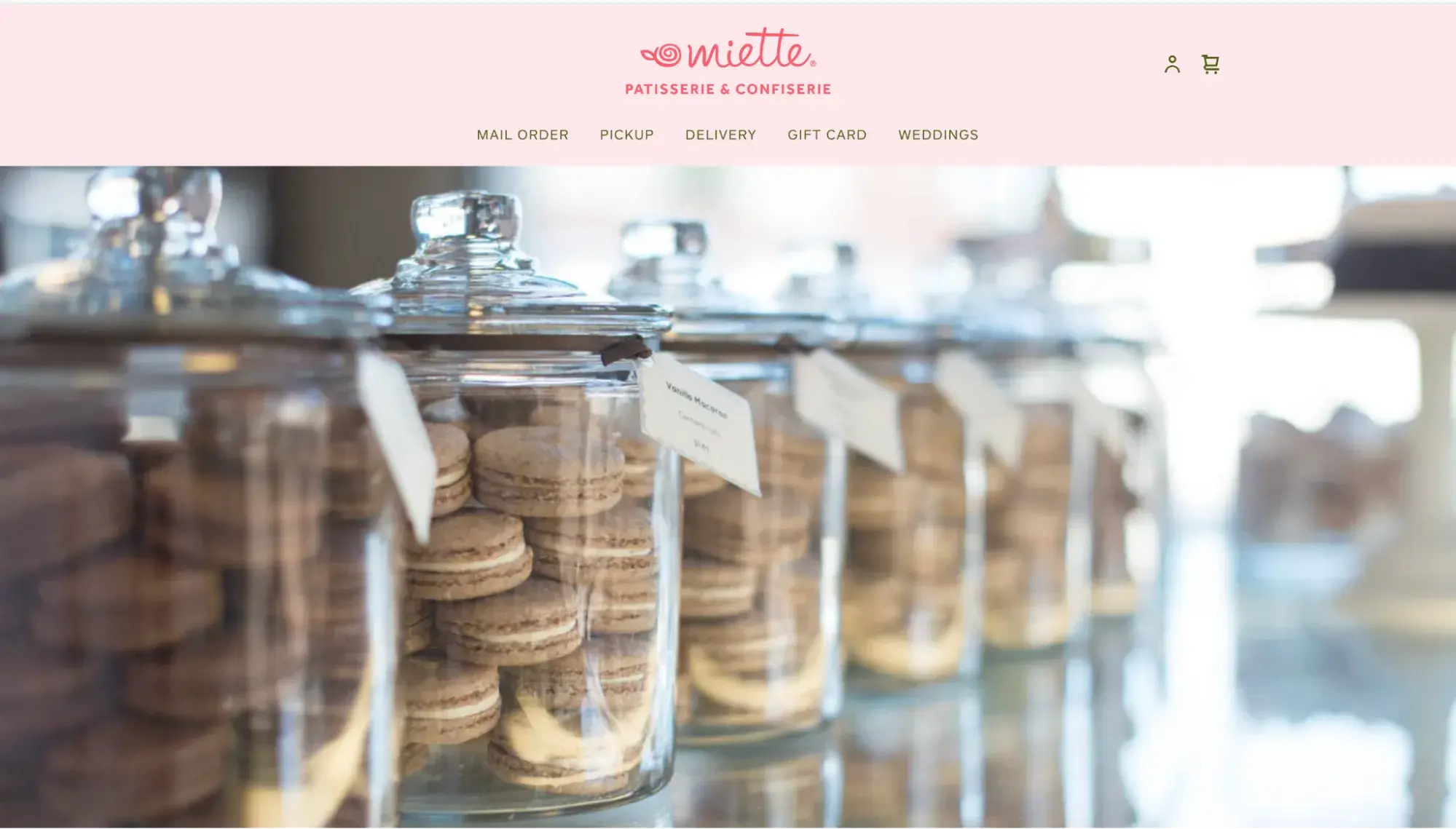
I wanted to include at least one Square website on this list since Square is another popular POS that many bakeries use. Miette has multiple San Francisco Bay Area locations and uses Square to power its website and POS.
What I love
Miette’s product pages feature customer reviews, which I always like to peruse before purchasing something.
25. Sun Street Breads
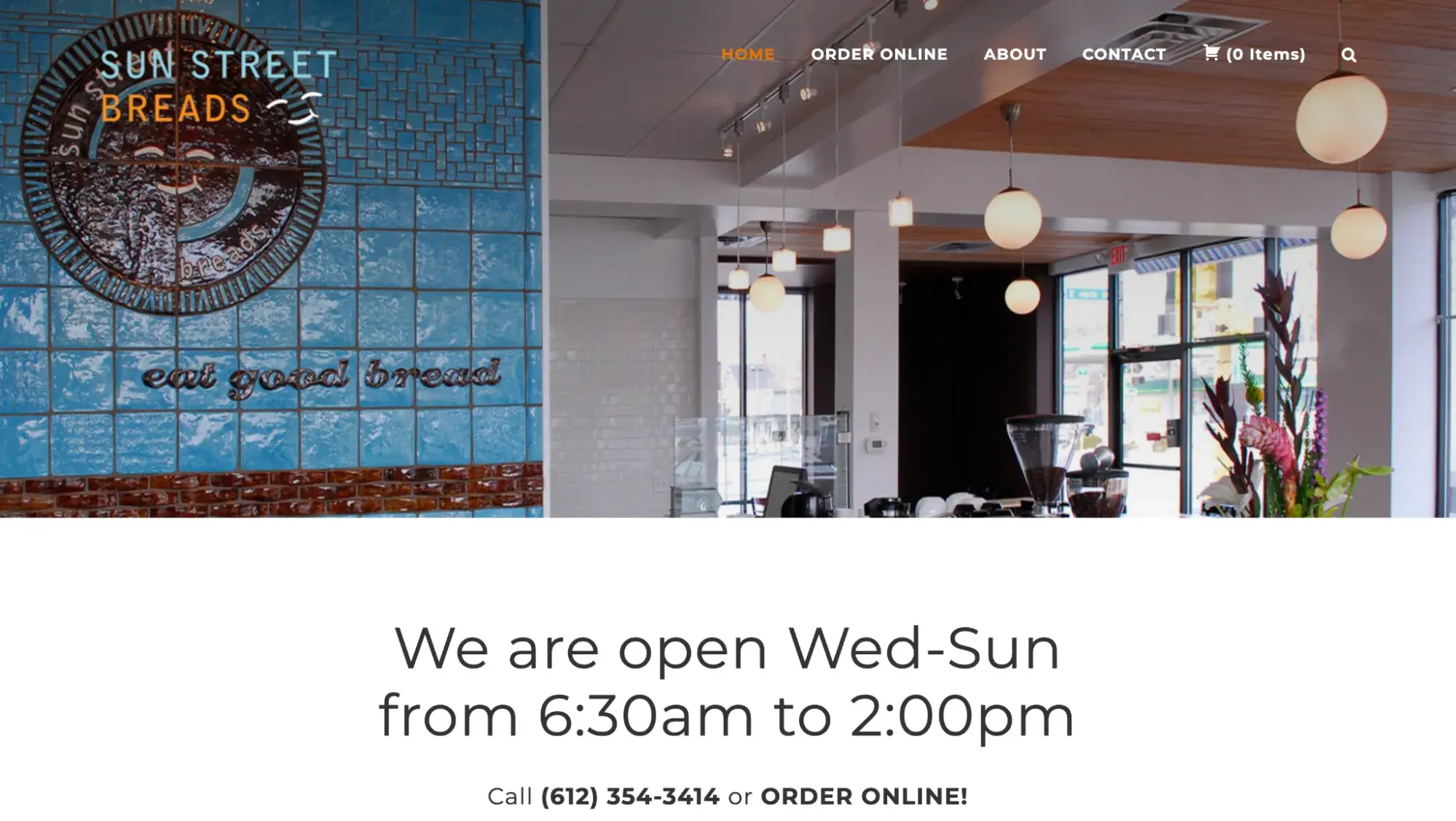
Sun Street Breads in Minneapolis presents itself as a true bread authority on its website. It lists every bread it bakes, along with a detailed description.
What I love
What I appreciated most about the Sun Street Breads website is that it clearly gets its point across above the fold on the homepage. It features an image of the inside of its store, plus it has huge letters telling me when they’re open.
Beneath that is a call-to-action to literally call them or place an order online. Straight to the point.
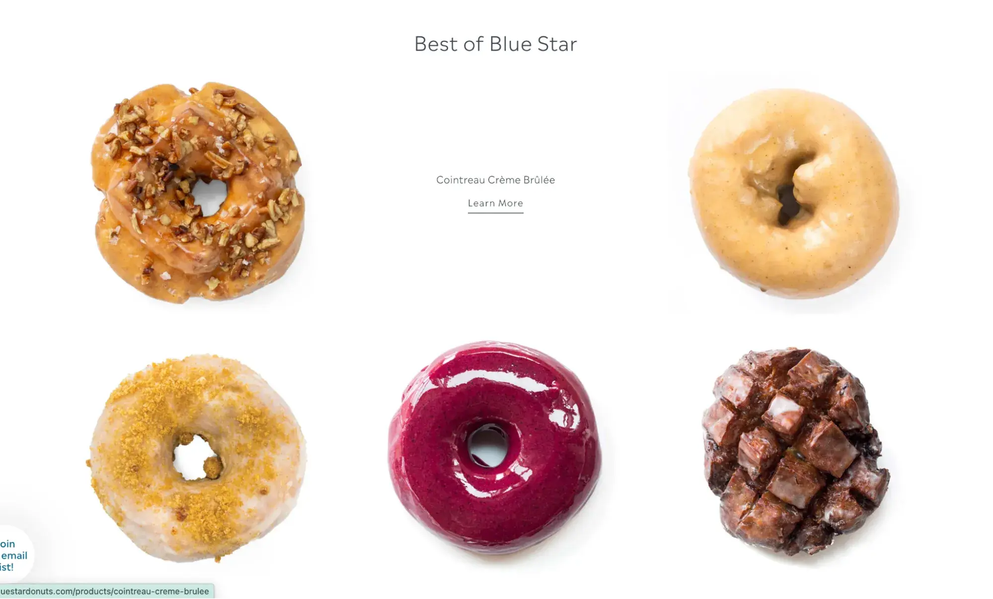
26. Blue Star Donuts
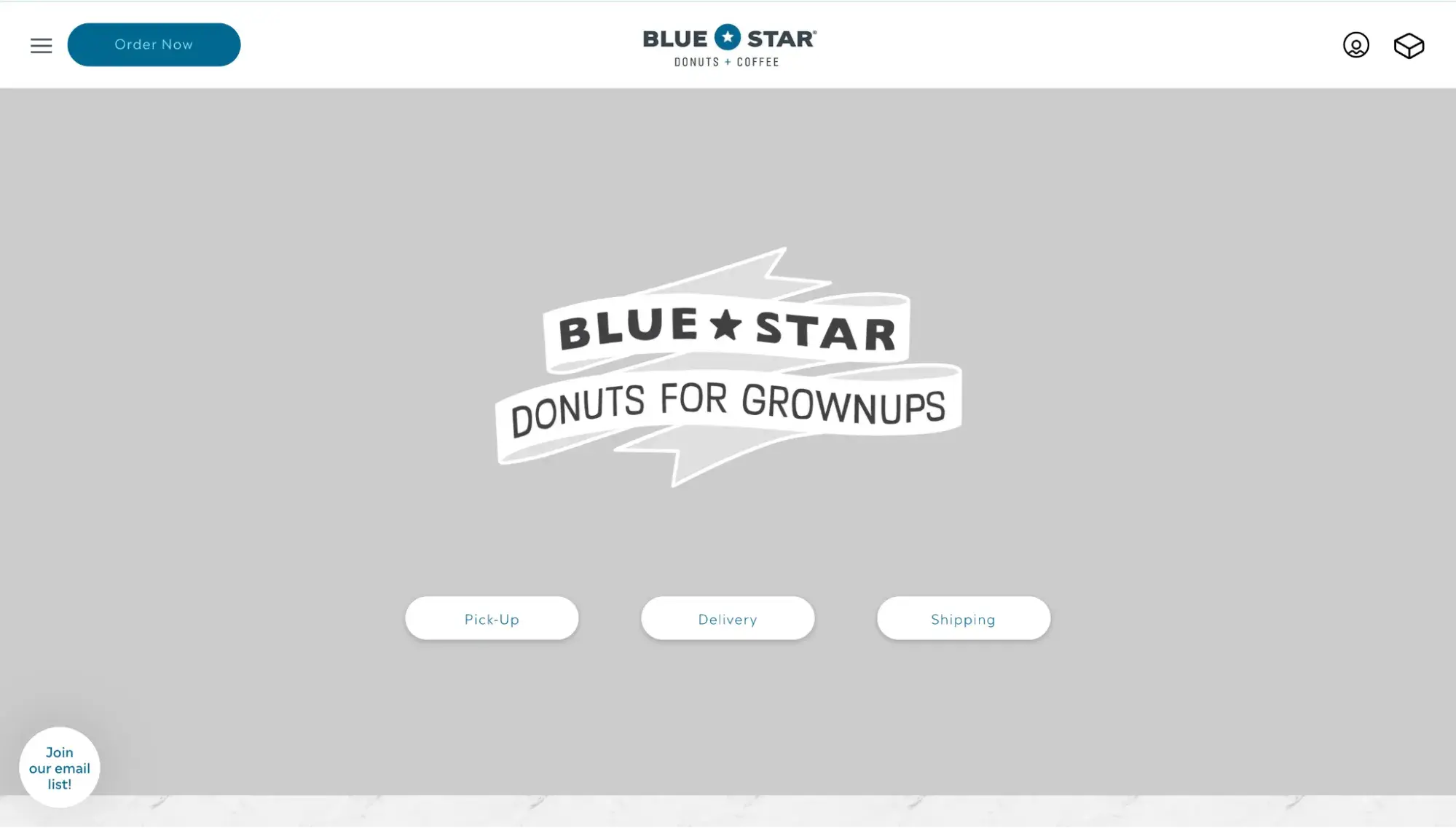
When you land on its homepage, Blue Star Donuts lets its copy do the talking: “Donuts for Grownups.” But scroll down, and you’ve got more treats in store.
What I love
This grid layout featuring Blue Star’s donuts is my favorite part of the site. It features a fun hover effect. The way you can see the sheen on each donut’s glaze makes it almost tangible. This is what I mean by high-res images!
27. Sugarfire Pie
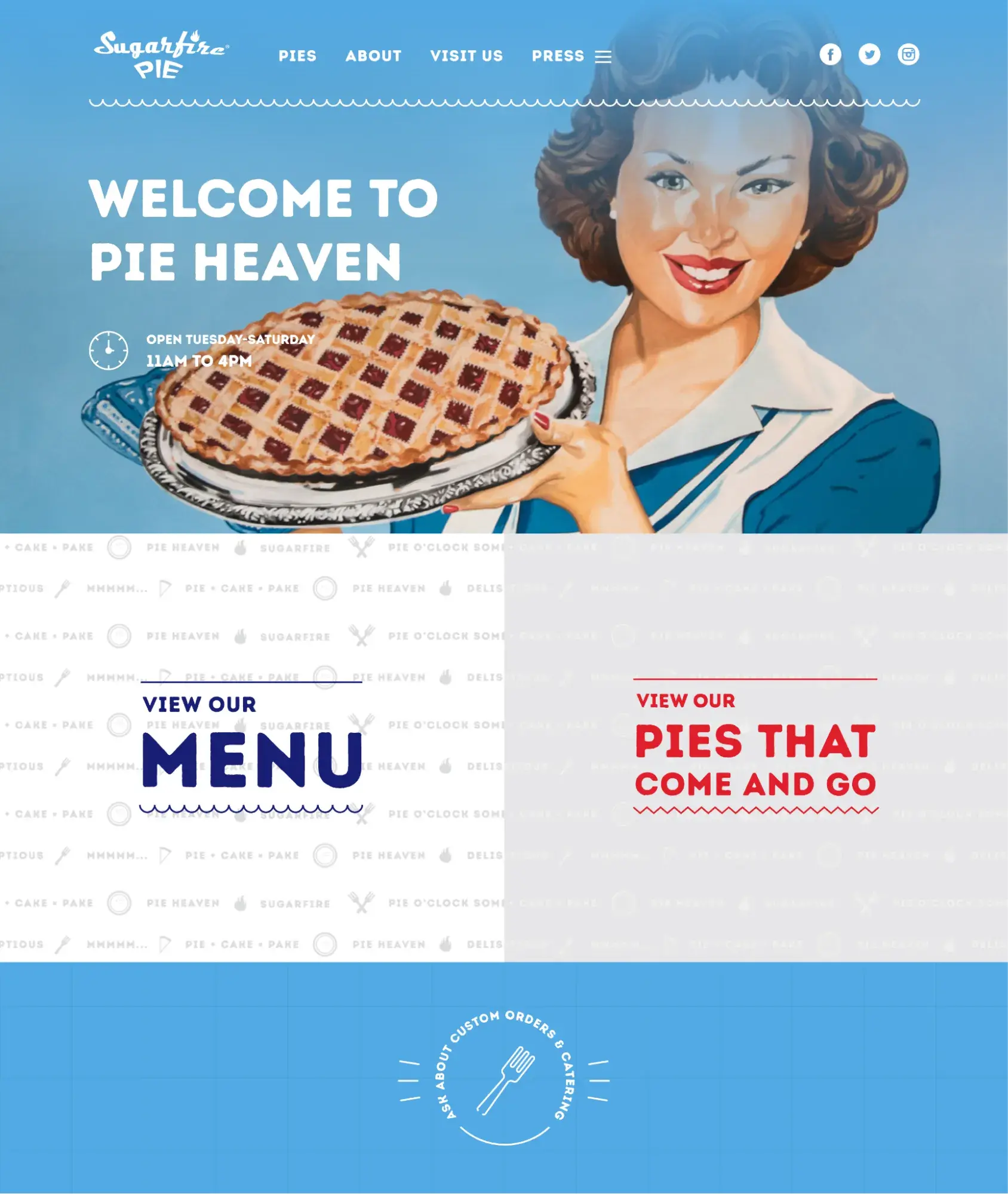
Sugarfire Pie in Missouri bakes a lot of fun into its website. It’s an impressive one-pager with bold colors and playful graphics.
What I love
This retro example fits a lot on its website without overwhelming. It’s also a great example of how memorable a bakery can be when it’s consistent with its branding.
28. Salt N Sprinkles
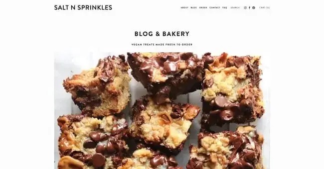
Salt N Sprinkles is a food blog and purveyor of vegan treats — her minimalist, Squarespace-powered website tells you everything you need to know to be sold. The homepage features delectable close-up photos of baked goods, along with CTAs for her newsletter and blog posts.
What I love
Not all sites require fancy gimmicks to convert visitors, and Salt N Sprinkles is proof of this. Focusing on clean design puts your content and creations in the spotlight.
29. Sprinkles
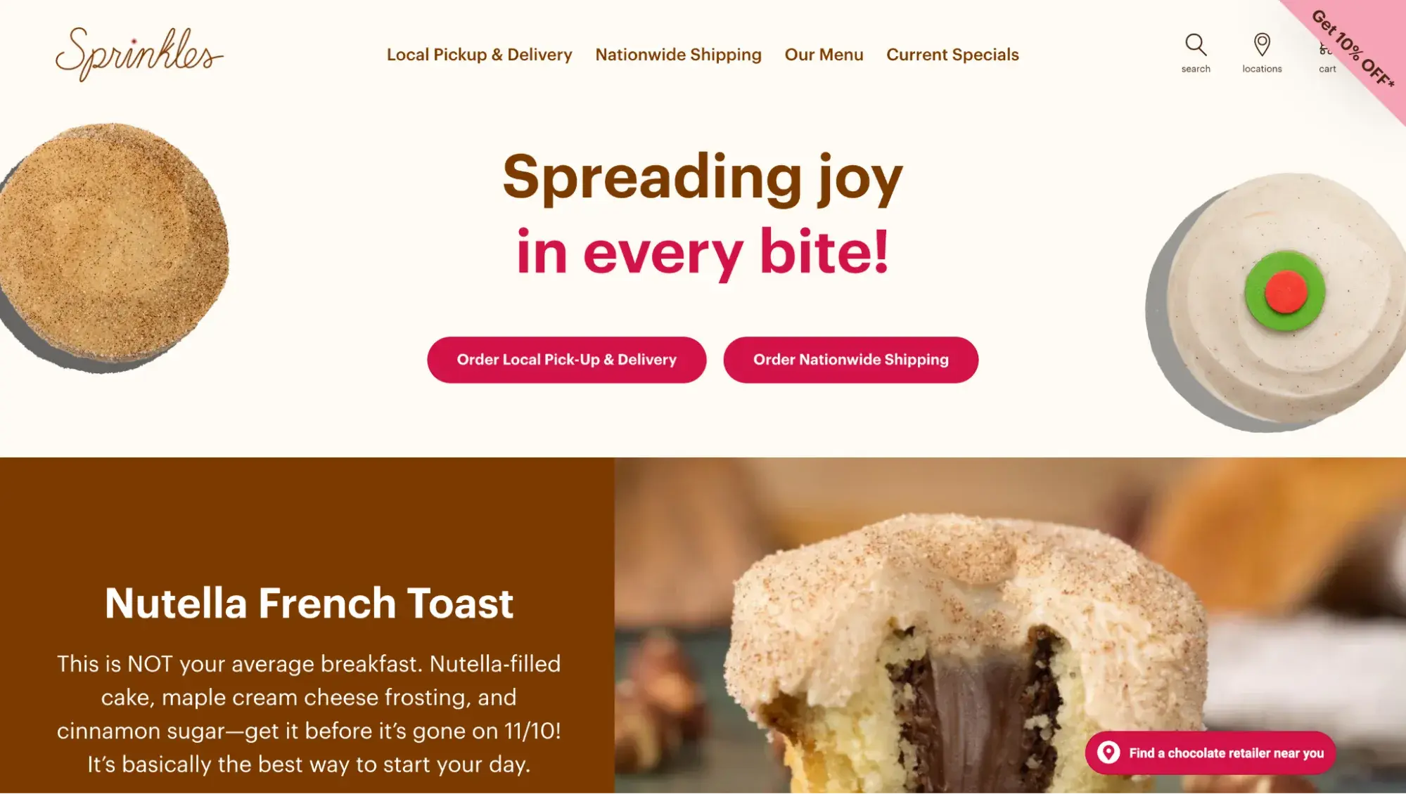
From the makers of those viral cupcake ATMs at the airport, Sprinkles makes a bold splash on its website, too. High-res cutouts of its famous cupcakes along with bold text captures the attention. Plus, there are two prominent CTA buttons for placing an order.
What I love
Sprinkles was the only bakery on this list where I noticed a loyalty program. For any business, encouraging repeat customers by offering rewards for each purchase is a genius way to boost revenue.
30. Pizzami Theme
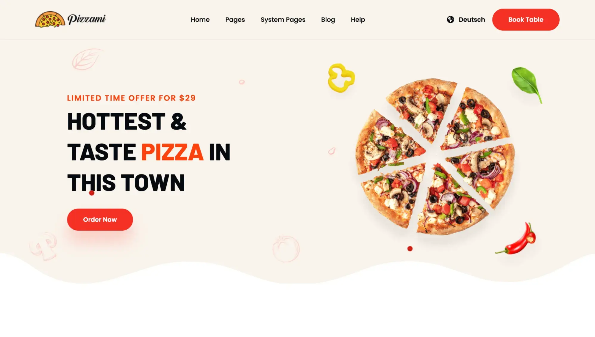
Now, I know what you’re thinking: That’s not a bakery website! But I included this in the list to show you something you need to watch out for while looking at themes: Just because a theme doesn’t have bakery photos doesn’t mean you can’t use it for your bakery website.
Themes are just premade templates filled with stock images and lorem ipsum text to give you an idea of what a completed website looks like with that theme. Regardless of which theme you choose, you’ll still need to swap out the stock images with your own images.
You can use any website theme to build a bakery website, and I think this Pizzami theme is a great option.
Here’s what it looks like after I spent about 15 minutes using Canva, HubSpot’s drag-and-drop editor, and a free logo maker to create a fictional bakery called Macaron Delights:
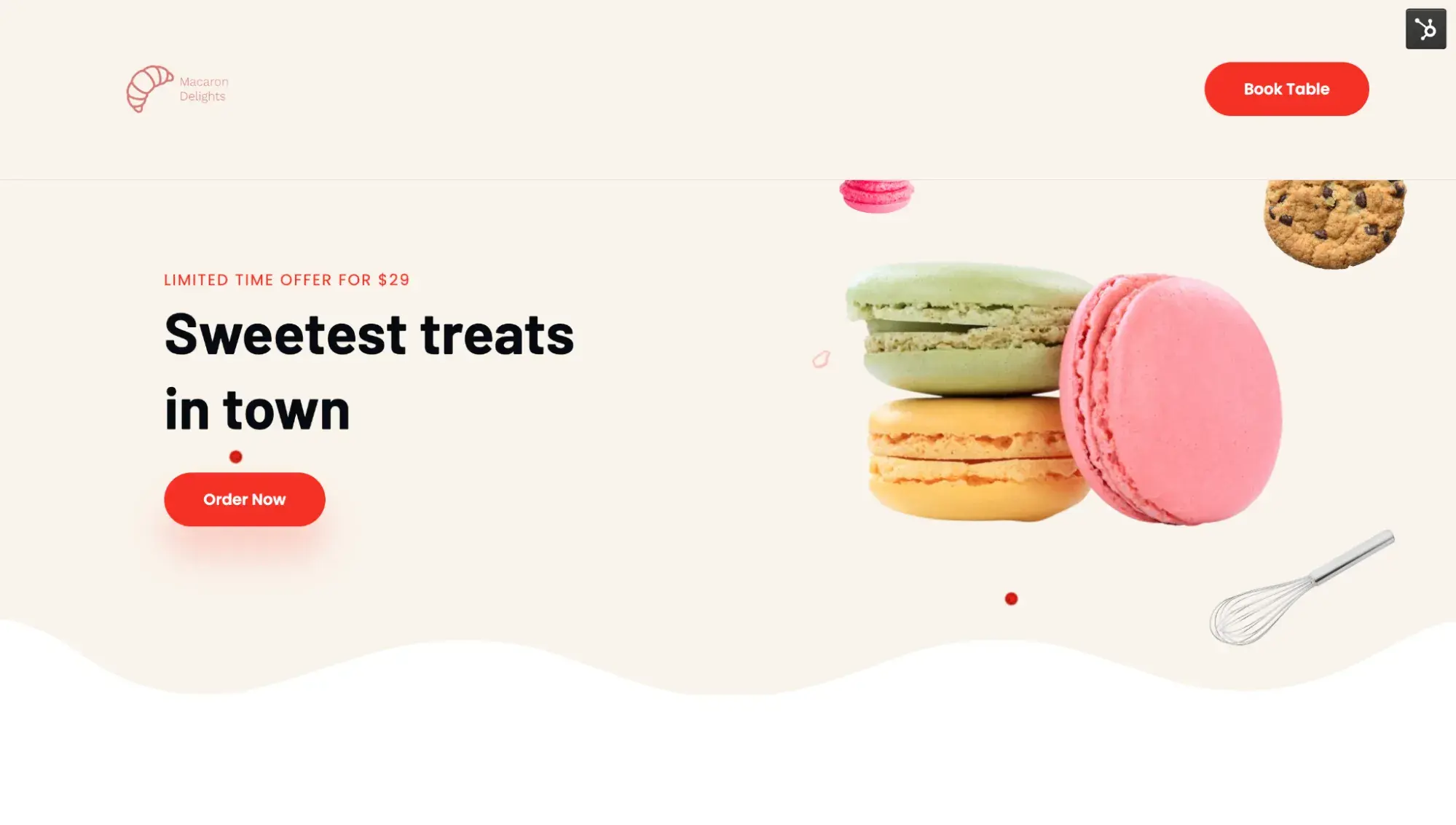
It was super easy for me to type in a few words and pick a few colors in HubSpot’s logo generator.
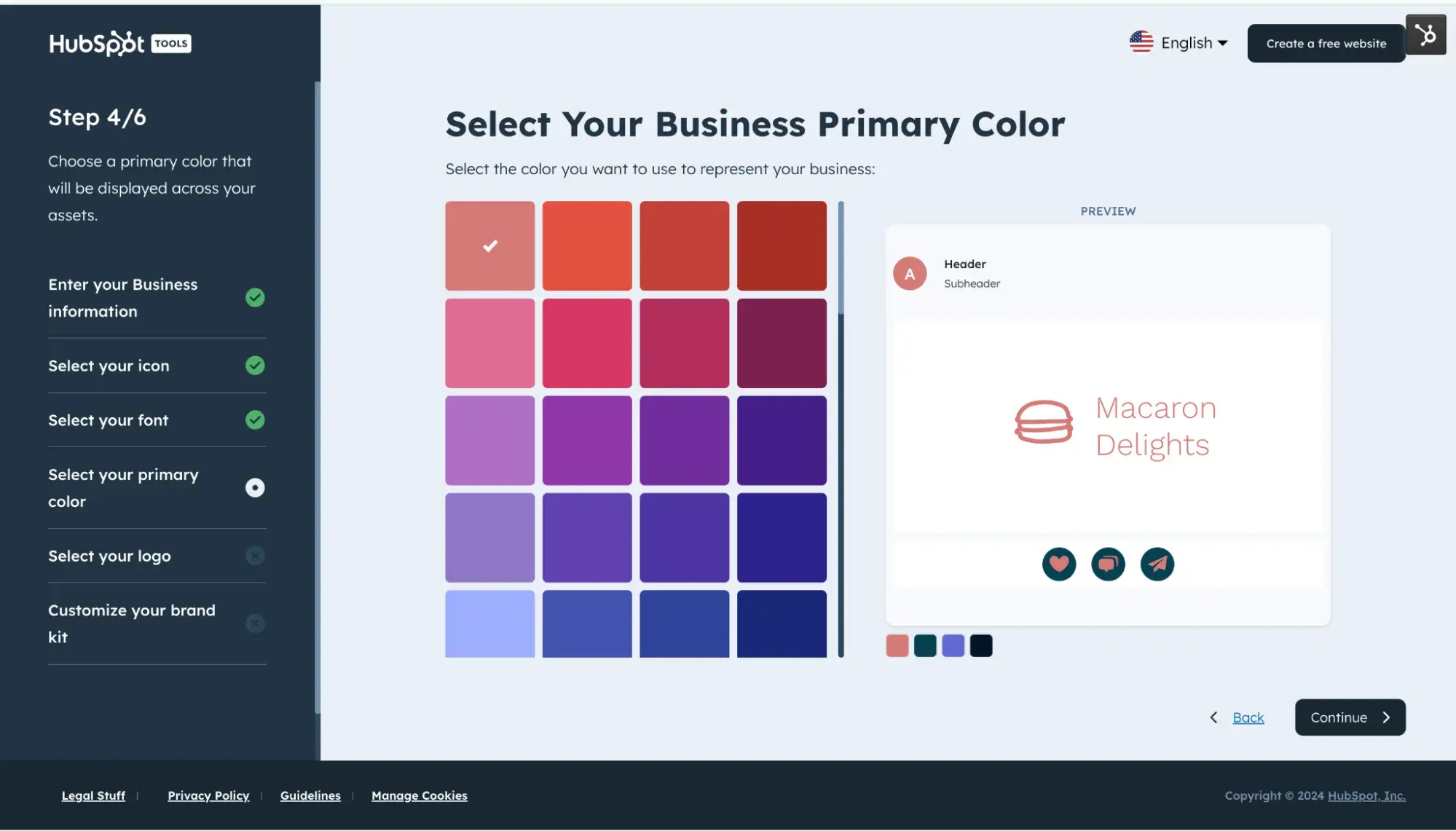
HubSpot created a few brand assets for me in less than a minute.
I was able to upload that Macaron Delights logo into my Pizzami template — and voila!
What I love
The Pizzami website theme tastefully uses motion. When I move my cursor, some parts of the design move slightly, which adds a playful visual effect.
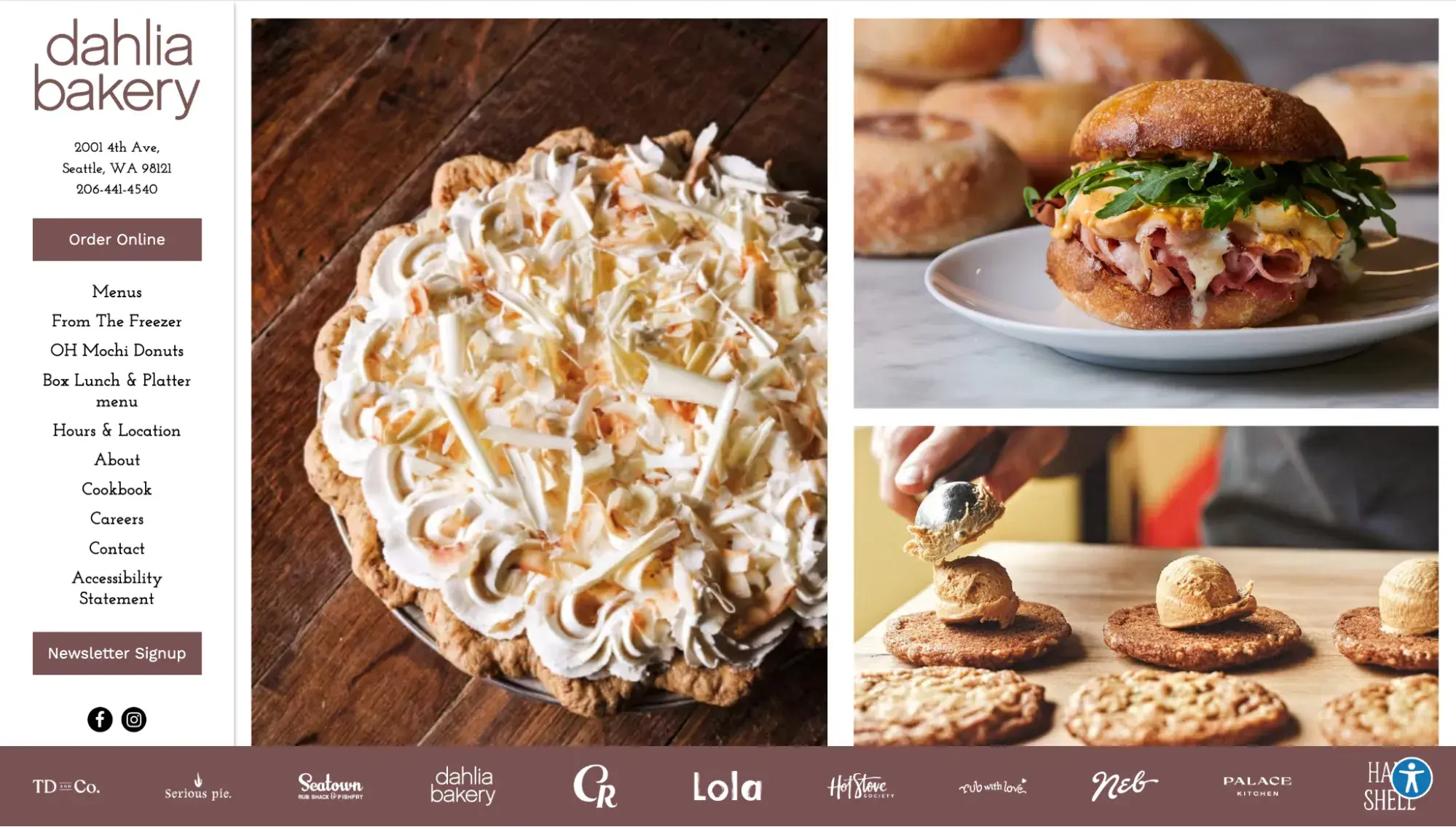
31. Dahlia Bakery
I’ve visited Dahlia Bakery’s brick-and-mortar store a couple of times to indulge in their gluten-free donuts. Its online storefront didn’t disappoint either. It captured my attention immediately with large images, and made it easy to know how to place an order online.
HubSpot's Free Website Builder
Create and customize your own business website with an easy drag-and-drop website builder.
- Build a website without any coding skills.
- Pre-built themes and templates.
- Built-in marketing tools and features.
- And more!
What I love
This Seattle bakery’s homepage stands out in a few ways:
- It features a left-hand navigation menu. Most menus are on the top of a page.
- It’s almost entirely images. When you click those images, a Toast order page opens, where you can buy the items.
- A banner of logos graces the bottom so you know the businesses where you can find Dahlia’s baked goods.
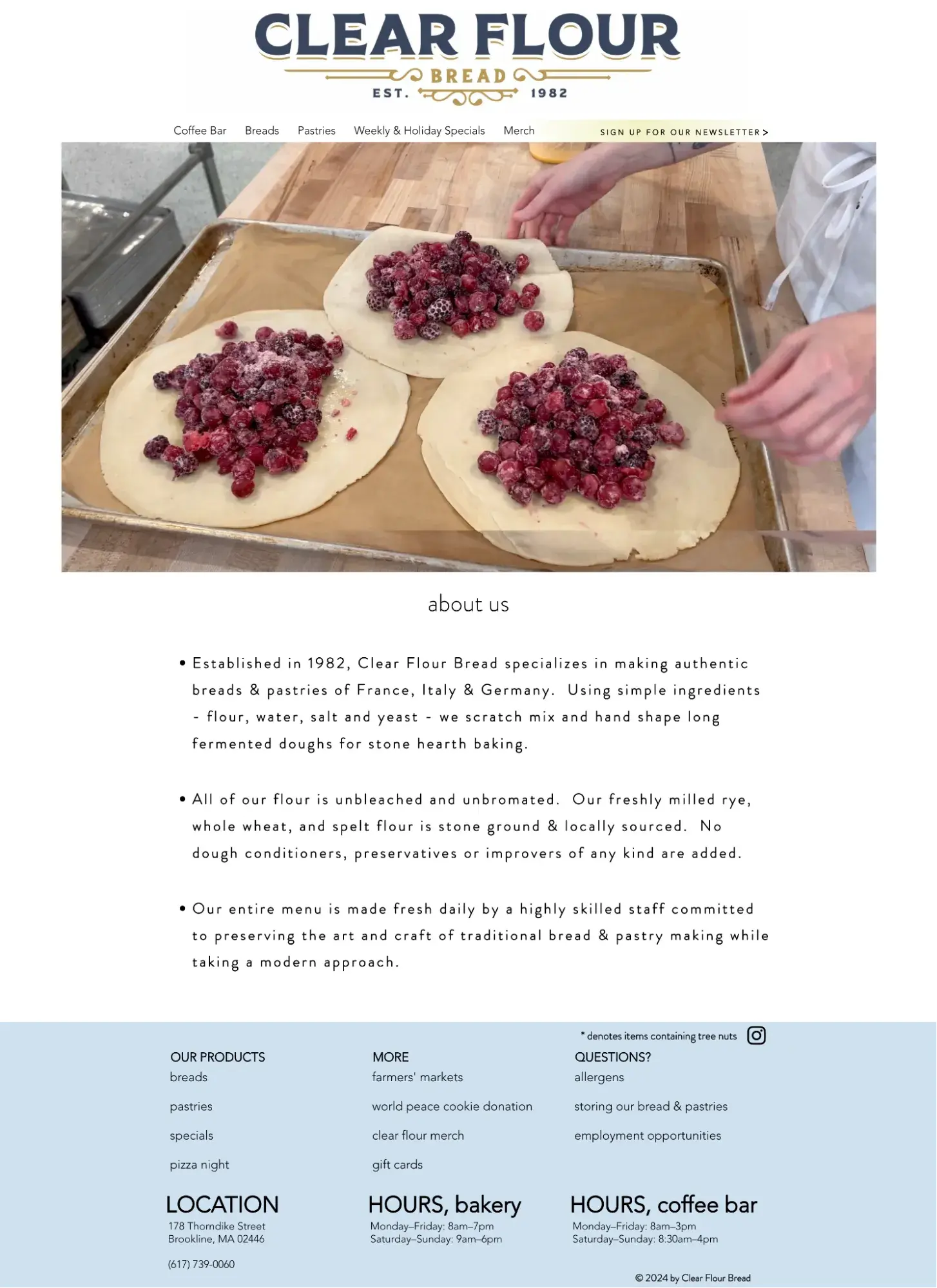
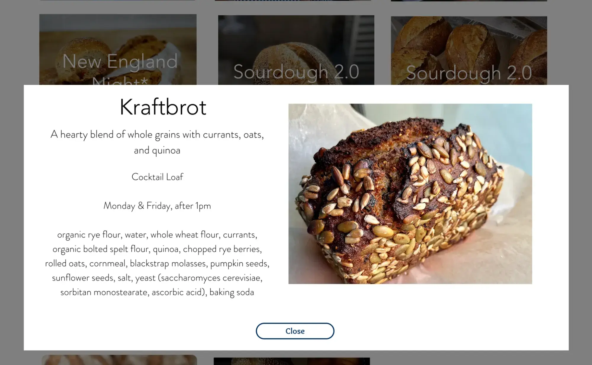
32. Clear Flour Bread
This Massachusetts-based bakery masters simplicity in both its ingredients and website. Clear Flour Bread uses unbleached, unbromated flour (no conditioners or preservatives ever). Its homepage uses an auto-play video hero image that shows the behind-the-scenes of baking. And the copy gives three bullet points about why the bakery stands out among competitors.
What I love
Clear Flour Bread is a great example of how good web design isn’t just about being pretty — it’s about being functional too. This was the only website I found that told me exactly which days and times specific breads will be baked.
So if I'm craving some Kraftbrot, I know not to visit unless it’s a Monday or Friday after 1 p.m. Talk about designing for the user experience!
33. Levain Bakery
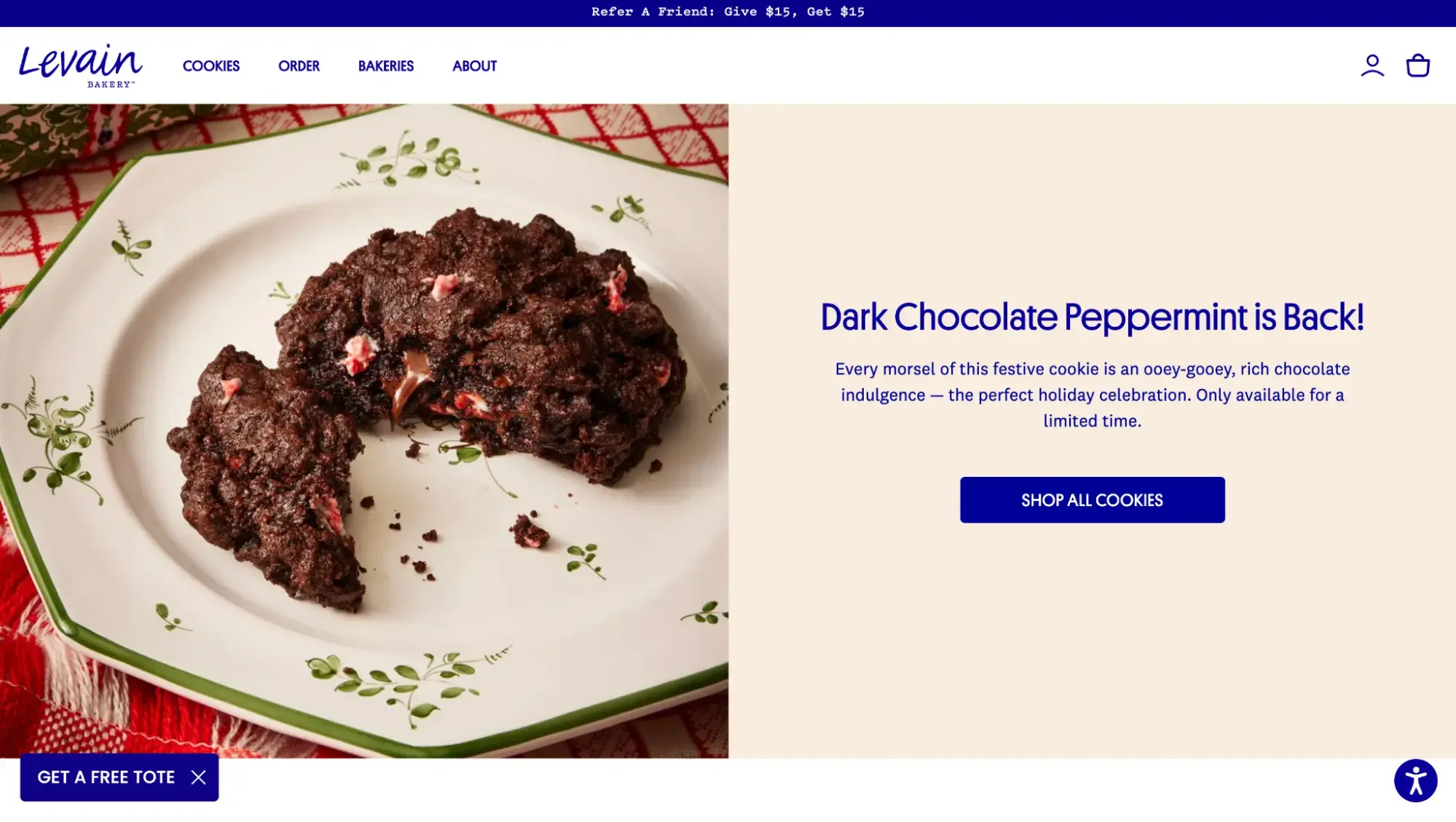
Levain Bakery knows how to lead with its strengths: a tantalizing closeup of the giant, gooey cookie that launched it to fame graces its homepage. Couple that with the refer-a-friend banner and “Get a free tote” call-to-action, and you’ve just spotted marketing masterminds in the wild.
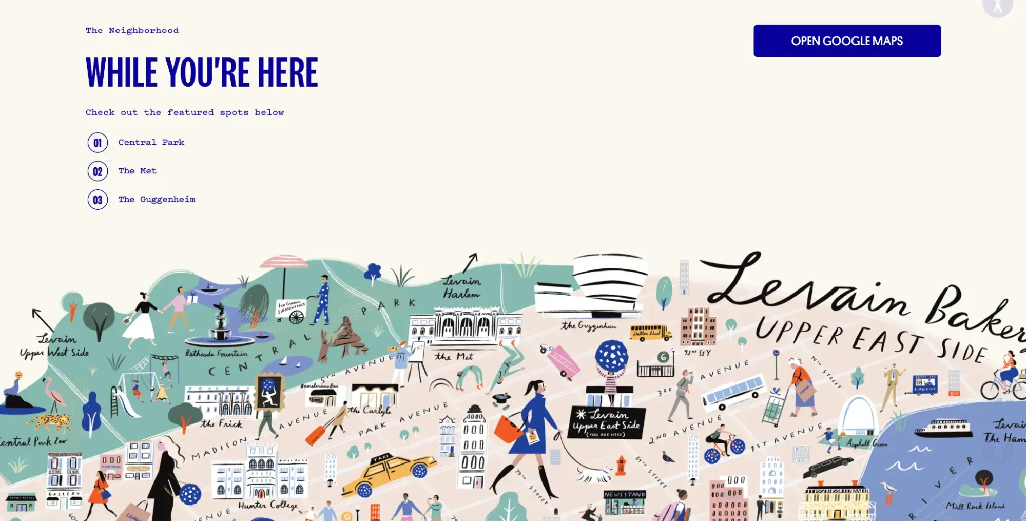
What I love
Sure, this website shows off “New York City’s Most Famous Cookies,” but I was most impressed by Levain’s “Bakeries” pages. So, if you’ve got multiple bakeries, take note. On many of its location pages, Levain:
- Lists three landmarks to check out at this location
- Includes an illustration of those landmarks
- Features a menu of what’s available at this particular location
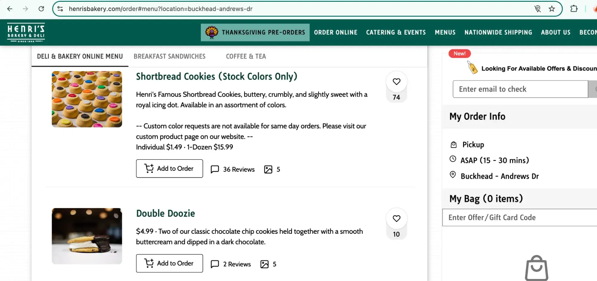
34. Henri’s Bakery
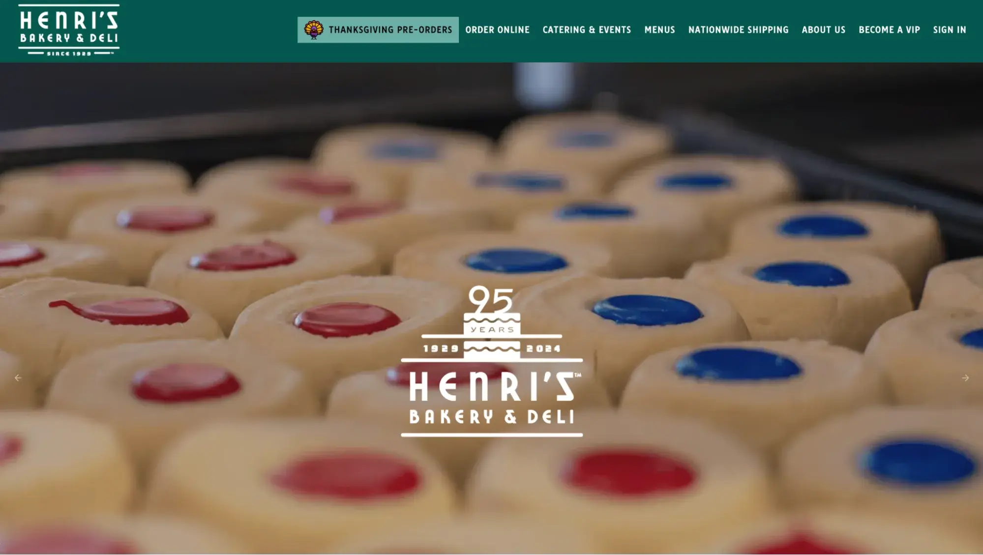
Established in 1929, Henri's Bakery has a website that combines old-school charm with modern web design practices. A full-screen hero image of its famous shortbread cookies draws in the eye.
Plus, the prominent “Thanksgiving pre-orders” button at the top of the page displays a timely call-to-action. POS system and site builder Popmenu powers this website, which makes it easy for visitors to order online under the same domain.
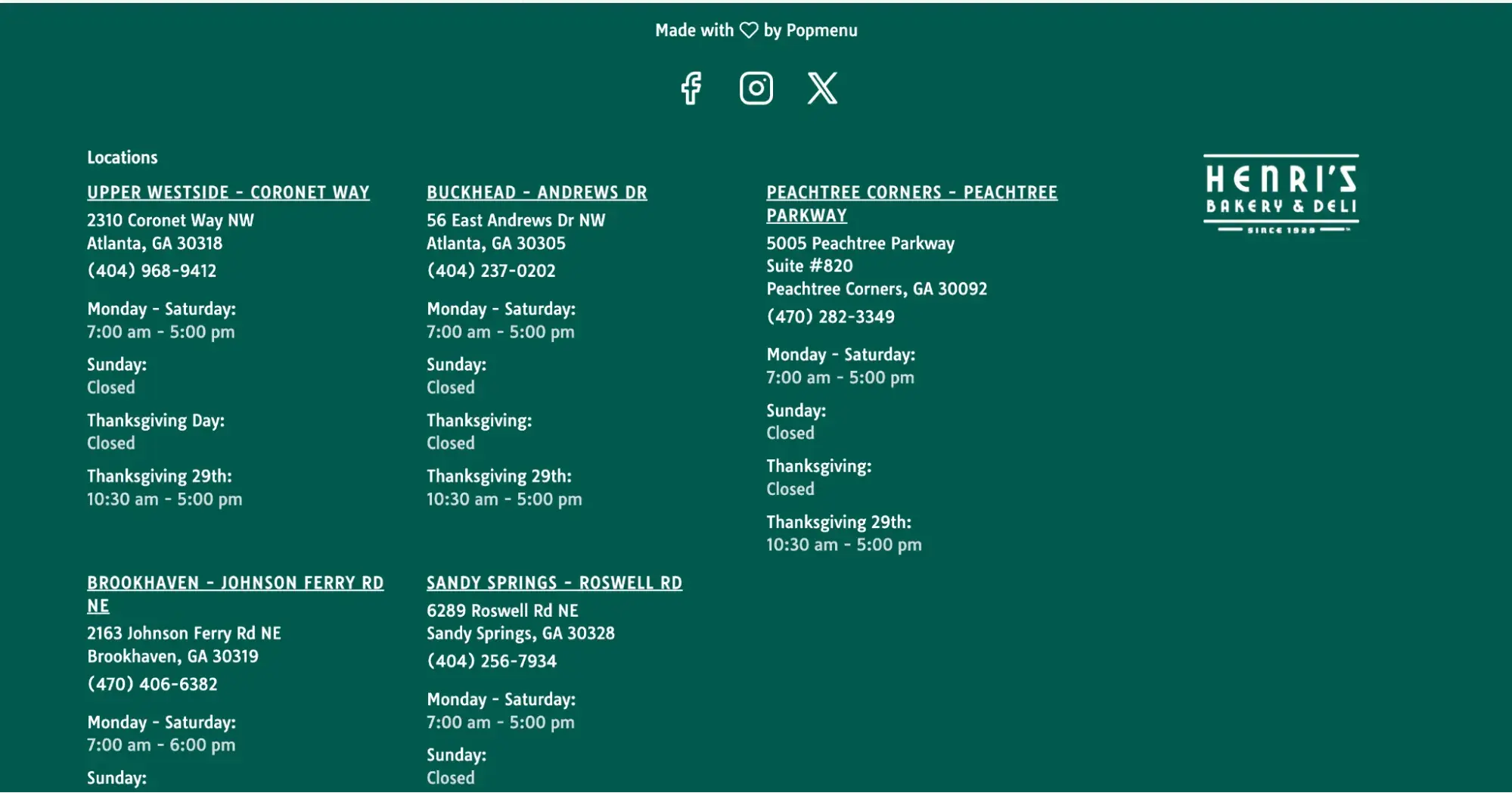
What I love
Personally, I’m a huge fan of footers. A lot of web visitors, particularly on mobile devices, will scroll quickly through your website — and the footer is the last thing they’ll see.
Henri’s has a huge footer that features information about all of its locations, making a scroll through this website quick and efficient.
35. Sud Forno
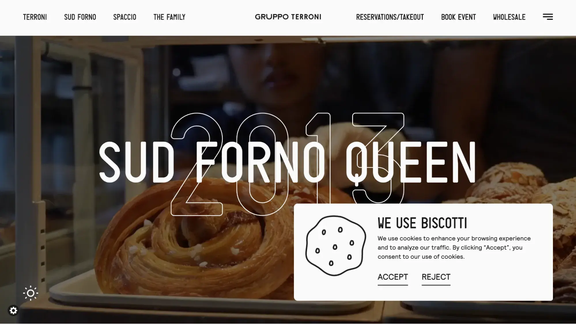
As a writer, I always appreciate when a website leverages good copy. Its copywriter turned something as boring as a cookies acceptance policy popup and made it fun. Notice the “We use biscotti” instead of “We use cookies” (biscotti means cookies in Italian, which further enhances Sud Forno’s authentic Italian brand).
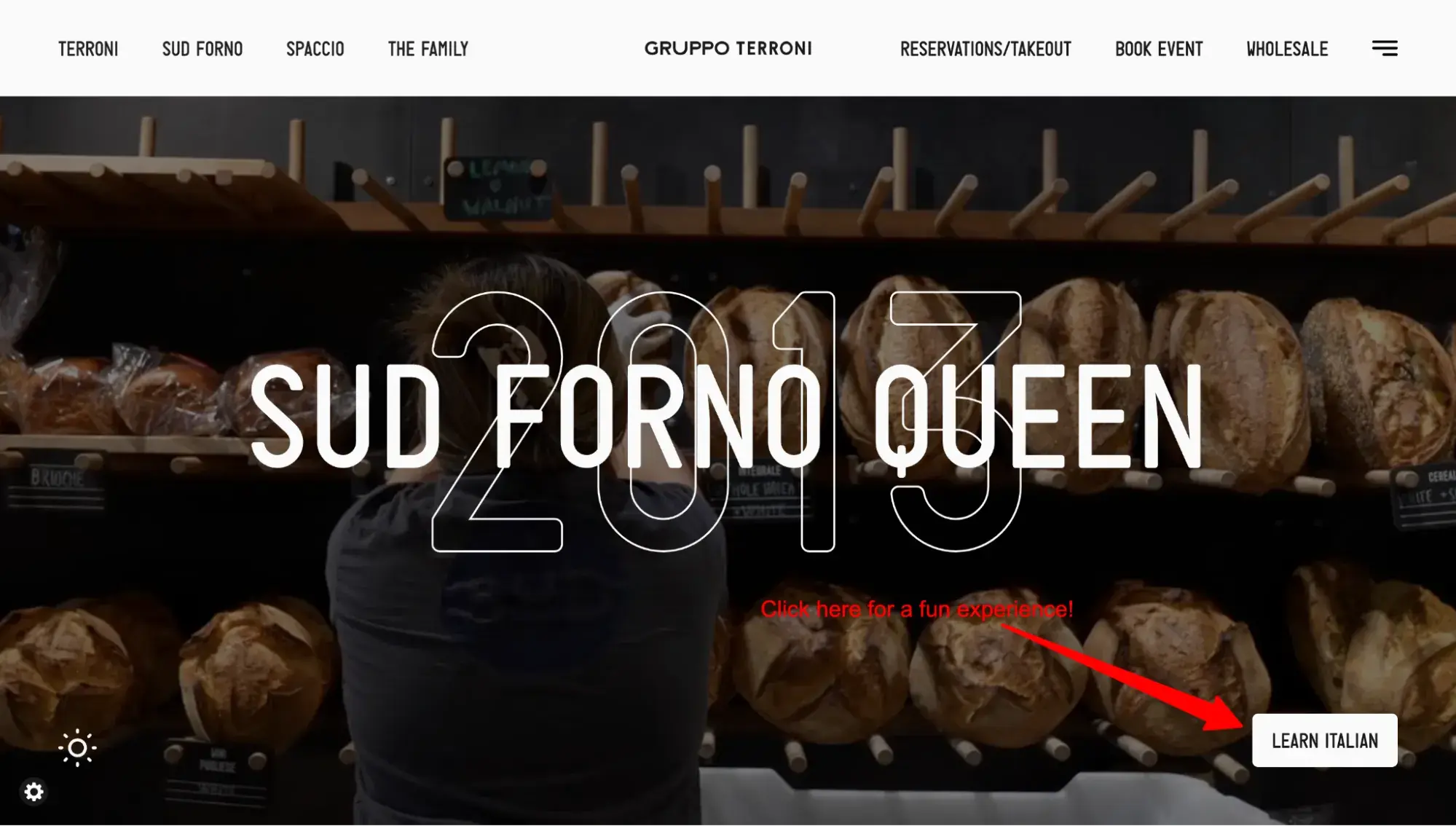
What I love
Anytime you can incorporate an element that makes a website visitor go, “Wow!” you’ve won. And Sud Forno did this with something so small: In the lower right corner of the site, if you click “Learn Italian,” you’ll hear Italian lessons set to dance music. It’s hilarious and catchy.
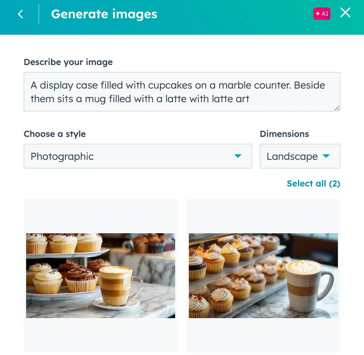
36. Triple C Patisserie
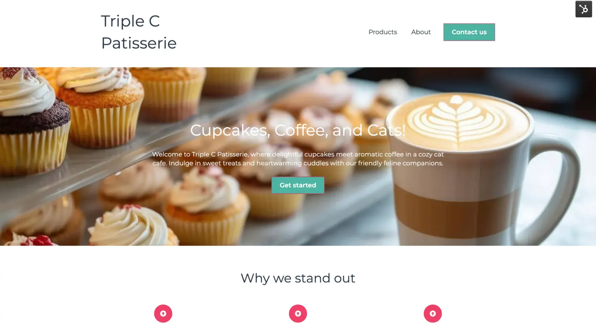
This fun concept bakery sells cupcakes and coffee, has an adjoining cat cafe … and is entirely made up.
Yep, I created this as a bakery website design example using HubSpot’s AI website builder. All I did was type a few words, and in less than 10 seconds, AI generated a website for me.

Of course, it didn’t get it perfect the first time. But it was easy to tweak to put a more fitting photo.
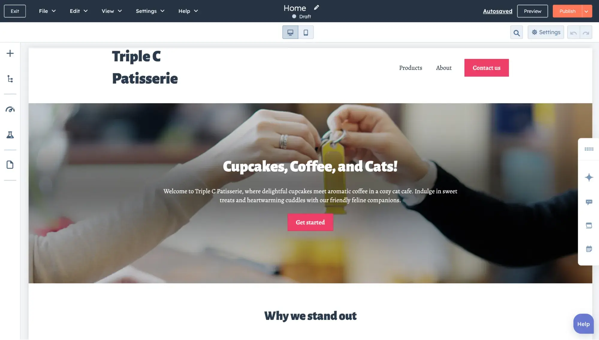
I ended up using HubSpot’s built-in AI image generator to create a more appropriate image of cupcakes and coffee.
Where Else to Find Bakery Website Inspiration
Still need more ideas for your bakery site? Search this database of website examples for inspiration. You can also check out the website of your favorite local bakeshop to get those creative juices flowing.
Once you have a vision, test out different site builders to see what works best for you. POS-integrated ones include Square, BentoBox, and Popmenu. And if you want your bakery website built on a leading customer platform (with the option of POS integrations), take HubSpot’s website builder for a spin (it’s free!).
Editor's note: This post was originally published in August 2021 and has been updated for comprehensiveness.
HubSpot's Free Website Builder
Create and customize your own business website with an easy drag-and-drop website builder.
- Build a website without any coding skills.
- Pre-built themes and templates.
- Built-in marketing tools and features.
- And more!
Website Design Examples


![15 black and white website designs to inspire your own [+ pro tips]](https://53.fs1.hubspotusercontent-na1.net/hubfs/53/black-and-white-website-design-1-20250520-1336267.webp)

![Gradient Website Design Examples That Prove This Trend Is Far From Over [+Tutorials]](https://lh7-us.googleusercontent.com/htOWIbyCIoCMxSjC4gJunkGnhCzXpccjTrL8NwoGdRdCsSiEmEAxe_qBFkMrzy2Y8d3cwEr_DMzSGHq9Xi-hQFnMJCo8HDQJ1yQGigcSfFxI2QKXo0s7xXSB2sY-eALG1iUqnHXgomcDsnp7AHRSH1s)
![15 Brochure Website Examples to Inspire You [+ How to Make One]](https://53.fs1.hubspotusercontent-na1.net/hubfs/53/brochure-website-examples-1-20250319-362228.webp)
![28 Types of Websites to Inspire You [+ Real-Life Examples]](https://53.fs1.hubspotusercontent-na1.net/hubfs/53/types-of-websites.png)

