As avid internet users, we love a nice grid. A grid layout arranges contents in a way that our eyes and brains naturally understand, allowing us to quickly and efficiently digest text and media — it’s no wonder that most websites use them.

 For designers, however, grids can present a challenge: Is it still possible to be unique and creative while staying within the literal boundaries of columns and rows?
If you want to take a chance and push the design envelope on your site, you might want to try a broken grid layout instead.
Broken grids aren't a perfect solution for every website, but those who want to inject a bit more personality and originality into their pages can do so in the layout itself. In this guide, we’ll learn how to break the standard grid layout in favor of something different.
But first, let’s review what a standard grid layout can accomplish in web design, just so we know what we’re actually trying to break here.
What Is a Grid Layout?
In web design, a grid layout is a way of structuring and organizing page content such as text, images, buttons, and other elements. A grid layout segments the web page into columns of equal width. Elements are placed and aligned within these column boundaries.
The grid layout is more of a concept than a defined method. To implement a grid layout, designers follow a particular grid system, a set of specific rules for how a grid should be formatted.
There are many grid systems in use today, one of the most popular being the 12-column variant of the 960 Grid System.

This system divides the width of the page into 12 columns, each 60 pixels wide, separated by 20-pixel spaces. Designers unflatteringly refer to the spaces between columns as “gutters.
Grid systems like 960 are very, very common on the web — they inform the design of the vast majority of websites. While it’s difficult to get an exact count, I’d wager that at least nine of your 10 most-frequented sites probably follow a grid layout to some extent. For a clear-cut example of a functional grid, look no further than our blog page:

But why are grids so popular in the first place? A grid layout enables web designers and web developers to:
- build pages more quickly and easily, not having to reinvent the wheel each time.
- organize page elements of varying types and sizes.
- adjust the spacing and sizing of elements to fit together neatly.
- arrange content that helps users effortlessly scan and navigate the page.
- follow an established practice that users have come to expect while browsing.
All of these factors make the grid a tried-and-true approach to web page design. It’s flexible enough to accommodate for any type of content, while rigid enough to keep websites intuitive and navigable.
However, there’s no rule saying your website needs to follow a grid layout. If you’re not afraid to get more create and break from convention to build a site that stands out, consider “breaking the grid.”
What Is a Broken Grid Layout?
A broken grid layout is a web page layout that defies some standard of a traditional grid layout. This could mean adjusting column width and/or row size, overlapping and stacking elements, animations, or other techniques beyond what a grid system dictates
Broken grid layouts allow designers to engage users with unique but visually-engaging pages arrangements. If you want to offer up a memorable experience and distinguish your online business from competitors, broken grids are one design approach to achieve this.
Like the standard grid layout, the broken grid layout is not a set of hard rules — you can break the grid in a few ways. In the next section, we’ll discuss the most common and effective techniques for building broken-grid websites.
How to Create a Broken Grid Web Design
Breaking the grid doesn’t typically mean throwing all grid-related concepts out the window. Sometimes even subtle variations on well-established techniques can lend some extra visual allure.
When starting out, the best approach to broken grid design is to first build a page within a grid system like 960, then adjust the styling of the grid through CSS or a graphical interface tool to produce something original.
You may prefer to draw out ideas beforehand, or go in blind and experiment — either way, it’s easier to work from a pre-build grid than style the placement of elements from scratch
Here are some changes you can make to traditional grids to elevate your site beyond plain rows and columns:
Varied Alignment
A straightforward way to make a broken grid layout is by embracing asymmetry and changing the vertical alignment of your page elements. It’s as simple as placing your elements in a grid, then changing column widths. This basic method violates users’ expectations that text images should be aligned left, right, or center.
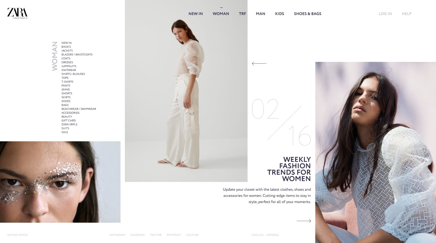
Zara does a nice job of this technique on their site, shown below. Notice how each column varies in width, and the occasional overlap between column elements:
Layering
“Layering” is a fancy term for making page elements overlap each other. When distinct elements cross paths, the user unconsciously assumes they are related and processes them as a single visual item with depth.
Layers can be challenging to implement on the first try without looking messy — some sketching, adjusting, and experimentation will be useful to produce a cohesive look that effectively breaks the grid.
Australian recruitment firm Marble accomplishes simple but effective layering on their homepage — the primary heading “All About People.” sits in front of a search form to bring attention to these two elements in succession.

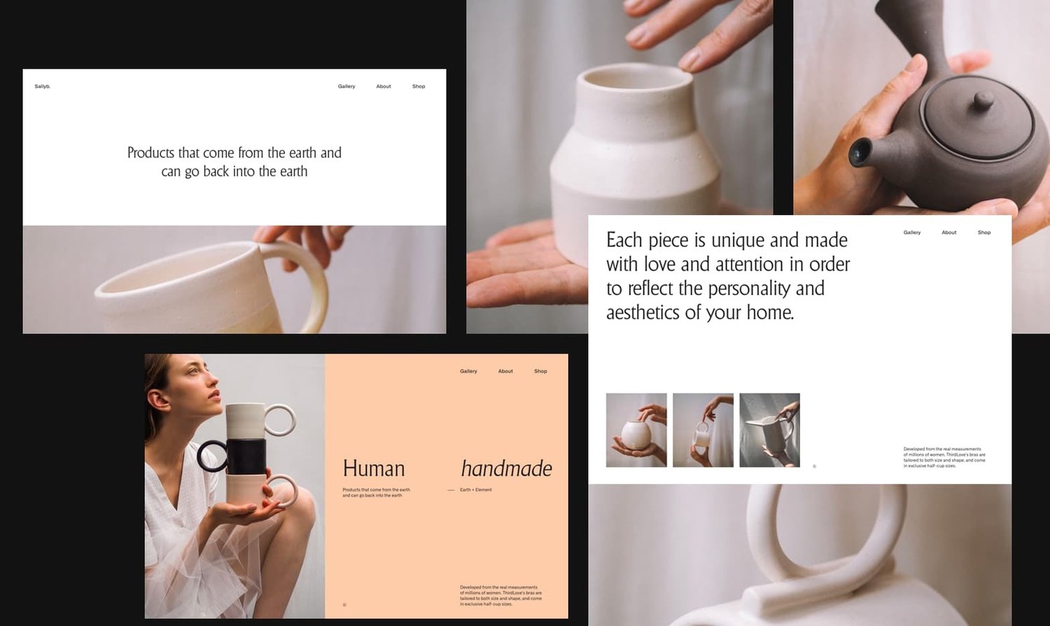
Containers
Instead of having your page elements partially overlap, you might try placing related text, icons, and/or buttons entirely inside an image or block element. With this approach, the block element serves to contain its child elements and unite them together. Containers are a natural way to break up your grid while keeping content organized.
In the example below, some containers enclose multiple elements, including images, text, links, and solid colors. Though there is overlap and asymmetry, it’s clear which elements are related.
Whitespace
Whitespace is a hidden hero of web design. Without some breathing room between content blocks, the average web page would be confusing and overwhelming.
In your grid experiments, don’t be afraid to turn up the dial on whitespace and emphasize just one or two pieces of content. Exaggerated margins draw focus entirely to your featured elements, a spacious alternative to your standard grid layout.
The visual portfolio website below showcases its off-centered images against a white background, with more scattered images entering frame as you scroll. This minimalist approach helps users focus on the featured artwork and avoids the tired row-column presentation we see so often with online image displays.
Gutters
Grid systems tend to create their gutters by adding margins to each column in the grid. In the 960 grid system, for example, each column has a margin of 10 pixels on either side, which creates 20-pixel-wide gutters between adjacent columns.
Gutters are essential for most grid-based websites to add whitespace and limit clutter, but you might try playing around with them to see what effects you can create, or even scrapping them altogether.
Take this spin-off website from Canadian design firm Blender Media — its tiles are arranged in an obvious grid, but there’s no gutter at all. A felt texture effect helps create a quilt-like aesthetic. If you’re taking this approach to broken grids, always select contrasting background colors to establish a clear border.
Illustration
Unlike what your childhood coloring books might have taught you, it’s okay to draw outside the lines — just make sure your illustrations are intentional and tasteful. Drawings that cross the boundaries of a grid and/or overlap other elements can bring some welcomed variation to the clean-cut borders your visitors are used to.
This use of illustration by an Italian seafood brand is a delight. It features animated illustrations of sea life that move in parallax and cross column boundaries. In my opinion, it’s about as fun as a frozen fish website can be.

Breaking Out of the Grid
As we’ve seen, broken grids usually don’t abandon the grid concept altogether. Instead, they offer an alternative take on the format through subtle adjustments. Think about each of these methods when imagining the future layout of your site, and see if you or your design team can work out an implementation in CSS.
Also, keep in mind that broken grids still adhere to web design principles despite their creative liberties. No matter what, your site should be simple, mobile-responsive, accessible, easily navigable, consistent in aesthetic choices. You don’t need to give up a pleasing user experience in order to stand out.


![What Is a Website Mockup? [+ How to Make One in 4 Steps]](https://www.hubspot.com/hubfs/website-mockup.webp)
![Website Design Proposal: A Beginner’s Guide [+Template]](https://knowledge.hubspot.com/hubfs/website-redesign-proposal-template-1-20240530-4167751.webp)


