Table of Contents
- What is CSS card animation?
- CSS Card Animation in Action
- How to Create Card Animation on Click
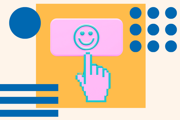
What is CSS card animation?
CSS card animations use the CSS language to animate images or boxes on a website. CSS card animations methods are often used to create interactive experiences when users click on items. With CSS card animations, you can add visual effects and transitions that bring your user interface to life with just a few lines of code.
Imagine a digital flashcard. You can click a term, and the card flips for a definition. That’s all powered by CSS card animation.
However, this effect can do more than just flip an image. The CSS card animations can be used to trigger many changes in an element’s appearance. This could include adding a drop shadow, changing its background color, or even animating the element itself.
By using CSS card animations on click, you can create engaging interactive experiences that your users will love. From subtle hover effects to more elaborate transitions and animations, they provide an easy way to add life and motion to any website or application.
CSS Card Animation in Action
Perhaps you want to add movement to your site but need more inspiration before getting started. Let’s explore sites that use CSS card animation and bring the user experience to life.
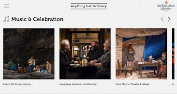
Anything but Ordinary
Anything but Ordinary helps travelers visiting Newfoundland and Labrador preview the area’s must-see attractions to plan their trip. To keep the information organized, they use CSS card animations.
When you hover over the images, a description of different experiences is provided.
StudyStack
Studystack is a website that helps users study with digital flashcards. Students can start learning all with one click. In this example, the deck focuses on U.S. states and their capitals. When you hover over the card it flips and shows the correct answer.

Types of CSS Card Animation
CSS card animation can create a wide range of movement on your site. Check out some of many types of card animations below.
If you like what you see, you can follow the links and get the code that powers these animations. From there, all you need to do is copy and paste into your source code.
CSS Card Animation with Hover Effect
This card animation uses the hover effect and can be created with just HTML and CSS. When the user places the cursor over the card, the animation is triggered. This type of animation is great for digital game cards.
Created by: Tuan on CodePen.
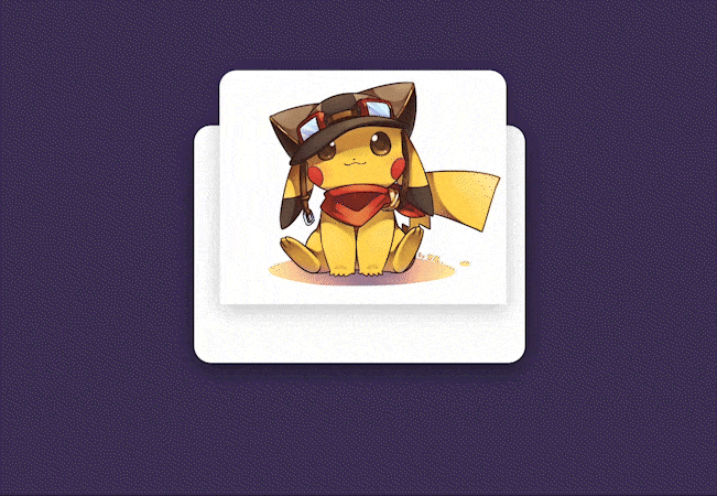
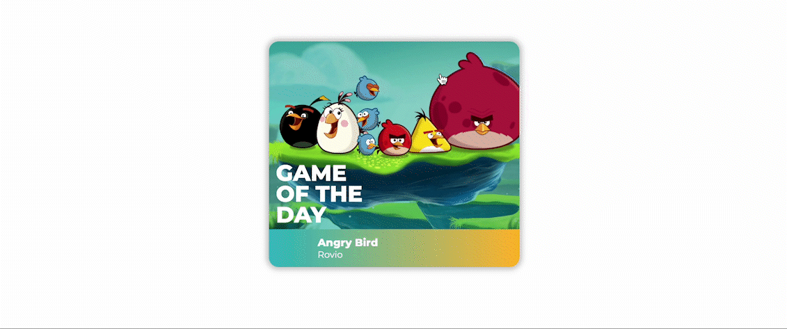
CSS Flip Card Animation
CSS animation can also power a simple card flip. In the example above, the card opens and the user is able to see the video and additional detail about each excursion. All the user needs to do is hovers over the object.
This type of CSS card animation is great for digital birthday cards, digital brochures, or short stories.
Created by: Madelena on CodePen.
CSS Grow Card Animation
This animation is created entirely with CSS and HTML. When the user clicks on the card, it expands. This animation is good for adding a dramatic effect to any web page.
Created by: Harsh Shah on CodePen.
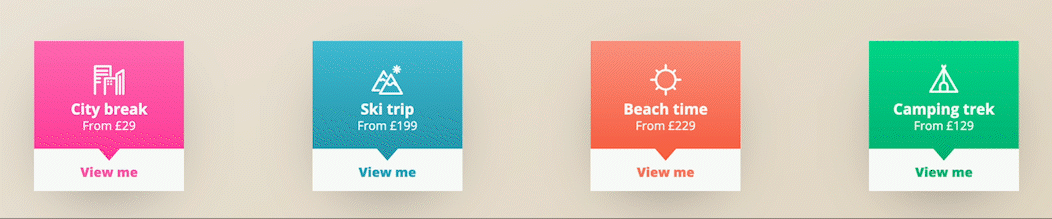
CSS Card Swap Animation on Click
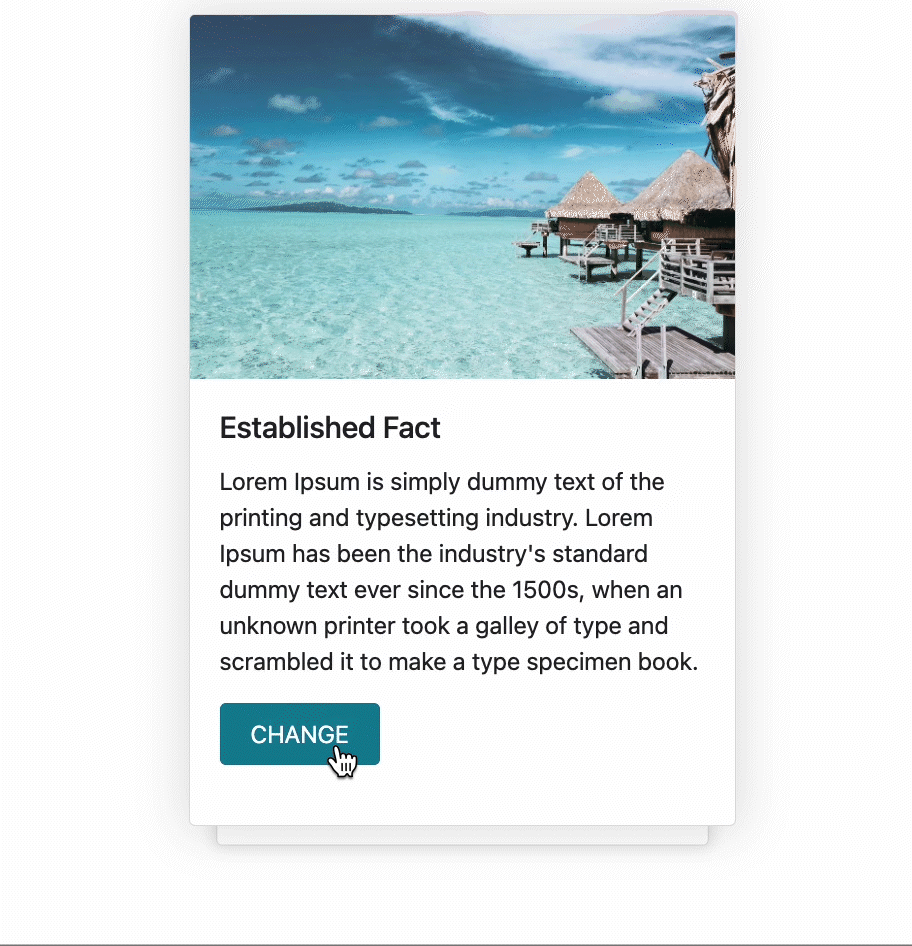
For this card animation, you’ll need to use HTML, CSS, and a few lines of Javascript code. When the user clicks the change button, the card is swapped.
This type of CSS card animation is good for recipes, games, or name cards.
Created by: Shubham Chaudhari on CodePen.
CSS Spread Cards

Author Andrew Canham created animated spread cards using HTML, CSS, and Javascript. When the user clicks the card, a spread of cards is displayed. This type of card animation is perfect for card games.
Created by: Andrew Canham on CodePen.
How to Create CSS Card Animation on Click
Now that you’ve seen how to create an animation with CSS, it’s time to create your own. We’ll walk through how to make a card that flips on click, but this is just one of many possibilities.
1. Use HTML to designate what will be in the card.
To create a CSS card animation, you’ll need to start with the HTML for your web page. If your card is all text, you’ll use standard HTML tags for paragraphs (<p>), headings (h1, h2, etc.), and more.
You’ll also need to designate what information is on each side of the card. To do this, use tags with specific classes that designate both the effect and the side of the card. The below example uses the following:
-
This designates the effect itself.
-
This determines which side is the front.
-
This determines which side is the back.
We also included body text to indicate the action the user can take. In this case, we use <p>Click to flip</p>.

2. Create the CSS.
Now, it’s time to create the CSS. When working in CSS, you’ll need to specify the design you want for the front and back of the card. You’ll also designate how the card will move or change when clicked.
Let’s take a look at the code below.
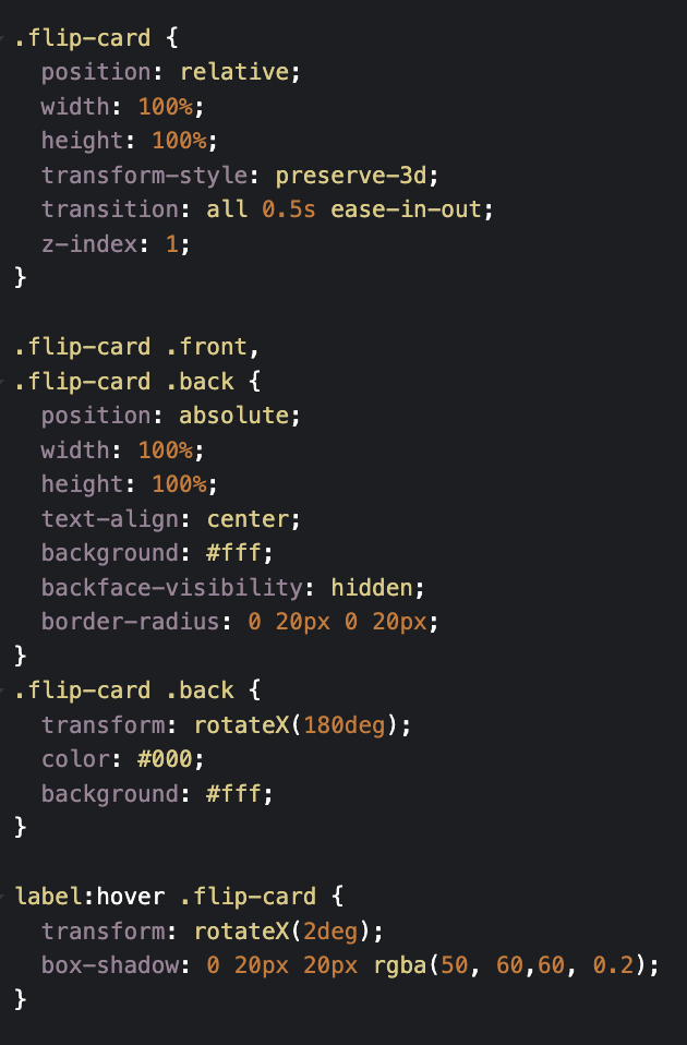
The “.flip-card,” “.front,” and “.back” classes refer to the different sections of code written in HTML. From here, you can designate different effects. For example this section of code tells the card to flip over when clicked:
Remember you can customize the values however you want. You can edit the code you just learned now using CodePen.
Here’s the card our code produced:

Code your own CSS card animations.
Overall, CSS card animations are a great way to add life and motion to any website. By using this powerful tool, you can create engaging user experiences that keep visitors coming back.
With just a few lines of code, you can make your web applications come alive with CSS card animations. Start exploring the possibilities today and see what you can create.
Css Animation
![Creative and unique CSS animation examples that bring websites to life [+ code]](https://53.fs1.hubspotusercontent-na1.net/hubfs/53/how-to%20(1).png)