
What changed was learning about modern layout tools, specifically CSS Flexbox, CSS Grid, and frameworks like Bootstrap. Suddenly, I could make complex, responsive layouts (that looked good on multiple screen sizes and devices) without using CSS float (I really hated that), hacks, or a lot of media queries every 50px.
In this post, I’ll break down how Flexbox and CSS grid layout systems work, when I use each one in real projects, and which might be better for your next web build. I will also show how they differ from using an actual CSS framework (Bootstrap).
Table of Contents

50 Free Coding Templates
Free code snippet templates for HTML, CSS, and JavaScript -- Plus access to GitHub.
- Navigation Menus & Breadcrumbs Templates
- Button Transition Templates
- CSS Effects Templates
- And more!
Download Free
All fields are required.
Form not available
CSS Grid vs. Flexbox
When I first started with CSS layout tools, I asked my friends in tech for advice: “When should I use CSS Grid, or is Flexbox enough?” With a better understanding, I found that the answer isn’t about one or the other, but which tool fits the job.
I’ll walk you through how I think about them, how they compare, and hands-on code examples to give you a full understanding.
What is Flexbox?
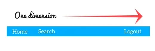
Flexbox, or Flexible Box Layout, is a box model that lets you arrange items in one direction: a row or a column. You set a container display property to flex (or inline-flex), and then control how the content of that container (child items) align, wrap, grow, or shrink. It’s good for UI components like navbars, footers, or a group of cards.
Below is a helpful illustration by developer Ayush Gupta that shows a layout that’s possible with Flexbox.
Here are some of the key properties, what they do, and how I use them:
|
Property |
What it does |
Common values |
My real-world use case |
|
display |
Makes the container a flex container |
Flex, inline-flex |
I set display: flex on a navbar so its items align horizontally. |
|
flex-direction |
Sets the main axis direction (row or column) |
row, row-reverse, column, column-reverse |
I use row by default and switch to column for mobile stacked menus. |
|
justify-content |
Aligns items along the main axis |
flex-start, center, flex-end, space-between, space-around, space-evenly |
I use space-between when the logo is on one side and actions on the other. |
|
align-items |
Aligns items along the cross axis (perpendicular to the main) |
flex-start, center, flex-end, stretch, baseline |
I use center to vertically align middle items inside a toolbar. |
|
flex-wrap |
Determines whether items wrap onto new lines |
nowrap (default), wrap, wrap-reverse |
I use wrap when I want cards to move to a new line on smaller screens. |
|
flex, flex-grow, flex-shrink, flex-basis |
These five control how items grow or shrink to fill space |
e.g., flex: 1 1 150px means grow=1, shrink=1, basis=150px |
I use flex: 1 1 auto to evenly distribute columns when the content is dynamic. |
|
align-self |
It lets a single flex item override align-items |
same kinds of values as align-items |
If I want one button to align differently inside the row, I use this. |
Why I like Flexbox: If I’m working on a linear layout (navbars, footers, lists of cards) that needs to align items horizontally or vertically, Flexbox gives me the tools with minimal CSS.
Code Example: Flexbox in Action
Here’s a simple code snippet showing Flexbox for a horizontal navbar:
See the Pen Hubspot: Flexbox example by Clinton Joy (@Cejay101) on CodePen.
Why this works:
- The .navbar is flex, so the logo, nav links, and user auth button are arranged in a row and spaced apart with justify-content: space-between.
- Inside .nav-links, I also used flex to spread the links horizontally and gap to add spacing between them.
- On smaller screens, you might add flex-wrap: wrap; on .navbar so it stacks if needed.
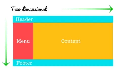
What is CSS Grid?
The CSS Grid Layout model is for two-dimensional layout. This means that it handles both rows and columns together. You define a container with display: grid; or inline-grid;, then lay out tracks (rows/columns), gaps, named areas, and explicitly position grid items.
Below is another helpful illustration by developer Ayush Gupta of a possible layout with CSS Grid.
Here are key properties, their roles, and how I use them:
|
Property |
What it does |
Common values |
My real-world use case |
|
display |
Makes the container a grid container |
grid, inline-grid |
I set display: grid on the page wrapper when I need a multi-section layout. |
|
grid-template-columns / grid-template-rows |
Define explicit column and row tracks (number, size) |
e.g., 200px 1fr 300px, or repeat(3,1fr) |
I use repeat(auto-fill, minmax(150px, 1fr)) for responsive card grids. |
|
gap, row-gap, col-gap |
Space between rows/columns |
20px, 1rem, etc. |
I choose gap: 1rem 2rem to quickly define uniform spacing. |
|
grid-template-areas |
Names areas so you can place items more semantically |
It consists of strings of area names |
I name areas like “header header header” to structure the layout visually. |
|
grid-column, grid-row, grid-area |
Place items explicitly (start/end lines, span, or named areas) |
grid-column: 1 / 3 to span two columns |
I use this when a banner should span full width, but sidebars are narrower. |
|
justify-content, align-content, justify-items, align-items, justify-self, align-self |
Align and distribute grid container/tracks and items within the grid |
justify-content, align-content, justify-items, align-items, justify-self, align-self |
I might use justify-items: center inside a grid cell to center content. |
My Grid workflow: When I’m building a large layout — i.e., header, sidebar, main, footer — I reach for Grid. It gives me a clear map of where everything lives. Then, inside each zone, I might use Flexbox to align or distribute smaller items.
Code Example: CSS Grid for Page Structure
Here’s a code snippet showing CSS Grid for a page with a header, sidebar, main content, and footer:
See the Pen Hubspot blog: CSS grid example by Clinton Joy (@Cejay101) on CodePen.
Why this works:
- .layout is set to grid, with three columns: a fixed sidebar (200px), a flexible main (1fr), and a right widget (300px).
- Rows: Header (auto height), middle row (1fr fills the remaining space), and footer (auto).
- Using grid-template-areas, I define names for each region, making the layout easier to read and maintain.
- The gap adds spacing without messing with any margin.
How They Compare and What I’ve Learned
Here are some more nuanced reflections:
- One-axis vs. two-axes. As mentioned, Flexbox handles one axis at a time (row or column) while Grid handles both axes (rows and columns) by design.
- Content-driven vs. layout-driven. Flexbox is perfect when your content is controlling how things should align (e.g., a navigation list with variable items). Grid excels when you design the layout blueprint first (e.g., magazine-style page, dashboard).
- Item alignment. If I just need to distribute items nicely and handle wrapping, Flexbox is quick and minimal. If I need control over overlapping, spanning multiple rows, and precise area placement, Grid is less hacky and more direct.
- Mixing them is normal. I usually set the main container with Grid for the page skeleton, then inside one of the grid areas, I use Flexbox to lay out buttons, icons, and cards.
- Learning curve. Flexbox is quicker to pick up. Grid takes a bit more planning (defining grids, areas). But once you use Grid, the layout code becomes more semantic (you can read grid-template-areas and understand the structure at a glance).
- Browser support & fallback. Both are widely supported in modern browsers. Grid had a bit slower adoption, but now it is widely supported and only needs a prefix for Internet Explorer, where it has partial support. Still, if you have to support very old browsers, you should add fallbacks.
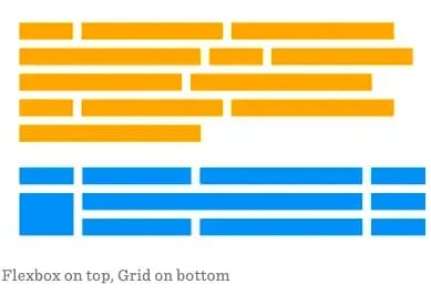
Here’s a side-by-side comparison of a layout built with Flexbox and one built with CSS Grid that shows this effect.
When I Reach for Each
In my day-to-day work:
- If I’m aligning a row of buttons, centering items, or building a small component, I use Flexbox.
- If I’m making the skeleton of a page or designing an aesthetic gallery, I use CSS Grid.
- I rarely use just one of them. Usually, I combine Grid for structure and Flexbox for the inside of each grid cell.
50 Free Coding Templates
Free code snippet templates for HTML, CSS, and JavaScript -- Plus access to GitHub.
- Navigation Menus & Breadcrumbs Templates
- Button Transition Templates
- CSS Effects Templates
- And more!
Download Free
All fields are required.
Form not available
Flexbox vs. Bootstrap
As I continued building websites, bigger web applications with a lot more components and responsive layouts, I soon found out that I had yet another decision to make. Should I write custom CSS with Flexbox or pull in a framework like Bootstrap and let it handle the heavy-lifting?
In this section, I’ll explain how Flexbox and Bootstrap compare, how Bootstrap uses Flexbox under the hood, and show you practical code examples.
What Bootstrap Is and How It Uses Flexbox
Bootstrap is a front-end design framework that gives you a set of predefined styles, layout systems, UI components (navbars, buttons, forms, modals), and responsive utilities.
It speeds up development, especially when you want a consistent, production-ready interface rather than building from scratch.
One important point: Bootstrap’s grid system (and many of its layout utilities) are built using Flexbox. The official docs state (currently on v5.3.8) that the grid is “a mobile-first flexbox grid” and uses containers, rows, and columns to layout content.
For example, columns automatically adopt the flex behavior to align and distribute items inside a row.
Because of this, when you use Bootstrap’s grid, you are indirectly using Flexbox, so many of the alignment advantages of Flexbox carry over into Bootstrap layouts.
How I Compare Flexbox vs. Bootstrap
Here are the main considerations I use when deciding whether to code with Flexbox directly or lean on Bootstrap:
- Control vs. convenience. With Flexbox, you write your CSS and you decide exactly how many items, how they grow or shrink, how they wrap, etc. With Bootstrap, you give up some of that low-level control, but you gain speed and consistency.
- Component vs. layout system. When I’m designing specific components (a custom toolbar, a card layout, a flexible list), Flexbox is often enough. But when I’m building full page layouts or switching across many viewports and I want uniform alignment + spacing + UI behaviour out of the box, Bootstrap helps.
- Dependency vs. custom code. Using Bootstrap means adding an external dependency and adopting its class-based API. If my project is very custom and lightweight, I often favor Flexbox with minimal classes. If I’m prototyping or need a quick turnaround or team consensus, Bootstrap wins.
- Flexbox knowledge still matters. Even when you use Bootstrap, understanding Flexbox is extremely helpful. Many utility classes in Bootstrap (e.g., .d-flex, .justify-content-between, .align-items-center) map directly to Flexbox concepts.
- Performance and size. In some cases, Bootstrap may include more styles than you use; if build size is a concern, a custom Flexbox-only implementation is more efficient.
Code Example: Bootstrap Grid in Practice
Here’s a snippet you can see to experiment with Bootstrap’s grid system:
See the Pen Hubspot: Bootstrap flexbox example by Clinton Joy (@Cejay101) on CodePen.
Explanation of the code:
- I included Bootstrap CSS via CDN.
- I created a .container which centers and pads the content.
- Inside, I created a .row and then three .col-* elements.
- .col-sm-6 means: from the “small” breakpoint (≥576px), each of the first two columns takes half the width; .col-md-4 means from “medium” (≥768px), each takes one-third. The third column uses .col-12 on extra-small devices (full width) and .col-md-4 on medium and above.
This gives an adaptive layout across device sizes. The built-in gutters, column sizing, and breakpoint logic all come from Bootstrap’s implementation of a Flexbox grid.
Why I Might Choose Flexbox Directly Instead of Bootstrap
Here’s a simple Flexbox-based example of a row of buttons or a toolbar. I usually would code this when I don’t need the whole Bootstrap overhead:
|
<!-- HTML --> <div class=“toolbar”> <button>Action 1</button> <button>Action 2</button> <button>Action 3</button> </div> |
|
<!-- CSS --> .toolbar { display: flex; justify-content: flex-end; align-items: center; gap: 12px; padding: 10px; } .toolbar button { padding: 8px 16px; } |
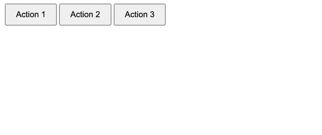
Why this is useful:
- Straightforward. It has fewer classes and dependencies.
- Full control. I decide exactly how items align, space, and wrap if needed.
- Lightweight. Minimal CSS, no grid system overhead. When your layout is simple and you just need to align a few items, this is faster and cleaner than including an entire framework.
My Rule of Thumb for Using Each
- If I’m building a full page layout with header, nav, content area, sidebar, and footer, and I want consistency, responsive behavior, and maybe UI components that come pre-styled, I reach for Bootstrap.
- If I’m building custom UI components, small modules, or I want maximum performance with minimal framework overhead, I code Flexbox directly.
- Even when I use Bootstrap, I still lean on my knowledge of Flexbox to customize or override layouts when needed.
CSS Grid vs. Bootstrap
When I build a site, one of the decisions I often face is whether to use a native layout system like CSS Grid or a framework like Bootstrap. My rule of thumb: If the layout structure is the main driver, I go Grid. If the content and UI components are the main driver, I go with Bootstrap.
How I Compare Them
Here are the key dimensions I weigh when choosing between CSS Grid and Bootstrap:
- Layout control vs. quick setup. CSS Grid gives me full control over both rows and columns, and lets me build a layout accurately. Bootstrap gives me a fast system with predefined classes and breakpoints. Grid supports complex two-dimensional layouts, while Bootstrap’s 12-column system is more constrained.
- Scope of what you need. If the project is heavy on custom layout, e.g., overlapping panels, unusual size divisions, asymmetry, Bento layout, etc., Grid wins. If you need a consistent UI, lots of components, and faster turnaround, Bootstrap shines.
- Learning curve and dependencies. With CSS Grid, you use your native CSS and layout logic. With Bootstrap, you introduce a framework layer (classes, grid system, built-in components).
- Browser support and legacy concerns. If I need to support older browsers or a variety of devices with no issues, Bootstrap offers more built-in reliability for breakpoints and mobile behaviors. Grid is well-supported now, but in some browser engines like Internet Explorer, a fallback is required.
- A combination of both. In many of my builds, I use Grid for the overall page skeleton (header, main, sidebar, footer) and then Bootstrap inside components, or I nest Flexbox or Bootstrap classes inside grid areas.
Code Example: CSS Grid vs. Bootstrap
Here are two side-by-side code snippets, one using CSS Grid, one using Bootstrap, so you can compare implementation style and choose what fits your project best.
CSS Grid Example
See the Pen Hubspot blog: CSS grid example by Clinton Joy (@Cejay101) on CodePen.
Why I like this: My layout is explicit. I know exactly where each section lives. If I want to change the layout (e.g., swap sidebar and extra), I just update grid-template-areas. The code remains minimal and semantic.
Bootstrap Example
See the Pen Hubspot: Bootstrap grid example by Clinton Joy (@Cejay101) on CodePen.
Why I like this: It’s quick. Bootstrap’s grid classes (col-lg-3, col-md-4) allow me to define widths per breakpoint easily. The markup is standard, and many developers know this pattern. It’s good for making fast layouts and having a consistent structure across browsers and screen sizes.
When I Choose One Over the Other
Here’s how I decide in my own projects:
- If I have to create a landing page with custom layouts (e.g., Masonry Layout), odd-sized panels, and parts with overlap, I go with CSS Grid.
- If I’m building a regular-looking website (e.g., blog, marketing site), where I need speed and responsive behavior, I use Bootstrap.
- Even with Bootstrap, I bring in a custom CSS Grid where I need to be precise beyond the standard 12-column grid.
- If I need to support a lot of browsers (browser versions, too) and help my team, Bootstrap is the obvious choice.
Getting Started
For me, the most important thing about understanding how CSS Grid, Flexbox, and Bootstrap each work means I’m not locked into one approach. I am free to combine them to meet the needs of any project. For example, I build a page skeleton with Grid, use Flexbox inside a module, and use Bootstrap to speed up UI elements.
In my next project, I’ll continue to apply this flexible mindset. I encourage you to experiment, too. Try Flexbox on a component, try Grid on a layout, and try Bootstrap when you need fast results. Over time, you’ll build your own instinct for “which tool to pull out next.”
Editor's note: This post was originally published in August 2022 and has been updated for comprehensiveness.
50 Free Coding Templates
Free code snippet templates for HTML, CSS, and JavaScript -- Plus access to GitHub.
- Navigation Menus & Breadcrumbs Templates
- Button Transition Templates
- CSS Effects Templates
- And more!
Download Free
All fields are required.
Form not available
Css


![How to Create Scrolling Text With CSS [+ Code Examples]](https://53.fs1.hubspotusercontent-na1.net/hubfs/53/Google%20Drive%20Integration/scrolling%20text%20css.jpeg)


