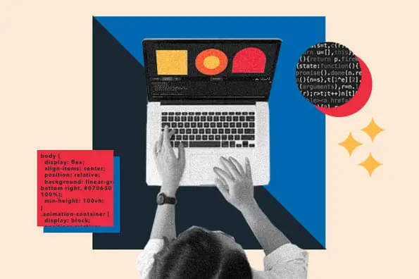
CSS animations can personalize your site and create delightful experiences for your visitors. When a website visitor hovers over an animated element like a link or button, for example, the element could change color, grow, shrink, rotate, or a combination of those. This isn’t just eye candy — it’s also visual feedback that their interactions are working.

With CSS, front-end developers can design animations and transitions without JavaScript. That means creating interactive elements is simpler and more lightweight than it used to be.
![Download Now: 50 Code Templates [Free Snippets]](https://no-cache.hubspot.com/cta/default/53/34adf7eb-7945-49c4-acb8-f7e177b323e5.png)
Both the CSS animation and transition properties can be specified with pseudo-classes, which define a special state of an element. Only in that state will the element change from one style to another. Pseudo-classes include:
- :hover, when a user hovers over the element
- :focus, when a user clicks or taps the element, or selects it with the tab key
- :active, when a user clicks on the element
- :target, when a user clicks on a different element
Of the pseudo-classes above, :hover is the most common, and it's what we’ll be covering in this post. We'll provide everything you need to know about how to create an animation or transition on hover, including
- what a CSS hover animation is
- how to use the hover pseudo-class
- how to create a hover animation with CSS
- some examples that you can use on your own website

50 Free Coding Templates
Free code snippet templates for HTML, CSS, and JavaScript -- Plus access to GitHub.
- Navigation Menus & Breadcrumbs Templates
- Button Transition Templates
- CSS Effects Templates
- And more!
Download Free
All fields are required.
What is a CSS hover animation?
A CSS hover animation occurs when a user hovers over an element with their cursor, and the element responds with motion or another animated effect. Hover animations highlight key items on a web page and are an effective way to enhance your site's interactivity.
Take a look at the example below. If you hover over the div, it will gradually change from light pink to dark pink.
See the Pen CSS Transition on Hover by HubSpot (@hubspot) on CodePen.
While this looks like an animation, it's actually a transition. The two terms are often used interchangeably, but animations and transitions are different in CSS.
Transitions allow you to alter the behavior and appearance of an element — but only when there's a trigger, like a user hovering over the element. Once triggered, transitions can only move from an initial state to a final state. You can't specify any intermediate points, and the transition can only run once.
Animations, on the other hand, can loop, repeat backwards, and move from an initial state to intermediate states to an end state, thanks to keyframes.
Keyframes indicate the start and end of the animation, as well as any intermediate steps between the start and end. In other words, each keyframe describes how the animated element should render at a given time during the animation sequence.
As an example, let's take a look at a bounce-on-hover animation below.
Bounce on Hover
To get your visitors’ attention, you can create a bounce effect when a user hovers over a page element. All you have to do is define some animation properties and keyframes. We'll walk through how to create an animation step-by-step later in this post. For now, we'll just briefly talk through this example.
In the example below, I'll place the div in a flex container. That way it will only bounce in that defined container area and not overlap with the heading or paragraph.
Then I'll define the animation to complete its bounce in two seconds and run infinitely (as long as the cursor is over the div). I'll also set its timing to ease so that the animation starts out slow, speeds up, and then slows down.
Finally, I'll define three keyframes. The first will set the initial state of the animation. At 0%, or the first moment of the animation sequence, the element will be at 0px along the y-axis. At 50%, or halfway through the animation sequence, the element will move -50px up the y-axis. At 100%, or the end of the animation sequence, it will return to where it started on the y-axis, completing its bounce.
Take a look at the result below.
See the Pen Bounce on Hover by Christina Perricone (@hubspot) on CodePen.
You may notice that it would not be possible to create a bounce effect using the transition property. That's because you can only specify the initial and end state of the transitioning element, not an intermediate point. Meaning, you could have the pink square move up the y-axis, but you couldn't tell it to move back down the y-axis to complete its bounce.
Now that we're more familiar with CSS hover animations and transitions, let's look at why you'd want to create them.
How to Use Hover CSS
Using the :hover pseudo-class in CSS has several benefits.
First, you can use it to convey important information to your visitors. For example, many websites add a hover effect over their links to set them apart from other text on their site.

Some websites also use the hover effect so that additional information only appears when a user hovers over an element. Otherwise, it remains hidden. This is perfect for adding tooltips to your site — here's an example by developer Sasha Tran:
You can also use hover effects to encourage visitors to take an action on your site. Making a button grow bigger when a user hovers over it, for example, may persuade them to actually submit a form, make the purchase, or complete whatever call-to-action you want. Below is an example by Adam Morgan.
However, use caution when implementing the :hover pseudo-class on touchscreen devices. The element might never begin its transition or animation effect when the user hovers over it. Or it might stop a moment after the user hovers over the element. Or it might continuously play through its animation sequence on loop, even if the user is no longer hovering over it. Its behavior depends on the browser.
You should therefore ensure that your content is accessible on all devices, including those with limited or non-existent hovering capabilities. That means you can still create and add hover animations on your site, but they shouldn't be essential to the content's meaning or the user experience.
50 Free Coding Templates
Free code snippet templates for HTML, CSS, and JavaScript -- Plus access to GitHub.
- Navigation Menus & Breadcrumbs Templates
- Button Transition Templates
- CSS Effects Templates
- And more!
Download Free
All fields are required.
How to Create a CSS Hover Animation
We're going to break down an example from Shay Howe on how to set up a CSS hover animation on an element. Here's the HTML and CSS code he used. We're going to style the div within it:
1. Set up the animation property.
Use the animation property or its sub-properties to style the div element.
Note that this only configures the duration, timing, and other details of how the animation sequence will progress. To actually begin the animation sequence and make the element move, you'll need to set the @keyframes rule.
2. Define the animation property's sub-properties.
The animation property consists of the following sub-properties:
animation-name
The @keyframes at-rule. The animation-name declaration is used as the property and the name of the animation the property value (e.g. animation-name: bounce).
animation-duration
This is the length of time for one animation cycle. It may be set in seconds (s) or milliseconds (ms) (e.g. animation-duration: 3s).
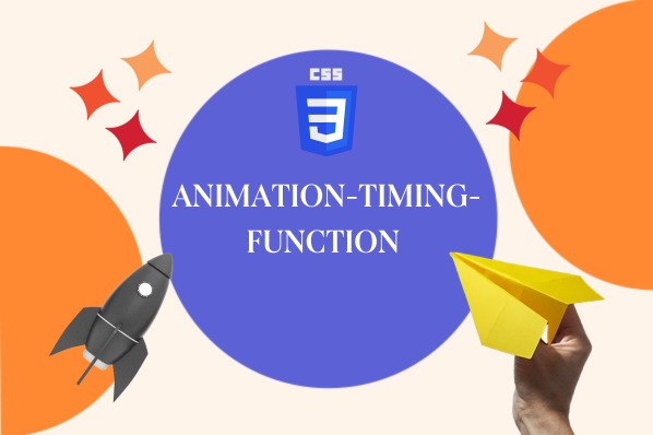
animation-timing-function
This is how the animation transitions through keyframes. It specifies the speed curve of an animation, ensuring the changes occur smoothly.
There are predefined values you can use including ease, linear, ease-in, and ease-in-out. You can also use your own values for this function.
animation-delay
The time before the loaded element starts the animation sequence, defined in seconds or milliseconds.
The values are: time (optional), initial (sets the property to its default value), and inherit (inherits property from parent element).
Negative values are also allowed. When set to negative, the animation starts as if it had already been playing. For instance, in animation-delay: -2s, the animation will behave as if it started playing two seconds prior.
animation-iteration-count
This is the number of times the animation repeats before stopiing. You can define it as infinite to repeat the animation indefinitely.
The property values are: number (default value is 1), infinite (the animation loops forever), initial, and inherit.
animation-direction
This configures the starting point of successive cycles. The animation can alternate direction or reset and repeat.
The property values are: normal (plays forwards), reverse (plays backwards), alternate (plays forwards then backwards), alternate-reverse (plays backwards then forwards), initial, and inherit.
animation-fill-mode
These are the values applied by the element when the animation isn't playing (i.e. before the first keyframe and after the last is played)
The property values are: none (default, no styles applied to the element), forwards (element retains style values set by the last keyframe), backwards (element retains values set by the first keyframe), both (animation follows rules for both directions), initial, and inherit.
animation-play-state
This specifies the status of the animation (running or paused). It allows a played animation to resume running from where it was paused rather than start over.
The property values are: paused, running, initial, and inherit.
For our example, let's set the animation property name to "slide," the duration to two seconds, and the timing to linear. This will ensure the animation is smooth and consistent throughout.
3. Use keyframes to define the CSS Hover Animation sequence.
Once the animation property and sub-properties have been defined, you need to set up the @keyframes at-rule. This helps you establish at least two keyframes that describe how the animation should appear at specific instances during the sequence.
To get the best support across all browsers, the @keyframes rule must be vendor prefixed, like all other transition and animation properties.
The vendor prefixes should appear like this:
@-moz-keyframes
@-o-keyframes
@-webkit-keyframes
Note: Previous examples have not been vendor prefixed in order to keep them as simple as possible.
To indicate the different keyframe breakpoints, a percentage is used with 0% being the first moment of the sequence and 100% being the last. The two points can also be defined by their aliases from and to respectively.
You can set up an intermediate moment at 50% and/or any additional breakpoints you may wish.
The properties to be animated (left and top) are listed inside the breakpoints as shown in the example by Shay Howe below.
Note that only individual properties may be animated. For instance, if you wanted to move an element from the top to bottom, trying to animate from top: 0 to bottom: 0 wouldn't work. Instead, you'd need to animate from top: 0 to top: 100%.
4. Use CSS Hover Animation shorthand.
Like transitions, animations can be written in a shorthand format. This is achieved by using one animation property instead of multiple declarations.
In order, this is how the values within the animation property should appear:
- animation-name
- animation-duration
- animation-timing-function
- animation-delay
- animation-iteration-count
- animation-direction
- animation-fill-mode
- animation-play-state
Now that you know how to create a CSS hover animation, let's look at some examples to give you some inspiration.
50 Free Coding Templates
Free code snippet templates for HTML, CSS, and JavaScript -- Plus access to GitHub.
- Navigation Menus & Breadcrumbs Templates
- Button Transition Templates
- CSS Effects Templates
- And more!
Download Free
All fields are required.
CSS Hover Animation Examples
When it comes to setting up CSS hover animations, your imagination is the limit. You can have elements zoom, flip, rotate, or even stop playing on hover. You can even go beyond simple effects and tap into the minds of other developers who have come up with sophisticated and interactive animations.
Here are some of the coolest animations you can use for your site.
1. Sass Hover Effects

This developer shares examples of hover effects organized by industry, including travel, photography, and construction websites. They each come with a code that you can install into your page's HTML and CSS.
2. Button Hover Effects

This is a collection of five button hover effects. When your mouse hovers over the button, they react with an animation. They're all smooth, simple, and ready to be used on your website or landing page.
3. CSS Image Hover Effects
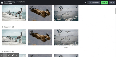
Here are fifteen hover effects that add life to your images. There are some that zoom in and out, slide, and rotate.
4. Creative Menu Hover Effects
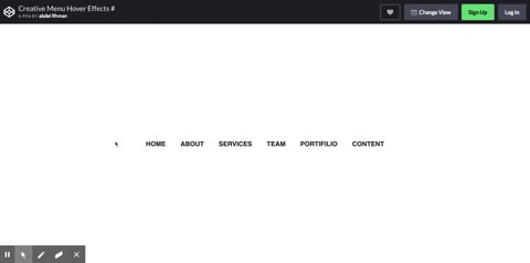
These CSS hover effects will help your website stand out with an interactive experience on your navigation bar.
5. Social Media Icons Hover Effect
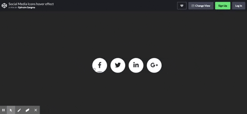
Users will see a cool animation when the cursor moves over a social media button. This can be a good prompt to get them to share your website with others.
6. Zoom Animation on Hover
Zoom in, zoom out, or use hover styling to create an image growth effect. This is great for highlighting a specific aspect of an image.
7. Flip Animation on Hover
Create a card flipping effect to use available screen space to share additional information. This is great for a contact profile page that introduces your staff or different clients that you support.
8. Rotate Animation on Hover

Rotate images using hover for an extra special effect. This can be a fun, lighthearted way to keep users engaged.
9. Pause Animation on Hover
Give users a reason to stop in their tracks with this pause animation on hover. It's perfect for catching the visitor's attention when you want them to see a specific element on your page.
Add hover animations to your website.
Interactivity is key to providing a good user experience on the web. CSS hover animations and transitions are a great way to improve the interactivity of your website. They can not only make your site more engaging — they can also provide important information to your visitors and encourage them to take action on your site. The best part: you only need to know a little bit of HTML and CSS to create them.
Editor's note: This post was originally published in February 2021 and has been updated for comprehensiveness.
50 Free Coding Templates
Free code snippet templates for HTML, CSS, and JavaScript -- Plus access to GitHub.
- Navigation Menus & Breadcrumbs Templates
- Button Transition Templates
- CSS Effects Templates
- And more!
Download Free
All fields are required.