

Table of Contents
- What are relative units in CSS?
- What is rem CSS?
- Why should you use rem units?
- The 62.5% Trick
- Rem vs. Percentage
- Rem vs. Em Units
- Rem in Media Queries
What are relative units in CSS?
Before we discuss rem units, we first need to understand how relative font size units work.
On responsive web pages, the size of page elements adapts to the size of the visible page area, known as the viewport. Text and other elements typically adjust in size, so the text will appear smaller on a mobile phone screen compared to the same page displayed on a desktop browser.
CSS lets you set font size using a variety of units, which can be divided into absolute units and relative units. Absolute units — like pixels (px), points (pt), and centimeters (cm) — are fixed in size. They do not change size based on their context. A paragraph of text in size 16px font will appear the same size on any screen it’s displayed on.
Relative units, on the other hand, make the text scale up or down based on its context. Relative units allow text size to adapt based on screen size: The smaller or larger a parent element is, the smaller/larger the text inside it will be.
Percentage is an example of a relative unit. A percentage unit is relative to the font size of its parent element. If a container has a font-size of 16px and text inside it has a font-size of 50%, the font size of the inner text will be 8 pixels.
Em units are another type of relative unit. 1 em unit is equal to the font size of the parent element. If a container has a font-size of 16px and text inside it has a font-size of 1em, the font size of the inner text will be 16 pixels. If the inner text font-size is set to 2em, it will be 32 pixels — twice the size of the parent element’s font size.
Which brings us to, you guessed it, rem units.

Free Guide: 25 HTML & CSS Coding Hacks
Tangible tips and coding templates from experts to help you code better and faster.
- Coding to Convention
- Being Browser-Friendly
- Minimizing Bugs
- Optimizing Performance
Download Free
All fields are required.
Form not available
What is rem CSS?
Rem (short for “root-em”) is a relative unit in CSS. Rem units set an element’s font size relative to the font size of the root element, typically <html>. The <html> element is referred to as the “root element” because all other page elements are nested inside it according to the document object model.
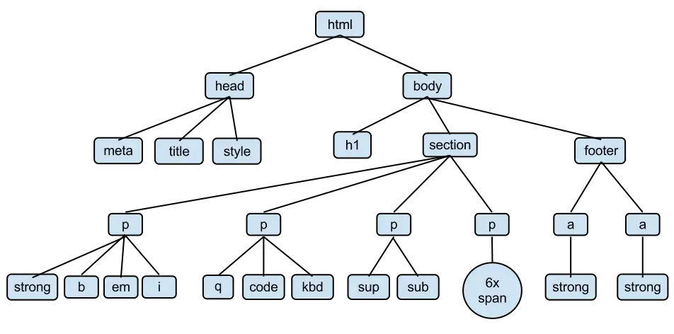
If no font size is set for the <html> element in CSS, it defaults to 16px in most browsers. Therefore, if the root element's font-size is 16px, any element on the page with a font-size of 1rem will also be 16 pixels. An element on the page with a font-size of 2rem will be 32 pixels, and so on.
However, you can change the font-size of <html> too. When you set the font size of the HTML element, you change the sizes of all the other elements
In the code below, the font-size of the root element is set to 16px, the default. Try changing the value of font-size and seeing how the text on the page scales as a result.
See the Pen rem example by HubSpot (@hubspot) on CodePen.
Why should you use rem units?
As mentioned, rem units set an element‘s font size relative to the root element’s font size. This creates two primary benefits that make life as a designer much easier.
The first benefit is scalability: Since a user can set the default size of this element from their browser settings, elements on the webpage can scale to match a user’s preference. If you want to design for adaptability, rem is your friend.
This is most commonly seen with font size — if text on a page is too small, all the user needs to do is change the font-size of the root element to scale the rest of the page text proportionally.
Scalability of rem also makes it easier to adjust font sizes when building your website, since all you need to do is adjust the root element’s styling.
The second benefit is accessibility: Absolute units like pixels create accessibility barriers. Pixels override the document’s root font size, meaning the user’s preferences are ignored if they have their root element set to a larger font size for accessibility reasons.
Since rem scales according to the root element of the page, it’s the ideal CSS unit for accessible text.
The 62.5% Trick
Once you set the font size of the root element, you can set the font sizes of all the other elements that use rem units as a percentage of this size (expressed as a decimal).
For example, assuming the font size of <html> is the default, 16px, you can make a paragraph of text 12 pixels by setting its font-size to 0.75rem because 12 ÷ 16 = 0.75.
However, doing these calculations each time you want to convert a rem unit to pixels can be annoying. Consider the following values obtained by converting 14px, 18px, and 20px to rem units, assuming a root font-size of 16px:
- 14px = 0.875rem
- 18px = 1.125rem
- 20px = 1.25rem
These values aren’t easy to memorize, and you may have to fish out your calculator more often than you’d like to confirm them.
One way to solve this problem is by setting the root font-size to 62.5%. When you do this, the font size of the root element becomes equal to 10px, which is 62.5% of its default size 16px. With this new root font-size, the above values become:
- 14px = 1.4rem
- 18px = 1.8rem
- 20px = 2rem
See the Pen 62.5% trick example by HubSpot (@hubspot) on CodePen.
Now, it’s easy to convert rem units to pixel units — just move the decimal point over one place to the right.
Rem vs. Percentage
Rem and percentage units are relative units, meaning they define font size relative to another page element. While the rem unit sets font size relative to the root element’s size, the percentage unit sets size relative to the parent element’s size.
The example below demonstrates the difference between the two:
See the Pen rem vs percentage example by HubSpot (@hubspot) on CodePen.
Here’s how each of these paragraphs works:
- This font-size is set to 16px, an absolute size. The font size will be 16 pixels in any context.
- This font-size is set to 1rem. Since the font-size of the root element is 16px, it looks the same size as paragraph 1.
- This font-size is set to 1.5rem, so it is 1.5 times the size of the root element.
- This font-size is set to 100%, which means it will be the same size as its parent element. The parent element of this paragraph is the <body> element, which has a font size of 16px in most browsers. Therefore, the text here appears the same size as 16 pixels.
- This font-size is set to 150%, which means it will be 1.5 times the size of its parent element, <body>.
- This text inside a div. The div has a font-size of only 8px. The text inside has a font-size of 150%, but since it is 150% of 8 pixels, the text appears smaller.
This all means that percentages are ideal when sizing an element’s font size relative to its parent container.
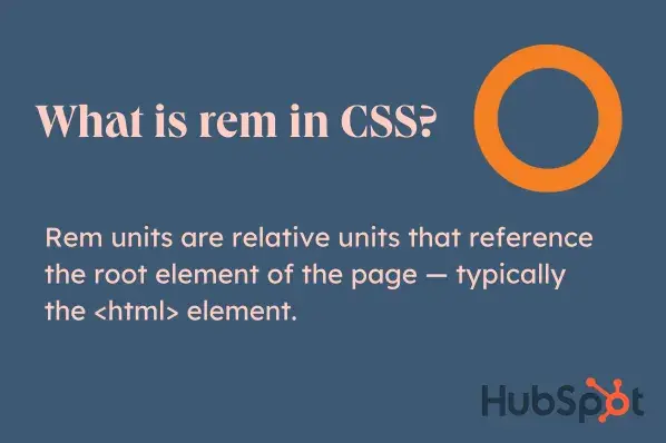
Rem vs. Em Units
Em is another relative unit that is similar to rem (they even rhyme!), but the two aren’t quite the same. Rem is relative to the root element, and em is relative to the parent element.
To illustrate, look at the example below. There are two paragraphs inside a div, and the div has a font-size of 20px. The first paragraph is 1rem, so it takes the size of the root element (16 pixels). The second paragraph is 1em, so it takes the size of its parent div, making it 20 pixels.
See the Pen rem vs em example by HubSpot (@hubspot) on CodePen.
If the element parent does not have a set font size, em will check the next parent in the DOM tree — all the way to the root element — until it finds a unit to reference.
One important thing to note about em is that font size compounds when you nest elements.
In the code below, the font-size for the ul element is 1.5em. This means that the first ul element will be 1.5 times the size of the body element, which is 16px. Its child elements will also inherit this font size.
This happens if we nest elements inside ul that also have their font size set with em. When you use em units in this way, the font sizes of the list items compound, increasing with each nested level:
See the Pen em compounding example by HubSpot (@hubspot) on CodePen.
You can avoid this effect with rem units, as the font size of all the elements in the document is derived from the font size of the HTML element.
Em units are useful when the size of a child element needs to be proportional to the parent element. If you choose to use em units, they are typically most suited to elements with non-default font sizing.
For example, when styling a navigation component, you want its padding, margin, width, and height elements to scale with it. You can use em units on these properties and rem units for the font size.
Rem in Media Queries
CSS media queries allow developers to make responsive web pages by applying styles based on viewport size, screen resolution, and device orientation (i.e., portrait or landscape).
The media query specification states that media queries are (almost) always independent of any internal styling in the document.
Therefore, rem units used in media queries depend on the browser’s default size or the size set by the user in the browser settings — not the size specified in the stylesheet.
This means the 62.5% trick does not work in the media query block, and 1rem inside will be equal to 16px or the value provided by a user.
Take this example with a media breakpoint of 32rem:
See the Pen Untitled by HubSpot (@hubspot) on CodePen.
The breakpoint here will not be 32 × 10px = 320px, but 32 × 16px = 512px.
Using Rem, Em, and Percentages in CSS
Rem units allow you to set sizes relative to the root element. Therefore, they are different from other sizing alternatives like em units — which depend on a parent element — or percentages, whose real values depend on the property on which they are used.
When building accessible websites, you should avoid using pixels to size font elements. Their absoluteness means they are not scalable. Instead, opt for rems, ems, and percentages. Use rem units to create elements that scale depending on user settings and em units for elements that should scale depending on their parent elements. To create fluid layouts, use percentages.
Of course, there are exceptions to each rule. Make use of trial and error as well as your best judgment, and prioritize scalability and accessibility in your web design.
Editor's note: This post was originally published in August 2022 and has been updated for comprehensiveness.
Free Guide: 25 HTML & CSS Coding Hacks
Tangible tips and coding templates from experts to help you code better and faster.
- Coding to Convention
- Being Browser-Friendly
- Minimizing Bugs
- Optimizing Performance
Download Free
All fields are required.
Form not available
CSS


![How to Create Scrolling Text With CSS [+ Code Examples]](https://53.fs1.hubspotusercontent-na1.net/hubfs/53/Google%20Drive%20Integration/scrolling%20text%20css.jpeg)


