
Table of Contents
- eCommerce Website Overview
- Step-by-step Guide to Building an eCommerce Website
- Final Thoughts: The Cornerstone of Your eCommerce Journey
Overview of My eCommerce Website
When I set out to create my eCommerce website, my top priority was to ensure that it would not only display products but also provide a smooth and enjoyable experience for visitors. My goal was to build something that felt intuitive and looked inviting.
The Beauty of HTML and CSS
While the sleek design of the website may catch your eye first, the real enchantment lies beneath, the code. Using HTML, I structured the content, laying out the framework for product listings and images. Think of HTML as the scaffolding of a building—it's essential for holding everything together.
To complement the HTML, CSS—and specifically the Bootstrap framework—was my tool of choice for styling. With CSS, I added color, defined layouts, and implemented responsive design elements to ensure the site looked good on any device.
Free Guide: 25 HTML & CSS Coding Hacks
Tangible tips and coding templates from experts to help you code better and faster.
- Coding to Convention
- Being Browser-Friendly
- Minimizing Bugs
- Optimizing Performance
Download Free
All fields are required.
Form not available
Emulating Full-Scale eCommerce Features
While HTML and CSS are the bread and butter of web design, bringing a website to life usually requires JavaScript. It’s JavaScript that adds the interactive elements, making a website not just a static brochure, but a dynamic, engaging experience. However, for the purpose of this exercise, we'll focus on creating an eCommerce site that mimics the full experience as closely as possible with just HTML and CSS.
In this simulation, we'll implement features that would typically rely on JavaScript, such as a checkout process, using creative HTML and CSS strategies. This approach allows you to practice and understand the foundational coding before adding the complexity of JavaScript.
Let's move forward with this understanding, creating a site that is both a joy to navigate and a tribute to the foundational web technologies that make the internet what it is today.
Make a Free Guide with HubSpot's Guide Creator
Step-by-step Guide to Building an eCommerce Website
Now let‘s dive into the creation process. I’ve broken down the journey into distinct steps, each essential in shaping the final masterpiece.
Step 1: File Setup
Using your code editor or choice, organize your files as it is paramount to keeping your project neat and manageable.
For this project, I created the root directory: E-COMMERCE. Here is a brief explanation of the files within it.
- img (Folder for storing all images)
- banner.jpg (Main banner image for the homepage)
- logo.png (Website logo)
- new-product.jpg (Promotional image for new arrivals)
- product-1.jpg (Image for product 1)
- product-2.jpg (Image for product 2)
- product-3.jpg (Image for product 3)
- product-4.jpg (Image for product 4)
- cart.html (HTML page for the shopping cart)
- index.html (Main homepage HTML file)
- products.html (HTML page dedicated to displaying all products)
- style.css (Stylesheet for the entire website)
HTML File Setup
We will start with the index.html file. Once inside, the very first thing we'll place at the top is the <!DOCTYPE html> declaration.
Pro Tip: If you‘re using a modern code editor, there’s a quick way to set up the basic structure of an HTML document. Most times, by just typing "!" followed by the Tab key, you can auto-generate the entire foundational structure [ ! + Tab], including the <!DOCTYPE html> declaration.
After using this shortcut, or typing it out manually, you'll see the following elements:
- <html> Tag: This represents the entire HTML document.
- <head> Tag: This is where we include meta information, crucial for search engines and optimal page rendering. Here, we can also link to our stylesheets (as you can see I already linked the CSS and Bootstrap stylesheets we will create in the next section) and other resources.
- <title> Tag: Here, we define the title of our page, which appears on the browser tab. As shown, our title reads “CoolGadgets | Ecommerce Website”.
- <body> Tag: The main content of our webpage will go here – from text and images to links and more.
CSS File Setup
To make our site visually appealing, we use CSS and Bootstrap framework. For this purpose, we'll work with a separate style.css file.
To ensure our HTML is cognizant of this style, we anchor it within our <head> tag (as shown in HTML setup):
By including the above link tag, we're essentially instructing our HTML page to fetch our styles, thereby enabling us to separate content from presentation.
With this structure in place, we can begin adding content and styling our eCommerce site.
Step 2: Create Website Header
The <header> tag is a container used for navigational links or introductory content. In our case, we‘re using it for the top navigation of our website. The content within the <body> tag is what is displayed on our webpage. The <body> tag is the main content area of our HTML document and is vital for rendering our site’s content.
In the code below, we utilize the CSS Bootstrap framework, a popular open-source toolkit for creating responsive designs quickly. With Bootstrap, you can achieve complex layouts with minimal custom code, thanks to its extensive library of pre-styled components.
Understanding Bootstrap Classes
In the code provided, you'll notice various Bootstrap classes being used within the class attribute of different HTML elements. This is a hallmark feature of using frameworks like Bootstrap. Instead of writing custom CSS for every style or layout choice, Bootstrap provides pre-styled components that you can easily apply to your elements by using specific class names.
For example:
- The class “bg-light” applies a light background color.
- The class “navbar” initiates the style for a navigation bar.
- The class “navbar-expand-lg” ensures that the navbar expands on large screens.
- The class “navbar-light” applies light-themed styles to the navigation items.
All these classes are part of the Bootstrap framework. By simply adding them to your HTML elements, Bootstrap will automatically apply the associated styles to those elements.
To get a better understanding of what each class does, I recommend that you refer to these valuable Bootstrap cheatsheets:
Bookmarking these cheat sheets can accelerate your development process and enhance your proficiency with the Bootstrap framework.
HubSpot's Free Website Builder
Create and customize your own business website with an easy drag-and-drop website builder.
- Build a website without any coding skills.
- Pre-built themes and templates.
- Built-in marketing tools and features.
- And more!
Understanding Font Awesome
Font Awesome is a widely used icon library that offers a vast collection of scalable vector icons. It allows web designers and developers to integrate icons easily into their websites without having to create or source individual image files for each icon.
To use Font Awesome, you first need to link it to your project. You can do this by adding the Font Awesome CDN to the <head> section of your HTML:
Once Font Awesome is linked to your project, you can use any of the icons in your navigation bar (or elsewhere). Simply refer to the Font Awesome website to find the icon class you wish to use. For example, to use a shopping cart icon:
The <i> tag with the respective Font Awesome class will render the icon. That's it!
Here's what the header looks like based on the provided code:

Step 3: Add Website Features
Banner Section
The banner serves as a visually appealing and functional part of the website, often used to grab the attention of visitors. In this design, the banner has two main components: the promotional text and an image.
The banner will be positioned within both the header and container tags.
Key Points:
- The banner is wrapped inside a <section> element with a class container-fluid, making it responsive and ensuring it takes the full width of the viewport.
- Within this section, there's a Bootstrap row (defined by the <div> with the row class).
- This row consists of two columns (col-md-6), splitting the row into two equal halves for medium-sized screens and up.
- The left column contains the banner text and a button. It uses classes like d-flex, align-items-center, and justify-content-center to center its content both vertically and horizontally. The background and text color are defined by bg-warning and text-white respectively.
- The right column is reserved for an image, which is represented by the class banner-image.
Pro Tip: For the arrow symbol in the “Shop Now” button, you can visit this HTML symbols link to select and copy your desired symbol's code.
This CSS will ensure that the image for your banner will fit appropriately and be displayed at a minimum height of 600 pixels.
Let's take a look at our banner results:

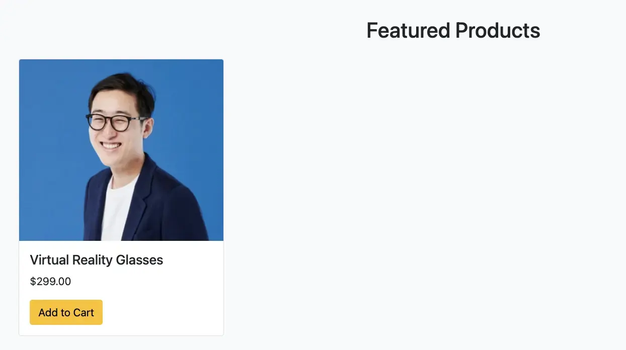
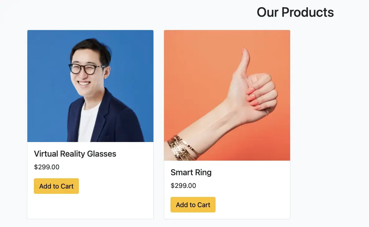
Featured Products Section
Give prominence to your top products by showcasing them in a dedicated section. This layout is designed for adaptability and appeal, making it easy to highlight products and streamline the buying process.
Key Points:
- The main container is styled with a top margin and bottom spacing to give it a distinct look on the webpage.
- The title “Featured Products” is centrally aligned for prominence.
- Bootstrap's grid system (row-cols-*) is employed to ensure the products adapt responsively across different screen sizes.
- Each product is encapsulated within a Bootstrap card, offering a clean, structured presentation.
- Product details, including its image, name, and price, are neatly arranged. A straightforward form allows users to quickly add the product to their cart.
Here is our updated results:
Take advantage of this amazing free extension that I highly recommend to assist you in your project walkthroughs. Thanks to the incredible HubSpot Guide Generator tool, you can make your project even more seamless and efficient.
Get the free extension
New Product Section
Elevate the unveiling of your newest offerings with a dedicated banner. This layout accentuates the product while providing essential details and a direct purchase option.
Key Takeaways:
- The layout utilizes Bootstrap's grid system to divide the content into two equal columns.
- The left column displays the product image, ensuring it stands out prominently.
- The right column is designed to detail the product's offerings. The use of d-flex and align-items-center classes ensure content is vertically centered.
- The inclusion of a direct “Add to Cart” form allows for an intuitive buying experience, facilitating impulse purchases.
Here is our updated results:

Contact Section
Facilitate seamless communication with visitors via a dedicated contact form. This layout is designed for clarity, ensuring users can easily provide their details and queries.
Key Features:
- Positioned within a section tag, the contact form is wrapped inside a container, ensuring it's centered and has appropriate spacing.
- Form elements are housed within a bordered, rounded, and shadowed div, offering a touch of design elegance and focus.
- Clear labels and placeholders guide users on the required inputs. This reduces ambiguity and improves the user experience.
Our results should look like this:

Step 4: Create Website Footer
Footer sections are pivotal for user navigation, offering insights about the company, and providing additional resources. Here's a cohesive footer layout for the “CoolGadgets” website.
Highlights:
- The footer is partitioned into four main sections, each facilitating unique purposes.
- Company's branding and motto section provides identity.
- The “Quick Links” directs users to essential site areas.
- “Resources” feature supplementary information and policy guidelines.
- “Stay Connected” prompts users to engage with the brand on social platforms.
- The footer concludes with a copyright line, asserting ownership and copyright.

Step 5: Add Additional Pages
To further enhance user experience, I've added a products.html page to showcase a list of all the products, and a cart.html to allow users to see their purchases.

View the full source code here.
The Cornerstone of Your eCommerce Journey
As we conclude our exploration into the essentials of crafting a simple eCommerce website, we've navigated through the foundational elements of HTML and the aesthetic enhancements of CSS. This journey has been more than just about putting together a site—it's about laying the first stones in your path toward eCommerce proficiency.
Through the structured application of HTML, we've built the skeleton of our digital marketplace. With CSS and a touch of Bootstrap, we've dressed it up to meet the aesthetic expectations of modern web users.
Though today's foray might not have included the functionality that JavaScript brings, it's vital to recognize the role each language plays in web development. Consider this project as the groundwork of your eCommerce venture, a mock-up from which you can expand, refine, and innovate.
As you continue to build and learn, let each project refine your skills and expand your capabilities. The world of eCommerce is ever-evolving, and staying abreast of new technologies and coding techniques is part of the exciting challenge.
HubSpot's Free Website Builder
Create and customize your own business website with an easy drag-and-drop website builder.
- Build a website without any coding skills.
- Pre-built themes and templates.
- Built-in marketing tools and features.
- And more!
Html


-2.webp)
![14 Stunning HTML Websites [+ How They Work]](https://53.fs1.hubspotusercontent-na1.net/hubfs/53/Copy%20of%20Featured%20Image%20Template%20Backgrounds-1.webp)


![How to Embed Google Map in HTML [Step-By-Step Guide]](https://53.fs1.hubspotusercontent-na1.net/hubfs/53/Google%20Drive%20Integration/How%20to%20Embed%20Google%20Map%20in%20HTML%20%5BStep-By-Step%20Guide%5D-2.jpeg)