1. Esscents of Flowers

Esscents of Flowers in Oakland is an exemplary florist website that sparks curiosity and conversions. When I landed on the homepage, I was completely drawn by the website layout and its vintage vibe.
Chic, neat, and magnificent. A warm color scheme and full-width hero image of wedding design make me trust this studio and prompt visitors to learn more. The header explicitly tells you what services are on the menu, which is helpful for the user experience.
Esscents of Flowers also offers a first-person story told by the owner, where she shares her vision and approach to floral design. This develops an emotional bond, which can lead to more potential clients.
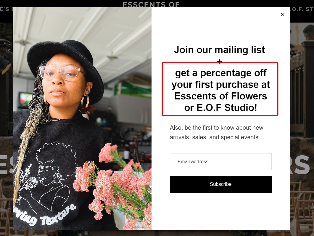
What we like: The site greets you with a pop-up, incentivizing you with 10% off your first purchase. This acts as an effective lead magnet.
2. Scotts Flowers
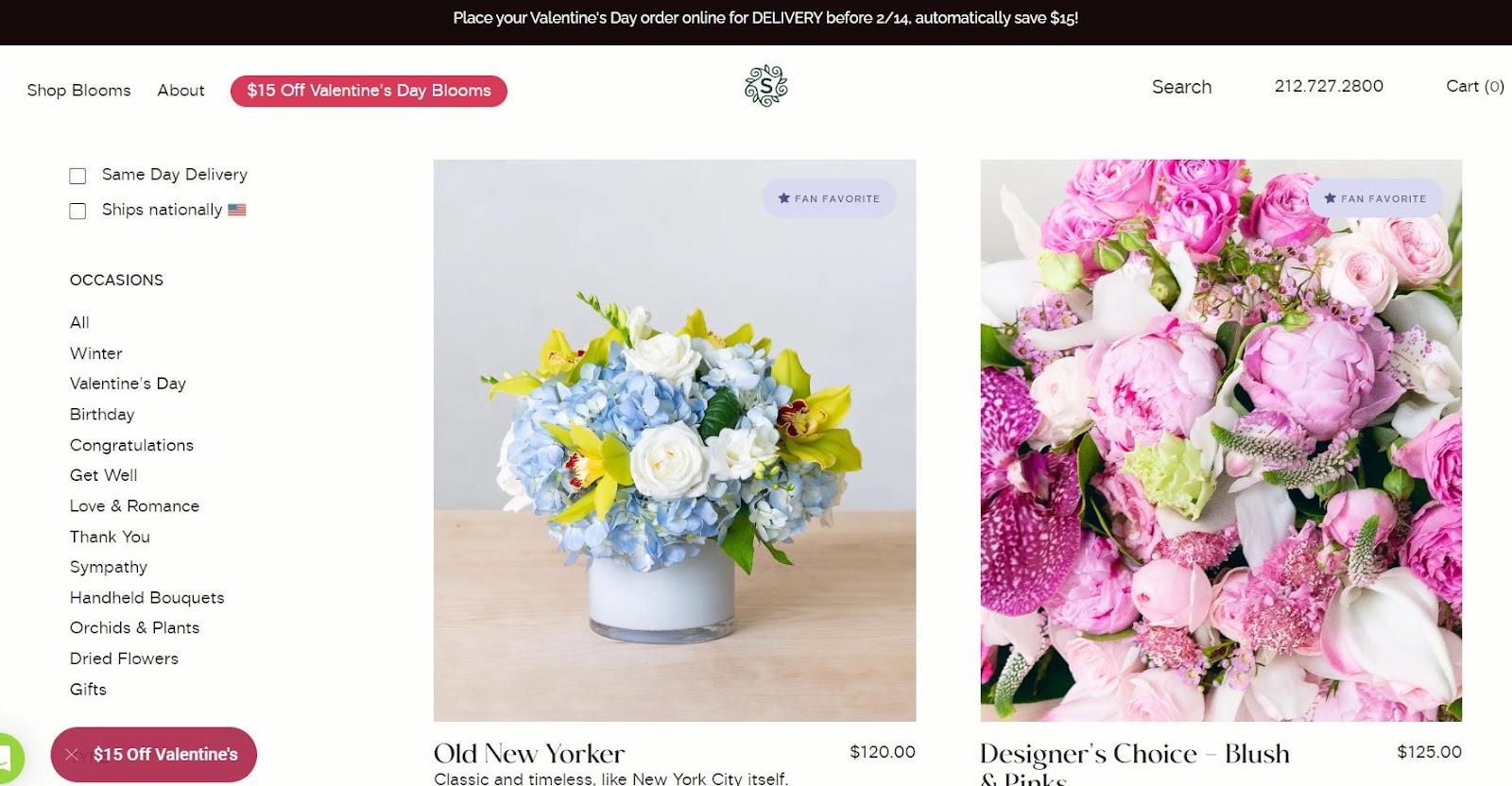
Scotts Flowers allows shoppers to buy flowers for any occasion right away. The menu bar takes you to the right flower category and lets you choose the delivery date.
On the homepage, you’ll see current deals, a chatbot to promptly contact sellers, and daily flower picks.
What we like: Scroll down, and you’ll see the integrated Instagram feed that brings life to the website and the human beyond the flower shop.
3. Arena Flowers

Upon entering the Arena Flowers’ website leads with bright and cheerful, a beautiful blend of pink, purple, and green. The graphics are modern, and the layout is easy to navigate.
Exciting promotions are featured prominently on the homepage, along with helpful information about delivery options and flower care instructions.
Arena Flowers is also one of the few florists that encourages customer reviews and press features. Consider adding these elements to your website to gain visitors’ trust from the get-go.
What we like: Take a look at the grid layout presenting the bouquet menu. It’s a perfect balance of big-sized pictures with thin white spaces.
4. Plantshed

Welcome to one of the most welcoming and elegant florist websites. The homepage features helpful information about different services, like shopping online, flowers for events, and an onsite cafe. You’ll also see current deals and notices about new plant arrivals.
The Plantshed website also has a section where you can check out what customers say about them. It's always helpful to see social proof before making a purchase, especially when it comes to plants.
Plantshed also invites visitors to its blog for plant care tips and floral styling advice. Consider creating a blog for your website, too.
What we like: The white color scheme creates a calm atmosphere that pairs nicely with the vibrant illustrations throughout the site.
5. Julia Testa
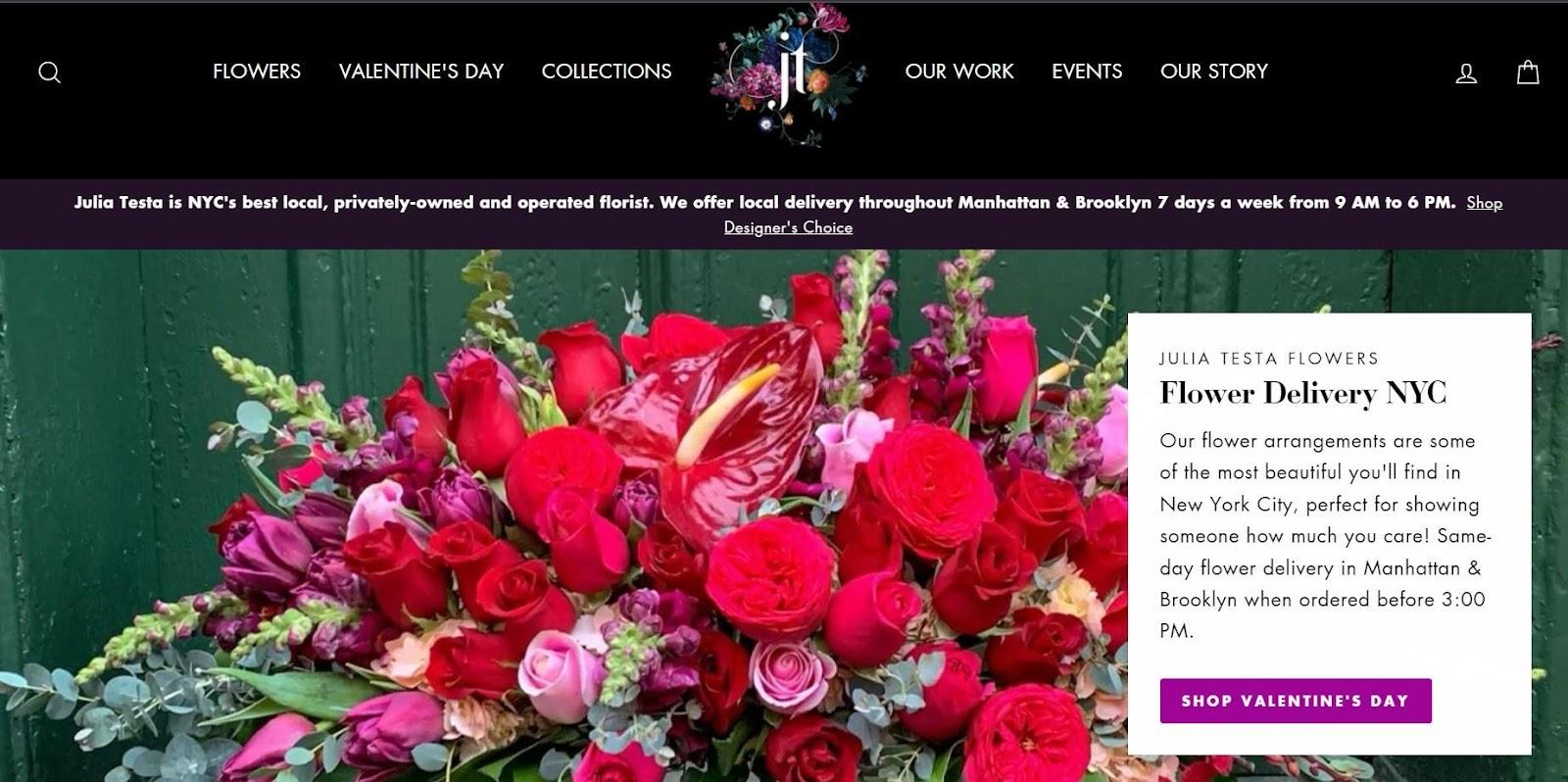
Julia Testa’s website has an elegant color scheme that creates a sophisticated look. Want your site to bring about the same effect? Try the dark background with the bright accents of red and green in full-width pictures of bouquets. This balanced combination ensures a pleasant viewing experience for customers.
Throughout the site, you’ll also see flower collections and Testa’s works in a neat, grid view.
What we like: In all, Julia Testa is an example of a simple florist website that you can deploy by yourself using a WordPress theme.
6. Flowers by Jordan Marie

Flowers by Jordan Marie is a stunning website with an exquisite contemporary style. The color palette of ivory and beige exudes elegance, creating an alluring atmosphere. Furthermore, the site uses vintage typography and full-width imagery to enrich its visual appeal.
What we like: You can access Jordan Marie’s florist portfolio and get lost in the stunning grid layout showcasing every intricate detail of her exquisite bouquets.
7. Rooted Floral
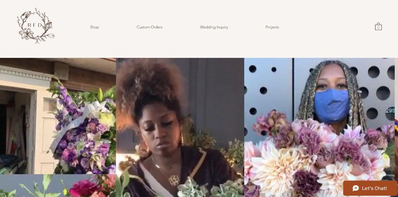
Rooted Floral turns videos and color up to the max! Instead of bland galleries and full-width pictures, Rooted Floral has populated the site with short video clips. This adds another layer of user engagement and trust. Vertical video is also a trendy design solution in 2023.
Pro tip: Incorporate video throughout your site. Customers are more likely to order on cutting-edge, engaging sites than those with static galleries from the 2000s.
8. Flower Chimp

FlowerChimps home screen exudes cute. A color-rich palette with dominating light pink and green creates a celebratory mood and invites you to explore the flower menu.
FlowerChimp also has a built-in search box for flower arrangements, where you can specify the theme and your budget. This feature is super convenient for visitors. Customers can find something they like without endless browsing, even if they know nothing about flowers.
Pro tip: Create specialized categories, like moods or themes, to make searching a breeze.
9. French Florist

FrenchFlorist is a sleek and sophisticated florist site with a muted color palette. The homepage of the website is eye-catching, with four slides showcasing different floral arrangements and bouquets. Customers can passively explore offerings without ever scrolling.
The drop-down menu is well-organized, with quick access to categories, such as pet-friendly plants and flowers by occasion. The website also offers an Instagram feed integration and a block with testimonials. Here, you can see big-name clients like Dior.
FrenchFlorist’s homepage creates a warm and inviting atmosphere, encouraging customers to explore their extensive selection of floral arrangements and gift baskets.
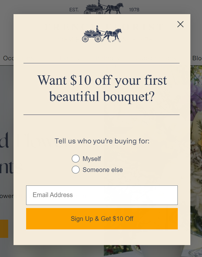
Pro tip: Trigger a pop-up for first-time visitors and offer a $10 discount for leaving their email.
10. Ballard Blossom
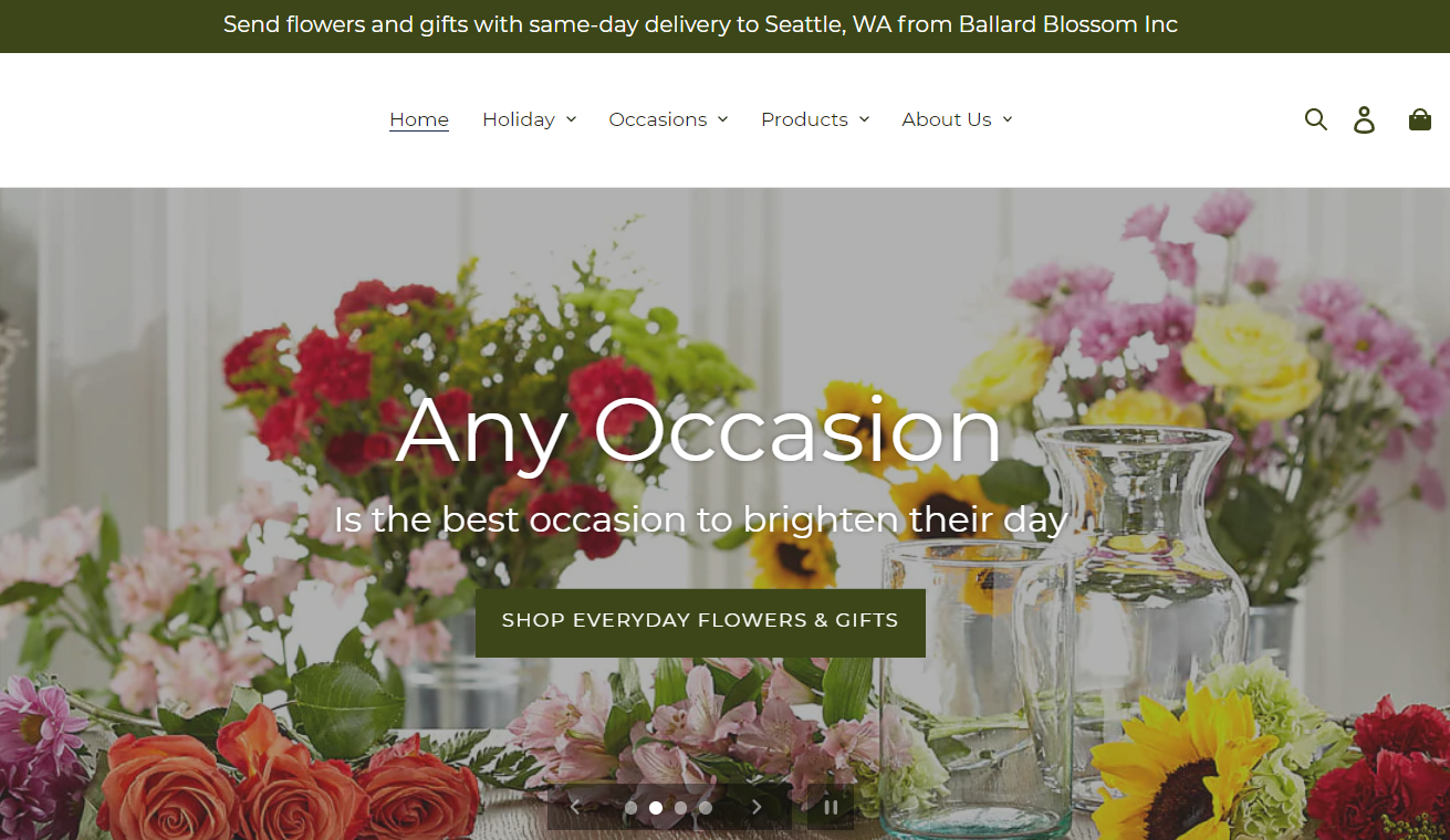
Ballard Blossom is another example of a simple website design that beginners can easily deploy. Although there’s no cutting-edge tech or jaw-dropping animations, this site wisely uses its given space.
It mixes full-width imagery with calls-to-action (CTAs) and a tiled layout with a flower selection, creating a smooth shopping and browsing experience.
What we like: The site collects customer reviews from verified buyers.
11. Terra Bella Flowers
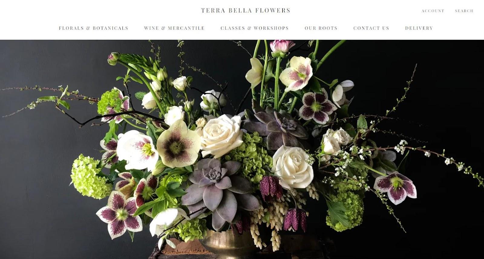
Dive into a rich, classy, and alluring floral experience with Bella Flowers. This site’s color scheme focuses on dark graphite and fresh green, coupled with ivory flowers. The juxtaposition of light and dark captures your full attention right off the bat.
On the homepage, you’ll find well-organized flower collections in a grid view with smooth navigational animation. You can also read a story about the team, their beliefs, and their vision toward organic, sustainable growing methods.
What we like: Terra Bella Flowers is an exemplary florist website that celebrates the exquisite atmosphere of the botanical world and sets you up for a premium experience.
12. Juniper Flowers - Seattle
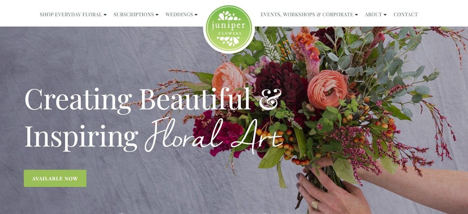
Juniper Flowers has a clean design, minimalist visuals, and original typography.
The homepage features a large hero image with a CTA button, making it easy for users to get started with available flowers. The navigation bar at the top of the page provides a range of categories for users to quickly find what they’re looking for.
What we like: Juniper Flowers makes the most of social media. There’s an Instagram Feed integrated at the bottom page, alongside Pinterest, Facebook, and YouTube buttons. This also offers a ticket to the behind-the-scenes life of Juniper Flowers’ team.
13. Ode à la Rose

Discover the world of roses in all colors, shades, and forms with an elegant French flair. Ode a la Rose is a sleek, minimalist florist website that puts its beautiful roses front and center.
The homepage showcases the company’s most popular products along with prices and short notices on whether the roses are fresh or preserved. The product images are clear and large. The descriptions provide enough information to help customers make informed purchasing decisions.
What we like: Notably, the website uses a clean white background, creating a stunning contrast with the roses.
14. Floom
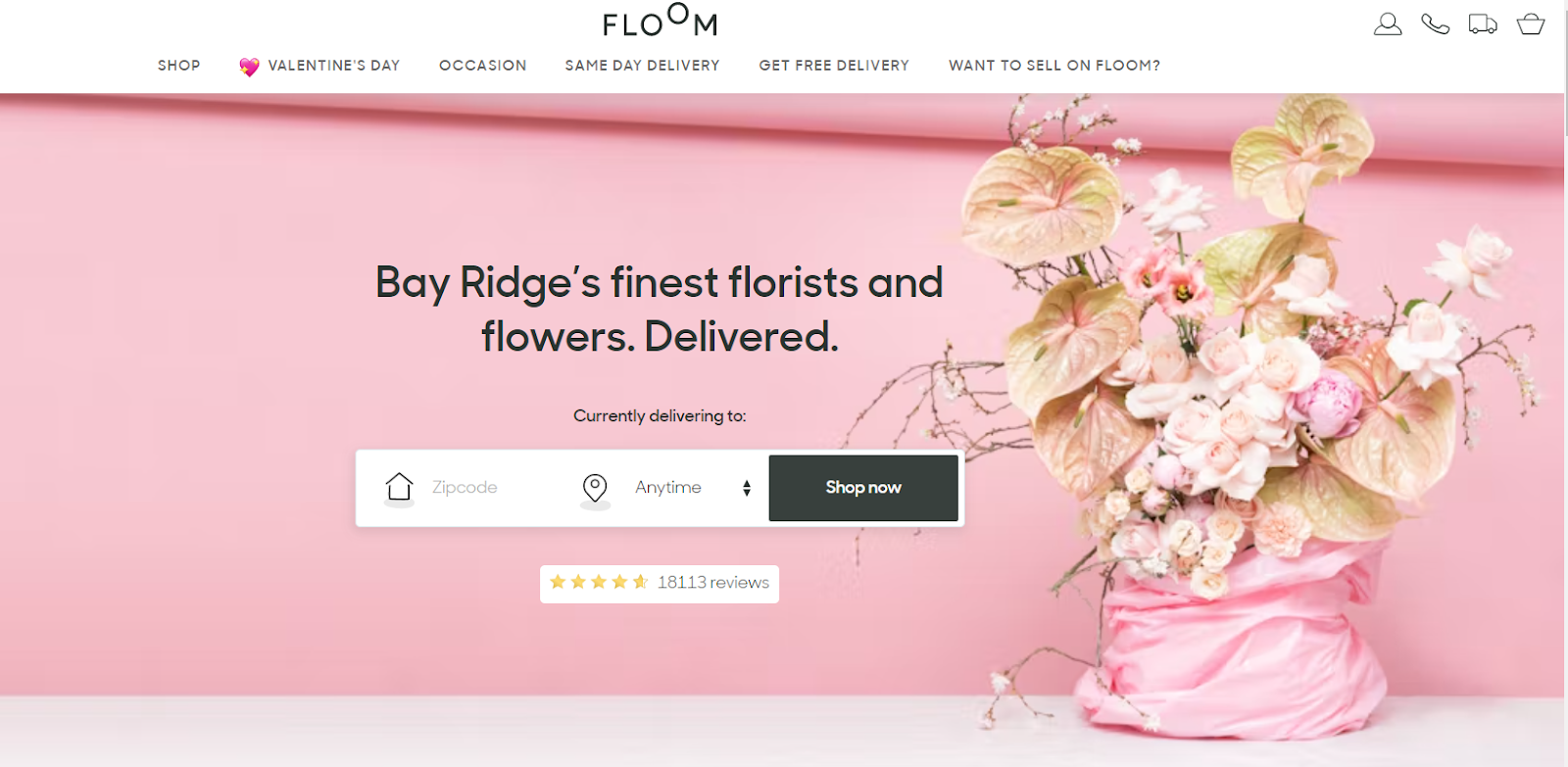
Looking for a florist website in a pink-peach color scheme equipped with modern tech? Bookmark Floom for later reference.
Right from the start, Floom greets you with an eye-catching hero image featuring beautiful flowers. In the center of the screen, you’ll find a handy search/order bar. Fill it out with your zip code and delivery date, and you’ll be shown the available flower collections.
What we like: Floom offers free delivery for first-time buyers in exchange for their emails.
15. Oberer’s Flowers
Oberer’s Flowers draws attention with its authentic look and feel. The gallery view of flower categories without a pixel of white space in between is something unique and captivating.
What we like: Each image is clickable, taking you to different areas of the site.
16. PETAL AND POST
Petal and Post is the only site that doesn’t demonstrate the flower menu on its homepage. Not a single flower. In turn, Petal and Post tells you a story about a daily flower bunch made from the best seasonal flowers directly from the farm.
What’s unique is that this florist shop updates posy every day at 7 AM. If you like it, add a bouquet to the cart, choose the size, and expect its delivery on the same day.
What we like: The site features customer reviews, a pre-order option, and a weekly/monthly posy subscription.
17. NetFlorist
NetFlorist is a flower delivery that operates in South Africa and has one of the most innovative florist sites out there. Let’s discuss it in detail.
- In the top left corner, you can see the countdown that says whether you can expect same-day delivery.
- The top-right corner has a feature for tracking your order.
- The site also features discounts for first-timers and different bundles to incentivize customers.
- Pay with 17 options for your convenience.
What we like: Customers can save time looking for the perfect flowers with GiftWizard. Specify the occasion, location, date, and budget — and get a bunch of flower and gift ideas matching your criteria.
18. Native Poppy
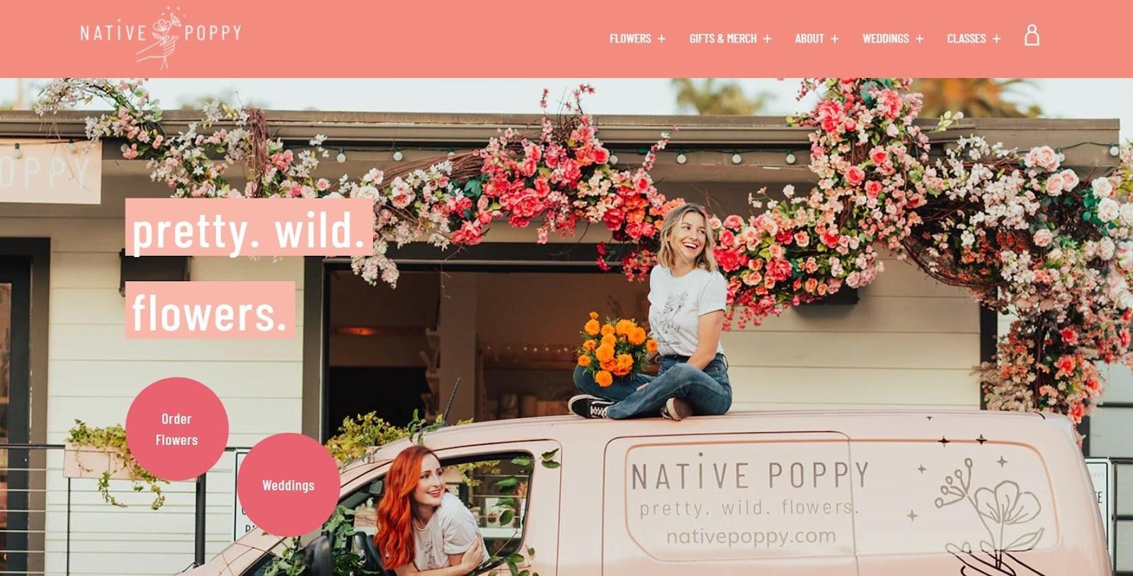
Native Poppy is an adorable flower shop in San Diego owned by t Natalie Gill and Meghan Blancato. The site solely focuses on its aesthetic, light, and airy design with smart CTAs sprinkled throughout the landing page.
What we like: Click on its menu buttons and be amazed by how these ladies weave their vision into every detail of the site.
19. La Vie en Rose Florist
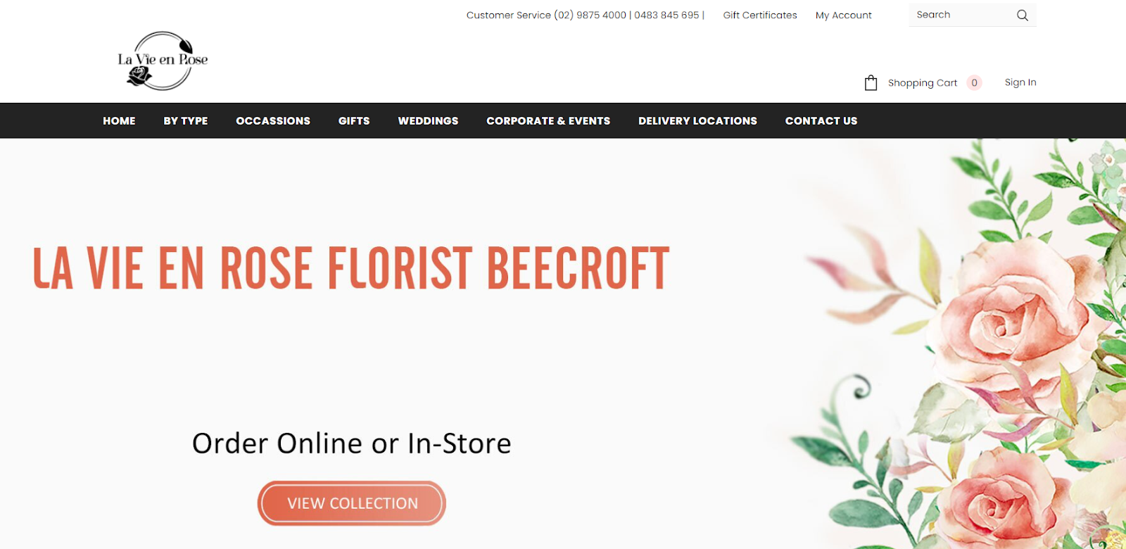
La Vie en Rose Florist is a minimalistic and lightweight website that puts its main services front and center. The first screen beckons you to discover the range of flowers available for delivery.
As you scroll down, you’ll come across a section dedicated to La Vie en Rose’s stunning flower installations for weddings and events. Keep scrolling, and you’ll be delighted to explore their new product arrivals, trending, and featured products.
What we like: The layout of your homepage modules tells a story. La Vie en Rose tells you the story of the business and about its offering on the main page visitors flock to.
20. Flower Lane & Co
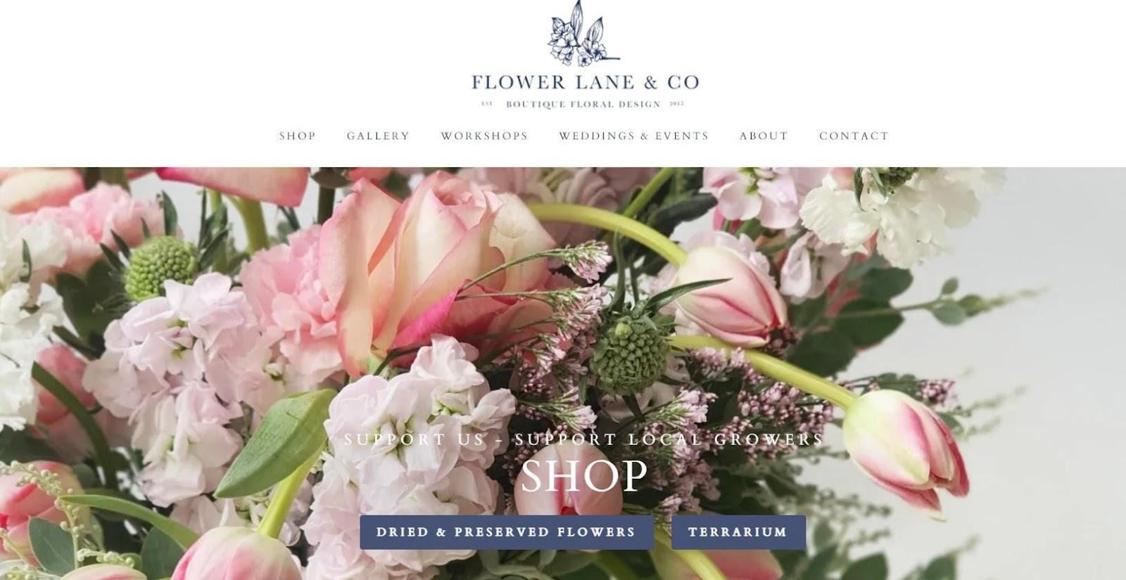
Flower Lane & Co really knows how to show off their flowers! As soon as you land on their website, you’re greeted with amazing full-width images showcasing their services — from flower workshops to wedding decorations to their shop.
As you scroll down, they list all the reasons you should choose them. But the best part is the flower gallery with those big, beautiful images that just pop against the gray background.
What we like: NetFlorist’s stunning imagery draws visitors to the site.
21. Flowers For Everyone
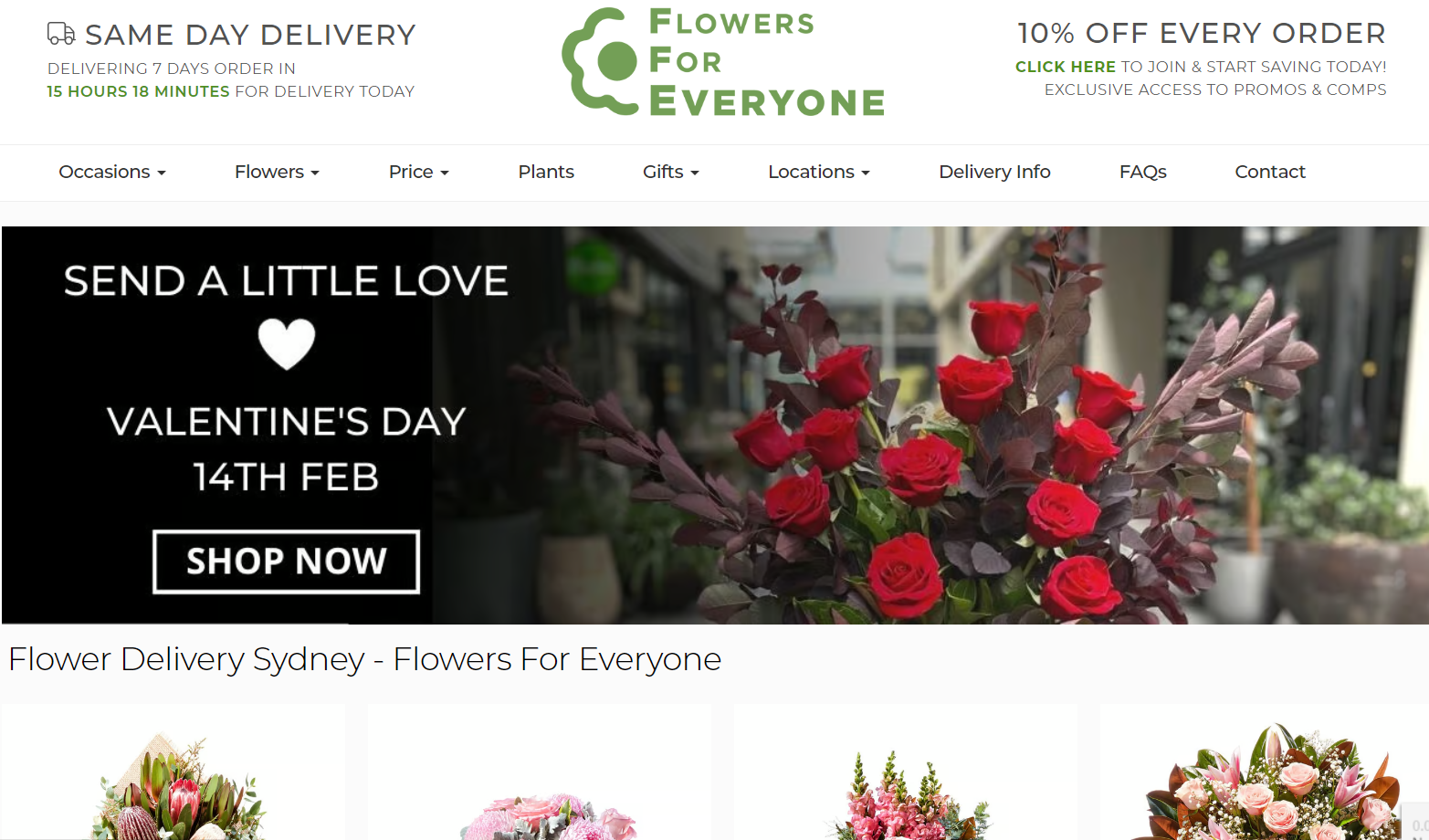
Flowers for Everyone comes with a classic ecommerce design that includes all the essential elements to draw visitors into your marketing funnel. From the start, the site warms you up with deals on its static hero image and in the header. Below the fold, you’ll see the flower menu.
What stands out is how the website optimizes for SEO. Every landing page comes with descriptive text at the bottom and FAQ sections. Moreover, each product page also has a product description.
This helps Flowers for Everyone secure 1,530 spots in the People Also Ask SERP feature, according to Semrush’s analytics.
What we like: The site competes in the top 10 by high-volume keywords like flower delivery Sydney.
22. Bloom Flowers - NYC
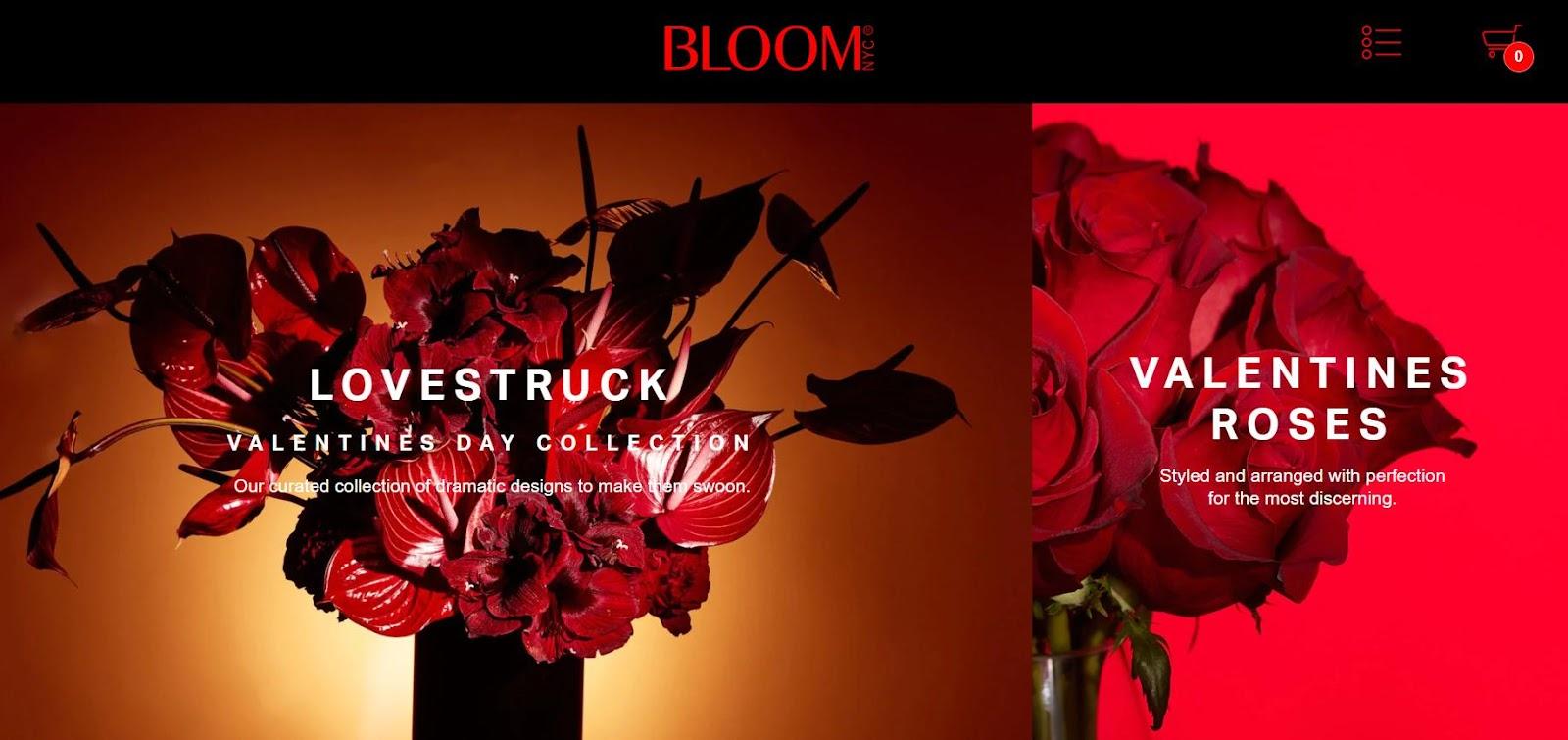
One of its kind, this site enchants you with a monochromatic color palette of bloody red and black coal. What is also notable is the seamless tile layout demonstrating Bloom’s services.
What we like: Overall, the site creates a mystical atmosphere that draws you in and bewitches you to explore more. It’s the perfect feel for a luxury flower company!
23. FloraQueen
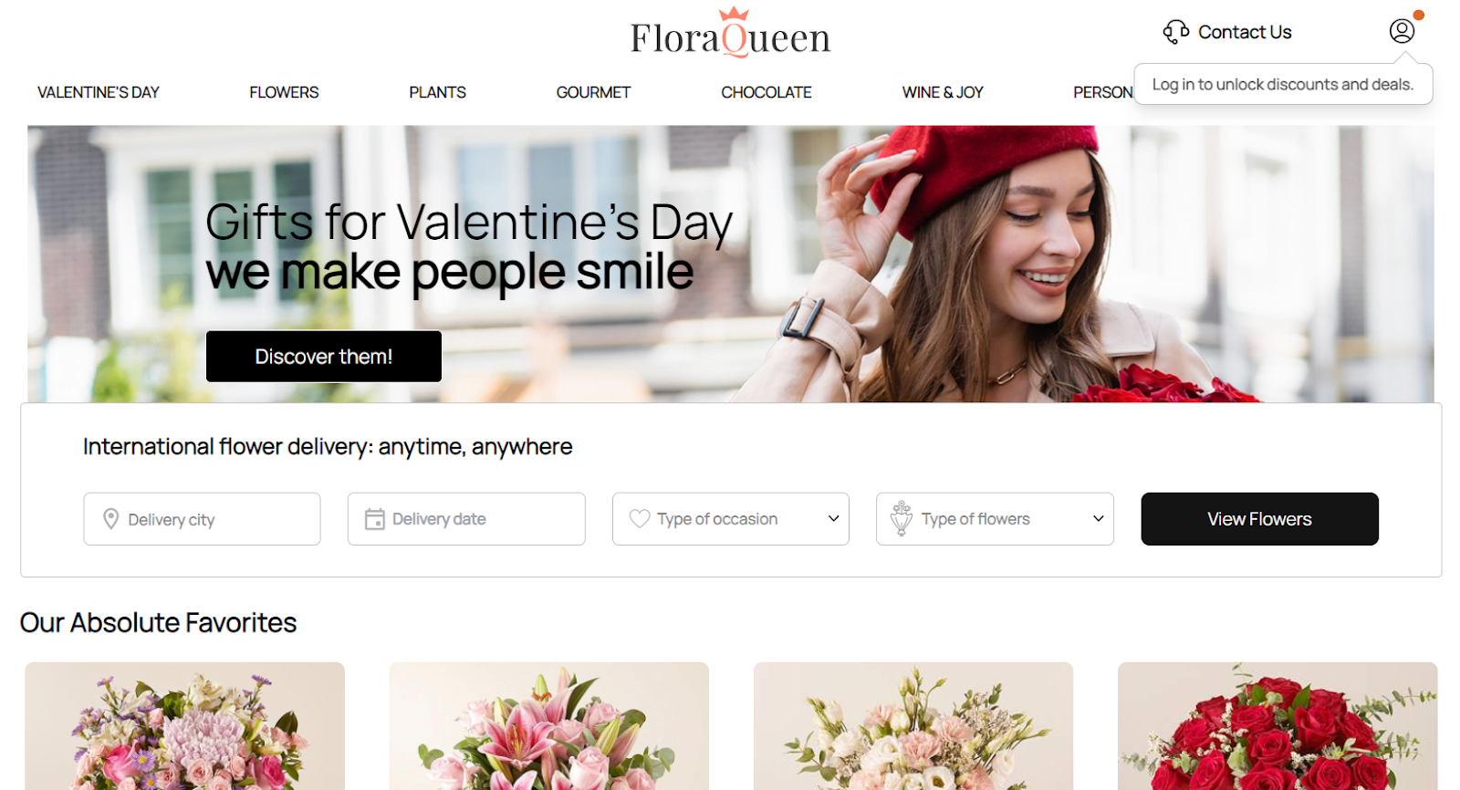
FloraQueen is an exemplary online flower shop with powerful ecommerce capabilities. Let’s dive in.
FloraQueen provides real-time tracking of orders, which adds a layer of assurance for buyers. The site also offers a convenient search menu, where you can select the delivery date, the city, type of occasion, and type of flowers. Visitors can access available products and save time on searching the website.
What we like: FloraQueen unobtrusively encourages visitors to log in to unlock discounts and deals. Look at the top right corner to see this little pop-up.
24. Elan Flowers

Open up Elan Flowers and find yourself in a lush gallery. Changing full-screen hero images with fantastic greenery entices you to discover available plants and bring home at least one new green friend and a bouquet.
What we like: The “Flower Subscription” option, which allows users to sign up for weekly or monthly flower deliveries, adds an element of convenience for frequent floral needs.
25. Starbright Floral Design
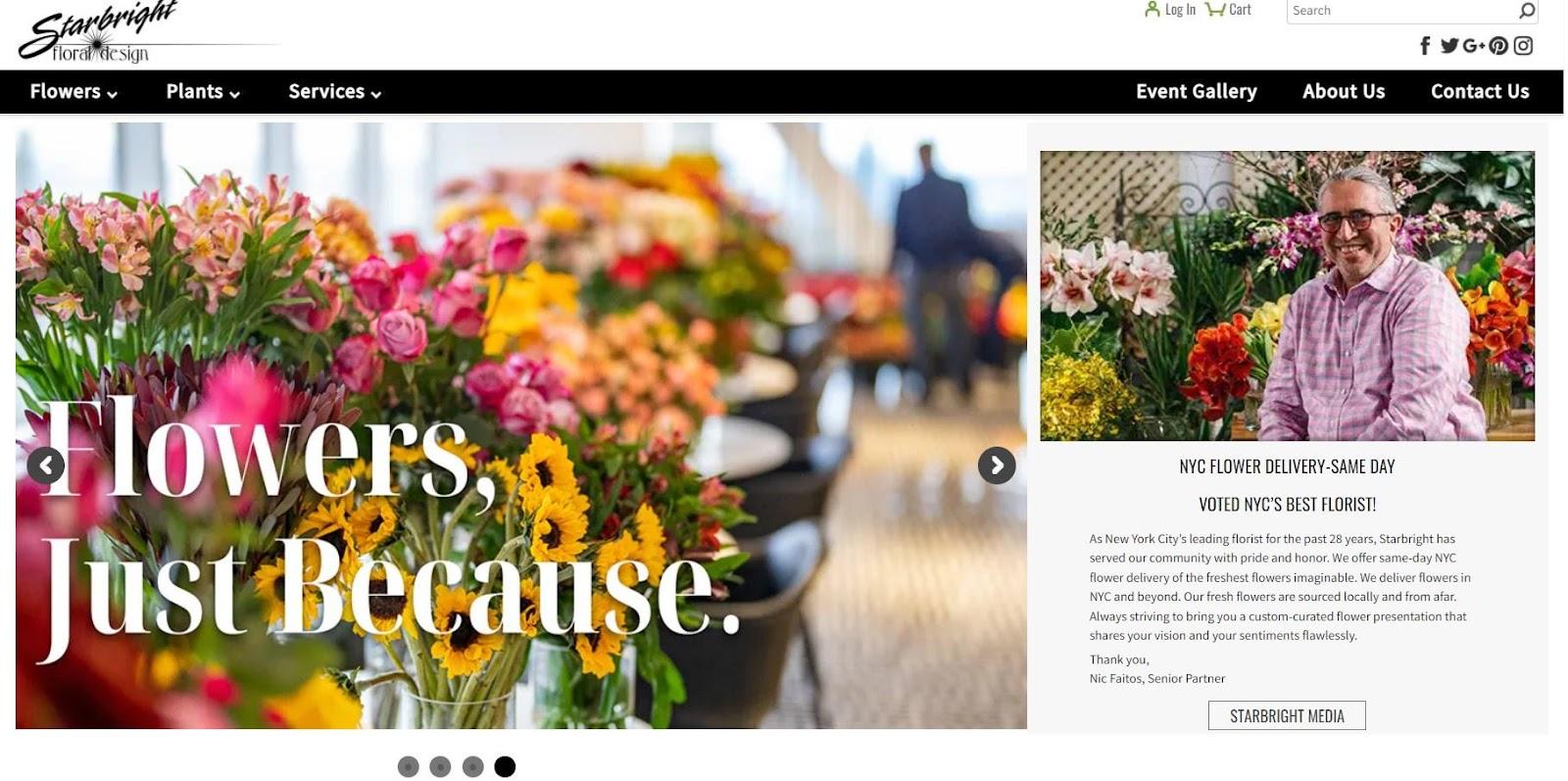
Starbright Floral Design is a unique combination of smart CTAs and personal branding.
The first screen is split into two sections. On the left is a slideshow showcasing new arrivals and the award for being NYC Best Sellers. On the right, you can read a short story about the owner, who is NYC’s best florist. This reinforces reliability and builds trust with customers.
What we like: In the flower menu below the fold, you’ll find an engaging solution — flowers by your zodiac sign. This adds an extra layer of personalization.
How to Design a Florist Website
1. Spark your creativity.
Before designing your florist website, finding some inspiration is crucial. Check out other floral websites and see what catches your eye. Maybe you love their color schemes or their page layout. Take note of what stands out to you and use it as inspiration for your own site.
Put yourself in the visitor’s shoes and try to make an order or book a meeting with a florist. How was your experience? Have you recognized any drawbacks, like the absence of order tracking, live chat, etc.? Was it easy to find your perfect flowers? Did you like a site’s look and feel?
Write down the answers so you know what features you’ve got to implement on your website.
But don’t stop there. Inspiration can come from anywhere, so feel free to browse non-related sites as well. Who knows what cool ideas you might stumble upon?
2. Choose your colors.
Is your favorite color green? Do you want to infuse your personality across the site? Consider the type of flowers you’ll feature on your site when picking your colors. You want to select a color palette that complements the hues of your blooms and makes them look amazing.
But it’s not just about presenting your flowers. Colors can also evoke certain emotions in your website visitors.
Do you want them to feel calm and relaxed when they browse through your offerings? Consider soft pink, green, or beige for your design. Muted and pastel colors have been trendy for website design since 2020.
3. Select a CMS or website builder.
Once you’ve gathered your design inspiration and decided on the color scheme, it’s time to set up a content management system (CMS). A CMS is what enables you to create and manage your website. Popular choices for florist websites include WordPress, Drupal, HubSpot, and Joomla.
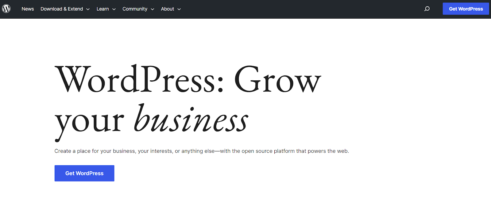
In terms of functionality, there are several key features that any good CMS for a florist website should offer:
- Ecommerce capabilities. If you plan on selling flowers or related products online, you’ll need a CMS with ecommerce functionality.
- Responsive design. More people than ever are browsing the internet on their mobile devices, so having a site that looks great on both desktop and mobile is essential.
- User-friendliness. As a florist, you may not have extensive experience in web development or coding. That’s why it’s important to choose a CMS that is easy to use and has an intuitive interface. This will save you time and frustration down the line.
- Scalability. Your florist business may grow over time, so choose a CMS that can accommodate that growth without requiring significant changes or upgrades.
- SEO optimization. To ensure potential customers can find your site through search engines like Google, look for a CMS with built-in SEO optimization tools.
4. Choose a theme.
A theme is a pre-designed template that contains all the elements you need to customize your website’s look and feel without coding.
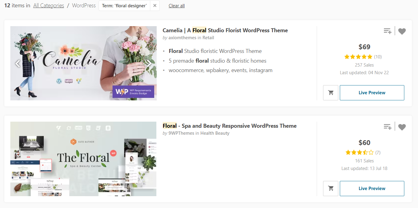
Features to consider for your florist website design include layout options, typography, color schemes, and plugins for additional features, like a shopping cart, contact forms, and social media integration.
Standard features to look for in the themes:
- Responsive and retina-ready design to ensure the website looks great on any device.
- Social media integration.
- Customizable branding elements, such as colors, fonts, and images that reflect your business’s unique personality.
- A contact page with a form so customers can easily get in touch.
- Integrated with the Yoast SEO plugin.
- Secure payment gateway integration for online sales.
- A customer account page so they can easily view their order history and current promotions.
Additional features for an innovative and user-friendly florist website include:
- A “send a gift” feature that allows customers to send flowers to someone special.
- A “create your own bouquet” feature for customers to customize their orders.
- An order tracking feature.
How do you know if a theme has it all? Developers usually list all features in the description of a theme. Check out free and paid florist themes for WordPress.
5. Pick your images.
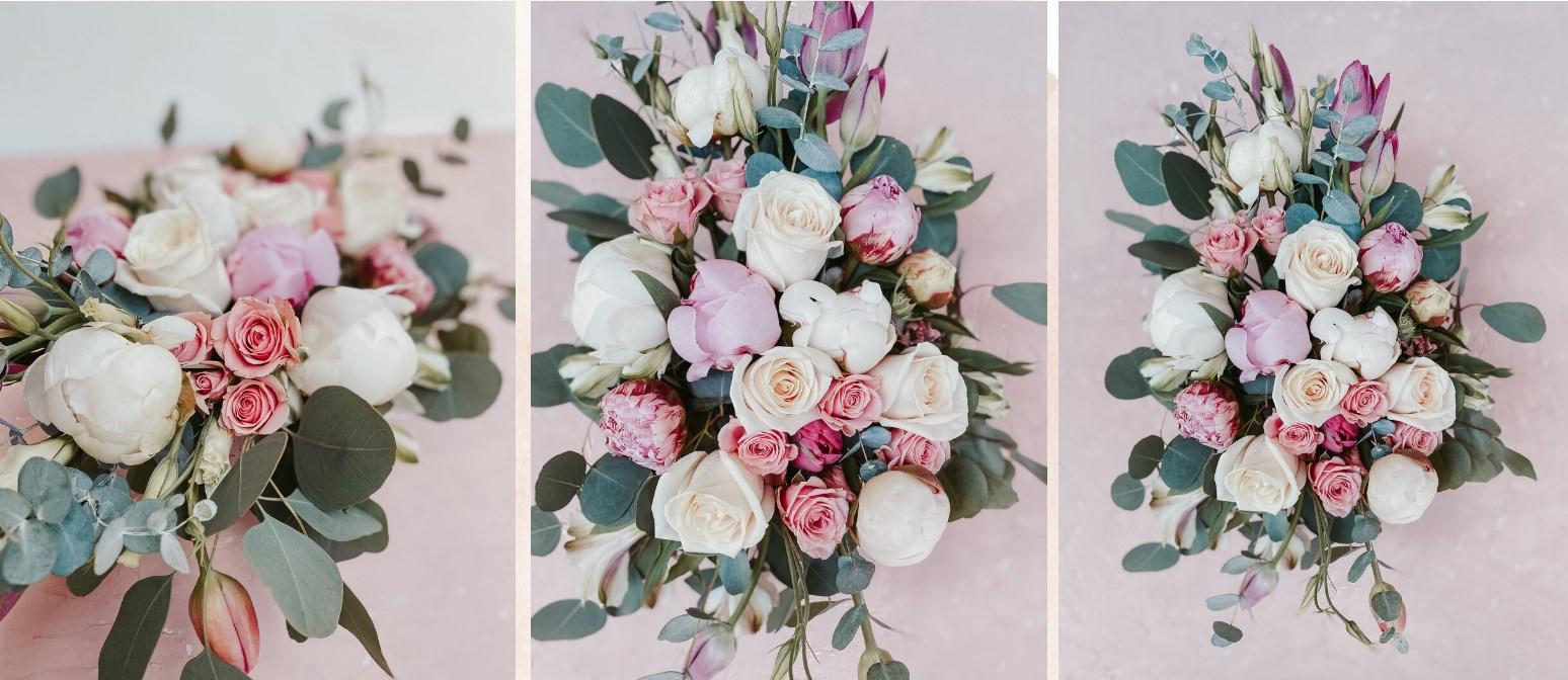
When you’re browsing florist websites, what do you look for? Right, wonderful flower installations or bouquets. So your site may not have the latest technologies, but high-quality images will do the trick.
From a hero to product images, you must take the best photos to draw potential clients to your site. Take photos in natural lighting, opt for simple and uncluttered backgrounds, and capture the whole of a composition.
Design the Best Florist Website
Get inspired by 25 beautiful florist websites, and add your personal touch to convey your story. Keep in mind the foundational principles of user experience to make sure your site not only looks great but also boosts conversions and drives visitors from organic search.
Website Design Examples
.png?width=112&height=112&name=Image%20Hackathon%20%E2%80%93%20Vertical%20(50).png)




![15 black and white website designs to inspire your own [+ pro tips]](https://53.fs1.hubspotusercontent-na1.net/hubfs/53/black-and-white-website-design-1-20250520-1336267.webp)

![15 Brochure Website Examples to Inspire You [+ How to Make One]](https://53.fs1.hubspotusercontent-na1.net/hubfs/53/brochure-website-examples-1-20250319-362228.webp)
![28 Types of Websites to Inspire You [+ Real-Life Examples]](https://53.fs1.hubspotusercontent-na1.net/hubfs/53/types-of-websites.png)

