.png?width=112&height=112&name=Image%20Hackathon%20%E2%80%93%20Horizontal%20(56).png)

Below, I’ll explore fluid web design as a solution for building responsive websites. You’ll learn what fluid design is, how it works, and how it sizes up with other designs, so you can decide the best way to scale your web pages and the elements inside them.
Table of Contents
- What is fluid web design?
- Fluid Grids in Web Design
- Fixed Design vs. Fluid Design
- Adaptive Design vs. Fluid Design
- Responsive Design vs. Fluid Design
- The Benefits of Fluid Design
- Examples of Fluid Design
- When should you use fluid design?
- Try fluid design if it fits your project.
What is fluid web design?
In fluid web design, the widths of page elements are set proportional to the width of the screen or browser window. A fluid website expands or contracts based on the width of the current viewport. Fluid design helps make websites more usable across device types with varying screen dimensions.
Let’s imagine a website with three adjacent elements using fluid layout CSS, one with a width set to 50% and two smaller elements with widths of 20% (for this demonstration, heights are unimportant). Let’s also put some margins between them.
When displayed in a browser window 1,000 pixels wide, the website looks like this:
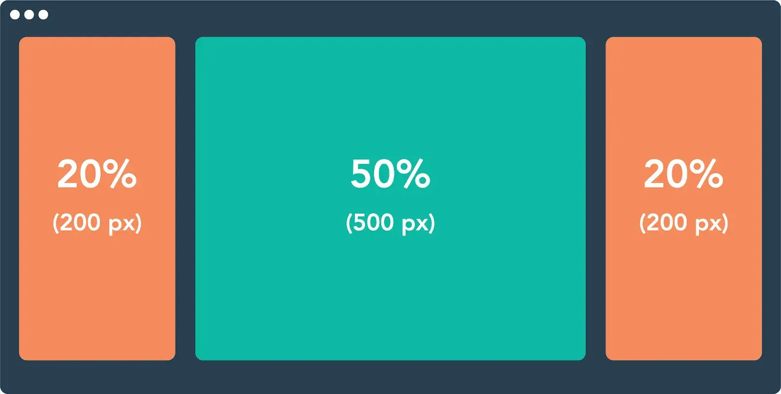
The width of each element in pixels is based on the 1000 px width of the viewport.
When we shrink the browser window to just 600 px, a fluid design scales these elements proportionally:
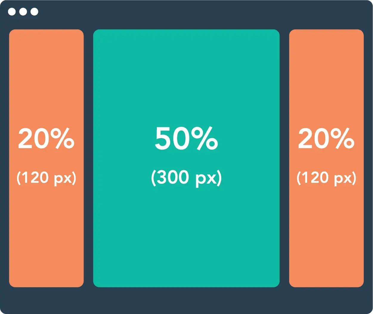
Fluid design ensures that a website always looks similar in layout regardless of the screen. A consistent layout benefits the user experience while ensuring usability for as many visitors as possible. “Your website must be OK when used by users in devices of their own choosing,” says Brian Dys Sahagun, a Principal UX Designer at Avaloq.
While fluid design does share some principles with other ways of creating device-agnostic web experiences, it’s important to note that fluid design does not rely on website breakpoints like responsive or adaptive designs.
Instead, fluid layout CSS seamlessly adjusts the design without taking into account any preset website breakpoints. I’ll talk about what website breakpoints are in more detail a little later in this post.
.png)
The Ultimate Workbook for Redesigning Your Website
Guidance + templates to simplify your next website redesign project.
- A four-part redesign planning guide
- A redesign budget template
- A website redesign audit template
- And more!
Download Free
All fields are required.
Form not available
Fluid Grids in Web Design
Fluid grids are a common implementation of the fluid design approach. A fluid grid breaks down the width of the page into several equally sized and spaced columns. Page content is placed according to these columns.
When the viewport expands horizontally, each fluid column expands according to your fluid layout CSS, as does the content within the columns:
Grids are a widespread layout for structuring page content in a digestible way, and applying fluid principles to grids is one way of making grids suitable for different screens.
However, fluid design isn’t the only approach. Let’s compare it with three other common layout designs: fixed, adaptive, and responsive.
Fixed Design vs. Fluid Design
Layouts that follow a fixed design do not conform to the viewport size. Unlike those in fluid designs and fluid grids, elements in a fixed layout are set to specific pixel widths, and these widths do not change by device or screen size.
Fixed design has lost favor among designers for its lack of flexibility and user-friendliness across devices. It’s rarely, if ever, applied to any professional website — designers now usually opt for fluid, adaptive, and/or responsive sites instead. It’s almost always worth the effort to use fluid instead of fixed designs.
Basically, I don’t think there’s any reason to ever use a fixed design unless you’re 100% certain that the website will only be used on the specific screen size that you’re designing for.
Adaptive Design vs. Fluid Design
Adaptive web design “is about creating interfaces that adapt to the user’s capabilities in terms of both form and function,” according to Aaron Gustafson, the founder of Easy Designs and author of Adaptive Web Design.
Fluid layouts help make websites more usable, but they lack the fine-tuned control of adaptive design.
In the adaptive approach, designers create multiple separate website layouts for specific screen widths, the goal being to cater to multiple specific devices. So, a website might have a separate layout design for viewing on desktop, tablet, and smartphone.
Web designers achieve adaptive design with media queries, a feature of CSS that detects properties of the user’s device, including screen dimensions. The media query reads the screen size and then selects the best-suited fixed layout from multiple fixed layout options.
Whereas fluid designs might look clunky on very large or very small screens, adaptive design lets us make more precise layouts for specific devices. The tradeoff here is that adaptive designs take much more time to make than fluid ones, so I think they can be difficult to implement for solo entrepreneurs or small businesses with a limited budget.
This can be a deep topic, so feel free to read more about it in one of our articles.
Responsive Design vs. Fluid Design
You might have heard the term “responsive” to describe any website that adjusts its layout for different devices. In this sense, both fluid and adaptive designs are technically “responsive.”
However, I think that the terminology becomes a bit confusing here — “responsive” can also refer to a particular way of making these adjustments. Here, I’ll be discussing responsive design in the latter sense.
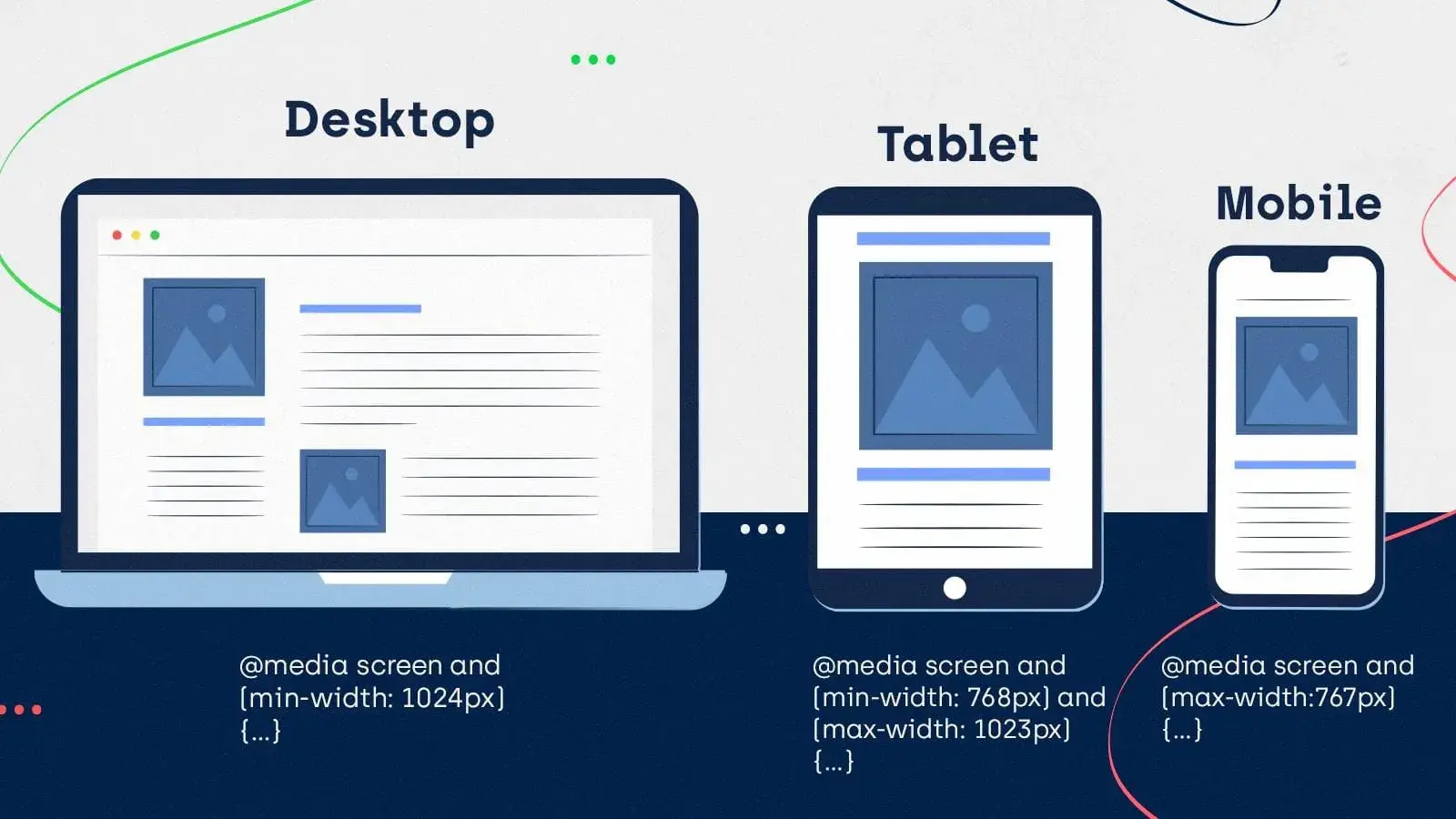
A responsive design layout is a single layout applied to a web page that reformats and resizes elements based on breakpoints. A breakpoint is a specific viewport width value (in pixels) that triggers a change in the website layout. Breakpoints are set in CSS with media queries.
Unlike fluid design, responsive websites use breakpoints to rearrange or eliminate elements on a page, instead of simply resizing them. Therefore, a responsive layout might appear quite different on a desktop versus a tablet versus a smartphone.
For example, one common difference that I think most people will have noticed is a change in the primary navigation menu. Responsive websites will typically use one type of navigation for desktop visitors and another one for mobile visitors.
Take the responsive website for the clothing brand Kotn, for example. Its breakpoints are set to 960 px and 560 px. Notice the effects of these breakpoints as I shrink the browser window.

There’s more going on here than just shrinking widths of elements, though that is part of the design as well. The content itself is changing.
Responsive designs are the go-to for business websites with content-rich, highly interactive pages.
Though they take more work to implement than purely fluid pages, a responsive design ensures that text, media, and interaction elements look great at any viewing width, especially when simply shrinking page elements width-wise doesn’t guarantee good usability or aesthetics.
A Deeper Look at Website Breakpoints
While fluid layout CSS does not rely on breakpoints, website breakpoints are an essential part of responsive design. For that reason, I want to take this section to dig a little deeper into website breakpoints.
If you’re implementing responsive design, you’ll use predetermined website breakpoints to control when a website’s content and/or design should change.
For example, your website might use an always-visible horizontal navigation menu for visitors with screen resolutions greater than 1280 px but a collapsed hamburger navigation menu for visitors on devices with a screen resolution under 480 px.
You can control your website’s breakpoints by using CSS media queries, which let you apply different CSS styling based on the characteristics of a visitor’s device (such as its screen resolution). You further have two options for setting up breakpoints in those media queries:
- min-width. This controls the minimum width of devices to which these rules will apply.
- max-width. This controls the maximum width of devices to which these rules will apply.
Your smallest breakpoint will use max-width, which has the breakpoint apply to every single resolution below that number. Similarly, your largest breakpoint will use min-width, which has the breakpoint apply to every single resolution above that number.
For the breakpoints between those, you’ll add both min-width and max-width rules to set the lower and upper boundary of that breakpoint.
Most Common Website Breakpoints
Because most devices follow a common set of screen resolutions, there are some “standard” screen sizes that are most often used for responsive breakpoints.
You do not automatically have to use these common website breakpoints for your own site — I’ll share some tips on using breakpoints in the next section. However, when in doubt, starting with the standard breakpoints is never a bad place to begin.
Here are the four most common breakpoints:
- 480 px (covers 0-480 px). This covers most small smartphone devices.
- 768 px (covers 481-768 px). This covers most tablets and larger smartphone devices.
- 1280 px (covers 769-1280 px). This covers lower-resolution laptops and monitors, as well as tablets in landscape mode.
- >1280 px (covers anything larger than 1280 px). This handles higher-resolution laptops and monitors.
Our post on common screen sizes digs into the resolutions of most users’ devices. However, as I’ll discuss in the next section, I always recommend choosing your website’s breakpoints based on your actual audience whenever possible.
Of course, this won’t be possible if you’re setting up breakpoints for a brand-new website, as you won’t have any analytics on your audience yet. In that case, starting with the most common website breakpoints is never a bad choice.
If you are setting up breakpoints for an existing website redesign, I highly recommend downloading our free website redesign workbook, which will take you through everything that you need to know about redesigning your website.
Download the free website redesign guide.
Tips for Using Responsive Website Breakpoints
Based on my experience, I want to share a few general tips for using website breakpoints for responsive designs. These are not hard-and-fast rules — just some general best practices that you’ll want to consider when working with your website’s breakpoints.
- Don’t use too many breakpoints (aim for 3-5). Adding too many breakpoints adds a lot of complexity to your design and will make it more difficult to maintain and adjust your site’s design going forward. Your site should have a minimum of three breakpoints. I think going up to five breakpoints can be helpful if you want a bit more customization for different device sizes, but I would be careful about using six or more breakpoints.
- Set breakpoints based on your audience. While I shared the most common website breakpoints above, I also want to emphasize that it’s always better to pick your design approach and base your site’s breakpoints on your actual audience, rather than a generic audience. For example, if you notice that a high percentage of your audience uses a certain device, you might want to prioritize that design’s screen sizes, even if it’s not a “standard” breakpoint.
- Use content to help determine breakpoints. In addition to considering your audience, I also recommend factoring your website’s content into your breakpoints. Rather than exclusively focusing on screen sizes when choosing breakpoints, you can also consider basing the specific breakpoints on your site’s content and design. This can be especially important if you’re working on an existing website.
- Don’t forget about high-resolution devices. While it’s easy to think about website breakpoints as “designing for mobile devices,” I want to remind you that it can also go the other way. Some of your audience might be using high-resolution devices (4K+) at low scaling, which might require some tweaks. If you see that your audience is using a lot of high-resolution screens, you’ll want to factor that into your design.
The Benefits of Fluid Design
Obviously, the main benefit of fluid design is the ability to display a website properly on any screen size, and this is especially important for mobile users.
As of 2025, mobile visitors account for 51% to 75% of total website traffic depending on the region, so the majority of your site’s visitors are going to be using some type of mobile device.
Given that, it makes sense to design with mobile devices in mind, even using a “mobile first” approach.
If thinking from the perspective of search engine optimization (SEO), then you would also benefit from knowing that Google does something called mobile-first indexing, which means that Google actually uses the mobile version of your site to determine its search rankings.
This means that, from an SEO perspective, you should prioritize creating great mobile experiences for visitors.
The Ultimate Workbook for Redesigning Your Website
Guidance + templates to simplify your next website redesign project.
- A four-part redesign planning guide
- A redesign budget template
- A website redesign audit template
- And more!
Download Free
All fields are required.
Form not available
Finally, another benefit is that fluid layouts tend to load fast. The reason is that there are not many adjustments to make in the positioning and sizing of elements when they’re loaded. Instead, there’s one set of fluid layout CSS rules that apply to the entire site.
Performance is often an extremely important metric, so this benefit is nothing to gloss over if that’s what you care about.
Examples of Fluid Design
One great example of fluid design can be found here. The site in the link is also displayed in the gif above, where I am simply making the window smaller and larger in order to see how it responds. If you are comfortable with development tools, nearly any modern browser will also have a way to preview various viewports from various devices as well.
If you focus on the left side of the gif, you will notice that the vertical bar disappears once the window gets small enough.
This is a way to get more screen space out of smaller screens and help the space feel less cramped in an already tiny space. Do be sure that this doesn’t remove important functionality from your site, and give another way to access it if so (perhaps make the bar horizontal instead of vertical).
Another thing this site does well can be seen while scrolling. While you scroll the site in both large and small windows, the text always remains readable in a linear fashion, and images that were stacked side by side will get stacked on top of each other in order to prevent the images or text from overflowing.
Both of these things mean scrolling up and down is a seamless experience in either a mobile window or a desktop one.
Fluid Grid Examples
The previous example used Flexbox in order to achieve its responsive design, but this site uses CSS grid to do it instead. I understand this may not really look much different to you at a glance since the end result is more or less the same, but under the hood, something different is going on.
Grid designs work well because they consist of columns and rows, and you can specify exactly how many columns and rows each element is supposed to fit into. For additional specificity, these rows and columns can also be set to specific pixel dimensions or percentages of the available viewport size.
For the above site, this works well since there are a few columns but many rows of content as well. Being able to fine-tune the size of each individual row or column can be extremely useful in such a situation.
When should you use fluid design?
Fluid design isn’t a one-size-fits-all solution, nor is it a responsive or adaptive design. These methods don’t have to be used in isolation, either — you can combine principles from any of them to improve the mobile experience of your website.
When considering a fluid design, I recommend thinking about the following:
- Audience metrics. Tracking tools like Google Analytics can segment your traffic by desktop, tablet, and mobile. Use metrics to inform where you put your design resources.
- Site content. If your site is relatively light on text, media, and interactive features, you can get away with a purely fluid design on some or all pages. Otherwise, it’s better to incorporate adaptive and responsive principles. Mapping your layout with wireframes is helpful in this phase.
- Resources. Because of their relative simplicity, fluid designs generally take less time, money, and effort to incorporate from scratch. However, website builders with out-of-the-box responsive page templates have made complex responsive pages more attainable for those lacking the design chops.
Lastly, if you incorporate fluid elements on your pages, test your site on a range of screen sizes, from smartphone to a large desktop browser window. Without specific instructions for how to accommodate specific dimensions, a purely fluid approach might not perfect your UX. But, it can get you pretty close.
Pro tip: To more easily test your fluid layout CSS, I recommend using a testing tool like BrowserStack, which will let you quickly test your site across a range of different screen resolutions (using real devices).
Try fluid design if it fits your project.
While fluid design is not the only way to create a great experience for people browsing from different devices, I think it is an essential tool to have in your website design toolbox, especially for simpler websites.
With a fluid layout, you can ensure that your website looks great on all devices while also offering a consistent experience for every single visitor, which I think is really important now that people are engaging with websites on all different kinds of devices.
Give it a try and see how you can incorporate fluid design principles in your next project.
Editor's note: This post was originally published in October 2020 and has been updated for comprehensiveness.
The Ultimate Workbook for Redesigning Your Website
Guidance + templates to simplify your next website redesign project.
- A four-part redesign planning guide
- A redesign budget template
- A website redesign audit template
- And more!
Download Free
All fields are required.
Form not available
Responsive Design
![Responsive Text: Making Your Font Look Great on Every Device [+CSS & HTML Tips]](https://53.fs1.hubspotusercontent-na1.net/hubfs/53/responsie-text-1-20250206-8138788.webp)
.png)