1. GOOD MOOD Truck
Oh, that’s the place where I want to try some food! Why? This site radiates a positive vibe and invites you to make an order and enjoy your food while watching the sunset.
Lyric aside, Good Mood Truck comes with all the essential features for a great customer experience: a pre-ordering option, an online menu, additional services like catering, a contact form, and the story and people behind the brand.
What we like: Good Mood integrates its Instagram onto its site, so you can see real pictures of the food they offer and the truck itself.
2. Food Truck Catering Company

Food Truck Catering Company is a professionally designed website that captures visitors’ attention from the get-go. The site is neat, balanced, and has well-thought-out calls-to-actions (CTAs) — like “request a quote” on the first screen.
Scroll down, and you’ll read the owner’s story and customer testimonials. The site also has a full-width hero image showcasing FTCC’s truck and happy customer images throughout the site.
What we like: The appetizing clips focusing on the steamy pizza, the loaded tacos, and people enjoying the food make your mouth water. It’s a great way to sell food to online customers who can’t taste or smell the food at the moment.
3. Old World Pizza Truck
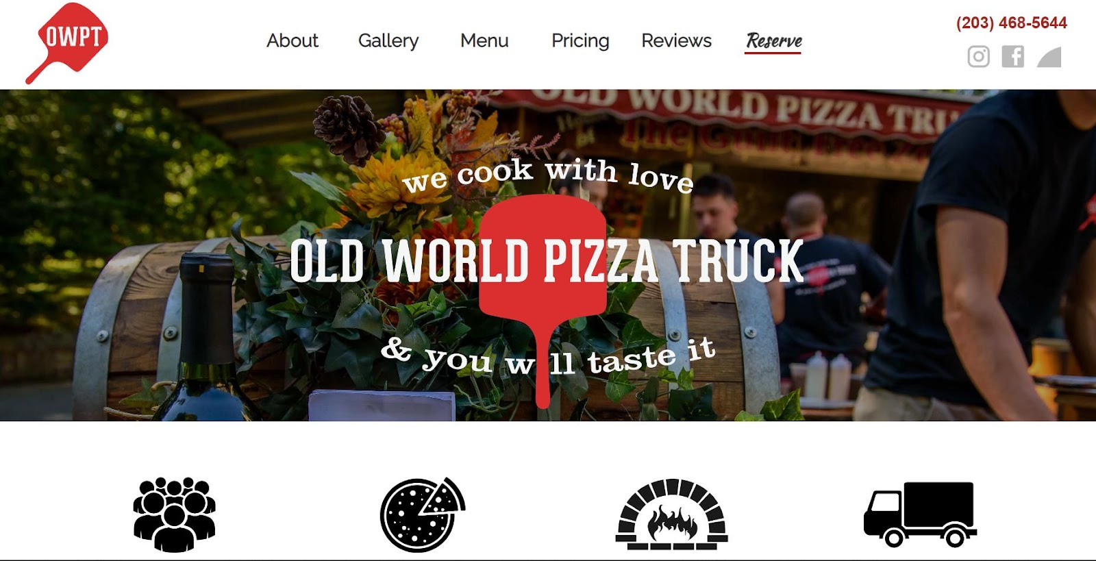
If I were to order a pizza and ended up on this website, I’d never check others. Open it up to steal ideas on how to present your food. Feeling hungry for OWPT’s pizza yet? Take a moment to think about which parts of their website make your stomach growl with anticipation.
First of all, the site has high-quality pictures of pizza and a welcoming staff. Smiling, happy people eating or serving pizza definitely influence the desire to taste a slice.
What we like: The site shows OWPT’s unique things, like woodfire-backed pizza and halal and vegetarian options.
4. Cousins Maine Lobster
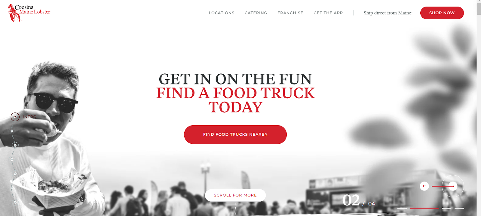
This website comes with an interactive design taking you to explore the delicious meal options with lobsters. Once you’re on the homepage, you’re playing with the interactive hero image as you move your cursor. This way, you’re instantly engaged and want to learn more about Cousins Maine Lobsters.
The next screen also surprises you with an interactive map that navigates you through the menu.
What we like: Gamification boosts time on the site by up to 30%, which impacts rankings in the SERPs and drives more sales.
5. The Halal Guys
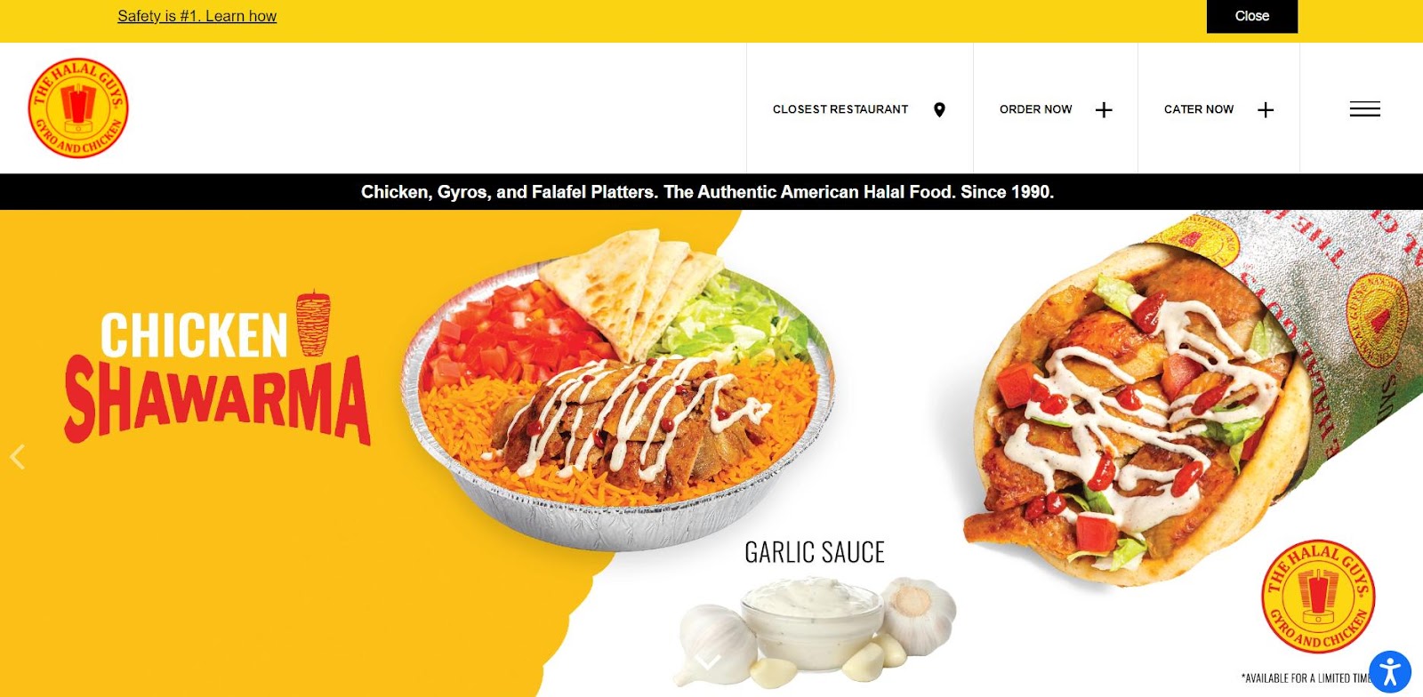
The Halal Guys’ video clips in the hero immediately make the food look appealing and delicious. While the rest of the website design isn’t particularly innovative, the site serves a customer greatly. It promotes food selection right from the homepage and demonstrates the app for easy food orders and delivery.
Pro tip: Bookmark it as a reference for a simple, well-organized food truck website.
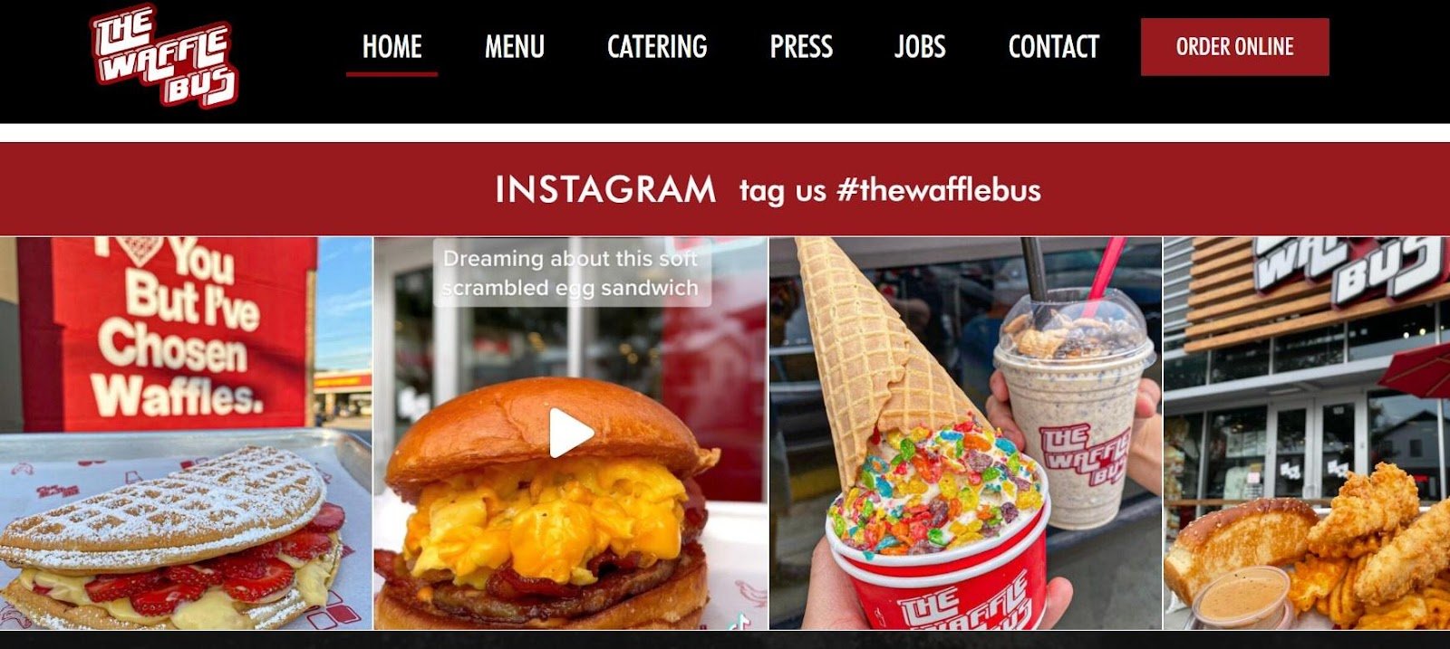
6. Waffle Bus

A quick look at the homepage is enough to entice website visitors to order online or search for the truck. A professional photo of delicious waffles as the hero image paired with a vivid color scheme does the trick.
What we like: The Waffle Bus website also comes with an integrated Instagram feed full of yummy waffle pictures. Providing their hashtag encourages customers to share their tasty photos so they’re featured on The Waffle Bus Instagram while also giving the company social proof.
7. Coolhaus
“Yeah, let’s spin it again!” Hold on, what are you talking about? Mmm, about the coolest interactive feature for an ice cream truck website!
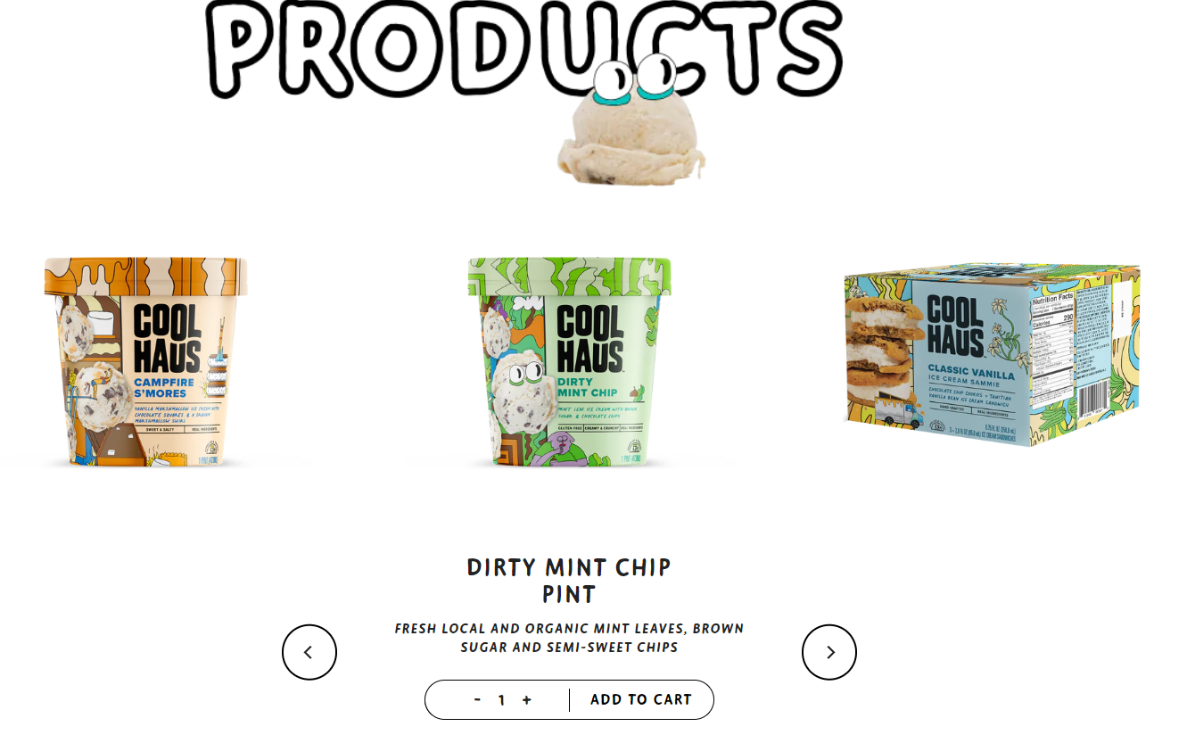
See the cookie on the vanilla ice cream in the top right corner? It spins when you navigate the site.
Now, look at Coolhaus’ featured products, which come immediately after the hero image — a minimalistic design puts them front and center. Impossible not to place an order.
What we like: The fun colors and interactive food truck further down the page keep customers scrolling through. Overall, LGBTQ+ women-owned Coolhaus nails it with awesomeness in every facet.
8. Salt N Pepper Food Truck
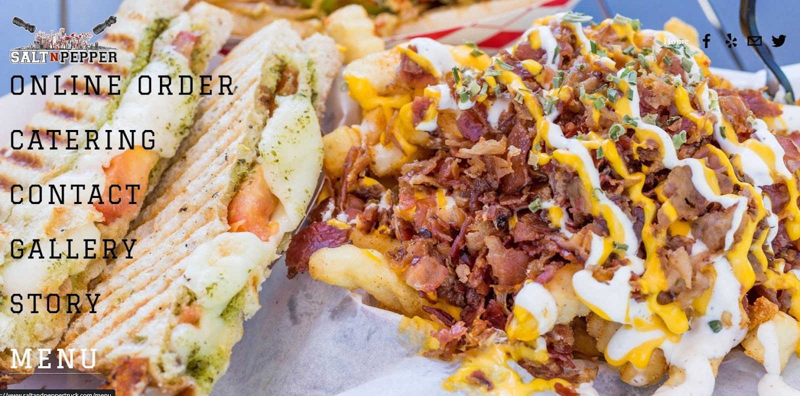
The Salt N Pepper Food Truck website is a super simple design that beginners can emulate. Although it consists of only several pages, it uses the given space wisely and presents different savory meals in the background when you hover over the menu buttons.
Pro tip: If you’re just starting out with a food truck business, consider building a simple site like Salt N Pepper.
9. 5 Elementos
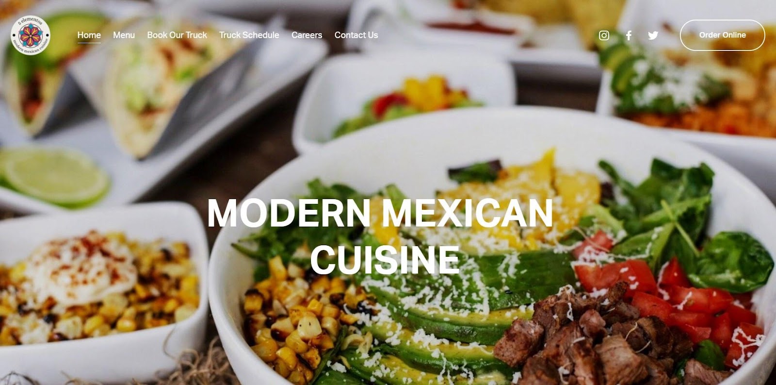
As soon as you land on the website, you are greeted with the vibrant colors of modern Mexican cuisine. Right from the first screen, you can book an order, discover the menu, or book a whole truck for an event. All that is thanks to clear, user-friendly navigation options.
Pro tip: One thing we would do differently is to add a section right after the hero image that highlights what makes 5 Elementos unique. This restaurant serves healthy, vegan meals, but you can’t find this information unless you scroll down to the footer.
10. Miffies Coffee
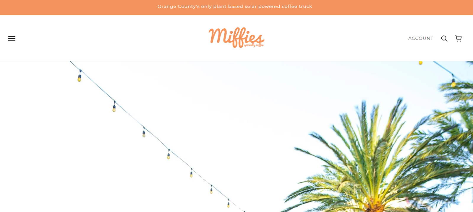
Meet a sunny coffee vegan truck from southern California! Bright colors, lively images, and the story behind the coffee truck all come together to create a cheerful and inviting vibe.
What we like: If I were to book a vegan coffee truck, my choice would be Miffies. Its simple but thought-out and detail-oriented website design makes you feel like you’ve stepped into a cozy cafe!
11. The Tropic Truck
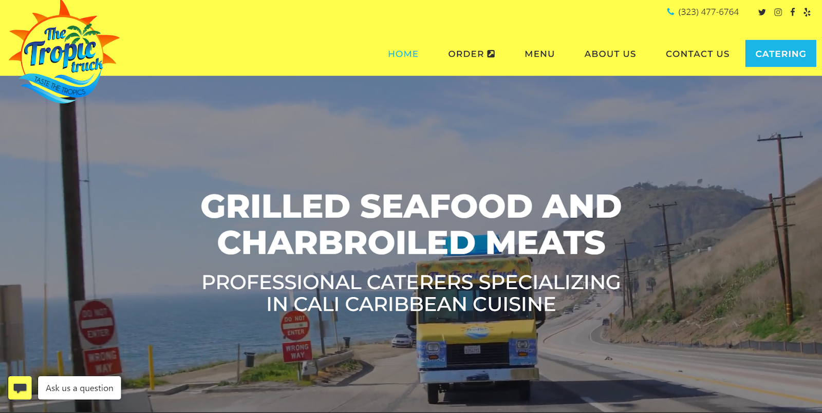
How would you convey a tropical feel through your site for a Caribbean cuisine food truck? Right, with the use of full-width video! The truck, ocean, and roads immediately draw your attention and set the tone for the rest of the site.
What we like: You also place an order for a pick-up or book the truck right from the header.
12. Zs Buddies Sushi & Ramen

You might mistake this site for a fancy sushi restaurant when visiting it for the first time. The food gallery is so well-curated and visually appealing that it gives off a high-end vibe typically associated with restaurants.
Pro tip: To achieve a similar effect, consider using a dark, contrasting background to make your menu items pop and look more appetizing. This will create a sense of richness and indulgence.
13. The Go Go Truck
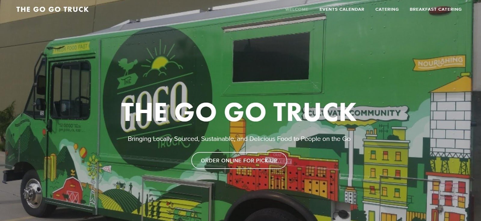
The Go Go Truck site has a sleek and simple design tailored to catering and online food ordering. Right on the first screen, you can find a food menu of delicious, locally sourced meals and an events calendar to check the truck’s availability.
Pro tip: Prominently feature a picture of the truck itself so people can identify your business.
14. Big Green Truck Pizza

Take a closer look at the stamp on the Big Green Truck Pizza website. It’s almost as if it’s staring back at you, tempting you with the promise of wood-fired pizza from a brick oven.
Just reading those words is enough to make your mouth water with anticipation. And this is the magic of an effective food truck website design — it should stimulate your senses and ignite your cravings for delicious food.
What we like: Big Green Truck Pizza encourages social media engagement by linking its social pages on its website. Customers will feel more connected with the company and enjoy sharing their experiences on social media too.
15. Dire Lion

Dire Lion is an example of a cost-effective and simple website for food trucks. Visitors can access Dire Lion’s menu, order food online, see meal photos, and find the truck’s schedule. All essentials are in place with no headaches, bugs, or glitches.
Pro tip: Not a web designer? Stick to the essentials. A minimalist approach can be extremely effective.
16. Exotic Bowls

No event is complete without a spread of fresh fruits and healthy food options on the table. Exotic Bowls is a perfect choice for that occasion. The company focuses solely on vegan, gluten-free, and lactose-free bowls and smoothies, conveying this message right from the first screen.
Pro tip: Put what makes your food truck unique front and center. If you’re looking for a vegan food truck, you’ll likely find helpful tidbits on Exoitc Bowls’ website.
17. The Oyster Lover

The freshest oysters from Long Island’s aquafarms are at your disposal. Book the food truck or raw bar service to indulge your guests with premier oysters.
What we like: The Oyster Lover site has a simple layout with the homepage focused on storytelling, which makes sense since it’s a family business. Visitors can also find information about catering services and oyster classes and connect with the founders.
18. NitroTaps
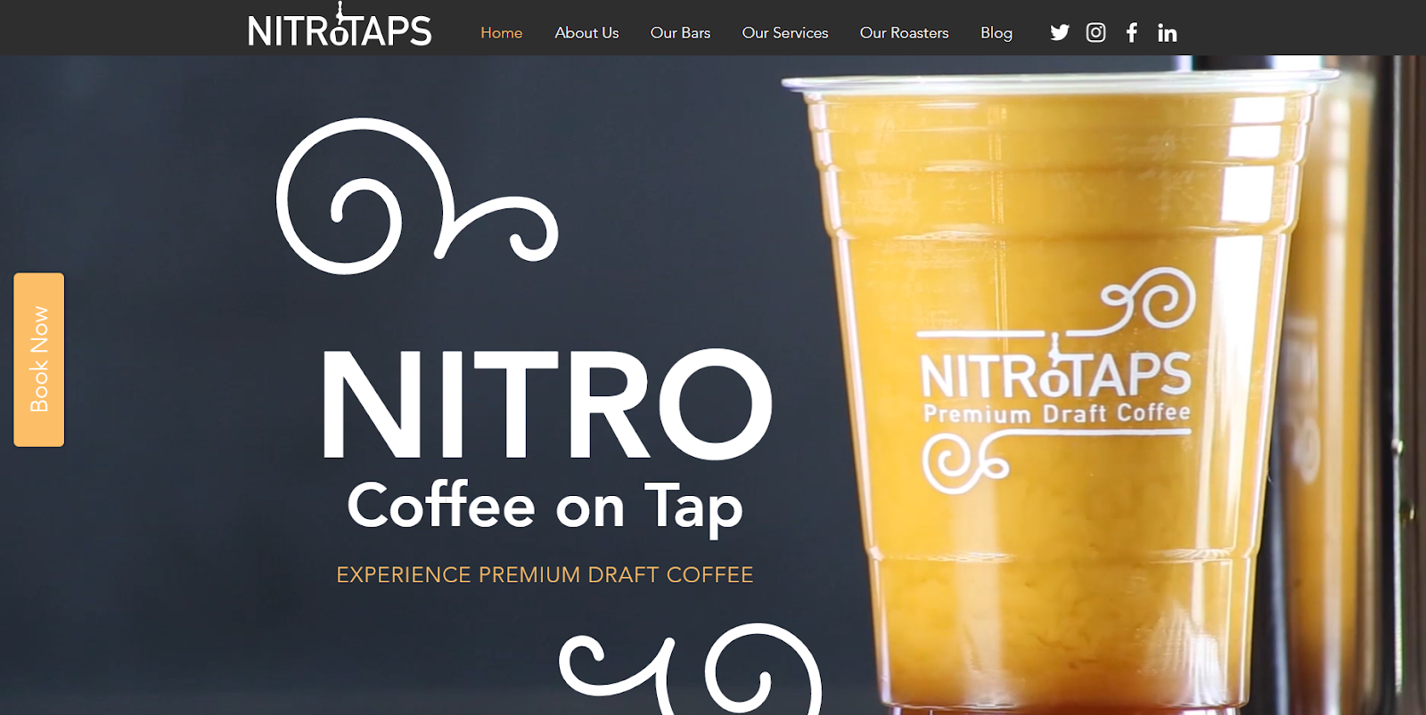
Immerse yourself in the ambiance of a coffee shop with the NitroTaps website and get a craving for a cup of rich espresso.
Geared towards big-name companies and special events, NitroTaps is New York’s premier coffee catering service. You can sense their expertise from the moment you land on the site, with a high-quality animated glass of coffee and an affluent color palette catching your eye.
What we like: NitroTaps gives you a short but sweet rundown of their premier catering services, followed by an impressive list of big-name clients who have turned to NitroTaps for their caffeine needs.
19. Grey’s Donuts
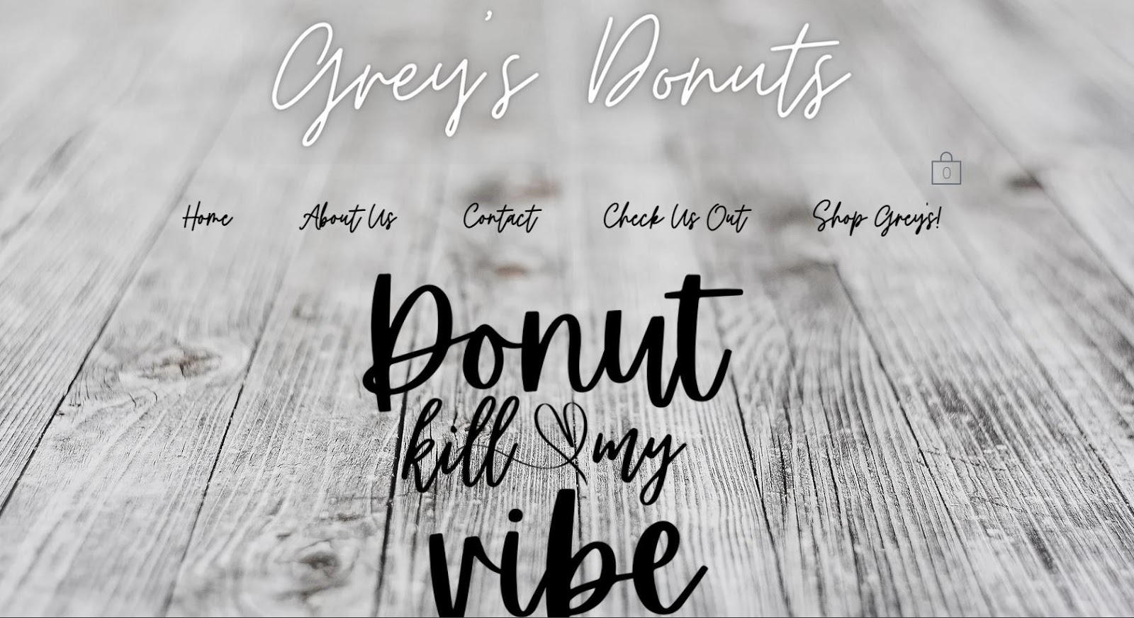
Grey’s Donuts is a minimalistic and simple site. It opens with a sophisticated font and a stock image for the background. We list this site just to show that there’s no need for expensive design to make your local business flourish.
What we like: Grey’s Donuts comes with a menu, contact form, about us, and even a small shop of merch items. That’s enough for a local food truck.
20. Makina Cafe

Makina Cafe’s website turns the color up to the max! Each screen comes in a new bright and gorgeous color, creating a vivid and joyful vibe. What also stands out is Makina’s custom design of the menu and full-width imagery of foodies between the screens.
Want to build an eye-catching website? Play with colors!
What we like: Makina Cafe uses eye-catching art to stand out. If you have an artist or designer on your team, this is an approach that you can emulate.
21. #Baonanas
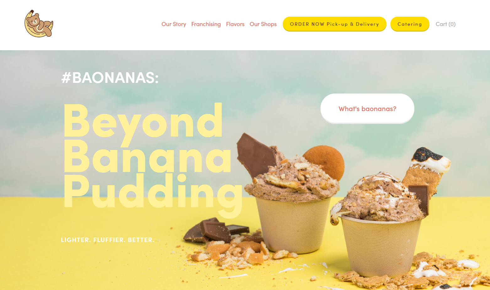
Baonanas celebrates a light, cheerful, and ideal combination of muted colors and awesome-looking treats. It tells the story of the descendants of Filipino immigrants and celebrates Baonanas’s achievements.
What we like: The site is user-friendly. It highlights order and catering options in the navigation menu.
22. The Steak Truck
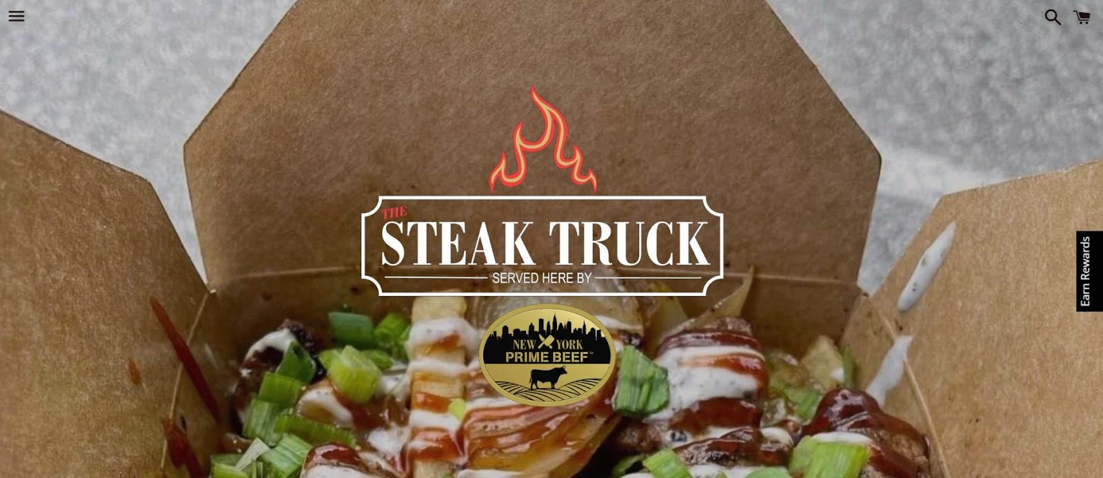
Oh yeah, it’s time to celebrate comfort and greasy food with The Steak Truck. The site is all about prime beef in different forms, from juicy, bloody steak sandwiches to classic hot dogs.
What we like: The website’s design is sleek and modern, with a clean layout that’s easy to navigate.
23. Food Smackdown

Doesn’t this rich plate of warm salad make you feel hungry, too? Food Smackdown is another exemplary site showcasing the best gourmet food trucks for catered events.
Upon landing on the website, you’re immediately struck by the vibrant design. The homepage features mouth-watering images of savory food and happy customers, inviting you to explore what they have to offer.
What we like: The site is user-friendly, with clear categories for the services, like corporate catering, food trucks, culinary entertainment, and venue partnerships.
24. Puddin DC
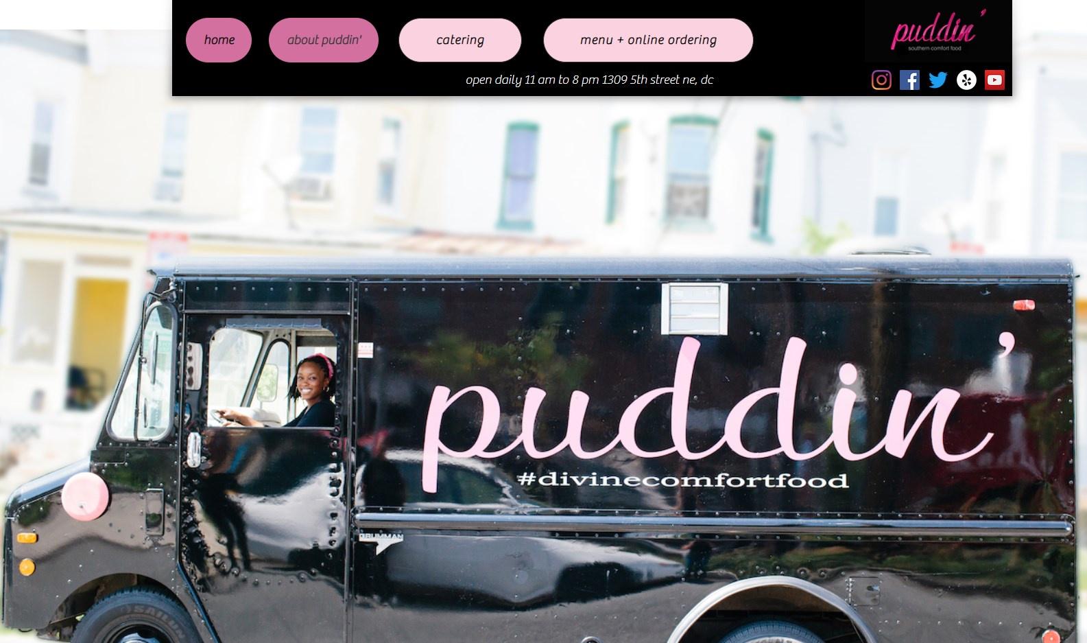
This website specializes in southern comfort food, and the design is just as comforting and inviting. As you scroll through the pages, you notice food photos and the real star of the show — Toyin Alli, the owner of Puddin.
Pro tip: To make first-time visitors trust your food quality, tell your story and show the behind-the-scenes process. It will make each dish look even more delicious and enticing.
25. Chez Felix Gourmet

Welcome to Chez Felix Gourmet, where great food meets adventure! The website is designed to introduce the visitor to unexpected twists on seafood classics. The website has a sleek, modern design that is simple and engaging.
When you first visit the website, you’re immediately greeted by a beautiful hero image of the food truck in action and the catchy slogan “great food on the go.” The website’s color scheme is composed of blue and white hues, creating a calming and fresh vibe.
What we like: Chez Felix Gourmet is a great example of a food truck website you can easily deploy on Wix.
How to Design a Food Truck Website
Food trucks have become a popular dining option in many cities, and a well-designed website can help increase their visibility and reach. Here are six steps to follow when designing a food truck website.
1. Choose the right platform.
Start by finding the right website builder. Consider WordPress, Wix, and Weebly, which offer food truck-specific themes and templates. With these platforms, you can create an attractive and functional website without any coding knowledge.
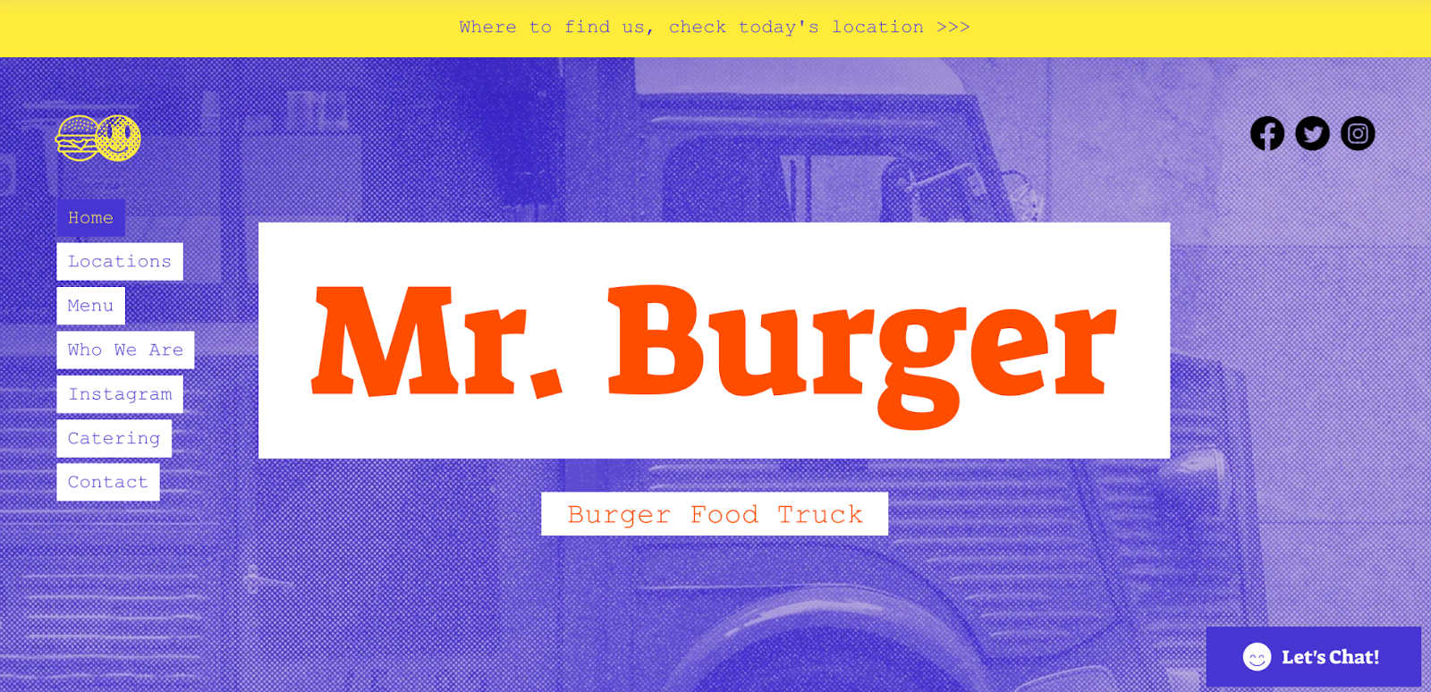
Here’s an example of a food truck website template by Wix.
2. Make your menu stand out.
Use high-quality images of your food items to make website visitors dream about your food just by looking at pictures. Add descriptions, ingredients, and prices to entice customers.
Studies show that 51% of consumers are more likely to visit a restaurant that offers environmentally-friendly food items.
3. Provide easy navigation.
Your food truck website should be easy to navigate, with clear menu options and a prominent search bar.
Make sure your website is mobile-friendly, as 89% of smartphone users use their devices to make dining decisions before visiting a restaurant. A mobile-friendly website ensures that customers can access your menu, location, and hours of operation on the go.
4. Use social media integration.
Social media is a powerful marketing tool for food trucks. Integrating your social media feeds on your website can help build robust customer relationships. You can also use your website to encourage customers to follow your food truck on social media, providing an additional channel for communication and marketing.
5. Provide a food truck schedule.
You should also have a location page that lists your upcoming events and where your customers can find your truck.
6. Optimize your website for mobile.
Since most customers will access your website from their mobile devices, ensure the experience is optimized for mobile. This means using a responsive design that adjusts to different screen sizes and optimizing images and content for faster loading times.
According to a study by Google, 53% of mobile users will abandon a website that takes longer than three seconds to load. Use PageSpeed Insights to understand your mobile site speed and get tips on how to resolve the issues if found.

Design a Food Truck Website to Drive More Sales
Take inspiration from the 25 examples we’ve shared to create an amazing and user-friendly website.
Remember to sprinkle engaging CTAs across the site and use high-quality visuals that accurately represent your food and business. And don’t forget to optimize your website for search engines and mobile devices, as these factors can significantly impact your online visibility and reach.
So why wait? Get started on your food truck website today and take your business to the next level.
Website Design Examples
.png?width=112&height=112&name=Image%20Hackathon%20%E2%80%93%20Vertical%20(50).png)






![15 black and white website designs to inspire your own [+ pro tips]](https://53.fs1.hubspotusercontent-na1.net/hubfs/53/black-and-white-website-design-1-20250520-1336267.webp)

![15 Brochure Website Examples to Inspire You [+ How to Make One]](https://53.fs1.hubspotusercontent-na1.net/hubfs/53/brochure-website-examples-1-20250319-362228.webp)
![28 Types of Websites to Inspire You [+ Real-Life Examples]](https://53.fs1.hubspotusercontent-na1.net/hubfs/53/types-of-websites.png)

