You’ve come to the right place. I’ve put together 30 furniture website design examples that will make you feel like you're walking into a designer showroom.
From stunning product photography to unique layouts and eye-catching graphics, these websites will inspire your customers to redecorate. Let’s dive in!
Table of Contents
Best Furniture Websites
- Format Furniture
- Case Furniture
- Robinson Furniture
- Justice Furniture
- Garado
- At The Helm
- The Furniture Gallery
- James Richardson Furniture
- Skyline Furniture
- Jardan
- USM
- Maglin Site Furniture
- Roweam
- Megafurniture
- HipVan
- abc carpet & home
- Furnish Green
- West Elm
- Wayfair
- Grandin Road
- Pottery Barn
- Feather Furniture
- Parkman Woodworks
- Croft House
- Angel City Woodshop
- CBD Glass
- Glassisimo
- Gothic Cabinet Craft
- New York Heartwoods
- Classic Sofa
1. Format Furniture
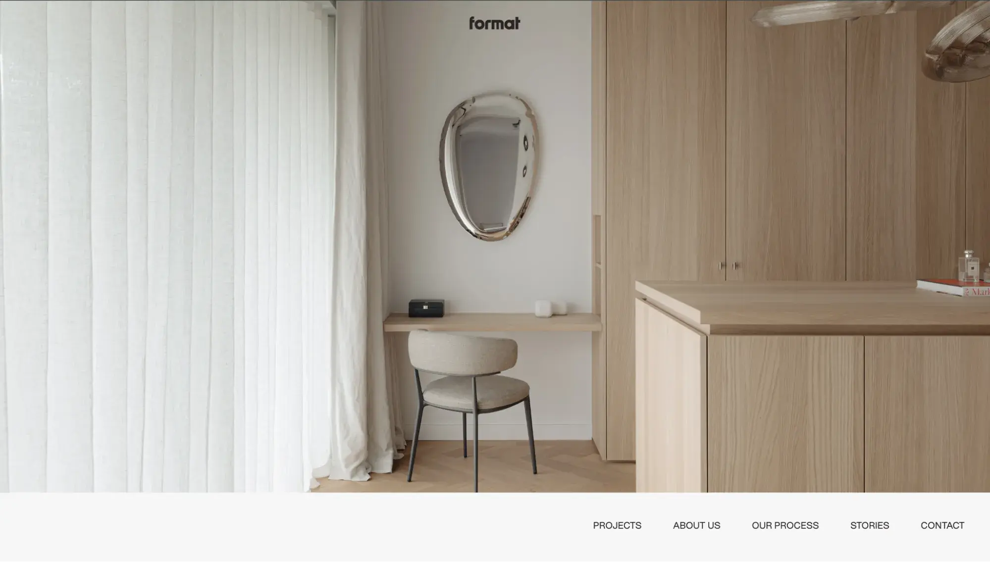
Format Furniture knows about custom-made furniture and crushes it in website design. This first screen grabs your attention with an airy photo from the company’s portfolio and minimal text.
What I like:
The website's overall look and feel are minimalist, aesthetic, and professional. The white background gives the website an open and bright feel, while the high-quality images of furniture products add a touch of elegance and luxury.
2. Case Furniture

In short, the website design of Case Furniture is stunning. The elegant typography and luxurious and high-quality images of furniture products all over the website create an exclusive and refined atmosphere.
What I like:
The grid layout below the fold consists only of product images with very sparse copy, which lets the furniture’s aesthetic really shine.
3. Robinson Furniture
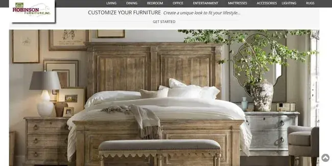
Royalty and luxury paired with modernism and rustic flair. This website conveys all these qualities thanks to outstanding furniture pictures and sophisticated italic typography.
What I like:
Like Case Furniture, this site also emphasizes imagery — a tried and tested tactic for furniture websites. For a better browsing experience, the site uses smooth animation for changing hero images.
4. Justice Furniture
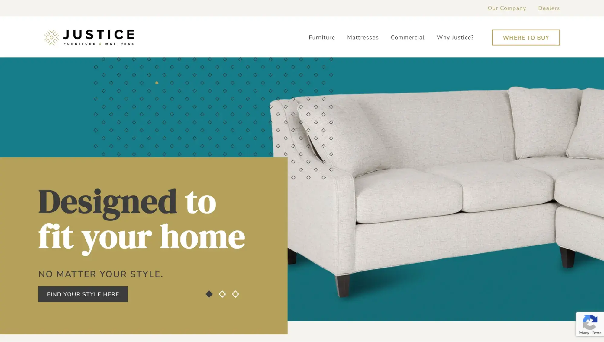
Justice Furniture is about minimalism, a clean layout, and a brilliant color scheme in muted hues of aquamarine, mustard, and burgundy paired with royal ivory and white.
For a seamless user experience, the site uses a transition effect and zoom-in animation when hovering over product categories.
What I like:
What stands out to me is the drop-down menu. Justice uses this space not only to list categories but also to showcase furniture collections. A pretty smart decision that doesn’t feel intrusive.
5. Garado
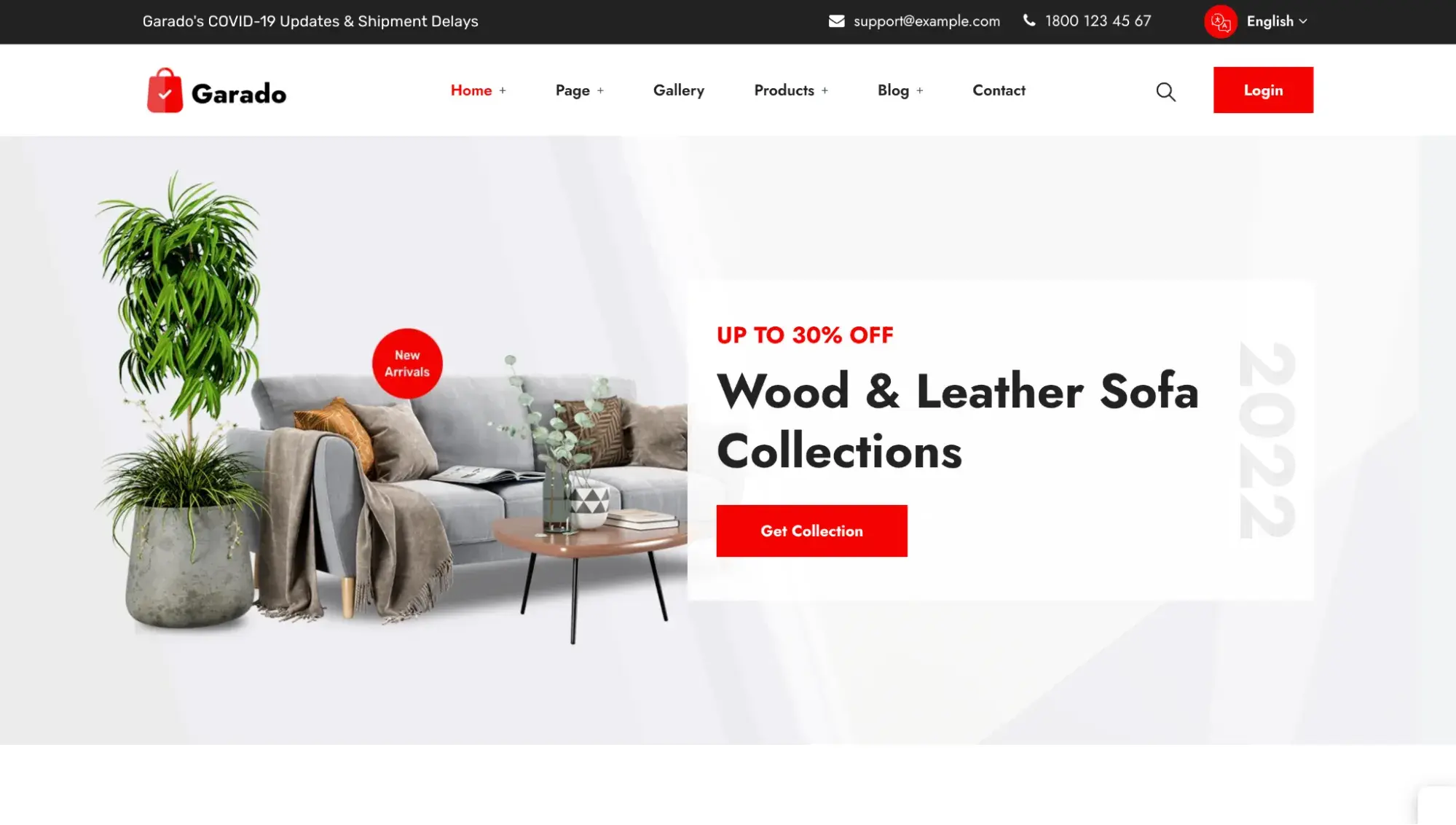
Garado is actually a free theme (a premade website template) made specifically for furniture ecommerce websites. On top of that, it integrates with leading CRM HubSpot so you can easily build relationships with and market to customers.
What I like:
With ample white space, prominent call-to-action buttons, and detailed product pages, Garado is an ideal choice for furniture websites.
Pro tip: If you’re not a web designer or developer, you can build a furniture website without knowing how to code, thanks to website builders and themes. These offer premade templates that you can customize with a few clicks in a drag-and-drop editor.
6. At The Helm
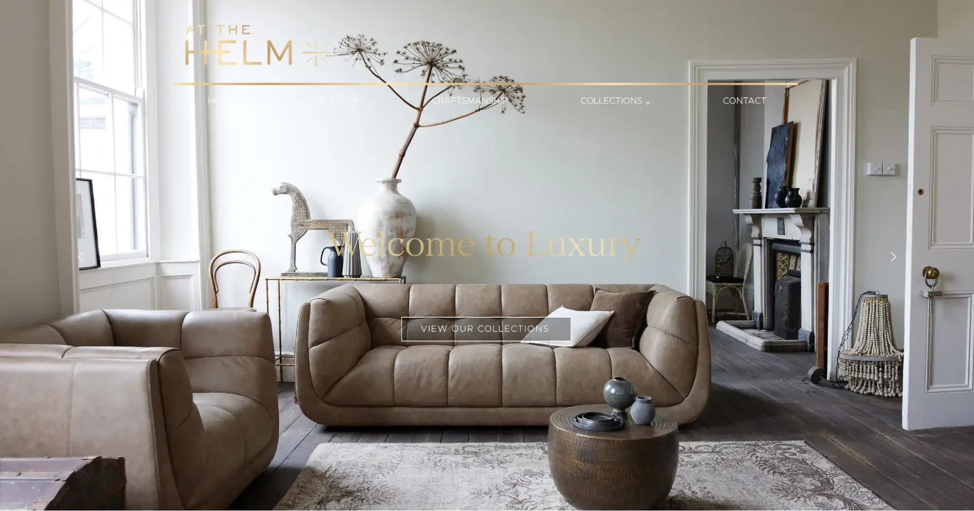
Immerse yourself in the world of Victorian London and its opulence with At The Helm's interactive galleries and captivating hero images.
What I like:
You can visit At The Helm’s showroom from your laptop. To do so, the developers incorporated a 360° online tour.
Through this, I was able to “walk” the showroom floor and even click on image icons to get a slideshow of the pieces. My only regret was not being able to sit on their plush sofas!
7. The Furniture Gallery
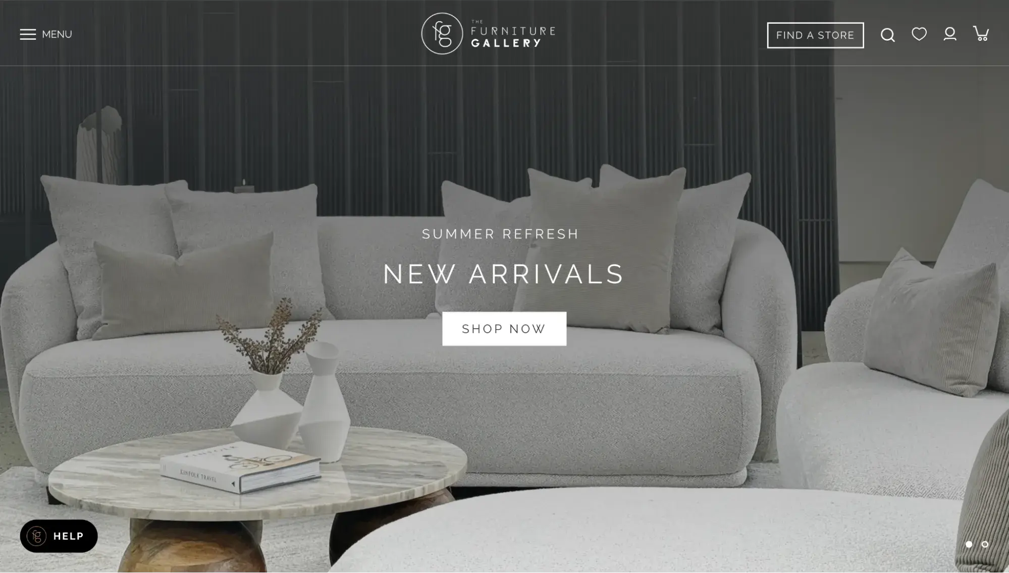
Beautifully designed photography takes center stage on The Furniture Gallery website — from a terrific full-width hero image to neatly organized product listings. To strengthen imagery perception, the website comes in white and light beige colors and has a breathy grid layout.
What I like:
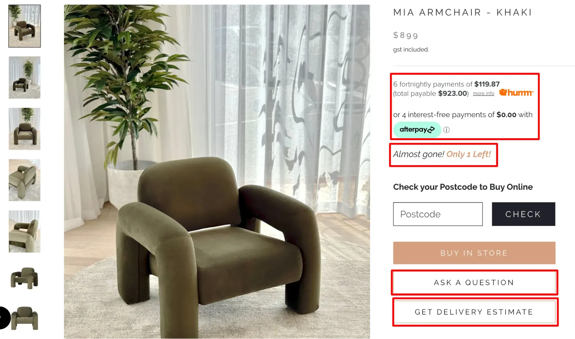
The Furniture Gallery’s product pages are masterfully designed for conversions. Three different elements address potential buyer objections:
- Payment plans for buyers who are price-conscious
- “Ask a question” button for buyers who need more information before making a decision
- “Get delivery estimate” for buyers concerned about when the item will arrive
8. James Richardson Furniture
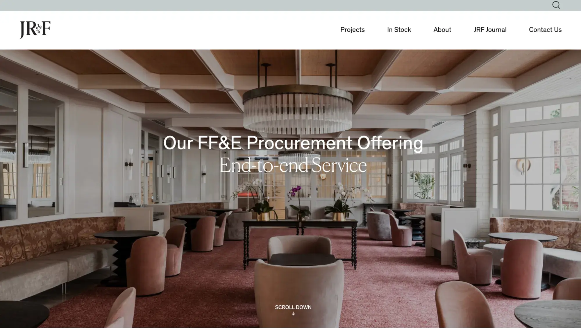
The James Richardson Furniture website focuses on images and touches lightly on copy. This approach ensures that visitors are mainly focused on the beauty of the furniture items.
What I like:
Browse a couple of product pages to see an unusual method to showcase a product from different angles. You'll see a gallery on the right of a product page, while the center is devoted to a product description and an order form. When you click on any image, it takes the center of the screen.
9. Skyline Furniture
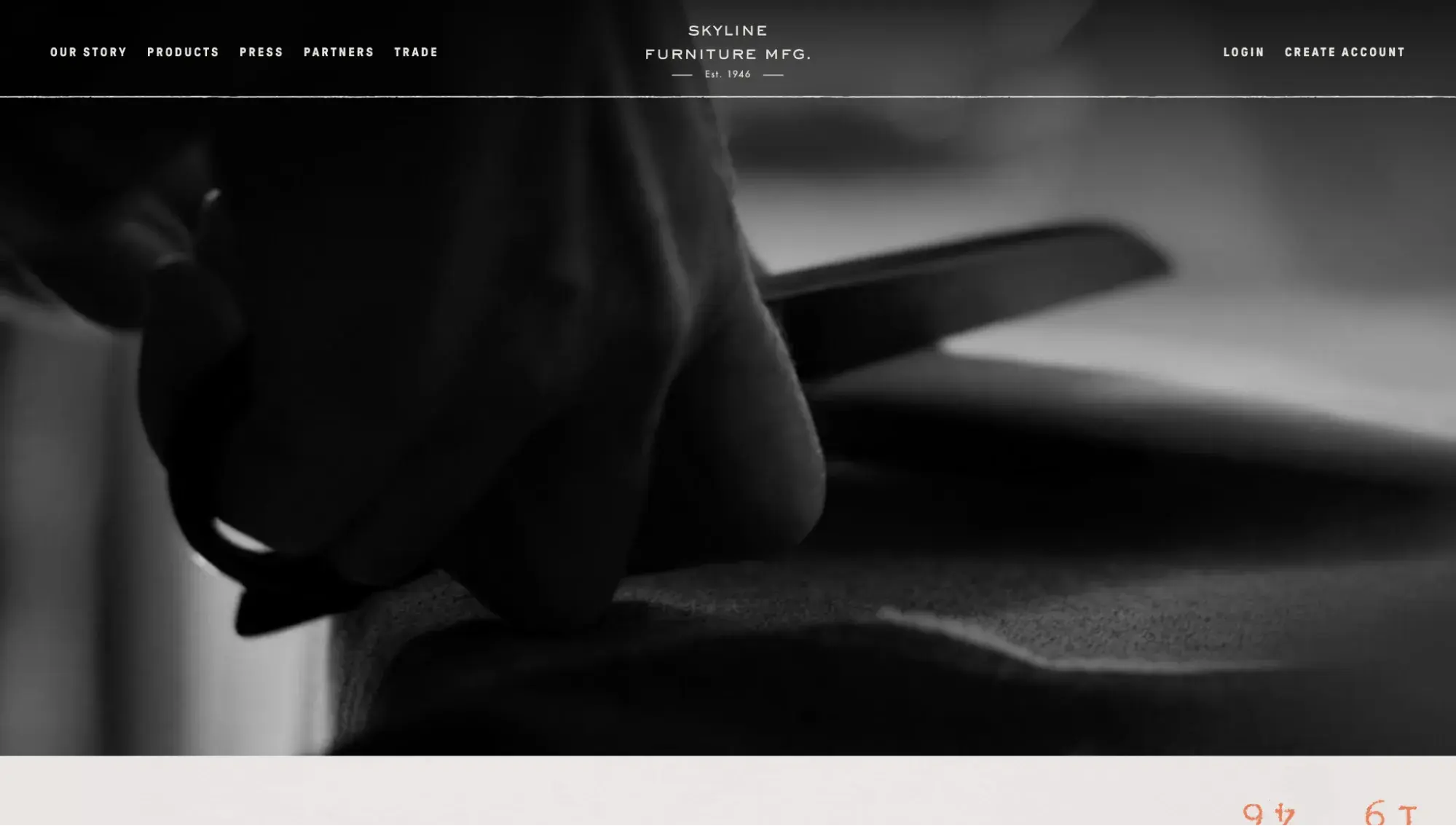
This website highlights its craftsmanship right from the start. I was greeted by a full-screen hero video showing a closeup of a hand cutting fabric, which transitioned to the fabric being run through a sewing machine. This immersed me immediately into the behind-the-scenes of Skyline Furniture’s crafting process.
What I like:
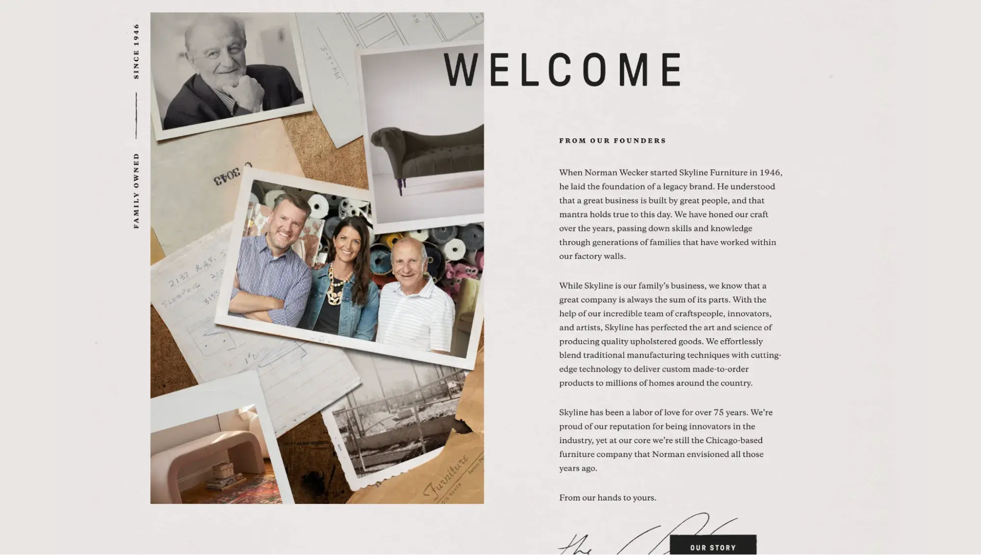
One scroll brought me to the “Our Story” section right on the homepage. This humanized the brand and helped me feel a stronger connection to it.
10. Jardan
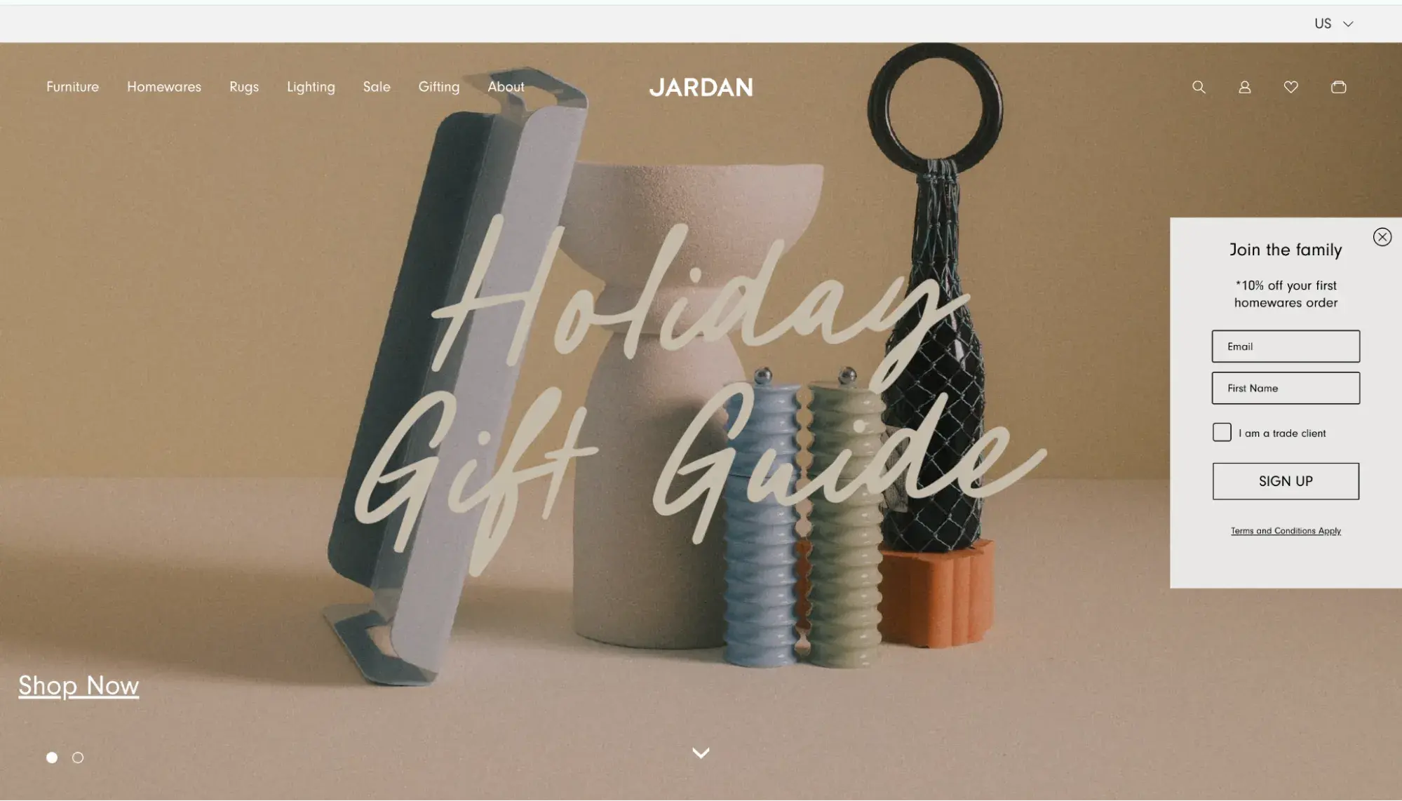
Jardan is a minimalist and sophisticated website at the same time. It uses black lines to separate screens and highlight buttons. It also celebrates space, so customers are not getting distracted from products.
What I like:
I enjoyed the tasteful mix of static images and a video on the homepage. Anytime you can add some motion to a website, it gives the viewer an intriguing break from the norm.
11. USM
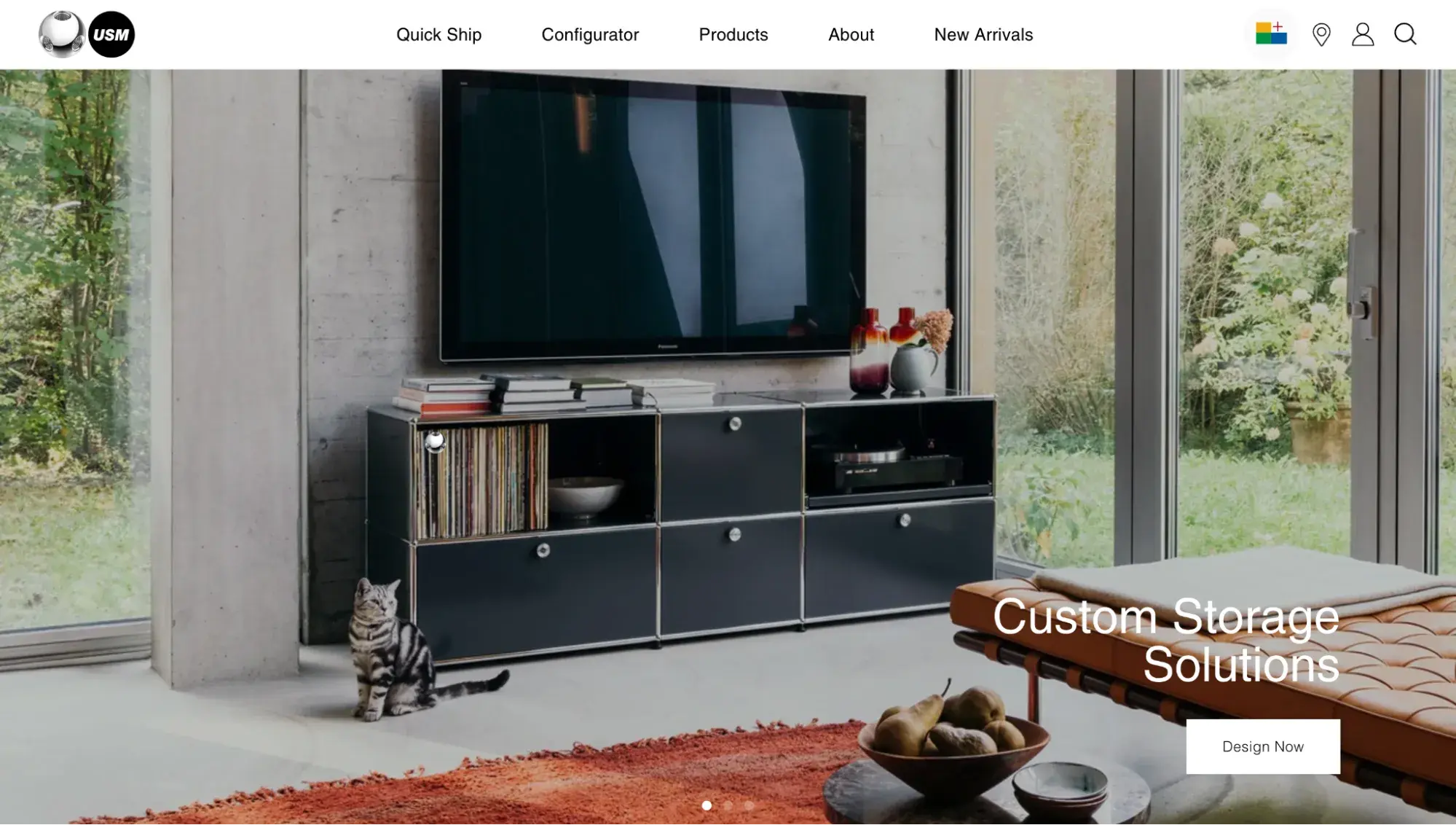
Besides a wonderful home page with stunning photography, USM tops all furniture design websites by providing a 3D experience.
What I like:
The USM configurator uses augmented reality so you can build your own furniture in any form, size, and color in real time.
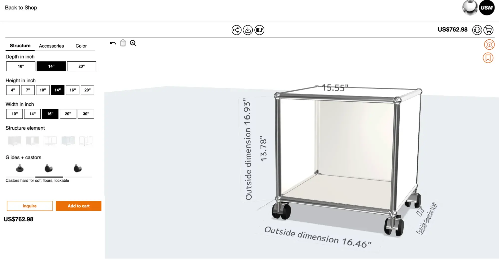
You can also add plants and accessories. Moreover, this feature automatically calculates the final price of the item. Then, click that orange button in the top right corner and try on the furniture in your room!
Pro tip: Want to create an unparalleled customer experience? Augmented reality might be your option.
12. Maglin Site Furniture
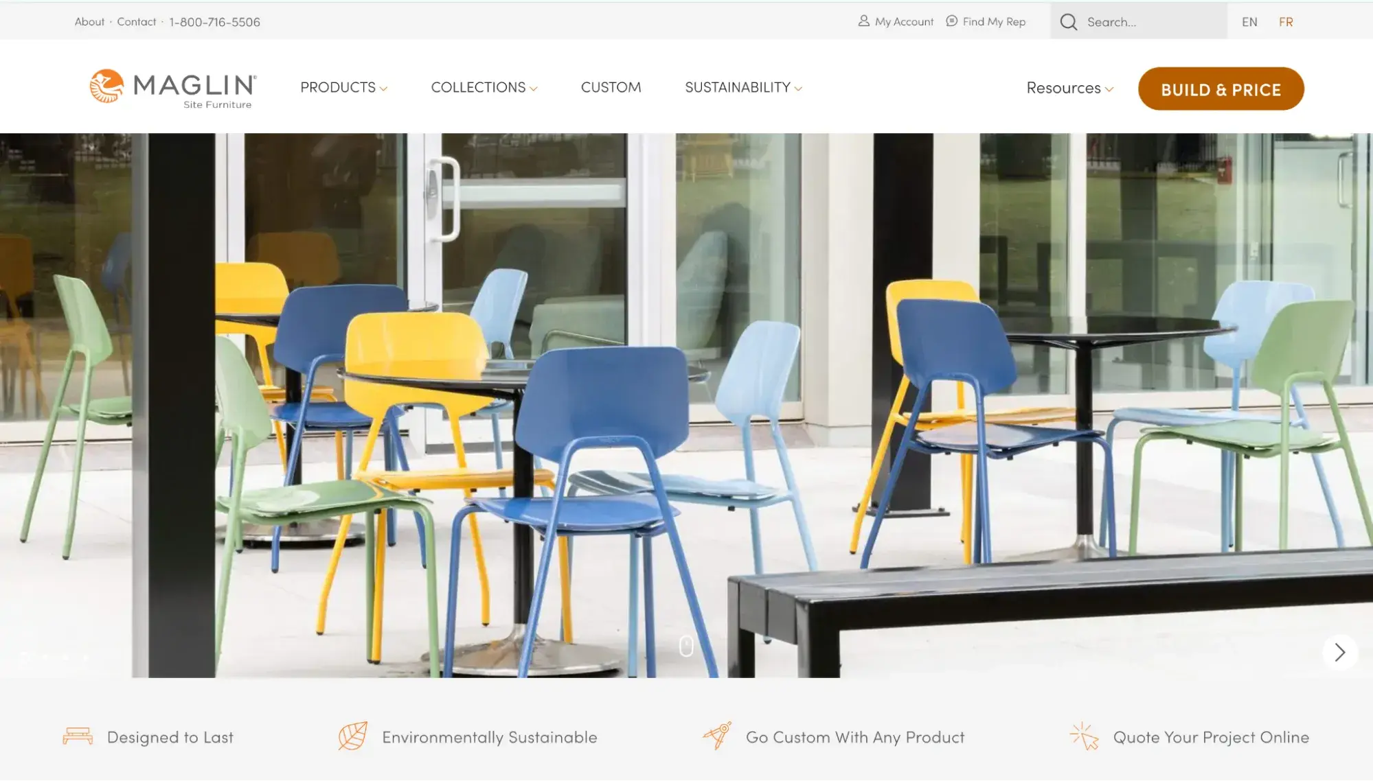
Maglin Site Furniture favors clean, sleek, and modern design with a focus on conversions. For the latter, you can see numerous CTAs spread across the home page and smart copywriting.
What I like:
This example stands out among furniture design websites because of its Maglin Product Builder. The interactive platform allows you to select, build, visualize, and confirm your selected components.
13. Roweam
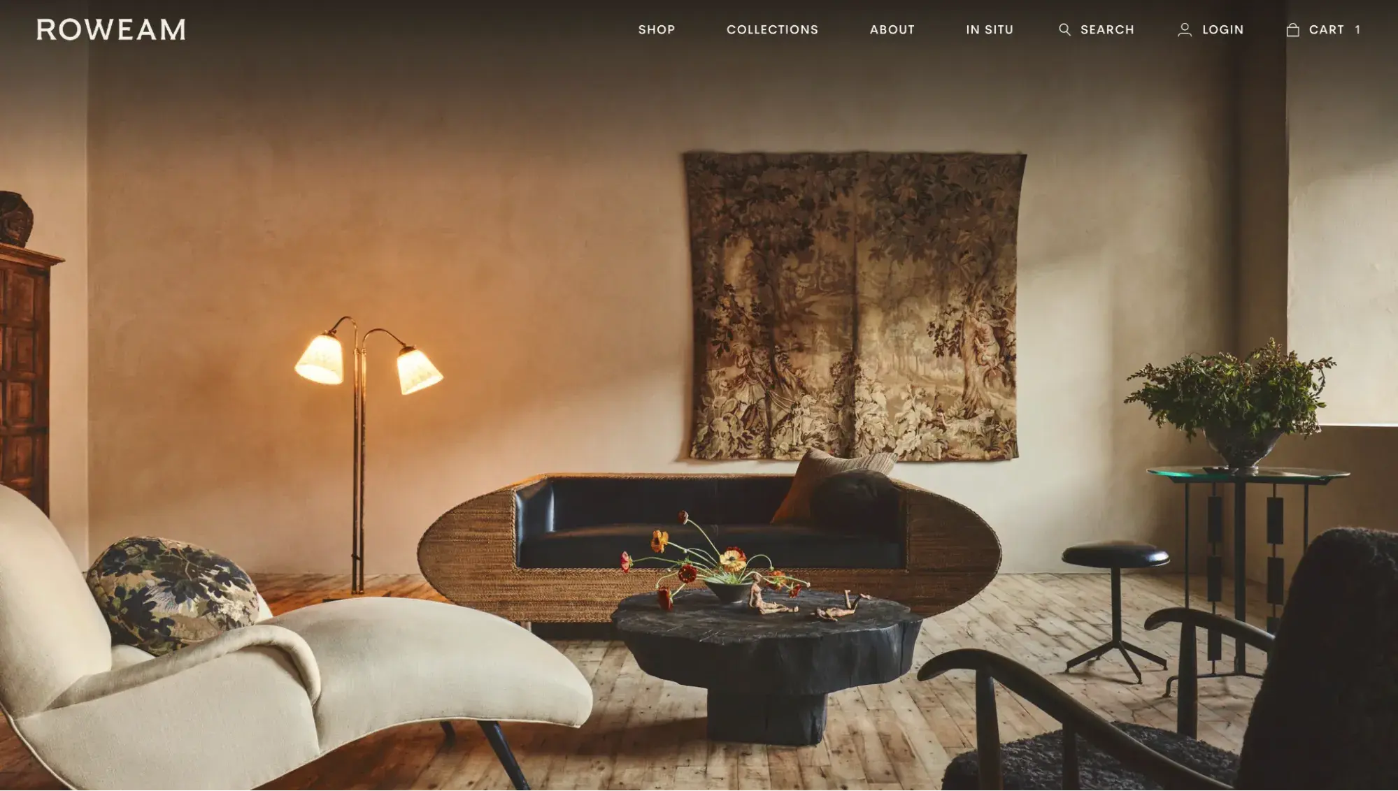
Roweam makes a bold choice with its full-screen hero image and no call to action. However, this allows the visitor to feel immersed in the vintage charm of its pieces.
What I like:
Part of the challenge of furniture ecommerce is shipping. Furniture products tend to be large and heavy, making shipping costly. You want to reduce returns as much as possible.
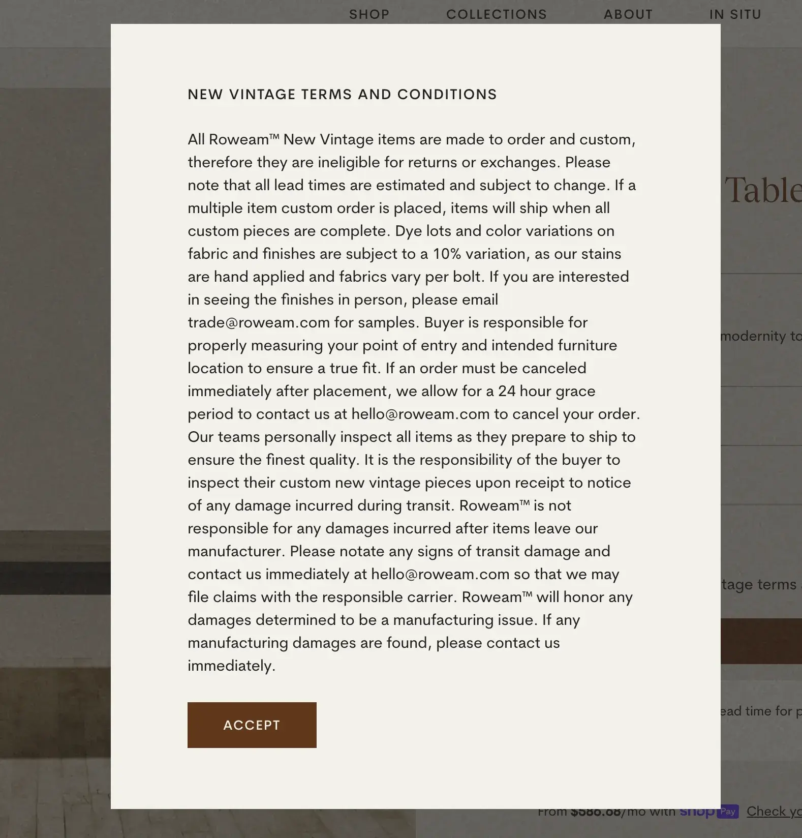
Roweam seems to achieve this by requiring shoppers to check a box that says “I agree to the New Vintage terms and conditions” before they can add the product to their cart.
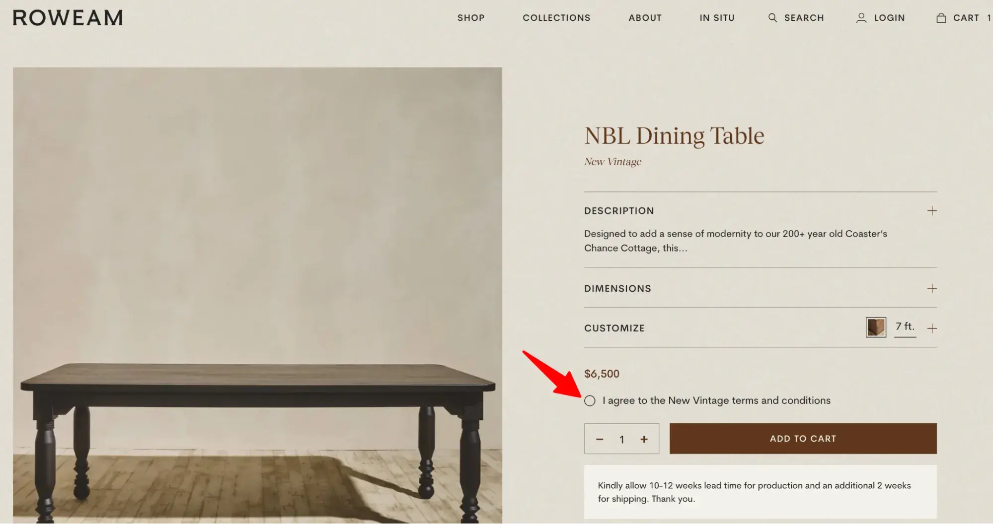
When the user clicks the radio button, they get a popup that explains that the item cannot be returned or exchanged. This helps to manage consumer expectations.
14. Megafurniture
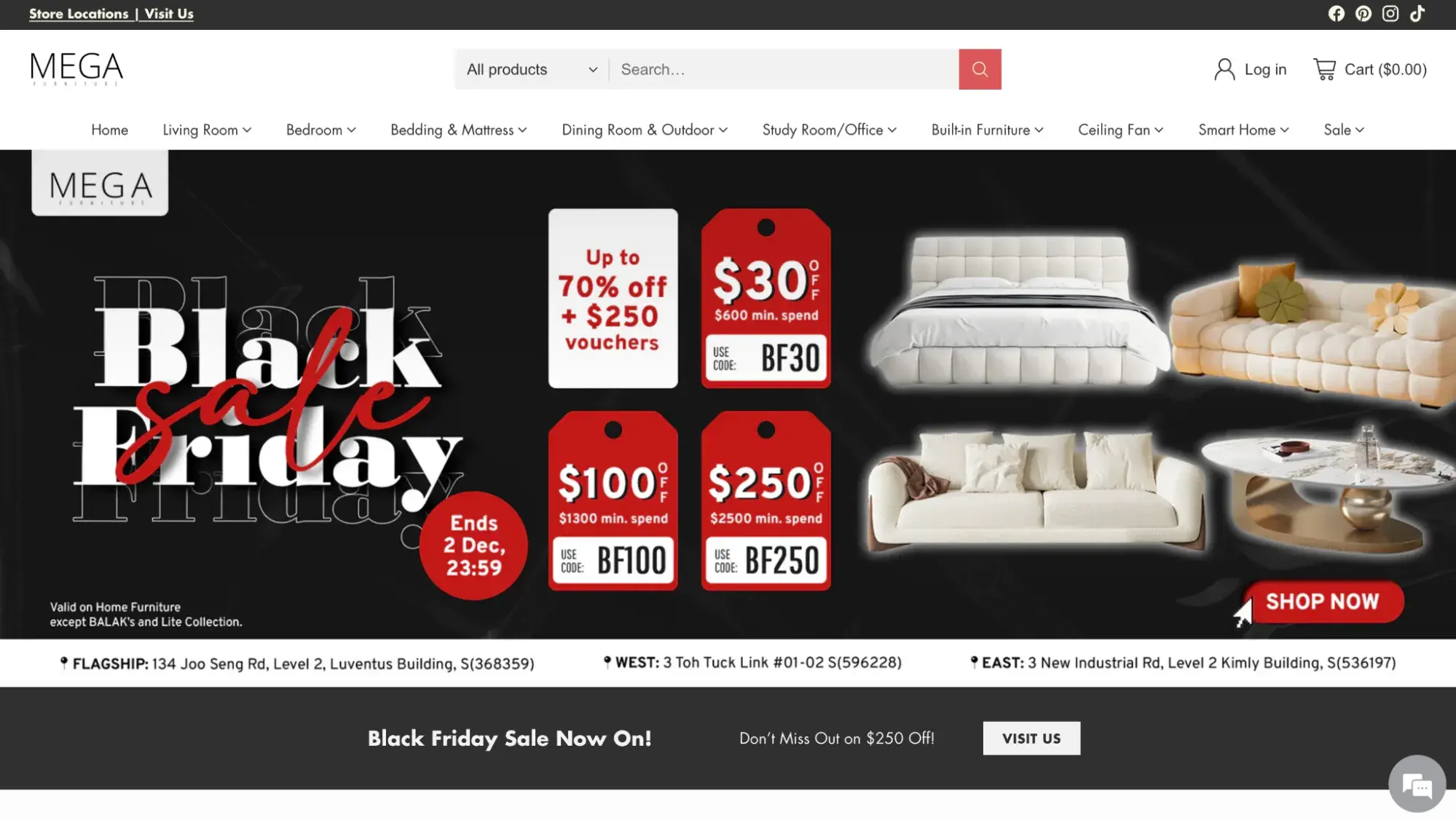
Megafurniture’s website design is created to sell in large quantities. Large hero images shout about discounts, seasonal sales, and sweet deals. Below the fold, you’ll see product categories in a grid layout and big-size product photography.
What I like:
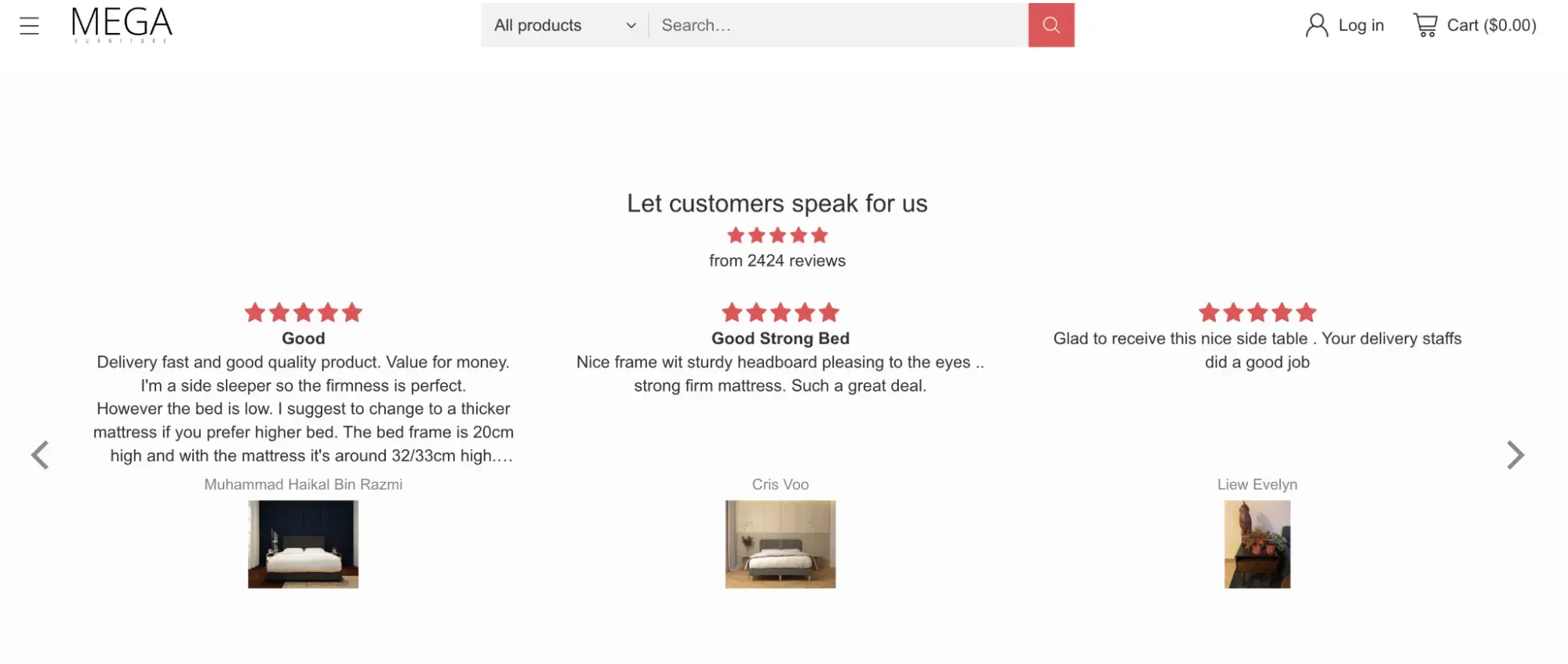
Closer to the footer, you’ll see customer reviews. This adds an extra layer of user engagement and elevates the brand’s credibility.
15. HipVan
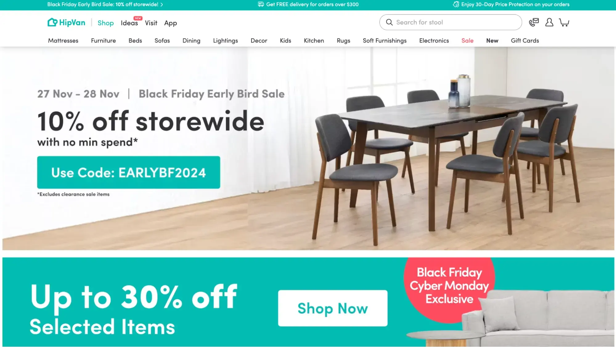
HipVan is another example of a great, fun furniture website. It comes in a white color scheme with turquoise accents.
What’s cool is how HipVan harnesses the power of user-generated content. You can find comments and customer reviews with photos under each.
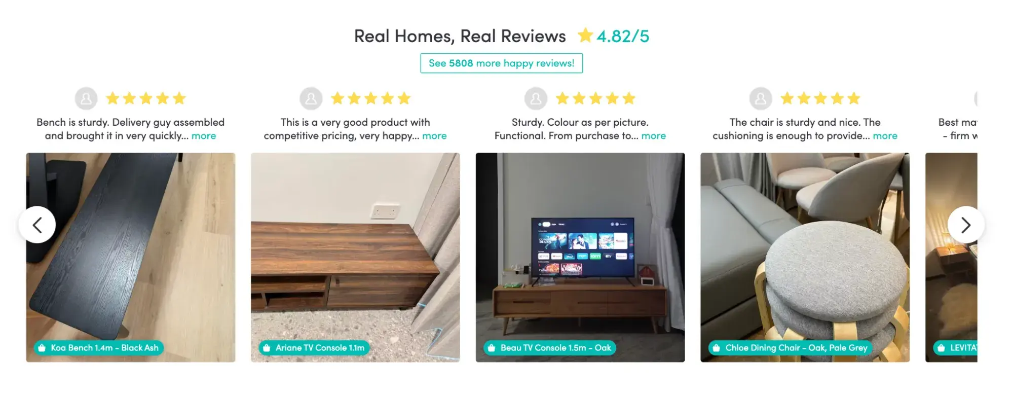
What I like:
HipVan has a 3D size measurer, where you can drag and drop any furniture items and compare them against each other and a human. All dimensions and human height are adjustable.
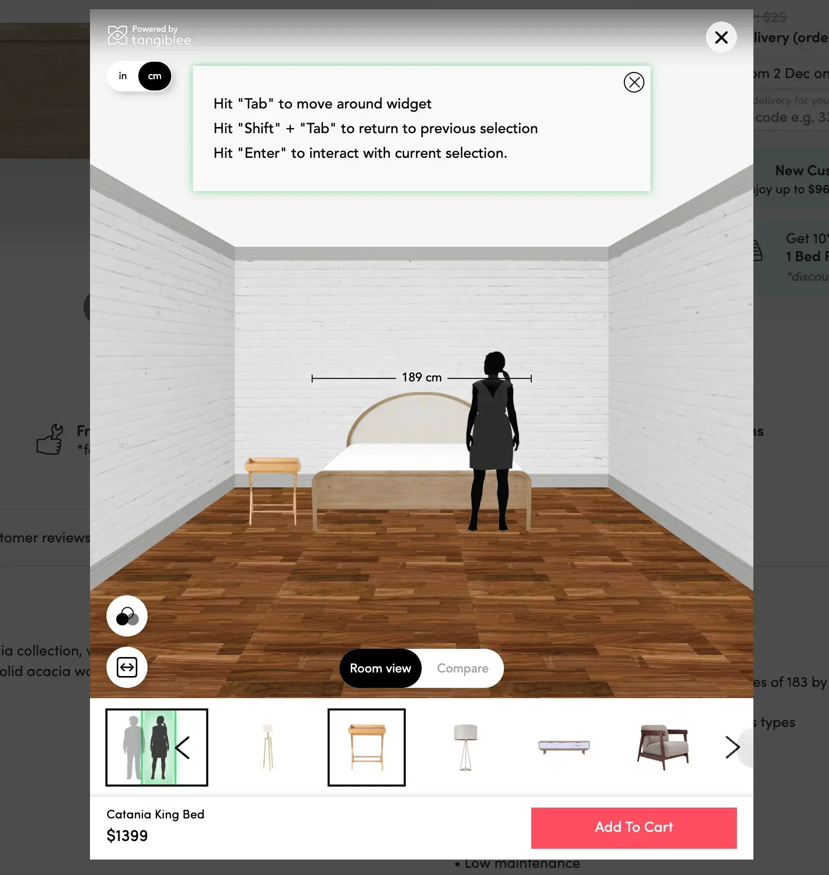
Pro tip: HipVan uses Tangiblee to power its 3D measurer view.
16. abc carpet & home

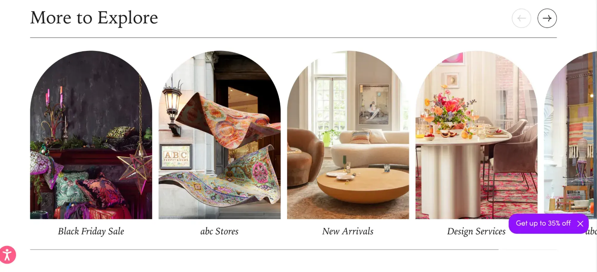
The abc carpet & home website has a unique color scheme: reds, purples, and pinks greet the user, drawing them in.
Secondly, the site features photography of thematic furniture arrangements. As you scroll down, you'll become immersed in the beauty of the home design.
What I like:
abc carpet & home once again breaks from the norm with unique shapes that aren’t just rectangles and circles. I liked these arch-shaped images on the homepage.
17. Furnish Green
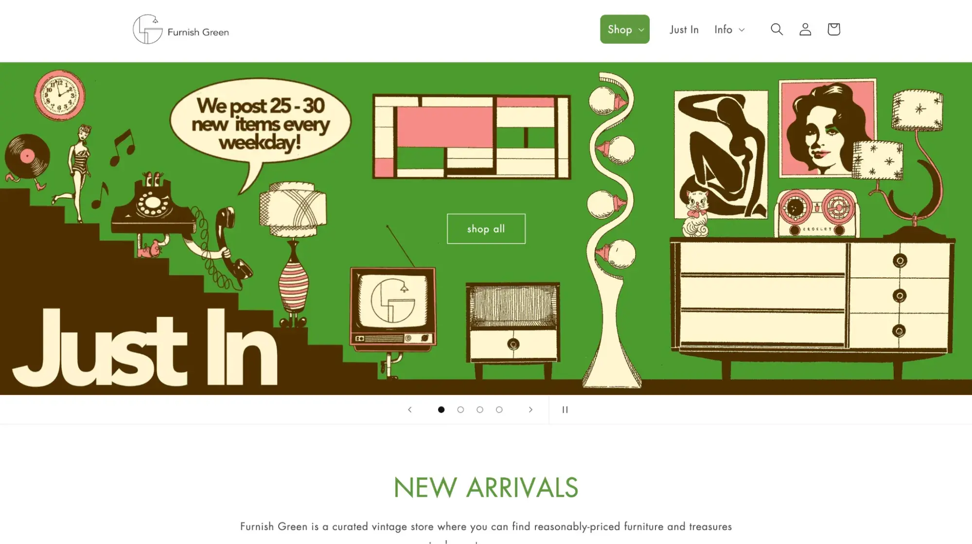
Retro and fun, Furnish Green stays true to its name with a green color palette.
What I like:
Staying true to the vintage feel, the Furnish Green team has quirky profile photos that help humanize the brand.

18. West Elm
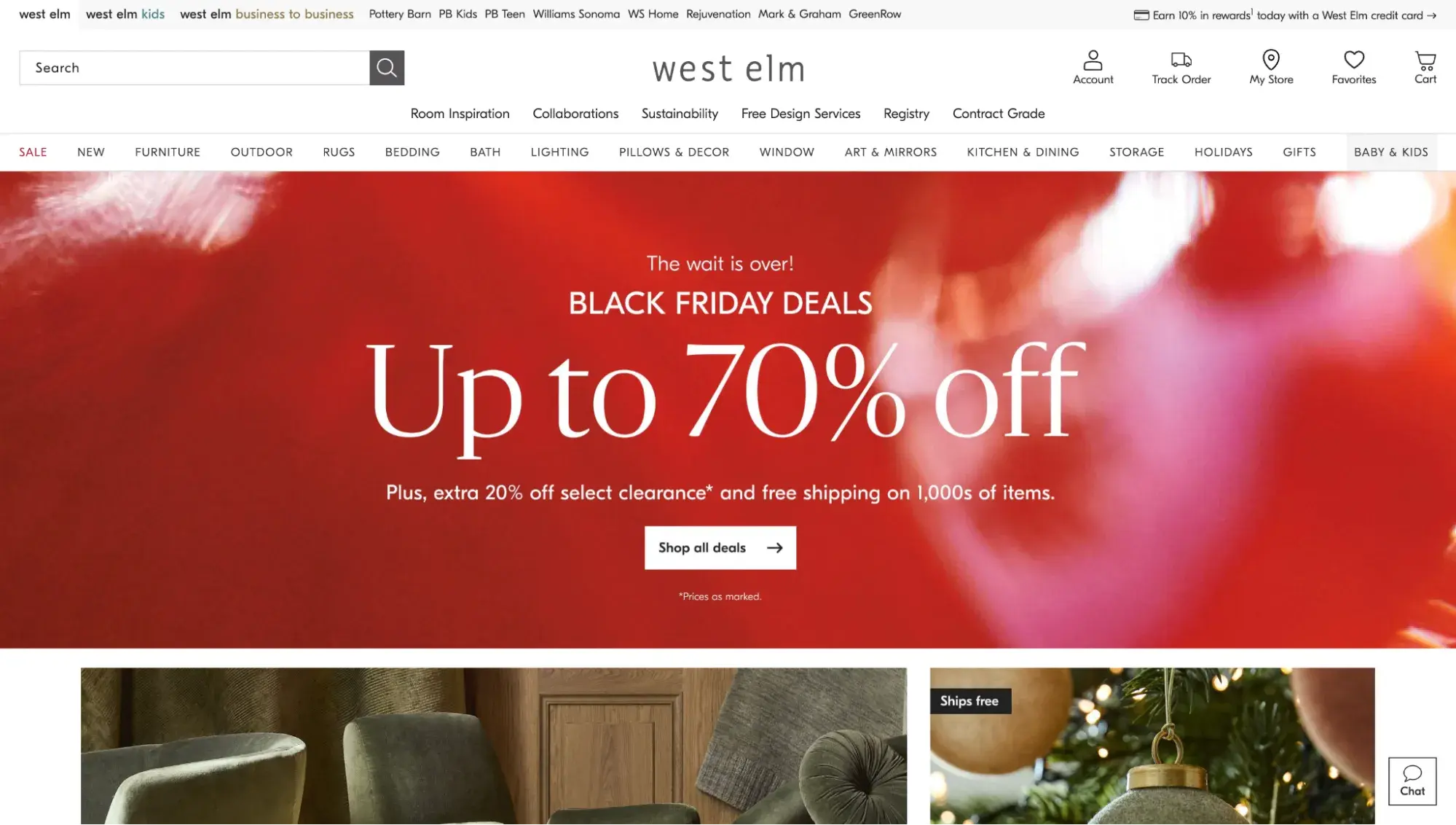
Among furniture design websites, West Elm’s home page is one of the most fantastic out there. The layout consists of gorgeous photos of furniture arrangements and fantastically decorated rooms. It’s hard to resist this beauty and leave empty-handed.
What I love:
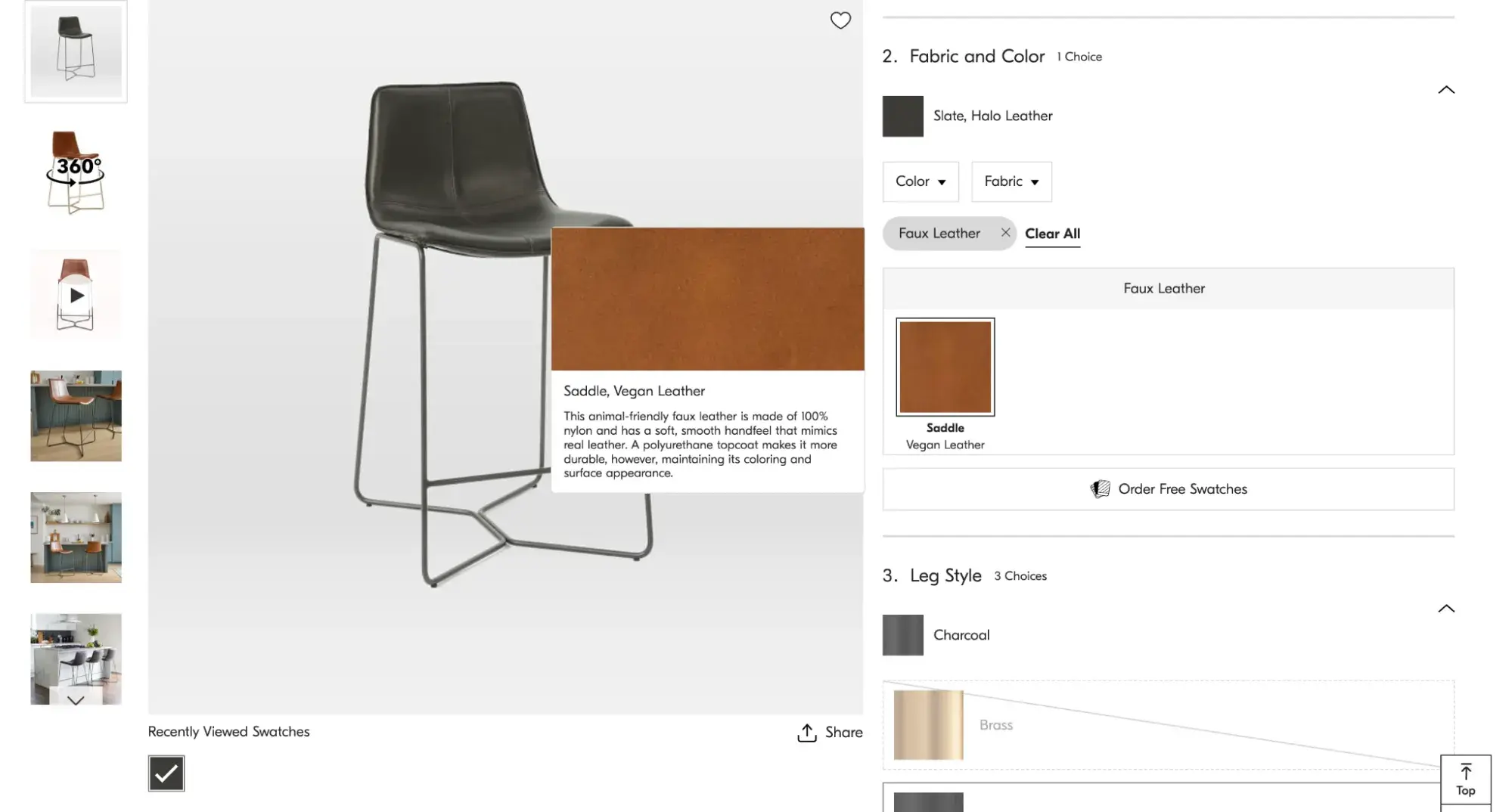
West Elm’s website guarantees an unsurpassed user experience. It’s easy to navigate and has the most descriptive product pages with a built-in product builder, where you can apply different colors, dimensions, and textures to your furniture.
19. Wayfair
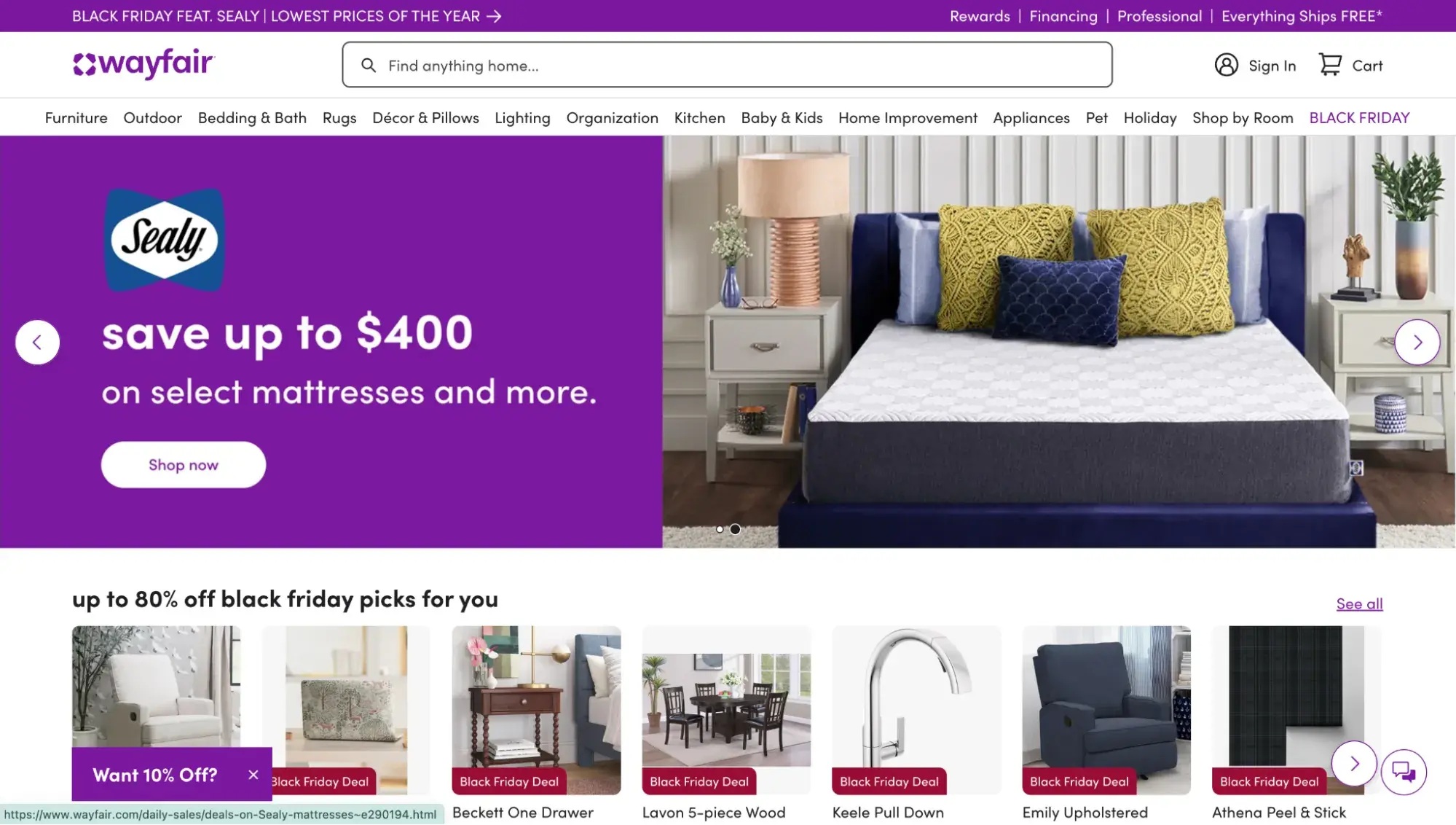
Looking for fresh ideas to drive more sales? Then, how do you like Wayfair’s home page? The first screen highlights its Black Friday deals. Discounts are popping out everywhere!
What I like:
In contrast to a colorful and animated first screen, the rest of the site has a minimal and clean design with a white background. It’s a nice way to balance out the boldness of the homepage.
20. Grandin Road

Grandin Road’s website is an ideal reference for small and medium furniture businesses looking for a simple but glorious design. It combines airy white blocks with picturesque product images to highlight products and leave an elegant flair.
What I like:
Having the search bar centered at the top of the website really helps the user experience. Anyone who knows exactly what they want doesn’t have to dig around. They can simply pop their terms in the search bar and be on their way.
21. Pottery Barn
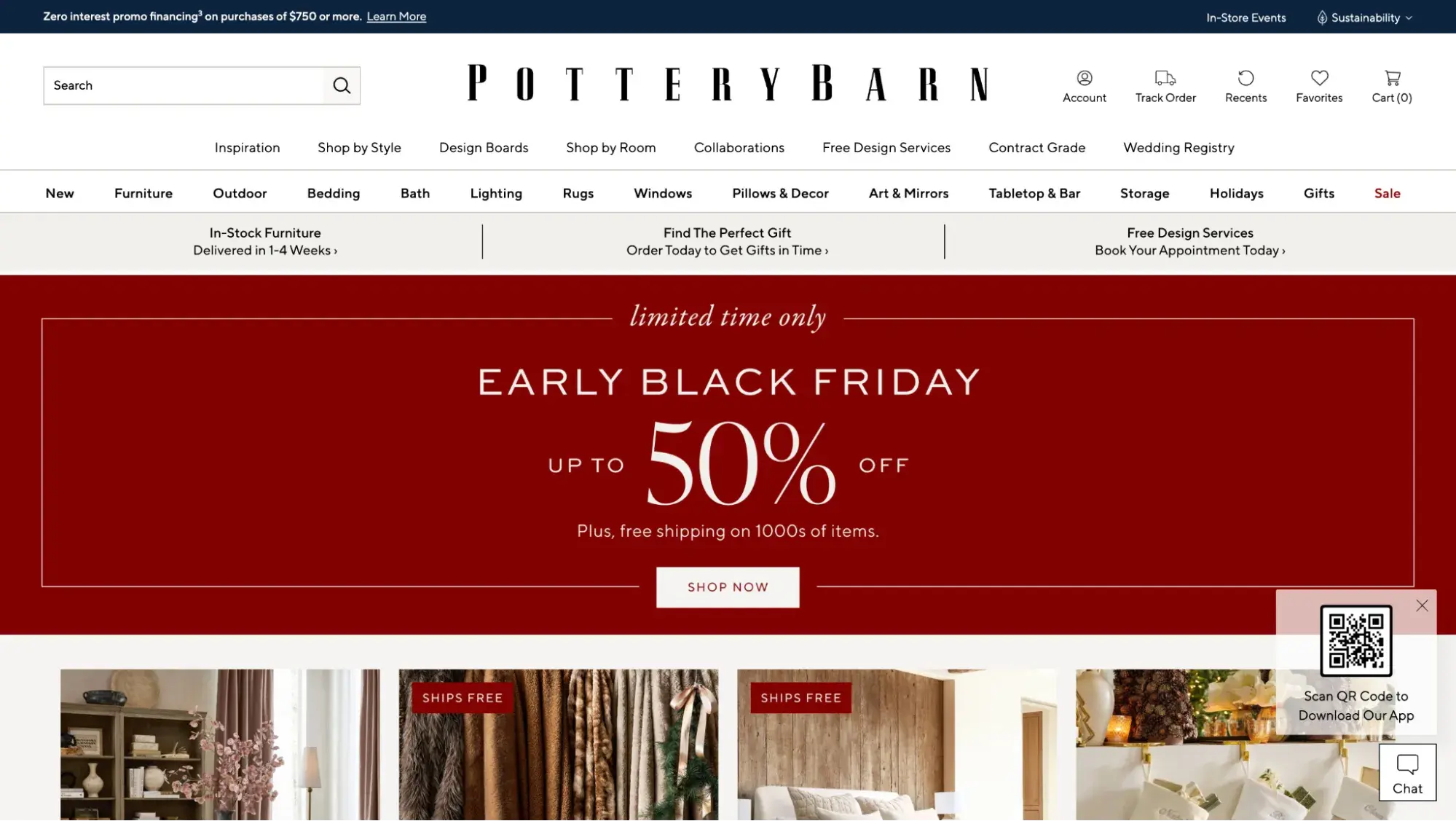
Pottery Barn's website design is a perfect blend of simplicity and elegance. The entire homepage feels like a big art gallery with only images.
In turn, the product pages are well-organized, with high-quality images that show off every detail of the item. The descriptions are informative and provide all the necessary information about the product, from dimensions to materials used.
What I like:
I enjoyed the #MyPotteryBarn section on its product pages. It shows how real-life customers are styling that product.

Pro tip: If you use lots of images on your furniture website, make sure you optimize your images so your site loads quickly.
22. Feather Furniture
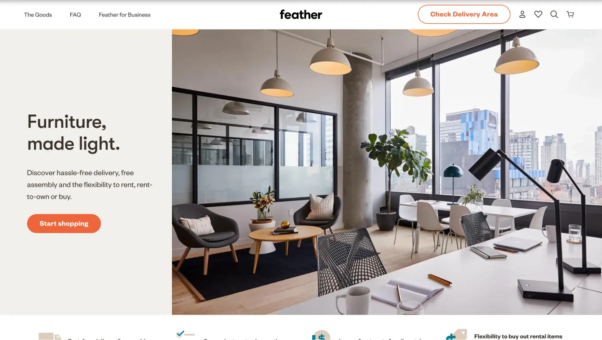
Stylish and modern, this website design combines contemporary with bright, dynamic colors. It has an identity and is a great example for furniture companies that drive sales through the owners’ personal brands.
Regarding user experience, Feather is good at generating product recommendations to complete the look.
What I like:
Feather inserts super-quality product photos in high resolution, so you can get a feel for the furniture even if you can’t actually touch it.
23. Parkman Woodworks
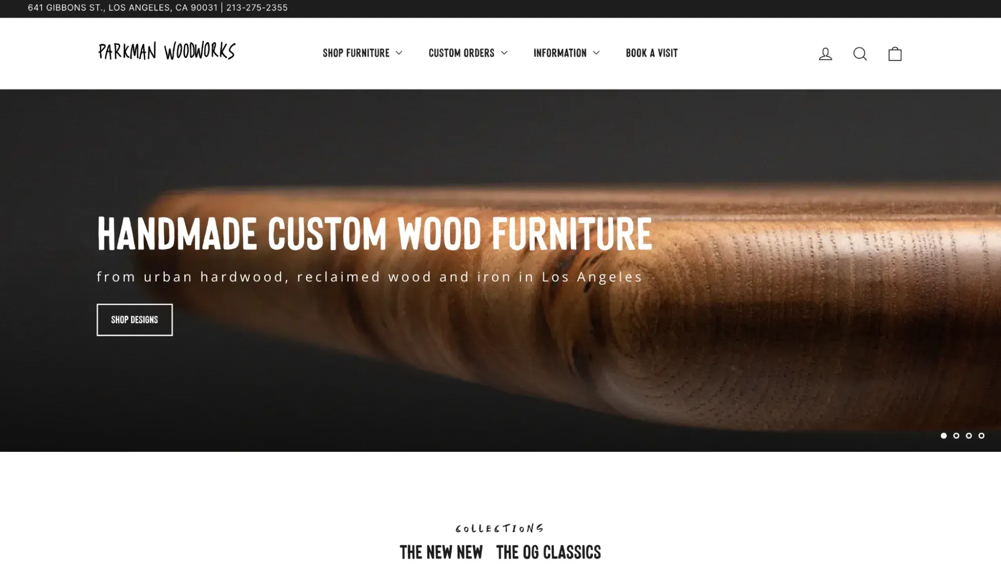
Are you planning to open your own custom furniture shop? Get inspiration from Parkman Woodworks! The site is simple and puts product images in the spotlight. Every screen is an acquaintance with Parkman’s ideology and furniture makers.
What I like:
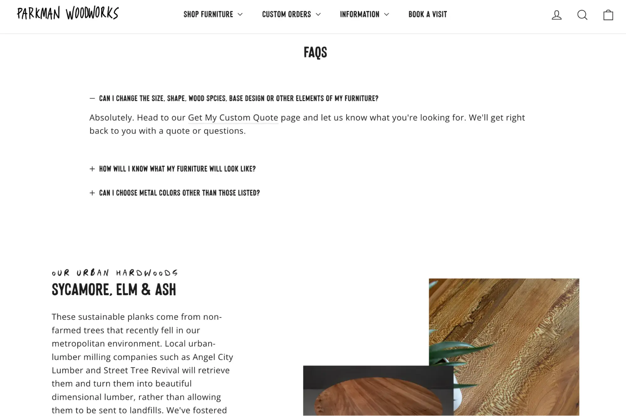
I’m a huge fan of Parkman Woodworks’ unique typography. The fonts used on the website have a handwritten feel, which complements its handcrafted products.
24. Croft House
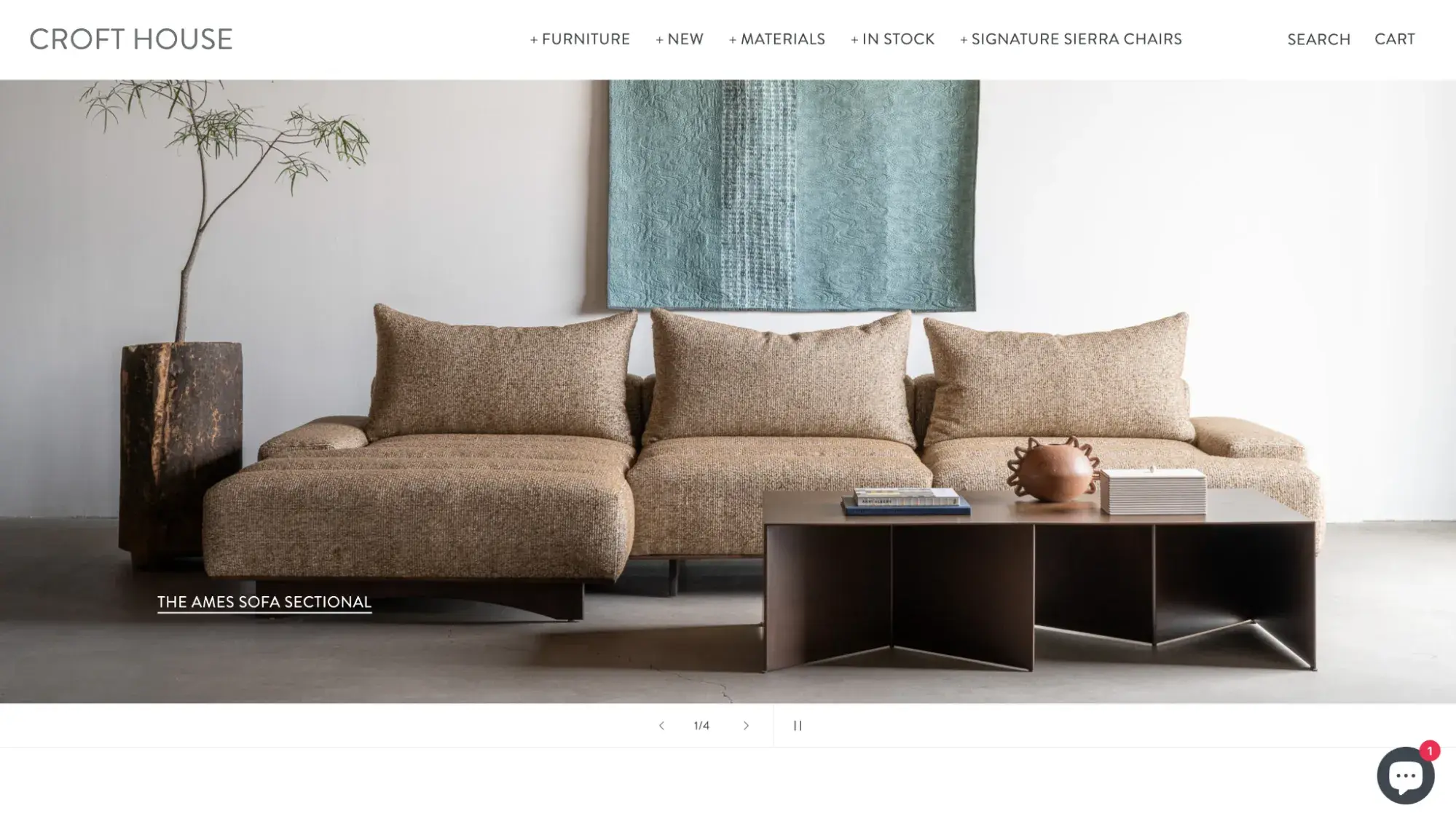
Elegance, aesthetic, and space are a winning combination for creating a modern furniture website design for a small- to medium-sized company. What stands out is that Croft House creates an entire gallery for each product to entice customers and drive sales.
What I like:
With such a huge focus on imagery, there’s no need for super-innovative technologies. Croft House keeps it clean and simple, which is part of its allure.
25. Angel City Woodshop
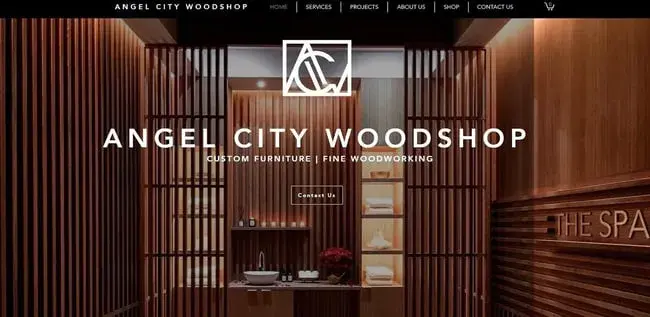
Angel City Woodshop was a great example of a custom luxury furniture website that celebrates craftsmanship and attention to detail. The bold hero image and parallax scrolling made a splash.
What I like:
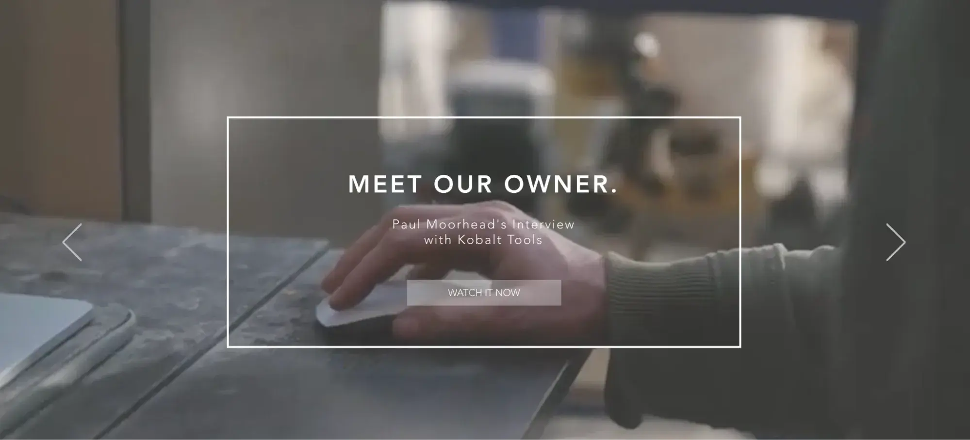
The “Meet Our Owner” section on the homepage was a nice touch to give the brand more depth and meaning.
26. CBD Glass

Meet CBD Glass for more inspiration for custom luxury furniture websites. Like Angel City Woodshop, this site uses a dark color palette of black, dark wood, and gold colors. It also has a tiny bit of animation to add intrigue.
What I like:
The hero image is a full-width slider of CBD Glass’s projects. Below, you’ll find several blocks that describe the company’s specialization and a handful of customer reviews.
27. Glassisimo
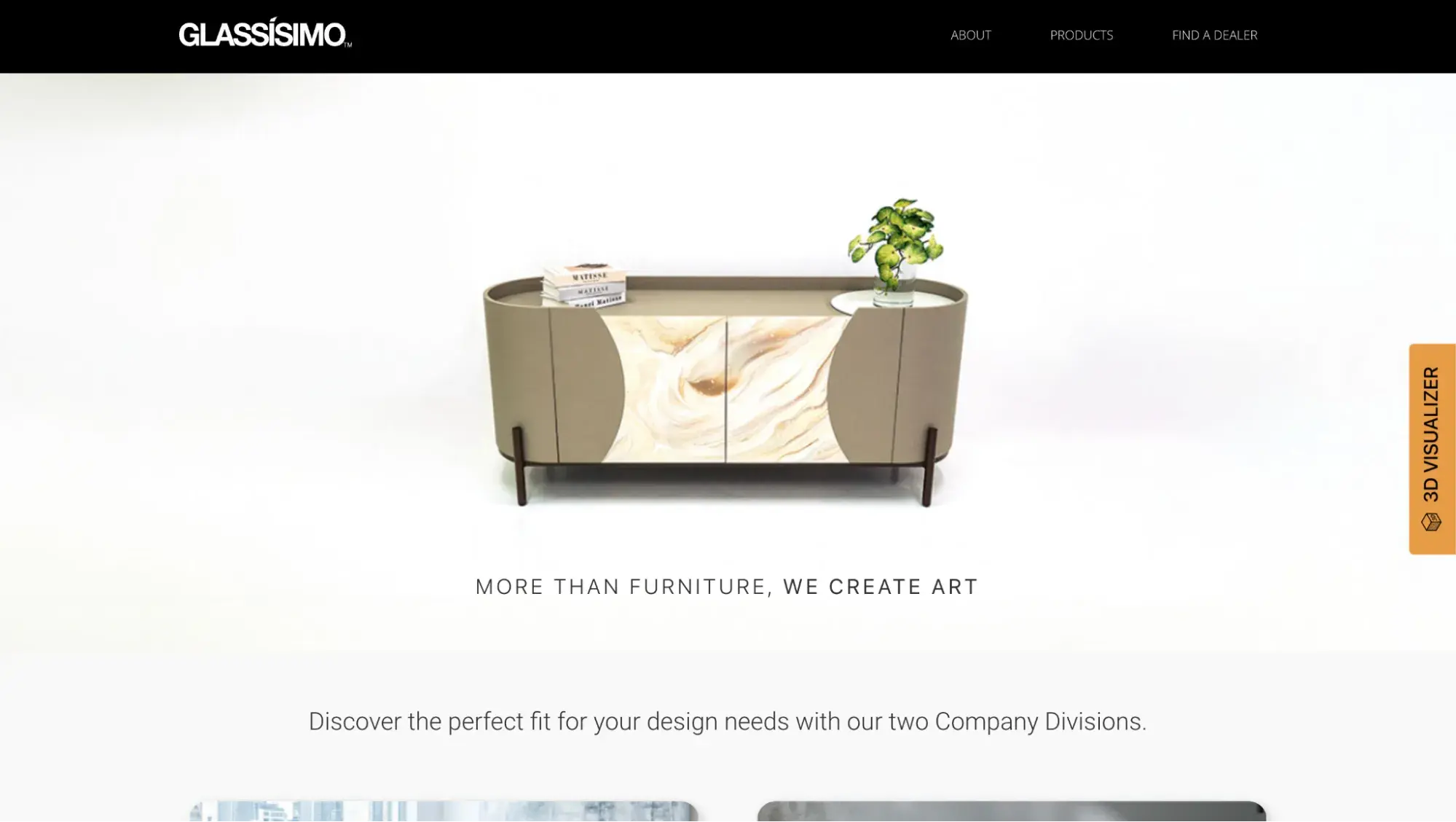
This is the last example of a luxury, custom furniture website design. Glassisimo is glamorous and uses whitespace wisely, making its unique piece front and center.
What I like:
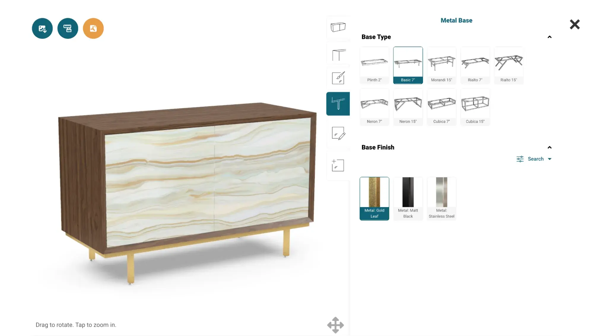
Glassisimo has a 3D Visualizer that lets you build a piece by selecting the model, base finish, and more.
28. Gothic Cabinet Craft
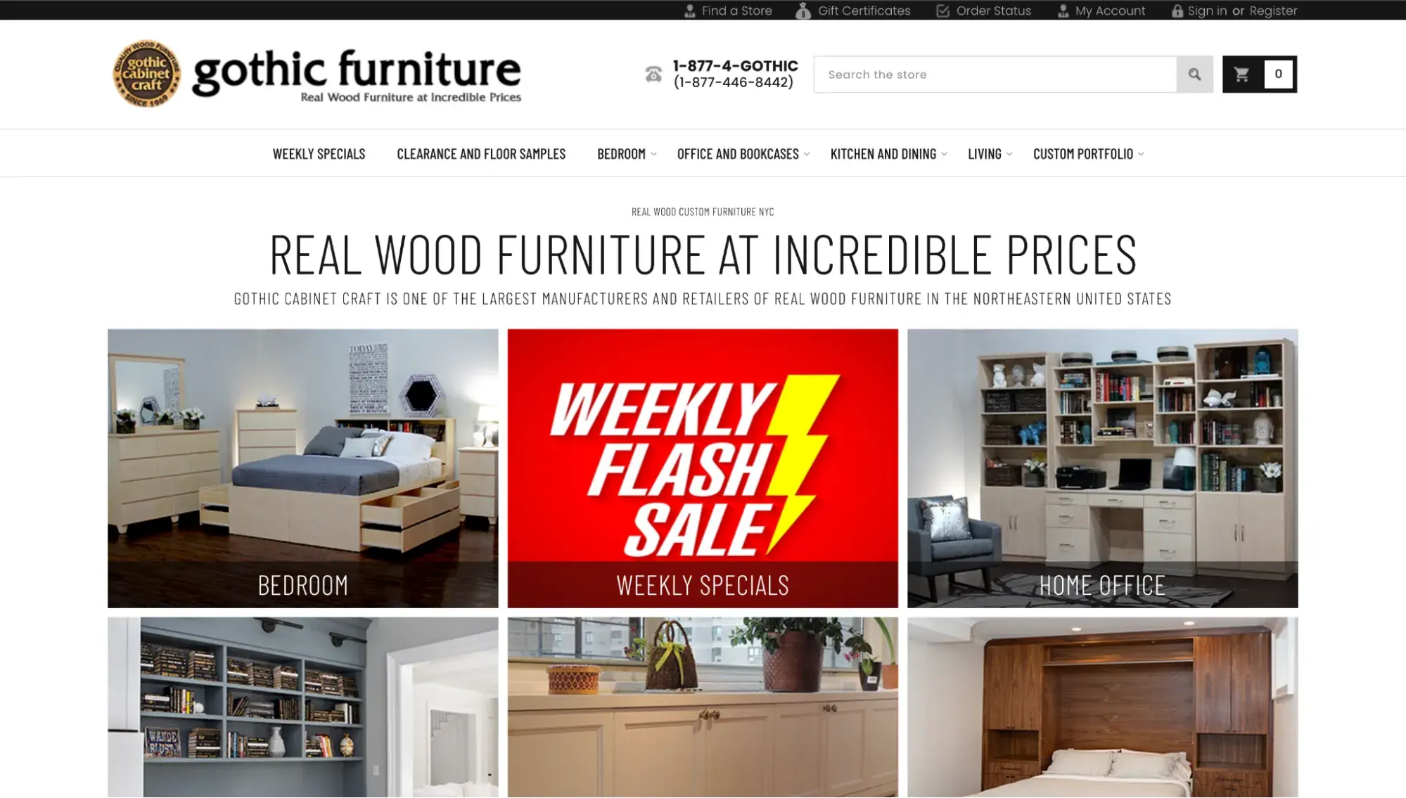
Gothic Cabinet Craft is a simple and elegant website in white and beige colors. It uses a grid layout and offers carefully curated product collections.
What I like:
By using a grid layout above the fold, Gothic Cabinet Craft gives visitors multiple options in one glance.
29. New York Heartwoods

The website design for New York Heartwoods is simple yet elegant, focusing on sustainable wood products. The imagery and ivory background create a welcoming atmosphere that complements the company's mission to promote sustainable forestry.
What I like:
Many of the product pages tell a unique story about each product and showcase them in the context of home decor. This helps customers to “see and feel” products as if they were already delivered and assembled in their homes.
30. Classic Sofa
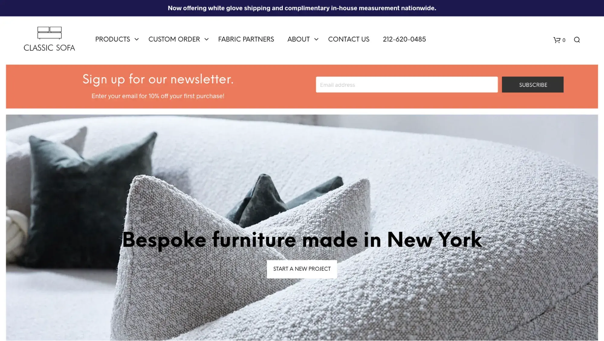
While the hero image looks good, what really captures your attention is the full-width email newsletter banner. What a great way to capture leads right away!
What I like:
Overall, the site is user-friendly, cozy, and welcoming, thanks to minimalist design, white space, pastel colors, and beautiful imagery.
How to Design a Furniture Website
I've gathered some essential steps to help you create a visually stunning and user-friendly website.
1. Know your target audience.
Before you begin designing your furniture website, you need to know who your target audience is. Why? It will help you to choose a color scheme that evokes particular emotions in your prospective customers.
For instance, clients who favor exclusive, expensive furniture will likely appeal to a website in the earth, grey, or dark hues like CBD Glass. In contrast, Wayfair attracts people looking for nice furniture on sale.
Consider your target audience's lifestyle, interests, and behaviors to create buyer personas and customize your website design to meet their needs.
Pro tip: Don’t skip the discovery phase! This is the kickoff of every web design project, where you dive deep to understand the problem and the solution you envision. It helps to incorporate user research.
“Website user research takes the people that visit your website and places them in the very center of the design process,” writes Abdul Suleiman, Chief Experience Officer of UX/UI agency UX 4Sight.
2. Create an engaging visual experience.
Furniture is all about aesthetics, so creating an engaging visual experience for your website visitors is essential.
Choose a color palette that reflects your brand and products, and make sure your website's typography is easy to read. Balance your website design by using negative space and intuitively organizing your content.
For instance, the furniture brand Croft House showcases the beauty of its products with stunning, detailed photography.
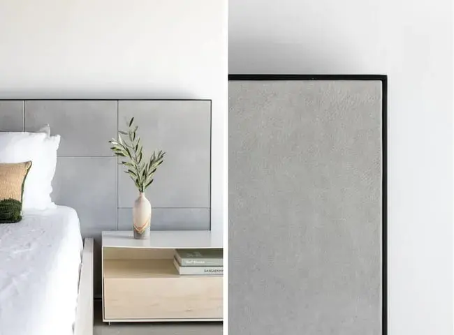
Pro tip: Looking to DIY your furniture photography? It’s best to hire a professional photographer to snap photos of your furniture, but if you’re on a budget, here’s a tip from Brandon Sweet, a professional photographer and furniture maker.
“While it may be tempting to accumulate a range of photography equipment, such as cameras, lenses, and lighting gear, I’ve discovered that the most significant progress is often achieved by starting with just one camera and one lens,” writes Sweet for Fine Woodworking.
Yes, even an iPhone can capture decent photos, though Sweet opts for a camera that lets him adjust the aperture.
3. Lift your sales with 3D commerce.
With 3D commerce, customers can rotate and zoom in on products, view them from different angles, and even see how they would look in their own space through augmented reality (AR) features. This enables customers to make more informed decisions about their purchases.
USM and Maglin Site Furniture utilize 3D technology on their websites to drive more sales. Likewise, luxury furniture company Mitchell Gold + Bob Williams incorporated 3D commerce and saw a whopping 60% growth in sales.
Pro tip: Do a test run with your bestsellers first.
“If you’re in fashion, beauty, or home decor, you’re already well-positioned to integrate AR and VR,” writes Dimitar Dimitrov, a digital transformation consultant. “Start with your core products and see how you can enhance your customers’ shopping experience. Tools like virtual try-ons for fashion or makeup and 3D furniture visualization are great starting points.”
4. Utilize color swatches.
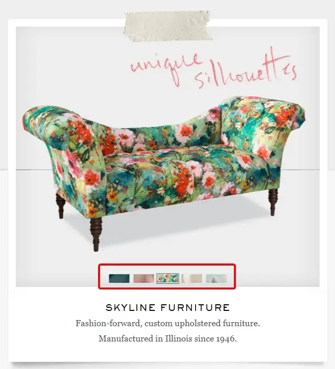
Furniture pieces come in various colors and finishes, so customers need to see what each option looks like before making a purchase. Color swatches allow customers to easily visualize how different colors would look on the product they are interested in.
This feature also saves time for both the customer and the retailer as it reduces the need for physical samples or back-and-forth communication about color choices.
Pictures change according to the chosen color. Take this one step further by giving customers a dynamic representation of each color option.
Pro tip: Make color swatches viewable in a horizontal, scrollable list. Research by Baymard found that 57% of sites don't show all the color swatches, leaving shoppers guessing at what they might look like on the product.
Moreover, the company found that, for the best user experience on a mobile device, brands should display all of the color swatches in a horizontal list that users can scroll through.
Check out Skyline Furniture’s site again and see how they incorporated animated changes in furniture color and texture triggered by clicking on color swatches.
5. Add configuration numbers to the product configurator.
Can customers customize a sofa on your website, like changing textures, size, color, and type of wood? If the answer is yes, then explain to your users what they should click on first, second, etc.
It’s hard to believe, but a simple change like adding configuration numbers (steps) can increase time on the page and orders of custom furniture.
Case Study
The Good, a conversion optimization agency, helped furniture company Knoll increase conversion rates up to 500% by:
- Improving the checkout page design
- Simplifying the navigation menu
- Adding numbers to the steps on their configurator
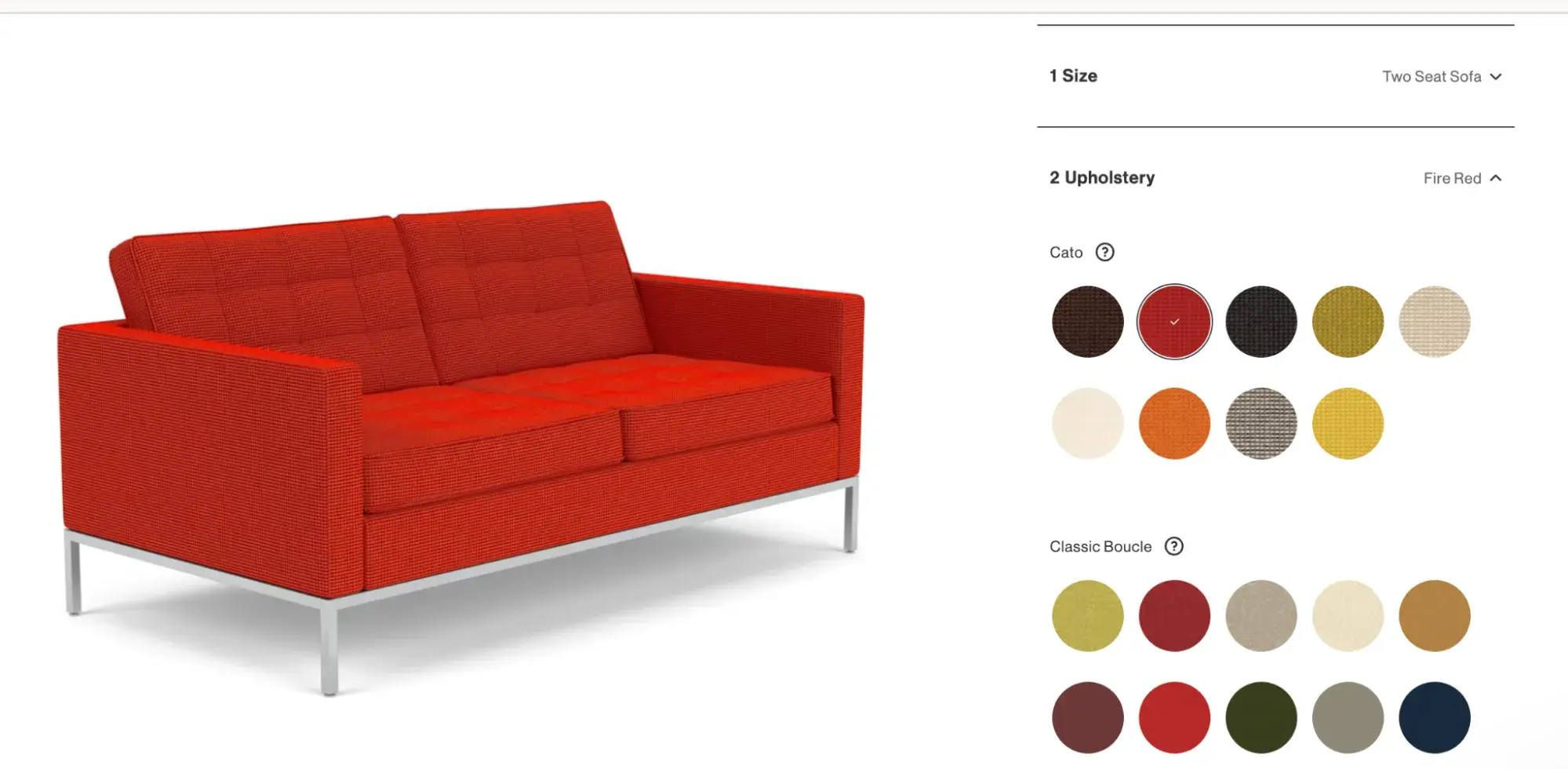
As a result, such minor changes at first glance can lead to a striking lift in conversions and sales.
6. Use a website builder.
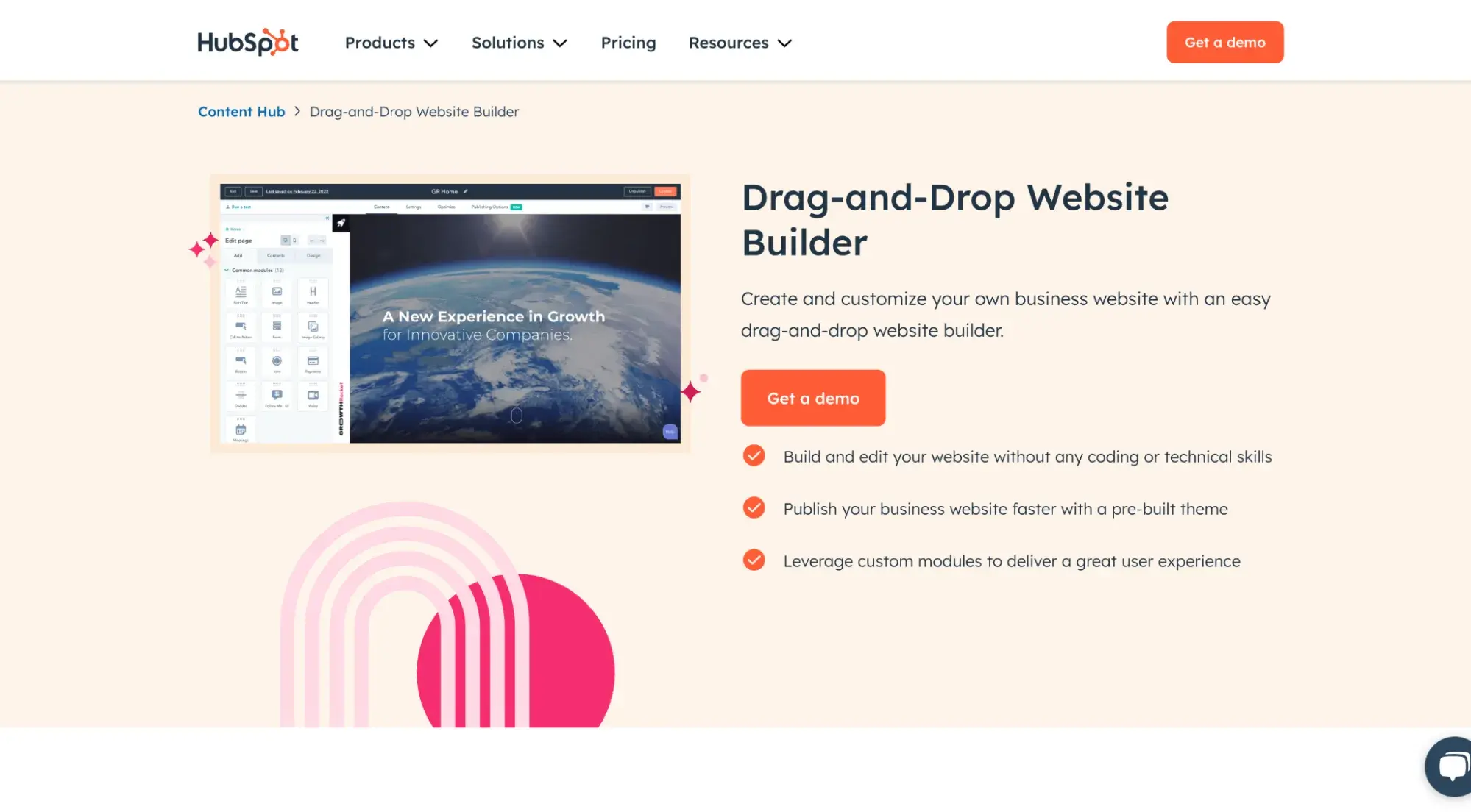
Launching a website for your business can be a daunting task. But with the help of website builders like HubSpot, you can create one easily with a drag-and-drop builder — no coding required.
The best part? It’s free to try out.
Design your best furniture website.
I hope these 30 best furniture websites inspire you with the latest best practices. Use web design examples to get your creative juices flowing as you build your online presence.
Remember, a visually stunning website is only half the battle. It's also important to create a frictionless user experience that makes it easy for customers to find what they need and complete transactions.
And thanks to free web design tools, you can build a furniture website with zero developer experience and on any budget.
Editor's note: This post was originally published in April 2023 and has been updated for comprehensiveness.
Website Design Examples
.png?width=112&height=112&name=Image%20Hackathon%20%E2%80%93%20Vertical%20(50).png)
.png)


![15 black and white website designs to inspire your own [+ pro tips]](https://53.fs1.hubspotusercontent-na1.net/hubfs/53/black-and-white-website-design-1-20250520-1336267.webp)

![15 Brochure Website Examples to Inspire You [+ How to Make One]](https://53.fs1.hubspotusercontent-na1.net/hubfs/53/brochure-website-examples-1-20250319-362228.webp)
![28 Types of Websites to Inspire You [+ Real-Life Examples]](https://53.fs1.hubspotusercontent-na1.net/hubfs/53/types-of-websites.png)

