What is a hamburger button?
A hamburger button, named for its visual resemblance to the food item, is a type of button common on websites and applications, especially mobile environments. It is an icon that consists of three parallel horizontal lines, often rounded at the ends.
Hamburger buttons are usually placed in the top corner of the user interface. When pressed, the button reveals a previously hidden menu (also called a “hamburger menu). This menu may “drop down” from the location of the button, appear as a modal, or slide in from the top, side, or bottom of the screen.
The main purpose of the hamburger button is to preserve screen space by hiding navigational elements. The icon itself is small and implies a hidden list that can be revealed with a click or press.
Hamburger Button History
The burger button got its start in 1981 when designer Norm Cox did some work for the Xerox personal workstation. He tried other iterations — including a downward-pointing arrow, asterisk, and plus symbol — but none offered the same ease-of-use as this simple hamburger helper.
Users quickly got the concept: Click on the button to get a drop-down menu of navigation or feature links. Beyond its initial run at Xerox, however, designers didn't really bother with the burger — until Twitter started using it in 2008. It showed up in iOS a year later and today it's a staple of web design, often appearing in the top-left or the top-right corner of webpages and providing an easy place to store larger menus.
Hamburger Button Bun-efits and Drawbacks
Not everyone is sold on the role of hamburger buttons on websites. Detractors say this bun is overdone, sighting concerns such as:
- Lack of universality — Despite broad familiarity, not every user knows what a hamburger button is, or what it does, making it unlikely they'll click through to see other website options.
- Low engagement — Navigation bars with clear menu icons are easy to see, recognize, and use. Hamburger buttons don't stand out and don't earn the same level of engagement from users.
- Lacking importance — Hamburger harangues make the case that anything behind the burger isn't as important as everything else on your site, or it would find a home on the front page.
But there are also benefits to deploying bun-based menus on your site, including:
- Clean look — The burger button takes up almost no space, making it easy to place anywhere on your page without distracting from other key elements. Users know what it looks like, meaning you can put more time and effort into other design elements.
- Consistent function — This three-line menu does one thing, and one thing really well. This makes it a great addition for consistency in website design — while it might not be flashy, it offers solid functionality.
- Clear purpose — Not everything belongs on the front page of your website. The hamburger menu provides a predefined place for navigational elements that aren't a top priority but are still worth keeping close at hand.
Hamburger Button Examples
Hamburger buttons are all over the web — here are a few examples to demonstrate how they might look.
Hamburger Button in an Android App
Let’s start with a standard example of an in-app hamburger menu. The Gmail app home screen looks like this — notice the hamburger button at the top left.

When you tap the icon, a menu slides in from the left side.

Hamburger Button on a Website
Next, food brand Pipsnacks makes creative use of a hamburger menu on its mobile website. On page load, the button displays in the top left corner of the screen.

Tapping the icon reveals a navigation menu that appears to fold out from the top of the screen. It’s a fun, clever effect that adds to the site’s artisan feel and immerses mobile users in the experience.

Creative Hamburger Button
There are also numerous creative iterations of hamburger buttons you can find online if you want to add a pinch of extra detail. Here’s one excellent animated button icon from CodePen user Danilo — try clicking the icon in the example below and seeing what happens.
See the Pen Animated menu by Danilo (@Danilo06) on CodePen.
How to Make a Hamburger Button With CSS
Thankfully, creating a hamburger button in CSS isn't terribly complicated. If you'd prefer to create CSS code in a standalone editor, try options like RapidCSS or Stylizer. RapidCSS is quick, lightweight and well-suited to users with some CSS experience. Stylizer offers a more GUI format and comes with immediate preview options to ensure the code you write delivers the results you want.
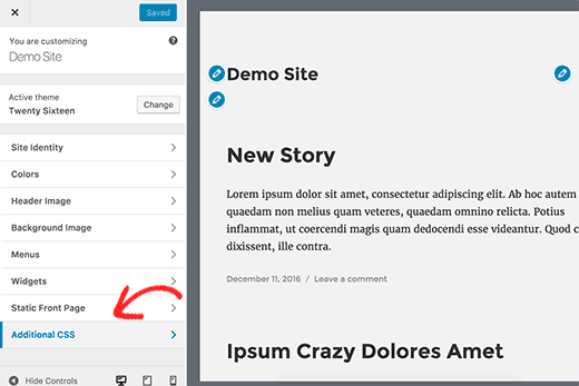
If you'd rather code in-platform, one of the simplest options is WordPress. First, log into your account, find "Appearance" on the left-hand sidebar and then click "Customize".
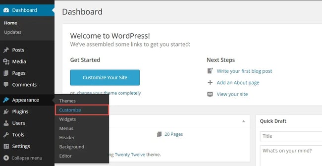
Head to the bottom of the new left-hand side menu and select "Additional CSS".
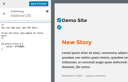
Finally, you'll see a CSS editor page that lets you enter and test CSS code before pushing it to your site.
Now it's time to build that burger. Let's say you want to build a static icon. The best place to start is with HTML:
This code provides the basis for your hamburger button.
Next, add your CSS:
The result is a standard, static hamburger button that leads to a menu once clicked.

Cooking Up a Dynamic Hamburger Button Icon with CSS
If you'd like to try your hand at something a little more complicated, consider an animated menu button that converts into a "cancel" icon when clicked. Here's how it starts:

Click to open the menu, and it turns into this:

The benefit here? Users not only get access to your burger-based menu, but understand how to make it disappear using the universal "X" for cancel.
To cook up this dynamic option, start with your HTML. Note the class attributes that we are targeting within each div element. This will help style each line in the hamburger menu as it transition through the animation:
Now, add your CSS. For this example, there are classes that target both before and after the change for each element:
Finally, toss in some JavaScript to make the action execute upon a click:
Building a Burger Button Without Code
Of course, not everyone wants to spend time and effort creating a hamburger button that may or may not get clicked by users. Some website owners simply aren't comfortable with CSS and HTML coding, while others prefer to prioritize content creation or main page layouts.
If that's your preference, consider website building tools that offer built-in burger options.
1. Content Hub
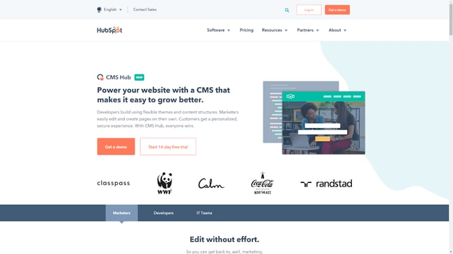
With Content Hub, you can build a great website that suits your needs and captures your target market. Make sure everything is working as intended with traffic monitoring and marketing campaign integration. Hamburger buttons come standard.
2. Squarespace
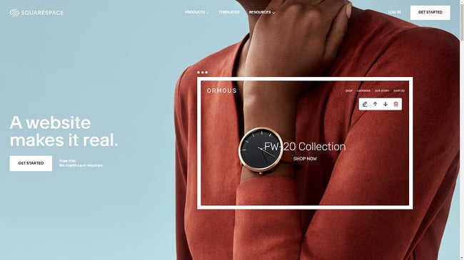
Design clean, fresh-looking designs with Squarespace templates, and use their simple hamburger menus to hold second-tier navigation options.
3. Webnode
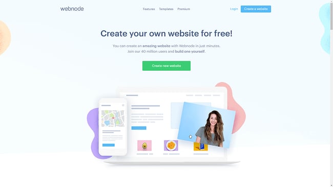
40 million users have built sites with Webnode — add or change content with just a few clicks, and quickly customize the placement and drop-down options of any hamburger menus.
4. Site123
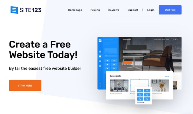
Simple is the name of the game for this website builder. Site123 isn't fancy — it's free and makes it easy to integrate hamburger menus into your web design.
Hamming it Up
Not everyone loves the hamburger button.
It makes sense; the menu can cause confusion or put critical navigation options just out of reach. But there are burger benefits: Building your own button or using a website builder tool lets you decide where this menu makes the most impact and gives you total control over navigation on your site.
Editor's note: This post was originally published in May 2020 and has been updated for comprehensiveness.

Website Design