So, if you are trying to figure out what you need, here’s a guide based on my journey and insights.
Table of Contents
- What's a Website vs. a Landing Page?
- Landing Page vs. Website: Key Differences
- When to Use a Landing Page
- When to Use a Website
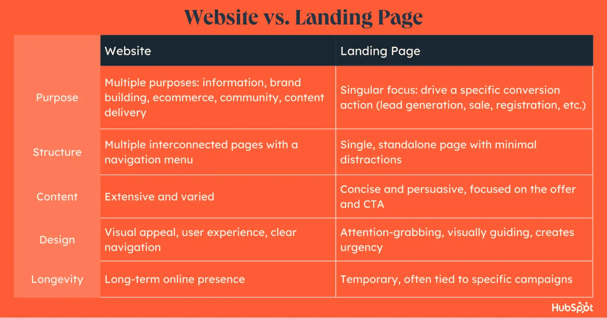
One of the biggest differences between landing pages and websites lies in longevity. Websites are like a home base — designed to last for a long time. They grow and change with the brand they represent.
Landing pages, on the other hand, drive specific actions during a limited time frame. They are created for specific events or promotions and usually disappear or get updated once those campaigns are over.
📚Want to learn more about single-page versus multi-page sites? Don’t miss our comprehensive guide on the topic.
Landing Page vs. Website: Key Differences
When I was building the District #1 Foundation site, I quickly realized it was way more work than designing a simple landing page.
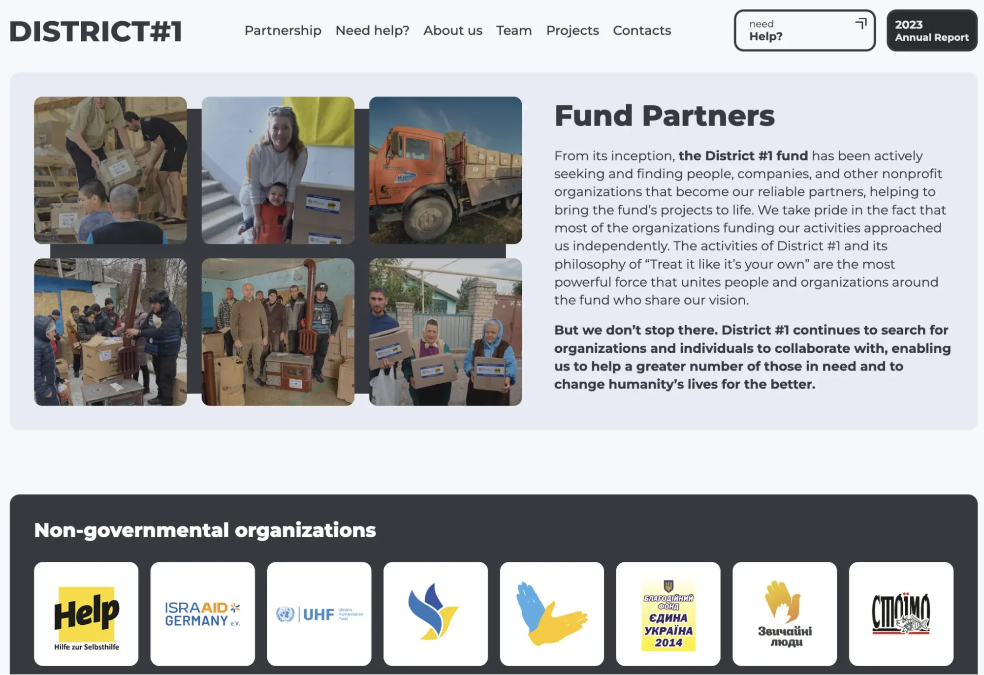
The process from concept to completion looked like this:
- Understanding what pages we have to design first.
- Gathering references for different pages.
- Developing our vision on a site.
- Turning references and ideas into the design brief and specification document.
- Having a series of meetings to sync stakeholders with the implementation team.
- Review, QA, & feedback.
- Revision.
- Production.
Besides the longer process itself, here are the key differences between a landing page and a website.
1. Purpose
Landing Page: Designed with a single, focused goal in mind, such as capturing leads, promoting a specific offer, or encouraging a single action (e.g., signing up for a webinar or demo request or downloading an eBook).
For example, in the case of Mind Body Green Institute, we can see that the primary goal of their landing page is to enroll people in a 12-week coaching program. The data is clear and concise, and the calls-to-action (CTAs) are very visible. It feels like they're saying, “Get it. Become a part of it. Join us,” from the moment I enter the page.
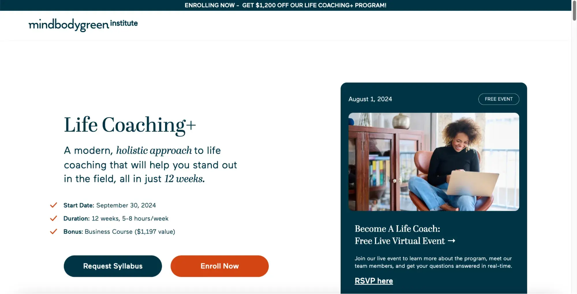
Image Source
👍Want to see how top-notch landing pages look? Check out our articles featuring 33 landing page examples for some inspiration.
→ Website: In contrast to what you see on landing pages, a website is designed to serve multiple purposes, such as informing visitors, offering customer support, and showcasing different aspects of the brand, its products, and customer stories.
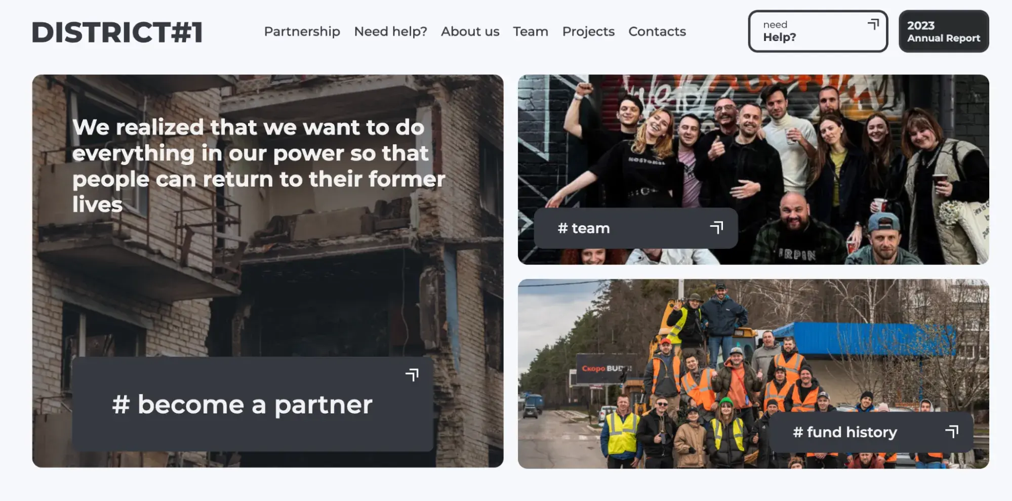
During the creation process for District #1, I aimed to make the site tell a story. The message. Our goal. Our mission. Rather than being pushy and aggressive, it has a soul. On the other side, landing pages are usually more pushy and sales-oriented.
2. Structure and Navigation
→ Landing Page: A single page with a clear and focused message, a landing page has limited or no navigation to keep visitors focused on the main goal.
→ Website: A website consists of several pages, like home, about, services, history, blog, press, team, and contact. Visitors explore different sections through menus and interlinks. Ideally, navigation should be super intuitive and available on any page so visitors can jump from one page to another without leaving a tab.
3. Content
→ Landing Page: Content is usually concise and highly focused on the specific offer or action, including headlines, persuasive text, images, and a CTA that aligns with the campaign’s objective.
A good example is Skillshare. The only content here is an offer for a free one-month trial, easy sign-up options, and benefits listed in the bullet list.

Of course, your landing page can feature more elements. For instance, you can add social share buttons to make it easy for visitors to share your offer. What you can see here is just the starting point.
To decide what to include, I recommend you understand your audience, their origins, and their position in the buyer's journey. The key is to provide enough information to drive conversions.
→ Website: Contains different content types, including information about the team, product or service descriptions, blog posts, and more. For instance, for the District #1 Foundation, I chose pages to show our mission, events, projects, donor info, and real-life experiences.
The first pages (those you see on the site) were devised with the idea of “let's create the most informative pages first that can speak about the foundation and showcase projects to attract potential donors and partnerships.” The information is subtle but enough to get the point across about the District #1 fund.
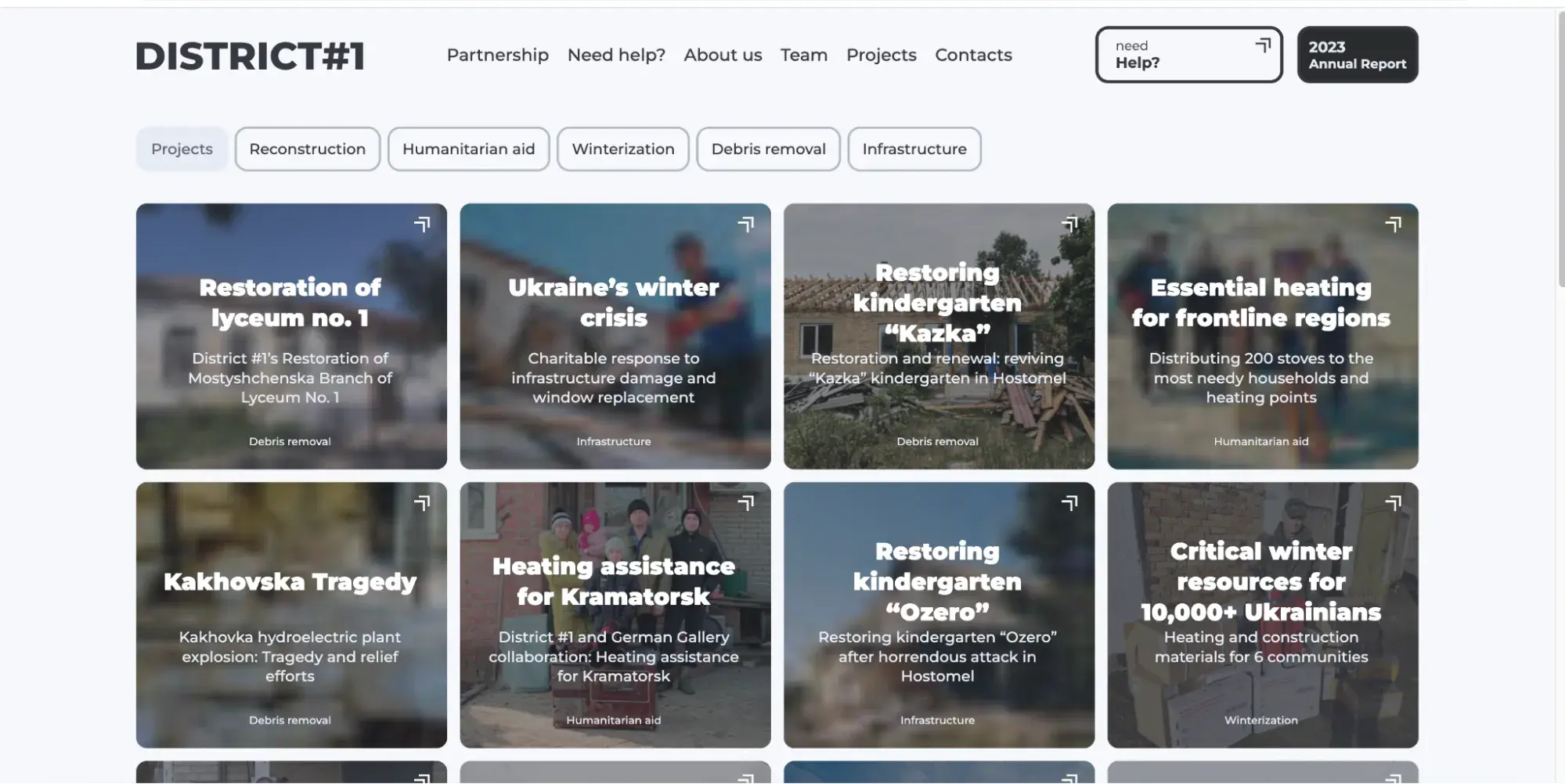
Note, more pages like blog, news, and donations soon will be released. So treat your website as a never-ending journey with tweaks and redos.
Pro tip: If you want to create and manage personalized content effortlessly, HubSpot's Content Hub might be the solution you need. Craft, distribute, and optimize your content with tools like AI Blog Writer and Content Remix and manage everything from one central location.
A Landing Page vs. Website Side-by-Side Comparison:
When to Use a Landing Page
So, when should you use a landing page instead of a website? Mike Mancini, Google Ads expert, weighs in: “Use landing pages if you want to increase sales and ‘quickly’ generate leads. They typically have higher conversion rates compared to standard websites, especially for targeted advertising.”
Boiling it down, I think using landing pages is perfect for three main goals:
- Marketing campaigns. Use them for specific campaigns to capture leads or promote a product/service.
- Event registrations. Ideal for collecting RSVPs for events.
- Product launches. Promote a new product with a dedicated landing page.
This is because they are optimized for specific actions and avoid unnecessary elements that could divert visitor’s attention.
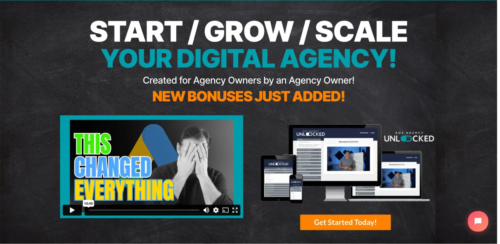
Take Mancini’s landing page, for example. It effectively attracts visitors with a simple and clear message to sign up for his course:
👍And if you need more inspiration for your landing page design, check out our article featuring 41 amazing landing page examples.
Best Practices for Landing Pages
1. Make your message straightforward and compelling.
Visitors should immediately understand what the product or service is and how it benefits them. Complicated messages or excessive information can confuse and deter potential customers.
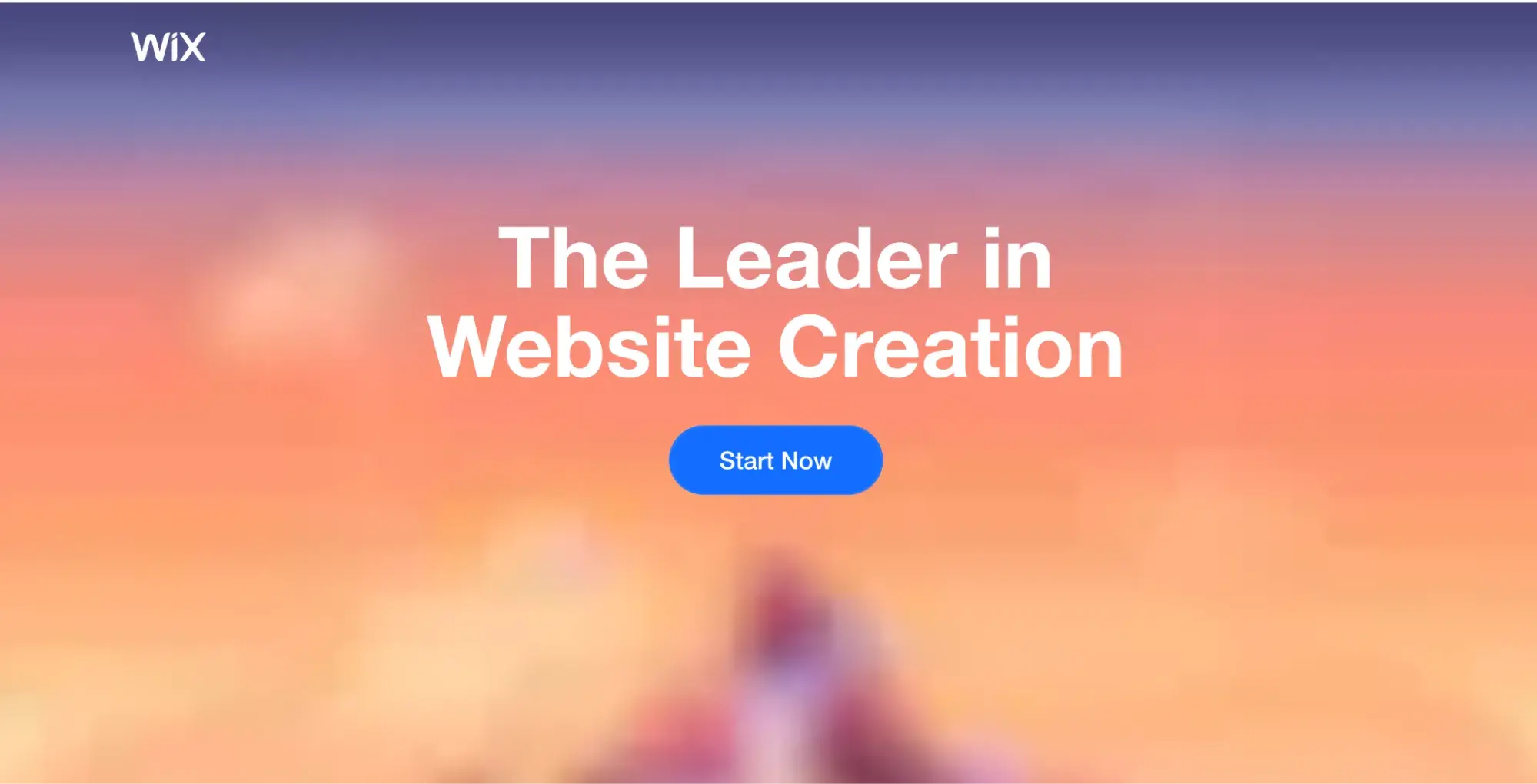
For example, the Wix landing page embodies all these principles of simplicity and directness. I like that its clear message immediately shows what Wix offers and its position in the market.
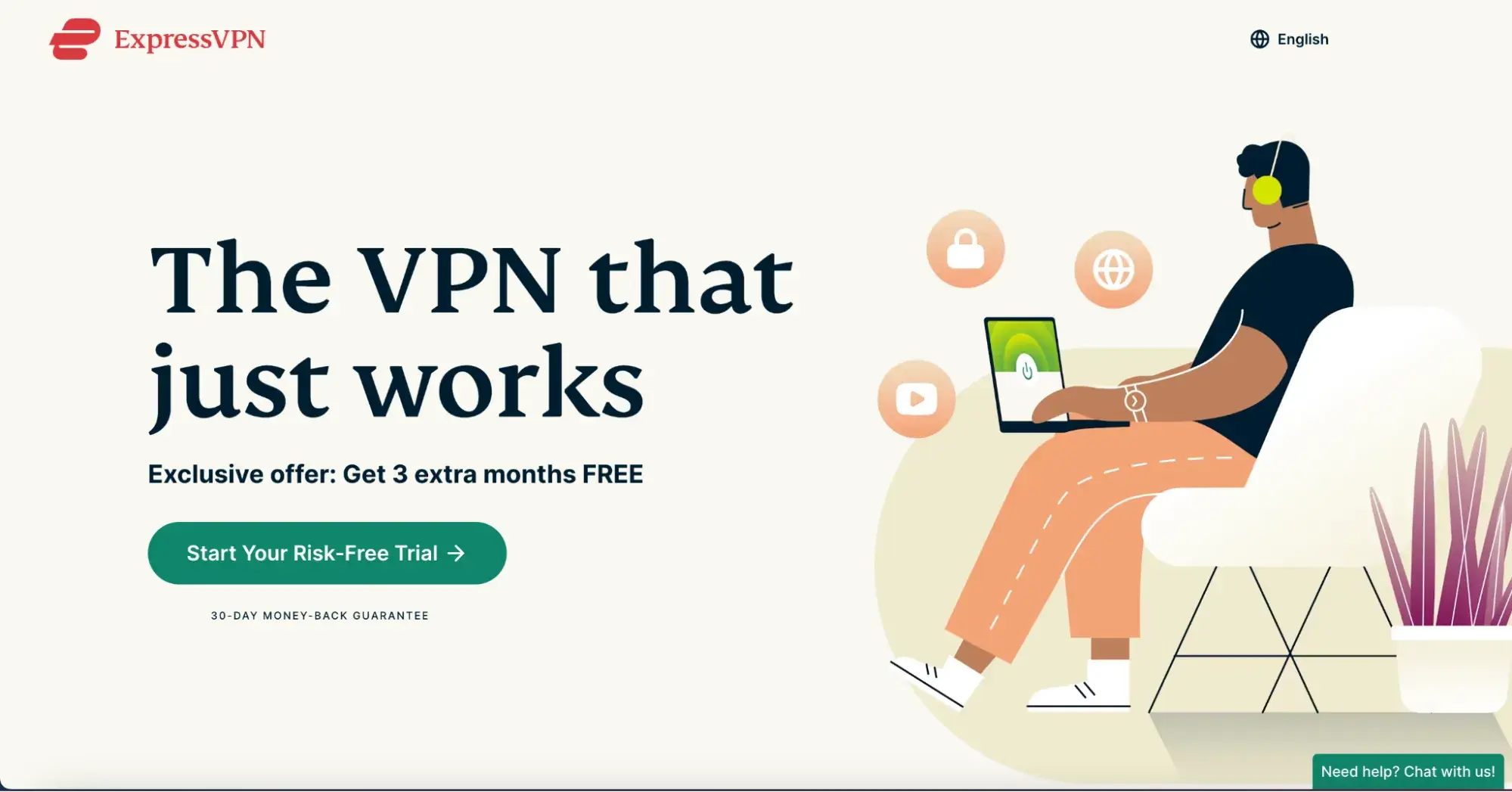
Another good example is the ExpressVPN landing page. The phrase immediately communicates the product's core value proposition and touches upon the customers’ pain points (I bet we all can relate to). No fluff. No this and that. The point is straight clear.
2. Make your CTA prominent and persuasive.
“Buy,” “Subscribe,” or “Order” mean nothing if you don't have a good CTA message alongside the button to encourage users to actually take that action.
A great example of this is VeryGoodCopy.
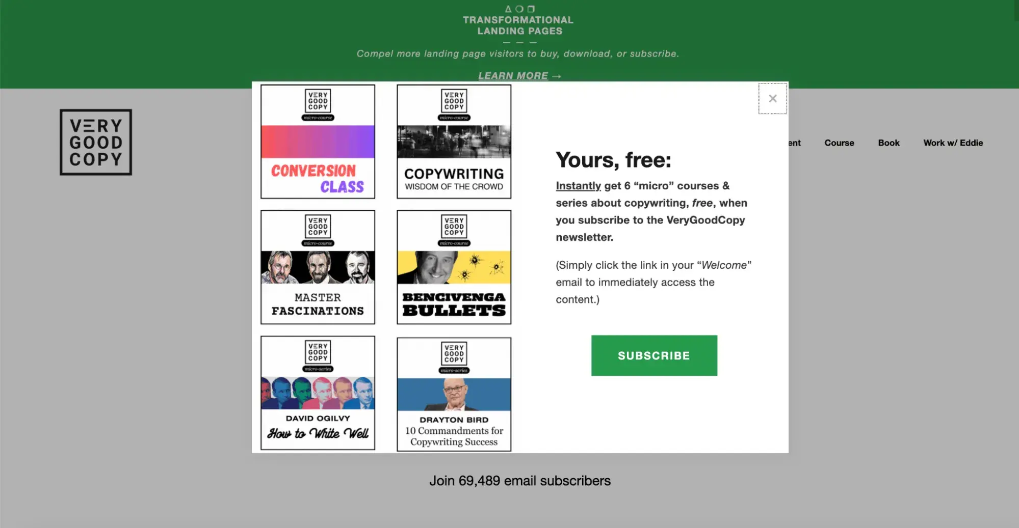
The word “SUBSCRIBE” leaves no room for ambiguity. And most importantly, the text above the button clearly outlines the benefit of subscribing — six weekly “micro” courses about copywriting.
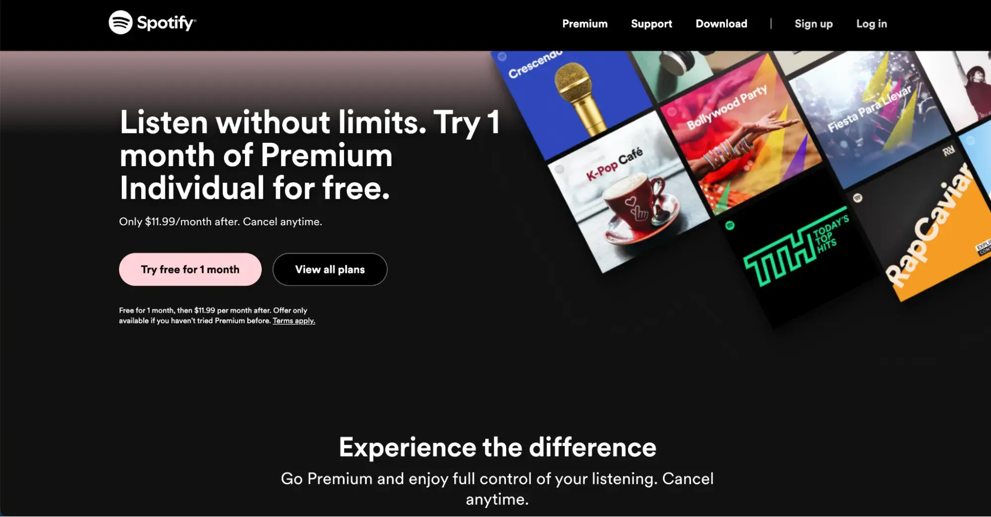
Spotify is also good at calling to action.
The button itself is impossible to miss, using a bright color that pops against the background. The words are simple and clear, telling you exactly what you'll get by clicking. I appreciate that they even repeat the message with lines like “Experience the difference” to drive the point home.
3. Keep navigation and other elements to a minimum to maintain focus.
Messy navigation on a landing page is a surefire way to lose customers. It needs to be crystal clear so visitors can find what they're looking for in a matter of a click (or two). Don‘t make visitors click a million times until they get to the desired point — it’s a major turn-off. You can actually read some of HotJar’s customer stories to see how many visitors drop off due to cumbersome navigation.
Conversely, the Canva Pro landing page gets it right:
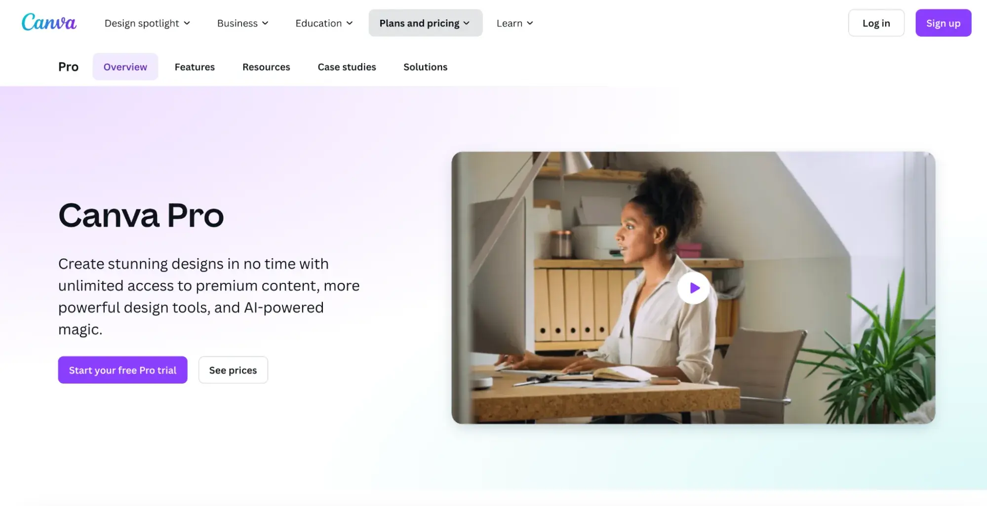
Everything is laid out in a logical order, with the most important information front and center at the top of the page. I like that there’s no clutter at all; it feels so clean and fresh.
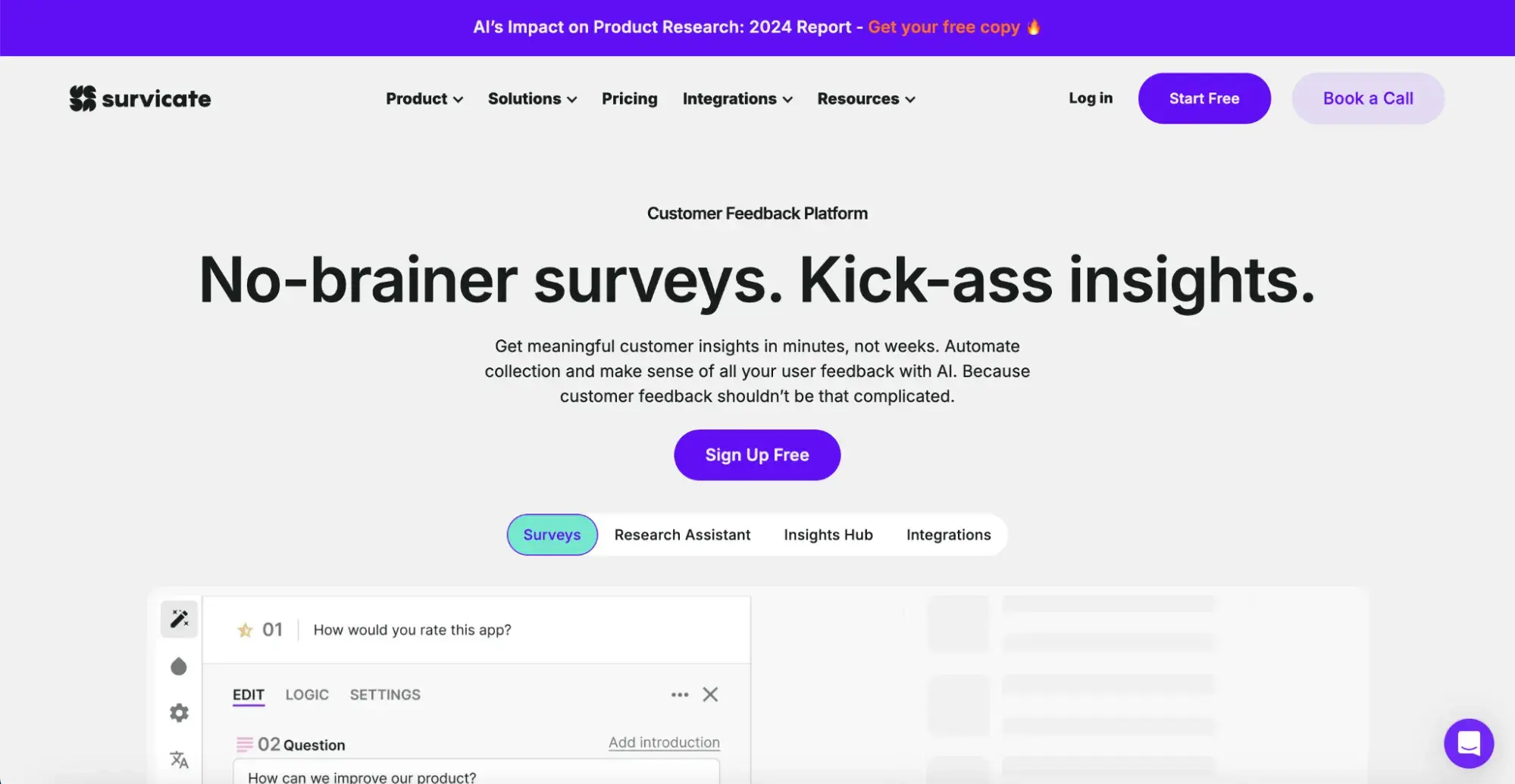
Survicate is another excellent example of how user-friendly navigation should look.
The use of different font sizes and colors creates a visual hierarchy and guides the user's eye to the most important information first — the headline and the CTA buttons.
4. Use relevant images or videos that attract attention.
Visuals are more memorable and help users retain information longer, but you need to use them wisely.
Pick those aligning with your brand and make sure not to overdo it. Use them to break up text, explain and visualize complex parts, or make a site more visually appealing.
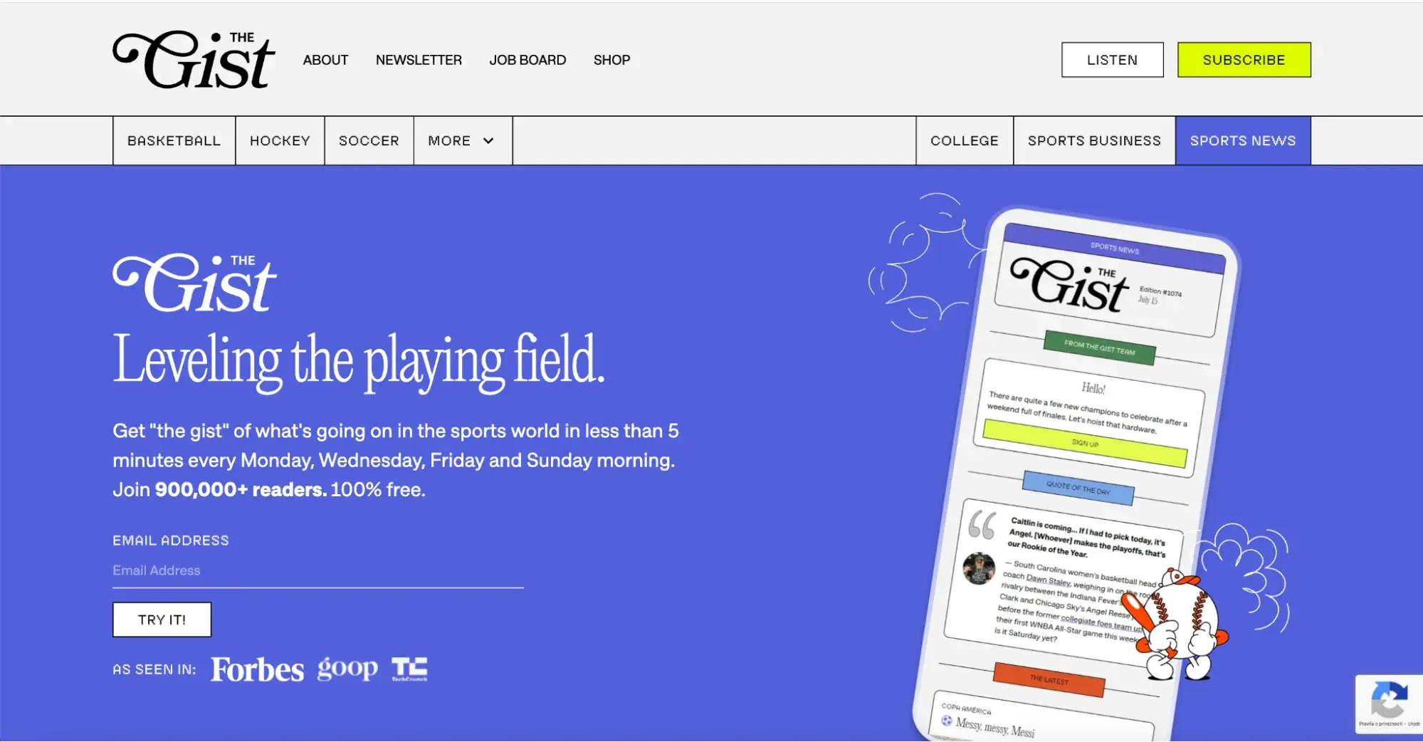
I think a great example is The Gist, which has a super cute visual with a bit of motion, conveying the idea of getting the “gist” of sports news quickly and easily.
It‘s the only visual on their landing page, and, as you can see, it’s more than enough:
Something different can be seen in the Freelancing School by Joanna Weibe. The purpose of her landing page is to sell the training.
And what’s the best way to do so? Including a welcome video.
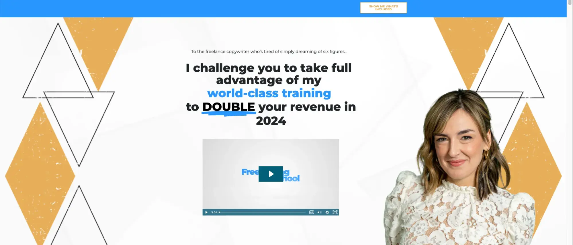
Also, I think Joanna's prominent picture in the background adds a friendly touch, making her feel real and allowing visitors to click with the person.
5. Include testimonials or social proof to build credibility.
I’m always the first to buy something based on someone else's review. Actually, I think we all trust testimonials, especially if they look real.
Justin Welsh's site does this remarkably by including written and video testimonials that feel more personal and believable.
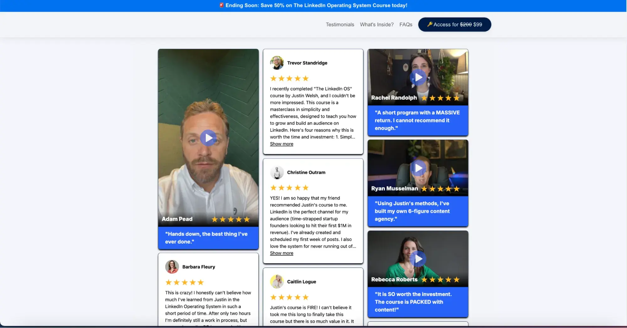
Social proof is super important, even for marketing stats like Justin, who made a whopping $8.3M in business revenue from selling LinkedIn courses.
Plus, major and well-known brands or names always forge trust and increase the chances of you collaborating with a service provider.
HubSpot is no exception. Look at our proofs:

6. Use a short, easy-to-fill form.
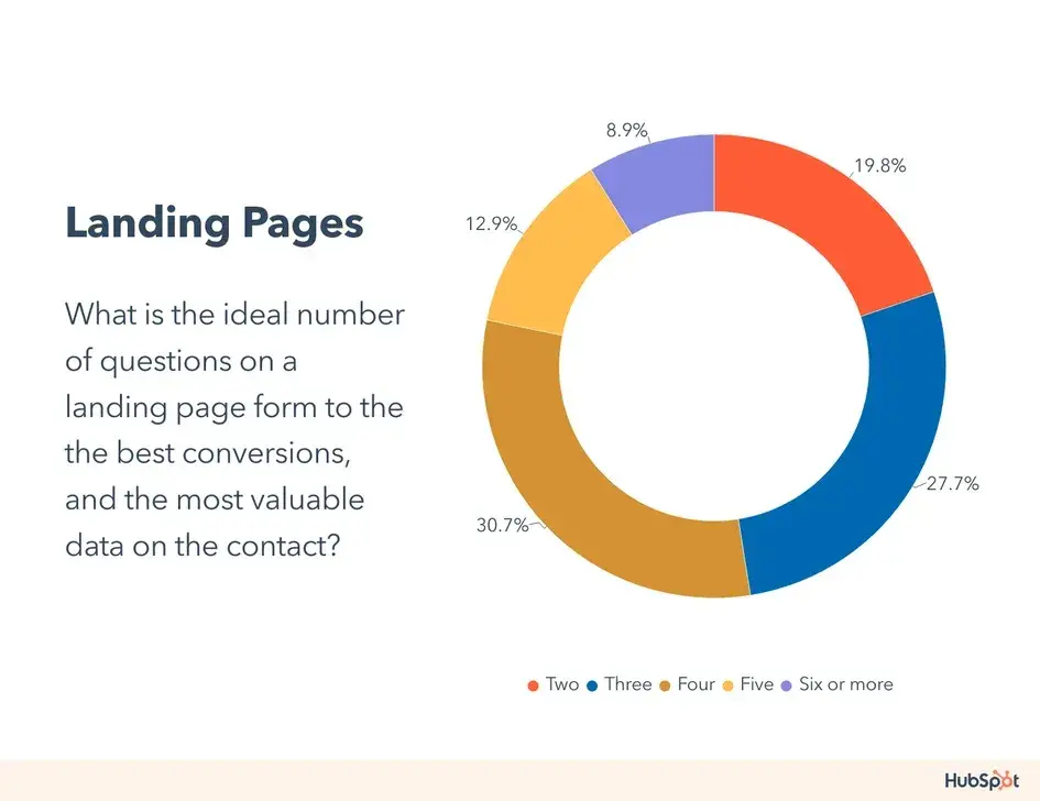
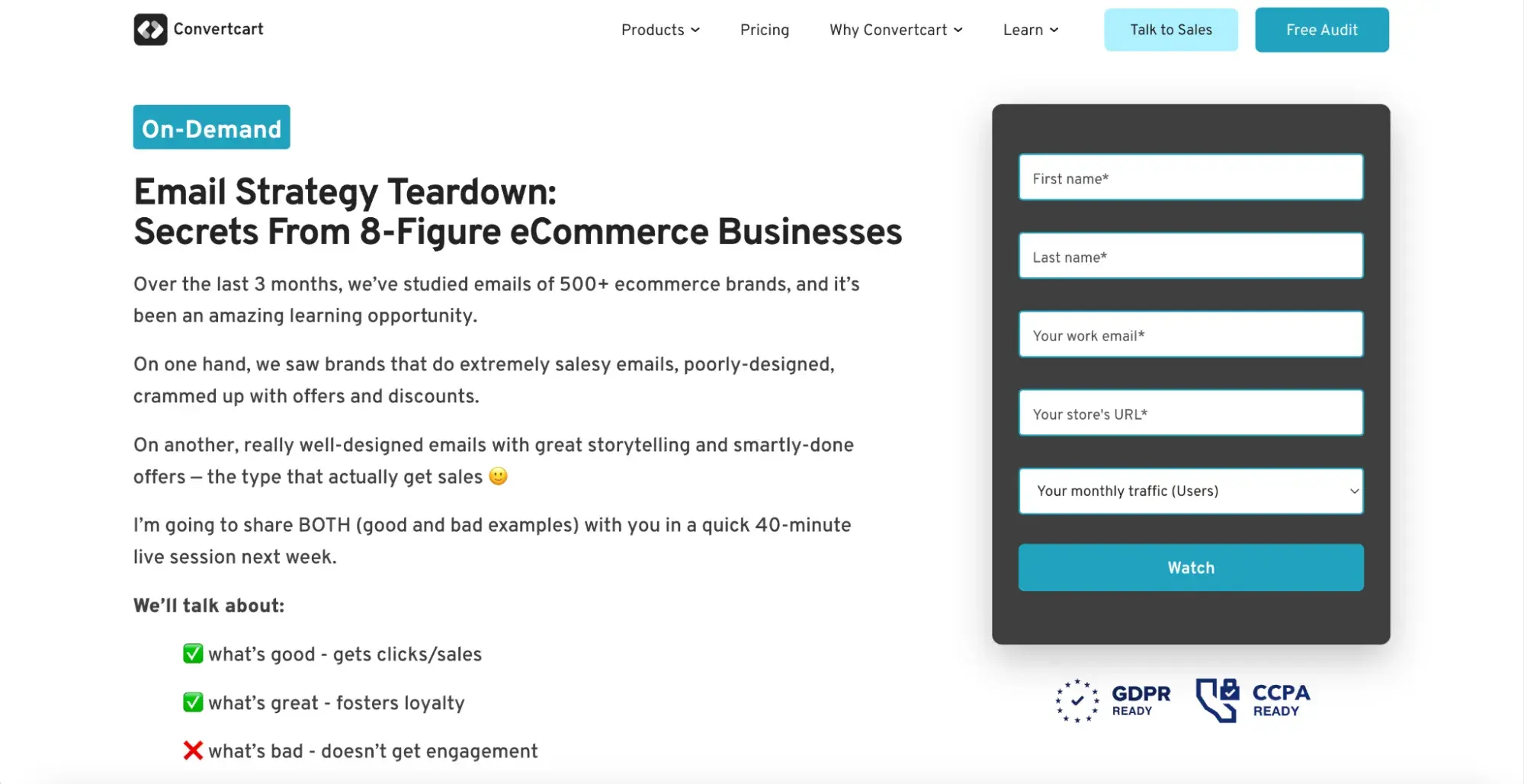
Our July 2023 survey found that 30.7% of U.S. marketers believe four questions on a form yield the best conversions.
If you plan to include a form, decide what lead information you need. If a name and email are enough, ask for just those. Avoid extra details unless necessary. Shorter forms work better — for example:
And here’s a helpful “best practices for landing pages” checklist you can use as a guide when building your landing page:
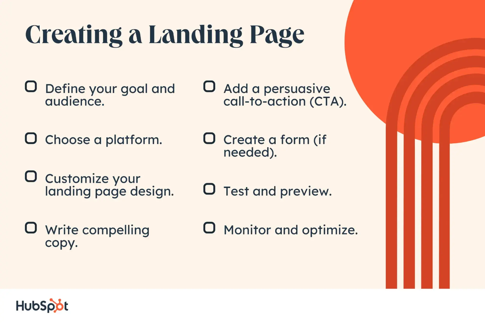
Image Source
Pro tip: If you want to generate more leads from your website, HubSpot’s Free Landing Page Builder is perfect for you. Easily create and test beautiful landing pages that attract visitors and convert them into leads — no designers or IT help needed.
My Favorite Landing Page
One of my favorite landing pages is Codecademy. It’s simple in both copy and design.
The CTA is clear, and the visuals are super cool. I love how it instantly communicates the value proposition and guides the visitor towards becoming a part of it.
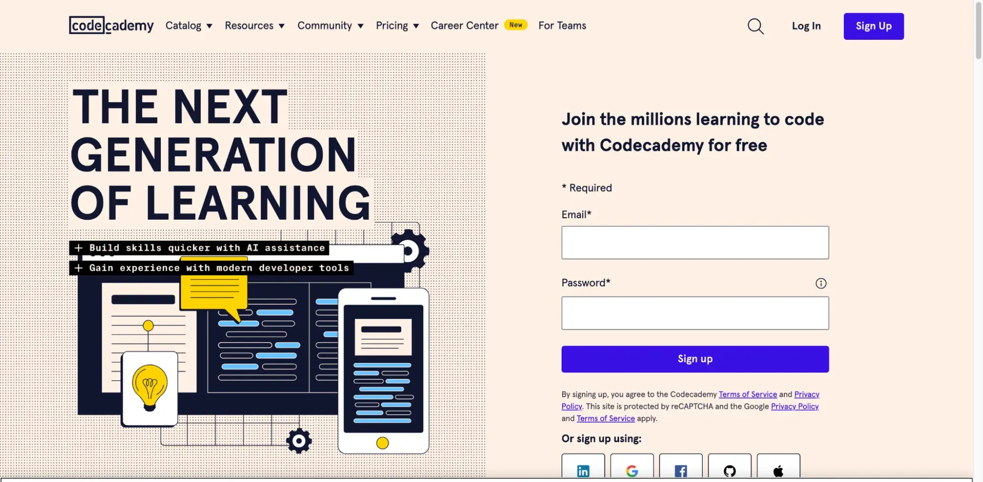
The form is easy, and users need just an email and password. Users can sign in via LinkedIn, Facebook, GitHub, or Google Plus (real-time-savers!).
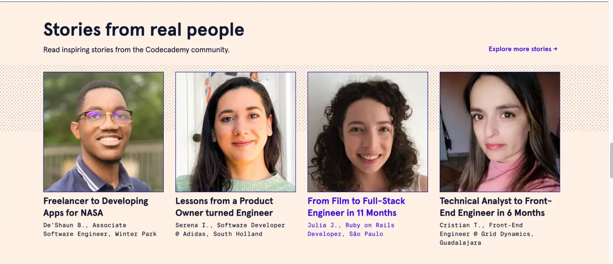
I also like that it includes success stories and testimonials to help beginners feel more at ease with coding.
When to Use a Website
I recently watched a great Marketing Island tutorial where they explained the differences between websites and landing pages really well. The tutorial basically says: Build a website if you want a central hub to show your expertise in a specific topic or niche through reviews, articles, and detailed content.
So, websites are best for:
- Business presence. Establish an online presence for your business or organization.
- Information sharing. Provide comprehensive information about your products, services, or mission.
- Ecommerce. Facilitate online sales and transactions.
- Community building. Create a platform for engaging with your audience through blogs, forums, or memberships.
But the most interesting takeaway is that 👉you can mix and match websites and landing pages.
For example, a website can have a banner that leads to a landing page, which helps guide users through a sales funnel:
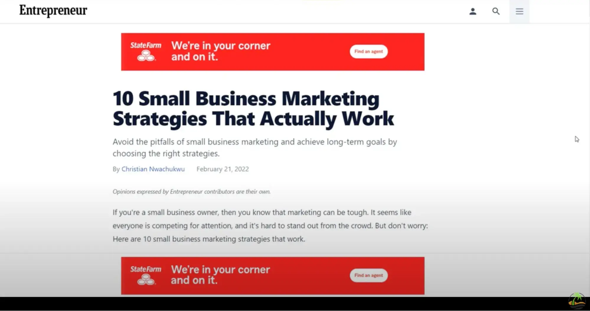
This way, you get the best of both worlds — the comprehensive nature of websites and the targeted focus of landing pages.
Best Practices for Websites
1. Make navigation smooth and easy to access all site sections.
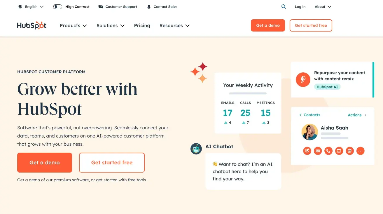
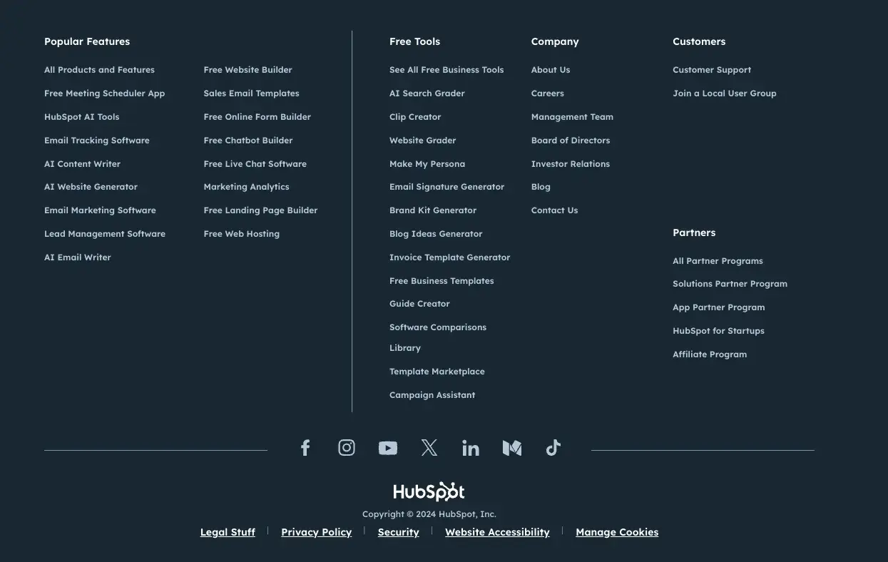
Websites can have thousands of web pages, so you must ensure they're easy to navigate. Put the most important things at the top and use dropdown menus for each section to keep things organized.
Take HubSpot’s site navigation bar and footer:
2. Optimize your site for desktops, tablets, and smartphones.
If your site isn't optimized, it might look weird or not work properly on smaller screens, which could frustrate visitors and make them leave.
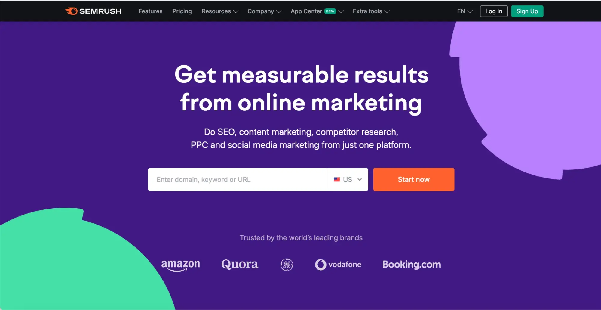
Here’s an example of an adaptive site on desktop and mobile.
Semrush on the desktop:
Semrush on the phone:
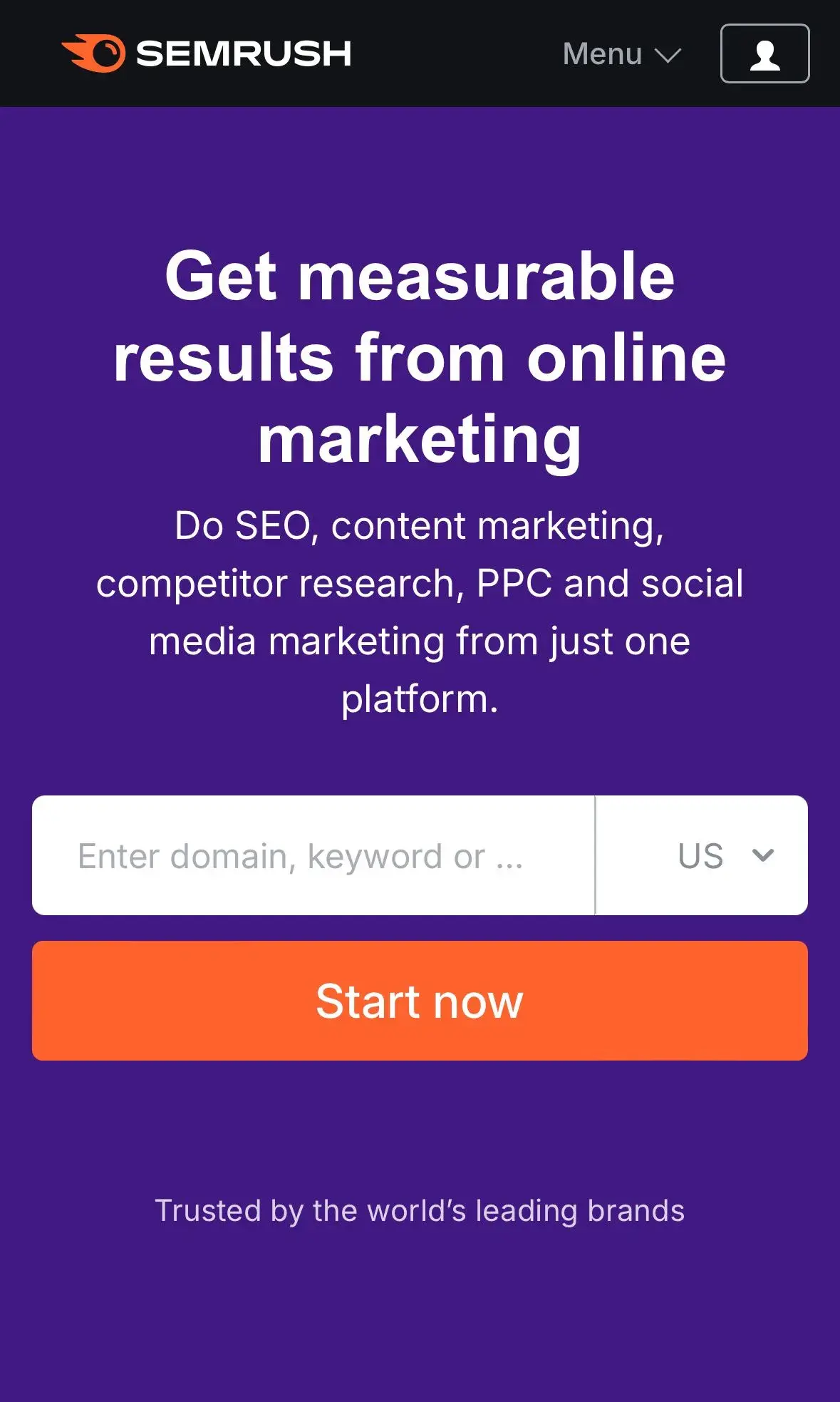
A good website builder can help you here — it comes with designs that are already responsive and suitable for different devices.
Pro tip: If you want to build a pro website, HubSpot’s Free Drag-and-Drop Website Builder might be what you need. HubSpot’s WYSIWYG editor lets you see exactly what your visitors will experience as you build. You can choose from hundreds of themes and use built-in templates.
3. Optimize pages on your website to improve visibility.
Not all web pages on your site are equally important for converting visitors into customers. Focus your optimization efforts on these high-traffic pages:
- Homepage. Your visitors’ first impression. Make it count with a clear message and easy navigation.
- About Page. Tell your story and build trust. Showcase your values, team, and achievements.
- Blog. Share valuable content to attract and engage your target audience.
- Contact Us Page. Make it easy for potential customers to reach out. Offer multiple contact options.
4. Provide valuable and engaging content that meets your audience's needs.
Search engines rank websites higher that have high-quality, relevant content and up-to-date advice. But what’s even more important is that your visitors love it.
When creating content, put visitors first. I recommend focusing on making it valuable and interesting for them, not just keyword-stuffed nonsense. Make it readable, engaging, and diverse — mix up blog posts, videos, and other formats.
A great example is Belkin's blog:
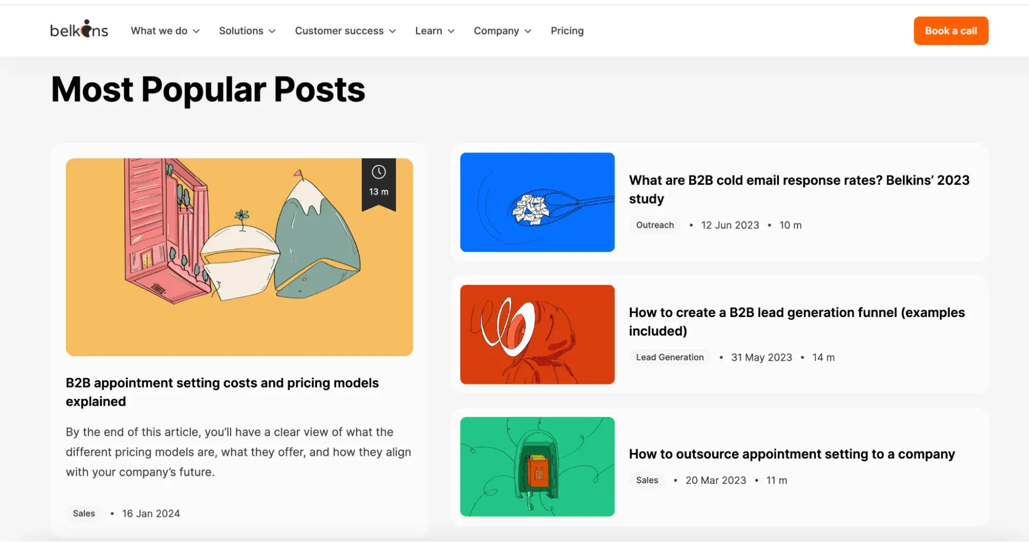
They focus on long-form content packed with expert interviews and valuable tips. Every sentence here counts.
5. Make sure your site loads quickly.
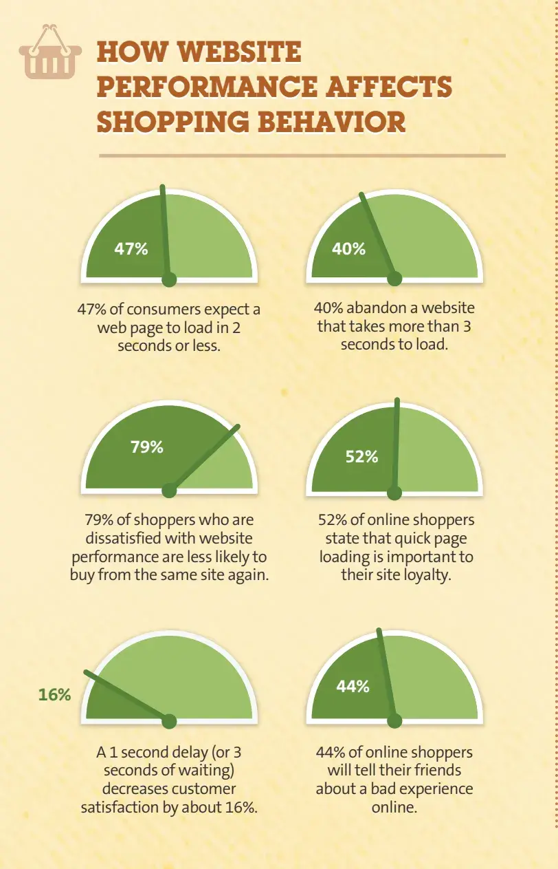
KissMetrics reports that a massive 47% of consumers expect a website to load in 2 seconds or less. Moreover, 40% will bounce if it takes more than 3 seconds. Nobody likes waiting for a slow website to load, so make sure you regularly test this to make it work properly.
On top of that, Portent's study on B2B sites and loading speed highlights the following findings:
- Most B2B sites load in under 5 seconds.
- Sites loading in 1 second convert 3x better than 5-second sites.
- Sites loading in 1 second convert 5x better than 10-second sites.
My Favorite Website
One of my favorite websites is Ahrefs, which is super catchy and has space in its navigation. The main tagline, “Everything you need to rank higher & get more traffic,” says it all.
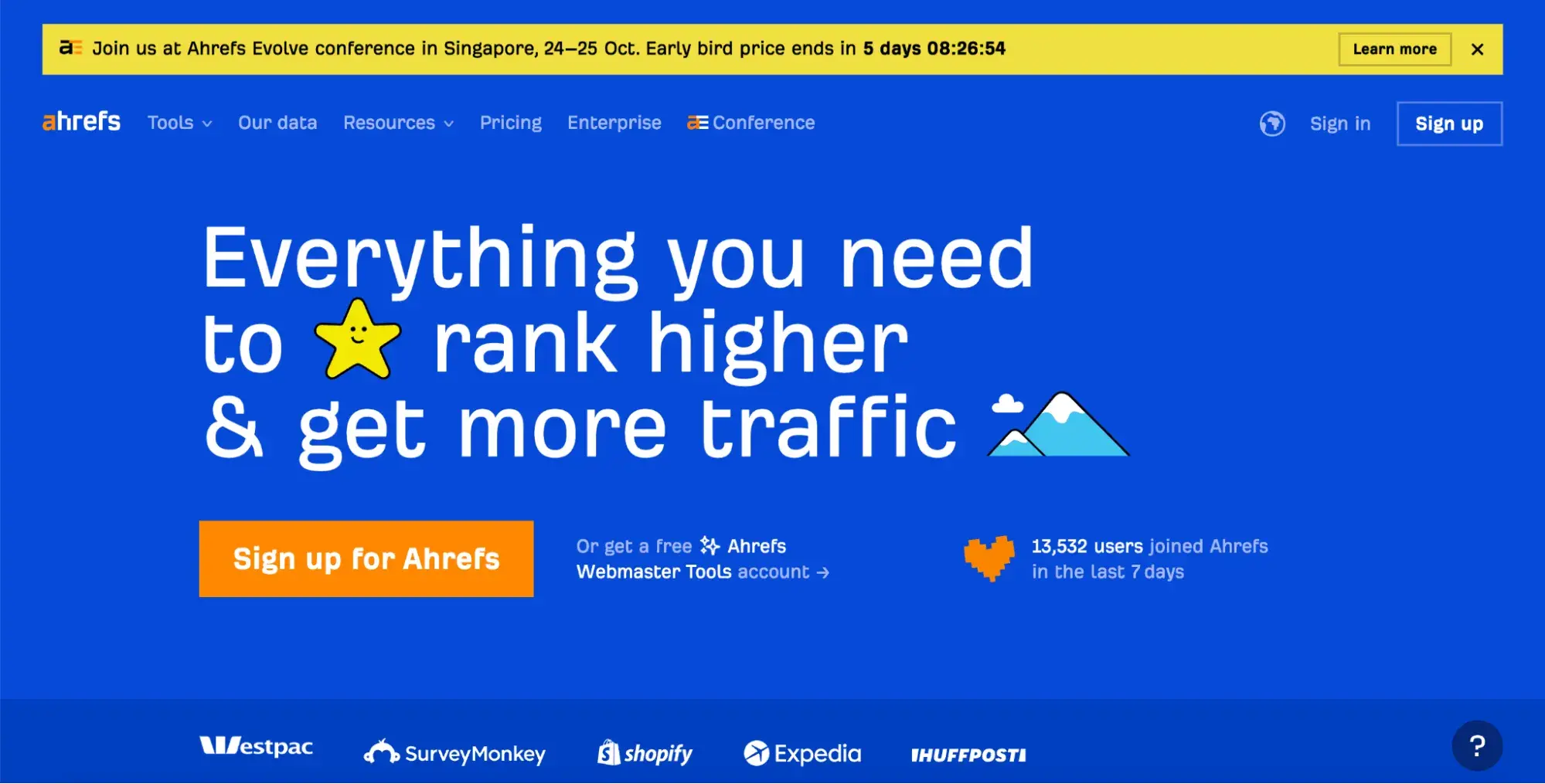
The top menu is simple with clear labels, so I can quickly find what I need. The dropdown menu gives me quick access to the Help Center, Blog, Academy, and Tools.
Plus, the yellow-highlighted message at the top promotes something current, creating a bit of FOMO and encouraging visitors to join events or courses. It’s a great way to get people involved (it influenced me a couple of times 🙂).
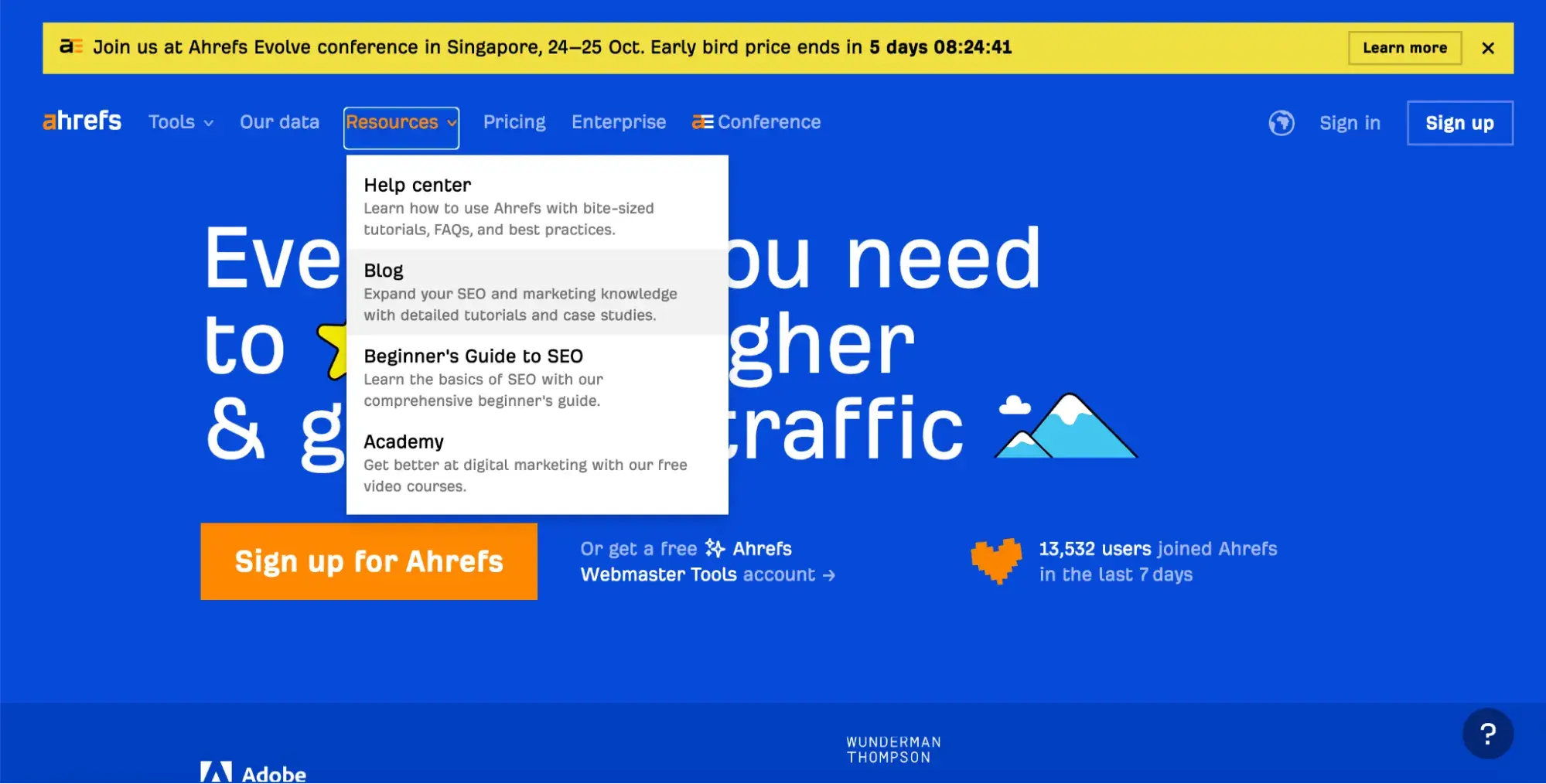
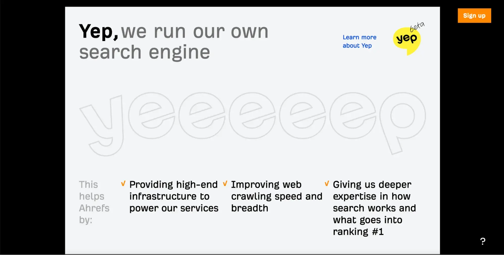
And honestly, Ahrefs' copy and graphics are so excellent — they totally win me over every time.
Know the difference between websites and landing pages.
Here’s what I can tell you: If you want to drive specific actions, a landing page is your best bet. If you need a comprehensive digital home for your business, go with a website. And most times, blending both can be precisely what you need.
You must listen to your audience. Understand them. Know their needs and how they think. Only then can you figure out what’s best for your business. Do you want to tell a deeper story or just generate leads and customers? It’s up to you.
But, don’t turn your landing page into a hard sell. Make it subtly persuasive. Encourage visitors to want to buy or sign up without feeling pushed. Likewise, keep your website clean and focused so visitors can easily see what you offer without getting lost in the clutter.
Find that balance. If you’re unsure where to start, don’t hesitate to seek expert advice.
.png?width=112&height=112&name=Image%20Hackathon%20%E2%80%93%20Vertical%20(50).png)

.png)
![21 Freelancer website examples we love [+ How to make your own]](https://53.fs1.hubspotusercontent-na1.net/hubfs/53/freelancer-website-examples-1-20260319-9141964.webp)