

As I made my list of recommendations, I researched web design best practices and even spoke to experts. That’s when I first found out about mobile first web design.
While this incident was years ago, I’ve kept a keen eye on mobile first web design ever since. Today, implementing mobile first web design isn’t just a strategy but the foundation for a successful online presence.
Table of Contents
- What is mobile first web design?
- What are the benefits of mobile first design?
- How to Implement Mobile First Web Design
- The Best Mobile First Web Design Examples
What is mobile first web design?
Mobile first web design is a design strategy that first focuses on creating a seamless experience for mobile users and then scaling up to larger screens like tablets and desktops. Instead of designing for desktops first and then shrinking everything down for mobile, the mobile first web design approach suggests starting with the smallest screen, i.e., mobile and expanding (if and as needed) for larger screens like tablets or desktops.
I’ve found that following this approach ensures that the website’s most essential elements — such as navigation, visuals, and content — are well-optimized for smaller screens, which can be tricky to retrofit due to their limited real estate.
But wait. Why focus on mobile first? My short answer is that mobile traffic has been growing over the past few years, and therefore, it is vital to account for the needs and preferences of these visitors.
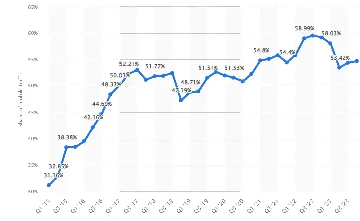
According to research from Statista, mobile devices (excluding tablets) generated 58.67% of global website traffic in the last quarter of 2023. And this has been a consistently growing trend over the last decade.
Prioritizing mobile usability ensures the website is more accessible to a broader audience with specific preferences, belonging to certain demographic groups, using older devices, or slower connections.
I realized this after speaking to William Bellia, the founder of Kaapisoft, a bespoke development services agency. Bellia shared his experience designing a website (and also an app) that focused on maintaining healthy daily eating habits, including nutrition and exercise. Their audience was teenagers and young adults based in Australia. He specified the majority of this group included iPhone users.
Bellia explained, “We were clear from the start that the website design was central to our client’s success. So, we ensured the website was tailored to handheld devices, as our target audience of young adults and teens spend most of their online time on mobile devices. We then used this as a foundation and propagated it easily for continued good experiences on larger screens.”
While this is the core reason to focus on mobile first web design, it also comes with several benefits. Let’s go over them.
.png)
Free Website Design Inspiration Guide
77 Brilliant Examples of Homepages, Blogs & Landing Pages to Inspire You
- Agency Pages
- Ecommerce Pages
- Tech Company Pages
- And More!
Download Free
All fields are required.
Form not available
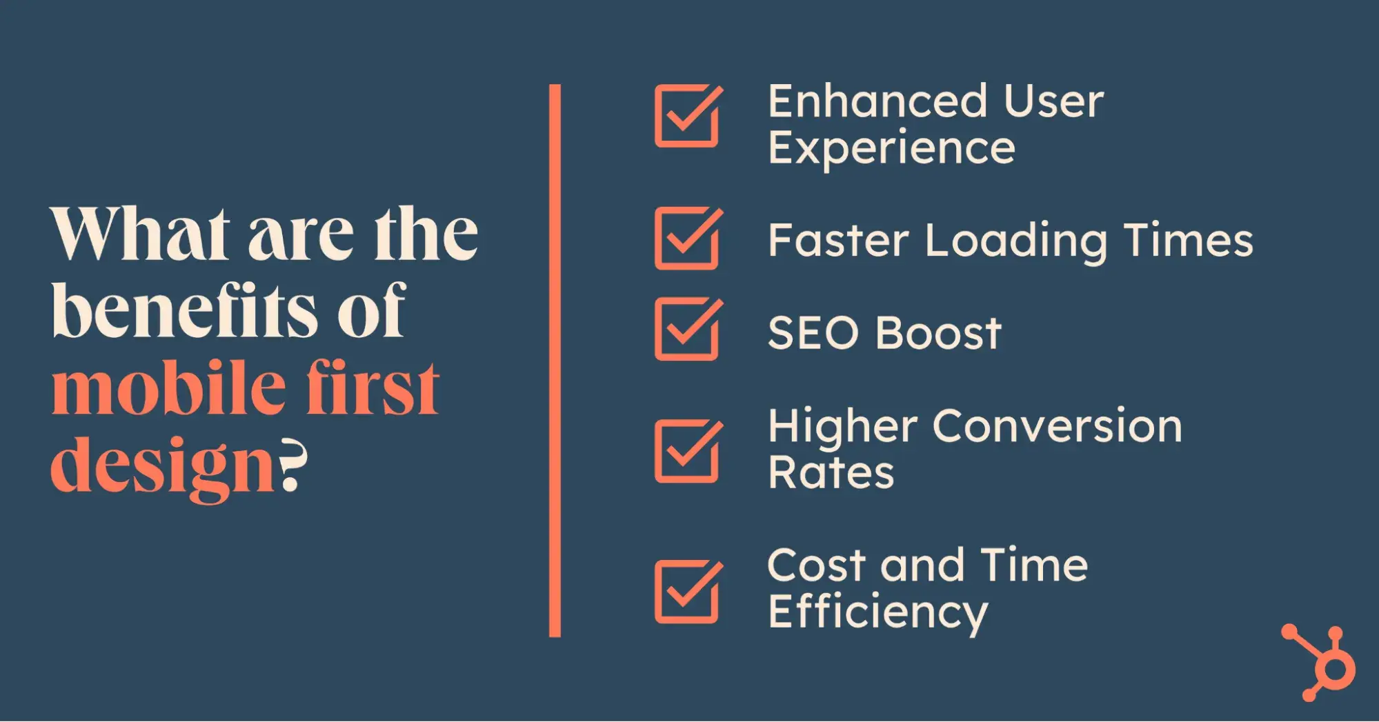
What are the benefits of mobile first design?
1. Enhanced User Experience
The mobile first design approach prioritizes essential features and content. Following it, your website design is clutter-free, focusing only on what users need. I’ve seen umpteen instances of this simplicity, ensuring a clean, intuitive, user-friendly interface that guarantees excellent user experiences.
2. Faster Loading Times
Mobile first web designs are principally lean and thereby improve a website’s performance. Reduced website dimensions and file sizes, compressed images, and minimized scripts make their load times quicker, a critical factor for users.
Research suggests that the probability of bounce increases by 32% as the page load time goes from one second to three seconds.
3. SEO Boost
It’s common knowledge now that Google uses mobile first indexing and prioritizes mobile-friendly sites in its search rankings. Adopting a mobile first design approach ensures you comply with these standards. I’ve seen first-hand how switching to this approach improves the website’s visibility and search engine performance.
4. Higher Conversion Rates
Mobile first design simplifies navigation and functionality, reducing friction for users on the go. This impacts conversion.
According to Google’s data, 50% of smartphone users are more likely to use the mobile site when browsing or shopping on a smartphone because they don’t want to download an app. Thus, a streamlined mobile surfing experience often results in higher engagement and conversion rates for purchases, sign-ups, or other actions.
5. Cost and Time Efficiency
Starting with mobile first also allows for a more efficient development process. Mike Funkhouser, founder of Agency Helper, shared that designing for smaller screens first guarantees the essentials are clear and functional. He explained how scaling to larger screens becomes a natural enhancement rather than a frustrating retrofit.
Funkhouser mentioned, “It is easier and more economical to scale up from a simple, mobile-optimized design to accommodate larger screens than to strip down a desktop-first design for mobile.”
Long story short, going for mobile first web design makes perfect sense. But how do you implement this?
How to Implement Mobile First Web Design
I was discussing the “how” of mobile first web design with Mejo Kuriachan, CEO of Everything Design, a leading web design agency, and his thoughts stuck with me.
Kuriachan said, “A great website design isn’t just about how it looks; it’s about making intelligent, contextual decisions. These details shape the experience and make all the difference between a website that just exists and one that truly delivers.”
His words made me curious to determine those decisions for implementing mobile first web design. So, I did my research, spoke to other experts, too, and here’s how I would break it down in steps.
1. Understand your audience.
I’d start by researching the target audience and industry. After all, you need to know what they care about and prioritize when browsing on mobile, right? I’ve figured this is important for designing features that meet their expectations.
If you’re building a new website from scratch, the good old approach of talking to your ideal customers works well. You can ask them directly what they prioritize when browsing on mobile. If you’ve got a vast database, I suggest even building out questionnaires using tools like Survey Monkey or Typeform to get closer to their preferences.
If you’re revamping an existing website, using tools like Google Analytics can unlock valuable insights about your existing users. You can study the data to identify facts like the devices they use, screen sizes, and common behaviors, and this evidence can be your guiding light.
Free Resource: The Ultimate Workbook for Redesigning Your Website
2. Recollect your objectives.
This step is a tip I got from Kuriachan. He recommended starting by nailing down the objectives.
“Assess whether you want to attract talent, draw in investors, or win over customers,” he told me.
You may feel this is obvious and think you know your objectives already. However, I’ve realized that reminding yourself why you’re building a mobile website is worth the extra minutes as it prevents you from getting swayed from your goal.
3. Prioritize core content and features.
Once the groundwork is done, it’s time to start designing. In this step, you need to decide on essential information and functionality. Key user actions to consider and zero in on include navigation, calls-to-action, or form submissions.
Pro tip: Considering the limited real estate, it’s best to prioritize minimalist choices that are intuitive and easy to use.
Aditya Kathotia, founder of Digital Polo and Nico Digital, recommends that you “compare what you’re planning design-wise to what others are doing in the same/similar industry.”
For example, if you are an ecommerce company selling curtains, compare your features with what giants like Nordstrom or H&M offer. “Doing this exercise directs you to prioritize key features using the right design principles,” said Kathotia, and I’d say he has a fair point.

4. Design a prototype.
Based on your shortlisted priorities, pick up the pieces and assemble them to design your mobile prototype. Using wireframe tools is the easiest way to do this. While there are many tools, I have experience with Figma and Canva and can vouch they’re super handy, even for those without any design background.

As you design an intuitive, easy-to-use prototype, ensure you’re also mindful of accessibility. You want your design to be inclusive and allow users with disabilities to interact with your site.
Lauren Alexander, CEO of Unreal Dev Studio, a full-service web studio crafting inclusive and accessible websites, suggests looking into the Web Content Accessibility Guidelines (WCAG) at this stage. These guidelines offer a strong foundation for accessible and equitable web design principles. Alongside that, Alexander also notes that “true accessibility goes beyond meeting compliance requirements.”
In essence, you should be thoughtful and create inclusive digital experiences that empower all users to engage meaningfully as you design your mobile website.
5. Implement mobile-friendly development.
Once you’ve designed your mobile first web design prototype, the next step is development. You need to build a responsive website that ensures a consistent user experience regardless of the device.
I am far from being a developer, so I asked Bellia if there was anything I should discuss with or remind my developer about when implementing mobile first web design.
He explained, “Nowadays, thanks to the onset of AI-assisted tools such as Cursor AI and Bolt, you can streamline the coding process significantly.” He added that these platforms help generate well-structured HTML and CSS, making it easier to maintain a responsive website that ensures a consistent user experience across all devices.
Bellia also said that leveraging AI to handle repetitive tasks makes it easier to focus on implementing mobile website best practices, such as using a “min-width” media query approach, flexible grids, fluid images, and responsive typography.
Free Website Design Inspiration Guide
77 Brilliant Examples of Homepages, Blogs & Landing Pages to Inspire You
- Agency Pages
- Ecommerce Pages
- Tech Company Pages
- And More!
Download Free
All fields are required.
Form not available
6. Optimize for performance.
Okay, so development’s done. The next thing to take care of is performance. Rob Clark, an experienced freelance web designer and developer, told me, “Performance is sometimes considered a ‘nice to have,’ but from experience, it's invaluable.”
Clark explained, “A fast-loading website has far greater importance on search engines, and for a user, it provides a much better experience for them. Always evaluate your development builds using Google Page Speed or GT Metrix to get the best result possible.”
In addition, here’s what I’ve found for performance optimization:
- Compress images (using websites like TinyPNG or Image Resizer).
- Reduce unnecessary scripts and stylesheets.
- Leverage browser caching to improve load times.
- Implement techniques lazy loading to delay the loading of non-essential content (like images) until needed to improve initial load times.
Follow these, and you’ll see improvements in user satisfaction.
7. Conduct thorough testing.
We’re almost there. Once you’ve completed all this, it’s time to test and ensure your design works seamlessly across various devices and browsers.
Alexander explains, “A properly built and meticulously tested site provides the right infrastructure for seamless management, high performance, and smooth scalability for years to come.”

I’ve found tools like BrowserStack are handy for testing. You can also conduct physical device testing to identify layout, functionality, or performance inconsistencies. While at it, remember to consider aspects like touch responsiveness, readability, and loading speeds.
8. Iterate and improve.
Last but not least, gather user feedback and analyze your mobile website’s performance. This step is crucial for identifying areas for improvement and ensuring your site remains relevant.
To do this, you can ask directly. Other ways include using heat maps, conducting A/B testing, and studying user session recordings to understand how users interact with your site. Based on your findings, iterate and update your design to address any points. This will ensure excellent usability and adaptability to changing user needs.
Now that we’re clear on the what, why, and how, let’s explore real-world examples of mobile first web design, which I love.
The Best Mobile First Web Design Examples
1. Google

I think Google’s web design is a classic example of mobile first web design. As a search engine, users visit the site's mobile website to search for information on the go, and the site seeks to provide quick answers in a language of users’ choice.
Keeping with the objectives, I feel their design is minimalistic yet practical. Their focus on the search bar helps users quickly search. It includes two voice and image search icons alongside language choices, making searching methods quick and accessible to varying needs. For users on the go, they provide a list of Trending Searches.
Their navigation is straightforward. Users can search between “All” content types or “Images,” the most popular search options. The site also caters to users looking at additional Google functionalities with a bento menu at the top right listing their other offerings.
2. Make My Trip

Make My Trip is a travel booking website. Users visit the site to view travel options and book. The company’s objective is to maximize bookings.
Keeping these in mind, the mobile website presents all the popular booking options at a glance without needing to scroll. Those looking at additional booking options can access them from the same screen by clicking the arrow, which expands to populate them. If you observe closely, you’ll see these icons are spaced just right, with the right explanatory font size. This facilitates easy clicking on mobile.
In my view, the navigation is also excellently built, with the bar at the bottom populating the other options a potential user is likely to stop by the site for other than booking. It’s also worth mentioning that despite the multitude of information, the generous whitespace in their design ensures it doesn’t look aesthetically cluttered.
3. BBC

BBC’s mobile website for surfing news is another web design I love because of its ease of use and visual appeal on mobile. What stands out to me is the clean top navigation menu with a search bar and hamburger menu, which considers users' needs when on a news site.
As someone looking to discover what’s going on globally, their design automatically takes my attention to their featured news with the image. Their images are sized consistently, and the news pieces are well-spaced — just right for easy mobile scrolling and no accidental clicks. Even though they’ve included ads, I find their placement excellent and non-disruptive while surfing.
4. Apple

My mobile first web design best examples list would be incomplete without Apple. I love how they do a fantastic job of bringing mobile users' attention to their products with high-quality, well-sized images and accompanying CTAs. Their design is no distraction, just attraction.
Each product occupies a good amount of real estate on their mobile site, yet is well spaced out to get the focus. There’s minimal content at first glance, but more information is available. Their navigation menu is also super clean, with just the things that matter: a search bar, a shopping cart, and a hamburger menu for those wanting something specific. They have my full marks!
Ready to future-proof your web design?
Mobile-first web design is hands down the most valuable way to build a future-ready website. There are no two ways about it: following it isn’t a choice but a necessity to thrive in today’s smartphone-dominated world.
If I were to distill my learnings on building a mobile first web design, I’d recommend focusing on hitting the sweet spot between understanding your audience, being clear about your goals, making the right design choices while following fundamentals, and implementing them as best you can.
Lastly — and crucially — don’t forget to test your design’s performance and revisit it regularly to ensure your mobile website design is always relevant.
Free Website Design Inspiration Guide
77 Brilliant Examples of Homepages, Blogs & Landing Pages to Inspire You
- Agency Pages
- Ecommerce Pages
- Tech Company Pages
- And More!
Download Free
All fields are required.
Form not available
Mobile Optimization