.png?width=112&height=112&name=Image%20Hackathon%20%E2%80%93%20Vertical%20(50).png)

Whatever the angle, these retro website designs will definitely inspire your next website design project. Plus, you can build everything you need in a CMS. Now, let’s dive into 20 retro websites that can inspire your design.
20
- Tonik
- KLR Architects
- Bialetti
- Ikony
- Old Iron Press
- Harvard Film Archive
- Jessica Hische
- Typewolf
- Bonjour Market
- Cone & Steiner
- Heritage Type
- Dunderville
- Girlboss
- Bonnie Hong
- Paak House
- Kalso
- Crappy Explanation
- Accord
- Mondo
- McSweeny’s

HubSpot's Free Website Builder
Create and customize your own business website with an easy drag-and-drop website builder.
- Build a website without any coding skills.
- Pre-built themes and templates.
- Built-in marketing tools and features.
- And more!
1. Tonik

Tonik’s “holiday operating system” website has a 70s-inspired color palette and typography but a decidedly digital sheen. We love the loading bar screen that’s perfect for Christmas and melts the heart of any 1980s-born millennial.
You get pixelated text and graphics all on a home screen that looks and behaves like a vintage Windows machine.
What we like:
- Pixelated graphics are reminiscent of a bygone era.
- 1970s colors mixed with 1980s pixelated graphics is fun.
- The special holiday website looks like an aging computer desktop, clever!
2. KLR Architects

KLR Architects’ website has a vintage feel, with a retro color palette of mustards and greens, looking like something straight out of Mad Men. We like the parallax scrolling, revealing new colors as you continue through the content.
Even the interior photography feels like something Don Draper would approve of.
What we like:
- Golds and greens are a classic, retro color palette and mirror the photography itself.
- The interiors evoke a retro feel and obviously inspired the editorial brand of the website.
3. Bialetti
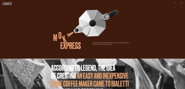
Bialetti’s website has a classic Italian vibe with a unique but retro color palette and simple illustrations.
Different textures and illustrations make this website feel like a vintage magazine, giving the branding time to shine. Its animated scrapbook feature feels tactile and lifelike.
We also really like the bold choice of peach against the maroon background — it has a retro effect without some of the usual tropes of this design style.
What we like:
- Bold colors match the coffee brand while offering a timeless feel.
- Textures create a tactile effect for the content throughout the site.
- Scrapbook photo animations add to the charming vintage aesthetic.
4. Ikony

The Ikony website is reminiscent of print newspapers — you know, those things they used to toss on your doorstep every day, where you read what was happening in the world?
Using black-and-white imagery and typography creates a vintage vibe, making the website’s design simple and effective. Bold colors help communicate the retro nature of this site's brutalist architecture.
What we like:
- Bold colors and font choices evoke the print advertising days of yore.
- The grid layout makes one feel as though they are browsing a zine.
- Large fonts feel like a retro billboard.
5. Old Iron Press
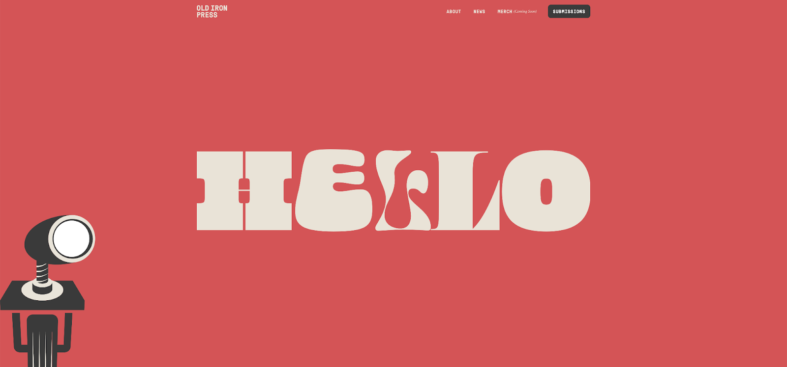
Old Iron Press has a charming retro brand palette that nods to their letterpress love and interest in well-designed books.
Typography is bold and fat, using vintage fonts and letterpress-inspired icons, such as a pointing hand. But, instead of reading Victorian, the site definitely feels more 1970s-inspired due to its color choices. You’ll have no trouble finding retro inspiration at the Old Iron Press website.
What we like:
- Bold illustrations evoke the press’s past and nod to its future.
- Red, black, and white color schemes pay homage to vintage newspapers.
- The brand’s social media utilizes color, look, and feel to continue the visual style.
6. Harvard Film Archive
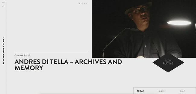
We love so much for the Harvard Film Archive, and it’s hard to pick just one retro element to focus on. But top of our list is the classic illustrations and the ledger-style layout of the blog content.
This works well to showcase the films without being too distracting via color palettes or other retro elements designers sometimes gravitate towards.
What we like:
- A cool layout evokes a vintage “ledger” feel, like something you’d see in an apothecary.
- The vintage aesthetic is simple and works well to showcase the films, rather than detract from them.
7. Jessica Hische

Jessica Hische is the design maven behind posters and logos for many of Wes Anderon’s films. Her website matches the brand, featuring a similar, muted, and retro color palette you would find from the director. The color feels a bit like a vintage candy store.
The typography — much of which is Hische’s own work — is retro with handwritten flourishes that play well with her hand-drawn illustrations.
What we like:
- The hand-drawn typography adds a personal and artistic touch to the site.
- Girlish colors are playful and fun while mimicking vintage films.
- Handmade typography makes this site detailed and layered.
8. Typewolf
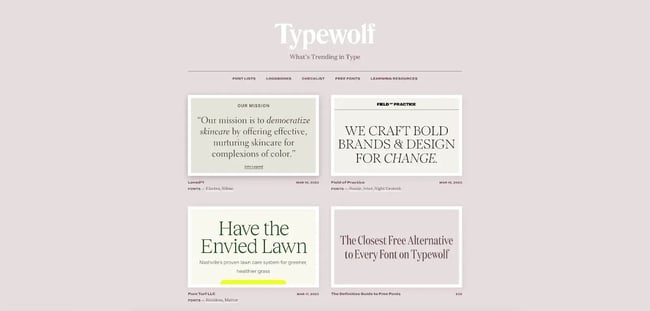
This soft purple website from Typewolf has loads of retro inspiration for you: The wide fonts feel like a magazine, and the gallery of font images is all cohesive enough to keep the vintage vibe throughout the site.
We like how Typewolf makes the blog post covers cohesive through its use of colors and typography.
What we like:
- The clean typography is easy to read and looks like a retro font.
- The muted color scheme is elegant and timeless, and pops of white are a unique touch.
9. Bonjour Market

The Bonjour Market website has a nice twist on the usual retro tropes — a French twist. With a bright gold header background showcased in the products across the website and a great selection of vintage fonts, you can find a lot of retro inspiration here.
You’ll love how the scrolling, retro fonts feel like an old movie marquee.
What we like:
- A French twist on the retro aesthetic with a roaring twenties appeal.
- Great fonts carry the retro look throughout the site with unique animations.
- The color palette is showcased in the products themselves.
10. Cone & Steiner

The Cone & Steiner website has a nice, retro logo that makes this general store’s website stand out. Typography and images from the store hone in on the brand’s timeless feel.
Marrying the colors and typography with stories about the brand’s history as a general store with 100 years of business makes this retro-inspired website feel effortlessly timeless.
What we like:
- A playful, colorful design that's both fun and functional.
- A clear focus on local and sustainable.
11. Heritage Type

We love everything about Tobias Saul’s typography storefront website — particularly the vintage fonts! Check out the way that Tobias creates vintage-inspired graphics using his fonts that are all over this website. You can find a goldmine of inspiration there as well as on his social media.
While the fonts are more Victorian than 1970s, the color palettes of gold, black and red could work for any period-inspired website design you might be working on.
What we like:
- Black and white typography creates a timeless feel that fits well with the vintage theme.
- Endless retro inspiration with Tobias Saul’s vintage type and fonts.
12. Dunderville
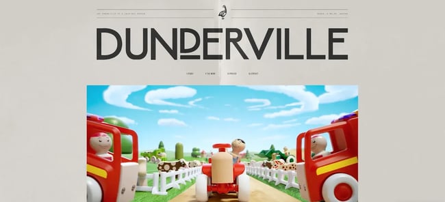
This website has one of the cutest logos we’ve ever seen, with a goose that looks straight out of a vintage illustration catalog. This black and white stamped logo, in combination with the magazine-inspired layout, feels perfectly old-school.
Dunderville adds a nice texture for a tactile feel to contrast its editorial content. Other vintage illustrations are also timeless, giving the brand a strong voice and presence overall.
What we like:
- Vintage illustrations feel hand stamped across this website.
- The paper texture of the website’s background helps make this feel like a throwback piece someone found in a drawer somewhere.
13. Girlboss
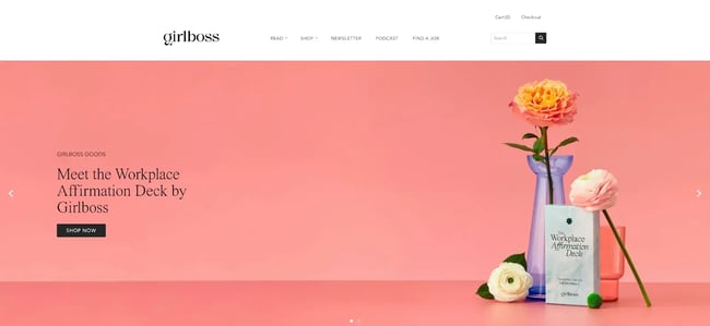
We really like Girlboss’s bold pink — it’s less girly than you might expect for a website with the name and more retro.
Plus, the logo type gives this website a unique take on the retro style. You won’t find gaudy, black-outlined illustrations here. Instead, a refined color palette fit for an Instagram lifestyle brand with a nod to the past.
What we like:
- Enjoy this brand’s youthful and retro vibe with the pink making a unique color choice.
- This brand bosses it up with a bold, but retro, logotype.
14. Bonnie Hong

Bonnie Hong’s website features vintage-inspired typography, bold colors, and playful illustrations. But while so many retro-inspired websites go for the 1970s feel, Bonnie’s portfolio reads 1980s.
You’ll surely be inspired by the pixelated, computer-age graphics and modern color palette. Despite the era, the website still feels modern with professional typography and layout choices.
What we like:
- Playful illustrations evoke a 1980s retro flavor, with quirky copy to match.
- We love the mouseover trail that appears when users interact with the site.
15. Paak House

Paak House focuses on soul and R&B music, and the website design takes its cues from vintage soul and funk. From the bright color palette to illustrations that would feel at home in any 1970s record bin, this site has a lot of retro eye candy.
What we like:
- Color illustrations pop on the black background, beckoning you back to the days of 1970s records.
- Primary colors and retro font choices with long shadows and thick outlines feel very '70s.
16. Kalso

The Kalso website has a retro feel, with a muted color palette, vintage fonts, and retro illustrations. The scrapbook feature on the website offers loads of inspiration for anyone looking to incorporate a retro feel with their website design.
The animation is seamless and only adds to the scrollability of this design. It’s a fun retro-inspired website.
What we like:
- Vintage fonts add to the look, harkening to the days of vintage advertising.
- Scrapbook images are animated as you scroll, giving a tactile, zinelike aesthetic.
17. Crappy Explanation

Crappy Explanation’s retro design is so spot on that it needs no explanation. But, just in case — we posit that this website will easily serve as inspiration for any retro-inspired websites you might be working on.
The Atari-esque logos that give some definite Tron vibes will, if anything, make you smile. Bright 80s colors and an actual, browsable record bin make for a cool, retro experience overall.
What we like:
- The colorful and pixelated design perfectly captures the retro feel of old video games.
- Scroll down for a cool, animated record bin you can actually browse.
18. Accord

Accord is a music shop and magazine with an interesting layout that gives off retro vibes. The orange and black logo feels straight out of the 1970s music scene.
Even the records that have been curated by this shop all lean retro in their palettes and font choices. Colors are bold and bright throughout the website, with loads of retro inspiration in store for visitors.
What we like:
- A bold, black, and orange logo evokes serious retro vibes right off the bat.
- The cool, magazine-style layout feels both classic and somehow timeless.
- Even the curated music selections have a retro feel.
19. Mondo

The Mondo brand is living up to its name with big images, oversized halftone textures, and bright colors that appear modern and timeless.
Cool illustrations offer a nostalgic comic book look and feel. Its graffiti-like use of art throughout the site pays homage to its humble beginnings as a quasi-bootleg art gallery and t-shirt shop. Be sure to check out Mondo’s unique website for your retro inspiration.
What we like:
- A large, oversized halftone texture to communicate its passion for comics and art.
- The torn paper texture mimics the paper-printed nature of the goods in the shop.
20. McSweeney’s
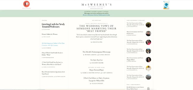
McSweeney’s is a household name for pop culture critics and nerds, and a timeless, retro website works well for the brand. You wouldn’t necessarily think of this as a retro brand, but the website’s design is a throwback to vintage literary magazines.
Muted color palette? Check. Classic fonts and stylish bylines? Double check. The interesting choice of link colors — yes, it’s blue, but still — keeps it fresh.
What we like:
- A unique color palette that goes beyond the usual bold colors with black outlines.
- Clean font choices keep the site content-focused while offering a classic touch.
How to Design a Retro-Inspired Website
Now that you’ve explored retro websites, it’s time to design your own. We’ll explain how below.
1. Look through archives for inspiration.
As retro website designs make a comeback, you can find several resources that showcase Web 1.0 sites and modern takes on 1990s web aesthetics. Here are a few to look into:
Peruse all the variations and types of websites from the beginning of the internet age. You’ll surely find inspiration for your retro themes, from images to fonts and more.
2. Choose a hosting platform.
Picking a website hosting platform is critical to building the website of your dreams. There are thousands of web hosts out there, and the key is finding the right service for your website and small business.
Start by exploring Hubspot Content Hub, Blue Host, Site Ground, and One.com. Check out our guide here to learn everything you need to know about web hosting.
3. Decide on your font and brand effects.
As we’ve covered in the sections above, your font and brand look goes a long way to making a site feel retro. Try to find certain color schemes, like a mix of neutrals, or “web-safe” elements. Bold colors also can give off a retro feel.
4. Add visual effects.
Whether it is a ’90s-style GIF or a funky text design, retro websites are all about adding fun, visually interesting effects.
Making the Most of Retro
Just about everything old can be new again!
Whatever your audience may be, a retro website design may be exactly what you’re looking for in order to create a timeless brand that stands out from the rest. Use 1980s colors, 1970s vintage fonts, and a dash of texture here and there to create your own unique retro combination.
When you’re ready to get your website online, take a look at the HubSpot CMS! We offer a comprehensive suite of tools you'll need to run your online business.

Website Design Examples


![15 black and white website designs to inspire your own [+ pro tips]](https://53.fs1.hubspotusercontent-na1.net/hubfs/53/black-and-white-website-design-1-20250520-1336267.webp)

![Gradient Website Design Examples That Prove This Trend Is Far From Over [+Tutorials]](https://lh7-us.googleusercontent.com/htOWIbyCIoCMxSjC4gJunkGnhCzXpccjTrL8NwoGdRdCsSiEmEAxe_qBFkMrzy2Y8d3cwEr_DMzSGHq9Xi-hQFnMJCo8HDQJ1yQGigcSfFxI2QKXo0s7xXSB2sY-eALG1iUqnHXgomcDsnp7AHRSH1s)
![15 Brochure Website Examples to Inspire You [+ How to Make One]](https://53.fs1.hubspotusercontent-na1.net/hubfs/53/brochure-website-examples-1-20250319-362228.webp)
![28 Types of Websites to Inspire You [+ Real-Life Examples]](https://53.fs1.hubspotusercontent-na1.net/hubfs/53/types-of-websites.png)

