What is Skeuomorphism?
Coined in 1889 by British doctor and amateur archeologist Henry Colley March, skeuomorphism is a portmanteau of two Greek words: Skeuos, which means "container" or "tool", and morph, which means "shape". Taken literally, the term means "to contain a shape" — but how does that apply to design?
The Interaction Design Foundation puts it simply: "Skeuomorphism is a term most often used in graphical user interface design to describe interface objects that mimic their real-world counterparts in how they appear and/or how the user can interact with them."
The word was originally used to describe structures or physical products that carried over familiar design elements from previous iterations.
Consider the classic American hot dog. While variations across brands exist the basic size, shape and color of hot dogs make them both easily identifiable and familiar. New offerings on the market — such as plant-based alternatives — use physical skeuomorphism to mimic the design and packaging of typical hot dogs, empowering consumers to try something new without feeling overwhelmed.
Digital skeuomorphism does the same thing in a virtual space. The first generation of iPhones offered a great example — even users who had no experience with mobile devices could easily recognize key functions: The "phone" icon featured a classic handset image, while the camera button looked like — you guessed it — a camera lens.
Rise of the Skeuomorphs
As digital devices moved into the mainstream, skeuomorphism offered an easy way for users to connect familiar functions with new UI elements.
The Windows Recycling Bin offers an easy example. Users instantly connect form and function — files, documents, and images they no longer want are tossed into this digital dustbin. Calculator apps across iOS and Android devices adopted the common button and color scheme of physical number-crunching devices, while burgeoning ecommerce sites leveraged the image of grocery shopping carts to point users in the right direction when adding new items or heading to the checkout.
Perhaps the most interesting application of skeuomorphism is the combination of digital and physical components to deliver a familiar experience. Think about the camera app on your smartphone or tablet. In addition to the icon mimicking the common camera shape, most devices include the classic "shutter' sound when pictures are taken — in turn providing physical feedback for a fully digital process.
Benefits and Drawbacks of Skeuomorphism
As skeuomorphism became the go-to digital design sensibility, it attracted both champions and detractors. Both made great points about the use (and misuse) of skeuomorphic design, so let's break down some of the top benefits and drawbacks.
Key Advantages
- Simplicity — Skeuomorphic design elements don't require explanation because function matches form. This helps streamline user interaction and limit frustration.
- Immersion — Adding skeuomorphic icons or backgrounds can help increase user immersion by aligning expectations with experience.
- Feedback — By integrating physical features — such as camera shutter sounds or haptic vibration — with digital forms, users get immediate feedback.
Potential Pitfalls
- Outdated — Critics argue that many skeuomorphs are no longer relevant and therefore lack value. For example, while the floppy disk icon still represents the "save" function in many word processors, these disks haven't been used for decades.
- Complex — There are also concerns around complexity. At the peak of skeuomorphic design, for example, many web pages and applications contained a host of unusable elements that offered familiarity but no function, creating a cluttered and overly complex design.
- Performance — The unrestrained addition of skeuomorphic components can negatively impact application or website performance as these elements are continually loaded and refreshed.
Skeuomorphic Design Examples
It's one thing to talk about skeuomorphic designs — but what do they look like in today's digital environment? Let's highlight a few examples.
1. Calendar
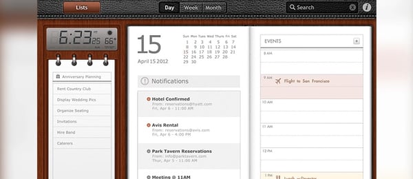
This calendar is instantly familiar. It has all the hallmarks of common planners and schedulers — room for notes, events and notifications — but also includes a digital clock and temperature readout.
2. Archive
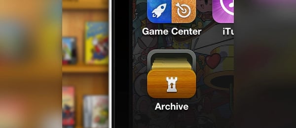
This skeuomorphic design is a single application button — but it clearly gets the message across with a "drawer" effect and "lock" symbol.
3. Clock Radio
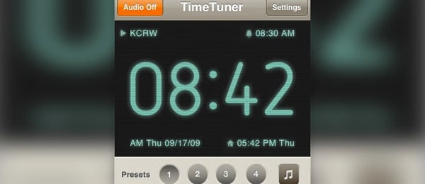
Harkening back to the halcyon days of digital clock radios, this application includes familiar elements that are clean and easy-to-use.
4. Light Switch
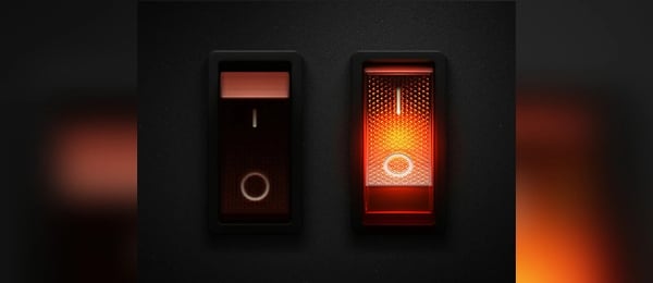
Simplicity is the name of the game here. No explanation is required for these switches — a quick tap and they're illuminated, another and they're off. It's clean, easy and straightforward.
5. Paper

This design evokes the tactile feel of paper by subtly showcasing the imperfect "stack" that appears when using multiple sheets.
Skeuomorphic vs. Flat Design vs. Minimalism vs. Neumorphism
While skeuomorphism remains common across digital devices and web pages, other design styles have emerged to offer a new approach.
- Flat Design — Flat design trades familiarity for an emphasis on readability and cleanliness. Each element has a single purpose and straightforward design that isn't necessarily tied to real-world function.
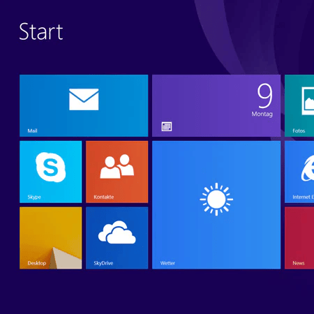
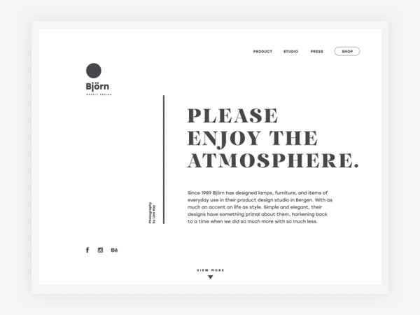
- Minimalism — Minimalism takes the flat design sensibility a step further with a focus on using the fewest elements possible. Nothing is wasted, and white space is often prioritized.
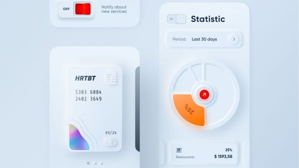
- Neumorphism — Neumorphism combines elements of skeuomorphism and flat design elements to deliver a more streamlined user experience. Buttons and images often have slight shadows and subtle color gradients along with familiar designs, but without the in-your-face familiarity of first-generation Skeuomorphs.
The Future of Familiarity
Despite potential drawbacks in a digital-first world, skeuomorphism remains popular as a way to communicate familiarity and help users bridge the physical/virtual divide.
And while alternatives such as flat design and minimalism have gained ground in recent years, combined approaches such as neumorphism are likely frontrunners as designers look to leverage the power of skeuomorphs without negatively impacting UI performance or the user experience.
Editor's note: This post was originally published in April 2020 and has been updated for comprehensiveness.
Design


![What's a Design System & What Components Is It Made Up of? [Examples]](https://53.fs1.hubspotusercontent-na1.net/hubfs/53/design-system.png)
.webp)

