When creating any website, you want to be sure that everyone who visits it is able to fully experience what you’ve created, no matter their abilities. That’s where the Web Accessibility Guidelines (WCAG) come in. These formalized standards have set the foundation for inclusivity in web design.
Over the past few decades, WCAG has evolved much like the digital technologies we interact with every day. As a writer who’s focused on meeting the needs of my audience, accessibility is a topic that’s front of mind.
Download Now: Free Website Accessibility Checklist
As I’ve been researching the key components of website accessibility, how accessibility and SEO interact, how you can conduct an accessibility audit, and more, I want to share my learnings so you can get up to speed.
In this article, here’s what I’ll cover:
Web Content Accessibility Guidelines (WCAG)
The Web Content Accessibility Guidelines (WCAG) are a set of guidelines for making web content more accessible to people with disabilities. Published by the Web Accessibility Initiative (WAI), WCAG is an international standard for web content accessibility.
How the Web Content Accessibility Guidelines are Organized
The Web Content Accessibility Guidelines are organized around four principles:
- Perceivable. Users can consume content via the senses (sight or hearing, sometimes touch).
- Operable. Users can operate a website with the controls they use normally.
- Understandable. Websites and user interfaces are comprehensible to users.
- Robust. Websites should work cross-browser and cross-platform.
I’ll go in-depth on each of these principles below.
There are thirteen web accessibility guidelines in all, and each guideline is broken down further into a list of success criteria. The success criteria are designed to be testable measures of accessibility. Each success criterion has a level of A, AA, or AAA. Level A criteria are the easiest criteria to pass and Level AAA are the hardest.
You might see a website described as WCAG 2.0 AA compliant. What does this mean? It means that the site passed all the WCAG 2.0 level A success criteria and the level AA success criteria. Think of it like levels in a video game. You can‘t complete level two unless you’ve completed all of level one.
Government websites in many countries have adopted WCAG 2.0 or WCAG 2.1 at level AA as their preferred standard. In the U.S., there have been rulings under the Americans with Disabilities Act (ADA) to say that the ADA applies to websites. There has not yet been a consensus on what web accessibility guidelines a website should follow to comply with the ADA.
As it seems highly likely that WCAG will be recommended in the future for ADA compliance, it's worth taking the time to understand and apply these web accessibility guidelines now.
Versions of the WCAG
Digital accessibility is constantly evolving as we find more ways to improve content online and make it easy to use for people of all backgrounds. Over the past few decades, WCAG has gone through several iterations, each improving the way we approach web accessibility.
Here’s a closer look at each version.
WCAG 1.0
The first version of WCAG was released in May of 1999. This first version formed the foundation for what accessibility looks like in web page design and how you can create an experience that’s inclusive for all visitors.
Key points:
- Introduced 14 guidelines with checkpoints at three priority levels.
- Focused on HTML-based websites.
- Emphasized alt text for images, clear navigation, and proper use of HTML.
Though much of the technology and software has changed in the past two decades, many of these initial principles are still a great starting point.
WCAG 2.0
Nearly a decade later, in 2008, WCAG 2.0 introduced the principles of perceivable, operable, understandable, and robust (which are still key components of the WCAG guidelines today). 2.0 significantly overhauled the first version and introduced a more flexible and technology-neutral approach.
Key changes:
- Organized around four principles: Perceivable, Operable, Understandable, Robust (POUR).
- Introduced three levels of conformance: A, AA, and AAA.
- Separated guidelines from techniques, allowing for more adaptability.
WCAG 2.0 had a massive impact on the web community and policy at large, becoming the global standard for web accessibility and influencing laws and regulations worldwide.
WCAG 2.1
In 2018, WCAG 2.1 debuted as an interim measure to respond to advancements in digital content since the publication of 2.0. (Considering the gap of time was between 2008 and 2018 – there was a lot of change.)
This update addresses gaps in coverage for mobile devices, people with low vision, and people with cognitive disabilities.
Key additions:
- 17 new success criteria across all levels.
- Enhanced mobile accessibility requirements.
WCAG 2.2
WCAG 2.2 version was published in 2023 to include new features that help make the user experience more inclusive and user-friendly. This included input assistance, navigation features, and much more.
By focusing on principles, not technology, WCAG emphasizes the need to think about the different ways people interact with content. The GOV.uk website offers some examples of what this looks like for users who:
- Use a keyboard instead of a mouse.
- Change browser settings to make content easier to read.
- Use a screen reader to “read” (speak) content out loud.
- Use a screen magnifier to enlarge part of a screen.
- Use voice commands to navigate a website.
To stay compliant with WCAG 2.2 guidelines, you’ll need to get an accessibility audit before your beta assessment to provide evidence that your service meets level AA.
WCAG 3
As of July 2024, the latest version of WCAG is still in draft mode. WCAG 3, also known as Silver, will have a different structure, different conformance model, and broader scope than previous versions. It will also apply to web content, apps, tools, publishing, and emerging technologies on the web.
It’s still unclear when WCAG 3 will be fully rolled out, but W3C’s website says that it could take a few years. In the meantime, however, you can have a look at the working draft to learn more about what to expect.
How to Follow Web Content Accessibility Guidelines
- Provide alternatives for non-text content.
- Provide different options for viewing media content.
- Create content that can be viewed on different platforms.
- Make content easy to hear and see.
- Make all functions keyboard accessible.
- Allow users to adjust timing.
- Avoid content that blinks or flashes a lot.
- Provide tools to help navigate your website.
- Accommodate various input options.
- Ensure text content is grammatically correct.
- Design predictable website features.
- Offer assistance when users make mistakes.
- Write code that works.
1. Provide alternatives for non-text content.
WCAG Guideline 1.1: "Provide text alternatives for any non-text content so that it can be changed into other forms people need, such as large print, braille, speech, symbols or simpler language."
All non-text content needs a text description to convey the meaning to users who can't see it. This means images, primarily, but also other content such as CAPTCHAS, ASCII art, and emoticons.
The most common method to describe images is through alternative text, commonly known as image alt text. This is a short description added to the HTML code for the image that indicates what it represents.
Most content management systems have a mechanism to add alt text when an image is uploaded.
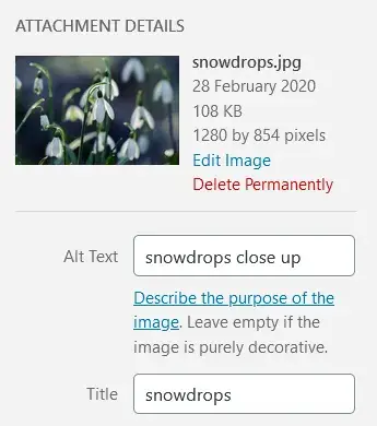
When you write alt text, think how you would describe the image to someone on the phone. You don‘t need to add the words "image of" or "graphic of." Screen reader software, which blind people use to access the web, notifies users when an image is present. It’s okay to add keywords to alt text if they're relevant for SEO. However, stuffing the same keywords in every image on a page is uncalled for.
This applies to GIFs as well. HubSpot Senior Software Engineer Shea Hunter Belsky says, “Lots of GIFs have embedded subtitles these days, so it's often necessary to describe who is saying what. For example, good alt text for the GIF below might be: Zuko from Avatar, the Last Airbender saying 'Hello, Zuko Here!'”

If an image is decorative, it should have a null alt attribute, i.e., alt=“”. WordPress, for example, marks an image as decorative (alt=“”) if you leave the alt text blank.
Linked images are a bit different. They need alt text that details their URL destination, not a description of the image.

For example, if this image of a house was linked to a home page, it would need alt=“Home”, not descriptive alt text like alt=“an orange house with a yellow roof and a brown picket fence”.
If you're unsure on what alt text to write, you can consult this handy Alt Decision Tree, or Hubspot's guide to image alt text.
.png)
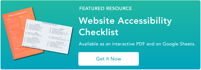
Website Accessibility Checklist
This checklist will help you make the following more accessible on your website:
- Web Pages
- Navigation
- Video & Media
- And More!
Download Free
All fields are required.
2. Provide different options for viewing media content.
WCAG Guideline 1.2: “Provide alternatives for time-based media.”
Time-based media refers to audio and video content. If your site has audio or video, it's most likely that they are pre-recorded, so you should supply them with alternative formats when you upload them. These formats will allow your visitors with hearing or visual impairments to access the content.
Audio Media Guidelines
For audio content, providing a transcript is the most common way to provide an alternative format. Transcripts should have a full record of speech that describe other relevant sounds in the recording, like sound effects or music.
Here's a good example from the Founders Unfound podcast:

Video Media Guidelines
To meet the captions requirement, videos should have captions synchronized to the audio. Captions may be open (burned into the video) or closed (able to be toggled on and off).
Here is an example of a closed caption video from HubSpot:
A common closed caption format is a .SRT file, which is a text file which is a text file containing the dialog and timings for a video. When you upload a .SRT file alongside your video, it enables your visitors to turn on closed captions if they need them. Try not to rely on auto-captioning, as it may misrepresent some dialogue.
For silent videos or parts of videos without audio, you can add an audio description describing what is happening in the video, e.g., for a video showing how to assemble a piece of furniture.
It's good practice to provide transcripts for videos as well.
Pro tip: One big advantage of captions and transcripts is that they can be indexed by Google and help with your SEO.
3. Create content that can be viewed on different platforms.
WCAG Guideline 1.3: “Create content that can be presented in different ways (for example simpler layout) without losing information or structure.”
This guideline has to do with the structure of pages and relationships between elements. Some of the problems can be solved by using the correct HTML code. Using a WYSIWYG editor makes it easy to add this to web pages. Here are three examples of using code for better accessibility.
Headings
Using headings makes a page easier to scan. People with vision loss who rely on a screen reader also benefit from headings as they aid navigation. When a section has a heading, screen reader users can jump directly to that section and bypass other parts of the page.
Start with a heading 1 for the page title. Your first subheading will be a heading 2. A further subheading under your heading 2 will be a heading 3, and so on. It‘s important to use proper headings because text that is bold or enlarged won’t be recognized as a heading by a screen reader.
Here's part of the heading structure for a HubSpot post on making a sales plan. There is a single Heading 1, the page title. Each main section has a heading 2, and subsections have heading 3s. In addition, many of the heading 3s are numbered in sequence for clarity.

Lists
Use bulleted or numbered lists for groups of items. Screen reader software can tell a user how many list items there are, and which one is being read out. Otherwise, screen reader users miss out on that information. Using bulleted or numbered lists may also help your content to be shown in Google's featured snippets.
Emphasis
Emphasize text with bold or italic text to make it stand out. Bold is preferable.
4. Make content easy to hear and see.
WCAG Guideline 1.4: “Make it easier for users to see and hear content including separating foreground from background.”
This guideline is about making content easier for people to see or hear.
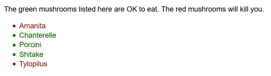
Use of Color
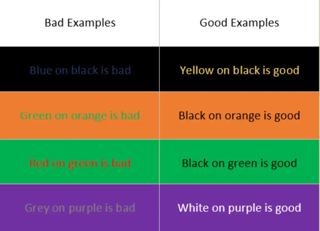
Don't rely on color alone to convey information, as colorblind people may not be able to make the distinction.
As an example, the UK Government Digital Service deliberately created an inaccessible website. This example taken from the website shows that careless use of color could have serious consequences for colorblind people.
Underlining links in your content can also help colorblind people. Otherwise, link text must have at least 3:1 contrast with surrounding body text, which you can test using WebAIM’s Link Contrast Checker.
It also must present a non-color indicator (typically underline) on mouse hover and keyboard focus. If you don‘t do this, and your link color and the surrounding text appear too similar to a colorblind person, they won’t be able to tell them apart. As a result, they won't click on your links.
Audio Control
Does any background audio autoplay on your site? If so, make sure your visitors have a control to stop it or adjust the volume. Speech or music that autoplays and can't be controlled will interfere with screen reader software as it reads a web page.
Minimum Contrast
Poor color contrast can affect anyone, but particularly people with low vision conditions. If you have any control over the design, test the color combinations you use for background and foreground text.
A good strategy would be to use the Emulate vision deficiencies feature in Chrome DevTools. With this feature, you can find out how people with vision deficiencies experience your web app. This will not only help you discover and resolve contrast issues — it will also help you build empathy with users with blurred vision and various types of colorblindness.
If you identify a section that's difficult to read using DevTools, you can figure out the exact contrast ratio using a tool like WebAIM's Contrast Checker.
To be WCAG AA compliant, WCAG recommends a contrast ratio of 4.5:1 for regular text, and 3:1 for large text. For AAA it's even more strict.
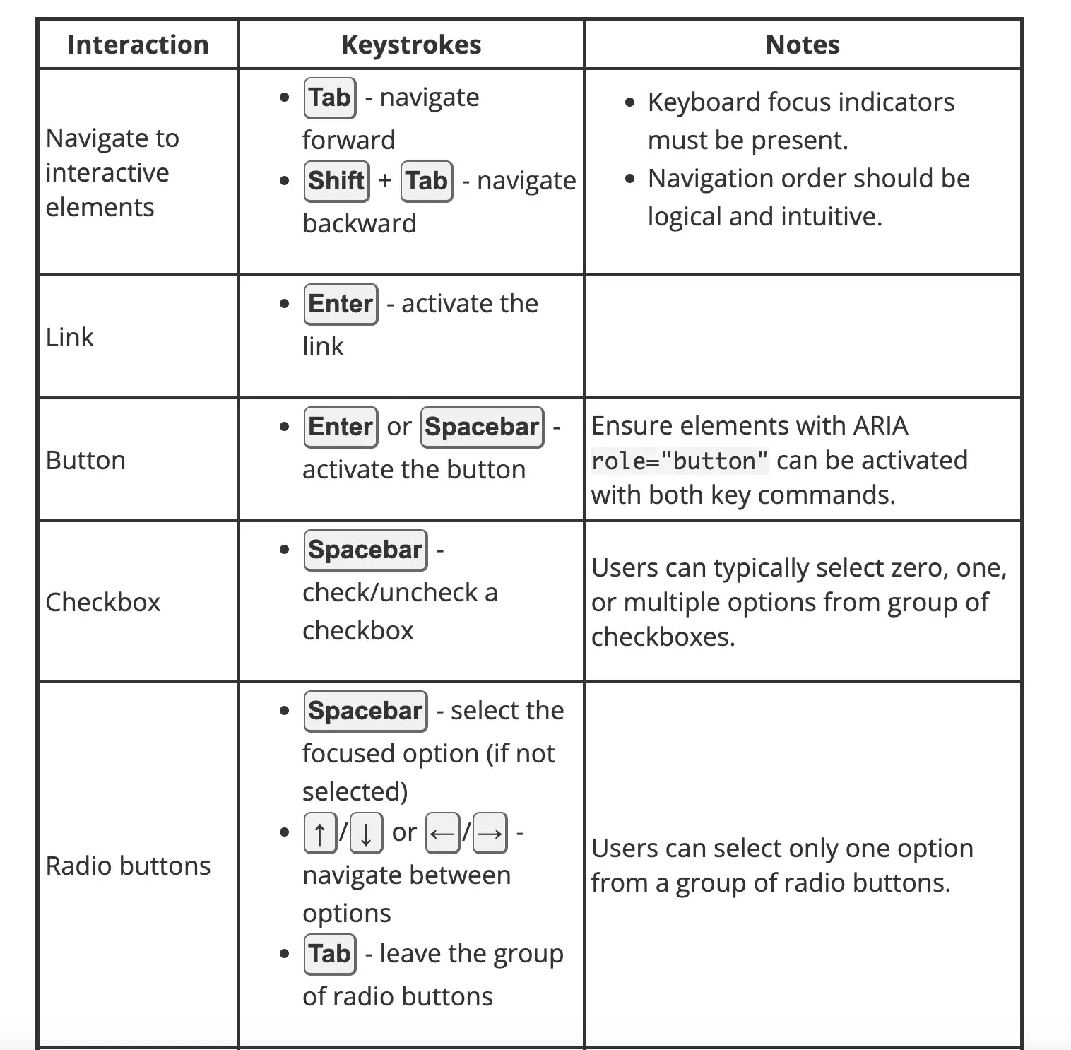
5. Make all functions keyboard accessible.
WCAG Guideline 2.1: “Make all functionality available from a keyboard.”
All functionality on a site should be reachable via a keyboard, as not everyone can use a mouse. People who can‘t use a mouse include those with fine motor control problems, caused by a condition such as Parkinson’s disease; those with muscle spasms, as seen in multiple sclerosis; and those with pain in their hands or arms, which can be caused by repetitive strain injury.
Try using the keyboard only for a day to browse the web. Pack away your mouse, or cover your touchpad, and use the tab key to navigate. When you reach a link, check that you can use the enter key to go to the destination. On buttons, check that pressing enter or the space bar performs an action, such as submitting a form.
If you appear to skip some controls when doing this exercise, it might mean that they don‘t have keyboard support — something that you can raise with a developer. And if you can’t tell where you are on the page when you use the tab key, that's another accessibility issue.
Pro tip: Belsky also suggests trying a screen reader to see how they can navigate their website: “If a screen reader can't get to it, there's a problem!” (See WCAG Guideline 2.4: Navigable.)
6. Allow users to adjust timing.
WCAG Guideline 2.2: “Provide users enough time to read and use content.”
Users should be able to adjust timings on websites if they need more time to complete actions. This is important for elderly users, who may be slower at browsing, motor impaired users, and users who are anxious.
One example of a situation where timing is critical is making a booking. If there's a time limit a user should be allowed to extend it. Another example is alert messages. Users should be permitted to turn off alerts if it would interrupt their browsing, except for emergency messages.
7. Avoid content that blinks or flashes a lot.
WCAG Guideline 2.3: “Don't design content in a way that is known to cause seizures or physical reactions.”
People with seizure disorders are sensitive to blinking or flashing content. The advice is to avoid using any content that blinks or flashes more than 3 times a second, as it might trigger a seizure. Be aware that some people are sensitive to the motion effect in parallax scrolling, so you might want to limit its usage.
8. Provide tools to help navigate your website.
WCAG Guideline 2.4: “Provide ways to help users navigate, find content, and determine where they are.”
Make it easy for visitors to find their way around web pages by implementing the following five guidelines on your site.
Defining the Page Title
A web page should have a descriptive title that indicates its content in the title tag. A well-written title tag makes it clear to users and search engines what the page is about, can help the page rank higher in search, and assists a visitor in finding it when there are multiple tabs open.
You can check the title tag of your page by hovering your mouse over the browser tab. Usually a page title will be the same as the first heading on the page.
Descriptive Links
Experienced screen reader users can have pages read to them very fast. Rather than listen to the whole page, they may browse a page by a list of the headings, or a list of links. It‘s therefore not very helpful for them to hear links that say "Click here," for example, because they’ll have no idea where they're being sent to.
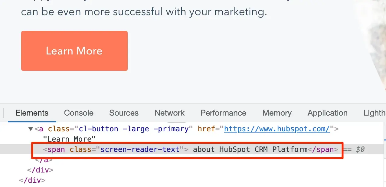
HubSpot Tech Lead Sang-Min Yoon provides this example: “Let's say there is a button that just says 'Learn More.' This is not accessible because users don't know what they are learning more about. So screen reader text is needed to let users know what they are learning more about.”
In the screenshot below, you can see the screen reader text “about HubSpot CRM Platform” is highlighted.
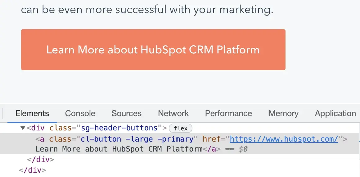
Another solution is to simply be more descriptive for the text provided for the link, Yoon said. In the screenshot below, the button text reads “Learn More about HubSpot’s CRM Platform” on the front end and in the source code:
Wayfinding
For websites bigger than a few pages, it helps if users have different methods to reach their destination.
Some people, such as those with visual impairments or cognitive disabilities, find it easier to use a search facility to find their way rather than a complex navigation menu.
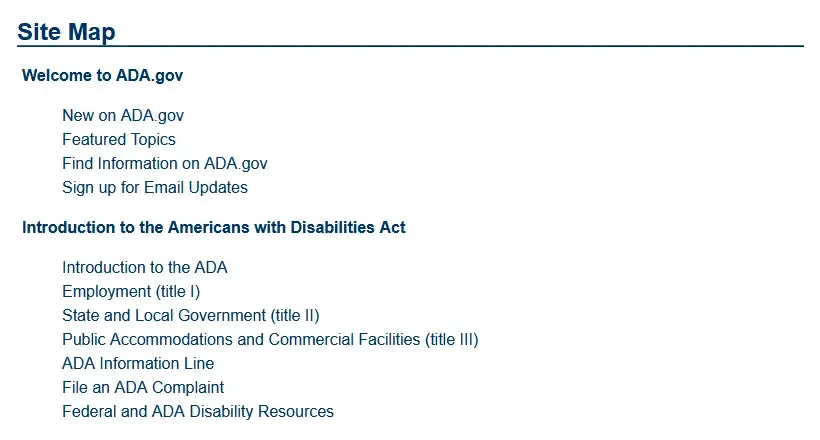
A site map can also be a useful tool. A site map lists all the website's pages in one place grouped by section. Using one makes it easy for users to quickly find what they need.
Another aid is breadcrumb navigation. Breadcrumb navigation is like a “You are here” sign, with links letting a visitor know where they've been and how to return home.
Finally, consider adding skip links to allow keyboard users to skip to the contents of the page.
Yoon says this is a particularly helpful feature for primary navigation menus that contain a lot of links: “Let's say for example that there are 30 menu links on a primary navigation menu. Keyboard users would need to tab through all 30 items to get to the main content area if there wasn't a skip link.”
Keyboard Focus
A focus indicator, also known as a focus ring or visible focus, is a visible indication on links, buttons, and form fields. Users will see a focus indicator when they use the tab key to navigate a web page. Focus indicators often get overlooked in web design but are essential for sighted keyboard users to find their way. Without a focus indicator, they won't know where they are on a page, and could waste time clicking on links to unknown destinations.
Focus indicators usually show as an outline or a highlight on links, buttons, and form fields. In the example below, a dotted outline and a yellow highlight make up the focus indicator on the link. It's an obvious way for the user to see where they are on the page.
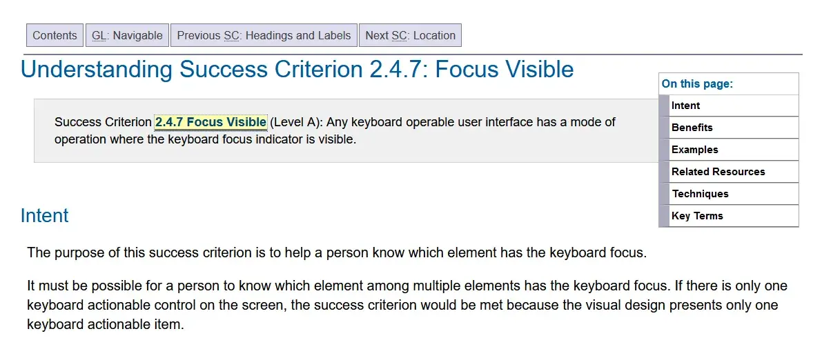
It‘s essential that focus indicators have a high contrast level, like the one above. Otherwise, they aren’t actually helpful for sighted keyboard users.
Section Headings
Having section headings relates back to WCAG Guideline 1.3: Adaptable. Section headings break up the page and increase readability. A web page with a wall of text is not user-friendly and is difficult to read.
9. Accommodate various input options.
WCAG Guideline 2.5: “Make it easier for users to operate functionality through various inputs beyond the keyboard.”
Guideline 2.5 is new in WCAG 2.1. It considers user input beyond the traditional keyboard and mouse. This includes tapping and gestures on touch devices, and speech input. This guideline's success criteria are more applicable to developers.
Website Accessibility Checklist
This checklist will help you make the following more accessible on your website:
- Web Pages
- Navigation
- Video & Media
- And More!
Download Free
All fields are required.
10. Ensure text content is grammatically correct.
WCAG Guideline 3.1: “Make text content readable and understandable.”
You should aim for all your text content to be easily read and understood by your audience. Below are a few tips.
Page Language
It's important that you set the language of a page because it helps both assistive technologies and conventional user agents (like media players) render text, captions, and pronunciation rules more accurately. As a result, users with disabilities will be better able to understand the content.
Michele Herzog, a HubSpot developer on the Web Accessibility team, said, “The TLDR I always tell folks is that it tells the screen reader what language to read the page in. If those don’t match, you might get a screen reader trying to read Spanish content as if it’s in English, and it’s very difficult to understand.”
If you use WordPress, you can define this in your Settings. The language will be applied to all your website's pages.
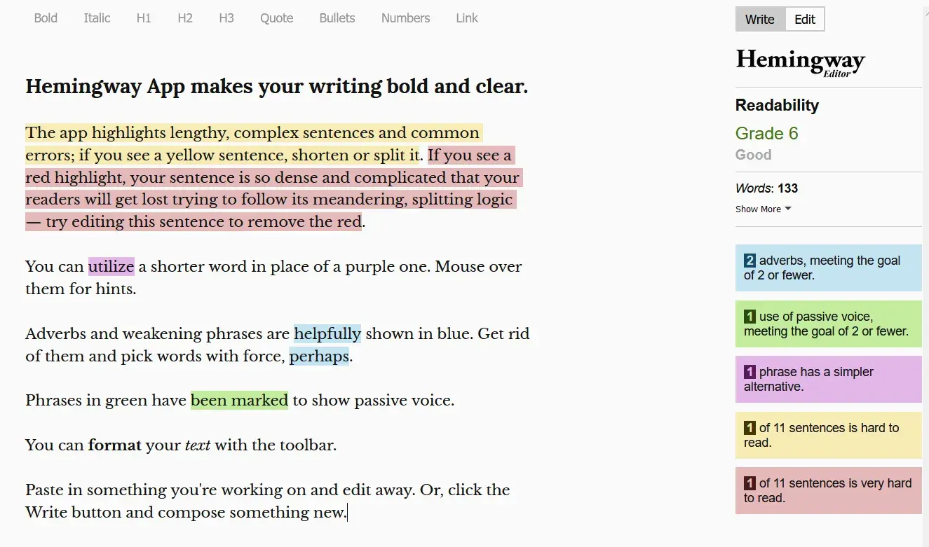
Plain Language
Write in plain language where you can. The Hemingway App can help with this. It warns you when your sentences are too complex or when you could use simpler words by highlighting the text in color.
If you need to use abbreviations or unusual words, they may not be universally understood, so define them for your readers' benefit. You could include your definition as part of the text, or link to the definition in a glossary.
11. Design predictable website features.
WCAG Guideline 3.2: “Make Web pages appear and operate in predictable ways.”
Users expect websites to behave in predictable ways. If the navigation on a website switched order or position on every page, most of us would get very confused. The effect would be heightened for anyone who had low vision, blindness, or a cognitive disability.
One example of unpredictable behavior is if a link is set to open in a new window or tab, and the user isn‘t warned before they click or tap. This will likely baffle or annoy some users, particularly those with cognitive issues, because they can’t use the Back button on the browser to return to where they came from.
ARIA roles are also key. Herzog said, “The main benefit of them is that common website features, like tabbers or toggles, have predefined keyboard interactions and roles you can use on your website to make your content — and how a user interacts with it — predictable and standardized.”
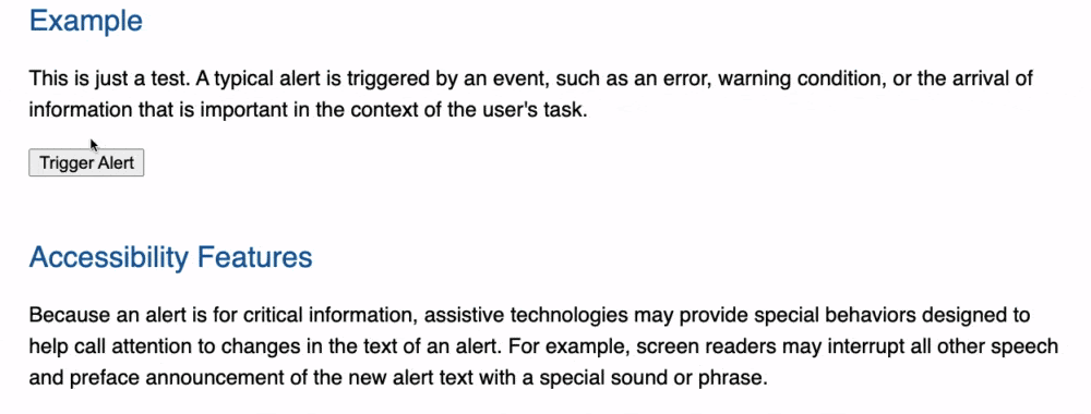
For example, say a button element contains a div element with an ARIA role set to “alert.” This role identifies the div element as the container where alert content will be added or updated.
12. Offer assistance when users make mistakes.
WCAG Guideline 3.3: “Help users avoid and correct mistakes.”
We all have to fill in forms on websites sometimes and often we make mistakes. Tips on completing forms and descriptive error messages help prevent or correct mistakes. Avoid doing the following things and you will make your forms more accessible.
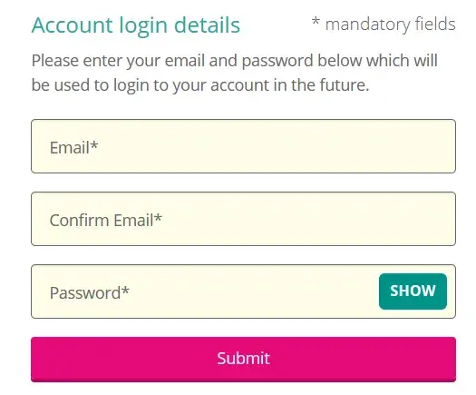
Relying on placeholders instead of form labels. Placeholder text disappears when someone starts typing. Anyone with memory issues may forget what information they were supposed to complete, with the result that they may type in the wrong data or abandon the form completely.
Withholding key information until after the form is submitted. An example is what characters to use when creating a password. If information is quite complex to fill in, people need to know the format first. Otherwise, they can get frustrated with having to repeat their input through no fault of their own.
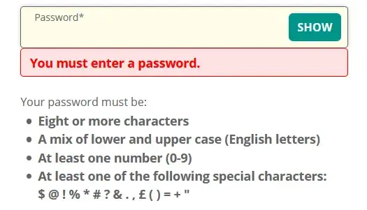
Failing to mark required form fields as required. It‘s very frustrating for someone to complete a form and find it fails on submission, because it wasn’t obvious which form fields were required and which were optional. Keep your users happy by marking required fields clearly.
Giving unhelpful error messages that don't tell users how to fix their mistakes. “Email address is invalid” tells someone what the error is, but not what to do to correct it. “Your email address is missing the @ symbol” is better, as it gives specific feedback on how to fix the error.
13. Write code that works.
WCAG Guideline 4.1: “Maximize compatibility with current and future user agents, including assistive technologies.”
The final guideline of the Web Content Accessibility Guidelines relates to the technical aspects of web pages. It covers these points:
Is the code correct and valid? Browsers are smart and can usually compensate for errors, but screen readers might not be able to recognize controls without the right code.
Are semantic elements used when appropriate? Semantic HTML uses HTML tags to effectively describe the purpose of page elements, not just because of the way they look.
Emphasizing the importance of using valid, semantic, standard HTML, HubSpot Senior Web Developer David Ding said, “Often developers can over-engineer components, which then need a lot of manual intervention to make them accessible, when using boring, standard <button> or <input> elements would have done the trick and supplied most of the accessibility out of the box.”
Are custom controls built in such a way that they can be used correctly? For example, an accordion might not be usable by a screen reader user if poorly coded.
Do users get status messages that let them know of a change as a result of their actions? If a user adds an item to a shopping cart, they should be told as much.
Common Web Accessibility Barriers
Over 96% of the top one million web pages had accessibility issues in 2023, according to WebAIM. Meaning just about any website likely has room for improvement when it comes to improving accessibility.
It’s easy to feel overwhelmed when looking at a long list of criteria you should be following — but don’t fret! Remember that it’s a process to follow, not an end destination. When it comes down to the most common issues websites face around accessibility, the solutions are quite simple.
According to the accessibility experts I spoke with, there are three common areas you can focus on: color contrast, alt text, and keyboard navigation.
Poor Color Contrast
People with limited vision or color blindness cannot read text if there is not enough contrast between the text and background (for example, light gray text on a light-colored background).
Here’s a handy example of what good color contrast looks like. If you want to get more technical, color contrast guidelines indicate that there should be at least a 4.5:1 ratio between the foreground content and the background content.
Aside from using good color contrast principles in the design of your site, you can also add extra features to support high contrast viewing.
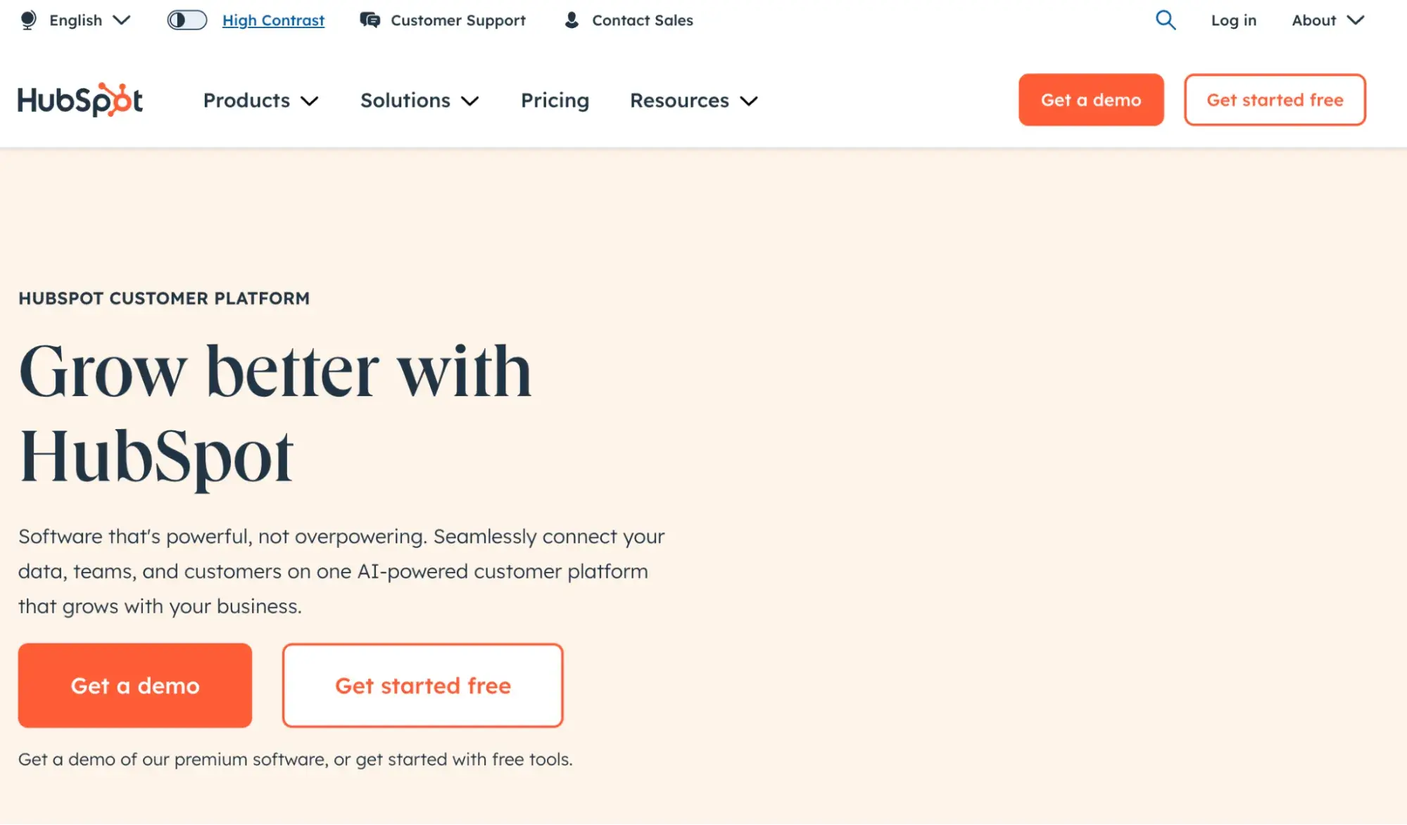
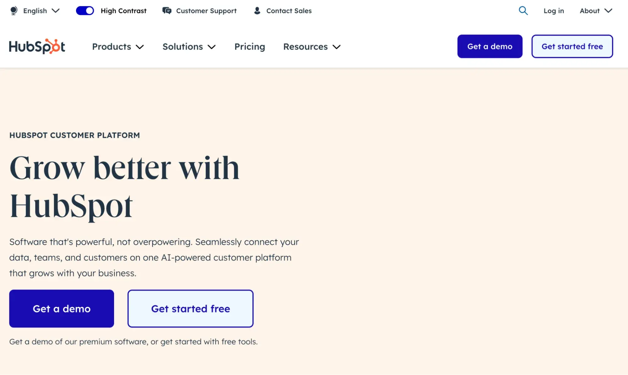
For example, the HubSpot website offers a setting to switch between normal viewing and high contrast. Here’s what the difference looks like.
Regular View
High Contrast View
Pro tip: Always get user feedback when building your site, as this will help you identify issues you may have missed.
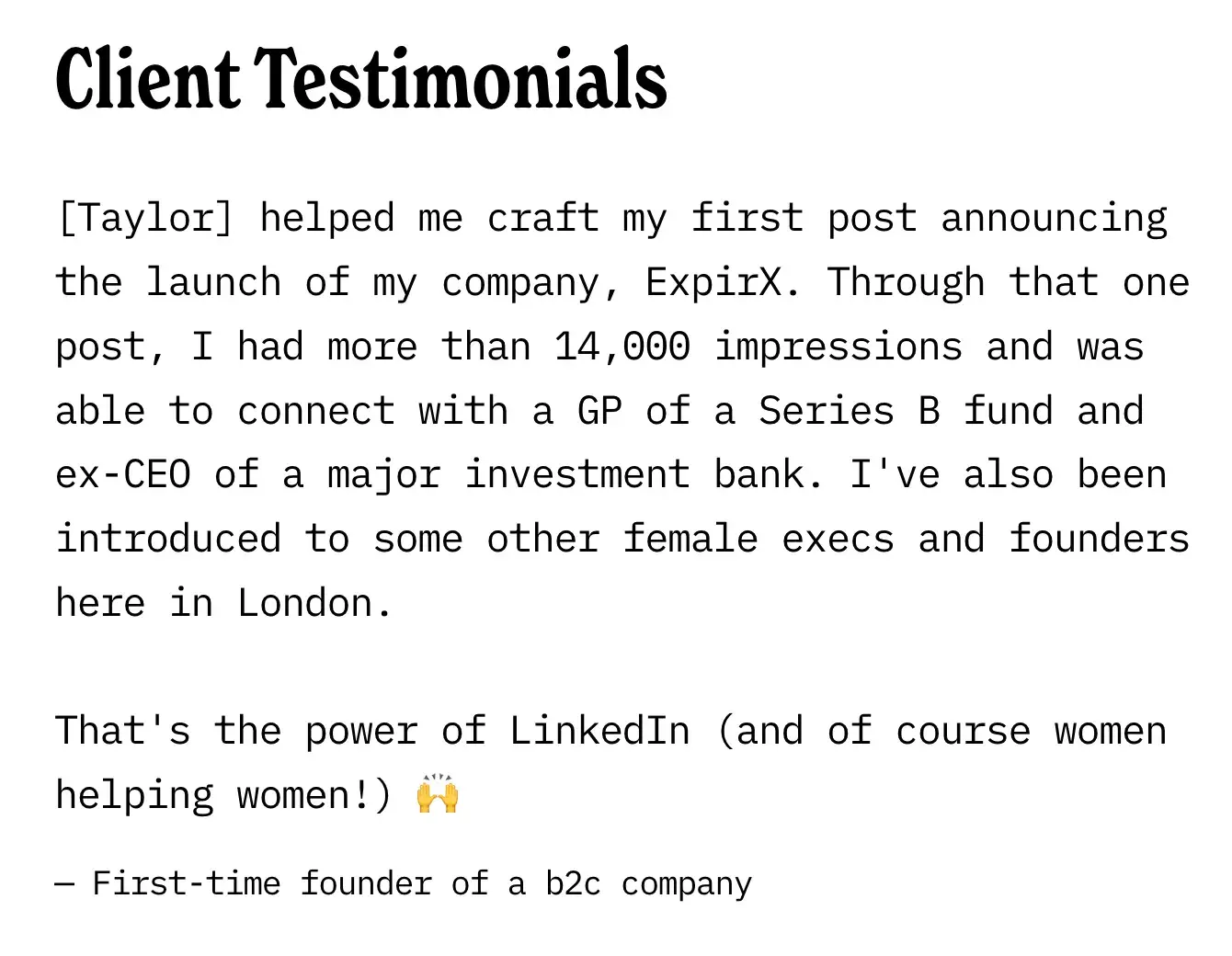
For example, Dr. Kevin Huffman, the CEO and Founder of Ambari Nutrition, found that user testing sessions greatly improved their overall site experience.
“A low-vision customer told us that he could barely read the labels on our products because there was not enough color contrast in them. This feedback allowed us to immediately make some improvements to increase accessibility,” Huffman explained.
Lack of Alt Text
Alt text is one the foundational elements of an accessible website – which allows people with vision impairments and with screen readers to understand all of the elements on the screen.
This one can be easy to overlook its importance. I spend most of my time as a content writer updating content for SEO (to which alt text is crucial) and I still had many gaps on my own website where the alt text was lacking or missing altogether.
Here are some best practices for writing alt text, according to Harvard’s Digital Accessibility Services
- Keep it short, usually 1-2 sentences. Don’t overthink it.
- Consider key elements of why you chose this image for your document, instead of describing every little detail.
- No need to say “image of” or “picture of.”
- But, do say if it’s a logo, illustration, painting, or cartoon.
- Don’t duplicate text that’s adjacent in the document or website
- End the alt text sentence with a period.
Lack of Keyboard Navigation
You’ll want to make it easy for people to navigate around a website or application that helps everyone find what they need more quickly and more effectively. If you’re able-bodied, you might not realize how other people interact with digital devices and websites.
WebAIM offers some helpful tips if you want to learn more about keyboard navigation.
Additional Website Accessibility Tips
Following the guidelines above will make your content more accessible to a wider range of people with disabilities.
WCAG includes accommodations for blindness and low vision, deafness and hearing loss, limited movement, speech disabilities, photosensitivity, learning disabilities and cognitive limitations, and combinations of these. However, they will not address every need for people with these disabilities.
If you would like to continue your efforts in making your content as accessible as possible, check out the tips below.
Website Accessibility Checklist
This checklist will help you make the following more accessible on your website:
- Web Pages
- Navigation
- Video & Media
- And More!
Download Free
All fields are required.
1. Focus on the most common types of WCAG 2 conformance failures.
All of the guidelines above are important for making web content more accessible. If you’re just starting your accessibility efforts and don’t know where to start, prioritize items which cause accessibility issues most frequently. WebAIM analyzed the homepages of the one million most popular websites and found that 96.7% of all detected errors fall into six categories:
- Low contrast text.
- Missing alternative text for images.
- Missing form input labels.
- Empty links.
- Missing document language.
- Empty buttons.
2. Regularly perform web accessibility testing.
Web accessibility testing is the method of evaluating how easily users with disabilities can understand, navigate, and interact with a website. Doing so will provide valuable information for improving your website for users with and without disabilities.
WAVE browser extensions and axe DevTools extensions are just a few tools that can help simplify and automate parts of the testing process.
Ding also notes that modern operating systems have built-in screen readers — like VoiceOver for MacOS and Narrator on Windows — which can be used to test their websites for screen reader accessibility in particular.
3. Respect a users' motion preferences.
Websites with bounce animations and other types of motion can be engaging and delightful for some users, but not all. Some users with or without a disability might feel sick or have a serious medical emergency, like a seizure, on websites with lots of motion. That’s one reason most new operating systems enable the user to set their own motion preferences.
To respect this, you can use the prefers-reduced-motion media query in your CSS and set it to either reduce or no-preference. By setting it to reduce, you can turn off an element’s animation if the user has explicitly set a preference for reduced motion. Or you can set it to no-preference, which means the animation will only apply if the user has no motion preference.
4. Respect a user's light or dark mode setting.
Similar to motion, dark and light modes might be preferred by users for accessibility reasons or other reasons. Users can indicate this preference through an operating system or user agent setting. To respect this, you can use the prefers-color-scheme media feature to detect if the user has requested a light or dark color theme and style your web page accordingly.
According to Belsky, respecting this setting as well as the “prefers reduced motion” setting above is great for all users, not just ones with a disability.
Website Accessibility Checklist
The A11Y project offers a handy checklist for checking your WCAG compliance. I highly recommend it as a great starting point for assessing the accessibility of your website. I recently tested it on the website for my company, Cromwell Creative Co., and found some valuable areas of improvement that I can focus on.
I’ll walk you through my process so you can see the checklist live in action. (Note: this is a condensed version of the checklist — check out the A11Y website for more detailed instructions. Some specific checks, like audio and video, weren’t applicable to my website which is text-only.)
Content
Content is the most important part of your site. You want to use plain language and avoid figures of speech, idioms, and complicated metaphors. Make sure that all button and label elements are unique and descriptive.
Pro tip: HubSpot’s Content Hub also has some helpful resources when looking to evaluate the accessibility of your website’s content.
Testing it Out
As a professional writer, I hope that I’ve gotten this covered on my own website – but it’s always good to give it a closer look from another perspective. One interesting thing I realized while adjusting my site for accessibility is that I should opt for left-aligned text when possible. A11Y explains that centered-aligned or justified text is more difficult to read.
I adjusted a few of my content sections accordingly:
Global Code
Global code is code that affects your entire website or web app. To make sure your site is accessible, you’ll want to do the following steps:
- Validate your HTML.
- Use a lang attribute on the html element.
- Provide a unique title for each page or view.
- Ensure that viewport zoom is not disabled.
Testing it Out
While I can navigate the basics of HTML, I’m much more of a creative than a technical web wizard. So I was a bit intimidated to look more closely at the code of my site.
However, I use Squarespace as my website hosts — which has some helpful resources for improving the accessibility of your site. In this step, I updated some of my pages to have a more descriptive, unique title.
Keyboard
Your content should be able to be operated and navigated by the keyboard. Some users can’t use a mouse or are using other assistive technologies that don’t work with a cursor.
Testing it Out
I knew this was a big component of accessible websites, but I didn’t know where to start when adding this feature to my own site. From what I could find, Squarespace isn’t letting me add more navigation options on the front end — though I’m sure it’s something that an expert developer could help me with.
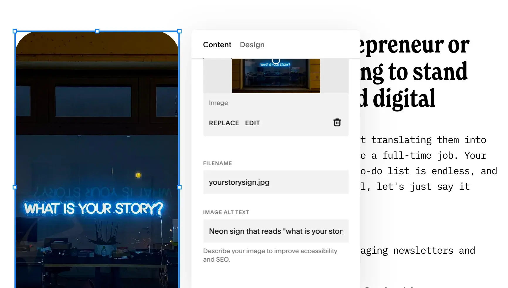
Images
You want to make sure that all images have descriptive alt text — and provide text alternatives for complex images such as charts and graphs.
Testing it Out
This step was easy for me as my website is largely text-focused. I do however have a few images scattered throughout my home page that I was able to add more in-depth alt-text to. (And as a bonus: this should improve my SEO as well — a win-win!)
Luckily, Squarespace makes this pretty easy to view and update. I also like how they included instructions to improve accessibility and SEO.
Headings
The headings on your site help break up the content of the page into related “chunks” of information: H1, H2, H3, etc. These are an important component for anyone who uses assistive technology to understand the meaning of a website page.
Here are some steps to follow:
- Use heading elements to introduce content.
- Use only one H1 per page.
- Heading elements should follow a logical order.
Testing it Out
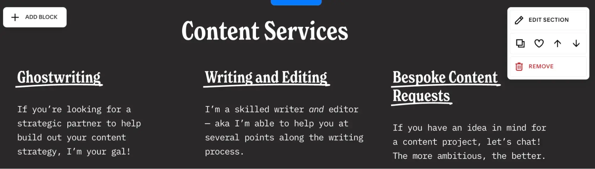
Luckily, I’ve recently done an overhaul to my website headers for SEO purposes. I had way too many H1 and H2 and not enough content nested in H3 and H4s. I’m still learning about how I can use headers to improve accessibility, though, so I wanted to give it a closer look based on this accessibility checklist.
You can see in this section below how I’ve turned Content Services into an H2 — and added these three pillars of content as H3s. This should comply well with the guidelines.
Make Your Site Accessible
Following the Web Content Accessibility Guidelines may feel like a challenge, but the rewards of an accessible website are worth the effort. After working through the areas of improvements on my own site, I feel inspired and empowered to continue improving accessibility of the other websites I work on.
By making your website more accessible:
- You will reach a wider audience because you‘ve thought about and catered to a range of different people’s needs.
- Your website will be more usable because people will find it easier to understand and interact with.
- Your SEO will likely improve, as using the correct code plus text alternatives to multimedia will delight search engines as well as visitors.
- You will protect yourself from legal risk and liability that could happen as a result of an inaccessible site.
Lastly, Logan Mallory, VP of Marketing at Motivosity, sums it up best: “It‘s the difference between someone actually being able to use our site and product, not to mention it’s just the right thing to do.”
Editor's note: This post was originally published in November 2021 and has been updated for comprehensiveness.