So, what’s the problem with these sites?
The design is oftentimes good, but they struggle with their content.
And when I say “content,” it isn’t just a blog. Content includes every part of the site you can see — from the “About Us” to the “Privacy Policy” section. So, let me show you what good website content should look like and what every site must have.
Table of Contents
What Is Website Content?
Website content is any written, visual, and audio content on a website — photos, logos, blog posts, embedded videos, marketing copy, podcasts, or any other productive feature. Even your Pricing and Contact pages are website content.
According to the latest CMI report, 67% of marketers report generating leads through content marketing — a solid reason to double down on all kinds of content for your site.
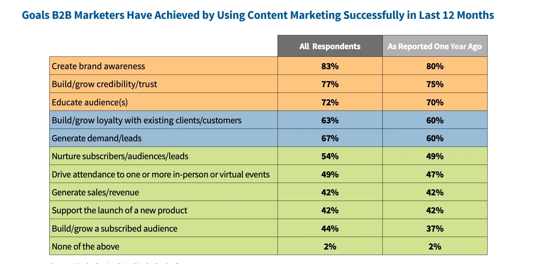
Hence, you must post relevant content on your site that's optimized for search engines — and, of course, for people. For readers.
It needs to be good enough to rank well but even better so that people want to read it and keep coming back for more.
Now, let’s break down the seven types of content pages that every website needs.
7 Types of Website Content
1. Homepage Content
Your homepage is the heart of your site, so it must have content that really grabs attention and turns visitors into leads.
It should inform visitors, quickly draw them to your products or services, and guide them to other pages they'll want to explore.
“I don‘t know if you knew this, but around 79-80% of people coming to your site are only going to scan the page; they’re really not going to read it. So you really need to format your web pages with that in mind,” advises Wes McDowell, a web strategist.
“You know, it makes pages easier to digest and the concepts easier to grasp, which is really going to make people stick around longer and consume more of your content. This makes it more likely that they're going to convert, and Google can actually see in their own way what the formatting is like. It rewards sites that are formatted more for the web than if there was just a big wall of text, which nobody really wants to read.”
Even though I usually write blog posts, I've had the chance to work on homepage content a few times. So, here are my top tips to make it seriously good.
- Value proposition: This is your chance to clearly state what your products or services are and how they benefit the user. I like to keep it short and sweet, so it’s direct and doesn’t bore visitors.
- Add unique selling points (USPs): People want to know why they should choose you over the competition. I highlight things like cutting-edge technology, great value for money, and amazing customer service. Whatever your USP is, make sure you present it with eye-catching, concise graphics that grab attention.
- Evidence of business excellence: Show your successes and legitimacy to build trust. This could be anything from partner logos to customer testimonials. Just be careful not to overwhelm your homepage with too much information. You can always dive deeper into case studies and corporate deals on other pages.
- CTAs are a must-have: Be sure to include multiple calls-to-action (CTAs) on your homepage and make them visually striking. But again, don’t make it too pushy or too salesy.
Let’s learn from two sites from different niches that do great content work.
Role Model to Follow: Semrush
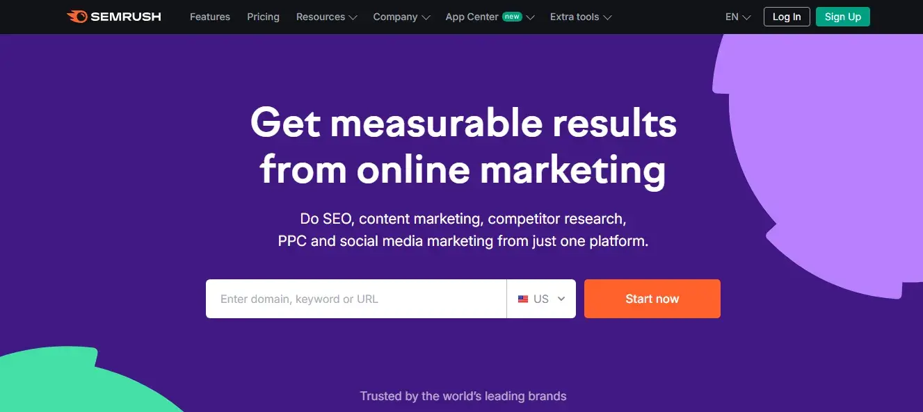
When you land on the homepage, Semrush’s purpose is immediately clear. And this is exactly how a homepage should function.
The text is concise yet informative — it highlights key features and benefits.
The homepage also has a free search bar, giving you the chance to test out Semrush immediately. I think it’s a great way to engage users from the very beginning and let them experience the tool's capabilities firsthand.
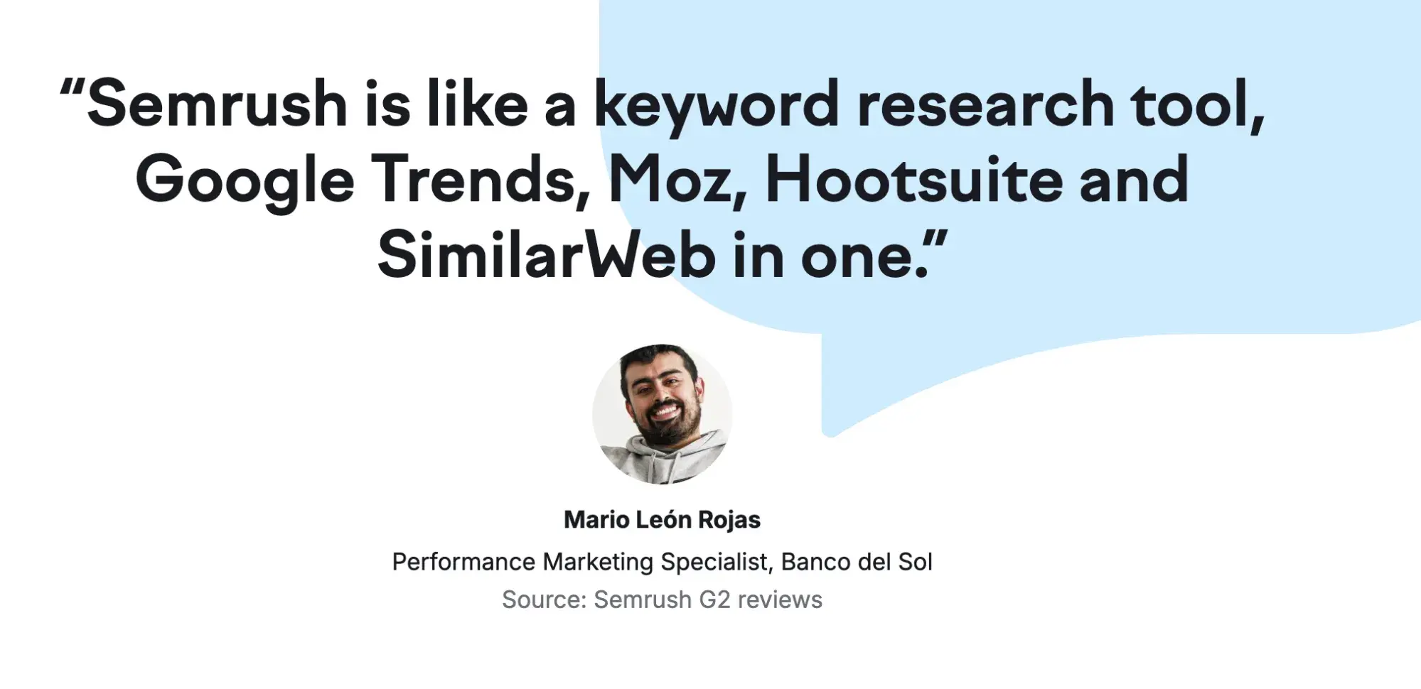
What I like: In the homepage testimonials, we can see real people — their photos, full names, roles, and the source of the review. It’s not some anonymous, fabricated feedback.
Also, the choice of graphics and images is fantastic — combining humor and style in a subtle but effective way.

Role Model to Follow: Future Current
I am a massive fan of Melyssa Griffin's website content. The homepage has a friendly, inviting design with a warm atmosphere.
The site is designed to reflect her brand and connect with visitors on a personal level. The hero section is attention-grabbing, with a strong headline and a clear CTA.
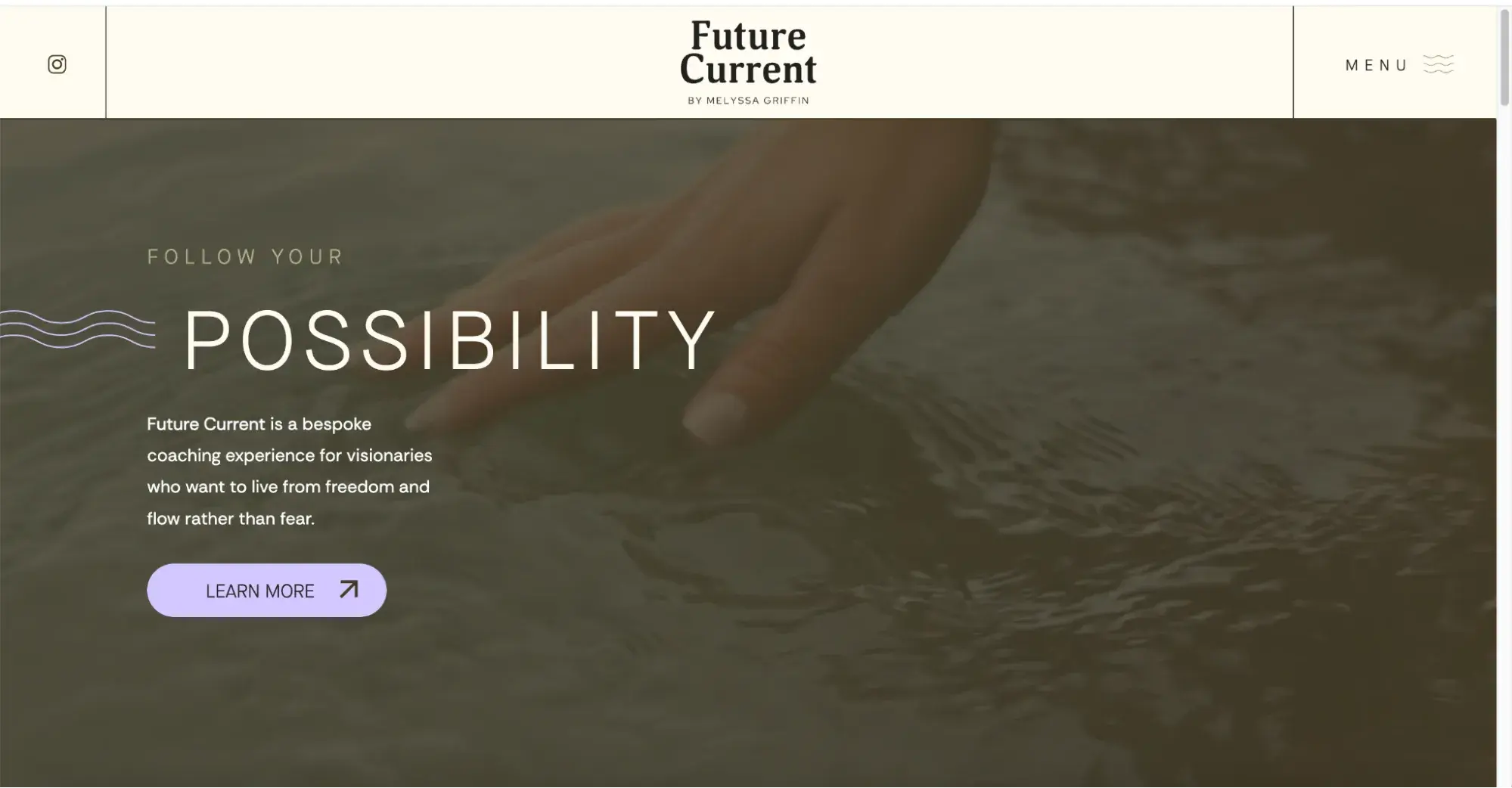
What I like: The serene vibe and the subtly compelling promise the homepage delivers right from the start. The background video, neutral colors, and overall design are so soothing. At the same time, it’s inspiring and motivates you to make a change.

2. About Us Page
The About Us Page explains everything visitors need to know about your brand. It represents an excellent opportunity to highlight your story, build customer trust, and show your key selling points.
You may also want to explain your business model and post explanatory content you can’t squash on your homepage:
- Tell your brand story: Everyone loves a good story, especially when it reveals how a company name, product, or service came to life. Sharing these moments connects with your audience and makes your brand more memorable.
- Show you understand the pain points: Buyers want to see you understand their needs. Are you launching eco-friendly products? Solving SEO issues? Whatever the goal, clearly communicate your purpose. Show potential visitors that you're the solution they’ve been looking for.
- Include a mission statement: Add a mission statement explaining how you intend to accomplish your goals. Valuable prospects are more likely to trust a company with a clear-cut growth strategy.
Role Model to Follow: Sermush
The Semrush About Us page quickly conveys the company's purpose, value proposition, and brand personality. It focuses on the customer and uses clear, concise language to make a positive impression.
The inclusion of statistics (years of experience, users, countries served, offices) and logos of well-known brands builds trust and demonstrates Semrush's widespread adoption and impact.
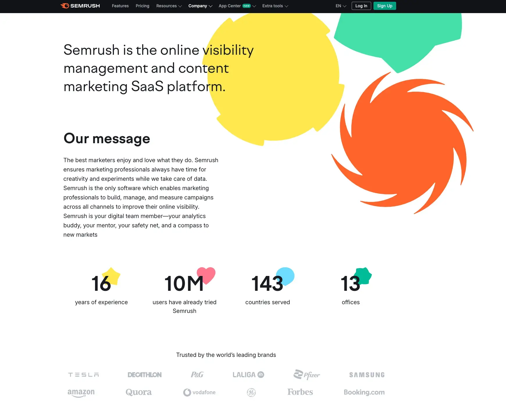
What I like: When you scroll a bit lower, there’s a map with office locations, which reinforces the idea that Semrush is a large international company with a broad reach. This instantly builds trust and credibility. The About Us page also clearly shares info about the company’s culture and opportunities for both jobs and investments.

Role Model to Follow: Future Current
This About page makes you feel like you’re meeting Melyssa in real life.
She’s open and authentic, a former teacher who became an entrepreneur and loves a good hug. You quickly get a sense of her passion for helping people live fuller, more limitless lives.
The message “By external measures of success, I was flying high, but inside something felt off” highlights Melyssa’s focus on changing her mindset. I simply adore this message. Copy on point.
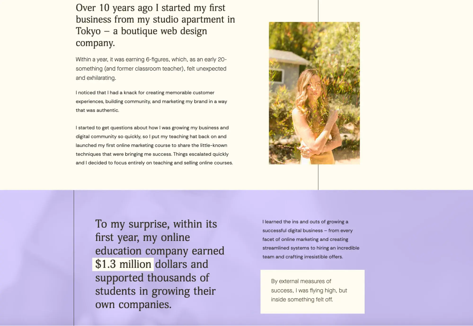
What I like: The entire About page is attractive and engaging and tells a story. It feels very natural, almost like I’ve come over for tea at a friend’s house.
3. Product or Service Pages
Product or Service Pages show what you offer. The content here needs to be clear, focused on benefits, visually stunning, persuasive, and trustworthy.
Jot down these three tips:
- Keep it simple. Avoid jargon and stick to straightforward language. Only use technical terms when needed, and make sure they resonate with your audience.
- Include images where it makes sense. For instance, if you’re selling products, use high-quality photos that clearly show different features of the item.
- Be upfront about pricing. Make it easy for people to find your pricing, whether through a clear price list or a CTA offering a free, no-obligation quote if prices vary. Such transparency builds trust and drives engagement.
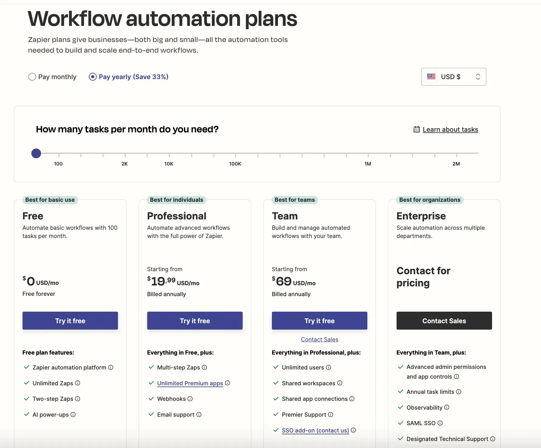
A great example of clear and transparent pricing is what we can see on the Zapier site.
It shows the offers and suggests the best plans for individuals, teams, and organizations, along with the benefit of the yearly plan — a 33% discount. There’s also a free option for basic use, which is great for general testing.
Role Model to Follow: Semrush
At Semrush, you won't find product descriptions under a “Products” or “Services” tab. Instead, they are listed under “Features.” The descriptions are concise and highlight the main benefits.
The page is organized into different areas of interest (SEO, Content, etc.), allowing users to quickly find the features most relevant to them.
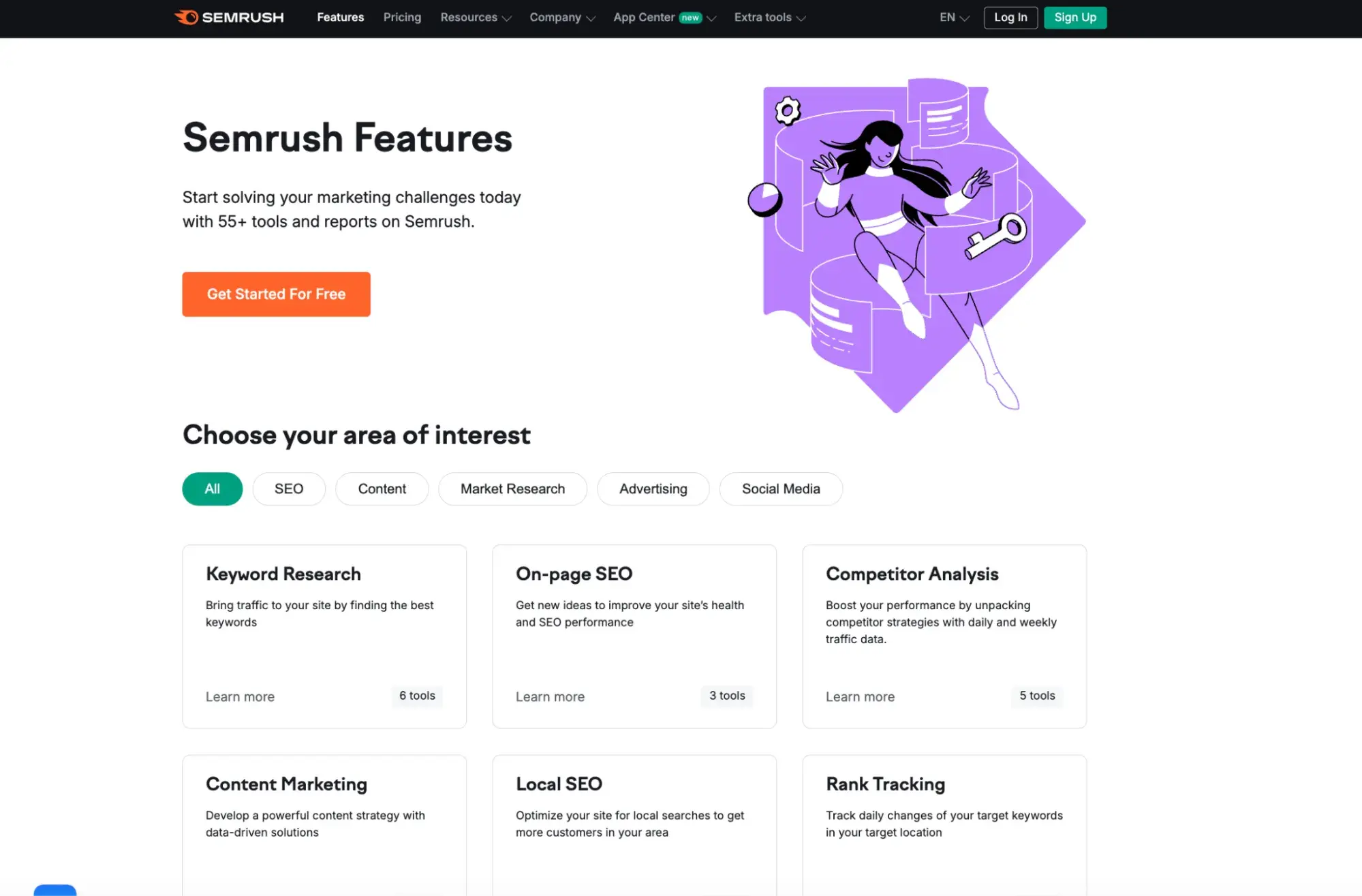
When you click on a specific feature that interests you, let’s say keyword research, a new tab opens with all the details. There’s also a CTA to try out each of the offered features for free.
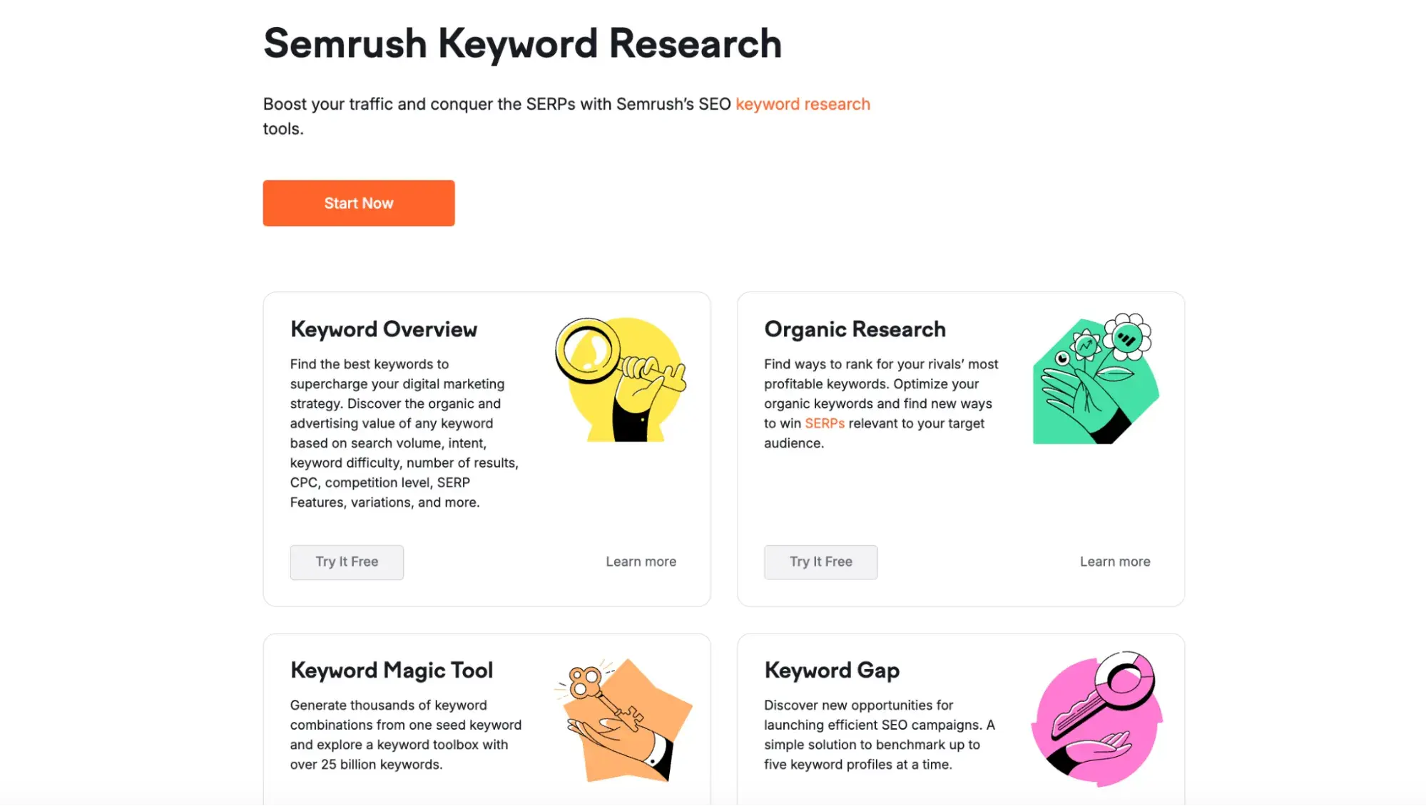
What I like: The use of headings, subheadings, and different font sizes guides the user's eye through the content in a logical order. I also love the colorful graphics — they break up the monotony of black and white.
Role Model to Follow: Future Current
Melyssa’s product page is all about her courses. The copy on this page uses strong verbs and action-oriented language to create excitement and motivate potential students.
I would say that the phrases she uses tap into what visitors aspire to.
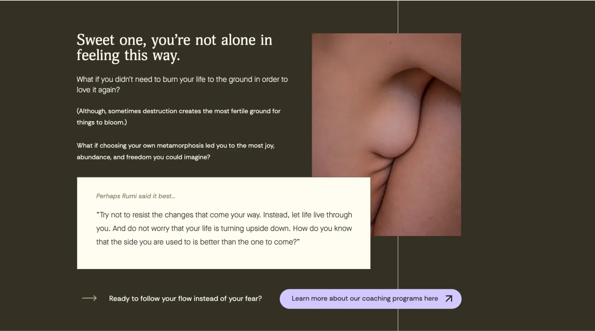
As you scroll down, you’ll find the courses laid out with crystal-clear structure, showcasing the benefits and essential components of each program:
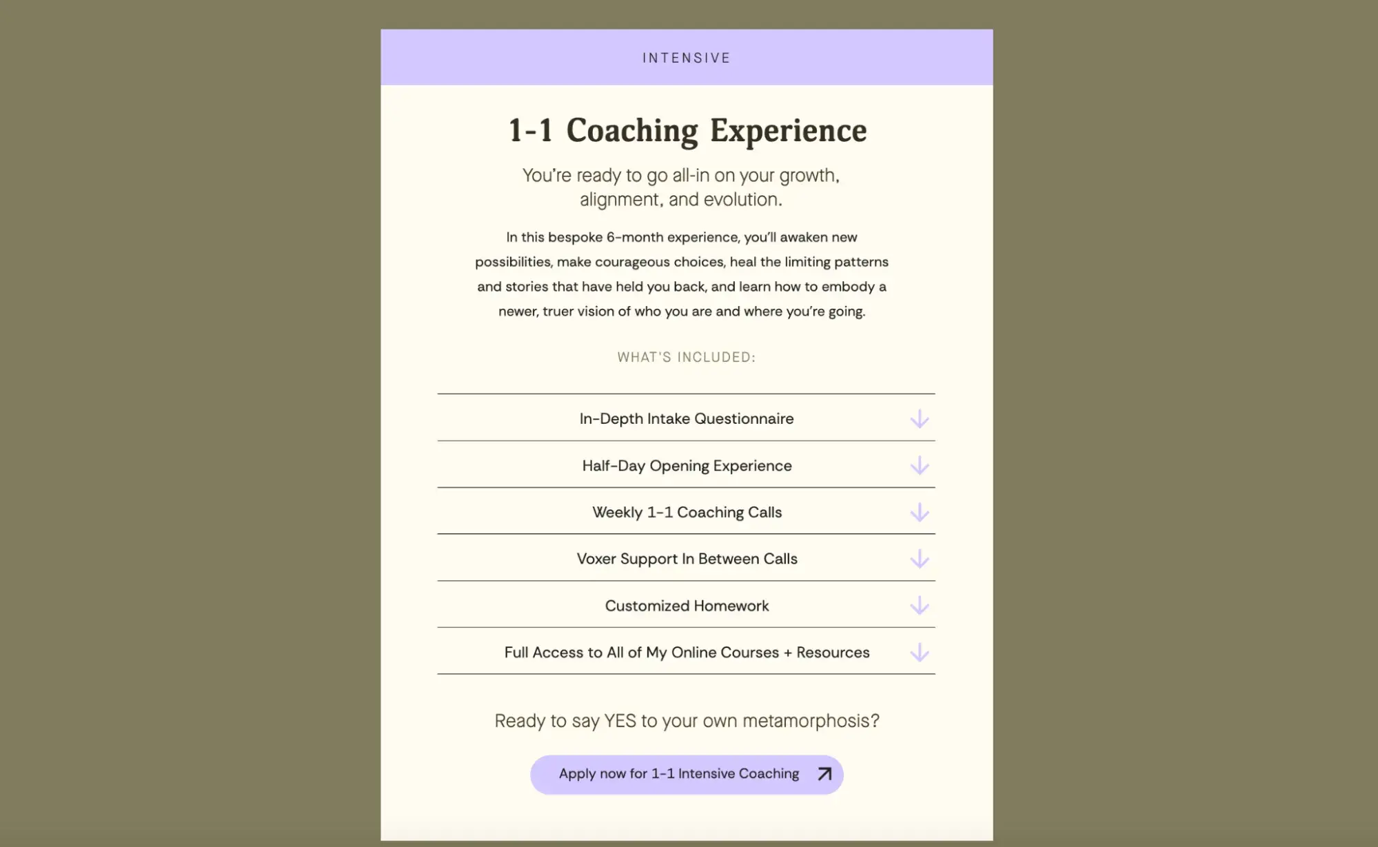
It also highlights the personalized nature of the experience, with bespoke coaching tailored to the individual client's needs, making it more attractive.
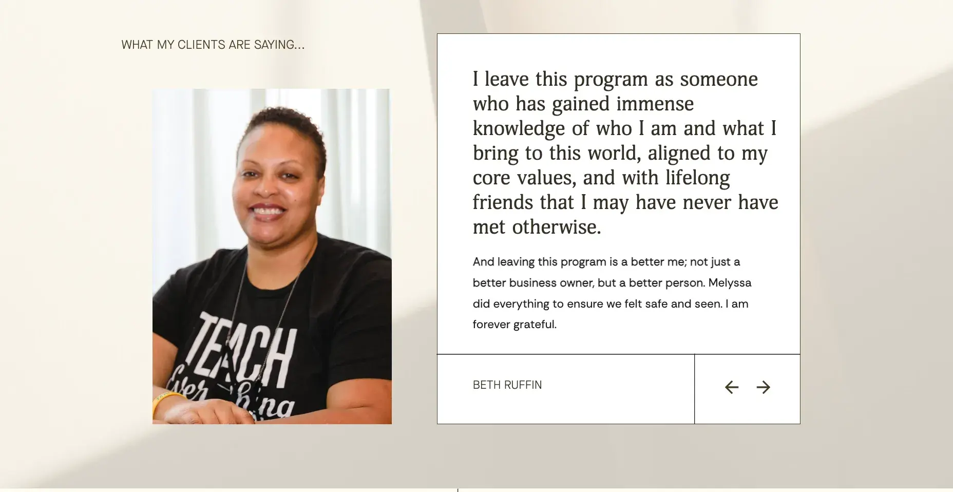
What I like: Including testimonials on Melyssa‘s product page is a smart strategy to build trust, demonstrate the course’s value, and, of course, encourage more people to sign up.
4. Contact Us Page
A contact page shows that you're a legitimate business open to interaction. It makes it easy for visitors to reach out with questions, feedback, or even potential business opportunities.
What to include on this page:
- A simple contact form for quick inquiries.
- Your phone number, email, and office address.
- Links to your social media accounts (if existing).
- A brief paragraph explaining how visitors can reach out and what to expect from your response.
This Italian florist’s contact page is a sound example of clarity and convenience for a small, local business site:
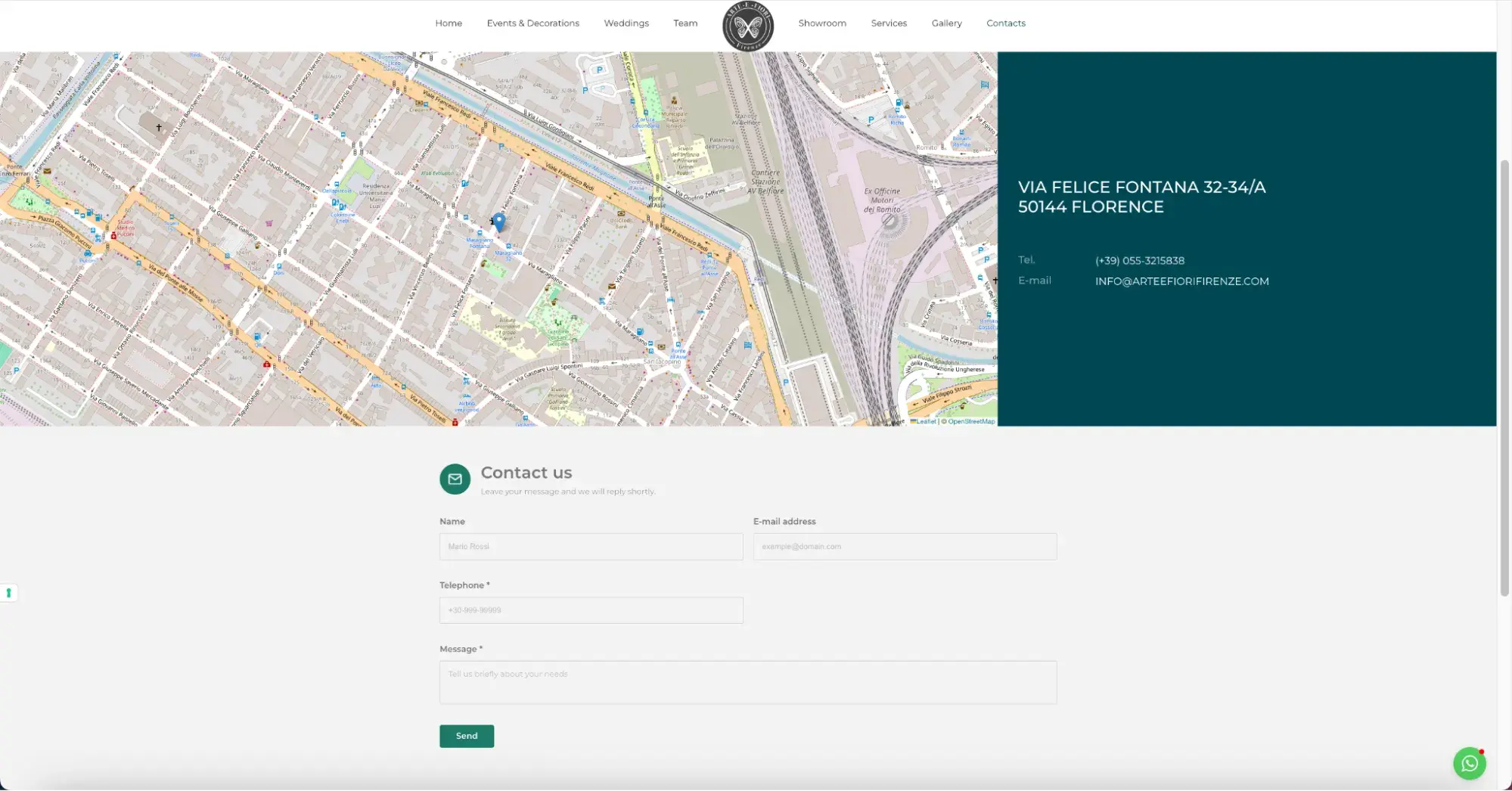
It shows the address, phone number, email, and a map. In my opinion, every brick-and-mortar business should include a map to help customers find them.
There’s also a contact form for quick messages and a WhatsApp link for direct communication. And at the bottom, you can easily find info such as working hours:

Role Model to Follow: Semrush
Semrush makes finding contact info quick and easy for a huge SaaS.
Once there, you have three straightforward options: book a session with an expert, contact sales to buy or upgrade, or visit the Help Center for self-service support.
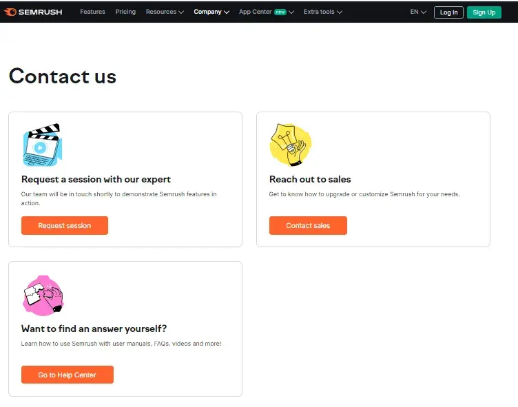
What I like: Providing both self-service and assisted support options caters to different user preferences.
Role Model to Follow: Future Current
The headline, “Get in touch,” sets a friendly and approachable tone from the start.
Clear instructions guide visitors on how to reach out — through the concise form or a direct email.
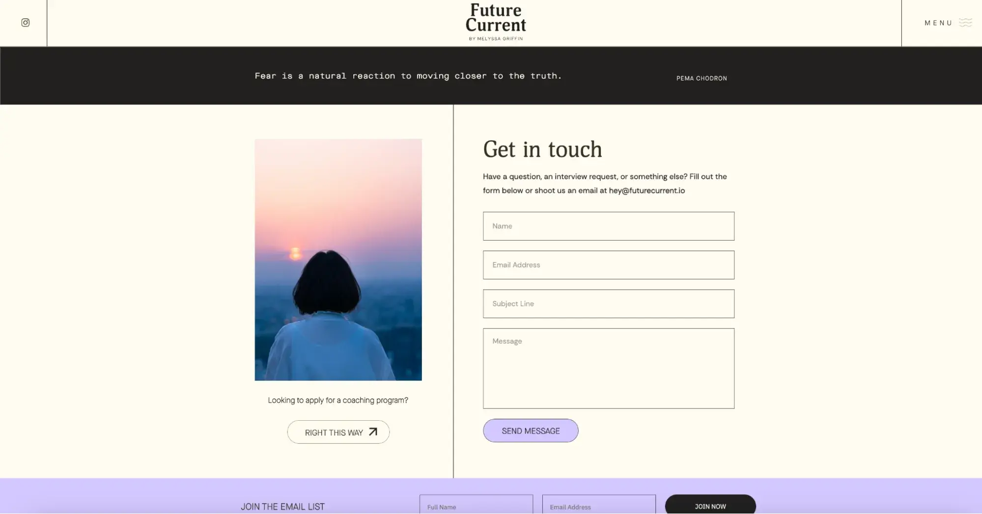
What I like: There’s no fuss here. It’s all minimalist and straightforward, so reaching out is easy peasy. Overall, the Contact page feels personal and welcoming.
5. Blog Section
I think even the birds on the tree know how important a blog is for a website. But it’s worth going over the basics again:
- Each blog post creates a new page for search engines to index. More pages = more chances to rank higher for relevant keywords.
- You can share blog content on social media and repurpose it for other posts.
- Every post can include a CTA and turn visitors into leads by offering valuable resources in exchange for their contact details.
- Regular content creation and distribution build trust with your audience.
- Quality blog posts attract backlinks from other sites, which improves your search engine ranking and boosts your site’s credibility.
- Blog posts continue to attract traffic and generate leads long after they’re published, making blogging a cost-effective and scalable marketing strategy.
But …
Don’t even think about starting a blog unless you’re ready to put in serious effort. Don’t waste time posting generic articles just to fill space — this won’t do a thing for you.
Get serious about researching your topic, supporting it with solid studies and current data. Make your blog genuinely interesting to your visitors.
And if you’re wondering whether your blog posts need to be 2,000+ words, it’s not a strict rule. Neil Patel provides the best explanation in one of his interviews:
“Do whatever‘s best for the user. Everyone’s like, ‘Oh, I need a 5,000-word article.’ Well, if your article‘s on how to tie a tie, do you think people want to read 5,000 words on how to tie a tie? But if your article is on how to build a car motor engine from scratch, I don’t think people want a thousand words. They probably want more than 5,000 words, and they probably want images, gifs, and videos integrated so that they know how to do it step-by-step.”
In short, write blog posts that make sense for your audience and business goals and mission.
Role Model to Follow: Semrush
Semrush’s blog will probably be one of my favorite blogs forever. All articles are well-researched, data-rich, and genuinely useful. They publish regularly, so there’s always something new and valuable to read.
How-to guides, case studies, industry updates, unique research, tutorials — you name it. The blog covers it all.
The blog is easy to navigate, color-coded by a category, with clear headings, attractive graphics, and a clean layout that makes finding information simple.
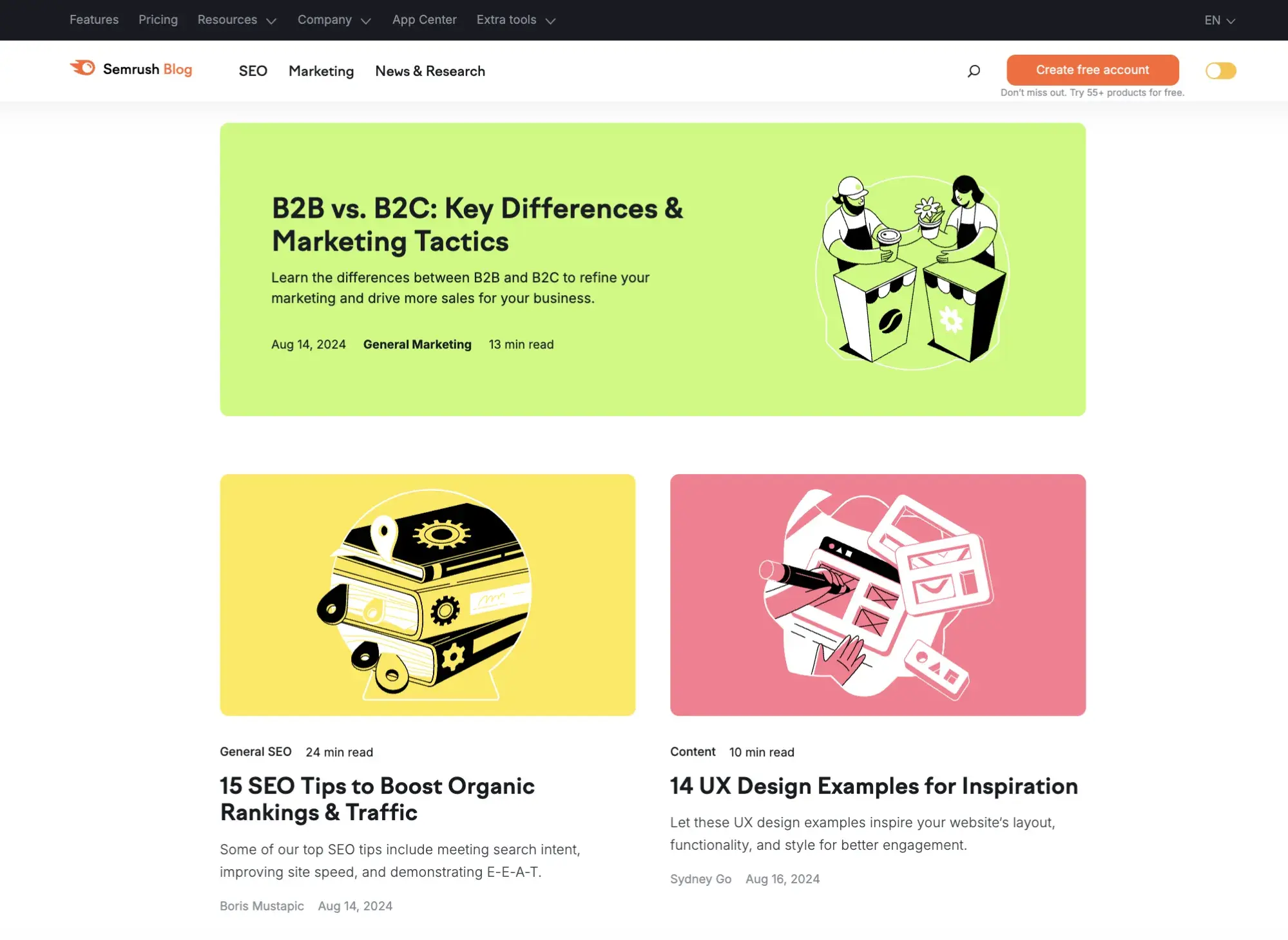
What I like: The articles often include insights from top industry experts and thought leaders. Some posts even feature interactive elements like quizzes, calculators, and downloadable resources, improving the reading experience.
Role Model to Follow: Young Adventuress
Since I love traveling myself, I just have to mention the Young Adventuress blog with amazing stories and experiences shared in a unique way by Liz Carlson.
Trust me, you'll enjoy every piece of content here.
One of the best features is that when you hover over each blog post, an inspirational message pops up.

It’s really catchy and makes you want to keep reading, and reading, and reading. And that’s how good content should work.
What I like: Everything is written in the first person, which adds warmth to the writing and shows a deep passion for what she does. Liz includes lots of real photos from her trips, making the articles way more engaging than if they used generic stock images.
Role Model to Follow: Clinique
Another blog worth mentioning is Clinique Skin School because it shows how even shorter posts can be super useful and effective.
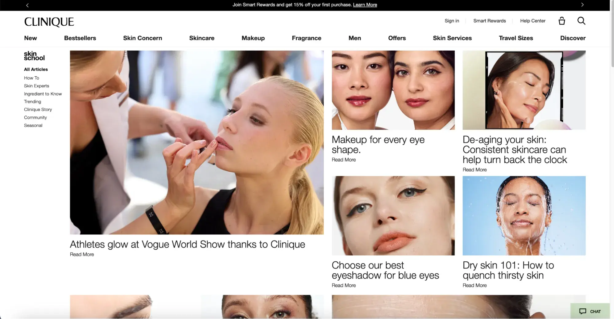
They dive into specific topics like skincare and makeup, but they don’t cover broad subjects like “How to care for your skin?”
Instead, they tackle more focused questions like “How to care for dry skin?” or “How to apply makeup for round eyes?” By zeroing in on specific issues, readers can easily find exactly what they’re looking for.
What I like: Each piece is a great mix of useful tips and subtle product promotion.
Streamline your content management with Content Hub — a one-stop solution for managing, updating, and distributing content. Benefit from SEO recommendations, advanced analytics, AI blog writing, and more. Get a demo now, or start for free!
6. Case Studies
Adding success stories and case studies is a great move for turning potential buyers into customers. People trust other people — that’s how it works.
You can gather testimonials from social media, Google reviews, emails, and customer surveys.
Here are some tips for creating great testimonial and case study content:
- Always ask permission before using testimonials to avoid any potential issues. If the user agrees, add their photo to make it more credible.
- Include specific examples of how your product or service has helped customers achieve their goals.
- Fix any typos or errors without changing the meaning of the customer’s message to keep your site looking professional.
- Add visual elements and statistics to highlight the effectiveness of your services and products.
Role Model to Follow: Semrush
The Semrush case studies cover different industries, from pet care (BetterVet and Hepper) to creative design (Picsart) and dentistry (Smileworks).
This showcases Semrush's versatility and applicability across different sectors:
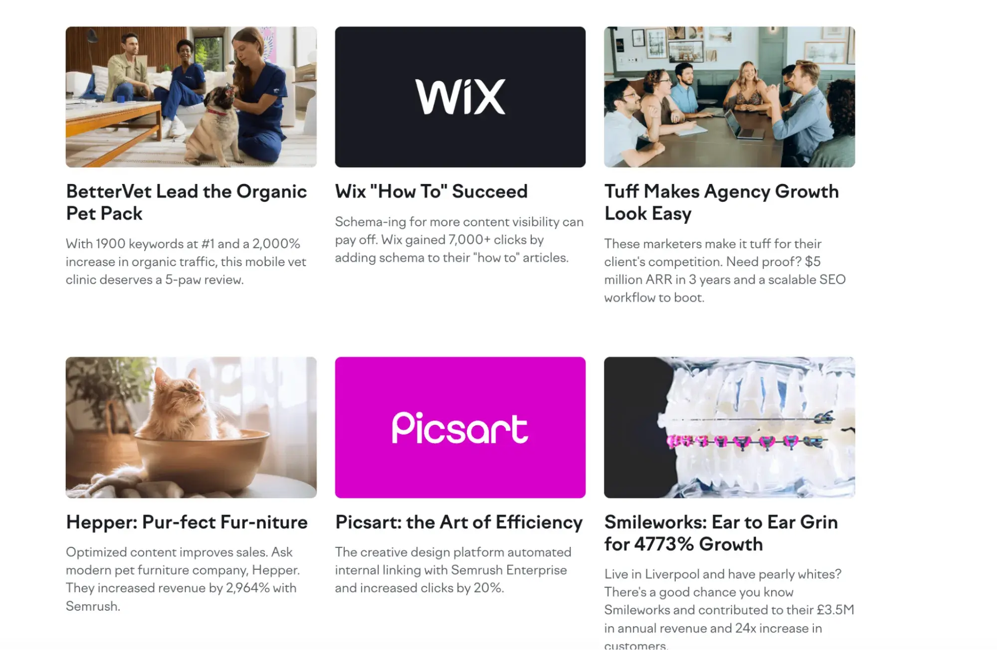
What I like: Right under each headline, there’s a quick snapshot of the numbers and results. It’s engagingly clickable and grabs attention, especially for people facing the same issues and needing a similar fix.
Role Model to Follow: Future Current
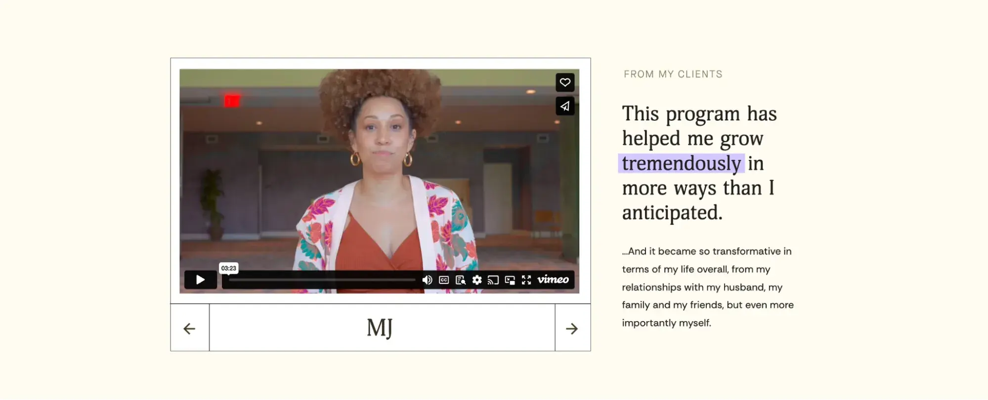
Melyssa uses well-crafted success stories with striking visuals, statements, and customer quotes to make testimonials and case studies super engaging.
She highlights key numbers and features happy clients (real-life photos) to make everything more convincing and impactful.
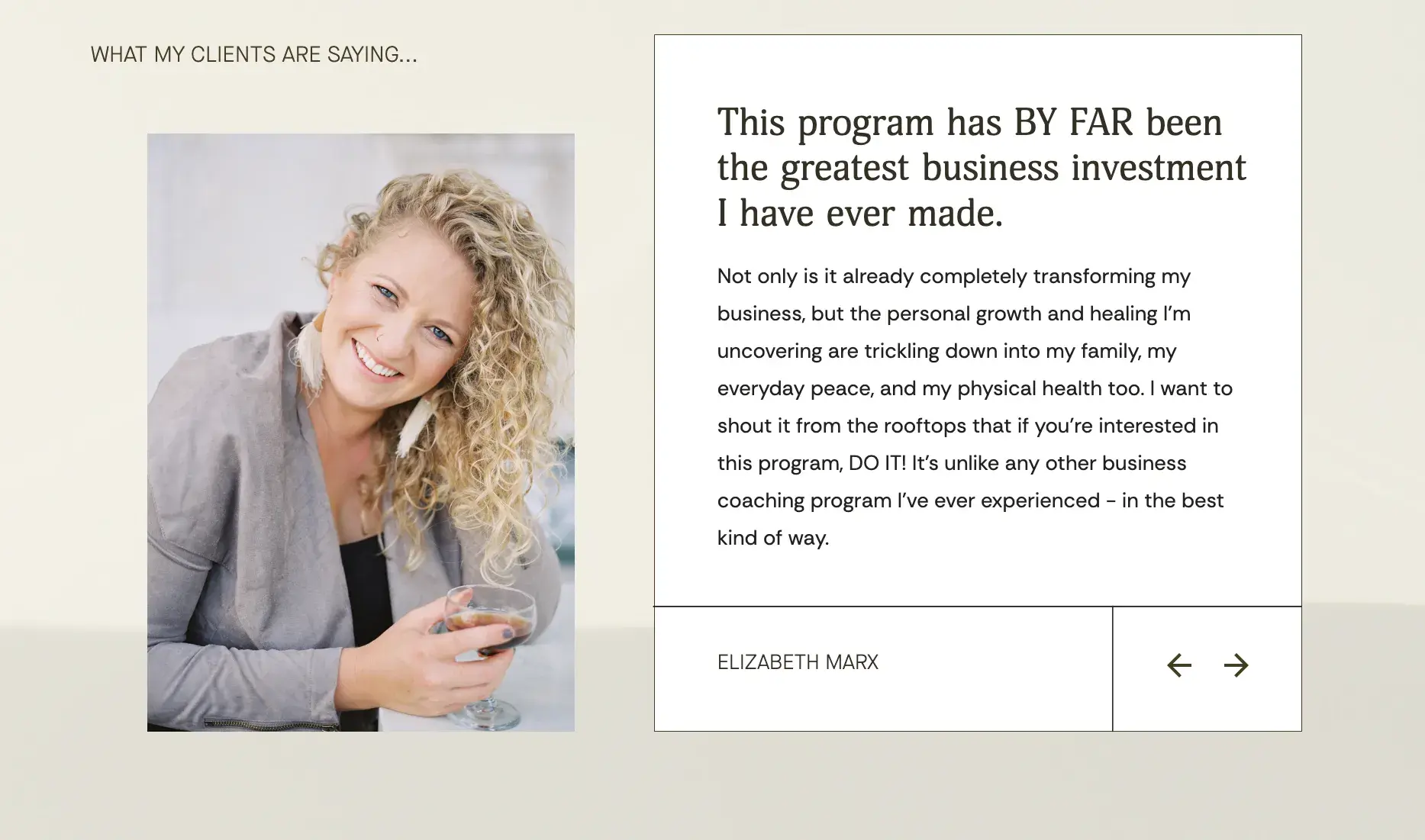
What I like: As a fan of firsthand experiences, I love that Melyssa’s success stories page includes video testimonials — definitely a big plus. I also like the categorization of success stories, based on the courses the participants took.
7. Privacy Policy and Terms of Service
While it might not be the most exciting type of content, a Privacy Policy page is a must-have. It informs visitors about what information is collected, how it is collected, and how it is used.
When writing a Privacy Policy, be aware of the laws that apply to your site's location, such as CCPA in the U.S., GDPR in Europe, and PIPEDA in Canada.
Also, your Terms and Conditions page should outline the key aspects of your business relationship with third parties. Include the following:
- Definitions of key terms.
- A statement that visitors must accept your terms to use your site.
- Details on how to file complaints.
- The laws governing your contracts.
- Payment terms and consequences of late payments.
- Guarantees or warranties related to your products or services.
- Responsibilities of all parties in the sales process.
- Delivery terms, including shipping delays and costs.
- How disputes will be handled.
Role Model to Follow: Semrush
Semrush’s privacy policy is a great example of how to put complex legal information in a user-friendly way.
It uses simple language, clear headings, and brief explanations so users can easily see how their data is used. The terms, complaint details, and third-party info are all straightforward.
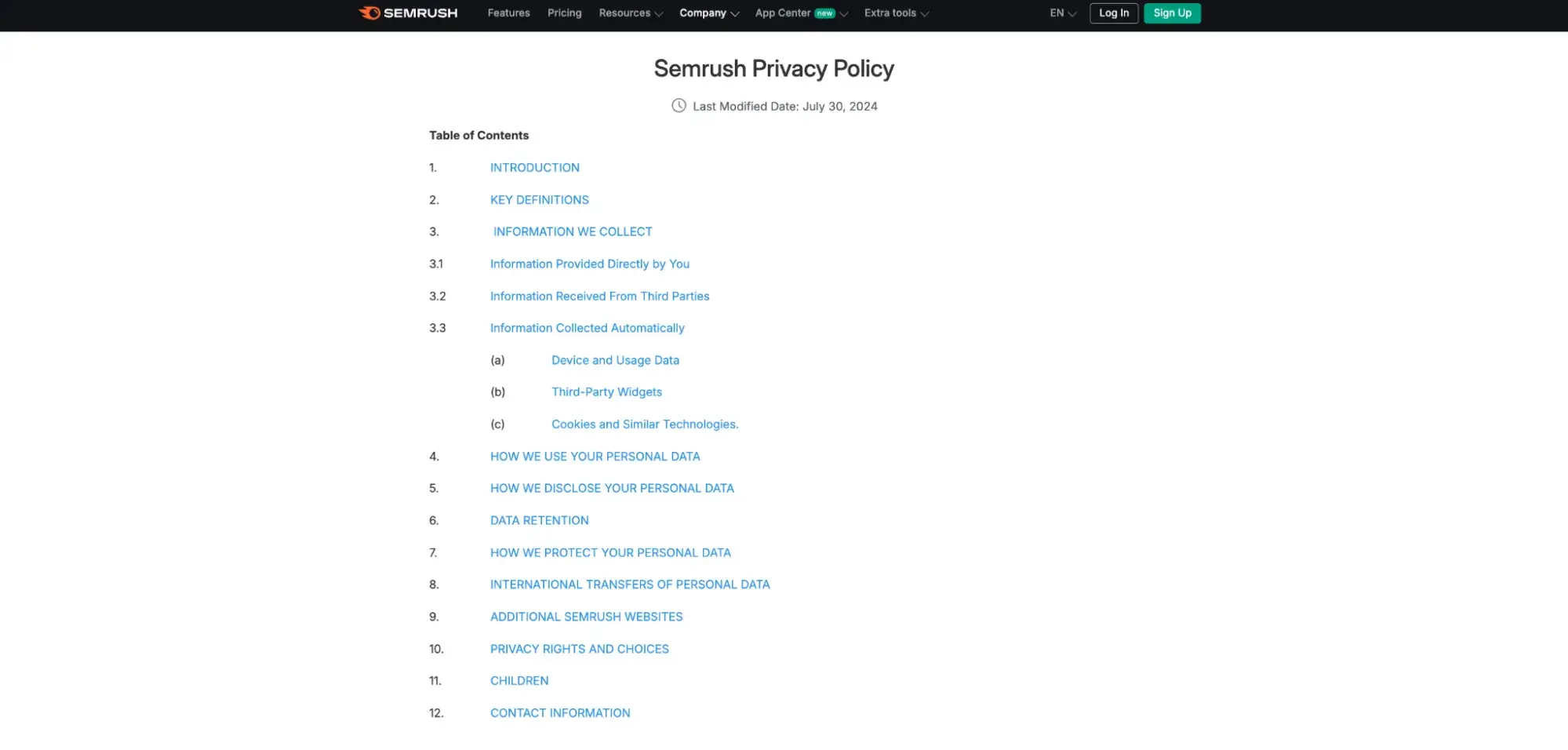
What I like: I can easily find the content I want with just one click, thanks to the clickable table of contents. No endless scrolling needed.
Role Model to Follow: Clinique
Clinique has a thoroughly detailed privacy policy, which is no surprise for such a huge cosmetics brand that needs to protect itself from potential issues in every possible way.
The policy includes details on user rights, data retention, cookie usage, and how they handle children's information and international data transfers.
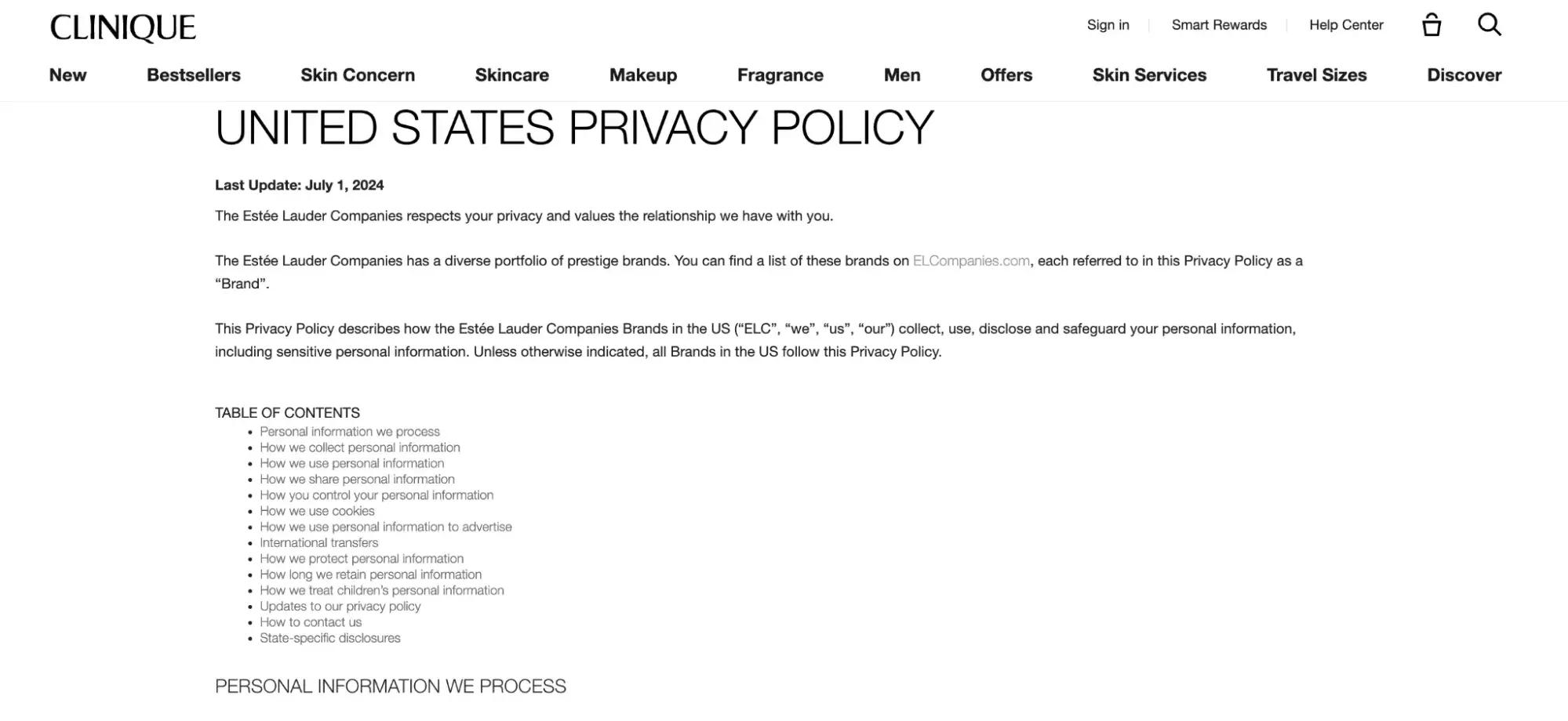
What I like: The tables with information are well-structured and easy to scan. They overview the data categories, their processing purposes, and details on how the information is sold or shared.
Reap the rewards of great content.
Content makes up the majority of a website — I‘d even say 90% of it, at least from the user’s perspective. They actually come for content. For answers. For a piece of information.
Every part of the content is equally important, from the first contact with your brand through the homepage, browsing products, and reading blogs to finding contact information.
And you should nurture and update them regularly.
Beyond these seven core elements, you can spice things up with extras like webinars, team info, careers, or anything else that fits your business and fosters trust in the site’s visitors.
Focus on good copywriting, or hire a writer if you can’t do it yourself. Invest in quality infographics or have a graphic designer create them. The same goes for video editing and other content.
Trust me, investing in website content pays off in the long run. It really does.
.png?width=112&height=112&name=Image%20Hackathon%20%E2%80%93%20Vertical%20(50).png)

.png)



![15 black and white website designs to inspire your own [+ pro tips]](https://53.fs1.hubspotusercontent-na1.net/hubfs/53/black-and-white-website-design-1-20250520-1336267.webp)

![15 Brochure Website Examples to Inspire You [+ How to Make One]](https://53.fs1.hubspotusercontent-na1.net/hubfs/53/brochure-website-examples-1-20250319-362228.webp)
![28 Types of Websites to Inspire You [+ Real-Life Examples]](https://53.fs1.hubspotusercontent-na1.net/hubfs/53/types-of-websites.png)

