.png?width=112&height=112&name=Image%20Hackathon%20%E2%80%93%20Vertical%20(50).png)
.jpg)
In this post, you’ll hear from five HubSpotters that shared insights about the most common website design mistakes. You’ll also learn actionable ways to fix or avoid these errors altogether.
8
- Not prioritizing accessibility.
- Forgetting the importance of responsive design.
- Compromising user experience for aesthetics.
- Not investing in customization.
- Using features that don’t convert.
- Having a lack of hierarchy.
- Having unclear navigation.
- Not effectively communicating your business purpose.
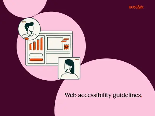
1. Not prioritizing accessibility.
Treating accessibility like an afterthought is the number one website design mistake you can make. According to Maria Kelly, Web Development Manager on the HubSpot Marketing Web Team, here are the four primary errors regarding accessibility:
- Insufficient color contrast
- Missing or inappropriate alternative text for images or graphics
- Inadequate or missing visual focus indicators
- Overlooking accessible names or labels
Let’s dive deeper into each of these.
Insufficient Color Contrast
Color contrast is an often overlooked accessibility error. Frequently, this mistake occurs because companies make websites that feature their brand color palette — which isn’t usually created with accessible design in mind.
“When a color combination used on a website lacks sufficient color contrast between the background and foreground colors, text and icons can be difficult to perceive, especially for those with visual impairments like color blindness,” shares Kelly. “According to the 2022 WebAIM Million annual report, color contrast issues were found on over 80% of homepages!”
Missing or Inappropriate Alt Text
Site visitors that use screen readers rely on image alt text to describe what the image or graphic conveys. If it’s missing or does not adequately describe the image, you’re isolating readers who need it to peruse your site.
“Images are part of your website’s content, so it’s important to think about them the same way you think of traditional website copy: What information is being conveyed by including the image on your page? Be sure the alt text you use conveys that same meaning,” says Kelly.
Insufficient or Missing Visual Focus Indicators
Without visual focus indicators, visitors won’t be able to experience your site to its fullest potential. “Focus indicators generally appear as outlines around interactive components like links and buttons,” shares Kelly. “It’s important that there be a clear visual indication of what element on the page has the current focus so users who are navigating with a keyboard and can see the screen know exactly where they are on the page and what to expect when they interact with the active element.”

Overlooking Accessible Names or Labels
If your site conveys information visually, be mindful of those using assistive technologies. “When designing pages and components where information is conveyed visually, that same information should be conveyed using accessible labels for assistive technology,” says Kelly.
“For example, a common trend in web design is card components with a ‘Read More’ button or link appearing at the bottom of each card. The information about which item each button is associated with is conveyed visually by the design, but, for screen readers, these buttons are generally difficult to distinguish if they are missing accessible labels with the relevant details, e.g., ‘Read More About Marketing Hub.’”
2. Forgetting the importance of responsive design.
In the second quarter of 2022, mobile devices constituted over 58% of global website traffic — which doesn’t even include tablets. If your website isn’t just as easy to navigate on mobile as it is on desktop, you risk frustrating visitors and increasing your bounce rate.
“Users now, more than ever, are visiting websites from multiple devices; phones, tablets, laptops, or even TVs. If our content looks poorly on any of them, visitors will lose trust and click/tap away from the site,” shares Juan Manuel Devia Pinzon, Associate Design Lead at HubSpot. “The age of breakpoints is now!”
According to Sean Landry, Principal Product Designer at HubSpot, there’s a reason why this occurs. “Websites are often built using tools in a desktop web browser. One common mistake is to assume your customers will be viewing your site in desktop format and neglect to consider mobile users.”
.webp?width=650&height=563&name=website-design-mistakes%20(1).webp)
3. Compromising user experience for aesthetics.
One of the website design mistakes that has gained momentum over the last few years is the prioritization of aesthetics over function. As the internet has grown saturated with mo “With a massive explosion of new media and design over the years, excelling is almost imperative for success. Unfortunately, this has ended in a blast of excessive use of design and graphic elements that elevate users’ senses but lack or feel disconnected from the true purpose of a website,” shares Sergio Martinez, Design Experience Manager at HubSpot.
According to Martinez, this presents itself in several forms “...from design trends that dilute the brands’ value proposition to the excessive use of animation, content, and heavy graphics that enhance the aesthetics but become useless. This doesn’t mean that a minimalist or neubrutalism style should be adopted; it’s about balance and how the form supports the function.”
4. Not investing in customization.
Walking downtown, you stroll by a clothing store with a creative, visually attractive window display. It features a variety of clothes on sale and tells a story with a backdrop and catchy copy. Then, you walk by a shop with just a few pieces of clothing on mannequins in the window — nothing catches your eye.
Think of your website as your business’s internet storefront. It should reflect your branding and feel unique to your company. One of the most significant website design mistakes is choosing a cookie-cutter template and not customizing it.
For instance, defaulting to the standard hero banner can prove counteractive. “We've all seen them - the full-width image right under the navigation usually with white or black text and a button sitting on top,” says Lindsay Derby, Senior Product Designer on the SAPG team at HubSpot.
“The image is either very light, very dark, or cropped in a clever way to make the text legible. There are a few reasons why I think this is such a mistake. The first is that it is so common that it has become formulaic and boring. What once was an eye-catching design decision is now monotonous.”
5. Using features that don't convert.
Another common error is using inefficient features. No matter how visually appealing an element may be, remember that the main priority is your website’s effectiveness. “Another common mistake is relying on rotating carousels to feature multiple pieces of content at the same level,” shares Derby.
“There has been countless research done to indicate that users do not often interact with carousels, particularly on mobile where the interaction cost is high.”
%20(1).webp?width=650&height=563&name=website-design-mistakes%20(1)%20(1).webp)
6. Having a lack of hierarchy.
Have you ever visited a website and found yourself unsure where to focus your attention? If so, you likely landed on a site that featured a lack of hierarchy. “Just like how a newspaper uses headlines and subheads to denote significance, so should your website’s typography,” says Landry.
Having order on your website has an aesthetic appeal, but it’s also functional. “Organization of website elements… give your site a cohesive structure that drives users to complete clear actions, achieves the primary goal, and, subsequently, creates a seamless experience,” says Martinez.
Fixing this is not simple, especially when your company has a broad audience with different goals. However, according to Martinez, it would be best if you did it because this issue can dramatically influence how users experience your site. “The lack of hierarchy misleads users and prevents them from reaching their goals,” he shares.
7. Having unclear navigation.
Clear navigation can reduce the friction visitors experience when they land on your site, which is why unclear navigation is such a predicament. “As more and more businesses branch into the digital world, content on the website becomes more crowded and complex, having a clear navigation and consistency across your multiple touchpoints and user journeys will ensure a smooth transition from first visitor to advocate,” shares Devia Pinzon.
8. Not effectively communicating your business purpose.
When visitors land on your website, they should be able to get a clear picture of what your company does. And if that picture is even slightly blurry? You guessed it — visitors may abandon your site.
“The first thing a website visitor does when they load your site is to determine if they reached the right destination,” says Landry. “Does your site clearly state above the fold what product or service it offers?”
Your website should enhance the credibility of your business. If it isn’t communicating your business purpose and affirming visitors that they’re in the right spot, a website redesign is likely in order.
%20(2).webp?width=650&height=563&name=website-design-mistakes%20(1)%20(2).webp)
How to Fix Common Website Design Mistakes
Now that we’ve walked through the most frequent website design mistakes, let’s discuss how to tackle fixing them. Don’t worry: awareness is half the battle. Now that you know what to avoid, you can begin creating a site that features website design best practices.
1. Make accessibility your top priority.
“Web accessibility means making websites and the information on them accessible to everyone, so it’s critically important to get right when designing websites,” says Kelly. “When we make these common accessibility mistakes in website designs, we create usability barriers for the millions of people living with some form of disability. Even if your site looks amazing, if certain content or actions are not accessible to a segment of visitors, it’s not meeting its full potential to meet your goals and business needs.”
Here are some actionable ways to fix the design accessibility issues.
Create User Personas to Fit Various User Needs
Ensuring your personas are inclusive and factor accessibility into the fabric of your site’s design. “Think about accessibility early and often. When designing websites, often one of the first steps is to create user “personas” that help ensure the site will meet a variety of user needs,” says Kelly. “Making sure your personas are inclusive of a variety of abilities is one way to guarantee that you’ll take accessibility into consideration at all stages of the project.”
(Psst: You can use this free website from HubSpot to create your personas!)
Educate Yourself on Accessibility Best Practices
Learn more about accessibility best practices so they’re top of mind when working on your projects. “There are a ton of resources, checklists, and guidance for how to design, build, and test websites for accessibility,” shares Kelly. You can get started by checking out our checklist for creating an accessible site.
2. Ensure your website features responsive design.
With responsive web design, you can rest assured that no matter how visitors access your site, they’ll have a seamless experience. Luckily, making a responsive website isn’t as difficult as it seems — and if you’re using a content management system like the one on Content Hub, you can even use already mobile-friendly templates.
“Think about what is the most important piece of information you want your visitors to take away from the page, then consider how it will look on the largest and smallest screen possible,” says Devia Pinzon. “Your goal is making sure that no matter the device, visitors will have the same understanding of your content.”
Once you’ve created the mobile version of your site, your job isn’t done quite yet. “Be sure to always test your site on your phone,” reminds Landry. Testing the site may pick up on glitches you didn’t notice before.
If you could use some inspiration, we’ve rounded up 21 of the best examples of mobile website design.
3. Balance aesthetic appeal with seamless user experience.
We know what happens when a website puts aesthetics first and function second. On a successful website, it’s possible to balance visual appeal with a seamless user experience that allows visitors to navigate through the pages and find what they’re seeking.
Achieving this, according to Martinez, mainly comes down to effective team communication and alignment. “Design teams should remain faithful to the strategy, ensuring the design supports users’ main goals and there’s a good alignment with the Development, Content, and SEO teams,” shares Martinez.
.webp?width=650&height=563&name=website-design-mistakes%20(2).webp)
4. Be intentional about site design, and don’t be afraid to get creative.
Just because you see a lot of websites with a particular design or layout doesn’t mean yours needs to be. “Give some real intentional thought to what should be placed in this highly valuable spot,” shares Derby about the area underneath the navigation.
Asking yourself questions about your intentions for the space is another effective way to understand what would suit it best. “Is the imagery meaningful or just decorative? Is the layout designed in a way to encourage the user to read or take action? Is there something interesting that may hold their attention for a few seconds?
Similar to the banner blindness effect with advertisements, users are starting to skip right past these large hero sections in favor of trying to dive into the actual meaningful content below. This is a missed opportunity for web designers and marketers who often place their most valuable CTAs in the hero banner.”
Alternatively, you may decide to switch up the layout of your site entirely, so it doesn’t feature an image underneath the navigation. Over 70% of businesses invest in design to help differentiate their company from competitors, so don’t be afraid to do something no one else in your industry is.
5. Don’t bury information on features that don’t convert.
If you know a feature doesn’t convert or visitors glaze over it, be sure you don’t bury crucial information on it. (Or better yet, scrap it altogether.) If your company’s website features a carousel, be sure that you consider best practices.
“A few things that can be improved about the carousel experience are using highly visible controls, limiting the number of slides, and putting the most important piece of information first,” says Derby. “Nothing critical should be hidden beyond the first slide so the user is sure to get a complete experience if they do not interact with the component.”
6. Make sure your site has a hierarchy.
Without a hierarchy, your website is overwhelming, confusing, and difficult to digest. With a hierarchy, however, visitors clearly understand where to look and what to read. Luckily, there are a few quick fixes you can make to implement a hierarchy on your website. To get some ideas you should research some website design services that specialize in hierarchy architecture in modern web design.
“Be sure to use the HTML heading tags and sizes of each to communicate to your users what the relative importance is of each line of text,” says Landry.
Martinez adds, “To avoid these mistakes it is vital to pay attention to these three main attributes: Scale (using size differences), balance (distributing visual elements), and composition (organizing elements). Apply the Gestalt principles, especially proximity, to generate a cohesive structure.”
7. Ensure your site’s navigation is intuitive.
If your site has glitchy navigation, you may see that reflected in your site’s bounce rate. Think of efficient navigation as a must-have for a seamless user experience.
“Intuitive navigation ensures a smooth user experience and supports the user’s journey providing an easy information discovery or a way to get back to a certain point,” says Martinez. “To guarantee this, teams should define the levels of navigation (ideally no more than three) and how pages on different levels link back to their parent level. Also, validate the correct labeling to make it easy for any user to understand and confirm that the navigation works on different screen sizes, as they could behave differently.”
8. Make sure you convey your business purpose through design and copy.
You’ll use compelling copy and visual elements to achieve this. Before you begin, ask yourself what your website’s purpose is. Are you creating an ecommerce site where visitors can purchase items from your company? Or is the primary goal of your website to inform what services your team provides? Get clear about what your website’s mission is. Every feature and piece of copy that you add to the site should contribute to that purpose. You may need to employ IT services for your business to maximize your audience engagement.
Avoid Common Website Design Mistakes to Boost Site Credibility
By avoiding common website design mistakes, you’ll boost your site's credibility and offer visitors an experience they’ll want to come back to.
“Web design is a team sport and requires a circular approach that ensures a good alignment between teams, stakeholders, and user knowledge,” says Martinez. “There’s no better way than testing and iterating, including user research and usability testing, to ensure your website is moving in the right direction.”