Website mockups give the first clear picture of how a website will look for you and your fellow stakeholders and are a vital step that all web designers should understand. It's exciting to see a website come to life, going from an idea in one designer’s mind to a fleshed-out online presence. In the website design process, a mockup is when that final product truly begins to take shape.

In this guide, I’ll explain what a mockup is, when you make them, and how they’re made. Then, I’ll recommend some tools you can use to draft your mockups and turn your notepad pages into stunning web pages.
Table of Contents
- What Is a Website Mockup?
- When Do You Create Website Mockups?
- Why Are Website Mockups Important?
- Benefits of Website Mockups
- Creating My Own Website Mockup Example
- How to Create a Website Mockup
- Website Mockup Tools
What Is a Website Mockup?
A website mockup is a static visual model of what a web page, website, or web application will look like in its final form. A mockup is designed to resemble the final product, but it is not yet functional (i.e., you can’t interact with it).
When Do You Create Website Mockups?
To kick things off, I want to be clear on what I mean by “website mockup.” They usually include main website layouts, branding, colors, fonts, and content like text and images. However, they’re static and simulate the final website without typically including the finishing touches, like animations, pop-ups, or working links, which are added later in the prototyping phase.
Crucial to the website creation process, especially for larger projects, website mockups come after the ideation/research wireframing phase, taking the fundamental wireframed layouts and adding content, branding, and styling. Most importantly, this phase allows designers to receive feedback from stakeholders and iterate on the designs before moving on to prototypes.
Mockups differ from wireframes in that wireframes are essentially a blueprint of the website, but can still range in fidelity from a pencil sketch to something more digital. For example, as a copywriter, I frequently use digital wireframes to map out website copy for my clients to help them visualize how the copy and images will lay out on the site.
The mockup is the next phase when the low-fidelity sketch becomes a fleshed-out website design. When I worked in a design agency, we used these to give stakeholders a glimpse at what the site might look like, and sometimes offer multiple options, so we could gather their feedback and iterate before spending all of the time prototyping or coding.
Like wireframes, mockups can have different levels of fidelity. Below, you can see a low-fidelity mockup on the left and a high-fidelity mockup on the right.
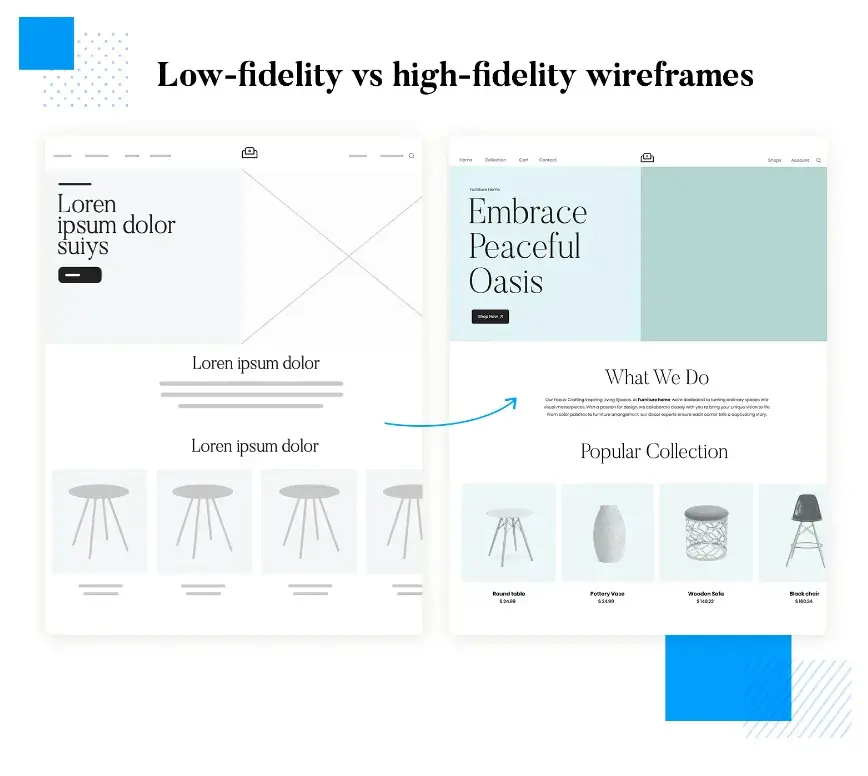
In prototyping, the mockup is converted into a high-fidelity, interactive demonstration of the website. While not the final coded website, a prototype simulates a website’s look and behavior as closely as possible. Designers use prototypes for user testing to receive valuable feedback about the site’s usability.
Once stakeholders approve the prototype, a development team takes over to program the website and prepare it for launch.
.png)
Free Website Design Inspiration Guide
77 Brilliant Examples of Homepages, Blogs & Landing Pages to Inspire You
- Agency Pages
- Ecommerce Pages
- Tech Company Pages
- And More!
Download Free
All fields are required.
.png)
Why Are Website Mockups Important?
In my experience working on countless website projects, mockups are important because they help visualize and finalize the key design aspects of a website and branding elements. They can be easily altered and shared with stakeholders, keeping everyone aligned on the final product.
For little cost and relatively low effort, mockups allow you to visualize your website’s design before investing time and money in development, including:
- Text, images, and other media content.
- Buttons, CTAs, forms, and other prominent page elements.
- Page layout.
- Visual hierarchy.
- Color schemes.
- Branding elements.
- Typography.
- Visual accessibility, including color contrast.
- Visual consistency across pages.
Additionally, mockups keep internal teams aligned on the final product. A good mockup conveys the design team’s vision for a website to product managers and developers. When it comes time to code the website, mockups serve as a visual reference for developers and clarify any ambiguity in the design specs.
In my experience, a well-designed mockup can appear very close to the final product, and allow the development team to assess the user interface similar to the way the end user would. From featured banners to the top navigation, a web designer can modify website assets quickly and efficiently in response to feedback from the development team.
All in all, website mockups are the bridge between the low-fidelity ideation stages and the high-fidelity demo stages of the process — they give everyone an understanding of how the website will actually look when loaded in a browser.
Benefits of Website Mockups
In partnering with designers, I’ve found that creating a mockup during the website development process can cut down the time to launch and aid other areas of the business like marketing and project pitching, too.
Here are some of the benefits of using a website mockup.
Save time and money on web development.
By creating a static mockup of your website, I’ve seen firsthand how it reduces the number of revisions for development teams. The reduced energy saves costs in large part because it’s more time-consuming to modify code than to make a change on a mockup.
Since user experience changes must be done through coding, making visual changes through a mockup can allow your team to allocate more time and budget here. If you’re outsourcing your web development, reducing the time spent here can also save you a great deal of money.
Find inconsistencies and reduce visual confusion.
When I write web copy for a client, I always make sure to go through a few revisions to minimize errors. However, once I hand the copy over, they sometimes make edits that have small errors or lead to inconsistencies that don’t always stand out until they’re outlined in a mockup.
What’s more, seeing the web copy laid out in the right colors, typefaces, and sections confirms that agreed-on design choices are still the right ones.
Also, sometimes the copy works well in a wireframe, but when clients and I see it in the context of the design, we need minor tweaks. For example, sometimes I’ve written a headline only to adjust it after seeing what it looks like in the proper H2 or H3 typography — whether due to the sizing, spacing, or even the typeface.
Good design matters, and you want to make headlines for the right reasons, not going viral because your typeface or spacing changes the message of your words. Mocking up your website can help prevent these kinds of errors before getting to the development phase.
Test ideation concepts.
The fantastic thing about creating a website mockup is the range of fidelity, meaning you can design a relatively low-fidelity mockup to compare various design concepts without building multiple fully-functional websites.
Let’s say you’re the Director of Marketing leading your company through a rebrand. I’ve seen people in this position work with their designer on a few different website mockups to present to leadership before choosing a final direction.
Mockups are also super effective for pitching projects. Years ago, when I worked in a newspaper, we mocked up a two-page ad for a new real estate publication and sold a premium placement as a result. And, the final design and layout ended up being very similar to the pitched mockup!
Build a design portfolio.
If you’re a freelancer — a designer or a copywriter, for example — but don’t know how to code, you can use mockups to build out your designs and add them to your portfolio. Since I’m not a web developer, one strategy that I’ve considered is partnering with designers to create mockups for our portfolios.
Thanks to the myriad mockup platforms out there, you could even mockup other ancillary design ideas like social graphics and email campaigns to present a fully integrated campaign. While a relatively easy lift on your end, it can make you look more professional and make your client feel like they’re getting a better value.
Creating My Own Website Mockup Example
I’m going to walk you through my process of creating a mockup using a fictitious bookstore as an example — meet the Little Lamb Bookstore. I’m using Google Slides to create a mockup homepage for the bookstore’s website, which is great since it’s a resource that’s completely free and accessible to everyone, regardless of your design experience or knowledge of complex tools.
When creating a homepage, you can customize it depending on your company, but there are certain features you’ll want to include, like a navigation bar, search bar, company logo, and name.
I started off with a “blank” layout on the Google Slide.
First, I created the header, using the “create shape” feature to make rectangles like the colored header and the search bar. Then I uploaded a logo and added details to my search bar, like the search placeholder and the magnifying glass icon.

For the site navigation, I used the “table” feature to create the navigation buttons and then created a hamburger menu using the same method as before to create three small and thin rectangles, which I layer on top of each other.
Next, for the hero section, I added another rectangle and inserted my hero image and text. I also included a button using the create shape feature and selected a rectangle.
The final touch on my mockup was adding a scroll bar to the right, mimicking a browser’s scroll bar.

My mockup looks very close to the hero section of a final website, but remember, it has no functionality just yet — that comes in the prototype phase.
While my full mockup for the bookstore website would also include products and a newsletter signup section, you can get a sense of how it might come together.
Now, I can share this mockup with my fictitious team to decide how we like the layout, colors, and concept without having to spend a ton of money and resources to get it coded first.
How to Create a Website Mockup
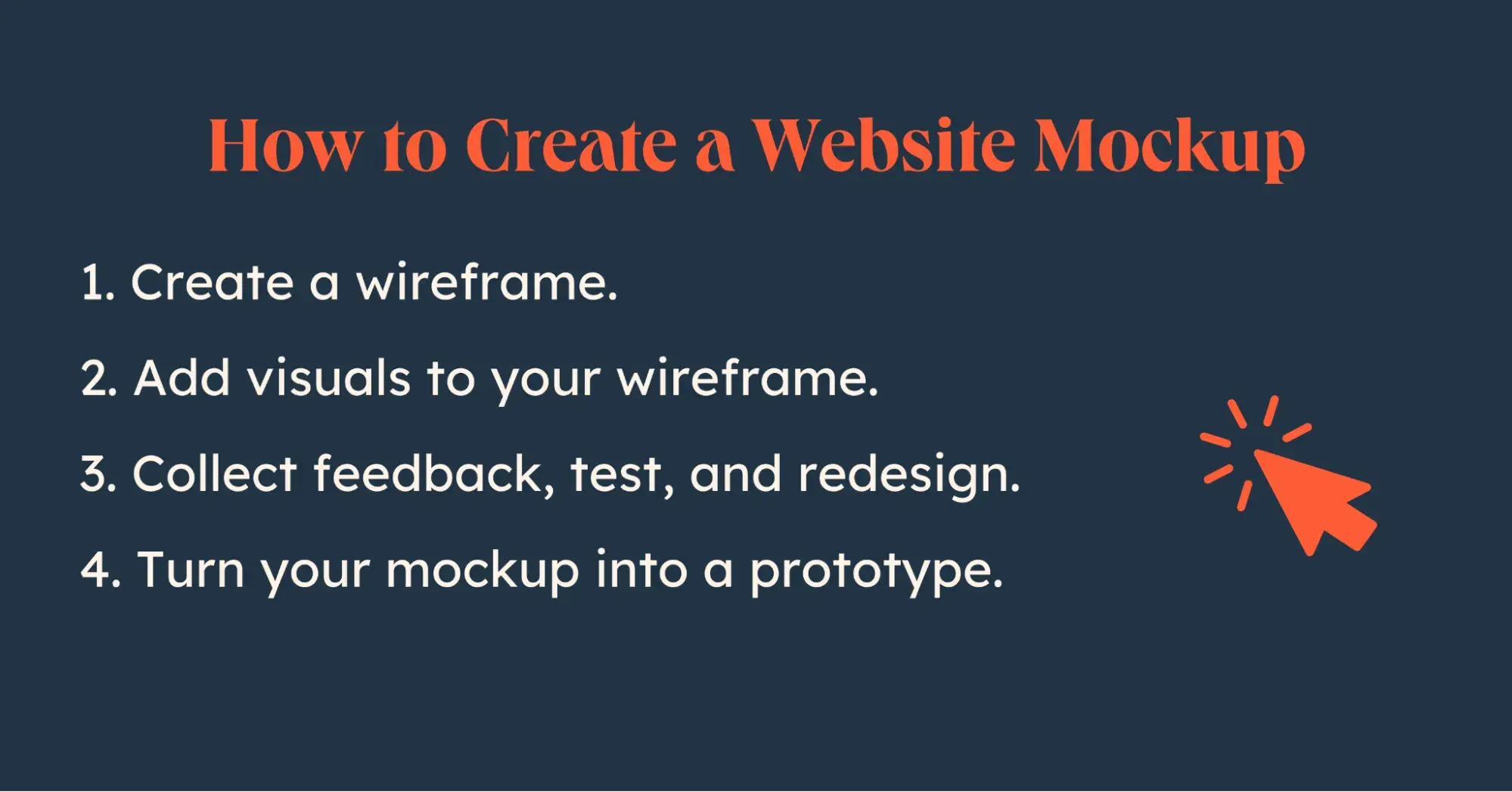
- Create a wireframe.
- Add visuals to your wireframe.
- Collect feedback, test, and redesign.
- Turn your mockup into a prototype.
Now that you’re familiar with how to mock up websites, here are some steps you can take for your next project.
When moving into the mockup phase of your website creation process, you’ll ideally have a clear idea of your website’s audience and purpose, as well as some wireframes to reference when creating your mockup. If so, you can skip to step two. Otherwise, let’s start from the top.
1. Create a wireframe.
Create low-fidelity wireframes to determine the layout and structure of your web pages without getting caught up in the details. Check out our beginner's guide to website wireframes for more information.
Keep in mind that you can create wireframes using pen and paper, printouts, or dedicated software. In my opinion, there’s no better place to start than with pen and paper because it helps me stick to the bare minimum in terms of features for my website. Focus on clear drawings that distinguish between page elements like text, images, navigation, CTAs, and key elements.
Pro tip: You can also create mobile wireframes to plan the layout of your mobile site early in the process. This helps you avoid adapting your completed desktop design to mobile and ensures a consistent look between the desktop and mobile versions at launch.
2. Add visuals to your wireframe.
Start creating mockups using your wireframe as a foundation. Incorporate key design aspects such as:
- Page elements.
- Color scheme.
- Typography.
- Content.
- Layout.
- Navigation.
- Consistency.
Add design features individually and iterate until you have a client-ready deliverable. I personally find this part of the process the most fun since I can see my scrappy pen-and-paper vision come to life.
3. Collect feedback, test, and redesign.
Website mockups are essential for conducting user testing and gathering feedback on design. They allow you to gauge the usability of the website and make necessary adjustments. Mockups can be shared with team members, clients, and stakeholders for feedback and can be easily modified. It's important to remember that mockups are not the final product and can be easily changed.
This adaptability is one of my favorite reasons to create mockups. No website design will be 100% perfect — while they should be error-free, iteration is the name of the game, even with well-known brands. The easier you can make changes early in the process, the smoother the development process will be.
4. Turn your mockup into a prototype.
Once the website mockup is approved, it can be turned into a prototype, an interactive model that simulates the user experience. This allows for usability testing and improvements before handing the designs off to developers. Having this level of interactivity right before the development process can give you a good sense of the website’s functionality.
Creating wireframes, mockups, and prototypes are all integral phases of the UX process, and we have some free templates to help you get started in your UX journey.
Website Mockup Tools
Your website design team relies on software tools throughout the entire design process, and the choice of tools depends on factors such as budget, team preferences, and the level of detail in wireframes and mockups.
There are two main categories of design tools: end-to-end tools that allow you to create wireframes and prototypes in one tool for convenience and consistency, and tools specifically for mockup creation.
The tools specifically for mockup creation allow you to draft wireframes and transfer them to the mockup tool. Some tools focus on both wireframes and mockups, while others focus on mockups and prototypes. Additionally, graphic design software tools can be used for high-fidelity mockups that provide realism, especially for unconventional website designs.
A word to the wise: make sure your mockups can be coded into a proper website.
Here are some tools you should consider for your mockup phase and beyond.
Adobe XD
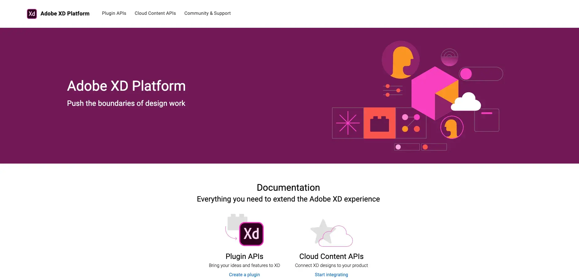
The first of the Adobe products listed here, Adobe XD is an end-to-end UX design application for Windows and macOS. Adobe XD handles design tasks for wireframes, mockups, prototyping, and developer handoff and leans heavily into pre-build components and third-party libraries to help build out designs efficiently.
I enjoy the fact that all of Adobe’s Creative Cloud products, including XD, work seamlessly together, and you can store all your projects on their cloud for easy access.
Figma
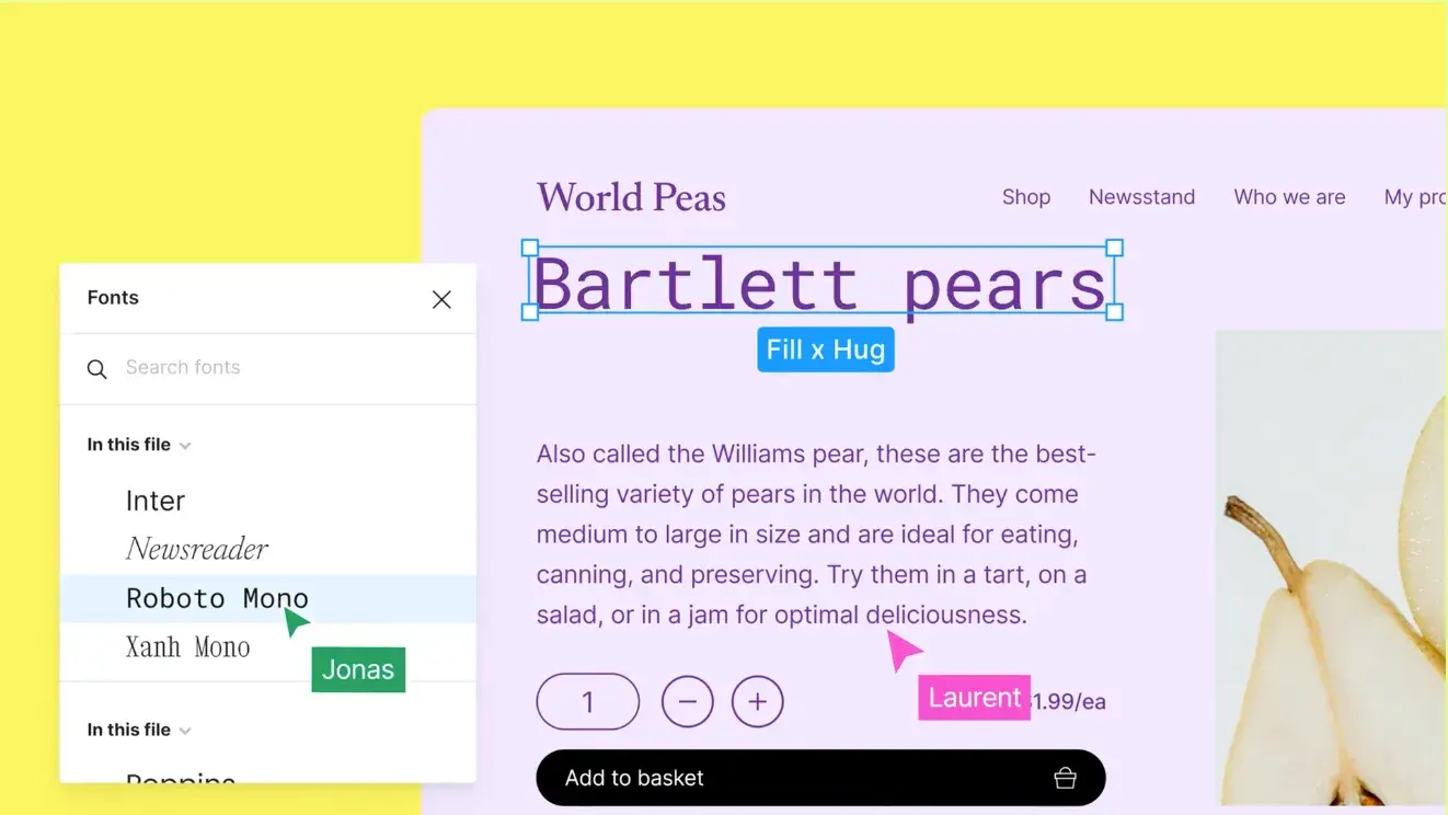
Figma is another end-to-end design tool for a wide range of website-building and application-building cases. It’s a freemium web-based tool, allowing teams to collaborate simultaneously on a file and access cloud files from one place. It also offers a wealth of features and design resources to aid your process, and you can get some decent mileage from it for free.
I often work with designers and other copywriters who love Figma — which is a popular alternative amongst creatives to Adobe XD — and is great for teams who don’t already have a Creative Cloud subscription.
Adobe Illustrator
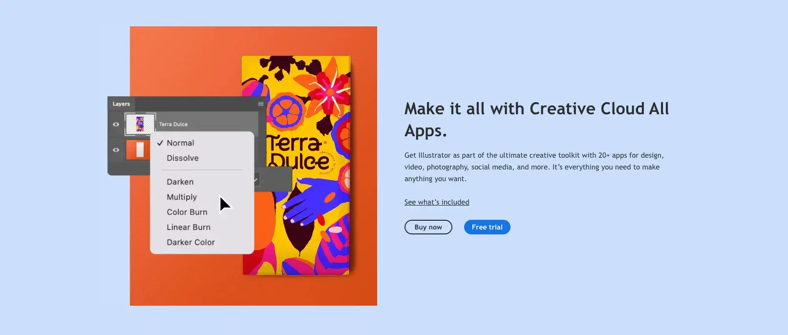
Another of Adobe’s Creative Cloud programs, Illustrator is a popular graphic design tool and the industry standard for vector graphics. It is excellent for wireframing and mockups and is relatively easy to learn.
Since Illustrator is a fantastic program for creating vectors, you can upload an existing logo and create a vector file. It’s perfect for resizing mockups without losing any fidelity.
Sketch
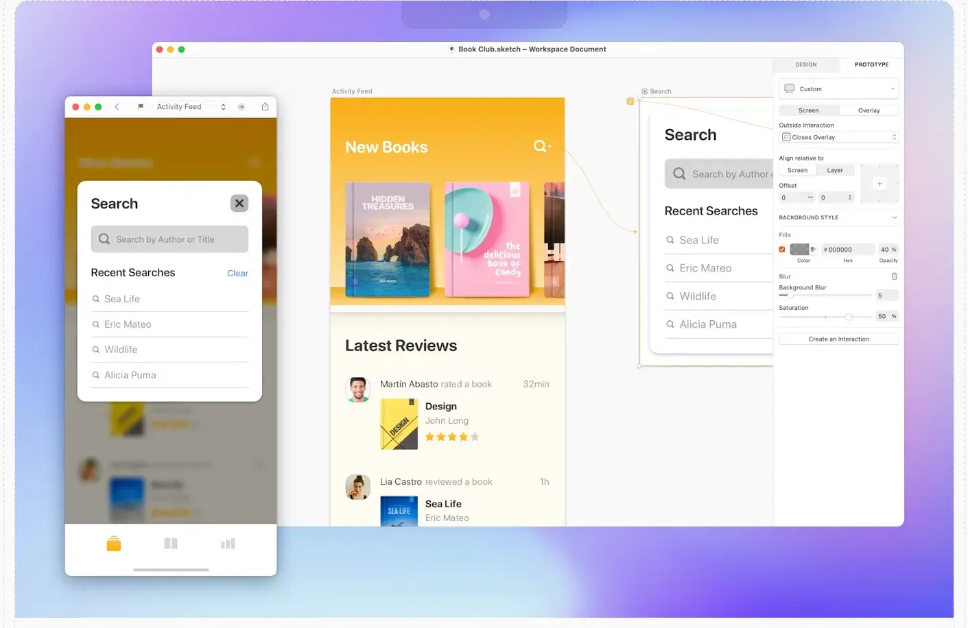
This Mac-only design tool packs a user-friendly, end-to-end design experience in one. Sketch offers robust collaboration features to support your entire team, plus an impressive library of third-party extensions and component libraries.
Though the tool is only for Mac, I like that it still offers some flexibility in that users could pay for a standard subscription billed monthly or yearly, or they can pay a one-time price and get up to one year’s worth of updates.
Adobe Photoshop

I bet you’ve heard of this one — Photoshop is a staple among graphic designers and can also be used to draft mockups.
If your mockups are lower-fidelity, it’s probably a good idea to use Adobe Illustrator or XD instead. But for more detailed or unconventional designs, it doesn’t get much more powerful than Photoshop. There’s a reason “Photoshop” has become a verb! While far from an expert in this app, I find their interface to be pretty easy to use, making it a great option for most designers.
Google Docs or Slides
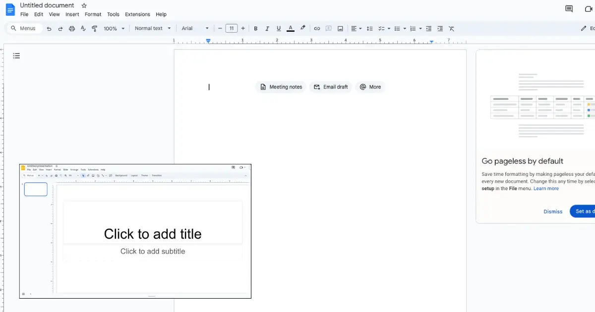
This is my personal favorite as a non-designer. While using Google Docs or Slides, it’s easy to approximate the look and feel of a site while sticking with familiar territory for those that aren’t design-oriented (ahem!). Both Docs and Slides are accessible to you simply by creating a Google account, meaning it’s completely free. Though you won’t have the most fleshed-out mockup, sometimes all you really need is a simple design to get the job done.
A quick note here: while Slides limits you to a small section of the site at a time, as you saw with my example above, it’s a great way to establish your look and feel for simple sites. And the new pageless feature of Docs allows you to better approximate how a site might look as you scroll through it.
Canva
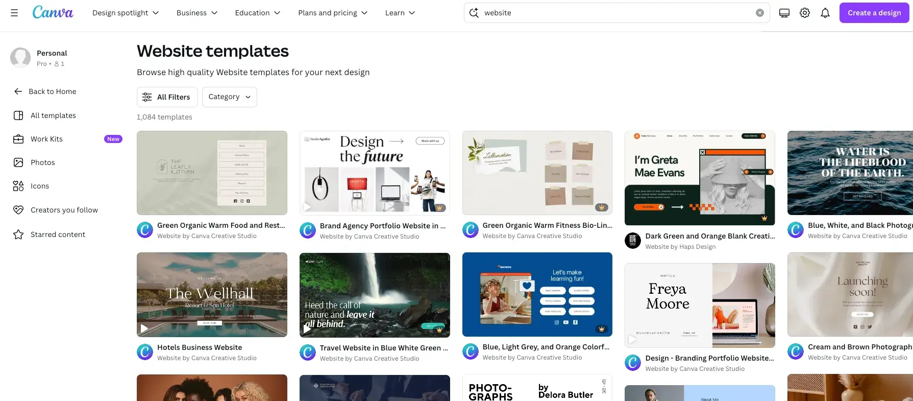
While Canva brings some limitations, it is a great tool that makes design more accessible to people with less design experience — especially if you’re exploring how to use mockups.
Canva recently implemented a “Mockup” feature that allows you to drag and drop an image into a pre-formatted mockup template. These templates include packaging, print materials, and even homewares. Canva’s not the best website mockup tool out there, but in my experience, it can be a great option for sharing your vision.
Take it further: Now that AI has made it into the mainstream, you can find some great AI website mockup solutions to suit your business needs. You can explore those options in the article AI Website Mockups: How to Use Image Generative AI to Inspire Website Layouts.
Bring Your Site to Life
Starting a new website comes with a lot of uncertainty. There are many ideas and concepts discussed in the abstract, and no real visuals to show for them.
The mockup phase is when things begin to fall into place — it’s the first time you create something that really looks like your product, which can be highly useful and motivating.
While some sites come together nicely without mockups, I find that as the number of stakeholders increases, it becomes increasingly important to align your team with the vision. This is why you want to keep website mockups as part of your process, and to do them right.
While wireframes act as the blueprint and prototypes make user testing possible, website mockups unite these phases. They make the value of your designs clear to your internal team and to your clients, and open the door for feedback to perfect it. Depending on the fidelity level of your mockup, you might not have to spend a lot of time building it out, but the results will speak for themselves.
Editor's note: This post was originally published in July 2023 and has been updated for comprehensiveness.


![Copyright Notice Examples: How to Write One for Your Website [+Template]](https://knowledge.hubspot.com/hubfs/copyright-notice-1-20241010-1359425.webp)


![Website Monetization Basics [+ 7 Expert Strategies for Success]](https://knowledge.hubspot.com/hubfs/website-monetization-1-20241007-9297556.webp)
![It’s Refresh Time. Here’s How to Update a Website [+ My Pro Tips]](https://knowledge.hubspot.com/hubfs/how-to-update-a-website-1-20240927-7786141.webp)