In this post, we’ll look at website pop-up examples you can use as inspiration for your own experiments. When done right, pop-ups perform well for lead generation. I’ve had success with them for business and for clients. And clearly, the proof is in the pudding. Why else would top brands continue using them? Let’s dive in.
Table of Contents
- Summary of Website Pop-Ups
- What are website pop-ups?
- Types of Website Pop-ups
- 4 Key Benefits of Using Website Pop-ups (Backed by Data)
- How do website pop-ups work?
- Pop-Up Design Best Practices for Higher Conversions
- Best Website Pop-Up Examples
- Frequently Asked Questions: Website Pop-Ups
Summary of Website Pop-Ups
Website pop-ups are temporary messages that appear on a web page, at the top, side, or bottom, and sometimes take up the full screen. These messages usually appear after a certain amount of time has elapsed, a user has scrolled a certain depth, or a user has clicked on something. Website pop-ups exist to draw the visitor’s attention to something important, such as a cookie notice, a free offer, a discount, or a newsletter, helping website owners generate leads and improve conversions.
Website pop-ups are particularly effective at reducing lost sales, with cart abandonment pop-ups converting at 17.12% according to OptiMonk data. The first step to building high-converting pop-ups is getting the right software. Create your pop-up with HubSpot.

HubSpot's Free Website Builder
Create and customize your own business website with an easy drag-and-drop website builder.
- Build a website without any coding skills.
- Pre-built themes and templates.
- Built-in marketing tools and features.
- And more!
What are website pop-ups?
When I explain them to people, I say that a website pop-up is a window that appears in the user interface, typically without an intentional action from the user — they “pop up” into view. Pop-ups are used primarily by marketers to grab the user’s attention to promote offers and generate leads, but they can also alert users to other things, like cookie use.
On websites, pop-ups often appear soon after the page loads the first time the visitor accesses the page. They can also be triggered by actions like scrolling, clicking, or an exit intent (i.e., when cursor movement indicates the user is about to close the page). My favorite ways to use them are exit intent and user action triggers.
Exit intent serves as a quick reminder, “Hey, want this cool thing?” while user action works well when someone clicks to contact or get a quote, and a form pops up. The caveat here is that the UX has to work on whatever device they’re using, so responsive design is a must.
Pop-ups can also appear in different forms, such as a modal that deactivates the rest of the page until the user interacts with the pop-up, a welcome mat that takes up the entire page, a banner that spans the bottom or top of the viewport, or a smaller window that still allows interaction with the rest of the page.
Types of Website Pop-ups
The types of website pop-ups are typically categorized by either the trigger that causes them to appear, the design, or the content.
Exit Intent
An exit intent pop-up appears when the visitor’s movements seem to indicate that they’re about to leave your site. For example, if a visitor’s cursor moves toward the top of their browser (on desktop) or if they hit the back button (on mobile). This type of pop-up is a last-ditch effort to grab a user’s attention before you lose them forever.
Full-Screen
A welcome mat is a type of full-screen pop-up that appears right when you land on a site. But a full-screen pop-up can happen at any point that you’re on a page; it can even be an exit intent pop-up.
Slide-In
As its name implies, this type of pop-up slides in from the bottom, left, or right of the page, usually triggered by a certain amount of scrolling or time spent on page. Slide-in pop-ups can feel less intrusive, since they don’t take up the entire screen, and they’re quietly positioned off to the side.
Banner
Banner pop-ups appear on the top or bottom of the page and span the full width of the page. These are commonly used in cookie consent notices.
Lightbox
A lightbox pop-up dims the background, bringing more intense focus to the pop-up itself. The user usually cannot interact with the rest of the website until they close the lightbox pop-up.
Cookie Pop-Ups
These types of pop-ups specifically notify the visitor of the website’s cookie usage and require the visitor to accept or reject these cookies.
Spin-the-Wheel Pop-Ups
These gamified pop-ups offer a digital wheel that the user spins to win some sort of incentive, usually a discount.
Pro tip: HubSpot Marketing Hub makes it easy to create banner, slide-in, and pop-up boxes. You can also use it to create exit intent forms.
4 Key Benefits of Using Website Pop-ups (Backed by Data)
Let’s address the obvious: Not everyone likes pop-ups. They’re (understandably) seen by many as annoying or even intrusive. Pop-ups disrupt the user experience and do so intentionally while trying to get you to do something.
Even still, website pop-up benefits may outweigh the negatives. There’s a reason they are common on business websites, especially ecommerce sites. They’ve been proven effective at channeling visitors into conversions by offering discounts, promoting an email newsletter, and/or offering membership of some kind.
1. Second Chance to Convert
Getsitecontrol analyzed over 200 popups from its user data and found that you can recover up to 13.5% of abandoned sales by offering a discount on a pop-up, encouraging visitors to complete their checkout.
2. Efficient List-building
This is especially true if you throw in a lead magnet, a free offer that incentivizes signup (such as an ebook or checklist). Getsitecontrol found that adding a lead magnet to email form pop-ups boosted conversion rates from 3.83% on mobile to 7.73%.
3. Flexibility in Goals
But pop-ups aren’t just for list building. They’re extremely versatile in the goals they can help you achieve, whether it’s promoting products or discounts, recovering cart abandonment, or simply boosting engagement. Pop-up conversion rates can be impressive. According to OptiMonk data, cart abandonment pop-ups convert at 17.12% — the highest of any of its pop-up types.
4. High ROI
Given that pop-up software is relatively low-cost and conversion rates can be relatively high, pop-up ROI can be high. OptinMonster shares a case study on its site about a real estate company that got $294,435 in revenue from just one lead captured via a pop-up.
So, while you may disagree with the ethics of pop-ups from a UX standpoint, they’re an easy, cheap, and effective way to get a visitor’s attention, which may result in them becoming a lead. Therefore, it’s at least worth experimenting with pop-ups on your website and seeing if your conversion rates improve.
Plus, pop-ups don’t have to be terrible. If yours offers a clearly stated benefit to the user, there’s a good chance they’ll take advantage. This could be a discount code, access to exclusive deals, a content offer, or anything else relevant to your unique business. If a user isn’t interested, give them an easy and obvious way to close the pop-up.
Pro tip: Remember, web pop-ups may render differently on mobile and desktop devices so be sure to test this.
HubSpot's Free Website Builder
Create and customize your own business website with an easy drag-and-drop website builder.
- Build a website without any coding skills.
- Pre-built themes and templates.
- Built-in marketing tools and features.
- And more!
How do website pop-ups work?
Web pop-ups might feel like magic, but really, it’s just behind-the-scenes HTML, CSS, and JavaScript coding at work. The code “pays attention” to user behavior and, based on specific actions, displays the pop-up.
Common Pop-Up Triggers
- Time on page - The pop-up will appear after a certain amount of time has passed.
- Scrolling to a specific point - The pop-up will appear once the visitor has scrolled to a specific point on the page, typically a percentage.
- Exit intent - The pop-up will appear when the user’s behavior indicates that they might leave your site, such as when their mouse moves toward the browser bar.
- Clicking a button - The pop-up will appear when the visitor clicks the button you specify.
- Inactivity - The pop-up will appear after the user has been inactive on your page for a specified amount of time.
Pop-Up Targeting Options
- Location - Show pop-ups to people in specific cities, regions, or countries.
- Page-Specific - For instance, in HubSpot, you can set a targeting rule and specify which URLs the pop-up will appear on, or you can exclude it from specific URLs.
- New or Returning Visitor - Some pop-up software allows you to display different messages for new visitors or returning visitors.
- Frequency - In HubSpot, you can set your pop-ups to appear only once to each visitor (“Don’t show again”), to appear every time (“Repeat”), or to appear after a certain amount of time has passed (“After a set time period”).
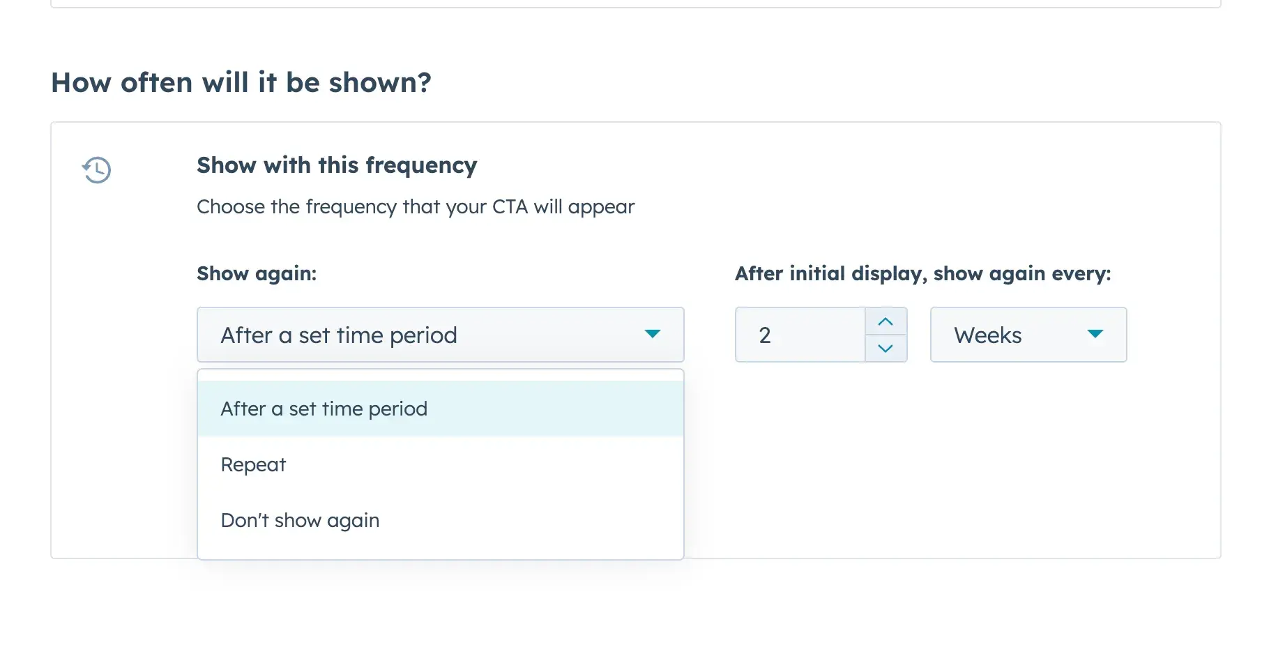
Integration and Personalization
On my website, I use my pop-up builder to define the triggers and when web pop-ups are displayed. One of my favorite features is being able to determine how often the same user is served a pop-up. For example, if someone is on the site going to different pages, I don’t want to show them the pop-up on every single page.
If you want to take your pop-up to the next level, you can also explore A/B testing, personalization, and integration with tools like HubSpot to improve conversions. In fact, HubSpot’s pop-up builder is a fantastic tool for creating web pop-ups — it has templates that make it easy to get impactful designs and set them up quickly.
Pop-Up Design Best Practices for Higher Conversions
1. Add a valuable lead magnet.
A lead magnet is a free resource (ebook, checklist, white paper, etc.) you offer in exchange for someone’s contact information. Adding one in your pop-up that is directly tied to the problem your ideal website visitor likely has can greatly boost conversions. Observe the difference between a business consultant website’s pop-up that reads, “Join my email list!” versus “Get my 5-step formula to 6-figure income.”
2. Make it easy to get rid of the pop-up.
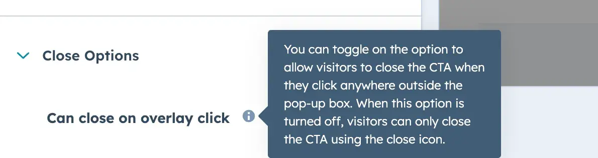
Some sites hide the exit button on a pop-up, or don’t let a user dismiss the pop-up by clicking outside of the box. Don’t do this. This is a dark UX tactic, and it frustrates users. Instead, make it clear that the user can click the “X” button to dismiss the pop-up.
And if the user clicks any area outside the pop-up, make it so that the pop-up goes away. With HubSpot, you don’t need to know how to code to do this. Within our CTA settings, just toggle this on: “Can close on overlay click.” Easy!
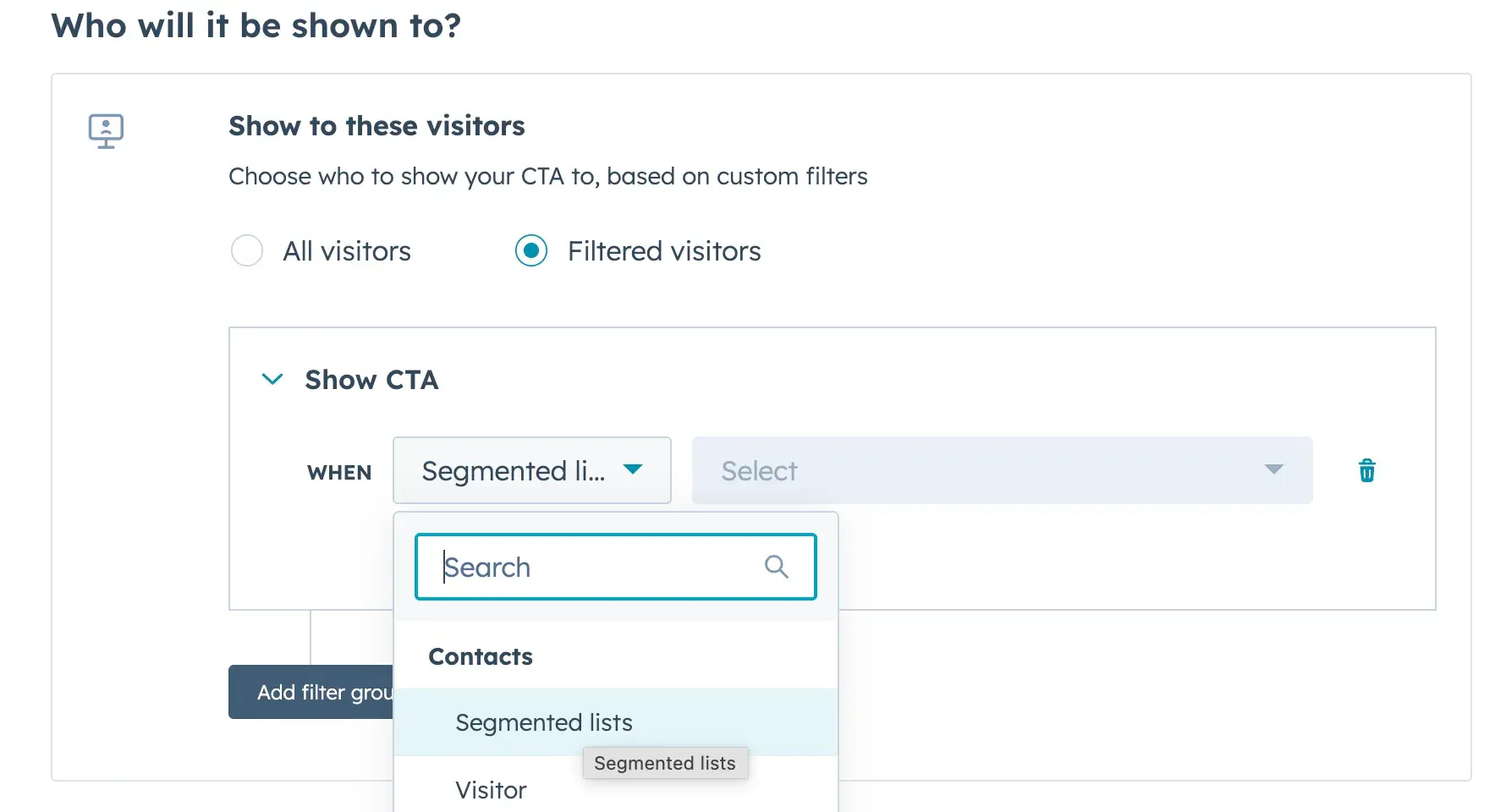
3. Take advantage of targeting.
Targeting is one of the top pop-up best practices. By filtering who sees your pop-ups, such as by location, page visited, or time spent on page, you can optimize for conversions by showing your CTA only to those most interested.
Pro tip: When you use a pop-up builder connected to a CRM, like you can do with HubSpot, you gain access to more enhanced targeting options. For instance, you’re able to target users on segmented lists that you created.
4. A/B test.
A/B testing pop-ups ensures you optimize for conversions. An A/B test creates at least two different versions of a pop-up, letting you compare the results and then move forward with the one that works best. You might test the pop-up design or the copy to see which changes make the most impact.
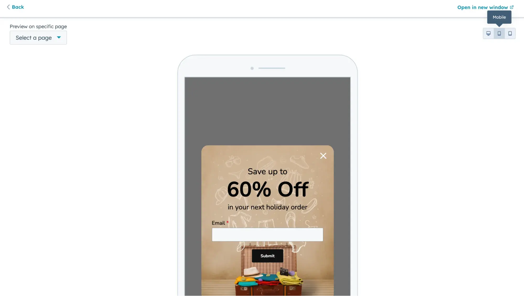
5. Test your pop-ups on mobile.
When you’re at work on your laptop designing your CTAs, it’s easy to forget that a huge amount of visitors are actually on their smartphones. Be sure that when you’re creating pop-ups for your site, you test them on both desktop and mobile. Mobile pop-ups need to adjust to the smaller screens of phones and tablets.
A good pop-up builder will make this easy. For example, as you can see below, HubSpot’s CTA builder lets you preview your pop-up on mobile before publishing it.
6. Optimize your pop-up landing page.
Some pop-ups do not require the user to complete the interaction right on the pop-up. Instead, the user must click through to a landing page, which means it’s crucial to optimize your pop-up landing page too. And, of course, we have a blog post chock full of tips for boosting your landing page conversions.
To see this in action, check out how the HubSpot blog uses pop-ups to drive users to a product page.

Best Website Pop-Up Examples
Now, let’s look at some high-quality pop-up examples across the web, broken down into the following categories:
- Discount Offer Pop-Ups
- Email Opt-in Pop-Ups
- Cookie Notice Pop-Ups
- Other Interesting Pop-Up Examples
HubSpot's Free Website Builder
Create and customize your own business website with an easy drag-and-drop website builder.
- Build a website without any coding skills.
- Pre-built themes and templates.
- Built-in marketing tools and features.
- And more!
Discount Offer Website Pop-Up Examples
1. Pip’s
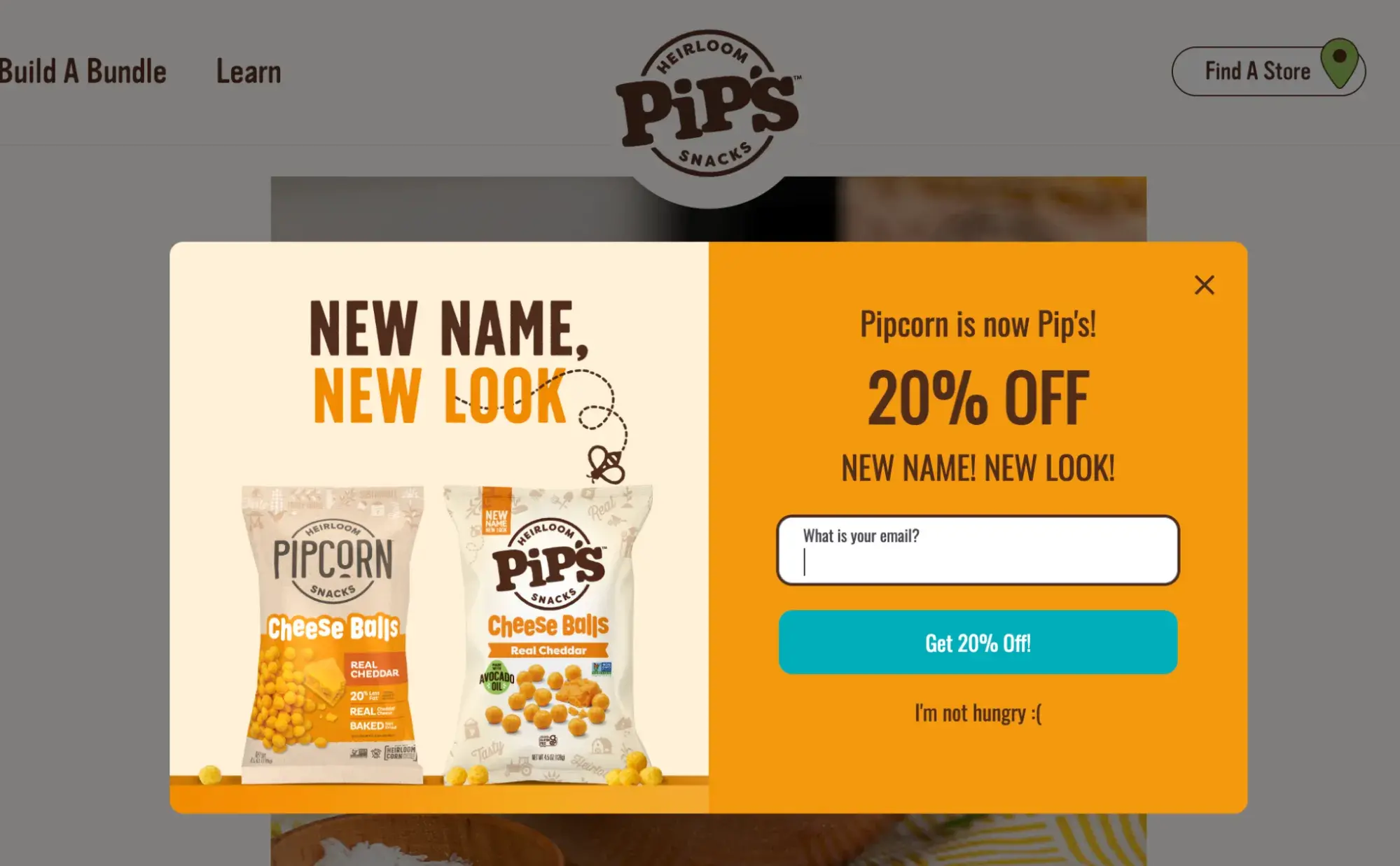
What we like: This pop-up just feels like Pip’s. The brand’s fun, snackable personality shines through in the design, from the playful fonts to the vibrant colors. And let’s talk about that CTA button — it's a bright teal that pops (no pun intended) against the background, making it impossible to miss.
There’s no hunting around for where to click. The copy is short, sweet, and to the point, encouraging users to take action right away. It doesn’t over-explain or try too hard — it just works. The best part? The 20% discount makes it clear what the immediate value is to joining the list.
2. Pourri
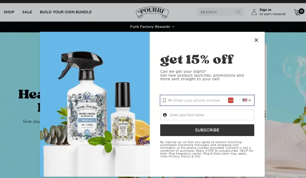
What we like: Pourri keeps it clean — literally and figuratively. The exit-intent web pop-up is clean and keeps a hint of the Pourri brand voice: “Can we get your digits?” Still, it’s a bit less playful than most Pourri copy, which actually makes sense. While clear nearly always wins over clever, it’s especially important when you’re about to leave a site and will most likely respond to an offer that it’s easy to say “yes” to.
No distractions, just a simple reason to stay. It feels like a friend casually reminding you, “Hey, don’t forget this discount before you go!” And we all could use a friend like Pourri in our corner.
3. Wild Souls
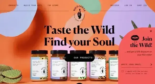
What we like: Wild Souls sports one of the coolest ecommerce websites out there, and its designers chose not to deactivate the main page with a modal. Instead, the email form pop-up is stuck to the bottom corner. It’s not overtly intrusive but still visible enough to get your attention.
This is a great example of a sticky web pop-up that doesn’t hijack the user experience. It’s there if you want it, but it’s not begging for attention. That’s a smart move — especially for a visually-driven ecommerce brand. By keeping the main page accessible, users can continue to experience (and explore!) its beautifully designed site without interruption. And yet, the pop-up is still noticeable enough to drive sign-ups.
4. Absolution Cosmetics
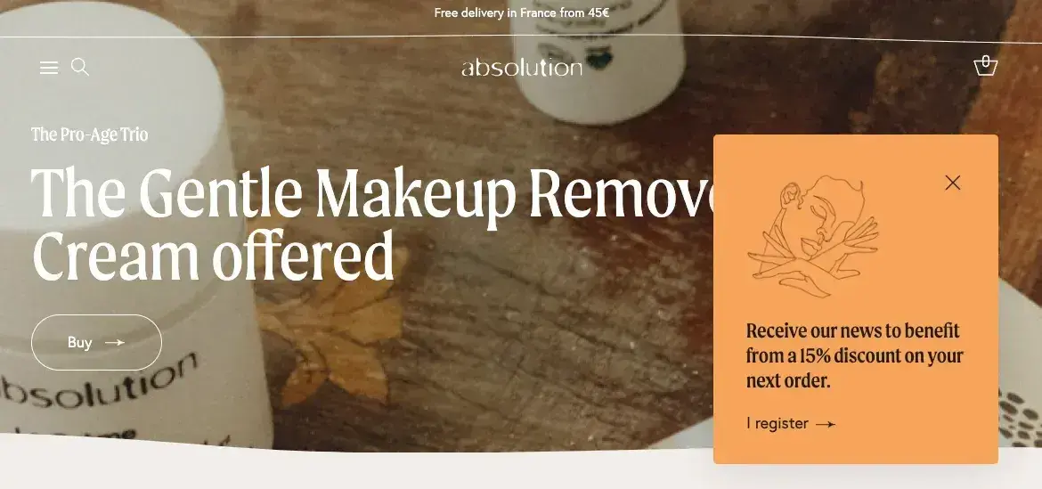
What we like: Absolution Cosmetics takes a similar approach to Wild Souls but adds a touch of elegance with a delicate illustration. This small design choice makes a big difference — it softens the look of the pop-up and gives it a polished, high-end feel that matches Absolution’s aesthetic.
And while some web pop-ups scream at you with bold colors and aggressive language, this one stands out, without overwhelming the experience. It’s subtle, classy, and exactly what you’d expect from a premium beauty brand.
5. Tommy Hilfiger
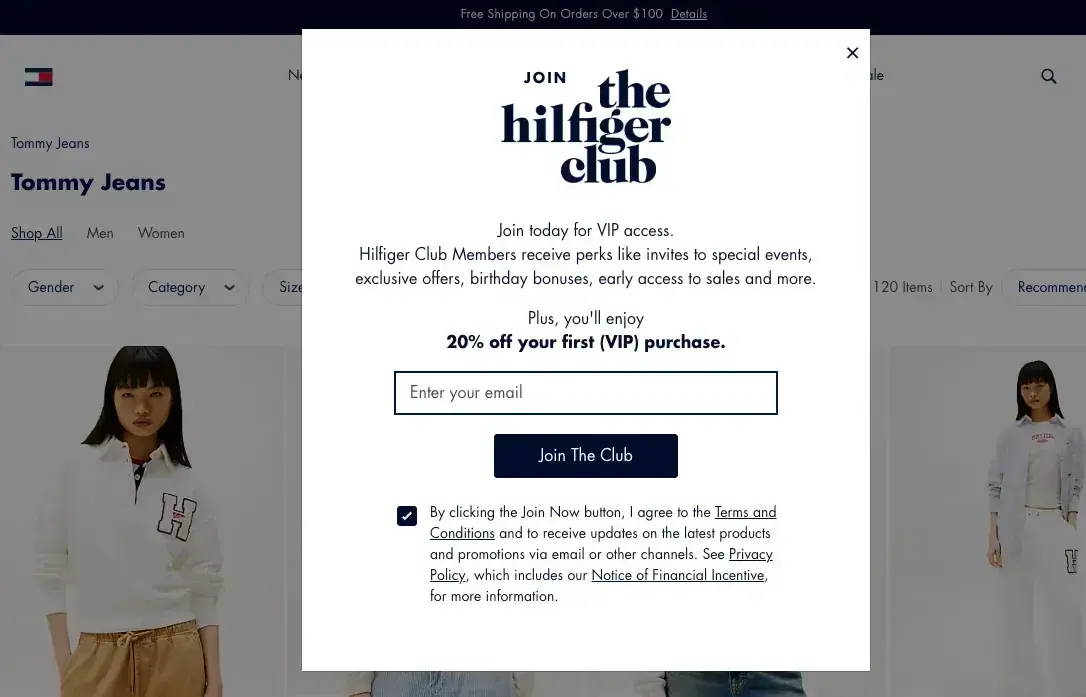
What we like: Tommy Hilfiger knows how to make things look sharp, and this pop-up is no exception. It’s clean, easy to read, and doesn’t bombard the user with conflicting colors or unnecessary distractions. The modal is structured in a way that mirrors their overall brand experience — sleek, polished, and intentional.
The copy is also on point. Instead of just throwing out a generic discount, it positions it as an exclusive offer for those who join the “club.” This small tweak makes it feel more like an invitation to something special rather than just another promo.
6. Primary
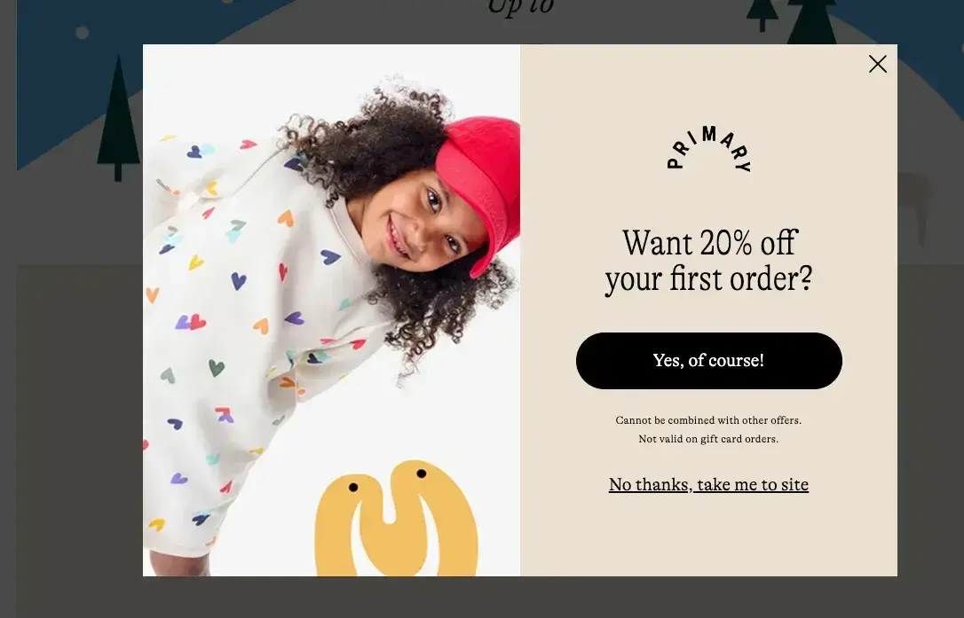
What we like: Here’s another delightfully simple pop-up with a bright color, playful photo, and an appealing offer. If pop-ups aren’t your favorite thing (which is understandable), this design tries to balance out any mild annoyance.
How? This web pop-up feels a lot more like a cheerful invitation than an interruption. Plus, the imagery of a happy kid in fun clothing stays true to the brand's promise. Primary knows its audience, and this pop-up does a great job of marrying brand personality with engaging design.
7. Blue Apron
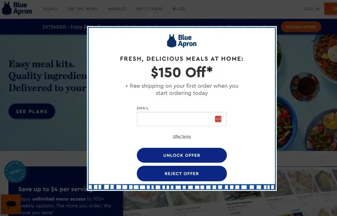
What we like: One of the first meal kit brands to really take off in popularity, Blue Apron offers visitors $150 off their order and free shipping if they provide an email.
In fact, how about that big offer? I almost took Blue Apron up on it just now. It’s a serious incentive, and the brand makes sure you don’t miss it. The large, easy-to-read text gets straight to the point, and the branding is clean and professional.
The free shipping bonus is the icing on the cake. When combined, these two elements make the decision to sign up feel like an absolute win. Who doesn’t love free shipping and a hefty discount?
8. Fable & Mane
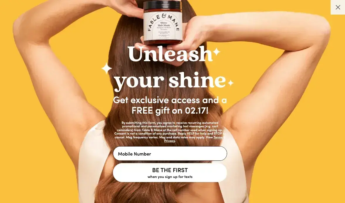
What we like: Fable & Mane’s web pop-up is bold, bright, and impossible to ignore. Taking up the full screen, it makes sure visitors see the offer.
While full-screen pop-ups can sometimes feel aggressive, this one works because it’s beautifully designed. The color scheme matches the brand’s aesthetic, and the high-quality product photo adds an element of visual appeal. The form fields are also well-placed and easy to interact with. Yes, some people might dislike the full-screen approach, but the design and offer are compelling enough to make it worth their while.
9. dbrand
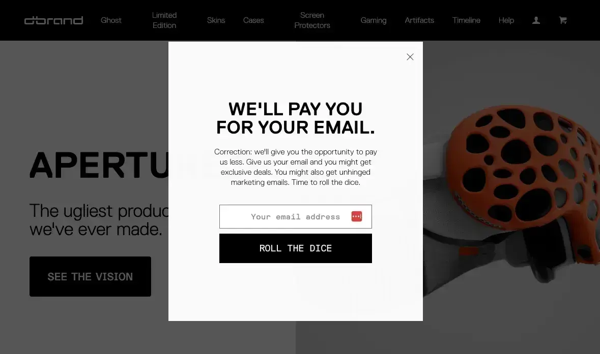
What we like: I’m obsessed with this fun copy. “We’ll pay you for your email. Correction: we’ll give you the opportunity to pay us less” is sheer brilliance, and I wish I had written this copy. This pop-up has a simple design and a fun CTA that makes me want to get their emails.
The design itself is simple — nothing fancy — but that’s the point. The humor carries the message, making the web pop-up memorable and engaging. This is a great lesson for you if you’re adding pop-ups to your site: If you can make people enjoy your web pop-ups, they’ll be far more likely to interact with them.
10. Sun Bum
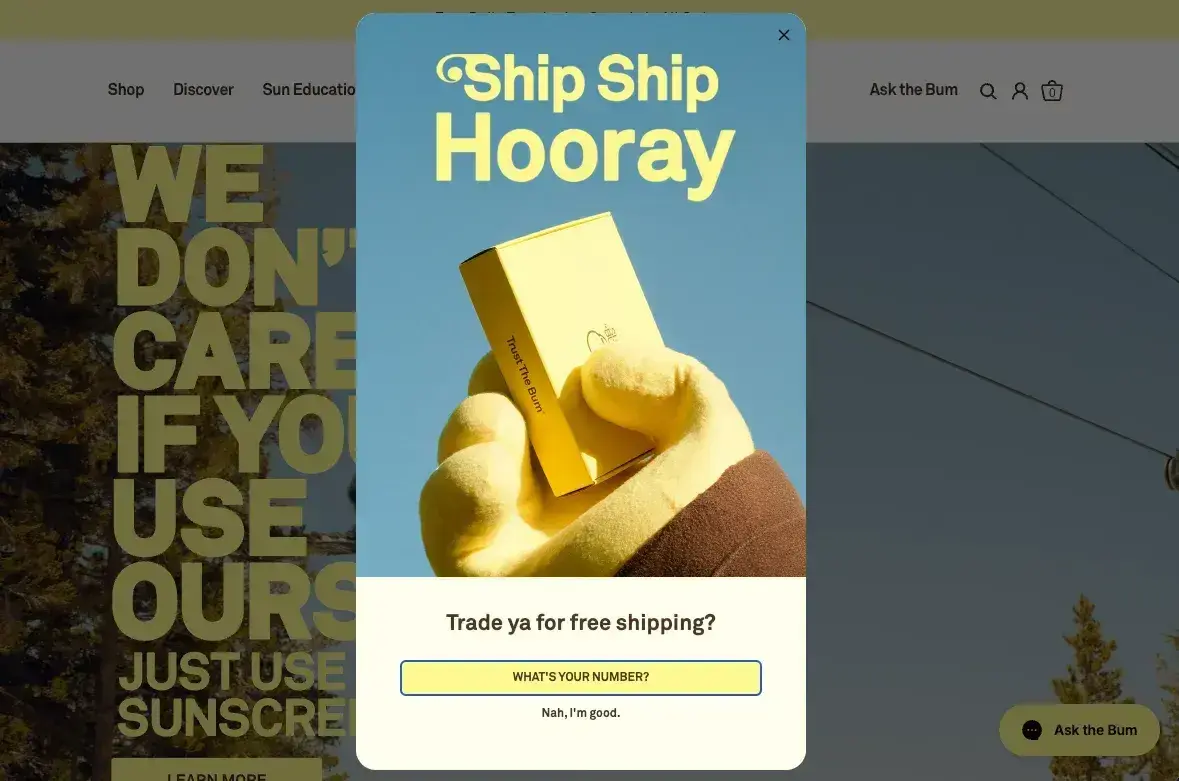
What we like: Sun Bum nails it two times over. The first, with fun, beachy vibes, and the second with the fun copy. Everything from the fun headline “Ship Ship Hooray,” the playful CTA “trade ya for free shipping,” and the opt-out “Nah, I’m good,” makes this a web pop-up I look forward to. Plus, the design is colorful and fun as well.
Plus, the bright, cheerful design matches the brand’s laid-back identity. Web pop-ups work best when they feel like a natural extension of a brand’s personality, and Sun Bum absolutely gets that right here.
11. Chillhouse
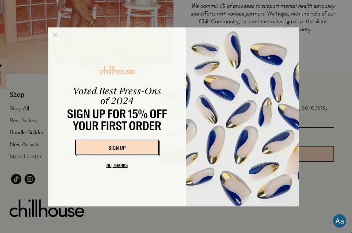
What we like: It’s probably not a surprise to you that people tend to like seeing fun, lively images on web pages. Chillhouse, a spa based out of New York City, knows this and embraces it throughout the site, including this web pop-up.
The vibrant, feel-good imagery draws you in instantly, creating a sense of relaxation and self-care. Instead of using loud colors or aggressive messaging, this pop-up feels like a natural extension of the brand. The CTA is clear and direct but without pressure — just a simple invitation to sign up or say no thanks.
12. Kinfield
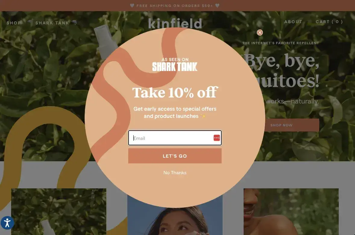
What we like: Using a different shape for your pop-up is one quick and easy way to make it stand out from competitors. And, sometimes, that’s all it takes!
Instead of the standard rectangular box, this one has a more dynamic, eye-catching shape that feels fresh and unexpected. The colors are bright but not overwhelming, and the copy is fun, making the offer feel exclusive without being pushy. It’s a small detail, but it gives the pop-up an edge over the usual layouts, making users more likely to stop and engage.
Lastly, the Shark Tank reference gives the brand and the offer some oomph and extra credibility.
13. Woodcraft
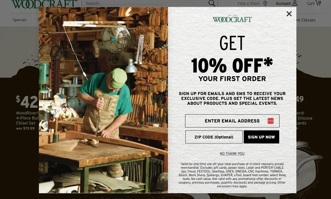
What we like: Woodcraft has a gorgeous web pop-up designed to attract its target audience of woodworkers. With a natural fiber background and an image of a well-kitted woodshop, the design is spot on with a clear offer.
While there feels like a lot of copy, most of it is legal disclaimer stuff and if you look past it, the offer is super clear. Also, I love that the zip code is optional. Across the board, this feels like an extension of Woodcraft’s site and I’d give it high marks on execution.
HubSpot's Free Website Builder
Create and customize your own business website with an easy drag-and-drop website builder.
- Build a website without any coding skills.
- Pre-built themes and templates.
- Built-in marketing tools and features.
- And more!
14. Goodr
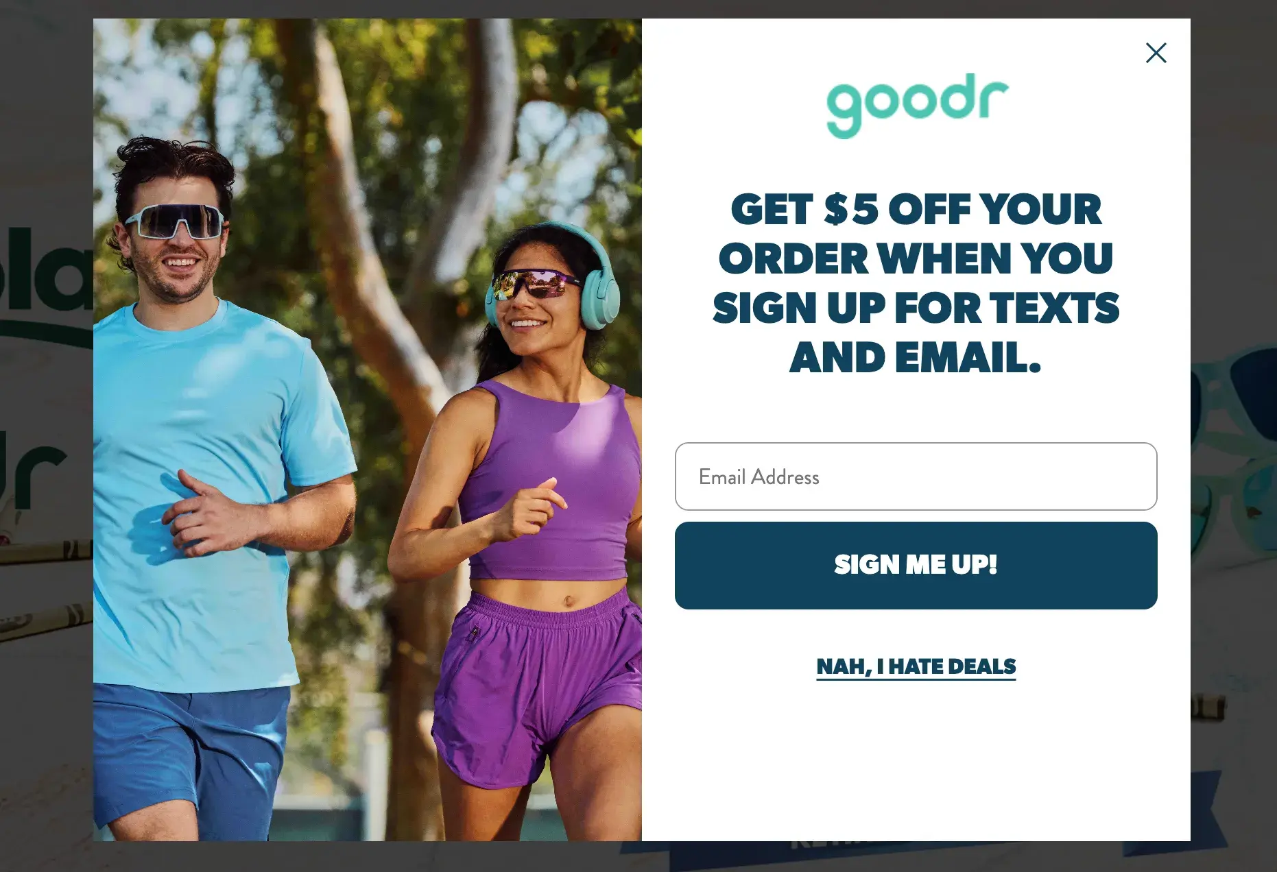
What we like: Goodr keeps it simple but effective. The design is clean, the language is friendly, and it even adds a little personality with its opt-out option: “Nah, I hate deals.”
This kind of playful approach makes the brand feel relatable and fun, which can go a long way in making pop-ups feel less annoying. Plus, the product imagery is front and center, reinforcing what’s on offer while keeping the design visually appealing. Less is more, and Goodr gets that.
And, with relatively low prices on their sunglasses, $5 off can be a pretty sweet discount.
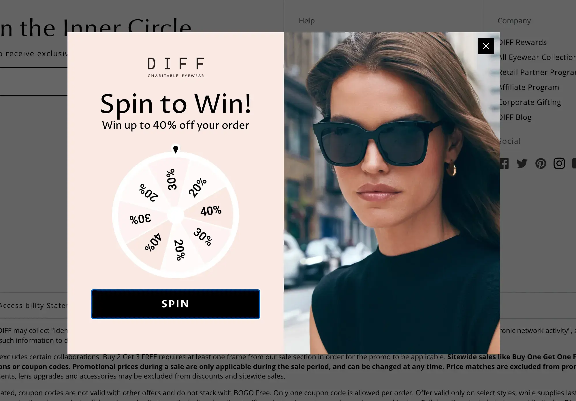
15. DIFF Eyewear
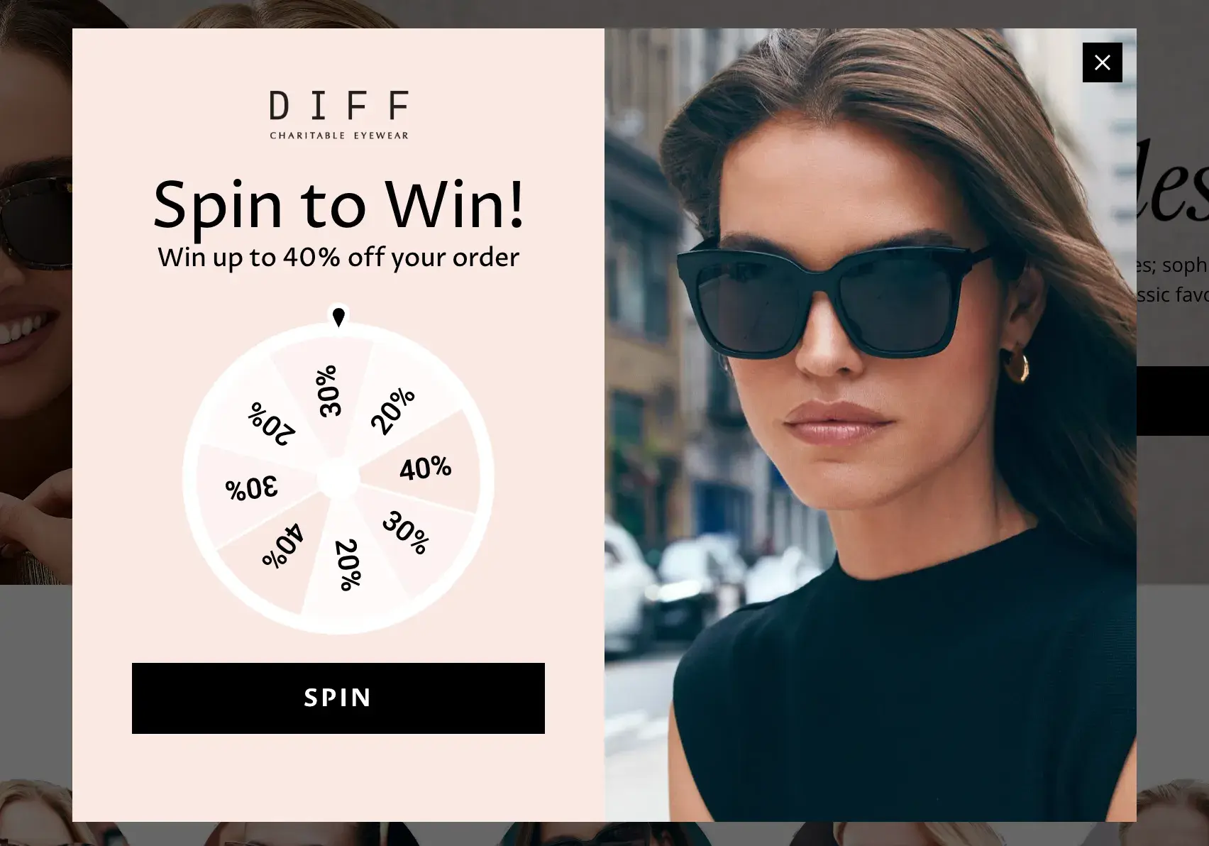
What we like: Gamification is a great way to engage users, and DIFF Eyewear pulls it off effortlessly with this pop-up. Instead of just offering a discount, they invite visitors to “spin to win.” It’s an easy way to make the experience interactive and exciting, and because you don’t have to enter your email right away, there’s less initial friction.
Who doesn’t love the thrill of potentially getting a bigger discount? It’s a fun approach that makes the pop-up feel like an opportunity instead of an interruption.
On top of that, DIFF is one of my favorite brands. Its sunglasses are gorgeous, and it has a great mission to give back.
16. Kind Socks
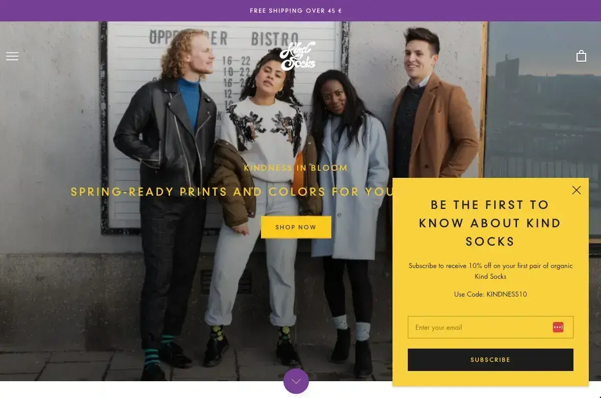
What we like: This web pop-up doesn’t just announce an offer — even though you can score 10% off. It takes things a step further and makes you feel like you’re part of something special. “Be the first to know” taps into a sense of exclusivity, making it feel like we’re insiders rather than just another email on a list.
The clean, modern design ensures there’s no visual clutter so the message is front and center. And of course, there’s the 10% discount. It sweetens the deal, without feeling like a desperate sales pitch. Instead, it’s more of a reward for being in the know.
This web pop-up also nails the balance between urgency and ease. It’s engaging without screaming for attention or taking over the whole page, giving users a simple, low-effort way to engage.
17. Portrait Coffee
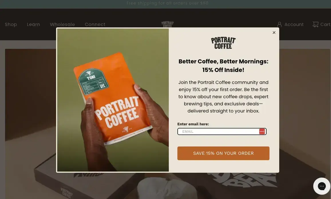
What we like: Mornings are better with better coffee. Enough said. This web pop-up understands its audience perfectly and doesn’t waste time getting to the point. I mean, who can focus on fluff if we haven’t had our coffee yet?
The 15% discount is a strong incentive, but what really sells it is the simple, effective copy. It reads like a casual conversation, making the offer feel even more appealing. Pair that with a warm, inviting design, and it’s hard to resist clicking through.
18. A Dozen Cousins
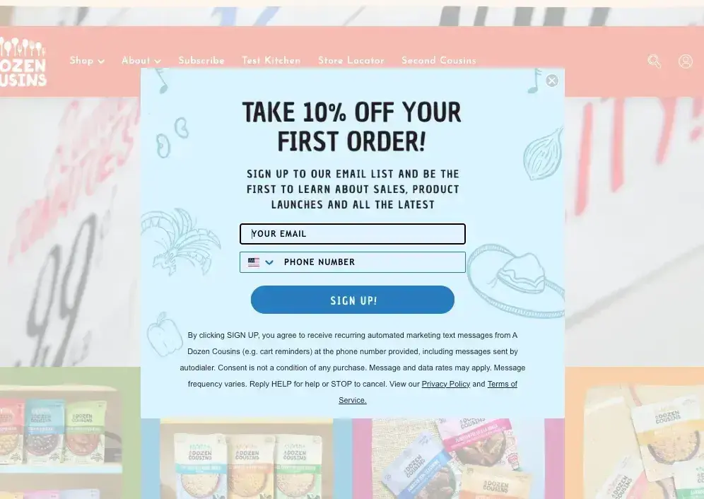
What we like: Bright colors, playful illustrations, and an easy-to-read layout make this web pop-up one of my favorites. The color choice is visually appealing and creates a sense of warmth that fits perfectly with the brand.
Plus, the “Be the first to learn about ... ” phrasing plays into the psychology of exclusivity. Everyone loves being in the know, and this pop-up makes that part of the offer as enticing as the discount itself.
19. Numa Foods
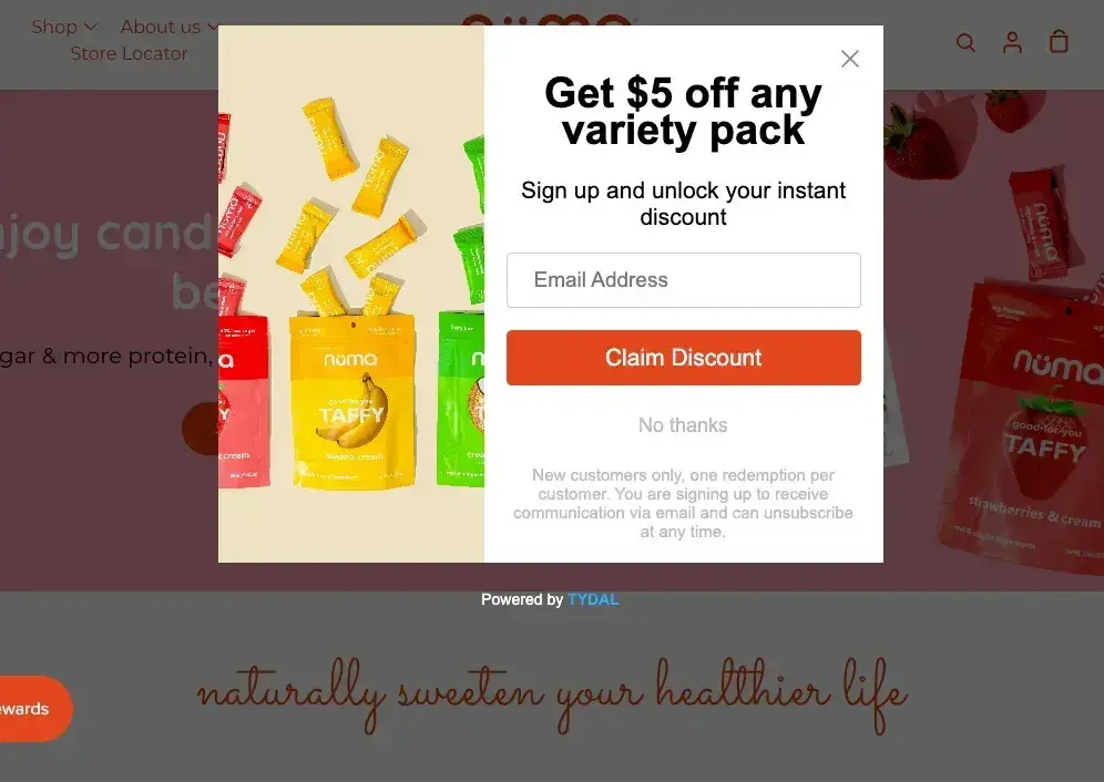
What we like: Most web pop-ups use background dimming to make the design stand out, and Numa Foods does this especially well. The dimmed background makes the colors of the pop-up itself pop even more, creating a high-contrast, eye-catching effect.
Overall, the message is simple, the design is clean, and the overall experience feels polished. A great example of how small design choices can make a big difference.
20. Unsun Cosmetics
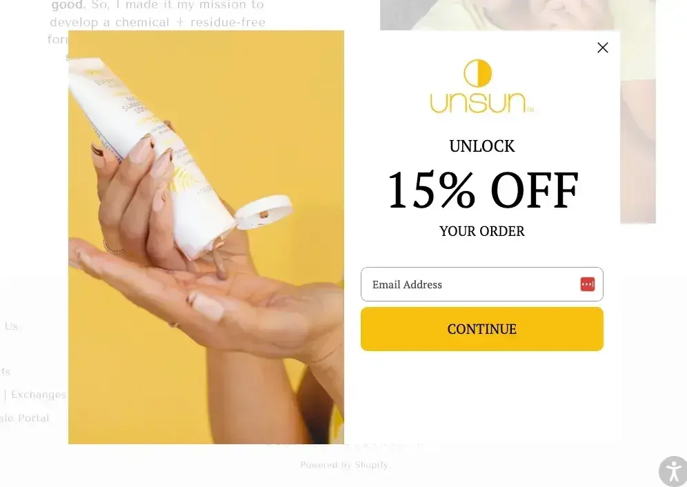
What we like: Unsun Cosmetics, which closed in 2025, flipped the usual web pop-up approach by lightening the background instead of darkening it. The result? Its bright, bold design stood out even more from the homepage, instantly drawing attention to the offer without feeling too aggressive. The color choice complemented the brand’s overall aesthetic, ensuring the web pop-up felt like a natural extension of the site, rather than an interruption.
Even better, the copy played off its brand name in a clever way, using the “un” prefix throughout to reinforce its identity while making the message feel more cohesive.
Lastly, I feel that the CTA was also a standout element. Instead of the typical “Sign Up” or “Claim Your Discount,” it used “Continue,” language that makes signing up feel less transactional and more like an invitation. Combined with a seamless user experience, this web pop-up managed to be both engaging and effective without overwhelming the visitor.
21. Marlow
What we like: Marlow goes big and bold with a full-screen welcome mat that immediately grabs your attention as soon as the homepage loads. It’s a risky move, but it keeps things sparse and includes a prominent CTA so visitors don’t feel overwhelmed.
It works well because it feels like your best friend throwing open the doors and saying, “Welcome, we’ve been expecting you!” The design is clean, the message is straightforward, and the whitespace keeps it from feeling like a chaotic entryway. No clutter, no confusion — just a clear, inviting way to get visitors to take action.
22. Yes You Can Drinks
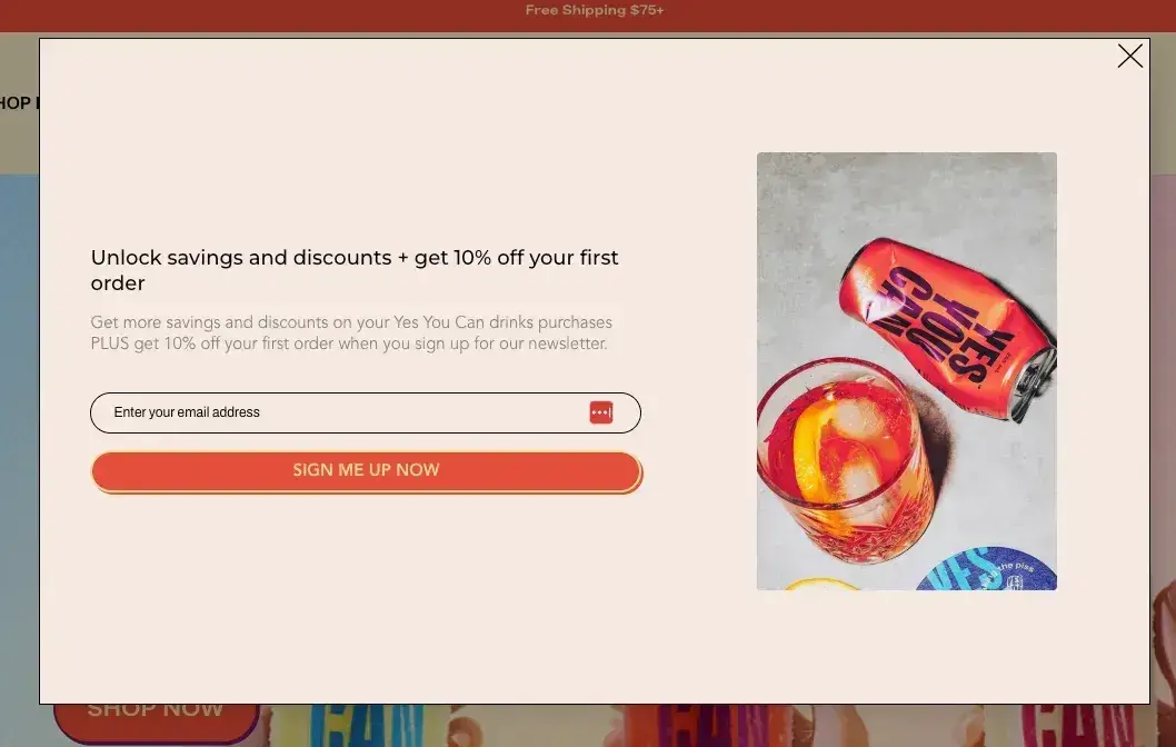
What we like: Opt-in pop-ups don’t need to be anything crazy. This example succeeds by keeping things simple. The email field is right there, the CTA is crystal clear, and there’s no fluff in sight.
It works well because it’s so easy for users to put in their email address and get back to browsing Yes You Can’s fun website.
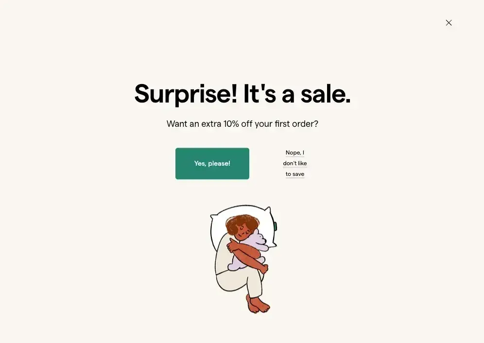
23. Northern Brewer
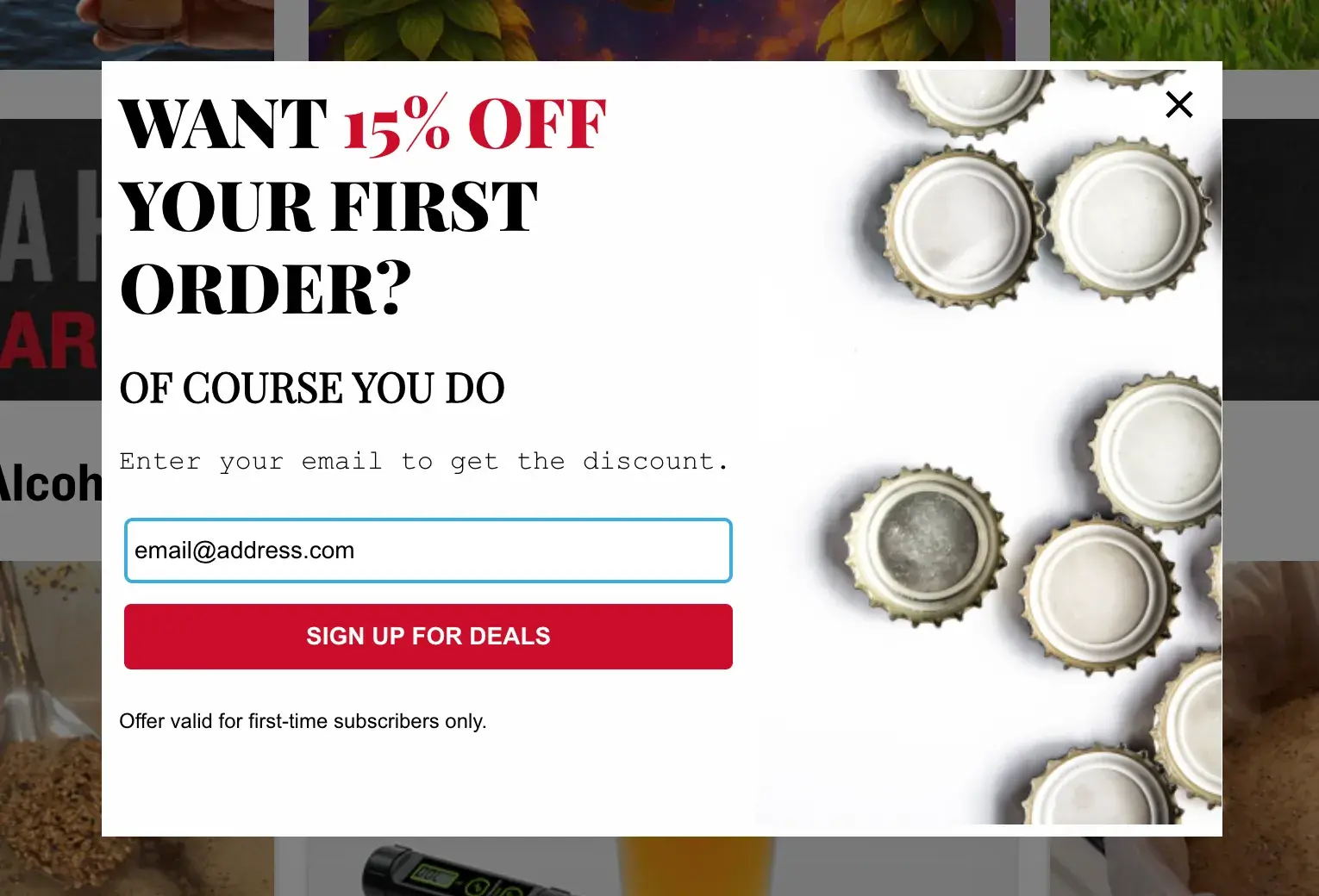
What we like: Northern Brewer understands its audience perfectly — people who love to brew beer and want to save money while doing it. The playful tone of “Want 15% off your first order? Of course you do,” hits the vibe on the head.
Even though homebrewing can be an expensive habit, people may have the “we’ll save so much money in the long run” mindset to justify the hobby. So, a 15% savings hits the mark!
If we could award points for a job well done, this pop-up and CTA would get high marks.
24. BarkBox
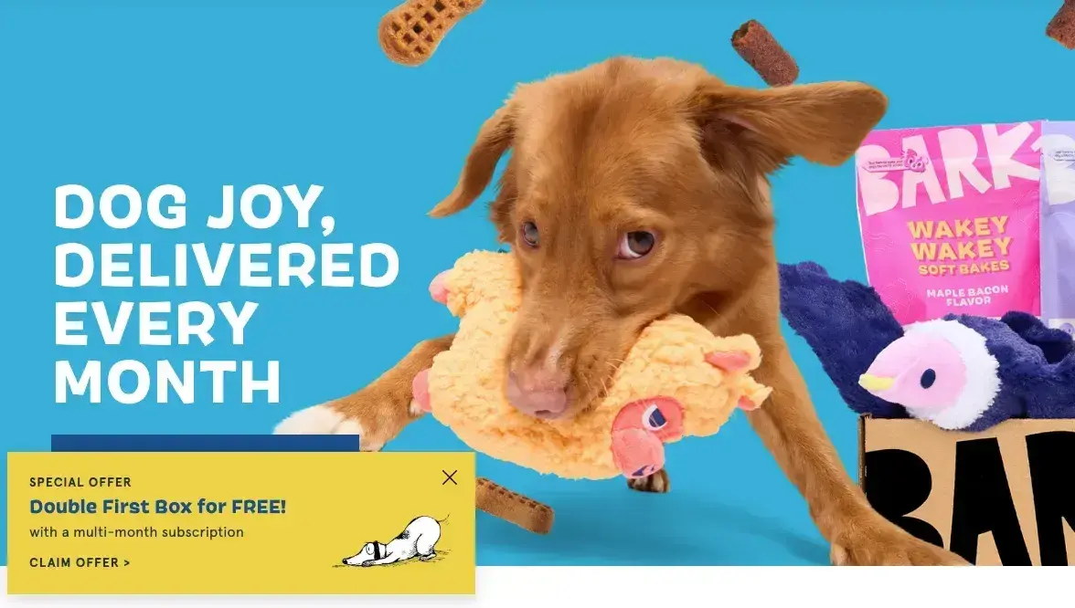
What we like: Everything about the BarkBox website is fun, including the slide-in pop-up. I like that it doesn’t distract from the playful imagery or the UX of the site, but still offers a compelling offer.
Even better, you don’t have to put in your email address right away to take advantage. All you have to do is click on the “Claim Offer >” CTA, which takes you to a questionnaire to help you find the right option.
Ultimately, there’s no friction and a heck of a lot of engagement. The strategy here is simple — make the process fun, and more people will take action. It works, so take note!
25. Cheese Brothers
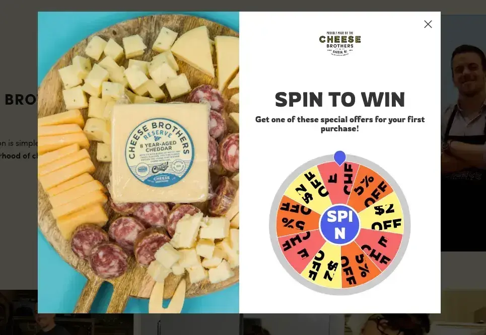
What we like: Gamified web pop-ups are always fun, and Cheese Brothers executes it perfectly with this “spin-to-win” pop-up. The interactive element makes visitors feel like they’re getting something extra, which means more conversions.
That’s not the only reason this works, though. What really gets me excited is the picture of a mouthwatering charcuterie board. I’ll spin to win!
26. Raaka Chocolate
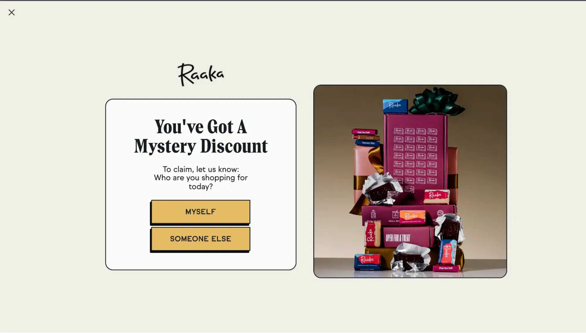
What we like: Raaka’s full-screen pop-up is playful, with just a hint of gamification. It offers a “mystery discount” that you can get by revealing who you’re shopping for (which provides Raaka with valuable information about its customers, too.
Email Opt-In Website Pop-Up Examples
27. PlantYou
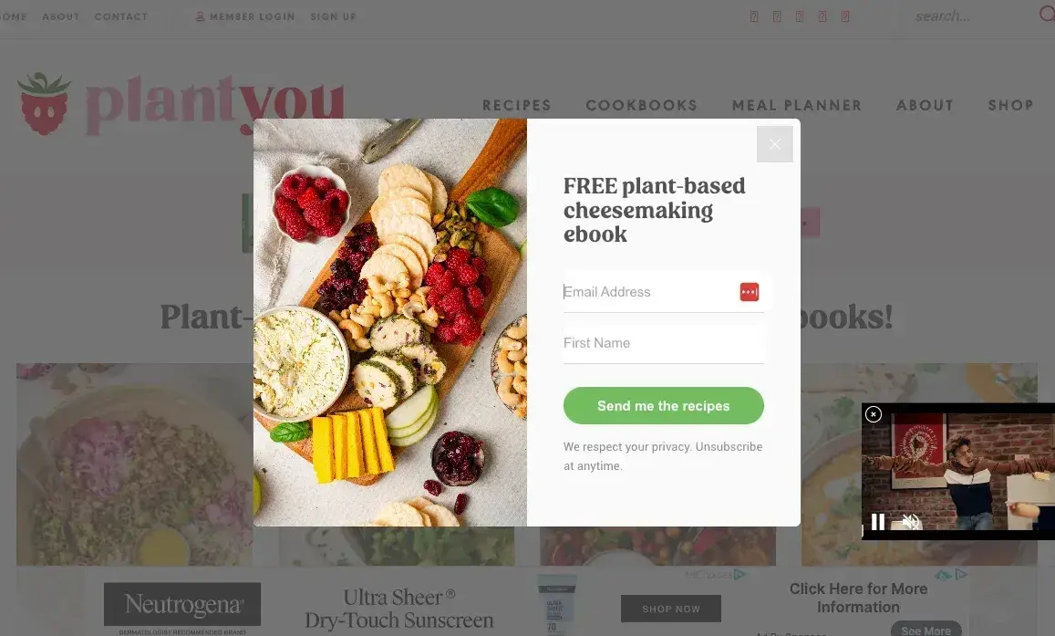
What we like: PlantYou is a vegan cookbook brand that focuses on creating delicious plant-based food. This offer of a free plant-based cheesemaking book — and the gorgeous photo — caught my attention, and I’ve been on their mailing list and buying cookbooks ever since!
Why it works? The lead magnet. By positioning the sign-up as a way to receive a valuable freebie rather than just another newsletter, it’s an easy yes which means great conversion rates. It’s perfect for anyone who loves cheese but either can’t do dairy or has gone vegan or plant-based.
28. The New Yorker
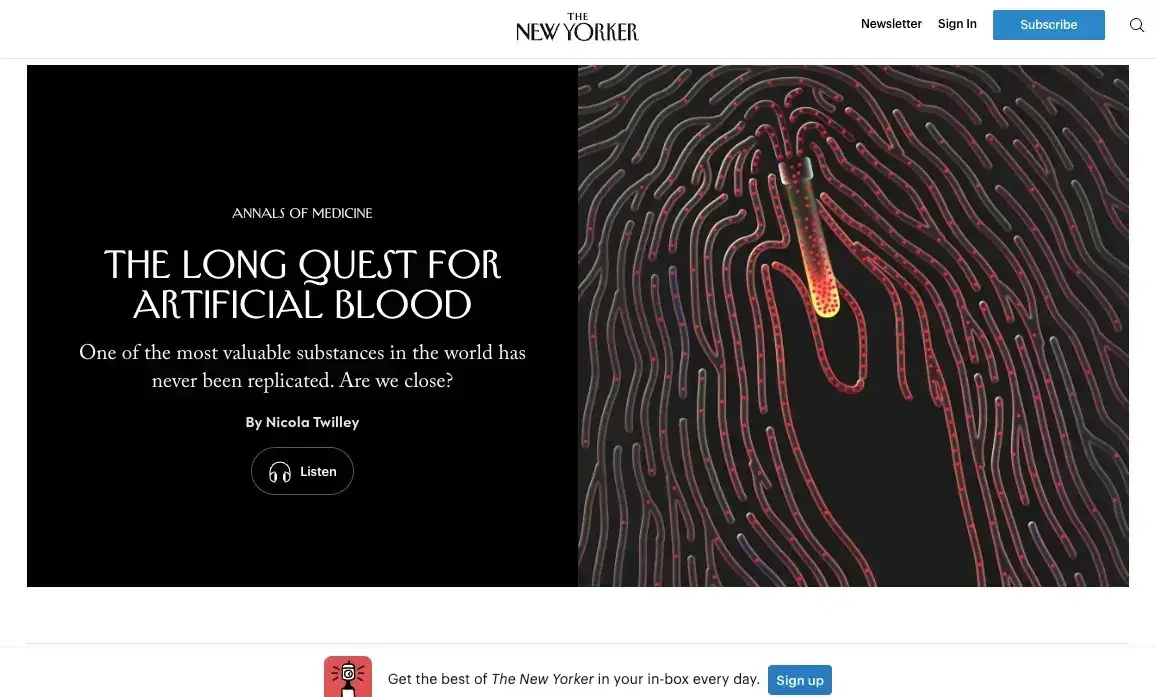
What we like: This banner CTA from The New Yorker takes a minimalist approach that fits right in with its brand. The website pop-up hangs out unobtrusively at the bottom of the screen and features a simple call to action.
Want in? All you have to do is click “Sign up.” Once you do that, it takes down your necessary info on another page. It’s a win that doesn’t take over your page or require clicking to get out of.
29. Cosmetic Packaging Now
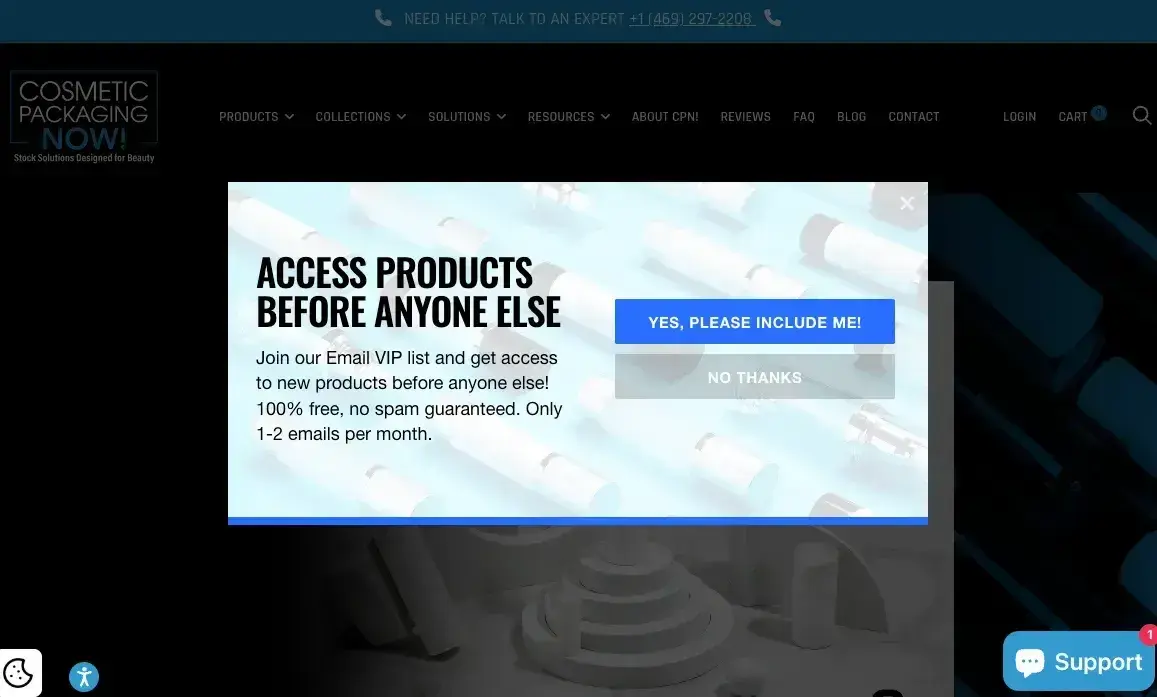
What we like: This web pop-up features a FOMO offer, a clear promise that there are no strings, and the note that people will only receive one to two emails per month. And that’s reassuring for people whose emails seem to multiply like bunnies cluttering their inbox. In turn, it leads to more conversions by addressing the “no more emails please” concern most people have.
As for the pop-up itself, the design is great. It’s clean, with just enough color to stand out, and easy CTAs.
30. Neil Patel
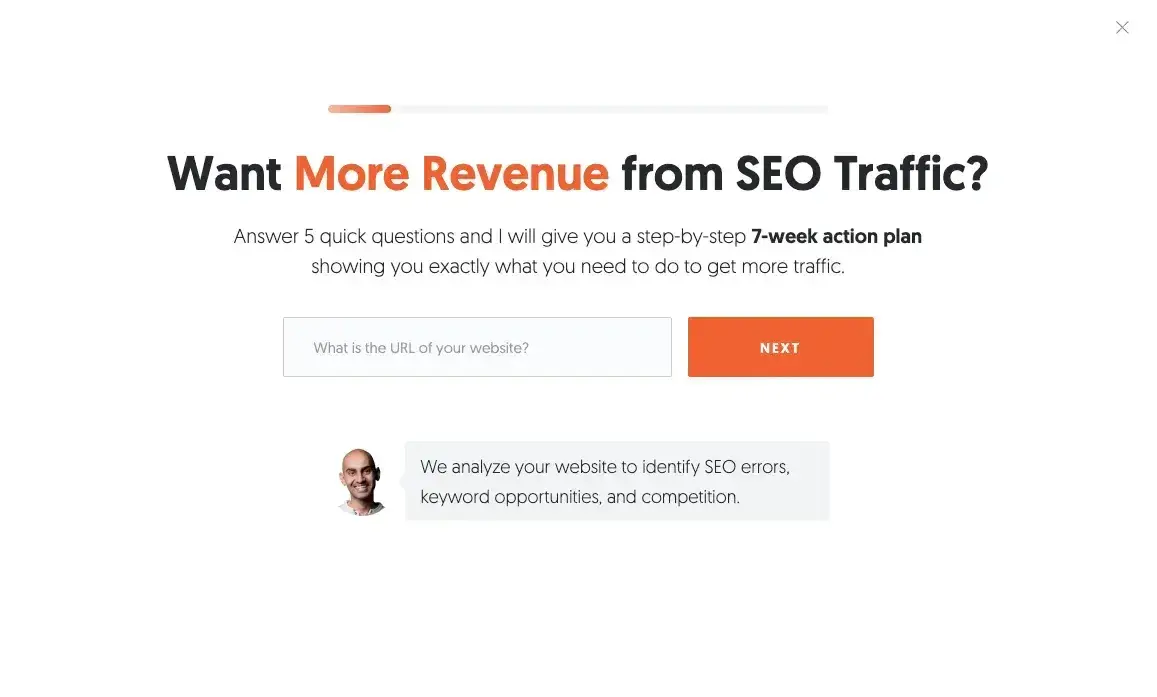
What we like: Neil Patel’s full-page website pop-up offers so much more than a discount or a newsletter. By signing up, you get an actionable plan to improve your SEO traffic.
The compelling offer, combined with a well-structured layout and strong language, makes this feel like an opportunity instead of an opt-in. It works well because Neil has such strong authority in the space and offers a meaningful incentive.
31. Poppi
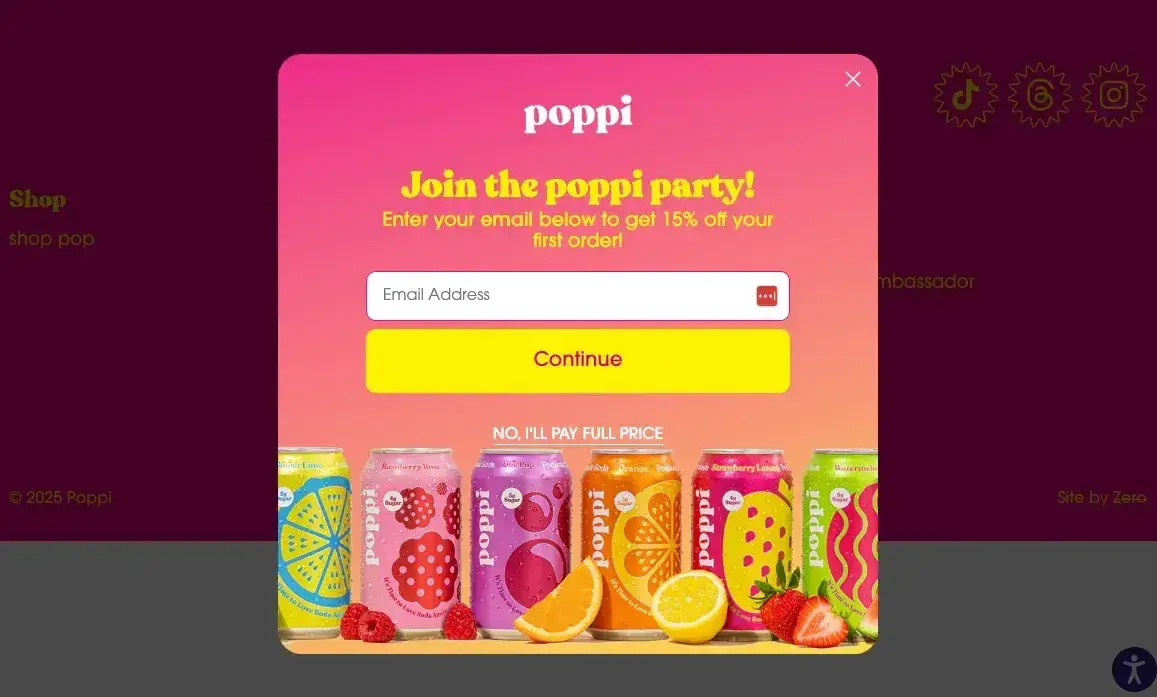
What we like: Poppi has a vibrant site with vivid colors, and its web pop-up doesn’t disappoint. Its pop-up captures attention with bold colors and high-energy copy.
While it is technically a discount offer, we love that the focus is on joining the Poppi party, which makes it feel more like a community than a product. Of course, the discount is a bonus, but it’s the icing on the cake, not the whole enchilada. (Okay, that’s a weird set of analogies for a soda, but it fits.)
32. Bukky Baldwin
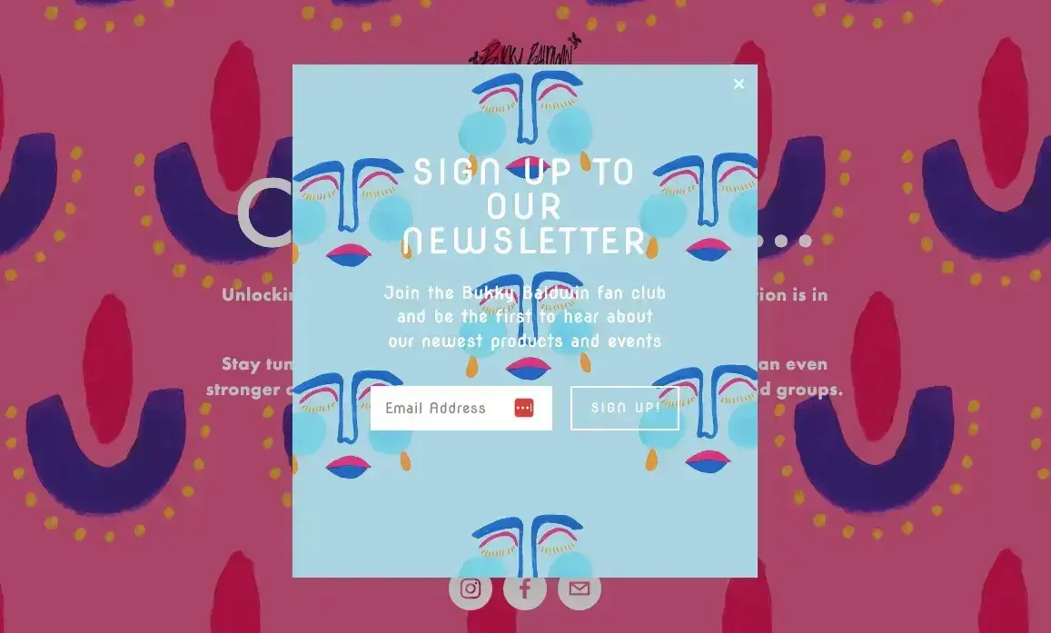
What we like: This pop-up is blooming with color and really inviting you to click. However, it’s not always the best design approach as it makes the copy slightly harder to read. Keep that in mind if you’re trying something similar. If you're going for bold visuals, ensure the typography is still highly legible.
With that said, here’s what it does really well:
First, the vibrant colors create an immediate sense of excitement, making it visually impossible to ignore.
Second, it changes with the background, giving it a dynamic, interactive feel. Overall, I love it!
33. Sincerely, Tommy
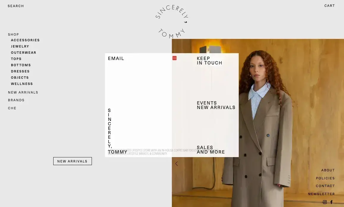
What we like: This pop-up is less conventional than others we’ve seen, but we respect that this brand isn’t afraid to take a risk with formatting. It shows the designers are committed to the site’s overall aesthetic and experience in every detail.
While the overall size and shape of the web pop-up are similar to most others in that it’s rectangular, that’s where the similarities stop. While most pop-ups have a justified layout, Sincerely Tommy’s reads more like a postcard, and requires some clicking to get where you need to go.
It’s a bit of a risk due to accessibility concerns, but all in all, it reinforces an artistic, curated vibe.
HubSpot's Free Website Builder
Create and customize your own business website with an easy drag-and-drop website builder.
- Build a website without any coding skills.
- Pre-built themes and templates.
- Built-in marketing tools and features.
- And more!
Cookie Notice Website Pop-Up Examples
34. Proweb
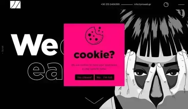
What we like: Since the GDPR went into effect, we’ve seen websites implement cookie notices so much that they’ve become the norm. That doesn’t mean you can’t get creative with them, though. Take this example from digital agency Proweb, which injects some humor into the mix.
When you add personality to legally required pop-ups, you create an opportunity to reinforce brand voice while still getting the job done. If you’re designing a necessary but unexciting pop-up, consider how a small tweak in language or design can make it feel more engaging.
As for the design, I’m obsessed. The bright pink stands out over the black and white animation, and it’s impossible to ignore.
35. Castor & Pollux
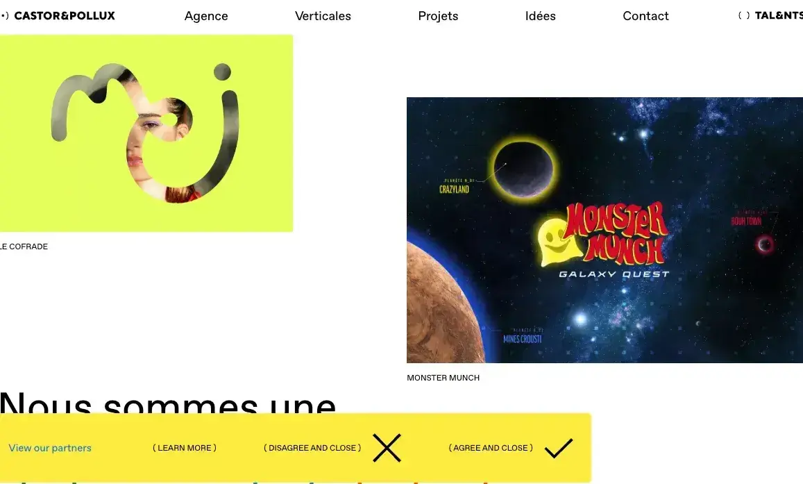
What we like: Instead of burying its cookie notice in the footer or presenting it as a tiny banner, Castor & Pollux makes its cookie notification unavoidable. The large, clearly labeled module ensures compliance while giving users an easy way to confirm and close it.
This design works because it makes the necessary message obvious while still allowing users to quickly move on. If you’re dealing with required notices, take a cue from Castor & Pollux — prioritize clarity and ease of interaction so the experience feels smooth rather than obstructive.
36. Tails.com
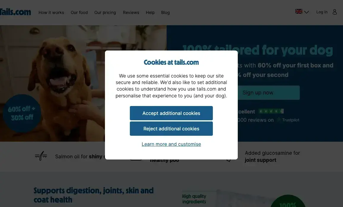
What we like: While the design feels like a standard cookie agreement, we couldn’t help but notice the reference to the real VIP — your dog.
Here’s why this works: It’s simple and well-designed, but this web pop-up isn’t your standard, boring cookie notice. It meets the legal requirements, doing so in a way that’s short, sweet, and doesn’t rehash what feels like miles of legal jargon.
37. Moovly
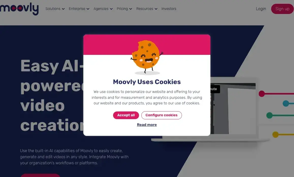
What we like: While Moovly used pretty standard cookie language, the design and color palette made it more fun and playful.
Since users are already accustomed to clicking through cookie messages, Moovly’s approach made it a more pleasant interaction, reinforcing brand personality rather than feeling like an interruption. Who doesn’t love a smiling, happy cookie?
38. Moooi
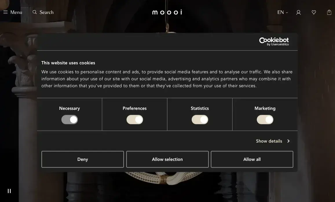
What we like: Moooi allows for fine-tuned control over its cookie use, and makes it possible to control from the initial pop-up. This may be more convenient instead of requiring users to click into a cookie settings menu — this gets the work out of the way up-front.
While I will never love cookie notices, I do love how this one respects individual choices. We aren’t forced into a default option; instead, we can tailor our preferences. It just feels good.
39. Ikea
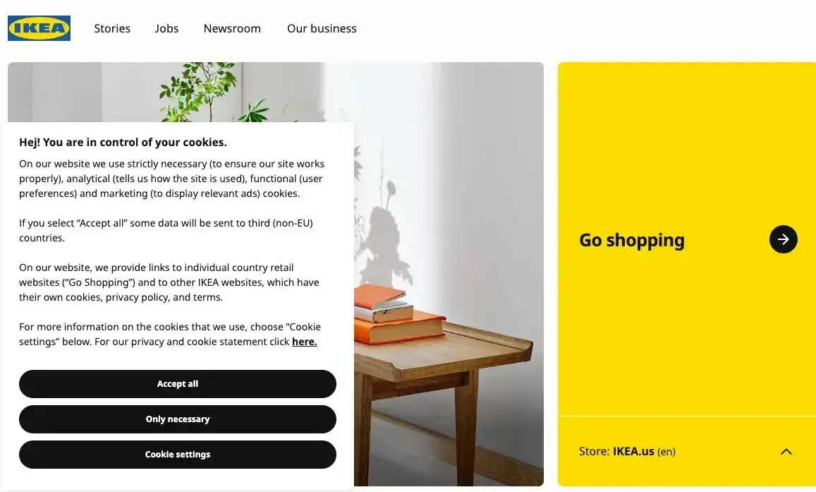
What we like: This cookie consent web pop-up is on brand with Ikea, “Hej!” and by explicitly putting the user in control — isn’t that what Ikea is all about? But instead of having to build our cookie preferences from scratch, Ikea gives us a few options.
Just as importantly, this pop-up errs on the side of transparency and clearly outlines why Ikea uses them.
40. PostHog
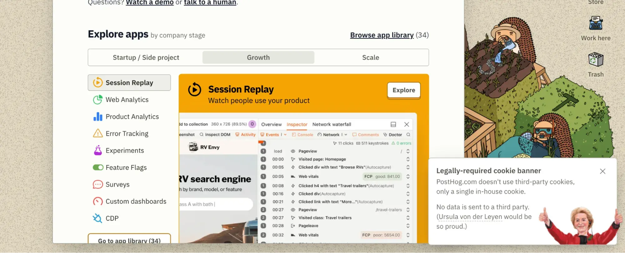
What we like: PostHog’s cookie slide-in pop-up is just as full of personality as the rest of its website. It even includes a note aout who Ursula von der Leyen is.
Other Website Pop-Up Examples
41. CoSchedule
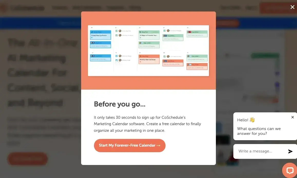
What we like: CoSchedule’s pop-up gets straight to the point: It’s not just a newsletter sign-up. You also get an immediate content offer — the opportunity to start a free calendar … one that’s forever free!
This is an excellent strategy for increasing opt-ins because it provides immediate, tangible value instead of asking for an email with only the vague promise of “updates.” If you’re offering an email opt-in, consider leading with something actionable and useful like this.
42. HubSpot
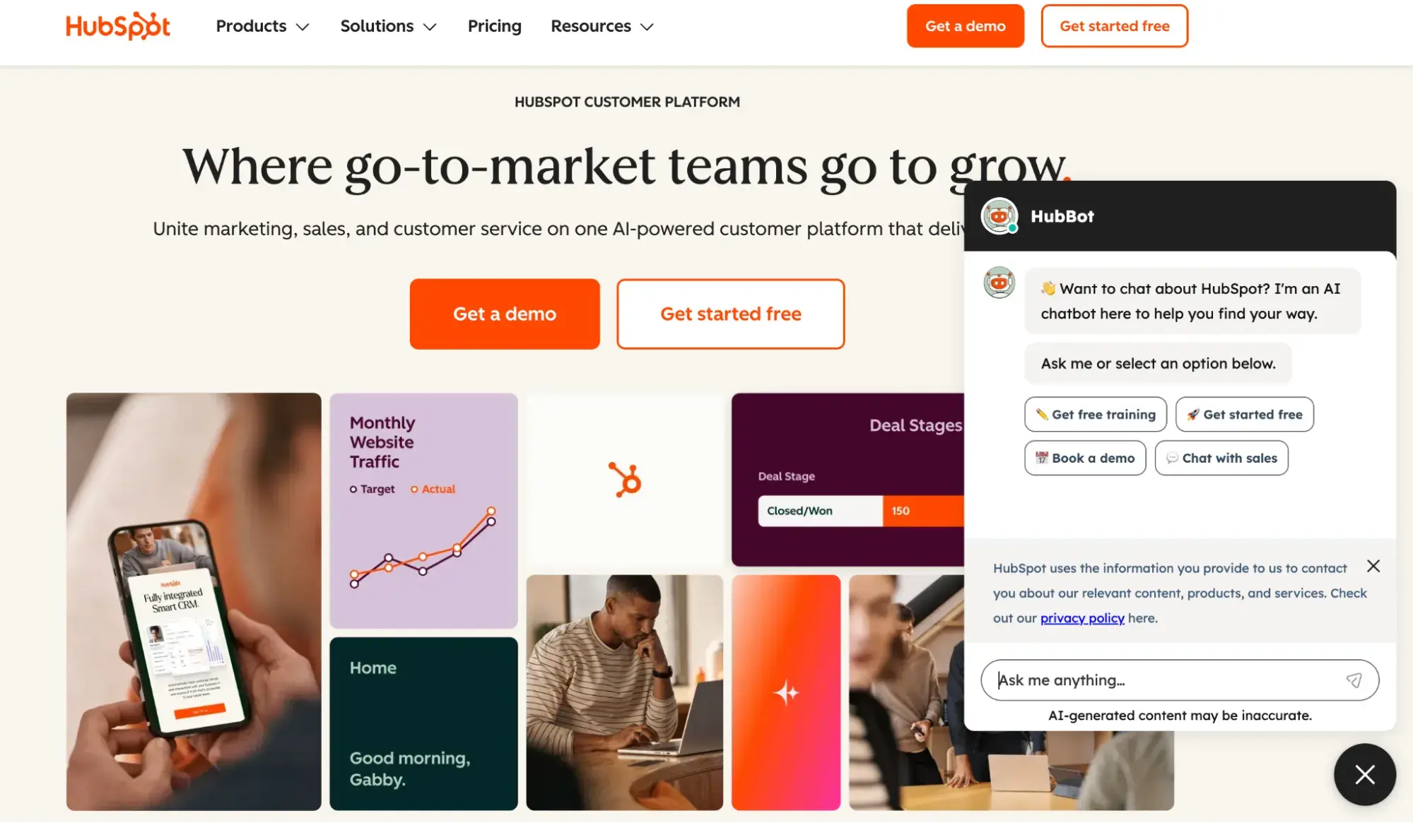
What we like: Surprise, surprise, HubSpot also uses pop-ups! Done well, they’re a fantastic strategy to deepen customer relationships and improve the overall experience for clients and users alike.
If you’re looking at our site, you’ll probably find a few different types of web pop-ups. That said, our AI-powered HubBot is the one you’ll encounter the most. Take it for a spin, and see what you learn. We’re here to help — plus, it’s proof that AI doesn’t have to be scary — it can actually be helpful (and maybe even charming?).
43. 10xTravel
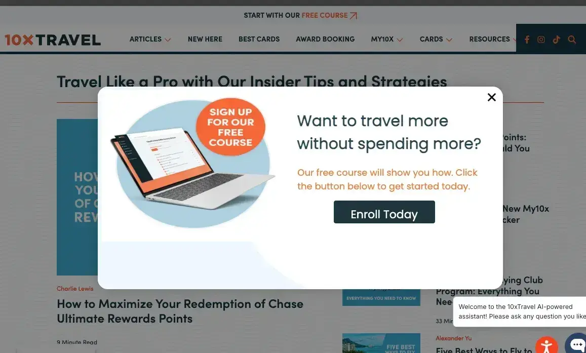
What we like: 10xTravel’s web pop-up is well-designed, simple, and makes it easy for people to say “yes.” Who doesn’t want to learn how to travel more without spending more … all for free?
The design keeps things simple and to the point, making the decision to opt in as easy as clicking “yes” on a free upgrade. And once you join the community, you gain a whole bunch of internet friends who are game to help you find insider tricks to hack your next vacation.
44. Countdown Timer
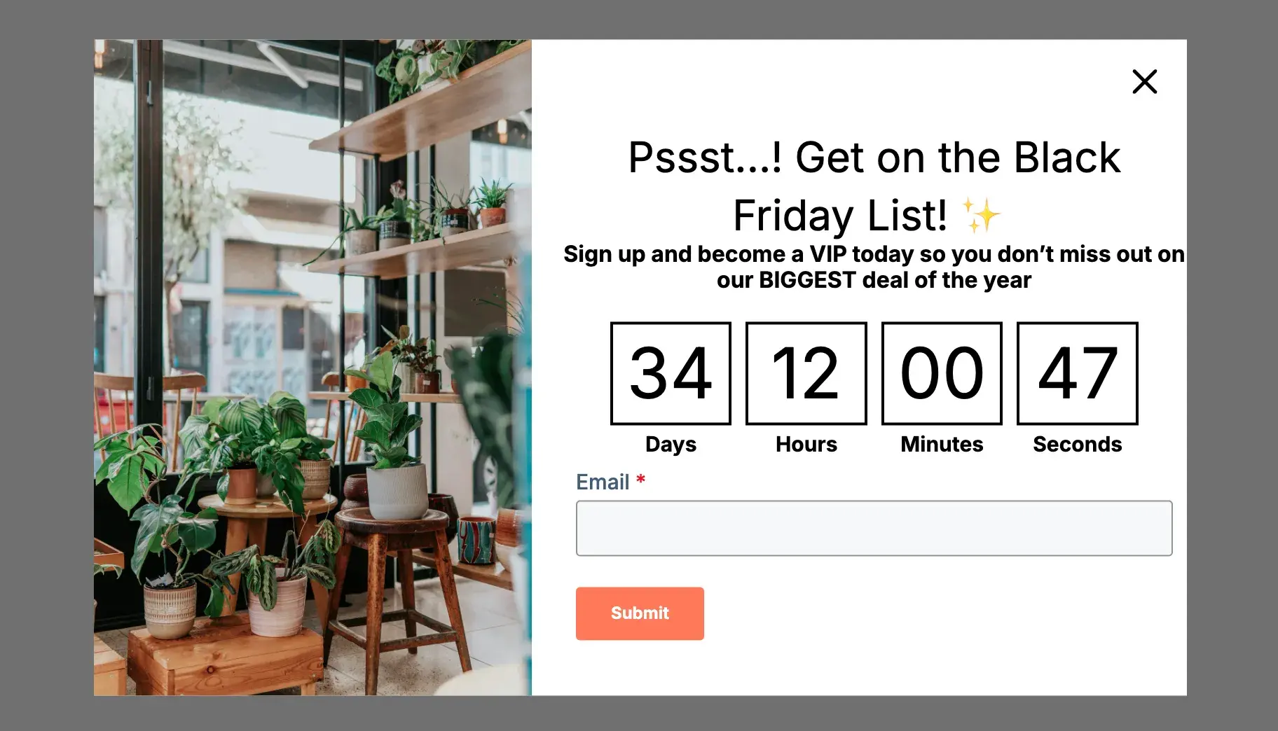
What we like: This website pop-up example is actually from a HubSpot template. It’s unique in that it implements a countdown timer to boost urgency and excitement in visitors. If you’re hyping up a big event, like Black Friday or a new product launch, take advantage of this pop-up within HubSpot Marketing Hub.
45. Universal Yums
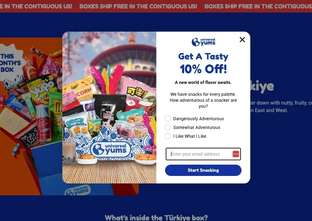
What we like: Interactive pop-ups win every time. Universal Yums plays on the choice architecture principle by turning the experience into a fun quiz. Instead of a boring “Sign up for 10% off” message, it asks snack lovers about their preferences, not that saving money is ever boring!
This tiny psychological tweak makes engagement feel effortless. Plus, who doesn’t love a snack-based personality quiz? (If “Salty & Savory” isn’t a valid personality type, it should be.)
On top of that, the design is fun and highlights the “what’s in it for me?” factor, showing you an example of a real box you could get.
46. Dr. Squatch
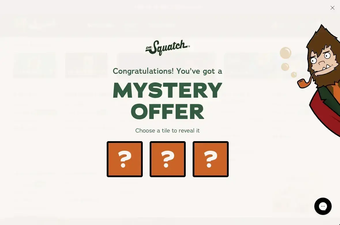
What we like: A Sasquatch, mystery offers, and gamification? It’s the marketing trifecta none of us knew we needed, but here we are! And for Dr. Squatch, it makes perfect sense.
This brand is known for playful copy, so it’s no surprise that its web pop-up matches the vibe of the rest of the site. With a silly Sasquatch leaning in and a mystery offer you get to choose, who wouldn’t want in?
The dopamine hit is real here, folks. It’s a real-world example of a web pop-up and opt-in that feels fun instead of like a sign-up form (which, of course, it ultimately is).
47. Great Lakes Distillery
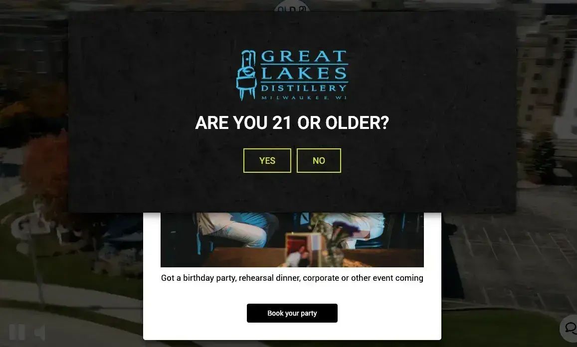
What we like: While stacking pop-ups isn’t usually a best practice, in the case of Great Lakes Distillery, it’s a legal requirement to prove you’re 21 before viewing the site content. From there, the first thing you see is an opportunity to book an event, which plants a seed for anyone considering hopping in.
You could look at this as killing two birds with one stone. Even though there are two pop-ups, it’s ultimately extremely effective marketing. And even if people don’t click to book, they now have it as an idea and might just take the distillery up on it.
48. The Verge
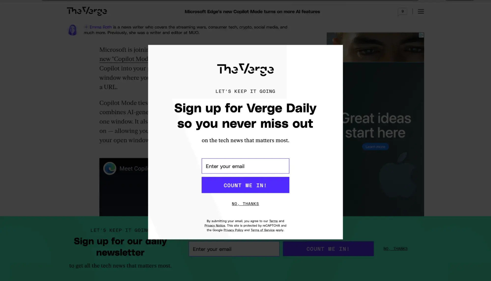
What we like: Here we can see an example of a double-pop-up strategy from The Verge. First, the banner pop-up slides in from the bottom. Then, when it senses that I’m about to exit (I moved my cursor to the top of the browser), it hits me with a second pop-up front and center.
I actually don’t mind this because it pops up as I’m on my way out, so it’s not blocking anything I was currently reading. I can see this being a great way of increasing chances for conversions.
Frequently Asked Questions: Website Pop-ups
What is the average conversion rate for website pop-ups?
The average conversion rate for website pop-ups is 11.09%, according to data from OptiMonk.
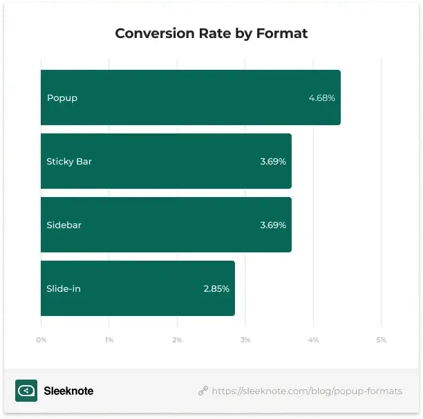
Sleeknote looked at over 677 million impressions for four different types of pop-ups and found the following breakdown of conversion rate by type:
How often should I show pop-ups to the same visitor?
If a visitor has already dismissed the pop-up (such as by clicking “X”) or has already taken the action recommended by the pop-up (such as joining your email list), do not show the pop-up to that same visitor again.
Are pop-ups bad for SEO?
Pop-ups can be bad for SEO if they slow down your site or if they provide a bad user experience by covering the parts of the site that the visitor is trying to view, or if the user is unable to get rid of the pop-up.
What’s the best time delay for showing a pop-up?
Sleeknote analyzed over 26,000 pop-up campaigns in 2024 and concluded that the best time delay is six seconds.
How do I make my pop-ups GDPR compliant?
Check out our blog post about GDPR. GDPR is complex, and our blog doesn’t provide legal advice so consult your legal team to ensure compliance. It’s important to note that to be able to show pop-ups to visitors, you must obtain their consent to cookies if the pop-up uses cookies.
What are the most effective types of pop-ups for lead generation?
Based on data from Sleeknote and Getsitecontrol, timer-based pop-ups that offer a lead magnet are probably best for lead generation, as both of those characteristics can boost conversions. I recommend experimenting with setting a time delay of six to seven seconds before the pop-up appears, and also offering something valuable to your visitor, such as a discount code, free ebook, or white paper.
Make your pop-ups stand out (more than usual).
I’m not going to tell you that everyone who lands on your homepage will want to see a pop-up. Even if they offer value, a lot of people just find them annoying.
However, you’re missing out on potential leads if you don’t at least experiment with this technique. Clearly, pop-ups are popular. And, when done right on your site, you’ll end up with more happy leads than bounces.
Struggling with where to begin? Here’s your quick start checklist to creating high-converting website pop-ups:
- Define your goal. Do you want to build your email list? Promote a specific product? Boost overall sales?
- Choose your offer/lead magnet. Now, based on your goal, what can you offer that’s related to it? If you want to build your email list about marketing tips, can you offer subscribers a free case study breaking down the exact steps of your most successful marketing campaign? If you want to promote a specific product, can you offer a discount to subscribers?
- Use pop-up builder software. Look, there’s no need to use code for pop-up implementation when there are so many wonderful pop-up tools out there. HubSpot Marketing Hub and Content Hub have a CTA tool that lets you create pop-ups in minutes with templates and targeting.
- A/B test your pop-ups. Once you’ve created your first pop-up, create a second one with only one thing changed. For example, maybe pop-up A says, “Get 10% off your first purchase,” while pop-up B says, “Save 10% off your first purchase.” You can then A/B test those options to see which CTA drives the best results.
So as you’re getting ready to review your web pop-ups or create new ones, take a spin through these examples, pick a few you like, and then get to testing. I can’t wait to hear what you choose!
Editor's note: This post was originally published in May 2022 and has been updated for comprehensiveness.
HubSpot's Free Website Builder
Create and customize your own business website with an easy drag-and-drop website builder.
- Build a website without any coding skills.
- Pre-built themes and templates.
- Built-in marketing tools and features.
- And more!
Website Design