In addition to hiding your full website, a well-crafted maintenance page can also:
- Tell visitors why your site is temporarily down and when it will be available.
- Provide an opportunity for visitors to stay in touch and/or provide feedback.
- Offer content.
- Promote an up-and-coming launch to keep visitors engaged in your business.
- Keep your website optimized for search engines.
In this post, we’ll see what goes into making a simple, informative, and effective under-construction page for your website, and provide some best practices for layout and templates to help keep up your online presence during downtime.
Website Under Construction Page
The content of your under-construction page will largely depend on your business and the reason for closing your website, but all maintenance pages should feature both a message for users and an informative visual component. Once you’ve added these, you might consider adding some other helpful features. Let’s discuss each of these below.
In this message, be sure to explain why your site is down. This doesn’t need to be lengthy, just a sentence to provide some context. If you think visitors will want more information, you can link to a page with more details or include a method to contact your business with questions.
“Temporarily” is also important here. Without communicating that your website will soon be back to normal, visitors could forget to return or assume the website is permanently closed. At the very least, state that your new site is coming soon, and provide a time period or date if possible. I also recommend including a basic sign up form for receiving updates about your site.
Depending on the tone you’re aiming for, you might choose to acknowledge the inconvenience of your unavailable website in your copy. Be sure to follow an apology with a thank you and the reassurance that your site will be back soon.
Here’s an example of excellent maintenance page copy:

Website Under Construction Image
If users navigate to your site when it’s inactive, they won’t be expecting a maintenance page. Placing clear visuals on the page alongside your message will minimize confusion about the state of your website.
Try to apply the same appearance to your under-construction page as the rest of your website and align the visuals with your brand image. Featuring your logo and applying your company’s usual color palette signals to visitors that they’re in the right place, even if the page is more minimal than they’re used to.
Also, as with your message, keep the visuals simple. Any additional images only should act as additional cues that your website is offline, under construction, etc. Less is more with maintenance pages — informing visitors is the main priority here.
The under-construction page for Springfield Public Forum effectively balances style with simplicity in its visuals.

Other Under Construction Page Features
After finalizing the message and visuals, try adding some additional elements to optimize your maintenance page and improve the user experience.
Contact Information
An inactive website doesn’t mean an inactive business. Always give customers a channel to reach you via an email address, a contact form, and/or links to social media. Having these channels in place helps to maintain trust with customers, and shows that closing your site doesn’t mean closing out all communication. No one likes being ghosted.
Keywords to Stay Relevant on Search Engines
If your website has been around for a long time, you’ve likely built a reputation on search engines with an SEO strategy. An inactive website isn’t great for SEO, but you can minimize the negative effects on organic search by including relevant keywords in your copy. This way, search engines know your site is still around. This doesn’t mean stuffing the page with keywords — ensure all of your text is relevant to your business, and choose simplicity and clarity over everything else.
Calls-to-Action
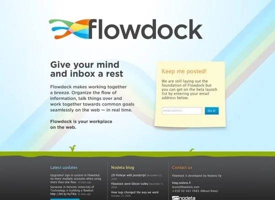
A maintenance page can serve as another touchpoint for your business. Consider adding one or more CTAs encouraging visitors to stay involved. For example, a subscription form keeps visitors informed about a launch or when your site is active. You can also provide visitors an opportunity for pre-order, a donation link, or free content in exchange for their patience. See Flowdock’s example of a relevant CTA below, and check out our list of recommended CTAs for more ideas.
Countdown Timer
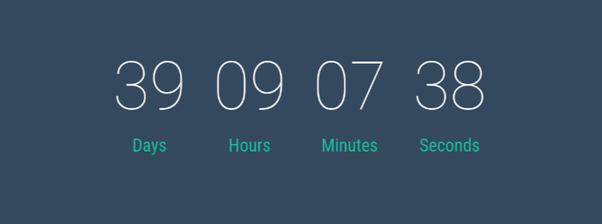
If you have a set launch date, adding a timer takes the “coming soon” message to another level. Only add a countdown if you know the exact launch time and date of your new site, and don’t let the clock dip into the negatives. Many maintenance page templates offer an easily programmable timer display option.
By following these maintenance page guidelines, your page will give the impression that your site’s downtime is planned and temporary.
7 Website Under Construction Templates We Recommend
If you use a CMS or website builder tool to customize your website’s appearance, your template of choice might provide an option for under-construction pages. For example, HubSpot’s asset marketplace offers templates for this purpose, as do website builder plugins like Elementor.
There are also many other HTML template options out there for creating a maintenance page, which you can download and implement yourself. Here are some templates we recommend for use or for inspiration:
1. POWER by maka Agency
POWER’s coming soon page features a countdown timer prominently, making it a great option for building hype up to your launch. The message copy is also clear above the fold, and users may scroll for more information and CTAs.

2. B2B by 310 Creative
For a solid maintenance page template with a featured image focus, try 310 Creative’s B2B template. This layout prioritizes an image to signal that your website is under maintenance, and moves the descriptive text to the bottom. B2B’s template is ideal for launches with an important visual component, like a product launch or a rebranding.

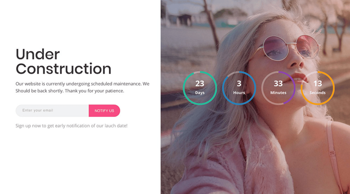
3. Coming Soon Template V16 by Colorlib
Colorlib makes a range of stylish, user-friendly templates for maintenance pages. V16 splits the page into a clear message display and a space for an image and countdown timer. There’s also an intuitive input form for customers to receive email updates.
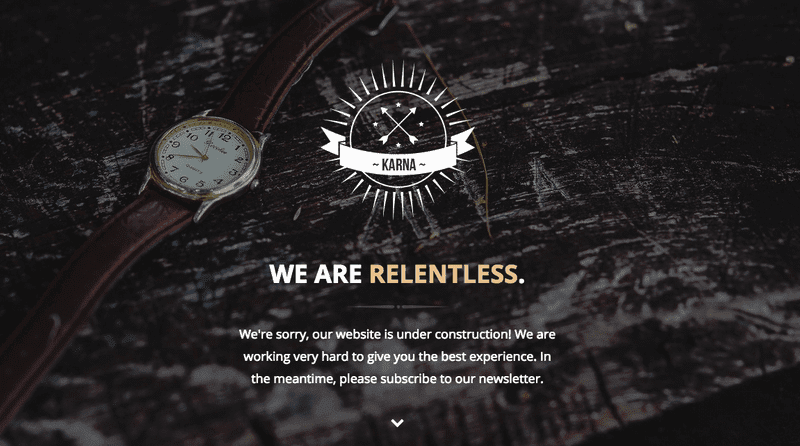
4. Karna by NattyWP
Karna is straight-to-the-point, placing your company logo, heading text, and message front-and-center. This template achieves style, but focuses emphasizing the substance on your maintenance page.
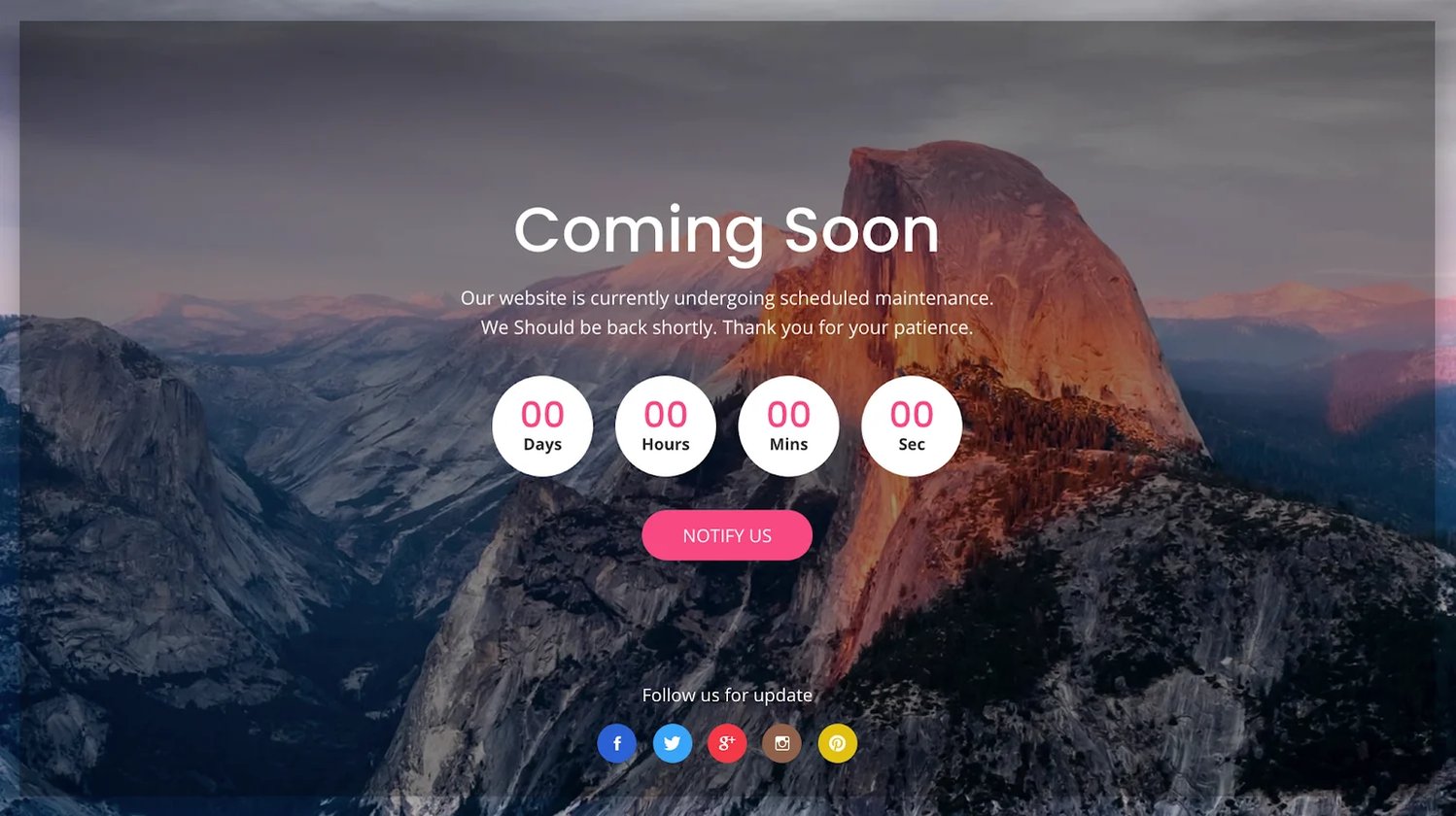
5. Coming Soon Template V21 by Colorlib
V21 applies a clean, sleek look to your under-construction page. It features a clean and simple countdown timer and a more subtle emphasis on message text and button links. The faded borders tie together the modern look.
6. Smart Cart by Anish Trehan
Smart Cart is another strong option for your under-construction page, especially if you’re looking to highlight your brand name and contact information. This template features the company name by default, with more prominent information displayed along the bottom. There’s also space for a muted presentation of message text, email form, and social media links.

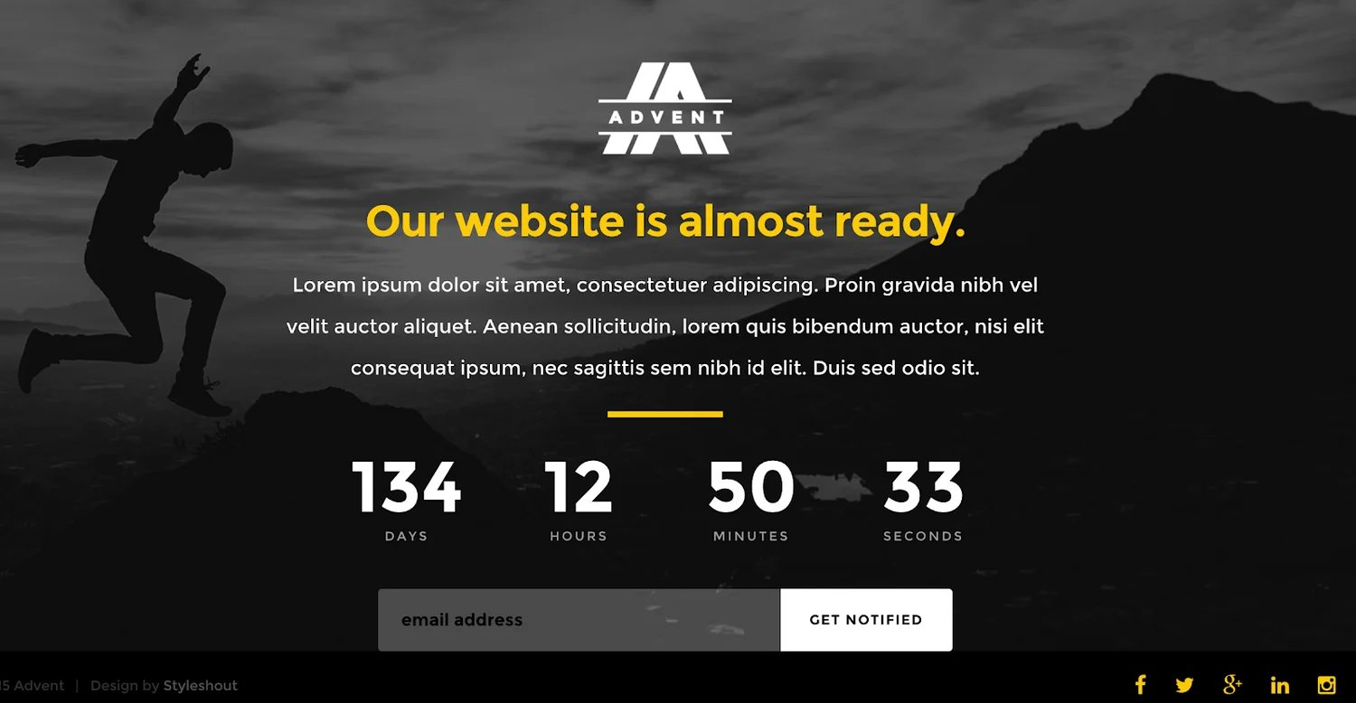
7. Advent by StyleShout
Advent fits all of the important content in your under-construction page above the fold, including a company logo, message, timer, and CTAs, without clutter. This highly customizable template even allows embedding for Google Maps and Mailchimp forms.
If you're building your site on WordPress, you can use the steps below to create an under-construction page.
Though temporary, an under-construction page is still an essential component of your website. It contributes to your company image and online reputation, and should be designed as such. Don’t leave your visitors hanging — craft a thoughtful, confident maintenance page that keeps them excited to come back.
Website Design


