Just like you wouldn’t expect to design a building without a floor plan, you can’t execute a website without a wireframe. Or if you do, they usually do not last or convert.
A website wireframe enables you to test drive the page layout and evaluate user flows to see exactly how the new website will function and exposes any potential mistakes that might eventually hinder conversions — all before you actually build the website.
In this post, I’ll discuss what the wireframing process looks like for websites, the types of wireframes you can use, and how to create a wireframe for your own web design project — including some premade wireframe templates to get you started.
Table of Contents
- What is a website wireframe?
- Mockup vs. Wireframe vs. Prototype
- When to Create a Wireframe
- When to Skip Making a Wireframe
- How to Create a Simple Wireframe
- What to Include on a Website Wireframe
- Should you use an AI wireframing tool?
- Wireframe Examples
- Website Wireframe Templates
What is a website wireframe?
A website wireframe maps out the main features and navigation of a new website design. It gives an idea of the site's functionality before considering visual design elements, like content and color schemes.
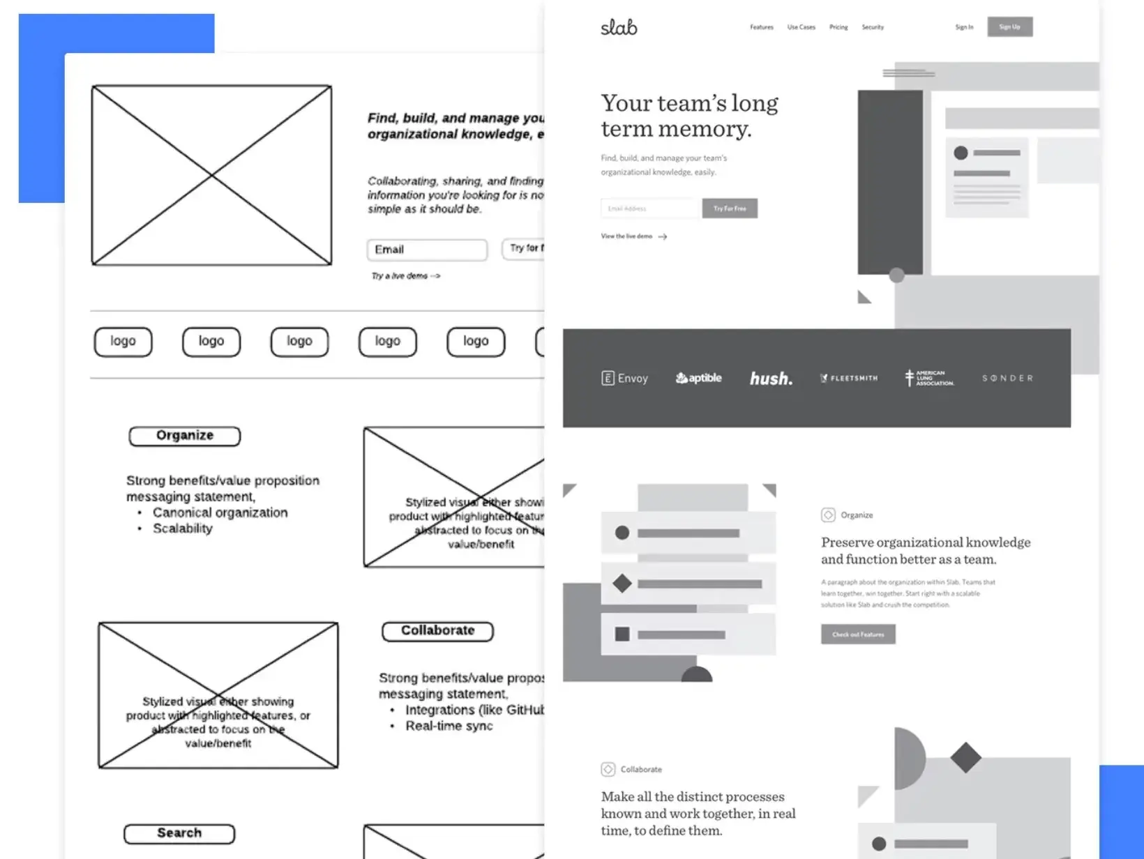
Layouts and features such as menus and buttons are mapped out to assess the end user's overall experience.
A website wireframe also provides a practical map of the project so that team members can see where everything will go as they complete related tasks.
Some designers or clients may tempt you to skip this part of the process, calling it unnecessary and time-consuming. But wireframing is about preparing yourself, and all good preparations require time. Also, working without a plan usually takes up even more time, and you risk a project failing altogether.
Why create a website wireframe?
Creating a website wireframe enables you to identify and take every opportunity to improve your site’s functionality, ease of use, and convenience to delight your users. It can also help your design team collaborate better and gather client feedback before the design process is too far along.
In my experience, here are some of the main reasons to create a website wireframe before building your finished website.
Wireframes visualize website architecture.
Wireframes form the basis of your website’s structure or architecture — akin to how floor plans work for construction projects.
With a wireframe, you can visualize your website’s layout and structure before you get to the final product. The wireframe shows where core elements like navigation menus and content sections will be on your website.
It's kind of like the old adage — “measure twice, cut once.” Your website wireframe is like measuring before you cut.
I think it's especially essential for larger websites with more complex architecture, though wireframes can be helpful even for smaller projects.
Wireframes save time and resources.
Because all relevant departments are involved in creating a wireframe, changes at the later stages are less likely, thus saving time and effort.
It is also much easier to make changes in the wireframe phase, as it requires less effort than when you’ve moved on to the more detailed part of your website development.
Identifying any friction points at this stage of the design process is much more ideal than discovering them after you’ve decided on colors, fonts, and imagery.
.png)
Free Website Design Inspiration Guide
77 Brilliant Examples of Homepages, Blogs & Landing Pages to Inspire You
- Agency Pages
- Ecommerce Pages
- Tech Company Pages
- And More!
Download Free
All fields are required.
.png)
Wireframes encourage iteration and feedback.
Because wireframes follow a step-by-step process, giving feedback at each stage is easy.
Wireframes lack detailed design elements, making it quicker to make changes depending on suggestions from stakeholders and team members.
In the early stages, you can even just sketch out a rough wireframe on a piece of paper. Even just a basic sketch should be enough to receive feedback and iterate.
With new AI wireframing tools, you might even be able to create more detailed mockups without much effort, which I think can be another thing that's really useful for iterative wireframing.
Wireframes clarify website functions.
A wireframe shows stakeholders how each aspect of your website works. It also shows how you expect users to interact with your site from navigation to conversion.
By providing a glimpse into how visitors will interact with your site, a website wireframe can reveal any aspects of its design or functionality that could be improved to better assist users in reaching goals like making a purchase, signing up for a newsletter, or reading a blog post.
For especially complex projects, you can even create an interactive website wireframe before finalizing the design, which can help you more easily visualize how important website functions will work.
When to Create a Wireframe
You should always create a wireframe in the early development stages because it will help you reveal errors in judgment or design, giving you time to correct them. In terms of collaboration, you can use wireframes to work effectively with your team and explain concepts to your clients.
Some wireframes are more detailed than others. That’s why I think it’s wise to start with a low-fidelity wireframe.
Low-fidelity wireframes show the general localization of elements on the screen. You can develop these initial designs into more high-fidelity wireframes, which provide more details — such as what the final elements will look like.
Whether you use a low-fidelity or high-fidelity wireframe will depend on what your project needs at the time.
When to Skip Making a Wireframe
I don’t recommend skipping the wireframe phase of web development. However, there are some situations where you might (big might) not need to make a wireframe.
When Designing a Small Website
Small websites or personal projects with a single purpose might not require you to create a wireframe. These websites usually have only 1-3 pages and no external stakeholders.
For example, if you‘re just building a simple website for a restaurant that includes the restaurant’s location and menu, you might not need to go through the entire wireframing process.
I think the same can hold true for other types of basic business brochure websites.
When Your Project Has High-Fidelity Needs
A detailed prototype works better than a wireframe when your project has high-fidelity needs. This is because clients might not get all they’re looking for in wireframes that aren’t too detailed.
Even in these situations, though, you still might prefer going through a few sketches or low-fidelity mockups before moving to the prototype.
I'll discuss the differences between wireframes and prototypes a bit later in this post.
How to Create a Simple Wireframe
1. Identify the goal of the website.
Before taking pen to paper to mock up a wireframe, you’ll find it helpful to understand the goal of your website. While it might seem obvious that you want to bring in as much traffic as your server can handle, I recommend thinking through what you want all those visitors to see and do while you’ve got their attention.
Should they end their visit with a purchase? Should they download an app? Perhaps you’d like them to view a certain page before dropping off to another website entirely. Whatever your goal is, ensure your team is aligned around it so that the subsequent steps flow smoothly until you take your site to production.
2. Understand the user flow.
Wireframes help you identify and evaluate user flows so that everyone on your team understands how the visitor should interact with each page on your site.
During this step, I recommend outlining each entry point a visitor could use to land on your homepage and then choosing a few primary entry points to create a journey flow.
Before sketching a wireframe, I like to take some time to outline the user flow in a text format. Why? Moving steps around is easier and faster when written out rather than mocked up as a wireframe.
3. Determine your website wireframe size.
Your wireframes will need to vary depending on the screen size you’re creating them for. Mobile devices, tablets, and desktop screens will vary in size — not to mention you can scale the window on a desktop.
I recommend using pixel measurements rather than inches or points to get the most accurate measurements for your wireframe.
Here are the standard sizes for each screen type:
Wireframe size for a mobile screen
1080px wide x 1920px long
Wireframe size for a tablet screen
8” Tablet — 800px wide x 1280px long
10” Tablet — 1200px wide x 19200px long
Wireframe size for a desktop screen
768px wide x 1366px long
4. Begin your website wireframe design.
Now, it’s time to visualize your user flow in a wireframe.
If you’re using physical pen and paper, I recommend using dotted or grid paper to keep things aligned. This will help you more easily transform the physical version of your wireframe into a digital copy.
If you’re starting on a digital platform, choose a tool that works best for your wireframe fidelity needs. If you’re unsure whether to use low, medium, or high fidelity, check out this comprehensive wireframe fidelity guide.
5. Determine conversion points.
Once you’ve sketched your wireframes, it’s time to decide exactly how the user should move through each step. Just because you’ve outlined the steps the user should take doesn’t mean they’re intuitive.
At this stage, you’ll determine what buttons, hyperlinks, images, or other elements on the page will guide the reader to the next step until they reach the expected end goal.
I recommend actually listing these down somewhere permanent, as it will help you shape your thoughts.
6. Remove redundant steps.
Wireframing is an iterative process. It’s rare to do a single round of sketching production-ready wireframes.
For example, as you go through the wireframing process, you might notice some web pages are redundant and can be combined to create fewer clicks for the user.
Wherever an opportunity exists to simplify your wireframe, sketch it out, and solicit feedback — that brings me to our last step.
7. Get feedback on the wireframe.
Your website will undergo several rounds of tests and revisions before it goes live, but getting feedback on your wireframes in the beginning stages is still a good idea.
Collaborate with your design and development teams, internal staff, and customers to get their opinions on the flow itself.
I believe getting input during this stage prevents the essence of the UX from getting lost after adding buttons, screens, and page layouts to the mix.
Once you‘ve incorporated feedback and have buy-in from everyone, you’re ready to move on.
What to Include on a Website Wireframe
For your wireframe to serve its purpose, it should contain the key elements I’ve highlighted below.
Page Hierarchy
Your website‘s page hierarchy is the structure that organizes and connects all of the various pages and content on your site. To help visitors easily navigate your website and achieve their goals, I can’t overemphasize how important it is to have a clear hierarchy.
When you're building your wireframe, you should include key sections like headers, footers, and so on, while also making sure to clearly outline how you want content to appear on your website and in the order of importance they should appear.
Content Areas
Most pages on your website will be divided into multiple different content areas. These content areas could include the hero section, categories, testimonials, videos, etc.
When you create your wireframe, you want it to clearly show the different content areas that you want to have on your website, along with how those different content areas connect and flow together.
The content areas should work logically and draw visitors down the page. Typically, you'll put the most important information at the top of the page and less important information lower down.
.png)
Free Website Design Inspiration Guide
77 Brilliant Examples of Homepages, Blogs & Landing Pages to Inspire You
- Agency Pages
- Ecommerce Pages
- Tech Company Pages
- And More!
Download Free
All fields are required.
.png)
Buttons and Links
For most websites, your call-to-action (CTA) buttons will be one of the most important elements on your site. These CTA buttons are what actually drive actions on your site and push visitors to perform whatever it is you want them to.
Because these buttons are so important, many of the website wireframe templates that I'll feature later in this post include lots of pre-built designs that you can use to set up your wireframe.
User Journey
If you’re creating a high-fidelity wireframe, you should include the expected user journey. A user journey mapping depicts the path users take from when they arrive on your website until they complete a specific action, such as buying something or downloading a lead magnet.
If you want to dig into this topic in more detail, I recommend reading our full guide to creating customer journey maps.
Notes
Notes or annotations give context to different elements on your wireframe. You’ll likely be showing the wireframe to stakeholders who don’t have a design or marketing background, and these notes will help them understand how the website is intended to work.
You can also use these notes to leave instructions or suggestions for other team members working on the wireframe.
Because notes are so important to collaboration, most website wireframe tools should include a built-in feature to help you do this.
Should you use an AI wireframing tool?
With the massive growth of AI over the past couple of years, you can now find a number of AI wireframing tools that can help you more speedily create and iterate your website wireframes. Some examples include Uizard, Jeda.ai, and Wiregen.ai.
So — should you use them to create your website wireframe?
The answer is yes and no.
AI website wireframing tools can be really helpful for speeding up your workflows. They let you use text prompts and other simple interactions to perform tasks that might have required a lot of manual effort before.
If you're using AI wireframe tools to help you get your own thoughts into a wireframe, I think they can be a great addition to your workflow. They can also be helpful for fast iteration, as they let you more quickly integrate feedback from others into your wireframes.
However, I don't recommend relying entirely on an AI wireframe designer at this time. It should be something that enhances your own workflows, rather than replacing your own work.
Wireframe Examples
Below are some of the best examples of wireframe types I found to help you solidify the wireframing process that works for you.
1. Sketch
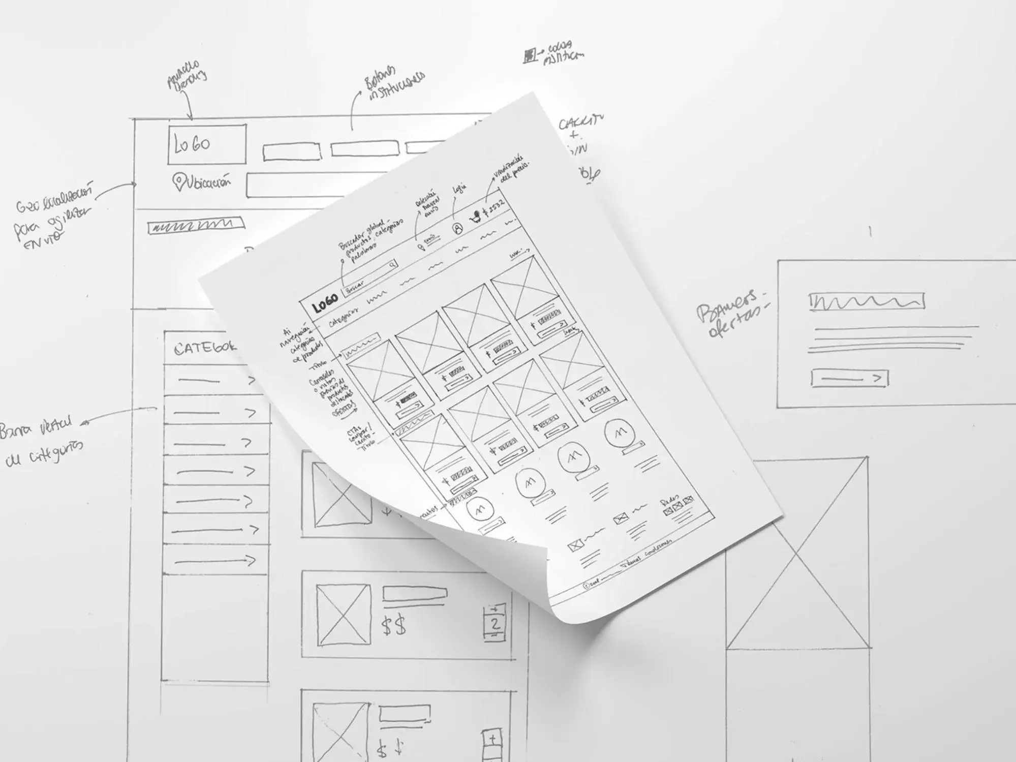
Some developers begin their sketching with a pencil and paper or a whiteboard. This simple, hand-drawn method illustrates a basic concept before spending time fussing with graphical elements.
It allows easy iteration, which can be especially helpful when you're in the early stages of working on your wireframe. It can also be helpful in group sessions as you and your collaborators can quickly get your ideas down on paper, even if team members lack the skills to create a digital wireframe.
2. Detailed Hand-Drawn Wireframe
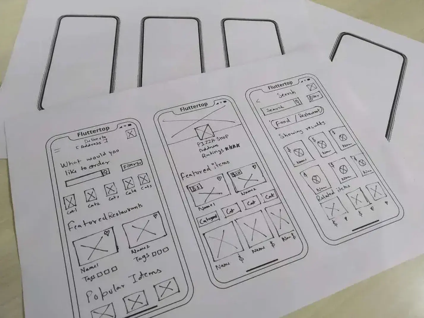
Hand-drawn wireframes don't always have to be simple. You can use a ruler in addition to your pencil and paper to create a more detailed design. However, using a digital wireframe tool for such detailed work might be more convenient since digitizing your hand-drawn efforts may be challenging.
Personally, I don't rely on detailed hand-drawn wireframes anymore. However, if you like being able to “touch” your design, you might still include it as part of your workflow.

3. Low-Fidelity Wireframe
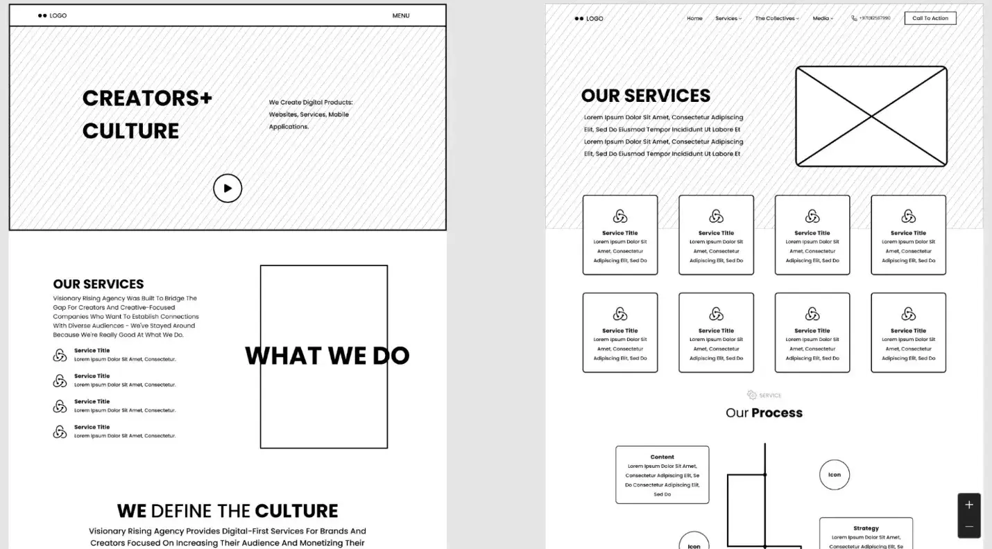
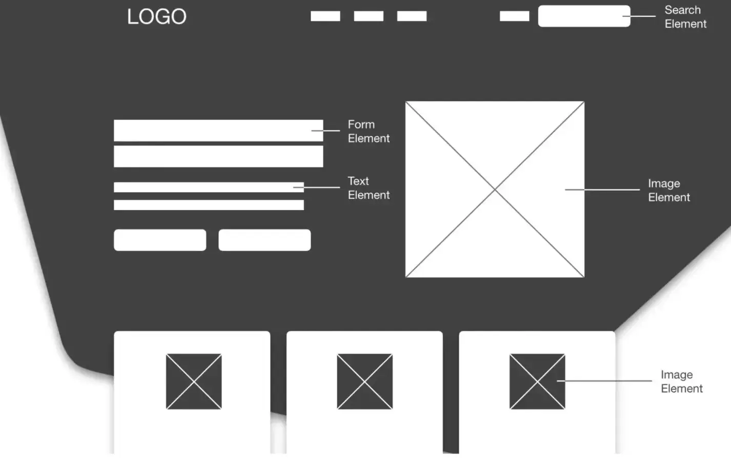
Low-fidelity wireframes are created digitally and display elements in simple content blocks. They take your basic concept sketch and turn it into something more refined.
Low-fidelity wireframes are important for determining what graphical elements need to be created and what copy needs to be written.
At the same time, because low-fidelity wireframes keep things very simple, they don‘t require as much time to create as other types of digital wireframes. Basically, I recommend thinking about it as an intermediary between any ideas you’ve sketched on paper and the more high-fidelity wireframes and mockups that you'll create later on.
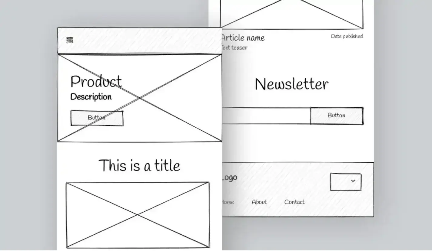
4. Low-Fidelity Mobile Wireframe
Don't forget that responsive versions of your website and mobile apps get wireframes too. Many designers even wireframe the mobile version first since website visitors are visiting sites on mobile more often than ever before.
Personally, I like this mobile-first approach because I think it's easier to fit a mobile design into a desktop design than it is to do things in the opposite direction.
5. High-Fidelity Wireframe
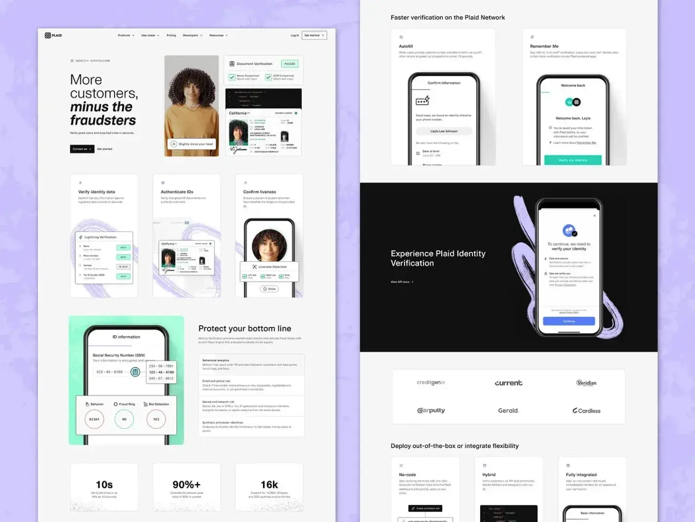
Using digital tools, you can create a high-fidelity wireframe that illustrates in more detail without creating too many graphical elements. This results in a more aesthetic look without time-consuming design work that could be discarded in the review process anyway.
To help you more easily create a high-fidelity wireframe, you can use one of the many pre-built wireframe component libraries. A little later in this post, I'll share some of my favorite wireframe templates and components.
6. Low-Fidelity Interactive Wireframe
Websites aren't static, so why should your wireframe be? Many interactive wireframe tools can help you demonstrate your user experience flow before committing to your graphics.
Creating an interactive wireframe is a little extra work, but I think it can be helpful in some situations because it lets people more easily visualize how everything connects.
7. Wireframe Mockup
Once the design's bones have been approved, you can create graphical elements to flesh out the design. This is called a mockup.
As with your high-fidelity wireframe, you can find a lot of component libraries that can help you more quickly create a website wireframe mockup.
If you're using a website builder, you could even use your builder to create a rough mockup. For example, HubSpot Content Hub's drag-and-drop tools can help you quickly spin up a rough mockup without needing to use any code.

8. Interactive Wireframe Mockup
You can also use wireframe tools to create an interactive mockup without creating the actual site, complete with a UI Kit and graphical elements.
This step can be helpful if you have a design team handing off the site implementation to developers because they can review both the intended look and functionality of the site, resulting in a more streamlined workflow with fewer revisions needed.
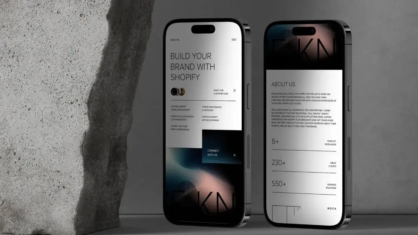
These are just a few examples, but they show how website wireframing can be achieved in different ways.
9. Free Website Wireframe
If you’re on a budget, you can explore free website wireframing tools like Miro. These free tools give you the basic wireframe capabilities that work great for low to medium-fidelity mockups.
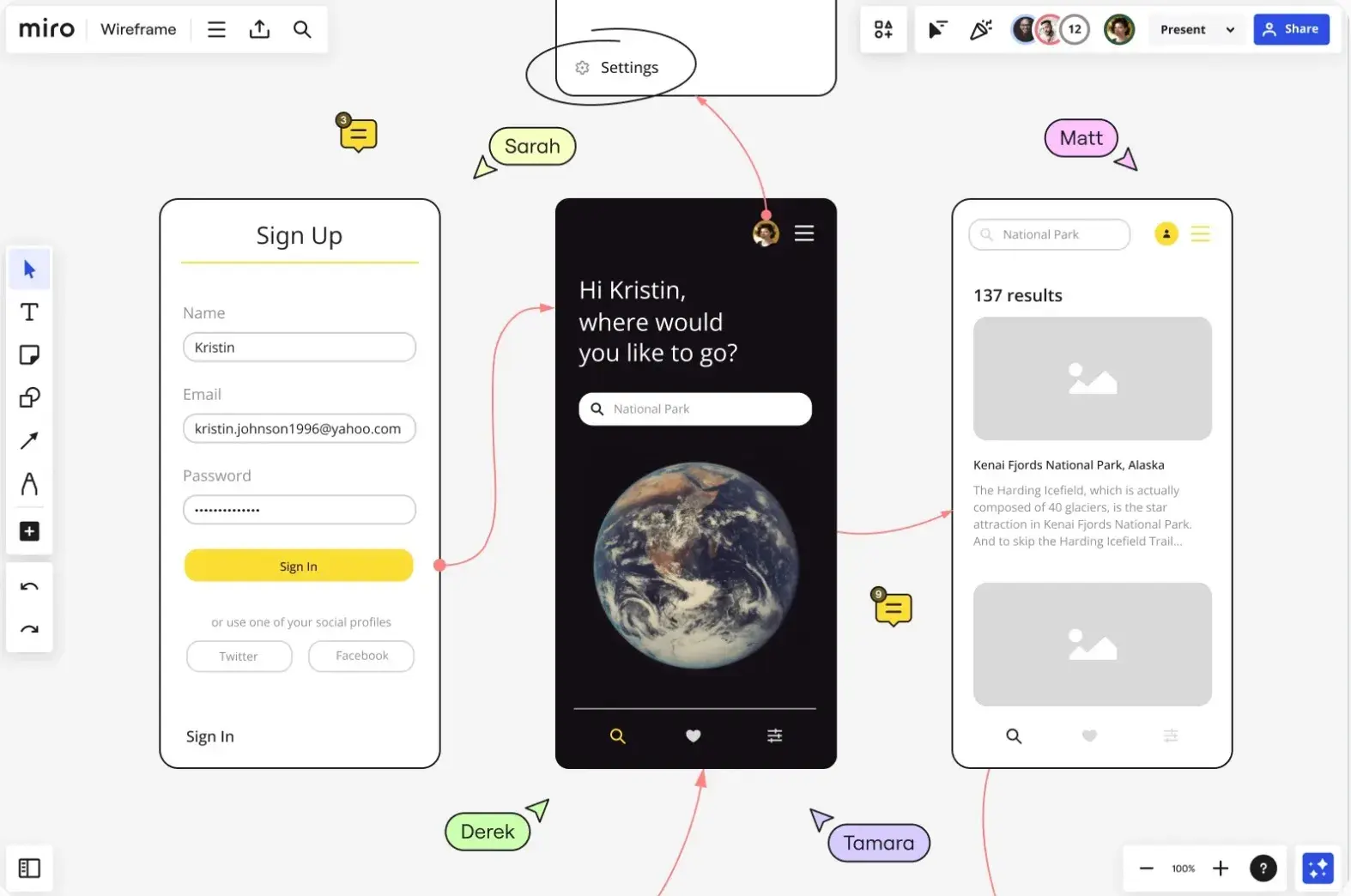
10. Mobile Website Wireframe
Mobile responsiveness is an essential web design best practice. Creating a wireframe for the mobile version of your website specifically is a key step for a successful website in general. By prioritizing mobile web design, you’ll fare better with UX, SEO, and conversions.
There are a few different approaches to building a mobile wireframe. Consider condensing all of your desktop features to fit onto a mobile screen. Or limit some functionality altogether to yield a mobile-friendly experience.
Mockup vs. Wireframe vs. Prototype
A wireframe is the first step in communicating your website ideas to others. It provides a basic foundation from which others can see and understand. A mockup goes a step further, illustrating the expected appearance of the product. After a wireframe and mockup have gone through the design approval process, you can then create a prototype.
Prototypes provide even more detail about the website design, revolving around the feel of the website for the user and basic functionality — such as demonstrating what an element looks like when you hover your mouse over it.
Wireframes, mockups, and prototypes are similar pieces in the website development process and involve design steps that happen in close succession to one another. Sometimes, they can overlap depending on the designer’s needs.
.png)
Free Website Design Inspiration Guide
77 Brilliant Examples of Homepages, Blogs & Landing Pages to Inspire You
- Agency Pages
- Ecommerce Pages
- Tech Company Pages
- And More!
Download Free
All fields are required.
.png)
This explains why some people need help understanding the differences between these three concepts.
So, what's the difference between a mockup, wireframe, and prototype?
I think that the best way to summarize the difference between a mockup versus wireframe versus prototype is by illustrating an example: where a wireframe shows a blank rectangular box, a mockup shows a resulting blue button, and a prototype shows what it looks like when it's clicked.
Here's an example of a wireframe versus mockup and a mockup versus prototype:

Website Wireframe Templates
To help you implement some of the different wireframe examples from the previous section, I want to share some actual website wireframe templates that you can use for your own projects.
Many of these templates are designed to be used with Figma, which I think is one of the best website wireframe tools. However, if you‘re not a Figma user, I tried to also include templates that will work with some other design tools, such as Uizard’s AI wireframe builder.
1. Website Wireframe Template
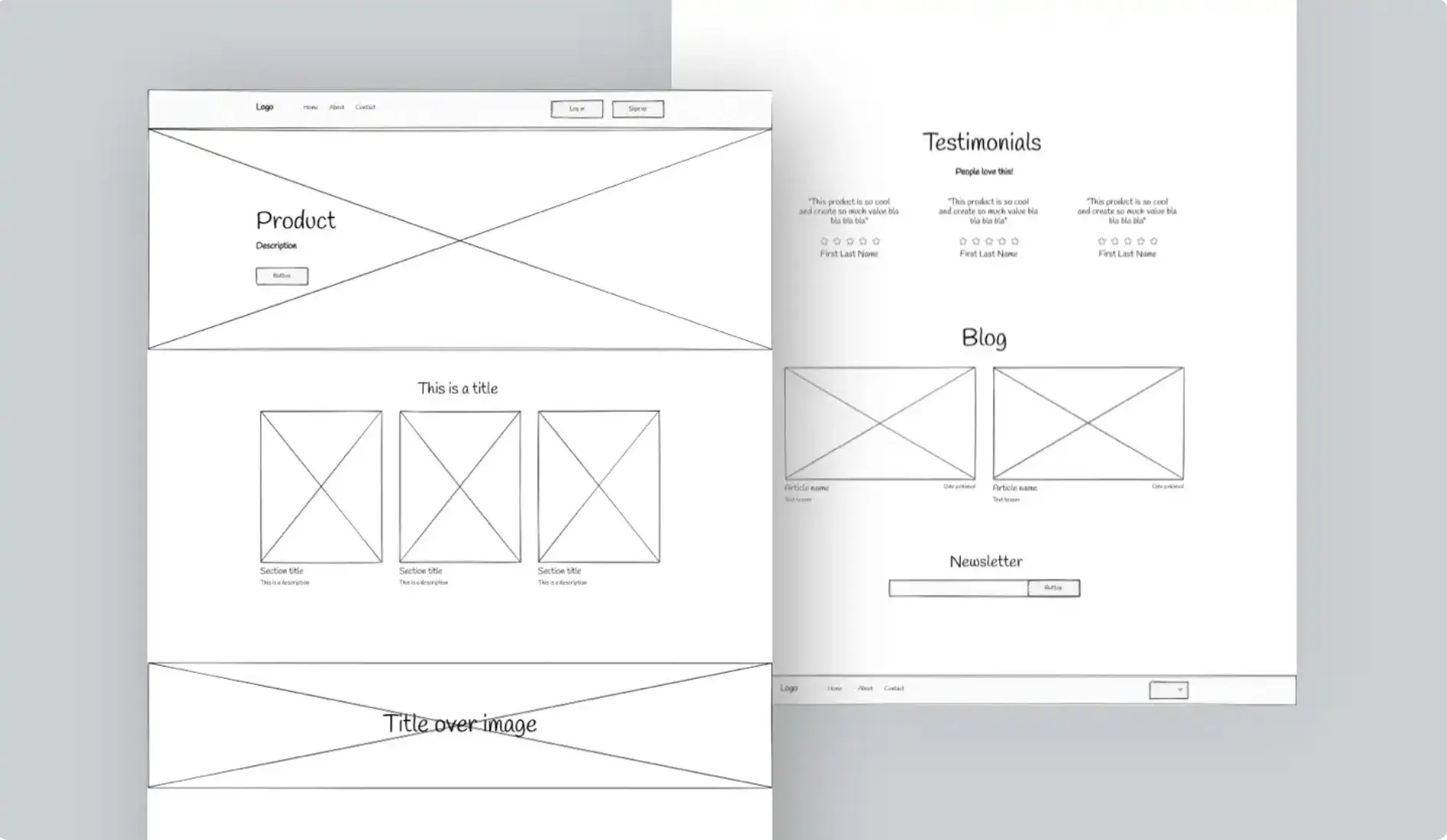
This website wireframe template from Uizard is a basic, but free, lo-fi wireframe that will work for a variety of different use cases. It includes wireframes for multiple essential website pages, including the homepage, about page, and contact page.
Because this wireframe template is powered by Uizard, you can also use Uizard's generative AI tools to tweak and adjust your wireframe using AI. For example, you can use simple text prompts to change the template according to your needs, which I think is pretty helpful.
2. Ultimate Landing Page Wireframe Kit

As the name suggests, Will Houghton's Ultimate Landing Page Wireframe Kit is a collection of website wireframe templates focused on helping you prototype your website's landing pages. As with a lot of the other templates on this list, this kit is specifically designed to be used with Figma.
It includes wireframes for two full-page layouts — a SAAS-style landing page and a Product-style landing page. It also includes multiple variants for the components, which gives you even more flexibility.
This kit is free, but there's also a premium further that gives you access to even more templates and components.
3. Website Wireframes UI Kit

The Website Wireframes UI Kit from BRIX Templates includes a huge collection of over 400+ different elements that you can use for building your website wireframe with Figma.
These elements cover a range of different use cases for both desktop and mobile designs, including headers, heroes, footers, calls to action, contact sections, and lots more.
If you want one resource that you can use across multiple different wireframing projects, I think that this could be a good one to consider.
4. Lo-fi Wireframe Kit
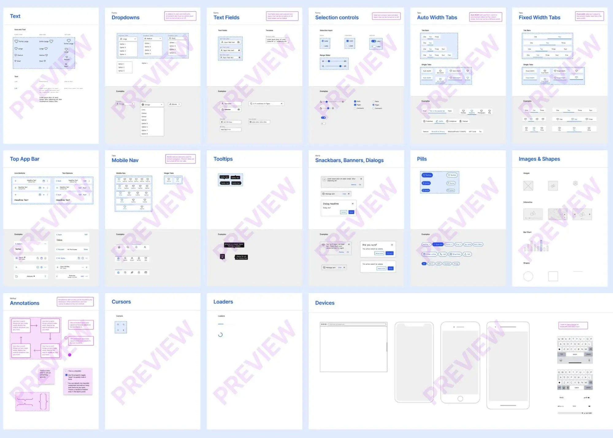
Dave Whitley's Lo-fi Wireframe Kit includes 100+ different templates and components that you can use for building wireframes in Figma. As the name suggests, it's specifically designed for low-fidelity wireframes. With that singular focus, I think it can be really useful when creating your low-fidelity wireframes.
There is a free demo version of the kit that includes 5+ unique UI elements. However, to access all 100+ components, you'll need to pay for the premium version.
5. Wireframing Starter Kit
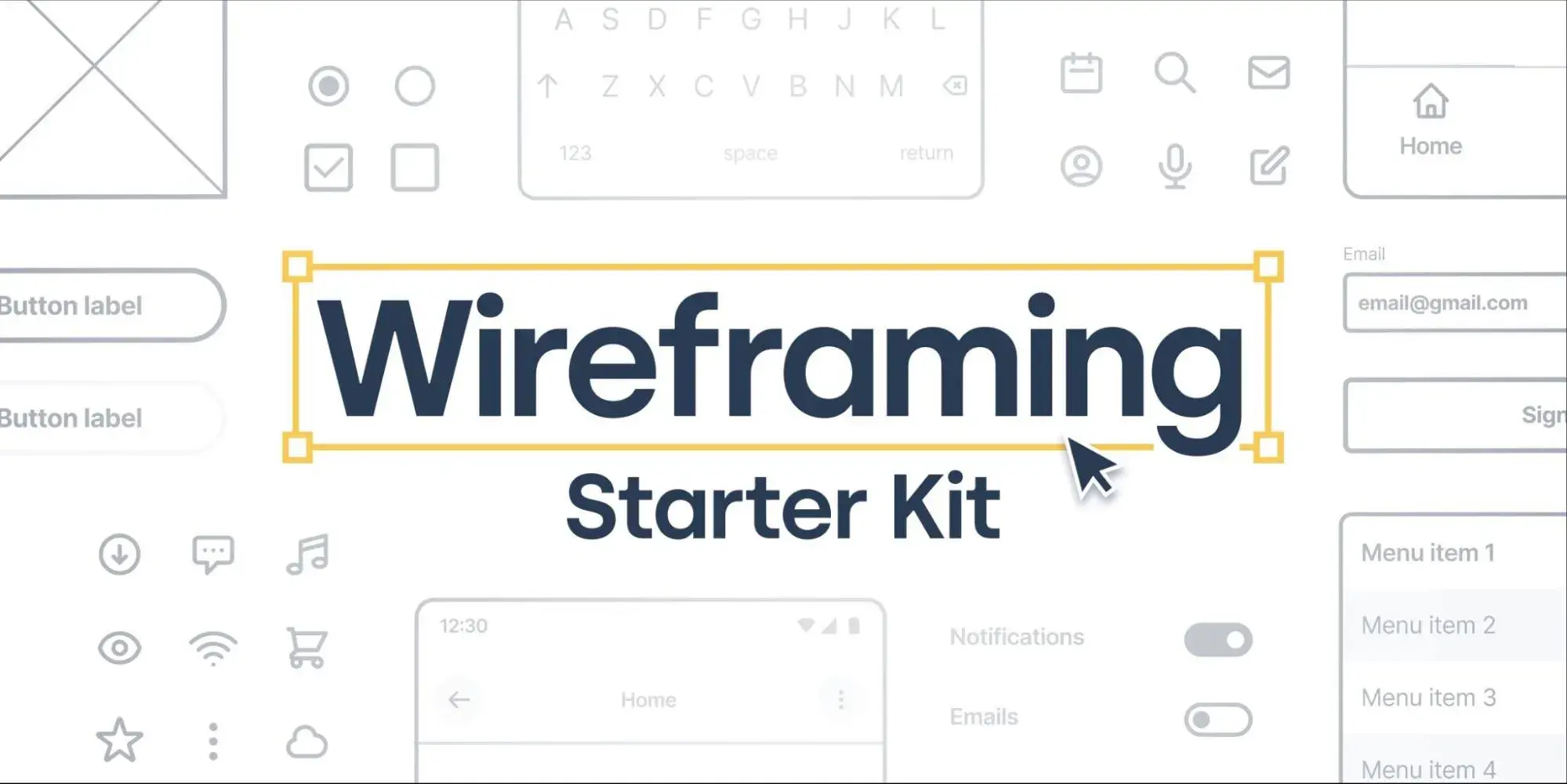
As the name suggests, the Wireframing Starter Kit from Tiago Gonçalves is a great collection of all the essential templates and components that you need to get started with website wireframes using Figma.
The free version already offers 50+ components and 100+ variations. If you're willing to pay $3 for the Pro Wireframing Kit, you'll be able to access even more templates, including web navigation, feature tiles, testimonials, footers, and more.
6. SmartDraw Homepage Wireframe Template
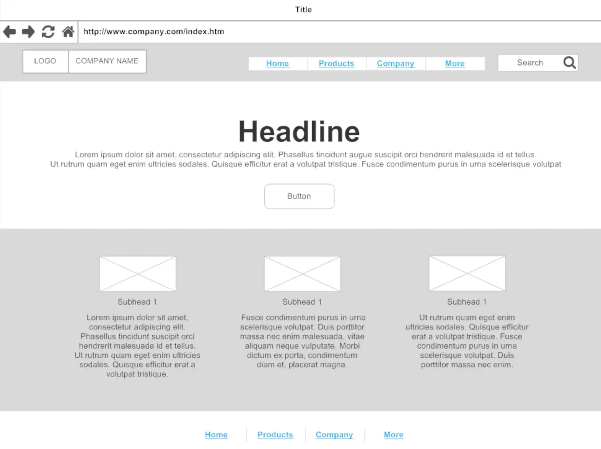
SmartDraw is a collaborative design app that can be a great website wireframe tool. It offers a number of website wireframe templates as part of its functionality, including this nice lo-fi homepage wireframe.
You can easily edit the template using SmartDraw's tools to make it your own, including working with your team to provide feedback.
7. Website Wireframing Template
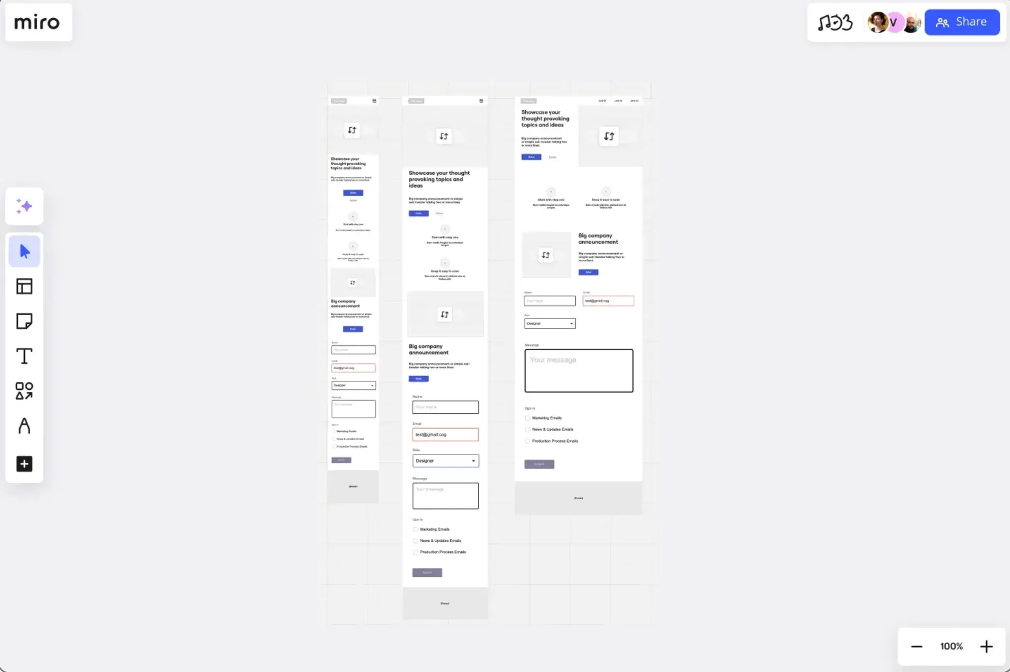
Miro's Website Wireframing template includes all of the essential components that your website needs, including wireframes for the desktop and mobile designs of your site.
You can easily tweak the template according to your needs using Miro's free tool.
Note — Miro acquired the same Uizard tool that powered one of the previous templates, but the two tools are still separate for now.
8. WireFramer
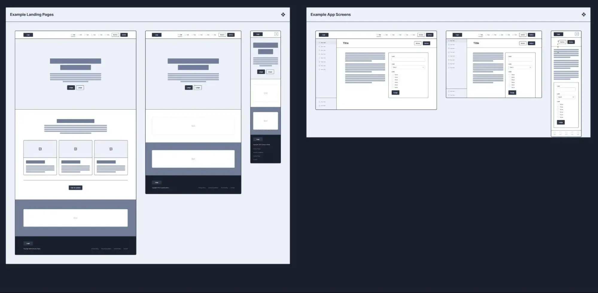
WireFramer is another Figma-based wireframe template that you can use for a ton of different situations. It comes with lots of pre-built templates for important pages, along with hundreds of components that you can use to quickly build your own wireframes from scratch.
If you‘re looking for full-page wireframe templates, you might want to choose a different option. However, if you’re looking for block templates and components that you can use to quickly build your own wireframes, I think that this one is a great option.
9. Ultimate Tech Start-Up Website Kit

The Ultimate Tech Start-Up Website Kit is another collection of Figma website wireframe templates from Will Houghton. It comes with wireframe templates for multiple essential website pages, including the following:
- Homepage
- About Us page
- Blog page
- Blog Post page
- Contact Us page
All these pages include wireframes for both the desktop and mobile versions.
Along with all those full-page wireframe templates, it also includes 360+ unique blocks and 400+ components that you can use to easily customize the templates (or even more quickly create your own wireframes from scratch).
10. Marketing Brand Website Wireframe Whiteboard Template

This last Marketing Brand Website Wireframe Whiteboard template comes from Visme and is built with Visme's cloud-based design tool. It includes full-page wireframe templates for three essential website pages:
- Homepage
- Services page
- Contact page
While Visme brands these templates as being for a “marketing website,” I personally think that they're very versatile designs, and you could easily adapt them to other types of websites, such as a personal portfolio or a service business website.
How a Website Wireframe Improves the Design Process
If you want a functional website, you must first start by making a proper plan for executing the design. As I’ve illustrated with these examples, a wireframe can help you easily map out the elements of each page and make changes as you see necessary.
I recommend starting with a low-fidelity wireframe and adding details gradually. If you like working with pen and paper, you could even start with a sketch and work up from there.
If you decide to use a wireframing tool, take your time to find one that meets your specific needs. You can also consider using some of the new AI wireframe tools to see if they can speed up your workflows.
Editor's note: This post was originally published in November 2023 and has been updated for comprehensiveness.
.png)
Free Website Design Inspiration Guide
77 Brilliant Examples of Homepages, Blogs & Landing Pages to Inspire You
- Agency Pages
- Ecommerce Pages
- Tech Company Pages
- And More!
Download Free
All fields are required.
.png)
.png?width=112&height=112&name=Image%20Hackathon%20%E2%80%93%20Horizontal%20(56).png)


![Essential Web Design Skills Everyone Needs for a Successful Career [+Expert Tips]](https://knowledge.hubspot.com/hubfs/web-designer-skills-1-20250204-2621071.webp)


![All the Image Sizes You Need to Know For Your Website [+Tips and Insights]](https://knowledge.hubspot.com/hubfs/image-size-for-website-1-20250205-643528.webp)


