
-Dec-22-2025-05-32-27-9830-PM.webp)
Imagine having a CSS framework that lets you design anything directly in your markup. And no, not using a pre-designed component. Yes, building from scratch and employing your creative potential. Well, that framework already exists, and it is Tailwind CSS.
![Download Now: 25 HTML & CSS Hacks [Free Guide]](https://no-cache.hubspot.com/cta/default/53/848be230-f06a-420e-9a24-82b45fe61632.png)
Before Tailwind, I often relied on traditional CSS frameworks and libraries. While they were helpful, I noticed over time that the similarities between my website and many others using the same tools became too common; it was hard to make something truly unique.
I see Tailwind as a framework that gives developers freedom to be creative and create websites that are unique and reflect the exact needs of their clients. And in this blog, we will be talking all about Tailwind CSS, from what it is to how you can best use it in web development.
Without further ado, let’s get started.
Table of Contents
Free Guide: 25 HTML & CSS Coding Hacks
Tangible tips and coding templates from experts to help you code better and faster.
- Coding to Convention
- Being Browser-Friendly
- Minimizing Bugs
- Optimizing Performance
Download Free
All fields are required.
What is Tailwind CSS?
Tailwind CSS is a utility-first CSS framework designed to enable users to create applications faster and easier. You can use utility classes to control the layout, color, spacing, typography, shadows, and more to create a completely custom component design — without leaving your HTML or writing a single line of custom CSS.

Let’s say I want to build a simple “Buy Now” button, something clean and modern. I want it to have:
- A fixed height.
- Some nice horizontal padding.
- A black background.
- Rounded corners.
- White, semi-bold text.
Here’s what that looks like in Tailwind:
|
<button class="h-10 px-6 font-semibold rounded-md bg-black text-white" type="submit">Buy now</button> |
This single line of HTML includes six utility classes, each handling one styling task:
|
Class |
What it does |
|
h-10 |
Sets a fixed height of 10 units for the button. |
|
px-6 |
Adds horizontal padding of 6 units. |
|
font-semibold |
Makes the text slightly bold for emphasis. |
|
rounded-md |
Rounds the corners to give a softer edge. |
|
bg-black |
Sets the background color to black. |
|
text-white |
Makes the text color white for contrast. |
Here is the result of our code:
 You may wonder what the true advantage of using Tailwind CSS is. After all, I don't need to learn utility classes to accomplish the same goals; I can just use my standard CSS. Let’s have a peek, then.
Benefits of Tailwind CSS
After building multiple projects with Tailwind CSS, I’ve realized that its real power lies in how it speeds up development without locking you into a design system you don’t control. Here are the biggest benefits I’ve experienced.
Faster Development
Tailwind lets me style components directly in my markup using utility classes. No jumping between HTML and CSS files, and I can see my results instantly. Ultimately, I can build UIs faster with fewer context switches.
Smaller CSS Bundle Sizes
Tailwind automatically removes unused styles during build time (thanks to PurgeCSS integrated by default). This means my final CSS file is tiny and often under 10KB in production. That translates into:
- Faster page loads.
- Better Core Web Vitals.
- Improved Lighthouse performance scores.
It’s one of the few frameworks that makes design and performance work hand in hand.
Highly Customizable
I can easily define my own:
- Brand colors.
- Font families.
- Spacing scale.
- Breakpoints.
Everything lives inside the tailwind.config.js file, so the design system evolves with the project.
Eliminates CSS Naming Problems
If you’ve ever spent 15 minutes debating between card-header and header-card, you’ll appreciate this one.
Tailwind eliminates naming conventions entirely. Each class name already describes what it does, and this makes my codebase easier to read, easier to maintain, and easier to onboard new developers.
No more CSS class name debates or “What does this selector even do?” moments.
Allows You to Make Safer Changes
With the traditional approach, if I make changes to CSS, I may break something across my site. Unlike CSS, utility classes in your HTML are local. That means I can change them without worrying about breaking something else on my site.
Why Tailwind CSS?
When I started out, I used Bootstrap for almost every project. It was quick, reliable, and came with ready-made components like buttons, navbars, and modals. The only problem? Every site I built ended up looking just like every other Bootstrap site out there.
Frameworks like Bootstrap, Bulma, or Materialize give you pre-designed components. Tailwind doesn’t. Instead, it gives you utility classes that you combine to build your own look from scratch. It’s more work upfront, but you get total control over your design. No more “this looks like a template” vibe.
I use Tailwind as my preferred framework because:
- Tailwind CSS gives me more creative freedom; I can design things exactly how I imagine them, without fighting default styles.
- Faster tweaks, as I can adjust layouts or colors right in the markup with no need to switch back and forth between files.
- Cleaner workflow — it works great with tools I already use, like React and Next. js.
- Smaller bundle size — Tailwind automatically removes unused CSS, so production builds stay lean.
To learn more about what Tailwind CSS is, what benefits it offers, and why you should use it, check out this video:
How to Get Started With Tailwind CSS
A step you must take before you start using Tailwind CSS is setting up Tailwind on your device. This might sound a little bit complicated, but it is by far one of the easier frameworks to set up on your computer.
Let me explain the procedure I took to configure Tailwind CSS on my device.
Free Guide: 25 HTML & CSS Coding Hacks
Tangible tips and coding templates from experts to help you code better and faster.
- Coding to Convention
- Being Browser-Friendly
- Minimizing Bugs
- Optimizing Performance
Download Free
All fields are required.
Step 1: Install Tailwind CSS.
As a developer, there are many alternatives when it comes to installing Tailwind CSS, like using the Tailwind CLI for a quick local setup or by using a CDN, which allows for faster testing. For me, I prefer to install Tailwind through npm.
Here’s the exact command I run in my terminal:
npm install -D tailwindcss postcss autoprefixer
npx tailwindcss init -p
This command does two things:
First, it installs Tailwind and its build dependencies. And then it generates two config files:
- tailwind.config.js is where you can customize your design system.
- postcss.config.js is where Tailwind integrates into your build process.

Note: To install Tailwind CSS using npm, you must have Node.js already installed on your device.
Step 2: Configure your template paths.
After installing Tailwind CSS and getting my tailwind.config.js file, the next step I took was configuring my template paths, which is simply telling Tailwind which files to scan for class names.
To do this, I update the content array in my tailwind.config.js like this:
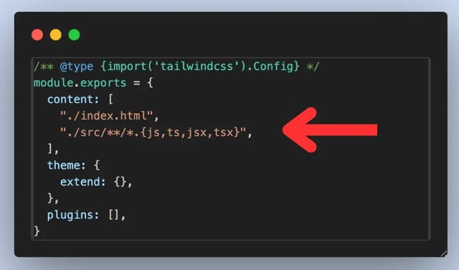
In the content array we have "./index.html" and "./src/**/*.{js,ts,jsx,tsx}". This tells Tailwind to scan the index file, every source folder and subfolder inside the source folder, and also any file with the js, ts, jsx, or tsx extension.
This ensures Tailwind only includes the styles my project actually uses, keeping my CSS file lean and fast in production.
Step 3: Add Tailwind to your CSS.
To use Tailwind CSS, it has to be added to my main CSS file (style.css). I can add the Tailwind base styles using these three lines of code:
@tailwind base;
@tailwind components;
@tailwind utilities;
These import Tailwind’s default styles, reusable components, and utility classes.
Note: Adding these directly to your CSS might result in an error (unknown at-rule @tailwind (unknownAtRules)); that's because your editor may not understand PostCSS syntax. So in most cases, like in VS Code, you will need a PostCSS Language Support extension.
Step 4: Start using Tailwind in your HTML or JSX.
That’s it — you can start using Tailwind directly from your markup. You don’t need to jump from your HTML to CSS to add styles.
Additional note: You may have written your first few lines of code using Tailwind CSS, and you may have noticed there are no styles being added. Well, if you are using plain HTML with no framework, it is necessary that you manually compile your CSS.
Here’s how I do it.
I run this command on my terminal.
|
npx tailwindcss -i ./src/input.css -o ./dist/output.css --watch |
This command tells Tailwind to take my input CSS file, process it with all the Tailwind utilities and configurations, and then generate a final CSS file that my browser can use.
Then in my HTML, I make sure to link to the compiled CSS file:
|
<link rel="stylesheet" href="./dist/output.css"> |
Tailwind CSS Examples
Tailwind offers UI components and templates, or “examples,” to help you start building your application quickly.
There’s a repository created by Tailwind that includes examples of landing page heroes, feature sections, newsletter sign up forms, tables, modal windows, checkout forms, shopping carts, and more. You can get the code for most or all of these examples for a one-time package fee.
The other repository is created by community members and is open-source. We’re going to focus on examples from this repository below.
Tailwind CSS Form
To enable users to subscribe to your newsletter, you can use Tailwind to create an email opt-in form.

To create a simple email opt-in form like the one shown above, you can use the following code:
To customize the border, background color, text color, and other aspects of this form, you can change the border-{style}, bg-{color}, and text-{color} utility classes, among others.
Pro tip: Add a number to the border-{color},bg-{color}, and text-{color} utility classes to use a shade of Tailwind's default color palette.
Tailwind CSS Search Bar
To enable users to search your application based on a keyword, you can use Tailwind to create a search bar.
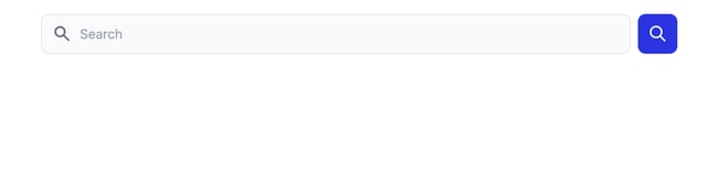
To create a search bar with an icon and Submit button like the one shown above, you can use the following code:
Pro tip: Use the w-full utility class to set the width of the search field to 100%.
Tailwind CSS Simple Accordion
I’ve built plenty of accordions over the years, from pure CSS versions to React-driven ones.
With the help of Tailwind CSS, you can create simple accordions that help you create a dynamic list and reveal details of each item on click. This functionality can be done without the use of JavaScript, which makes it very impressive.
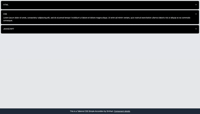
To create a simple accordion, you can use the following code:
Tailwind Search Bar
With the help of Tailwind, I can create a search bar that takes in input. This is a simple yet very intuitive design that can enhance any interface while providing great search functionality to users.
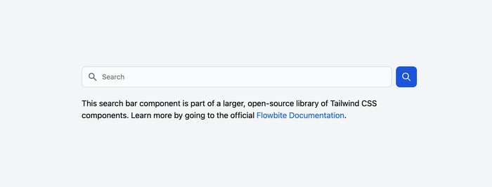
Here is the code for the Tailwind Search bar we have in the image above:
Tailwind CSS Slider
To slide through multiple elements and images, you can use Tailwind to create a slider or carousel component.
To create a slider like the one shown above, you can use the following HTML:
Note: This component was made without JS Library, but you will need the following JavaScript to trigger the slider.
Pro tip: Add the flex-nowrap utility class to the parent div to prevent it from wrapping and add the flex-none utility class to the child divs (the slides) to prevent them from growing or shrinking.
Tailwind CSS Pricing Table
To show customers multiple premium plans with different features and prices, you can use Tailwind CSS to create a pricing table.
.webp?width=650&height=347&name=Tailwind%20CSS%20What%20It%20Is%2c%20Why%20Use%20It%20%26%20Examples%20(1).webp)
To create the “Intro” section of the pricing table like the one shown above, you can use the following code:
Note: This code will only create the first container for the “Intro” plan. To create the containers for the “Base”, “Popular”, and “Enterprise” plans, you will have to replicate this code, swapping out the text for each plan name and price.
Pro tip: Add the modifier “hover:” before a class name like “bg-gray-200” to apply that utility class conditionally (i.e., so that the container only changes background color when the user hovers over it).
To walk through more examples, like how to build a sidebar with Tailwind CSS, check out this video:
Using Tailwind CSS to Accelerate Your Coding
As we have seen in this blog, Tailwind can be a very useful framework and, in my opinion, is the best CSS framework in 2026, as it gives me more creative freedom, is easy to tweak, supports a cleaner workflow, and has a smaller bundle size.
I recommend Tailwind CSS without a second thought. It’s not just fast or popular; it also works great with modern development workflows. Tailwind is perfect for everything from making a quick prototype to building a production-level SaaS dashboard to keeping a design system up to date.
Editor's note: This post was originally published in May 2022 and has been updated for comprehensiveness.
Free Guide: 25 HTML & CSS Coding Hacks
Tangible tips and coding templates from experts to help you code better and faster.
- Coding to Convention
- Being Browser-Friendly
- Minimizing Bugs
- Optimizing Performance
Download Free
All fields are required.
Css


![How to Create Scrolling Text With CSS [+ Code Examples]](https://53.fs1.hubspotusercontent-na1.net/hubfs/53/Google%20Drive%20Integration/scrolling%20text%20css.jpeg)


