
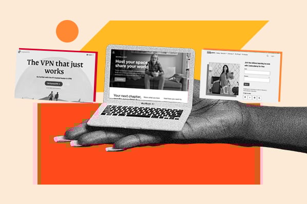
I’m breaking down 36 high-performing landing page examples and the strategies that make them work. Some are my personal favorites, and others come straight from HubSpot’s Channel Monetization and CRO teams, along with their go-to approaches to building landing pages that actually convert.
So, whether you’re launching your first landing page or optimizing your fiftieth, there’s something here for you.
Table of Contents
- What is the purpose of a landing page?
- What is a good landing page conversion rate?
- Lead Magnet Landing Page Examples
- Great Examples of Landing Page Design
- Simple Landing Pages
- Product Landing Pages
- Webinar Landing Page Examples
- Course Landing Page Examples
- B2B Landing Page Examples
- Membership Landing Page Examples
- Newsletter Landing Page Examples
Optimize Your Landing Pages
Learn the best practices for generating leads with high-converting landing pages.
- Landing Page Design
- Running A/B Tests
- Example Pages
- And More!
Download Free
All fields are required.
What is the purpose of a landing page?
The purpose of a landing page is to get someone to take action — whether that’s downloading a guide, booking a demo, or making a purchase. Unlike a homepage or product page, landing pages are laser-focused with one clear next step.
Often, that step involves offering something valuable in exchange for contact information: a lead magnet like an ebook, webinar, or checklist. When someone gets real value from that experience, they’re more likely to trust your brand and take the next step.
Pro tip: Want an easy way to add a form to your landing page? HubSpot’s free form builder makes it simple to capture leads directly into your CRM.
I’ve also used tools like HubSpot’s campaign assistant to turn messy value props into clear, benefit-driven landing page copy. And if you want to skip the manual setup altogether, the landing page creator GPT can generate a full page in just a few clicks.
Regardless of your toolset, one thing stays the same: Effective landing pages are strategic. You can’t just launch and forget. You need to test, learn, and refine over time. I’ve seen small changes (like a new headline or CTA placement) drive huge improvements.
If you’re just getting started, this website builder is an easy way to build pages that are both beautiful and high-converting.
What is a good landing page conversion rate?
According to data from WordStream, the average landing page conversion rate across industries is 2.35%. But top performers (the top 25%) convert at 5.31% or higher.
What qualifies as “good” depends entirely on your context. I’ve worked on landing pages that converted at 1% and still drove massive ROI, and others that hit 10% but didn’t move the needle because the leads weren’t qualified. Your offer, audience, traffic source, and funnel stage all play a role.
To calculate your own conversion rate, divide the number of conversions your landing page generated by the number of visitors it received, then multiply that number by 100 to get a percentage. For example, if 20 out of 1,000 visitors filled out your form, your conversion rate would be 2%.

If your current rate feels low, don’t stress. Conversion rates aren’t fixed and there are tons of strategies you can try to boost your numbers.
Most of the pages I’ve optimized saw their biggest lifts from small changes: rewriting a headline, simplifying a form, swapping out an image. Treat your landing page like a living experiment and make it easier for your visitors to say yes.
Lead Magnet Landing Page Examples
Let’s start with some of the highest-performing lead magnet landing pages — the kind that offer real value up front and convert cold visitors into warm leads. These examples come directly from HubSpot’s Channel Monetization and CRO teams, along with expert insights into what makes each one successful.
1. HubSpot’s Social Media Trends Report (SaaS: Marketing)

As soon as this page loads, the value is unmistakable: “Social Media Trends Report + Expert Panel.” The date stamp (“2025”) signals freshness, while the section jump links make it easy to scan and skip — especially helpful for marketers short on time.
For me, a standout detail is the quote callouts featuring names like HubSpot’s Global Head of Brand Marketing. These small trust signals go a long way in getting users to click download. I mean, who wouldn‘t feel more comfortable moving forward without knowing it’s legit?
How to Implement This Yourself
If you’re creating a gated report or guide, show just enough to build interest, but not so much that readers don’t need to opt in.
I’ve worked on plenty of lead magnets where we initially gave away too much upfront and saw the conversion rate dip. A strong landing page teases the value but holds something back. As Drue Stinnett, HubSpot Media’s former senior premium content strategist, explains:
“The secret is actually in the content creation process more so than even the landing page. We are very diligent with these original research reports to make sure that they have this unique perspective from what it's like to run social media at HubSpot, like how the brand team is thinking about this, and having really concrete examples from other brands who are doing social really well.”
In other words, the landing page hooks you with what you’ll get, but saves the real gold (how leading brands are actually implementing these trends) for the download. It’s a smart balance that drives curiosity without giving too much away.
2. HubSpot’s 40+ AI Tools Guide (SaaS: Marketing)

This landing page is a masterclass in clarity. The headline instantly tells you what you’re getting, the design is short and scannable, and the carousel preview gives you a peek at the guide without giving it all away. It feels modern, fast, and focused, which makes sense for a resource about AI.
Plus, this page hit an above-industry-average conversion rate. Ariel Gonzalez, the HubSpot content marketing manager who worked on this page shared the secret to its success:
"This landing page succeeds because it immediately addresses a specific pain point and clearly shows what readers will get in return for their information,” she said.
“My best tip: Strike the perfect balance between teasing your offer‘s value and giving too much away. Every line of copy should showcase what’s inside — whether it's toolkits, workflows, or how-to guides.
“Use relevant and appealing images that tease your offer, keep formatting scannable, and always answer the reader‘s question: ’Is this worth my contact information?‘ Make them feel confident they’re getting genuine value, not just another generic resource."
How to Implement This Yourself
If you’re promoting a toolkit, guide, or template, aim for simple and clear. From the headline to the visual hierarchy, everything here reassures visitors that what’s behind the form is worth it. I’ve seen too many gated resources overpromise and under-deliver. But when the copy stays focused on outcomes, people are far more likely to convert.
This landing page was built using a high-performing template designed by HubSpot’s CRO team. As Ben Young, senior marketing manager of conversion rate optimization, explains:
“One of the keys to creating landing pages that convert is to match the content of the page to the user intent.”
That means understanding where your visitor is in the marketing funnel. Are they discovering your brand for the first time? Comparing options? Ready to buy? HubSpot often builds landing pages for users coming from blog posts — meaning they’ve already clicked once and are deeper in the journey.
“They are already interested and have shown intent to move forward,” says Young. “They have context about what we are offering, and they have engaged. What we have to do next is remove points of friction.”
That’s where these high-converting offer landing pages come in. Young’s team has designed them to be free of distractions. They feature:
- Clear CTAs
- Action-oriented language
- Tangible value
- Social proof
“We have to do everything we can to reinforce the expectations we have set, make it easy for them to reach the finish line, and avoid introducing anything that will distract,” he says.
3. HubSpot’s Financial Planning Templates (SaaS: Marketing)

This landing page keeps things simple, and that’s what makes it work. The headline leads with value, clearly stating how the templates will help you “organize, analyze, and plan your personal and business finances.” And the imagery backs it up: real product screenshots that show exactly what you're getting.
That choice was intentional.
“Abstract images, although more attractive and creative, haven't helped us much,” says Young. “We tend to use images of the product itself. The impression I get is that users want to clearly see what they are going to get rather than nice imagery.”
How to Implement This Yourself
Design matters, but so does copy. I’ve learned firsthand that a clean, minimal layout with sharp copy often converts better than something flashy or overdesigned. This landing page design nails that balance.
Cyan Zhong, a HubSpot senior premium content strategist who writes copy for their entrepreneurial content, agrees. She focuses on writing copy that speaks directly to what the user gets, especially above the fold.
“Since I‘ve been doing these landing pages, I’ve definitely started to pay more attention to how we describe the offer upfront because above the fold is more important,” says Zhong. “Sometimes people don't even scroll down. So I try to be as conversational as possible and basically be as direct as possible.”
And if you’re optimizing a landing page that’s underperforming? Start with the words. “Copy actually matters a lot, not just design,” Zhong adds. “If we want to try and squeeze out a little more CVR lift, I've found it helps to orient the copy to focus on the benefits first and the features second.”
I know not everyone has a copywriter on hand, which is where tools like HubSpot’s Landing Page Creator GPT come in. It generates on-brand, benefit-driven landing page copy for you — and pairs well with HubSpot’s AI Landing Page Creator if you’re building the entire experience from scratch.
Pro tip: Stinnett puts it best: data should always be your north star. “It is the bane of being a marketer,” she says, “but we will test things or try new image styles or something, and I think it looks amazing — it hits our conversion rate in a negative way.”
That’s why split testing matters. Your instincts are valuable, but the data will tell you what your audience actually responds to. “You just have to let go of your pride,” says Stinnett, “and respond to what your clicks and conversions are telling you.”
Optimize Your Landing Pages
Learn the best practices for generating leads with high-converting landing pages.
- Landing Page Design
- Running A/B Tests
- Example Pages
- And More!
Download Free
All fields are required.
Great Examples of Landing Page Design
4. Calm (Health/Wellness)
Calm’s meditation landing page immediately draws you in with its soothing color palette and interface — but it’s not just a pretty face. Visitors can scroll through a library of guided meditations, with gated content previews and subtle lock icons that create just the right amount of FOMO (fear of missing out). There’s also a time-sensitive discount (“You're missing out! Get “40% off”) banner on top that adds urgency without feeling pushy.
What I like most is that the experience feels immersive and inviting. You’re not just reading about what Calm offers; you’re already browsing the content. That light interaction increases the odds of conversion because users feel like they’ve already started their journey.

How to Implement This Yourself
Give users a glimpse of what they’re getting and make it feel like they’re already participating. Whether it’s gated audio, downloadable templates, or feature previews, showing almost always beats telling. And don’t underestimate the power of a limited-time offer. A gentle nudge like “Get X% off today” can tip someone from “thinking about it” to “signing up.”
5. Notion (SaaS: Productivity)
Notion’s enterprise landing page shows how simplicity can still be bold. The headline, “Knowledge and work. Connected.”, is short, powerful, and impossible to miss. It's immediately followed by a supporting line that explains exactly what the product does, plus a clear “Request a demo” CTA. Everything about this page is built for clarity and trust.
When I worked on landing pages targeting enterprise buyers, this kind of clean, unfussy layout consistently outperformed pages that tried to do too much. The logos right under the CTA (OpenAI, Figma, Volvo) are a trust-builder, plain and simple. You see those and immediately feel like you’re in good company.
If 98% of the Forbes Cloud 100 trusts Notion, why wouldn’t you? There’s no overexplaining or feature-dumping. It’s just clean, direct messaging aimed at high-intent buyers.

How to Implement This Yourself
Start with a strong headline that speaks to your audience’s core outcome, then get out of the way. If you have big-name customers, this is the place to show them off. And if you don’t? Focus on clarity. Just one clear action and a reason to take it.
6. Duolingo (EdTech: Language Learning)
Duolingo is making waves on social media, and not just because of its chaotic green owl mascot (although, I Duo love him). While their social strategy grabs headlines, their landing pages are just as smart. The layout of this page is deceptively simple, but that’s what makes it effective.
The headline (“The free, fun, and effective way to learn a language!”) says it all, paired with an energetic visual and a bold green CTA. It’s joyful, direct, and built for mobile-first users. Personally, I love how they list popular languages right above the fold. It’s a subtle but brilliant way to validate the user’s intent. You came here to learn Spanish? Great, there it is. Now click.
As someone who’s tested a lot of different headline styles, I appreciate how confidently Duolingo leans into its brand voice. They don’t overexplain, they just deliver a crisp benefit and clear path forward. It’s a great reminder that delight and conversion can go hand in hand.

How to Implement This Yourself
Lead with emotion. Not every landing page needs to be polished and corporate, especially if your audience responds to personality. Whether it’s playful mascots, bright color palettes, or punchy microcopy, lean into what makes your brand memorable. Just make sure the CTA is unmistakable and easy to act on.
7. Recess (Ecommerce: Beverages)
Recess is a great example of seasonal, scroll-stopping design. Right now, the page headline reads: “Take a Recess this summer,” paired with bold colors, watermelon slices, and smiling faces holding mocktails. It’s definitely a vibe, but it's also a clever use of time-sensitive messaging that feels fresh and relevant.
I also love the way the sliding promo bar at the top of the page layers in urgency: limited-time discounts, free shipping, and retail availability at Target. These tiny nudges help move visitors from browsing to buying.
But what really won me over is further down the page: the “Why We Made Recess” section. It’s a subtle shift from aesthetics to emotional resonance. Suddenly you’re not just shopping for a fun summer drink, you’re joining a brand that gets your stress and offers a real alternative. That balance of fun and functional is what makes the page so memorable.

How to Implement This Yourself
Use topical hooks to meet the moment. If it’s summer, speak to summer. If it’s back-to-school or Q4 crunch time, adjust accordingly. And don’t stop at the surface — give visitors a reason to connect with your brand. Beautiful visuals draw them in, but it’s your “why” that builds long-term loyalty.
8. Framer (SaaS: Web Design)
Framer’s landing page is sleek, bold, and undeniably product-led, exactly what you’d expect from a website builder geared toward designers. The black background makes the headline pop (“Just publish it with Framer”), while the demo preview showcases the interface in action.
What I appreciate most is how the product takes center stage. This is a great example of letting your tool do the talking. Back when I worked on SaaS landing pages, I’d always aim to make the product itself the hero. If someone’s already searching for a solution, they don’t want fluff, they want to know how your product solves their problem and what it actually looks like.

How to Implement This Yourself
Lead with visuals, especially if you’re marketing to a savvy audience. Demos, screenshots, or animated previews can build confidence and reduce friction. When your interface is your biggest selling point, don’t hide it — spotlight it. And pair that with a CTA like “Start for free” or “Watch video” to move users into the experience fast.
9. Shopify (SaaS: Ecommerce)
Shopify’s POS landing page shows just how much thought goes into a seemingly simple layout.
The headline, “The point of sale for every sale," immediately communicates what the product does and who it’s for. Below that, two side-by-side CTAs let visitors choose their own path: Start a free trial or Talk to sales. And if you’re already a customer? There’s a third option subtly tucked below: Log in.
As someone who’s built a lot of SaaS landing pages, I know how tricky it can be to design for multiple intents. Most pages either prioritize one path or cram in too many buttons. This one nails the balance. The team behind it explained how color and contrast play a key role: The highest-priority action (starting a free trial) uses a dark, high-contrast button. The secondary CTA uses the same layout, but with reversed colors. It’s clean, scannable, and intentional.
The aesthetic mirrors the product: modern, minimal, and retail-ready. The product imagery (featuring Shopify’s POS interface) does a lot of heavy lifting here. Without saying a word, it shows you what the system looks like in action and makes it easy to imagine it on your own countertop.

How to Implement This Yourself
If you’re targeting multiple user types or funnel stages, think about how to visually prioritize your CTAs. Contrast, hierarchy, and proximity all play a role. And if you can, show the product in context — not just in a vacuum. A screenshot in the right setting can say more than a paragraph of copy.
10. Curology (Beauty)
I’ve never worked directly with beauty brands, but I’ve definitely landed on my fair share of skincare pages. And this one had me ready to check out.
The message is clear: This product is for you. The headline promises a personalized routine, and the supporting copy backs it up with a free trial, prescription details, and upfront pricing. It removes the usual friction that comes with testing a new skincare product, and instead makes it feel like you’re unlocking something valuable and made just for you.
I also love the use of limited-time offers and banner promos — they create subtle urgency without feeling pushy.

How to Implement This Yourself
Even if you’re not in the beauty space, this is a great reminder that specificity sells. Don’t just talk about what your product is — highlight who it’s for and what problem it solves. If your visitor can see themselves in your offer and feel confident they’re getting something tailored to them, they’re much more likely to convert.
11. Monday.com (SaaS: Work Management)
This landing page does a great job tackling the two biggest objections most visitors have before signing up: “Will I get charged?” and “Is this just a free trial?” Right under the CTA, it clearly spells out that there’s no credit card required and that the free plan has unlimited usage, not a time-limited gimmick.
I’ve found that kind of microcopy can make a huge difference, especially when users are still deciding whether it’s worth the click.
The hero copy is also strong: “Made for work, designed to love” pairs function with feeling, and immediately sets the tone for what monday.com is all about — a powerful platform that doesn’t feel clunky or complicated. The soft design, bold CTA, and conversational tone all reinforce that idea.

How to Implement This Yourself
Think about what your audience might be unsure about, and answer it right there on the page. Whether it’s a question about cost, commitment, or complexity, your landing page is the place to proactively reduce that friction. Bonus points if you can do it in as few words as monday.com does here.
12. Mailchimp (SaaS: Marketing)
This page is a great example of how to make something simple feel incredibly robust. From the bold yellow CTA to the modular grid layout, every design choice feels deliberate — confident without being chaotic. There’s tons of white space, but no wasted space. And the product visuals don’t just decorate the page; they show exactly how Mailchimp helps people grow their audience.
As someone who’s used Mailchimp for client projects, I know how overwhelming it can be to choose the “right” email tool. This landing page does a great job easing that anxiety. The copy is calm and benefit-first, and the screenshots are contextual — not generic UI mockups, but real in-platform views that make it easy to picture yourself using the product.

How to Implement This Yourself
Design can either distract or direct. On high-performing landing pages, it does the latter — guiding your visitor’s eyes toward key takeaways, reinforcing benefits visually, and removing friction wherever possible. If you’ve got a complex product, start by showcasing what success actually looks like, one screenshot at a time.
13. Spotify Advertising (AdTech / Audio Streaming)
This landing page makes a striking first impression and keeps delivering as you scroll. The dark mode design is ultra-sleek, the animation is smooth and on-brand, and the right-side product showcase instantly draws your eye. But what really sets it apart isn’t just the aesthetics — it’s how well Spotify backs up their value proposition with data.
As a marketer, I’ve seen a lot of advertising platforms promise more reach, better targeting, or stronger engagement. What I love here is that Spotify doesn’t just make the claim, they prove it. A little further down the page, they surface real stats that show how audio ads outperform expectations, complete with callouts by funnel stage and industry benchmarks. It makes the offer feel not just exciting, but credible.
The whole experience feels high-converting without being high-pressure. It’s bold, confident, and easy to navigate — with clear CTAs, intuitive layouts, and scroll-triggered visuals that reinforce the story.

How to Implement This Yourself
If your product’s a bit abstract (like an ad platform), anchoring it in visuals and proof points can go a long way. Show what it looks like in action, and explain why it works — with numbers that help your audience feel smart, not skeptical. Pair that with a clean, high-contrast design, and you’ve got a page that feels as polished as the product it promotes.
14. LinkedIn Premium (SaaS: Professional Services)
I’ve never actually subscribed to LinkedIn Premium, but I’ve been tempted more than once, and this page does a good job nudging users toward that tipping point.
The layout is clean and segmented by intent. You can immediately choose your use case (job seekers or small business owners/leaders), which makes the experience feel more personal from the start. It’s a smart way to streamline conversion without forcing visitors through a one-size-fits-all funnel.
From a design perspective, it’s not the flashiest page on this list, but it doesn’t need to be. The value prop is front and center, the copy is clear, and the CTAs are impossible to miss.
LinkedIn knows its audience. The people most likely to subscribe to Premium tend to skew a bit more old school and this page meets them where they are. It’s clear, trustworthy, and just corporate enough to feel serious without being cold. Everything from the copy to the color palette reinforces that confidence.
What I especially like is how the rest of the page breaks down the specific features you’ll get and ties them to real, tangible benefits. As someone who’s helped friends prep for job hunts and worked with clients on positioning, I know that type of detail is what builds trust.

How to Implement This Yourself
If your product solves more than one problem or serves more than one audience, try leading with a segmentation CTA like this. It immediately tailors the experience and gets people to self-select, which is one of the easiest ways to boost conversion without adding friction. And when it comes to design, don’t just follow trends. Make sure your layout, language, and visuals align with what your specific audience needs to feel confident clicking.
Simple Landing Pages
15. Lyft (Ride-sharing)
Lyft keeps things simple, and it works. The landing page is split cleanly between two CTAs: one for riders, one for drivers. No flashy animations, no unnecessary copy — just a short, benefit-driven headline and a CTA that leads you exactly where you want to go.
I like how the design uses real lifestyle imagery and color in a way that’s friendly and accessible without trying too hard. It feels familiar. The rider section promises convenience and rewards. The driver section is direct about control and earnings, and both messages speak clearly to their audiences without overcomplicating it.
When I worked on acquisition pages at a startup, I learned firsthand that “simple” doesn’t mean “basic.” Lyft does a great job showing how even a minimalist layout can hit two very different ICPs with just the right messaging and structure.

How to Implement This Yourself
You don’t need a single CTA if you serve multiple audiences, you just need clarity. Consider breaking your landing page into sections tailored to each group, with distinct CTAs and benefits. Make it obvious what action each visitor should take, and remove any extra noise that might get in the way.
16. Revolut (Fintech)
I love this simple, bold design. The headline alone, “Change the way you money,” stops you in your tracks. It’s playful, punchy, and paired with a high-impact visual that draws you in before you’ve even processed the text.
There’s no clutter, no lengthy paragraphs. Just a few crisp lines that explain the value: get more from your money, sign up fast, no fees. The CTA (“Get the app”) is clear, direct, and perfectly aligned with what the user is there to do.
I also really like how the app UI is subtly built into the design, showing a live balance and salary update. It gives you an instant sense of what the product actually feels like to use, without relying on a clunky feature list.
This kind of minimalism works because it doesn’t waste a single pixel. Every word, image, and button is intentional, and for a mobile-first audience, that speed and clarity is everything.

How to Implement This Yourself
Simple doesn’t mean boring. If your product has visual appeal or a clear value prop, you don’t need to say much — you just need to say the right things. Lead with a bold hook, show (don’t tell) your product in context, and let design do the heavy lifting. The fewer distractions, the faster your visitors can convert.
17. Canva (SaaS: Design)
Everything about this landing page screams: “You’ve got this.” From the bold gradient to the empowering headline, “Design like a pro,” Canva makes it clear that creativity isn’t reserved for professionals anymore.
There’s no guessing what Canva does or who it’s for. The copy is approachable and jargon-free, the CTA is immediately visible, and the supporting image isn’t just decorative — it shows the actual product features in use, which is something I’ve always tried to emphasize in my own work with visual SaaS tools.
I’ve worked on similar campaigns before, and what consistently works is focusing on ease and possibility. That’s what Canva nails here. The page doesn’t overload you with options or features; it highlights just a few magical tools (like background remover and brand kit) and lets the visual UI do the rest.
It’s also a good reminder that simple doesn’t mean static. The design is full of life, movement, and intention, but still completely digestible. It feels like you could click and start creating instantly — and that’s exactly the feeling this kind of product needs to evoke.

How to Implement This Yourself
Start by making sure your visitor knows exactly what they can do on your platform. Keep your messaging crisp, lead with the transformation (“Design like a pro”), and don’t be afraid to show real UI in context. When your landing page reflects the experience your product delivers, you build confidence before they even sign up.
Optimize Your Landing Pages
Learn the best practices for generating leads with high-converting landing pages.
- Landing Page Design
- Running A/B Tests
- Example Pages
- And More!
Download Free
All fields are required.
Product Landing Pages
18. Apple iPhone 16 Pro (Consumer Tech)
No one does a product launch quite like Apple. This landing page for the iPhone 16 Pro is clean, dramatic, and instantly communicates one thing: This is their most powerful device yet.
The headline, “Built for Apple Intelligence,” taps into the current wave of AI hype, but makes it feel exclusive and tailored to Apple’s ecosystem. And the visual does the rest. The glowing “PRO” in the background, paired with the sleek profile shot of the phone, tells you exactly what this product is and who it’s for without needing a long scroll.
From the font choice to the dark background to the microcopy on pricing (“From $999 or $41.62/mo. for 24 mo.”), everything here is designed to feel premium but accessible. When I worked on product landing pages in the past, I always tried to emulate this balance — bold, simple design that centers the product and keeps the CTA frictionless.

How to Implement This Yourself
Start with one strong idea. Instead of cramming in every spec or feature, pick the single most compelling benefit and build your page around it. Use visual hierarchy and intentional design to highlight your product, and keep your CTA crystal clear. If you’re launching something premium, let it look and feel premium.
19. Oura Ring 4 (Consumer Tech/Wearables)
There’s something so elegant about this landing page, and not just in the design. The copy is short, sharp, and deliberate: “Sleeker. Smarter. Made for you.” It mirrors the product itself — compact, high-tech, and tailored to the individual.
The muted tones, serif script, and subtle animation give it a premium feel without needing to overexplain. You instantly get the sense that this is a smart device, but it’s not screaming “tech.” It’s wearable wellness, reframed as lifestyle luxury.
I also love the subtle banner up top offering a free Natural Cycles trial at checkout, a perfect example of how a well-timed perk can make you feel like now is the right time to buy.
As someone who’s part of Oura’s target audience (and has spent way too much time comparing wearables), this page works. It doesn’t bombard you with stats or try to justify every feature up top — it leads with identity. You see it and think: “That’s the kind of person I want to be.” That emotional connection does more to drive clicks than any spec sheet ever could.

How to Implement This Yourself
If your product is sleek or design-forward, don’t clutter the page trying to say too much. Instead, let your visuals carry the story. Use bold, minimal copy to drive an emotional hook then guide users deeper into the experience if they want more. Remember: high-converting product pages aren’t just informative; they’re aspirational.
20. Furbo (Consumer Tech / Pets)
Furbo’s landing page does something that a lot of pet tech brands miss — it makes the product emotional. “Keep your pets safe, healthy, and happy even when you’re away” isn’t just a feature; it’s a feeling. The message taps into the core anxiety of pet parents and flips it into peace of mind.
Visually, the page is clean and playful without being too cutesy. I love the toggle between “Cat” and “Dog,” which subtly reinforces the idea that this product is truly tailored to your pet. The use of real product photos in context (like the treat flinging mid-air) shows exactly what the device does, without needing much explanation.
Plus, the subtle touches like the “#1 Best Seller” Amazon badge and the “Subscribe & Save” banner at the top stack the value in your mind before you even scroll. You don’t need to do much mental math to justify the purchase — it already feels worth it.

How to Implement This Yourself
When you’re marketing a physical product, especially one with a niche use case, lean into why it matters, not just what it does. Center the customer’s emotional trigger, then support it with visual proof and persuasive context. And if you’ve got credibility builders like bestseller status or promo offers, don’t be shy — surface them early, like Furbo does.
21. Rhode (Ecommerce: Beauty)
Besides being iconic, Rhode's lip case product page is a masterclass in influencer branding meets product simplicity. From the second you land, it’s clear who this is for. The image of Hailey Bieber using the product feels authentic, aspirational, and almost like a peek into her camera roll. No overly polished product shots or lifestyle fluff.
The copy is tight and minimal, letting the product speak for itself. “Your essentials in one place” says everything it needs to and the ability to bundle a matching lip tint upsell is frictionless and on-brand. Even the font and color palette support the Rhode aesthetic: clean, neutral, and subtly cool.
There’s also smart use of microcopy to handle logistics without distraction. The star rating adds instant social proof, while the flexible payment options (Afterpay) make the $38 price point feel more accessible. You get everything you need to say yes without feeling like you're being sold to.

How to Implement This Yourself
When your brand is this strong, your landing page doesn’t need to over-explain. Instead, show your product in use by the people your customers admire. Keep the copy short, the CTA clear, and let design and social proof do the heavy lifting. If your product is aesthetic and functional, your landing page should be too.
Webinar Landing Page Examples
22. Gong (SaaS: Sales Enablement)
This webinar landing page from Gong is bold, direct, and hard to ignore — exactly what you’d expect from their brand. The headline uses strong, benefit-focused language that immediately tells you what you’ll walk away with: a way to empower revenue teams using generative AI.
But what makes this page really effective is its simplicity. There’s one offer (an on-demand webinar), one action to take (“Watch now!”), and one field to fill out. The minimal design draws your eye straight to the form, and the sidebar CTA reinforces urgency with “Explore the next revolution in Gen AI.” You know exactly what you’re signing up for and why it matters.

How to Implement This Yourself
If you’re promoting a webinar, clarity is everything. Instead of trying to sell the webinar itself, sell the transformation — what the viewer will gain by the end of it. Keep your copy tight, make your form short, and let the content do the talking. Bonus points if you can anchor it in a trending topic, like Gong does with AI.
23. NP Digital (SaaS: Marketing Agency)
The title alone is enough to make you click: “E-E-A-T or Die.” NP Digital doesn’t waste time with generic headlines — they immediately position this as a must-watch if you care about SEO in the age of generative search.
What works so well here is the urgency. The copy spells out the stakes in clear language: you can’t fake authority anymore. It’s not just about keywords or content volume — it’s about real, credible expertise. Add in a clean design, recognizable face (Neil Patel), and a single standout CTA, and you’ve got a webinar landing page that feels bold and important without trying too hard.
Also? Bonus points for practicing what they preach. This whole landing page is dripping with EEAT — and not to brag, but so is this blog post.

How to Implement This Yourself
Don’t be afraid to go bold with your messaging, especially if your audience is jaded by fluff. Zero in on what’s really at stake for them and show that your webinar is essential, not optional. The best headlines don’t just tell you what the session is about, they make you feel like you need to watch it right now.
24. MasterClass (Edtech)
MasterClass is the gold standard when it comes to content presentation, and their landing pages are no exception. This one features Daniel Pink, bestselling author and behavioral science expert, and leans on the strongest CTA of all: celebrity authority. You don’t need paragraphs of explanation when your teacher has already written multiple NYT bestsellers and delivered one of the most popular TED Talks of all time.
Visually, it’s clean and confidence-inspiring. A bold headline, high-quality photo, simple copy, and a frictionless “Get MasterClass” CTA. The page is built around one thing: making you want to press play.
And let’s be honest, if you’re not motivated to buy after seeing Daniel Pink flash that smile, are you even trying?

How to Implement This Yourself
You don’t need to land a MasterClass-level instructor, but you can build authority by highlighting credentials, testimonials, or proven frameworks. Consider including a short trailer, teaser, or speaker quote to boost credibility fast. Keep the layout focused, the copy crisp, and the call to action clear. The less you ask your visitor to think, the more likely they are to convert.
Course Landing Page Examples
25. Coursera (Online Course Marketplace)
This landing page for the Google Foundations of Digital Marketing and Ecommerce course is a standout — but what’s even more impressive is that Coursera brings this same clean, conversion-focused design to nearly every course on their platform.
From personal experience, I’ve browsed dozens of Coursera courses over the years and every time, I’m struck by how consistent, trustworthy, and easy to navigate they are. This one delivers all the must-know details right away: who it’s for, how long it’ll take, and what kind of results you can expect. And it builds instant trust with elements like Google’s branding, the “Top Instructor” badge, nearly 30,000 reviews, and that eye-catching stat — over 1.4 million students enrolled.
But what really makes it effective is the user experience. The layout removes friction and helps you imagine what it’d be like to learn here. Everything about the page says: You’re in good hands.

How to Implement This Yourself
Everyone appreciates a good user experience. Thankfully, you can create an attractive course landing page using drag-and-drop builders like HubSpot. You don’t need a design or technical background to make it easy for visitors to say yes. Highlight credibility upfront, whether it’s through instructor credentials, brand partnerships, or real user stats. Then, use a simple, confidence-boosting layout to surface the essentials fast. When your design reinforces trust at every step, conversions feel like a no-brainer.
26. Part-Time YouTuber Academy by Ali Abdaal (Video)
Ali Abdaal’s Part-Time YouTuber Academy landing page feels like a masterclass in persuasion — which is fitting, since that’s exactly what this course teaches.
The hero headline is clear and aspirational, but grounded in real-life relatability: “Thrive on YouTube — without quitting your day job.” And because Ali has built a wildly successful YouTube channel while working as a doctor, the value prop feels instantly credible.

One of the most compelling elements on the page is the short, punchy video that introduces the course. It‘s high-quality, direct, and packed with personality — doing a brilliant job of turning passive visitors into active buyers. And it doesn’t just hype the course — it makes you feel like you’re being personally invited into a community of future creators.
There’s strong EEAT throughout, too. From the social proof (“Join 310k+ subscribers”) to the clean, modern design and polished brand identity, every element reinforces that this is a premium learning experience from someone with proven authority. Even with a quick glance, it’s clear how much intention and credibility went into this page.
It also includes reviews from successful students and popular creators like Tiage Forte, author of the Wall Street Journal bestseller Building a Second Brain, and Chris Williamson, host of the popular "Modern Wisdom” podcast.

I love that all the testimonial videos were recorded in high resolution. I've seen course pages from well-known creators with low-resolution video reviews, which weaken the impact of the testimonials and their brand. We know this landing page converts well because Abdaal reported earning $2.5 million in course sales in 2023.
How to Implement This Yourself
Think like a creator. Build trust by showing that you’ve been in your audience’s shoes — and design your landing page like a piece of content, not just a sales tool. A short video that feels personal (not overly scripted) can do wonders to drive conversions. Pair that with bold headlines, intentional design, and clear social proof, and you’ve got a high-converting formula.
27. Trailhead Academy – Discover Data Insights with Tableau (Analytics)
Trailhead Academy’s landing page for one of its Tableau courses is a great reminder that B2B course pages don’t need to be dry or overwhelming. This one strikes a smart balance between clarity and friendliness, delivering a clean design, a warm tone, and all the essential course details without clutter or fluff.
From the top, you know exactly what the course is for, who it's aimed at, and how long it’ll take.
The page breaks everything down with plain language and clear structure — like “Who should take this class?” and “About This Class” — which makes it easy to scan and inspires confidence. The visual design reflects the larger Salesforce/Trailhead brand, with soft illustrations and branding that leans approachable without sacrificing credibility.

How to Implement This Yourself
Make it easy for learners to say “yes.” Use short sections, clear headers, and plain language to show exactly who the course is for and what they’ll learn. If you’re offering something technical or data-heavy, balance authority with approachability. Bonus points for real-time scheduling or logistics — it signals operational readiness and creates a sense of immediacy.
28. Adobe Video Training – Premiere Pro & After Effects (Video Editing)
This is one of the cleanest, most intuitive course landing pages I’ve seen, especially when you’re catering to both beginners and more advanced learners.
Right away, Adobe nails the value prop: learn from certified instructors, for free. There’s instant credibility there, but the site doesn’t rely on brand name alone, it backs it up with thoughtful structure and smart design.
The dark hero section sets the tone, with bold CTAs for each course track and direct copy that tells you exactly what you’re getting. As someone who’s worked on a lot of landing pages, I know how tricky it can be to guide different audiences without overwhelming them. This layout gets it right.
Whether you’re just starting out in Premiere Pro or you’re prepping for your After Effects certification, the page makes it clear what your path looks like and gives you just enough info to take the next step.
What really stood out to me, though, is the way they introduce the instructors and course clips further down the page. You get a feel for who you’re learning from and what kind of content you’ll experience before ever signing up. That kind of transparency builds trust and it’s something I always recommend when building or auditing course funnels.

How to Implement This Yourself
If your course caters to different skill levels or learning tracks, use that to your advantage. Offer distinct, side-by-side CTAs right up top. Add short video previews and introduce your instructors visually — not just with names and bios. And don’t be afraid to lead with value. A free intro module or foundational class can drive real sign-ups by proving your course is worth their time.
Optimize Your Landing Pages
Learn the best practices for generating leads with high-converting landing pages.
- Landing Page Design
- Running A/B Tests
- Example Pages
- And More!
Download Free
All fields are required.
B2B Landing Page Examples
29. Zapier (SaaS: Automation)
Zapier’s Zaps page nails the B2B sweet spot: technical power delivered with non-technical clarity.
The hero headline, “Make your work flow,” is both a clever turn of phrase and a user benefit. Paired with a subheadline that puts AI automation front and center, this landing page speaks directly to its core ICP: operations, marketing, and revops professionals who want to move fast without dev bottlenecks.
What I love most is how Zapier communicates scale without overwhelming. “Connect AI to nearly 8,000 tools” is a wild stat, but it’s immediately followed by a user-first promise: “Start automating in minutes.”
The call-to-action buttons are simple, conversion-focused, and reinforce that you don’t need to commit upfront — just start for free. And the embedded interface preview at the bottom of the fold does a great job of making the experience feel real and accessible, even if you’ve never built a workflow before.

How to Implement This Yourself
The best SaaS landing pages aren’t just feature-forward — they’re problem-first. Lead with a pain point your audience feels acutely, then make the case that your product solves it with clarity, speed, and scale. Avoid buzzwords that complicate the message. Instead, take a page from Zapier’s book: prioritize clarity over cleverness, and reinforce your CTA with confidence at every scroll.
30. Figma (SaaS: Design)
Figma’s Design page nails clarity, positioning, and visual storytelling — all while showcasing a product that’s notoriously tricky to explain to non-designers. Instead of diving deep into technical features, the hero copy gets right to the point: Figma is a “powerful, collaborative design tool for teams.” That’s it. That’s the product and the value prop in one clean sentence.
From there, the page supports that claim with purposeful UX. The visuals highlight real-life design work in progress, giving visitors an instant feel for the platform’s interface and collaborative flow. You can literally see team avatars working on the same file. It’s proof of product-market fit baked into the layout. I’ve used Figma to collaborate with designers, content folks, and product teams — and this page reflects that experience with surprising accuracy.
What stands out most is the CTA simplicity. There’s no unnecessary friction. “Get started” and “Contact sales” cover both ends of the buyer spectrum without overthinking it. It’s the kind of intuitive experience Figma itself is known for — and that kind of consistency builds trust before a user even signs up.

How to Implement This Yourself
Start with the experience, not the feature list. Lead with a clean, confident value prop. Then reinforce it with visuals that show (not tell) how your product works in action. And if your platform serves both end users and decision-makers, offer clear CTAs for each, just like Figma does. Simple design is harder than it looks, but when done right, it builds credibility with every scroll.
31. Slack (SaaS: Team Collaboration)
Slack’s landing page is a perfect example of product-first storytelling. The moment you land, you’re met with a clean headline, “Where Work Happens,” paired with an auto-looping product demo that shows exactly what that work looks like in action. From team updates to AI-generated summaries and channel-based workflows, Slack shows (not tells) what makes it a true collaboration hub.
Personally, I’ve used Slack at almost every company I’ve worked with, from early-stage startups to global tech teams. What always stands out to me, and what this page nails, is the balance between simplicity and power. It's not overloaded with copy or tech jargon. Instead, it reinforces trust with recognizable logos like Spotify, OpenAI, and IBM, and backs things up with hard stats: 80% of the Fortune 100 use Slack Connect, and teams report a 47% productivity boost.

How to Implement This Yourself
Like other examples we’ve seen, this one leads with the product, and you should too if you want to get the same effect. If users are already solution-aware, showing your tool in action builds confidence faster than paragraphs of explanation.
Add in data points that reinforce the value, and layer in social proof from brands your audience already trusts. Slack doesn’t just ask you to believe them, it proves why you should. And that’s what builds real authority.
Membership Landing Page Examples
32. Soho House (Community: Creative Lifestyle)
It’s rare to see this level of restraint and confidence in messaging. The copy on Soho House's membership page is minimal, but every word feels curated. The design is editorial, not salesy. And the photography? It does 90% of the storytelling.
One thing I especially admire: the page includes multiple CTAs throughout (“Apply now,” “Apply for membership”), but they all lead to the same place. It’s a subtle way to reinforce exclusivity. You’re not choosing a plan, you’re requesting access. This approach streamlines the experience while keeping the user anchored in the brand’s elevated tone.

How to Implement This Yourself
When I help clients design membership landing pages, I always recommend focusing less on features and more on how it feels to belong. Soho House doesn’t just sell access, it sells identity. Use imagery that captures your brand’s vibe, write with clarity and confidence, and don’t be afraid to guide everyone toward a single, frictionless CTA. Most of the time, one clear next step is all you need.
33. Pavilion (Community: Marketing)
The Pavilion membership page proves that there’s no one-size-fits-all when it comes to great landing page design. Compared to the polished elegance and aspirational lifestyle of Soho House, Pavilion goes for something entirely different — loud, bold, and straight to the point. And it works.
With its vibrant duotone overlay, oversized headline, and punchy CTA buttons, this page immediately signals energy and urgency. Pavilion isn’t trying to ease you into a high-touch experience, it’s inviting high-performance professionals to level up now. As someone who’s worked on B2B content for sales and marketing audiences, I know how important it is to convey ROI fast. Pavilion nails that.
There’s also strong positioning baked into every line of copy. The messaging frames career growth as a climb, with Pavilion offering the tools and network to support your ascent. It’s a clever metaphor that turns their membership into a must-have resource, not just a nice-to-have community.


How to Implement This Yourself
If you’re targeting driven, results-oriented professionals, take a page from Pavilion’s book: skip the soft sell and go straight to value. Use bold visuals, confident copy, and give people a clear next step. This page isn’t trying to charm; it’s trying to convert. And it’s doing a great job of it.
Newsletter Landing Page Examples
34. Morning Brew (Business & Finance)
There’s a reason this page converts so well, just ask the 4M+ professionals already subscribed. Morning Brew nails the fundamentals of a high-performing newsletter landing page. There’s no navigation bar or distractions — just one message, one form, and one call-to-action. The header makes a bold claim, backed by a visual of the newsletter on a mobile screen (a smart way to set expectations and build familiarity). It’s a simple formula, but it works.
I’ve seen firsthand how easy it is to overcomplicate newsletter landing pages, adding content previews, multi-step forms, and competing CTAs. But this one reminds me that a clear hook, a clean layout, and a single field form is often all you need.


How to Implement This Yourself
Start with a single, benefit-driven headline — something that clearly articulates what readers will get. Remove your top nav and focus the page around a single action: subscribing. If you can, show a preview of the newsletter itself to help people picture it in their inbox.
35. TLDR (Tech & Startups)
This newsletter landing page wastes no time. The email signup field is front and center, paired with a punchy headline, “Keep up with tech in 5 minutes”, and one clear promise: summaries of the most interesting stories in startups, tech, and programming.
What really works here is the live content preview directly beneath the fold. You’re not just taking their word for it, you can instantly scan today’s headlines and see what kind of stories TLDR curates.
As someone who’s subscribed to my fair share of newsletters, I appreciate when a landing page shows me exactly what I’m signing up for. It builds trust fast and adds a ton of value without needing to spell it out. And that little line underneath the form? “Join 1,250,000 readers for one daily email.” It’s short, it’s humble, and it’s powerful.
If you’re building a landing page for a content-heavy product or newsletter, this is a great model: lead with clarity, then back it up with proof.

How to Implement This Yourself
Put your value prop in the headline, make the CTA stupid-simple, and show the product in action. If you‘re writing content, let people read a preview. If you’re sharing insights, give a taste. TLDR nails this by placing the email form above the fold and backing it up with real headlines — not mockups or vague promises. You don’t need a fancy design to do the same, just lead with clarity and credibility.
36. Refinery29 (Lifestyle & Culture)
This is one of the most thoughtful newsletter landing pages I’ve seen from a user experience perspective. Refinery29 doesn’t just drop a single email form and call it a day.
Instead, they give you a clear, curated list of options, organized by interest and audience: fashion, lifestyle, community, culture. Each one has its own short description, a featured image, and a line explaining how often you’ll receive it. (That last detail might seem small, but it goes a long way in building trust.)
What I love most here is how tailored the experience feels. You’re not subscribing to Refinery29’s newsletter, you’re subscribing to the parts of Refinery29 that matter to you. That makes the value feel more personalized, which can drive higher signups and lower unsubscribes later on. It's a clean, modern take on user-led segmentation, and it’s executed beautifully.

How to Implement This Yourself
Let your audience opt in with intention. If you offer multiple newsletters, events, or content streams, give people control over what they receive and how often. Even if you only offer one newsletter, consider telling users how frequently you send it — daily? weekly? monthly? It sets expectations early and shows you respect their inbox.
And if you do have multiple types of content, look to Refinery29’s structure as a model: pair a descriptive headline with a quick one-liner and a simple checkbox. Clean, clear, and conversion-friendly.
Ready to build your landing page?
If there’s one thing I’ve learned from building landing pages over the years, it’s that there’s no single “perfect” formula. The best landing pages aren’t just well-designed. They’re intentional. They know exactly who they’re speaking to, what action they want the visitor to take, and how to make that action feel both easy and valuable.
I didn't just pick the examples in this guide because they look good ... I chose them because they work. They reflect best practices I’ve seen succeed in the real world — clear positioning, compelling CTAs, strong social proof, and intentional design choices that guide the user journey. In some cases, I’ve tested variations of these formats myself and seen the results firsthand.
So if you’re staring at a blank page trying to figure out where to start — take a breath, pick an example that inspired you, and build from there. You've got this.
Editor's note: This article was originally published in July 2014 and has been updated for comprehensiveness.
Optimize Your Landing Pages
Learn the best practices for generating leads with high-converting landing pages.
- Landing Page Design
- Running A/B Tests
- Example Pages
- And More!
Download Free
All fields are required.


![How to create a landing page with high ROI [+ expert and data-backed tips]](https://53.fs1.hubspotusercontent-na1.net/hubfs/53/%5BUse-2.webp)


![How to get sponsored on Instagram [what 500+ social media marketers are looking for]](https://53.fs1.hubspotusercontent-na1.net/hubfs/53/paid%20partnership%20instagram.png)

![How to do market research and better understand your target customers [+ AI prompts & template]](https://53.fs1.hubspotusercontent-na1.net/hubfs/53/Operation-everest-market-research-1-20250916-346125.webp)