-Oct-10-2023-02-55-07-8252-AM.png)
How to Create a Marketing Report
Create Your Marketing Report Today
Marketing Reporting
Marketing reporting is the process of gathering and analyzing marketing metrics to inform future marketing decisions, strategies, and performance. Marketing reports uncover meaningful, actionable data that help you draw important conclusions and meet organization-wide goals.
Marketing reports vary depending on what data you’re reviewing and the purpose of each report. They can assess where your traffic and leads are coming from, what content they interacted with, if and when they converted, and how long it took to become a customer.
To reiterate: Marketing reports inform decisions.
You wouldn’t run a marketing report to review data performance or check on an ongoing goal — for these purposes, you’d glance at your marketing dashboards.
Look at it this way. Compiling a marketing report for knowledge’s sake is synonymous with scheduling a meeting to review a project. Who wants to attend a 30-minute session to review what could've been shared via email? Not me.
The same goes for marketing reporting. Reports should help you decide or come to an important conclusion — similar to how a meeting would help your team deliberate about a project or choose between project resources.
In short, marketing reporting is a precious process if used and crafted correctly.
Marketing Reporting Templates
Excel, PowerPoint, and Google Drive Templates to Make Your Monthly Reporting Faster and Easier
- Track leads.
- Measure CVR.
- Track channel performance.
- And more!
Download Free
All fields are required.
Marketing Reporting Examples
There are hundreds of reports that you can run to dig into your marketing efforts. At this point, however, you’re likely asking, “Where should I start?“ and ”What are those basic marketing reports I can run to get more comfortable with all the data I’ve been tracking?”.
We’ve pulled together these five marketing reporting examples to get started.
You will need some marketing software (like HubSpot Marketing Hub) to do this. You should also ensure your software allows you to export the data from your software and manipulate it in Excel using pivot tables and other functions.
This free guide and video will teach you how to create an Excel graph, make pivot tables, and use VLOOKUPS and IF functions.
Since we use HubSpot for our reporting needs, I'll show you how to compile these reports using the Marketing Hub tool. (The data below is sample data only and does not represent actual HubSpot marketing data.)
1. Multi-Touch Revenue Marketing Report
As a marketer, you’re a big part of your company’s growth. But unless you can directly tie your impact to revenue, you’ll be forever underappreciated and under-resourced. Multi-touch revenue attribution connects closed gain to every marketing interaction — from the first page view to the final nurturing email.
That way, marketers get the credit they deserve, and marketing execs make more innovative investments rooted in business value instead of vanity metrics. As a bonus, multi-touch revenue attribution can help you stay aligned with your sales team.
HubSpot customers can create multi-touch attribution reports quickly; HubSpot’s attribution tool is built for real people, not data scientists. (It also connects every customer interaction to revenue automatically.)
Navigate to your dashboard and click Add Report > Attribution Report. Select from the set of pre-baked best-practice templates, or create your own custom report.
How to Analyze Revenue Reporting
To analyze revenue reporting, determine what’s working and double down on it. Look at the revenue results from different channels and see where you most succeeded. Use this information to decide what marketing efforts to invest in moving forward.
For example, if you notice that your Facebook campaigns drove a ton of revenue, run more Facebook campaigns!
Multi-touch attribution reports should be run monthly to understand the broader business impact of your marketing channels. While revenue is necessary, you should dig into some of your other metrics for a more complete picture.
Marketing Reporting Templates
Excel, PowerPoint, and Google Drive Templates to Make Your Monthly Reporting Faster and Easier
- Track leads.
- Measure CVR.
- Track channel performance.
- And more!
Download Free
All fields are required.
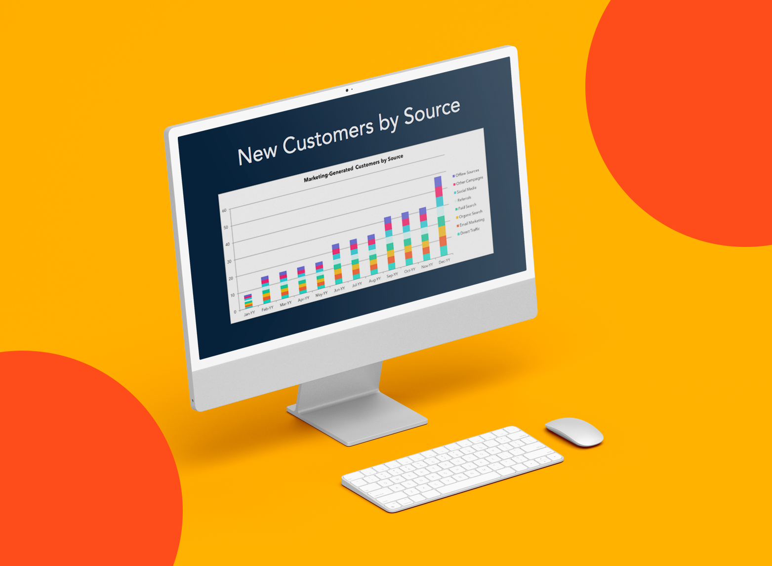
2. Channel-Specific Traffic Marketing Report
Understanding where your traffic comes from will help you make strategic decisions as you invest in different marketing channels. You should invest more resources if you see strong performance from one source.
On the other hand, you can invest in some of the weaker channels to get them on pace with some of your other channels. Whatever you decide, source data will help you figure that out.
HubSpot customers can use the Traffic Analytics report (under Reports > Analytics tools in your navigation) to break down traffic by source.
Want to get an even deeper understanding of your traffic patterns? Break down your traffic by geography. (Example: Which sources bring in the most traffic in Brazil?) You can also examine subsets of your website (like your blog vs. your product pages).

How to Analyze Channel-Specific Traffic
Take a look at what channels are performing well. Based on your goals, that could mean looking at the visitor data or focusing on the visit-to-lead and lead-to-customer conversion rates. Here are a couple of different ways to think about your data:
- Suppose you get a lot of traffic from a particular channel, but the channel is not necessarily helping your visitors move down the funnel. In that case, it may mean investing more in other channels or optimizing that underperforming channel for conversion.
- Think about how you can invest resources in your most robust channels. Did you run a campaign that helped the channel perform well? Was there a piece of content you created that set it off? Consider how you can replicate your past success.
- If you have yet to work on a particular channel, it could be an excellent time to test it. Think about how you can incorporate multiple channels into the same campaign.
Pulling this data weekly will allow you to stay up-to-date on how the channels perform. If a channel takes a turn for the worse, you'll have enough time to remedy the situation before it gets out of control or you waste resources.
Pulling the report daily may be a bit overboard since some channels take multiple days to be effective, and pulling it monthly would prevent you from responding with agility — so weekly data is ideal.
3. Blog Posts by Conversion Marketing Report
Blogs have become a marketer's best friend. There’s a direct correlation between how often a company blogs and how many leads it generates (not just the amount of traffic it drives). So, you must monitor how well your blog is helping you grow that critical metric.
Reporting on your blog leads is a quick way to see how many leads you generate daily, weekly, or monthly — and by what channel.
This report is a great way to understand the channels most vital for your blog, where you should spend more promotion time, and how well your content performs over time.
If you're using HubSpot, creating a blog leads report is accessible. Navigate to Add Report from any of your dashboards, and choose Top blog posts by contact conversion. This report shows the posts most often seen by contacts immediately before filling out a form on your website.

How to Analyze Blog Posts by Conversion
Look at how many leads you're generating from your blog over time. If you see spikes in leads, you know to dig into your content to see if specific topics are more successful at generating leads than others.
The more you can run these reports to determine what works and what doesn't, the better off your marketing and blogging will be.
This data type should be pulled monthly to ensure you write the most relevant content over time.
4. New Contacts by Persona Marketing Report
Every marketer needs to be well-versed in their buyer personas — but you need to do more than just understand them. It‘s essential to track how many new contacts you’re adding to your database based on each persona.
This will help you determine how accurate your buyer personas are and how successful your marketing is in targeting and reaching them.
To report on this in HubSpot, plot your contacts by Create date, showing the date you added a new contact to your database. Then, break down your report by persona.

How to Analyze New Contacts by Persona
Did you run a marketing campaign around a particular topic? Did you focus on promoting your content through specific channels? What did you do that led to an increase or decrease in persona acquisition?
Digging into this report can help you allocate resources more wisely to grow different business segments.
Pulling this report monthly can give you insight into how your campaigns affect new contacts by persona — and might even shed light on an imbalance in resources dedicated to specific personas.
Marketing Reporting Templates
Excel, PowerPoint, and Google Drive Templates to Make Your Monthly Reporting Faster and Easier
- Track leads.
- Measure CVR.
- Track channel performance.
- And more!
Download Free
All fields are required.
5. Lifecycle Stage Funnel Marketing Report
Another way to segment your contact database is to look at their appearance by lifecycle stage. This will give you a sense of how many leads, subscribers, customers, and opportunities you have in your database in a certain period.
This data will help you understand if you need to generate more leads or focus more on closing your current leads. It will also give you a general understanding of the quality of your contact database.
As a HubSpot customer, create a funnel report by clicking Add Report from any dashboard then choosing the Funnels category. Pick which stages to include, select your visualization, and you’re off and running.

How to Analyze a Lifecycle Stage Funnel
This report will give you an overview of how your leads progress through the buying process. Use this report to see what areas of your funnel you must address for greater efficiency.
For example, update and optimize your nurturing program if your report shows that you’re generating leads but not converting any to MQLs. Pulling monthly funnel reports can help you stay on top of the efficiency of your marketing process.
6. Email Marketing Report
When I want to assess my email marketing campaign, I take a look at the following KPIs:
- Number of emails sent
- Click rate
- Unique open rate
- Overall campaign performance
These metrics allow me to analyze the effectiveness of my campaigns by showing me what kind of content performs best in email channels.
7. Social Media Marketing Report
To track the performance of your social media channels, your social marketing report needs to include target audience demographics, likes, followers, engagement, reach, impressions, and your top-performing posts.
Knowing your target audience demographics helps you to better understand the kind of content that would be helpful to them.
For example, if your target audience demographics consist of first-time business owners who are new to marketing, you'll want to create social media content media content best suited to beginners.
Likes, comments, and overall engagement help you fine-tune your social media campaign by showing you which content your current audience prefers.
Furthermore, you‘ll need to track these metrics for each of your organization’s social media accounts, such as Facebook, Instagram, X, and more.
8. SEO Marketing Report
I always include the following in my SEO marketing reports:
- Keyword rankings
- Organic sessions
- Organic landing pages
- Organic conversions
These metrics show how well certain keywords are working to rank your content in SERPs, so you and your team will know which words to rank keep ranking for and if there are any changes in SERP algorithms you need to be aware of.
9. E-commerce Marketing Report
E-commerce marketing occurs over various marketing channels, including social media and Google Analytics. Key metrics you must track are:
- Bounce rate
- Conversion rate
- Transactions
- Pages per session
- Average order value
- Revenue
How to Create a Marketing Report
As I said, you can run many different marketing reports.
This section won’t focus on what specific data to put into your marketing report — that will depend on what type you decide to run. Remember, that process is a bit different if you’re building a marketing dashboard.
Let's discuss how to build marketing reports that inform your decisions and benefit your audience, whether your team, CEO, or customers.
Featured Tool: Marketing Reporting Templates [Download for Free ]
Most of your marketing reports will contain a few of the same elements:
- Title: What is your marketing report analyzing? Whether you’re running a report on campaign performance, quarterly blog performance, or monthly leads, be sure to title your report so the intent is clear. I found this to be especially important if I share my report with people outside of marketing.
- Reporting period: Your marketing report should reflect a certain time period. This period can be a few days, months, or even years. I notice analyzing my data within a time period allows me to compare performance to past periods.
- Summary: Your report summary should reflect the key points of your report, including your wins, losses, and goals for the next reporting period. It’s basically the TL;DR of your report.
Next, let’s dive into the report specifics. Valuable, insightful marketing reports recognize two distinct components: purpose and audience.
What's the purpose of your marketing report?
A marketing report should help you make a decision. Choosing the content of your marketing report (i.e., the data you’re analyzing) is simple; however, it’s how you will use this data to make a decision or draw a more difficult conclusion.
This is true for two reasons:
- Marketing reporting is often performed to review data, which is simply a waste of time.
- Data points can be used to draw multiple conclusions or make numerous decisions, so you should know precisely how to use the data before removing it.
You should determine the goal of your marketing report before you pull any data. Once you make this impending decision, list all the data that might be relevant. From there, you’ll better understand what reports to run and how to use said data.
Marketing Reporting Templates
Excel, PowerPoint, and Google Drive Templates to Make Your Monthly Reporting Faster and Easier
- Track leads.
- Measure CVR.
- Track channel performance.
- And more!
Download Free
All fields are required.
Who's the audience for your marketing report?
Marketing reports are precious because they can inform so many different decisions — decisions made by a wide variety of people across your organization.
Whether you’re delivering a marketing report to your team lead, department manager, or CEO, your marketing report must be tailored to whoever may be reading and using it.
Here are a few ways to do this:
- Ask your audience what they need. If you know the decisions your audience needs to make, you’ll know what data to pull and analyze. I often find knowing this information helps me avoid running reports my audience doesn’t care about.
- Speak in their language. Marketing involves a lot of acronyms and jargon. When giving reports, I sometimes notice my team members understand what I'm saying, but my executive team and co-workers outside marketing may not be fluent. So, believe me when I say consider your audience when writing your marketing report and choose words and descriptions they’ll understand.
- Don’t mix audiences. Creating separate accounts for separate audiences is best if you create a marketing report for a mixed audience. For example, I wouldn’t make the same report to give my CEO and Marketing co-workers; I'd likely break this into two reports with different data and jargon. This will allow my audience to focus on the data and analysis that’s most relevant to them.
Marketing Reporting Best Practices
- Schedule your marketing reports.
- Collect feedback from your audience.
- Create marketing report templates.
- Put your most valuable data first.
- Visualize your data as much as possible.
Marketing reporting can take up much of your time (and waste some, too). Here are some best practices to help you work smarter, not harder.
1. Schedule your marketing reports.
Whether you create a recurring reminder on your calendar or set your reports to run automatically, schedule your marketing reports beforehand. This will take the guesswork out of when to run your reports and when to send them to the relevant audiences.
2. Collect feedback from your audience.
As you send out your marketing reports, ask for feedback from your audience. Whether you ask an open-ended question like, “How did this report help you?” or provide a short Google Form, gathering feedback from those using your reports can help you improve them in the future.
3. Create marketing report templates.
If your marketing report will be designed the same way each time you send it out, consider turning it into a template. This will save you time and energy building each template and provide a reliable, predictable report design for your audience to read.
These free monthly marketing templates make your monthly reporting faster and easier.
4. Put your most valuable data first.
Long marketing reports are acceptable as long as all the data you include is valuable and helpful for whatever decision you or your team need to make. However, you should place the most impactful data first so your audience can stop reading once they decide.
Nobody wants to read an entire report only to utilize the final page.
5. Visualize your data as much as possible.
When possible, include visual data in your marketing reports. Not only does this help your reports pack a more significant punch with your coworkers and executives, but it trims down the time and effort needed to digest your data.
To do this, include charts from Excel or screenshots from your reporting tools (like HubSpot Marketing Hub). You can also use heat maps if you’re reporting on website performance.
Create Your Marketing Report Today
Marketing reporting is a vital part of your marketing efforts and the growth of your business. By understanding how efficient and effective your marketing is, you can better allocate time, resources, and money — and make well-informed decisions.
Start with these marketing reporting examples and expand your reporting as you utilize more data.
Editor's note: This post was originally published in April 2014 and has been updated for comprehensiveness.


-Apr-22-2023-12-26-04-1013-AM.png)
.png)
![How to Calculate Marketing ROI [+Free Excel Templates]](https://53.fs1.hubspotusercontent-na1.net/hubfs/53/Marketer%20calculating%20ROI%20in%20marketing%20from%20free%20Excel%20templates.jpg)

![How to Create a Funnel Report [Quick Guide]](https://53.fs1.hubspotusercontent-na1.net/hubfs/53/funnel-reporting_1.webp)