.png?width=112&height=112&name=Image%20Hackathon%20%E2%80%93%20Horizontal%20(37).png)

Below, let's review how to increase your conversion rate for both your desktop website and mobile site.
How to Increase Conversion Rate
- Use a CRO planner.
- Shorten your forms.
- Include social proof.
- Track how people interact with your site.
- Add live chat.
- Test your offers.
- Conduct A/B testing.
- Increase trust and remove friction.
- Create abandoned cart email campaigns.
- Communicate your value proposition.
- Incorporate multimedia elements into your landing pages.
- Write strong CTAs.
- Eliminate unnecessary distractions.
- Meet your audience's expectations.
- Improve your page speed.
- Optimize for mobile.
- Enhance the purchasing process.
- Be creative with your mobile marketing.
- Make adjustments to your mobile site.
- Localize your content.
.png)
The Complete A/B Testing Kit for Marketers
Start improving your website performance with these free templates.
- Guidelines for effective A/B testing
- Running split tests for email, landing pages, and CTAs
- Free simple significance calculator
- Free A/B test tracking template.
Download Free
All fields are required.
How to Increase Conversion Rate on Your Website
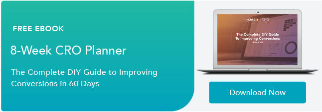
1. Use a CRO planner.
Getting started with conversion rate optimization can seem like a daunting task.
The first step to improving your conversion rate? Use a CRO planner.
With a CRO planner, you'll be able to analyze and develop a strategy for increasing your conversion rate.
For example, with HubSpot CRO planner, you'll find instructions on how to conduct a site audit, identify areas to improve your conversion funnel, understand users on your site, and go through the process of A/B testing and experimentation.
CRO planners can be helpful because they take through the entire process from A to Z.

2. Shorten your forms.
One reason that users don't convert is because there's friction in the process. For example, if you have a long-form, visitors might be hesitant to fill it out.
It's your job to eliminate hesitation, not create it. By shortening your forms, you'll create trust among your audience. Plus, it takes less time to fill out so users are more likely to complete it.
3. Include social proof.
Did you know that 89% of consumers check online reviews before making a purchase? The Canvas8 study commissioned by Trustpilot also found 49% of consumers consider positive reviews one of their top three purchase influences. Without a doubt, your reputation and online presence impact your conversion rate. That's why you should include social proof on your site.
You can link to your Yelp or any other directory page where customers have left reviews.
Additionally, you should also add testimonials and reviews right on your site so visitors don't have to go to a third-party site.
It should be apparent that your customers have enjoyed using your product or service. If it isn't, your conversion rate will suffer.
4. Track how people interact with your site.
It'll be hard to improve your conversion rate if you don't understand how users are interacting with your site.
But how can you see where visitors are getting tripped up? With website analysis tools, you can see screen recordings of users on your site. You'll see what they click on, if they skip over an offer, or if they stop filling out a form in the middle.
Additionally, these tools should include heat maps of your site, so you can see what elements stand out and what draws the eye.
A tool like Crazy Egg or HubSpot's website grader can help you see what you're doing well and diagnose what areas of your site you need to improve. You should also calculate your conversion rate and analyze why visitors aren't converting on your site.
5. Add live chat.
When a web visitor doesn't convert, they might have a question or concern about your product or service.

To avoid losing potential customers, you should consider adding live chat to your site.
With live chat, your customer service or sales employees can alleviate concerns of prospects who are on the fence.
6. Test your offers.
Sometimes it can feel like you've checked everything — you've written a strong copy, included social proof, and have optimized your forms … but you still aren't converting.
When this happens, it's time to check your content offers. Do they align with your audience? Are they creative and compelling? Do the offers make sense for the page they're on?
Think about your current offers and answer those questions.
For example, offering a free trial or consultation is fairly generic. Instead, you could offer something like HubSpot's Website Grader. With this offer, the customer is getting a lot out of it. They're getting actionable advice, for free, and they don't need to clear out time on their calendar to get it.
Tangible and compelling offers always perform better than a generic offer. To improve conversions, you need to analyze and test your content offers.
7. Conduct A/B testing.
It's not always easy to know what's working and what isn't. When that happens, you should conduct A/B tests.
See what types of headlines, colors, copy, layout, and CTAs work for your audience. Get creative with your experiments.
For example, you can try testing an entirely new type of CTA or completely changing the format of your copy.
8. Increase trust and remove friction.
Users don't convert if they don't trust your brand or experience friction in the process.
So, how can you increase trust?
You can use several tactics, including money-back guarantees, updating your site content regularly, avoiding spammy links, and making the site easy to use.
If it looks like you haven't posted a blog in two years or there are a lot of broken links — that's friction and it creates distrust.
Additionally, you can include team bios so your audience knows who they're getting information from.
9. Create abandoned cart email campaigns.
Have you ever been on a site, added something to your cart, but decided not to check out? We all do it and that means it's probably happening on your site too.
You shouldn't forget about those potential customers. If someone abandons their cart, they should receive an abandoned cart email campaign.

With this type of email campaign, you'll email users a reminder about the products in their cart, send a follow-up, and then perhaps include a discount or offer.
If you don't send this email, you're losing out on conversions.
The Complete A/B Testing Kit for Marketers
Start improving your website performance with these free templates.
- Guidelines for effective A/B testing
- Running split tests for email, landing pages, and CTAs
- Free simple significance calculator
- Free A/B test tracking template.
Download Free
All fields are required.
How to Increase Landing Page Conversion Rate
10. Communicate your value proposition.
On any landing page, your value proposition should be clearly communicated. To do this, you need to have a solid understanding of who your audience is and your buyer persona.
Write your copy specifically for your target audience. For example, you can address their goals, motivations, and pain points.
Additionally, you should discuss the benefits of your product or service over the features. Benefits will help your potential customers imagine their life with your product, while features are easy to skim and ignore.
Your copy should communicate how your product or service can solve your audience's problem. If you aren't converting, you should check and see how well your copy is written.
11. Incorporate multimedia elements into your landing pages.
Have you ever ordered something at a restaurant and when it came out, it looked completely different than what you imagined?
You don't want this to happen when people download your content offers. To avoid this, include images and videos of your product or service on your landing pages.
Multimedia elements make your site feel more trustworthy. Plus, it's the preferred way of consuming content.
To improve your conversion rate, try adding images of graphs and charts, or video testimonials to your site.
12. Write strong CTAs.
A huge component of conversion is your call-to-action (CTA). Your CTA could be to download an offer, share a post on social media, or subscribe to your email newsletter.
Whatever it is, you need to include CTAs throughout your website and landing pages. Usually, this means that they're clear and easily accessible.
"Marketers need to take a Goldilocks approach when it comes to placing CTAs since sometimes, one placement isn’t enough," explains AJ Beltis, HubSpot's Senior Marketing Manager. "But it’s very easy to have a CTA appear so often as to appear spammy to website visitors."
Typically, each landing page will only have one call to action but be incorporated several times on a page. For example, this blog post has three CTAs that lead to one offer. One at the bottom of the page, one in the text in the introduction, and one that pops up after scrolling down the page.
Typically, the sooner a CTA can appear on a page, the better, Beltis says. Otherwise, you run the risk of visitors who don’t scroll down far enough missing the conversion point entirely.
The important thing to note is that you can access the CTA no matter where you are on the page. Removing risk for the visitor (like offering a guarantee) and communicating that message clearly in your CTA will encourage them to take action.
13. Eliminate unnecessary distractions.
Speaking of CTAs … it’s important to remove anything on your landing page that would detract from visitors taking a preferred action. Get rid of any unnecessary links, pop-ups or navigation options that could potentially divert a visitor’s attention away.
A busy or cluttered page is less likely to convert visitors. You only have a few seconds to win them over, and a page that’s hard to navigate will discourage them from sticking around.
Design a page that encourages visitors to click your CTA using visual hierarchy to your advantage.
14. Meet your audience's expectations.
When someone clicks on your site after reading your meta description on Google or seeing your search engine ad, your landing page needs to follow through.
You have to deliver on the promises that were made in that copy. For example, if a user sees this post in Google, they're going to expect to find strategies to improve their conversion rate. If they clicked through and this page only had pictures of puppies, they'd be confused.
If a landing page doesn't deliver on what a user thought they were getting, they won't convert. That's why you need to think about the entire process from seeing an ad, going to your landing page, and downloading an offer.
If a landing page isn't converting, review your social media posts and search engine descriptions to see if you follow through on the promises you made.
How to Increase Mobile Conversion Rate
15. Improve your page speed.
When it comes to mobile conversion, a huge obstacle is page speed. This is the time it takes for your content to appear on the screen.
Did you know that 40% of people abandon sites that take more than 3 seconds to load? On mobile specifically, a one-second delay in page response can result in a 7% reduction in conversions.
If your mobile page isn't converting as well, analyze your page speed with Google's PageSpeed tools. This will test your mobile page speed.
To improve your page speed, images need to be smaller and compressed. Additionally, your site should be responsive and optimized for mobile.
16. Optimize for mobile.
Since Google switched to mobile-first indexing, mobile optimization has been more important than ever. If you don't optimize for mobile, your Google rankings might be impacted, which could reduce conversions.
You might be wondering, "How do I optimize my site for mobile?"
Before you begin, it's important to remember that mobile and desktop experiences are different.
You can use Google's mobile testing tool to see if your site is mobile-friendly. With this tool, you'll get recommendations for how to improve your site's mobile performance.
For example, you might need to increase your font on mobile, compress your images, or improve page speed.
17. Enhance the purchasing process.
Making a purchase on your phone should be a simple process.
That means you shouldn't have too many steps in your checkout process and your payment buttons should be easy to see and click.
Additionally, try to remove restrictions on online forms where you gather payment information. Personally, I'm always stopped on mobile forms because the name of my city is too long (22 characters).
Users should be able to check out as a guest and use whatever payment method they want, whether that's Google Pay, Apple Pay, or PayPal.
Ultimately, this process should be easy and pain-free. A complicated checkout process will reduce mobile conversions.
The Complete A/B Testing Kit for Marketers
Start improving your website performance with these free templates.
- Guidelines for effective A/B testing
- Running split tests for email, landing pages, and CTAs
- Free simple significance calculator
- Free A/B test tracking template.
Download Free
All fields are required.
18. Be creative with your mobile marketing.
When you want to increase your mobile conversion rate, that doesn't just mean you need to adapt your site to the mobile experience.
You can also start to get creative and run mobile-only marketing campaigns.
For example, maybe you can start an SMS text message campaign, or you can use push notifications on your app.
These creative, out-of-the-box techniques can help increase your mobile conversion rate.
19. Make adjustments to your mobile site.
Since the mobile and desktop experiences are different, your mobile and desktop sites should be different.
For example, your email subscriber form might be smaller or nonexistent on your mobile site.
Additionally, you'll probably use different CTAs on your mobile site. For instance, when you read this blog, the website and mobile have different types of CTAs. While the offer is the same, the button and the way to access the CTA aren't.
On mobile, less is more. Your mobile site should be simple and eliminate distractions. This can mean you have simplified navigation and use a hamburger menu so it's easy to get around your site.
20. Localize your content.
Mobile users are usually on your site because they're looking for contact information, want to know your location, find directions, or look up reviews.
That's why you should optimize for local marketing. This means adding location pages to your website, managing your online directory listings, and creating local content.
To improve your mobile conversion rates, consider localizing your content so you perform better in local searches.
Before I sign off, I want to remind you that many of the tactics for improving your website's conversion rate can be applied to mobile CRO.
Empathize With Customers
At the end of the day, we've all been consumers before. Take a step back, look at the bigger picture, put yourself in your customer's shoes, and think about whether you would make a purchase off your site.
This article was originally published May 25, 2020, and has been updated for comprehensiveness.
Conversion Rate Optimization


![What We Didn’t Do Boosted Our Paid Ad CVR by 11% [Expert Interview]](https://53.fs1.hubspotusercontent-na1.net/hubfs/53/hubspot-labs-paid-ad-cvr.webp)


![What is a CRO Test? [+ the 5 Steps to Perform Them Yourself]](https://53.fs1.hubspotusercontent-na1.net/hubfs/53/conversion-rate-optimization-tests_4.webp)